Abstract
Background:
Pictographs (or pictograms) have been widely utilized to convey medication related messages and to address nonadherence among patients with low health literacy. Yet, patients do not always interpret the intended messages on commonly used pictographs correctly and there are questions how they may be delivered on mobile devices.
Objective:
Our objectives are to refine a set of pictographs to use as medication reminders and to establish preliminary steps for delivery via smart phones.
Methods:
Card sorting was used to identify existing pictographs that focus group members found “not easy” to understand. Participants then explored improvements to these pictographs while iterations were sketched in real-time by a graphic artist. Feedback was also solicited on how selected pictographs might be delivered via smart phones in a sequential reminder message. The study was conducted at a community learning center that provides literacy services to underserved populations in Seattle, WA. Participants aged 18 years and older who met the criteria for low health literacy using S-TOFHLA were recruited.
Results:
Among the 45 participants screened for health literacy, 29 were eligible and consented to participate. Across four focus group sessions, participants examined 91 commonly used pictographs, 20 of these were ultimately refined to improve comprehensibility using participatory design approaches. All participants in the fifth focus group owned and used cell phones and provided feedback on preferred sequencing of pictographs to represent medication messages.
Conclusion:
Low literacy adults found a substantial number of common medication label pictographs difficult to understand. Participative design processes helped generate new pictographs, as well as feedback on the sequencing of messages on cell phones, that may be evaluated in future research.
Keywords: Medication Adherence, Health Literacy, Smartphone, Patient Education as Topic, Health Communication, United States
INTRODUCTION
Nonadherence to prescription medications is prevalent in most areas of the world and is associated with negative, even fatal, outcomes that are otherwise preventable.1
Adherence can be described as the degree to which a patient follows the instructions, proscriptions, and prescriptions of his or health care provider.2 One group of patients who are less likely to be adherent their medication regimens are patients with low health literacy3,4 which can be described as the “degree to which individuals can obtain, process, and understand the basic health information and services they need to make appropriate health decisions”.5 In short, patients understanding of their medication regimen may not be concordant with the understanding and expectations of their prescribing clinician due to low literacy.
A potential solution to overcoming literacy limitations is the use of pictographs to convey health information.6 Pictographs, or pictograms, are described as simple line drawings or a group of step-by-step, standardized graphic images to convey key health information, reducing reliance on complex textual health information, particularly in low health literacy patients.7,8,9 Use of pictographs for discharge teaching instructions and to convey medication use and adherence are common in the literature10,11 and may help mitigate issues related to medication literacy defined as “the degree to which individuals are able to obtain, process, and understand basic health and medication information and pharmacy services needed to make appropriate health decisions”.12 One explanation for why pictographs may work is the Dual Coding Theory, first proposed by Paivio in 1971.13 The theory essentially holds that human memory uses two interactive stores – verbal representations and mental images. When exposed to an image the verbal memory may be triggered reinforcing memory traces and subsequent recall.14
Medication-related pictographs have been developed by various sources including the United States Pharmacopeia Convention (USPC)15, the International Pharmaceutical Federation (FIP)16 and research study investigators.7,17,18,19,20 Many studies have identified the need to tailor visual aids by using pictographs with the target population.7,11,19,21 In one study conducted by Kheir et al.21 123 participants reviewed 11 medicine labels which included text and verbal, pictograph and verbal, or pictograph-only instructions. The highest level of comprehension came from participants who were given the combination of pictograph and verbal instructions. Kripalani et al.,22 recruited participants with a history of coronary heart disease from a large primary care center. Customized pill cards containing pictographic medication instructions were created based on each patient’s individual medication dosing and schedule. Overall, “patients who used the pill card found it helpful for remembering which medicines to take, as well as the medication name, indication, dosage, and time of administration”22; Similarly, the FIP storyboard concept was developed to assist healthcare providers in communicating medication directions with illiterate patients, those who speak different languages, patients with slight cognitive impairment or difficulty seeing. The label with customizable size, prescription calendar with combined medication regimen placed on one sheet of paper allowed for convenience and ease of use. FIP recommends cultural sensitivity as a component of pictograms attention to – noting that things like common representations of foods and time may not translate well in different cultures. Key to successful development is returning culturally specific designs back to the community for further evaluation and validation.16
The fact that these visual aids helped patients understand and remember to take their medications is notable as 42% of missed doses are unintentionally forgotten.23 A different approach than pill cards or storyboard concepts that has worked well in reminding patients about their medications are text reminders using the simple messaging service protocol.24,25,26 However, text only reminder approaches may not work as well for patients who have trouble reading. One possible solution is to use smart phones which can deliver pictographic reminder messages to patients with literacy challenges using multimedia messaging service protocol.
But before we send reminder pictographic messages to people on their cell phones, we need to have good pictographs and a logical sequence for the message components. Several of the studies we reviewed paid careful attention to cultural sensitivity and used iterative, participatory design approaches.7,18,19,21,27,28 Participatory design allows the participants and the researchers to analytically examine the impact of the candidate pictographs in stages, and work together to produce and revise the design that is acceptable for specific use. This design is commonly adapted in technical communication research and human-computer-supported cooperative work.27
The purpose of our study was to use participatory design techniques to develop a set of candidate pictographs as medication reminders for patients with low health literacy. A secondary purpose was to explore the sequencing of the messages for delivery on a smart phone. This was part of a larger study that sought to explore methods for evaluating the ‘recognizability’ of pictographs and feasibility of delivering them via smart phones using simulation techniques prior to a longitudinal trial.
METHODS
This study was largely qualitative in nature, employing focus groups and iterative, participatory design techniques. Our two objectives were to:
Use participatory design approaches to improve existing pictographs
Gain preliminary feedback on the sequencing of pictographic reminders via cell phones.
Study Instruments
The 36-item Test of Functional Health Literacy in Adults (S-TOFHLA) was used in subject recruitment. Participants were allowed seven minutes to provide responses to all items per instrument instructions. Correct response to each item was scored as 1 point, with a maximum score of 36 points. A total score between 0-16 signified inadequate literacy, a score between 17-22 signified marginal literacy, and a score between 23-36 signified adequate literacy. The scale has been tested for validity and reliability and found to have good internal consistency (Cronbach’s alpha=0.97).29 The second instrument was an investigator-developed and used to assess demographic characteristics of our study population. Ethnicity and race questions in this instrument were modeled on the short form of the U.S. Census. Also included were questions related to participants’ histories of cell phone, text message, multimedia messaging service (MMS), and medication use so that we could characterize our study population. (
).
Materials
We developed a database of pictographs by performing literature searches through Medline, University of Washington Health Sciences Library Multimedia Resources, EBSCO database, and Google from June to July 2012. Key search words were “pictograph”, “warning labels,” and “pharmacy related pictographs.” We contacted 10 authors of these pictographs to obtain permission for use and for modifications of the pictographs. Authors were assured that they would retain copyright to any modified images. Five authors responded, three allowed use and modification of images, 1 allowed use without modification, and 1 denied use and modification of their pictographs. Pictographs were then printed onto 3’ x 2’ cardstock with text descriptors removed to prevent confounding.
Procedures
Participant Recruitment
All participants were recruited using convenience sampling from the Literacy Source (LS), a community learning center based in Seattle that provides instruction to more than 680 adults from underserved populations annually.30 The study procedures were reviewed and approved by the University of Washington Institutional Review Board.
Eligible clients were age 18 or older, English speaking, and had past or present experience with prescription medication. Individuals with dementia, cognitive impairments or uncorrected vision or hearing impairments were excluded from recruitment. Exclusion determination was made by the research coordinator and based on observable characteristics, individual interviews, and communication from study staff. Eligible participants who completed the S-TOFHLA and demographic survey received a USD25 gift card.
Consent materials written at the 6th grade reading level were verbally explained to each participant before written consent was obtained. Participants were then screened using the S-TOFHLA and asked to provide responses to the demographics survey. The S-TOFHLA was immediately scored by the research coordinator. Participants with low or marginal literacy scores (0-22) were invited to participate in one of five focus group (FG) sessions at the LS.
Our target group size for each FG was eight and based on qualitative research design methods described Morgan.31 Each focus group was facilitated by the principal investigator; the research coordinator and a graphic artist. As we had too many pictographs to explore in a single session, we divided the pictographs in half and explored them across two focus groups (FGs 1 and 3), with two additional focus groups (FGs 2 and 4) exploring the same pictograph sets. A fifth FG examined potential sequencing of the pictographs when delivered on a cell phone. All FG sessions were conducted in a private area at LS and were audio recorded.
FGs began with introductions of research staff, name cards for participants, and a brief introduction of medication-related pictographs. We employed specific interaction techniques including asking open ended, conversational, and probing questions, rephrasing, listening without interrupting, and not allowing a particular individual to dominate the conversation.32,33,34,35,36
Following introductions, participants in FGs 1-4 were asked to identify “not easy” pictographs. Each participant was given a stack of cards measuring 3” x 2” with each card containing a pictograph. Captions present in the original pictograph were removed before printing of the pictographic flash cards. Participants were asked to sort the cards into two piles: Pictographs that were deemed “easy” were put on top of a piece of green paper labeled with the word “easy” and also “#1”. Participants were instructed to place pictographs not considered easy onto a piece of red paper labeled “not easy” and also labelled with “#2”. Participants were not asked to order the pictographs from easy to hard, only to place them into two separate piles. After sorting was completed, the pictographs were collected by the RC. The cards labeled “not easy” was grouped and totaled, and grouped pictographs were then rank ordered by frequency by study staff so that the picrograph that most people identified as ‘not easy’ came first. Pictographs were then displayed in this order on an overhead digitizer and participants asked what they thought each pictograph meant. After 1-2 minutes of discussion, the RC told the participants what the pictograph was supposed to mean if it had not already been identified by the group. The participants were then asked to help improve the design of the pictograph by providing input while a graphic artist was able to modify the image in real time using the overhead digitizer. Discussion on the redesigning for each pictograph was limited to five minutes to ensure that we covered as many ‘not easy’ pictographs in each FG session as possible. If refinements of the same pictograph were available from another focus group, these would be displayed to prompt conversation and to gain additional feedback.
Following each focus group, the digital audio recordings of the session were transcribed and coded. The recommendations for improvement were grouped and summarized with emphasis on points having general consensus. These were then attached to a visual representation of the development of each pictograph which included the original pictograph, graphic artist’s sketches from the sessions, refined interpretations of the sketches, and a final recommendation from the graphic artist. Upon reviewing the developed visual and transcript summaries, investigators made additional requests of the graphic artist for revisions if key points from the focus group discussions had been missed, or if important medical or prescription features needed clarification. Use of specific shapes, colors, and prioritization techniques were guided by published literature8,37,38,39,40,41,42 A general overview of this process can be found below in Figure 1.
Figure 1.
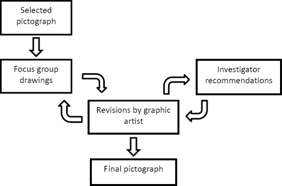
Schematic of Pictograph Design Process
Focus Group 5: Pictograph Sequencing
A fifth focus group examined the sequencing of a series of pictographs to represent specific medication-related messages. We started the FG session by asking participants to think about information normally presented on prescription medication bottles. We then asked participants to arrange a pictographic medication sequence using paper print-outs of a cell phone screen (see Figure 2) in the order that made the most sense to them.
Figure 2.
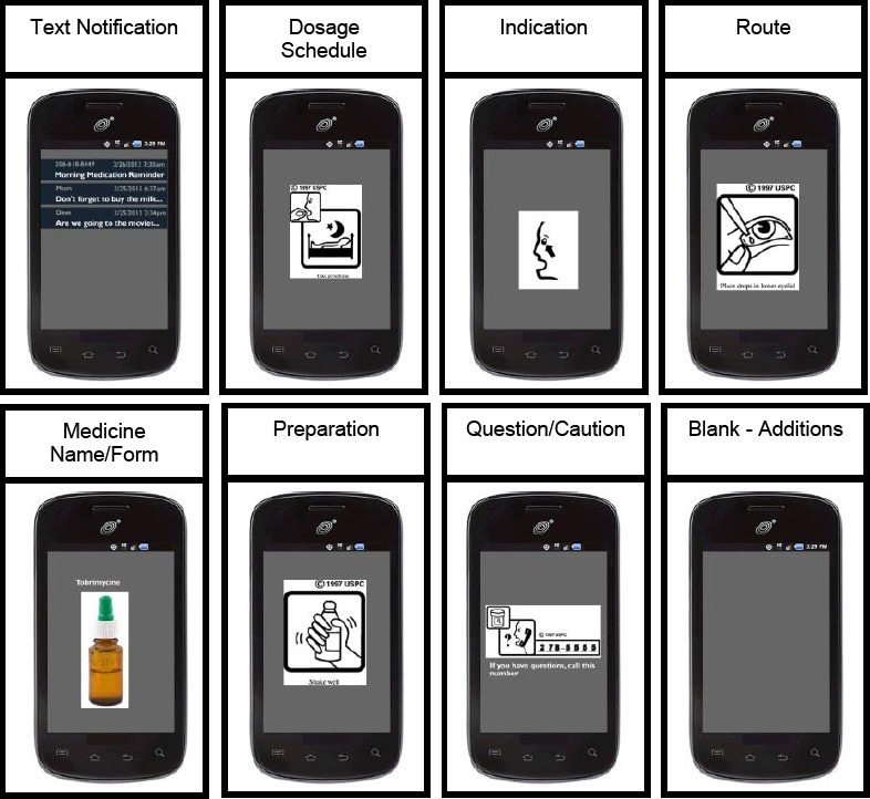
Sample print-outs of pictograph information categories used to generate sequence preferences
After participants completed the task of arranging the sample pictographic message, the messages were collected and discussed using an overhead digitizer and covering topics like the arrangement of the pictographic medication sequence, pictograph re-design, addition/removal of pictographs, and additional features.
Data Analysis
Paper-based forms related to demographics, S-TOFLHA, and cell phone use were entered into SPSS (version 17) for data cleaning and analysis. These data were summarized using basic descriptive statistics and frequencies. In order to determine the appropriate sequence of pictograph information categories for optimal comprehension of the medication instructions, an internally constructed variation of an ordinal ranking system was used to score each information category. For each sequence chosen by the participants the information category placed at the beginning was given a score of 10, 2nd position =7, 3rd position =5, 4th position =3, 5th position =2, 6th position =1, 7th position =0. The scores for each information category were then averaged to determine the preferred sequence based on all participant responses.
RESULTS
Participant characteristics
Among 45 LS clients screened, 9 were ineligible due to high health literacy scores, and 29 of the remaining 36 clients (81%) consented to participate. The majority was male, over 47 years old, Black/African American, and half of the sample was single. Our sample was limited in education, income, and presence in the workforce (Table 1). The median literacy level on the S-TOFHLA test was 12 (IQR=12) indicating inadequate health literacy.
Table 1.
Demographic data for analytic sample
| Demographics | Measurement |
|---|---|
| Female (N=29) | 45% |
| Hispanic or Latino (N=23) | 30% |
| Black/African American (N=23) | 57% |
| Age (N=25) | M=46.36, SD=9.30 |
| Not Working (N=29) | 38% |
| Household income 35k or less (N=23) | 83% |
| Completed 12th grade or less (N=29) | 86% |
| Single (N=28) | 50% |
| Literacy level (S-TOFHLA) (N=29) | Mdn=12, IQR=12 |
Table notes: M=Mean, Mdn=Median, SD=Standard Deviation, IQR=Interquartile Range
Regarding medication use, 21 of 28 participants (75%) indicated that they regularly took medications. A majority of the 29 participants (55%) responded ‘yes’ to the question, “Have you ever forgotten to take prescription medications?”
The cell phone usage data collected from participants is shown in Table 2. Of note, only one participant did not own a cell phone, and almost half of participants had an unlimited texting plan.
Table 2.
Use and plan data for the 29 participants with a cell phone
| Cell phone data | Measurement |
|---|---|
| Years of cell phone ownership | M=7.73, SD=4.99* |
| Have unlimited texting plan | 46%** |
| Number of text messages sent per week | M=58.28, SD=156.52 |
| Number of MMS sent per week | M =6.74, SD=27.25 |
| Number of years texting | M=2.73, SD=3.48 |
Table notes: M = Mean, SD = Standard Deviation
Missing data from two participants
Missing data from three participants
Objective 1: Pictographic Revisions
Ninety-one original pictographs were evaluated, with a range of 14-22 participant responses for each pictograph. Out of all 1,616 evaluations, 369 (23%) of the evaluations were deemed “not easy.” Following sorting into ‘not easy’ piles and frequency counts by study staff, pictographs were discussed and refined in the focus group sessions. Due to time constraints (5 minutes per pictograph) we were limited to refining the 20 pictographs with the highest frequency counts. The original pictographs also were grouped in categories based on medication information. The average difficulty of each category, based on the card sorting analysis, is shown in Table 3. The complete card sorting results along with sample sizes and selection for redesign are listed in
.
Table 3.
Pictograph category card sorting analysis by information category.
| Information category | Pictographs in category | % of participants ‘Not easy’ |
|---|---|---|
| Warning: Precaution | 2 | 36% |
| Handling: Storage | 5 | 32% |
| Warning: Adverse Reaction | 6 | 27% |
| General Information: Indications and Usage | 5 | 27% |
| Dosage & Administration: Route | 13 | 26% |
| General Information: Other | 10 | 24% |
| Dosage & Administration: Frequency, Duration, and Schedule | 10 | 23% |
| General Information: Questions | 3 | 22% |
| Dosage & Administration: Preparation | 12 | 20% |
| General Information: Use in Population Groups | 5 | 19% |
| Handling: Form | 2 | 11% |
| Dosage & Administration: Take With/Without | 18 | 7% |
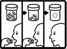
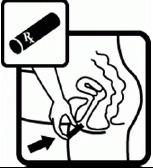
Revisions commonly included the addition of color, adding information through additional panels or animation, and clarification of confusing items or actions. The six most difficult to understand pictographs are illustrated below (Table 4) along with revised pictographs.
Table 4.
Six pictographs rated the most difficult by participants
| Concept/Caption (% Not Easy, Sample Size) | Original Pictograph | Revised Pictograph |
|---|---|---|
| Do not store near heat or in sunlight (64%, N = 22) |  |
 |
| Take until gone (57%, N = 14) | 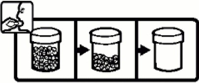 |
 |
| Insert into vagina (45%, N = 22) | 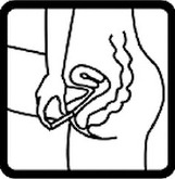 |
 |
| For stomach/intestinal problems (45%, N = 22) |  |
 |
| Read the label (45%, N = 22) | 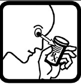 |
 |
| Flammable (45%, N = 22) |  |
 |
All images used by permission. © copyright United States Pharmacopeia
Objective 2: Pictograph Sequencing
The results from focus group 5 participants for the preferred sequence of pictograph information categories are shown in Table 5. There was a consensus priority to begin with “Text Notification” as the first graphic in the sequence, followed by a subtle difference in priority among the next four information categories (mean score difference 1 or lower), the final category of Questions/Cautions, and Route.
Table 5.
Preferred sequence of seven pictograph information categories
| Information category | Mean sequential value | Preferred ranking Order |
|---|---|---|
| Text Notification | 10.0 | 1 |
| Dosage schedule | 4.0 | 2 |
| Medicine Name/Form | 3.7 | 3 |
| Indication | 3.3 | 4 |
| Preparation | 3.0 | 5 |
| Question/Caution | 2.4 | 6 |
| Route | 1.6 | 7 |
DISCUSSION
We successfully conducted five focus groups with low-literacy participants where we explored the relative ease of recognizing the meaning of existing pictographs, ways to improve some of the most difficult, and possible sequencing steps to communicate pictographic reminder messages on smart phones. We had a diverse group of participants with a considerable amount of cell phone ownership.
Nearly a quarter of the pictographs were identified by our participants as “not easy” to understand. This number should be a cause for concern as it indicates that there is a possible disconnect between the intended meaning of the messages and the audience. Twenty of these pictographs went through substantial, iterative revisions with a graphic artist, the focus groups, and members of the research team and the modifications were returned to the original contributors for potential use. The process for redesigning this subset of pictographs worked well. Having a graphic artist on site with an overhead digitizer was very helpful and engendered feedback as people could see their suggestions put into action immediately.
In general, after feedback from participants the revised pictographs contained fewer details. Our findings are similar to a study in Malaysia that explored both enlarging fonts and incorporating pictograms into medication labels.9 The study authors used focus group discussion for redesign; subsequent testing found that elderly patients and those with a higher number of co-morbidities preferred pictograms over labels with solely text. Zargarzadeh et al.28 also revised labels, using an iterative design process with input from stakeholders consisting of patients, physicians, and pharmacies. The researchers followed design conventions based on the literature and prior studies with attention on the ‘content, convenience, and cosmetic appearance (3Cs)’. The investigators reported a higher preference from patients, pharmacists, and physicians with the redesigned labels.
We received valuable feedback on the sequencing of messages and will use this in our future research as a starting point. However, this needs more exploration given that patients choice in sequencing may be ordering based on importance. For example, having route listed last may be due to the fact that many know the route so place less importance on it – instead it may make more logical sense to pair it with instructions on when to take the number of pills. Further, the use of paper cut-outs of images on cardboard phone prompts may have interfered with feedback and it would be worthwhile to explore this better on actual cell phones and with objective knowledge tests.
There are several additional limitations to this project. Our findings cannot be generalized to populations of different demographics. One reason is that pictographs are not universally comprehensible, and some illustrations may not be appropriate to meet all cultures and all types of medical conditions.16,43 Our sample had a high rate of cell phone ownership and most were experienced at texting despite limited income, education and low health literacy scores. We could not account for the impact of the participants’ cell phone and texting experiences on the feedback provided in helping us develop and improve the pictographs and pictograph sequencing.
We would have improved our methods by conducting a semiotic analysis of the core components within pictographs classified as ‘not easy’. Korenevsky et al.44 conducted such an analysis – noting that semiotics is “studying how signs are perceived and how they should be designed”. The researchers used a rigorous selection approach to establish ‘preferred pictograms’ and then examined graphical elements that were common to 50% of the preferred pictographs. While they did not find patterns in the key graphical components, they did find a preference for storyboarded designs which, along with key graphical components, could be studied further with respect to improved pictographs and sequential panels delivered on smart phones.
Another weakness was that we could have structured how to elicit feedback from participants better. Instead of having participants essentially self-report by sorting pictographs into ‘easy’ and ‘not easy’ piles, we could have objectively tested comprehension and then grouped responses using the four categories for judging safety according to the American standards (ANSI Z535.3) for safety symbols (Correct, Wrong, Critical Confusion, No Answer) and chosen pictographs for refining based on frequency counts within the ‘Wrong’ and ‘Critical Confusion’ categories.45
There are many avenues for future research related to pictographs. Of particular interest is exploring the concept of animated pictographs which can be delivered on smart phones. Some messaging, such as ‘do not crush’ are difficult to convey with static images, mobile devices represent the potential for animation and additional multimedia components that might be relayed on a smart phone as a reminder message. Tait et al.46 reported that animated pictographs were preferred over printed materials and other animated formats such as text, pie charts and graphs on an iPad when adult participants, predominantly white and educated, were shown the risks and benefits about taking statins.46 Combining animated pictographs for communicating complex messages along with other pictographs in a logical, sequential reminder message on a smart phone is an area that seems worthwhile of exploration.
CONCLUSIONS
Almost a quarter of the medication pictographs that we explored were found to be difficult to understand by participants with low health literacy. Participatory design incorporating end-user feedback was found to be a valuable approach to re-designing pictographs and making them more understandable. We were able to develop a preliminary sequence for delivering pictographic reminder messages on cell phones - a topic to be explored in future research. By making changes to improve proper interpretation of the labels of low literate patients, we can potentially increase medication safety and self-care ability of this vulnerable population.
ACKNOWLEDGEMENTS
We would like to thank the Literacy Source in Seattle and particularly the staff and participants who helped support this study.
Footnotes
CONFLICT OF INTEREST
The authors report no conflicts of interest.
Funding: This study was funded by the National Institute for Nursing Research, National Institute for Health: NIH (1R21NR012504-01A1)
Contributor Information
Seth E. Wolpin, Clinical Associate Professor, Department of Biobehavorial Nursing and Health Systems, School of Nursing University of Washington. Seattle, WA (United States). swolpin@uw.edu
Juliet K. Nguyen., Project Director, Department of Biobehavorial Nursing and Health Systems, School of Nursing, University of Washington. Seattle, WA (United States). Julietknguyen@gmail.com
Jason J. Parks., Research Analyst, Department of Biobehavorial Nursing and Health Systems, School of Nursing, University of Washington. Seattle, WA (United States). elfrijoli8@hotmail.com
Annie Y. Lam, Clinical Associate Professor, School of Pharmacy, University of Washington. Seattle, WA (United States). aylam@uw.edu
Donald E. Morisky., Professor, Fielding School of Public Health, University of California, Los Angeles. Los Angeles, CA (United States). dmorisky@ucla.edu
Lara Fernando, Research Assistant, Department of Biobehavorial Nursing and Health Systems, School of Nursing, University of Washington. Seattle, WA (United States). laramariefernando@gmail.com.
Adeline Chu, Clinical Assistant Professor, Department of Biobehavorial Nursing and Health Systems, School of Nursing, University of Washington. Seattle, WA (United States). adechu@uw.edu.
Donna L. Berry., Associate Professor The Phyllis F. Cantor Center, School of Medicine, Harvard University. Boston, MA (United States). Donna_Berry@dfci.harvard.edu
References
- 1.Jones CM, Mack KA, Paulozzi LJ. Pharmaceutical overdose deaths, United States 2010. JAMA. 2013;309(7):657–659. doi: 10.1001/jama.2013.272. doi: 10.1001/jama.2013.272. [DOI] [PubMed] [Google Scholar]
- 2.Meichenbaum D, Turk DC. Facilitating Treatment Adherence. A Practitioner's Guidebook. 1987 ISBN-13 978-1468453614. [Google Scholar]
- 3.Bauer AM, Schillinger D, Parker MM, Katon W, Adler N, Adams AS, Moffet HH, Karter AJ. Health literacy and antidepressant medication adherence among adults with diabetes: the diabetes study of Northern California (DISTANCE) J Gen Intern Med. 2013;28(9):1181–1187. doi: 10.1007/s11606-013-2402-8. doi: 10.1007/s11606-013-2402-8. [DOI] [PMC free article] [PubMed] [Google Scholar]
- 4.Chisolm DJ. Capsule commentary on Bauer et Al., health literacy and antidepressant adherence among adults with diabetes: implications for future research. J Gen Intern Med. 2013;28(9):1223. doi: 10.1007/s11606-013-2437-x. doi: 10.1007/s11606-013-2437-x. [DOI] [PMC free article] [PubMed] [Google Scholar]
- 5.Selden C, Zorn M, Ratzan S, Parker R. National Library of Medicine Current Bibliographies in Medicine: Health Literacy. Bethesda, MD: National Institutes of Health, U.S. Department of Health and Human Services; 2000. [Google Scholar]
- 6.Advani AA, Lopez J, Jones J, Patel S. The Role of Pictograms for Enhancement of Patient Prescription Medication Information in the US. J Pharm Technol. 2013;29(1):40–45. doi: 10.1177/875512251302900107. [Google Scholar]
- 7.Ngoh LN, Shepherd MD. Design, development, and evaluation of visual aids for communicating prescription drug instructions to nonliterate patients in rural Cameroon. Patient Educ Couns. 1997;31(3):245–261. doi: 10.1016/s0738-3991(97)89866-7. [DOI] [PubMed] [Google Scholar]
- 8.Barlow Magumo A, Kohake JR. Iterative Test and Development of Pharmaceutical Pictorials” IEA: Volume 4: Ergonomics and Design. 1994:360–362. [Google Scholar]
- 9.Chan H-K, Hassali M. Modified labels for long-term medications: influences on adherence, comprehension and preferences in Malaysia. Int J Clin Pharm. 2014;36(5):904–913. doi: 10.1007/s11096-014-0003-1. doi: 10.1007/s11096-014-0003-1. [DOI] [PubMed] [Google Scholar]
- 10.Choi J. Pictograph-based discharge instructions for low-literate older adults after hip replacement surgery: development and validation. J Gerontol Nurs. 2011;37(11):47–56. doi: 10.3928/00989134-20110706-03. doi: 10.3928/00989134-20110706-03. [DOI] [PubMed] [Google Scholar]
- 11.Moynihan M, Mukherjee U. Visual communication with non-literates: a review of current knowledge including research in northern India. Int J Health Educ. 1981;24(4):251–262. [PubMed] [Google Scholar]
- 12.AHRQ Pharmacy Health Literacy Center. [accessed December 1 2014];Agency for Healthcare Research and Quality. Available at http://www.ahrq.gov/professionals/quality-patient-safety/pharmhealthlit/index.html .
- 13.Paivio A. Imagery and verbal processes. New York, New York: Holt, Rinehart, and Winston; 1971. [Google Scholar]
- 14.Dual Coding and Common Coding Theories of Memory. [accessed February 14 2016];2014 Available at http://plato.stanford.edu/entries/mental-imagery/theories-memory.html .
- 15.United States Pharmacopeial Convention (USPC) Pictograms. 1997 [Google Scholar]
- 16.Development, references and publications. [accessed January 15 2016];2015 Available at http://www.fip.org/pictograms_development .
- 17.Wolf MS, Davis TC, Bass PF, Curtis LM, Lindquist LA, Webb JA, Bocchini MV, Bailey SC, Parker RM. Improving prescription drug warnings to promote patient comprehension. Arch Intern Med. 2010;170(1):50–56. doi: 10.1001/archinternmed.2009.454. doi: 10.1001/archinternmed.2009.454. [DOI] [PMC free article] [PubMed] [Google Scholar]
- 18.Dowse R, Ehlers MS. The evaluation of pharmaceutical pictograms in a low-literate South African population. Patient Educ Couns. 2001;45(2):87–99. doi: 10.1016/s0738-3991(00)00197-x. [DOI] [PubMed] [Google Scholar]
- 19.Dowse R, Mansoor LE. Design and evaluation of a new pharmaceutical pictogram sequence to convey medicine usage. Ergonomics. 2004;16:29–41. [Google Scholar]
- 20.Montagne M. Pharmaceutical pictograms: A model for development and testing for comprehension and utility. Res Social Adm Pharm. 2013;9(5):609–620. doi: 10.1016/j.sapharm.2013.04.003. doi: 10.1016/j.sapharm.2013.04.003. [DOI] [PubMed] [Google Scholar]
- 21.Kheir N, Awaisu A, Radoui A, El Badawi A, Jean L, Dowse R. Development and evaluation of pictograms on medication labels for patients with limited literacy skills in a culturally diverse multiethnic population. Res Social Adm Pharm. 2014;10(5):720–730. doi: 10.1016/j.sapharm.2013.11.003. doi: 10.1016/j.sapharm.2013.11.003. [DOI] [PubMed] [Google Scholar]
- 22.Kripalani S, Robertson R, Love-Ghaffari MH, Henderson LE, Praska J, Strawder A, Katz MG, Jacobson TA. Development of an illustrated medication schedule as a low-literacy patient education tool. Patient Educ Couns. 2007;66(3):368–377. doi: 10.1016/j.pec.2007.01.020. [DOI] [PubMed] [Google Scholar]
- 23.Langer Research Associates. Medication Adherence in America A National Report Card. New York, NY: National Community Pharmacists Association (NCPA); 2013. [Google Scholar]
- 24.Strandbygaard U, Thomsen SF, Backer V. A daily SMS reminder increases adherence to asthma treatment: a three-month follow-up study. Respir Med. 2010;104(2):166–171. doi: 10.1016/j.rmed.2009.10.003. doi: 10.1016/j.rmed.2009.10.003. [DOI] [PubMed] [Google Scholar]
- 25.Pop-Eleches C, Thirumurthy H, Habyarimana JP, Zivin JG, Goldstein MP, de Walque D, MacKeen L, Haberer J, Kimaiyo S, Sidle J, Ngare D, Bangsberg DR. Mobile phone technologies improve adherence to antiretroviral treatment in a resource-limited setting: a randomized controlled trial of text message reminders. AIDS. 2011;25(6):825–834. doi: 10.1097/QAD.0b013e32834380c1. doi: 10.1097/QAD.0b013e32834380c1. [DOI] [PMC free article] [PubMed] [Google Scholar]
- 26.Mall S, Sibeko G, Temmingh H, Stein DJ, Milligan P, Lund C. Using a treatment partner and text messaging to improve adherence to psychotropic medication: a qualitative formative study of service users and caregivers in Cape Town, South Africa. Afr J Psychiatry (Johannesbg) 2013;16(5):364–370. doi: 10.4314/ajpsy.v16i5.49. doi: 10.4314/ajpsy.v16i5.49. [DOI] [PubMed] [Google Scholar]
- 27.Spinuzzi C. The methodology of participatory design. Technical Communication. 2005;52(2):163–174. [Google Scholar]
- 28.Zargarzadeh AH, Law AV. Design and test of preference for a new prescription medication label. Int J Clin Pharm. 2011;33(2):252–259. doi: 10.1007/s11096-011-9488-z. doi: 10.1007/s11096-011-9488-z. [DOI] [PubMed] [Google Scholar]
- 29.Baker DW, Williams MV, Parker RM, Gazmararian JA, Nurss J. Development of a brief test to measure functional health literacy. Patient Educ Couns. 1999;38(1):33–42. doi: 10.1016/s0738-3991(98)00116-5. [DOI] [PubMed] [Google Scholar]
- 30.Helmholz A. In: Number, and Reading Levels, for Students Served by the Literacy Source. Wolpin S, editor. Seattle: 2010. [Google Scholar]
- 31.Morgan D. Planning Focus groups - Focus group kit 2. Thousand Oaks, CA: Sage; 1998. [Google Scholar]
- 32.Crabtree B, Miller W. Doing qualitative research. 1999 [Google Scholar]
- 33.Kitzinger J. Qualitative research. Introducing focus groups. BMJ. 1995;311(7000):299–302. doi: 10.1136/bmj.311.7000.299. [DOI] [PMC free article] [PubMed] [Google Scholar]
- 34.Krueger R. Developing Questions for Focus Groups - Focus Group Kit 3. Thousand Oaks, CA: Sage; 1998. [Google Scholar]
- 35.Krueger RA. Moderating Focus Groups - Focus Group Kit 4. Thousand Oaks, CA: Sage; 1998. [Google Scholar]
- 36.Fern E. Advanced Focus Group Research: Sage. 2001 [Google Scholar]
- 37.Wogalter MS, Clayton Silver N. Warning Symbols. Handbook of Warnings. 2006 ISBN 9780805847246. [Google Scholar]
- 38.Abdullah RRH. Pictograms, Icons & Signs: A Guide to Information Graphics. New York: Thames & Hudson; 2006. [Google Scholar]
- 39.Bertin J. Semiology of Graphics. University of Wisconsin. 1983 ISBN-13 978-1589482616. [Google Scholar]
- 40.Cowgill J, Bolek J Symbol Usage In Health Care Settings for People with Limited English Proficiency. Part Two: Implementaion Recommendations. Scottsdale: JRC; 2003. [Google Scholar]
- 41.Dreyfuss H. Symbol Sourcebook: An Authoritative Guide to International Graphic Symbols. Vol. 28. New York: Wiley; 1984. ISBN-13 978-0471288725. [Google Scholar]
- 42.Bliss CK. Semantography: One Writing for One World. Blissymbolics. 1965 [Google Scholar]
- 43.Perri S, Argo L, Kuang J, Buia D, Hillab B, Brayac B, Treitler-Zenga Q. A picture's meaning: The design and evaluation of pictographs illustrating patient discharge instructions. J Commun Healthcare. 2015;8(4):335–350. doi: 10.1080/17538068.2016.1145877. doi: 10.1080/17538068.2016.1145877. [DOI] [PMC free article] [PubMed] [Google Scholar]
- 44.Korenevsky A, Vaillancourt R, Pouliot A, Revol M, Steed E, Besançon L, Wahrendorf MS, Patel JR. How many words does a picture really tell? cross-sectional descriptive study of pictogram evaluation by youth. Can J Hosp Pharm. 2013;66(4):219–226. doi: 10.4212/cjhp.v66i4.1269. [DOI] [PMC free article] [PubMed] [Google Scholar]
- 45.The role of in the conveying of consumer safety information. [accessed 3/12/2016];Department of Trade and Industry. 1997 Available at http://www.ergo-eg.com/uploads/digi_lib/362.pdf .
- 46.Tait AR, Voepel-Lewis T, Brennan-Martinez C, McGonegal M, Levine R. Using animated computer-generated text and graphics to depict the risks and benefits of medical treatment. Am J Med. 2012;125(11):1103–1110. doi: 10.1016/j.amjmed.2012.04.040. doi: 10.1016/j.amjmed.2012.04.040. [DOI] [PMC free article] [PubMed] [Google Scholar]
Associated Data
This section collects any data citations, data availability statements, or supplementary materials included in this article.


