Abstract
Plotting growth curves is a powerful graphical approach used in exploratory data analysis for continuous longitudinal data. However, plotted growth curves for multiple participants rapidly become uninterpretable with categorical data. Categorical data define specific states (e.g., being single, married, divorced), and these states do not necessarily need to represent any hierarchical order. Thus, a trajectory becomes a sequence of states rather than a continuum. We introduce a horizontal line plot that uses shade or color to differentiate between states on a categorical longitudinal variable for multiple participants. With appropriate sorting, stacking the horizontal lines that represent each participant can reveal important patterns such as the shape of, or heterogeneity in, the trajectories. We illustrate the plotting techniques for large sample sizes, observed groups, the exploration of unobserved latent classes, large numbers of time points such as are found with intensive longitudinal designs or multivariate time series data, individually varying times observation, unique numbers of observations, and missing data. We used the R package longCatEDA to create the illustrations. Illustrative data include both simulated data and alcohol consumption data in adult schizophrenics from the Clinical Antipsychotic Trials of Intervention Effectiveness.
Introduction
Longitudinal data are often visualized using a growth plot, also known as a growth curve or trajectory plot (Singer & Willett, 2003). Growth curves are used frequently in the biological, medical, social, and behavioral sciences for exploratory data analysis (EDA). This plot is simply a scatter plot with time on the horizontal axis and the values of the variable being studied on the vertical axis. When time is discrete, the points can be connected using linear interpolation or some other function (e.g., a smoothing function).
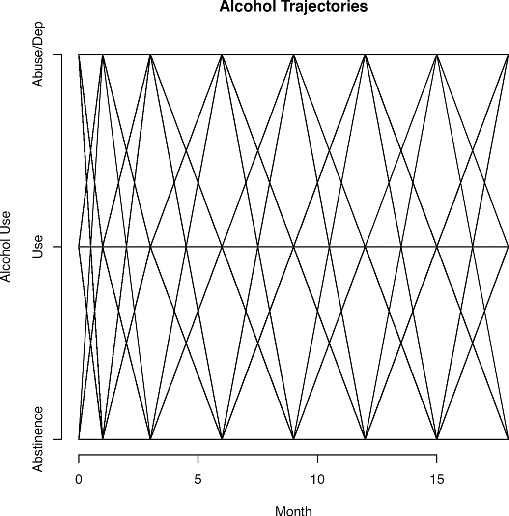
Unfortunately, the growth plot has limited usefulness when applied to categorical data, as illustrated in Figure 1 using data from the National Institute of Mental Health–funded Clinical Antipsychotic Trials of Intervention Effectiveness (CATIE). CATIE is a randomized clinical trial that investigated the effectiveness of conventional and atypical antipsychotic medications in 1,460 adults with schizophrenia (Stroup et al., 2003; Swanson et al., 2006). Self-reported alcohol use data were collected every 3 months through the 18-month duration of the study. Responses were used to determine alcohol abstinence, use, or abuse/dependence at each assessment (Desmarais et al., 2013). As seen in Figure 1, the growth curve does little more than iterate all possible trajectories, yielding an uninformative geometric pattern. The fact that the sample contains n = 1,460 individuals is completely lost in Figure 1. Most important, we cannot tell whether there is any change over time in this sample, negating the hoped-for utility of the growth curve.
Figure 1. Growth curve plot of categorical CATIE (Clinical Antipsychotic Trials of Intervention Effectiveness) data.
Evidently, a different paradigm is required for plotting categorical longitudinal data. We developed an alternative to the growth curve, called the horizontal line plot, which addresses the limitations noted in Figure 1. The next sections demonstrate the limitations of the growth curve with categorical data and then explicate the theory and powerful generalizability of the horizontal line plot, including its implementation in the R package longCatEDA (Tueller, 2013). We then return to the CATIE data to illustrate how the limitations of Figure 1 are ameliorated using the horizontal line plot.
Limitations of the Growth Curve
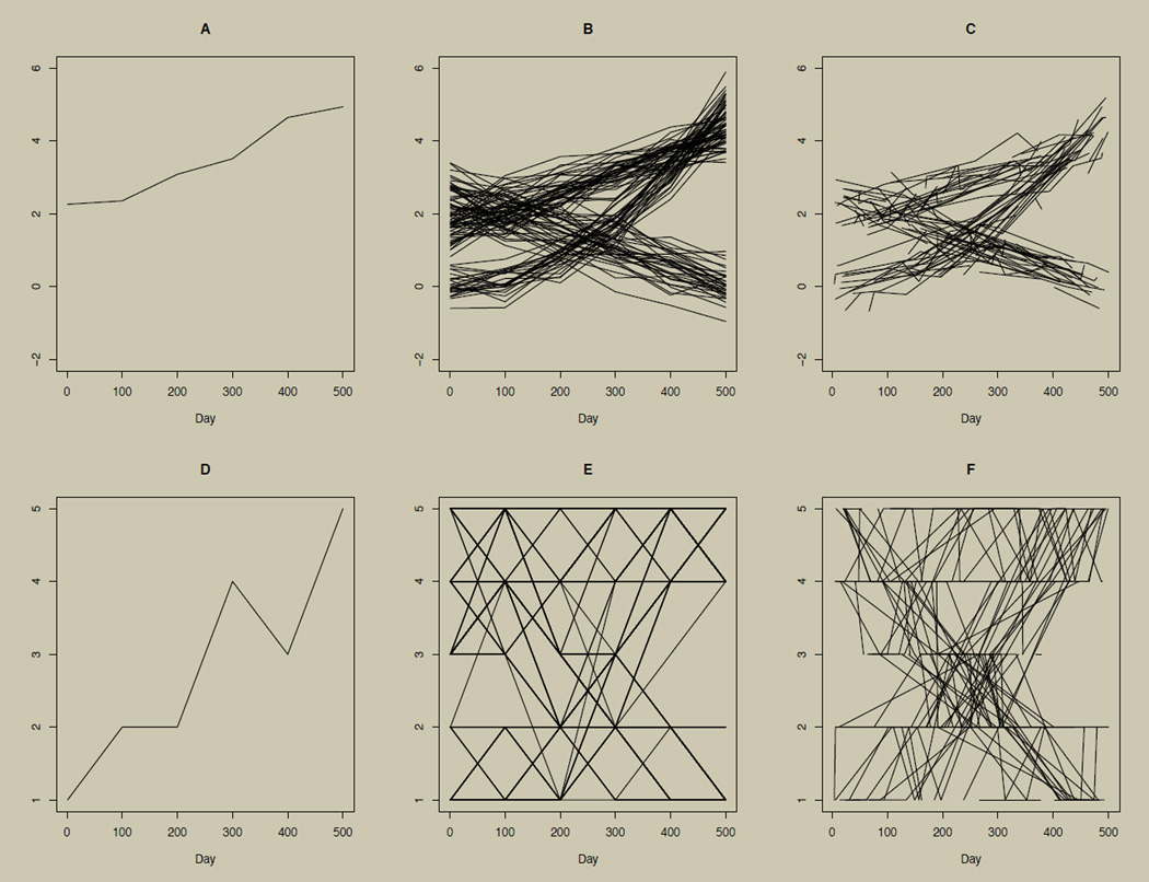
To illustrate the connection between the growth curve for continuous data and the horizontal line plot for categorical data, we start with simulated continuous data (the upper row of Figure 2) and categorize the simulated data (the lower row of Figure 2). A simulated continuous variable was simulated from n = 5,001 individuals once every 100 days, for a total of 500 days resulting in six time points. Linear interpolation is used to connect time points. From these simulated data, an example growth curve for a single participant is given in panel A of Figure 2. In general, the growth curve can be generalized to include multiple participants (or subsets of participants) as long as data are continuous. An example of multiple participants is shown in panel B of Figure 2. Although plotting every participant can obscure patterns, this can be alleviated by plotting several subsamples.
Figure 2. Growth curve illustrations using continuous and categorical data.
Growth curve illustrations using continuous data (panels A–C) and categorical data (panels D–F) from n = 5,001 simulated individuals. Data for D–F are categorized versions of data in A–C, cut such that the sorted data are binned into five approximately equally sized categories. Panels A and D illustrate the growth curve for one participant. Panels B and E illustrate growth curves for many participants. Panels A, B, D, and E show data collected at 100-day intervals for a total of six time points. Panels C and F illustrate growth curves for many participants with individually varying times of observation and individually varying numbers of observations (in this case, from two to six observations).
Panel B of Figure 2 shows three heterogeneous trajectory groups. Two groups are increasing over time but at different average rates. The third group is decreasing, on average, over time. In cases where group membership is not already an observed variable in the data set, plotting the data is useful in suggesting appropriate modeling techniques, such as the growth mixture model (Muthén & Shedden, 1999), to deal with the heterogeneity observed in the trajectories. Another strength of the growth curve with multiple participants is that each participant may have individually varying times of observation, a unique number of observations, or missing data (Singer & Willett, 2003). An example of this scenario is illustrated in panel C of Figure 2. Here, each growth curve is made up of six observations, but each curve is observed at unique time points rather than each 100 days as in panel B.
Failing to account for differences in times of observation or failing to deal appropriately with missingness can bias both graphical and inferential analyses. Hence, exploratory data analysis must be able to adequately represent such data complexities, as is accomplished by the growth curve for continuous data in panel C of Figure 2.
The growth curve for a single participant retains its utility when outcomes are categorical. See panel D of Figure 2, which categorizes the data used in panel A into a five-level ordered categorical (ordinal) variable, cut such that the sorted data are binned into five approximately equally sized categories. This is done using the native R function cut with five breaks. This is also useful for time series data with a single participant (e.g., Alper, 2008; Wei, 2008; Foster, 2011). However, as illustrated in Figure 1, the growth curve for categorical outcomes quickly loses its utility when extended to multiple participants, as shown in panel E of Figure 2. Panel E categorizes the data from panel B. Discerning between individual trajectories is difficult, if not impossible. The presence of individually varying times of observation and presence of missing data are similarly obscured, as shown in panel F of Figure 2, which categorizes the data from panel C.
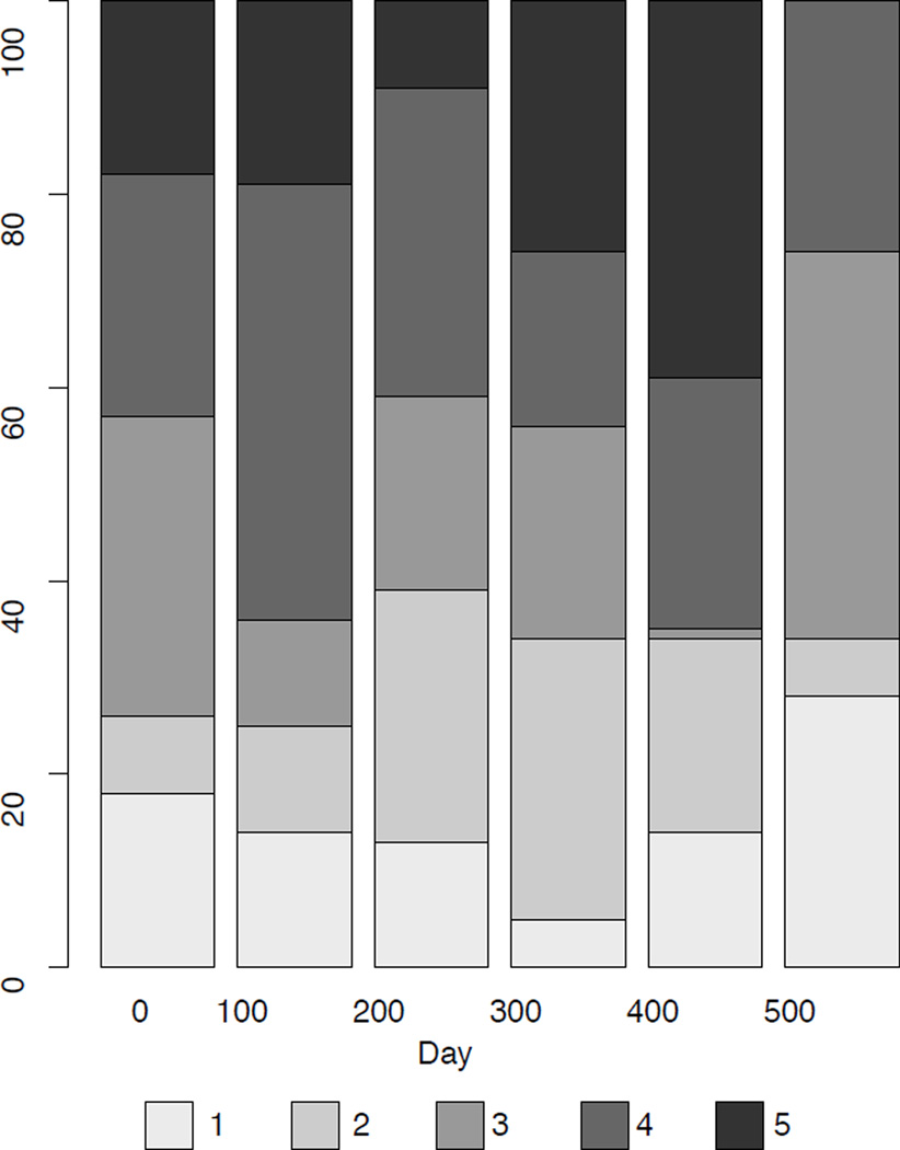
An alternative way to plot categorical longitudinal data is in a stacked bar plot (Feldman, Masyn, & Conger, 2009; Gelman & Bois, 1997). An example is shown in Figure 3 using the same data as those used in Figure 2E. The stacked bar plot approach allows one to see the overall change in the proportion of cases responding to each of the categories and is more easily interpreted than panels E or F in Figure 2. However, the stacked bar plot shows only proportions at each time point and not individual trajectories or patterns among trajectories. In addition, the bar plot cannot extend easily to individually varying times of observation.
Figure 3. An example of a stacked bar chart.
A stacked bar plot of the data from Figure 2E. Note that this plot only provides descriptive statistics of responses at each time point, but does not show individual or group trajectories.
The stacked bar plot also masks the presence of missing data unless the maximum height of the bar is rescaled proportional to the sample size at each time point. Even when applying such a rescaling, it is impossible to tell what type of trajectories have missing data and whether participants are dropping out or just missing a given time point and then returning to the study.
Our work introduces a method for plotting categorical longitudinal and time series data that overcomes the limitations of the growth curves illustrated and the stacked bar plot, including providing the means to deal with individually varying times of observation, unique numbers of observation, or missing data.
Methods
A Horizontal Line Plot for Categorical Longitudinal and Time Series Data
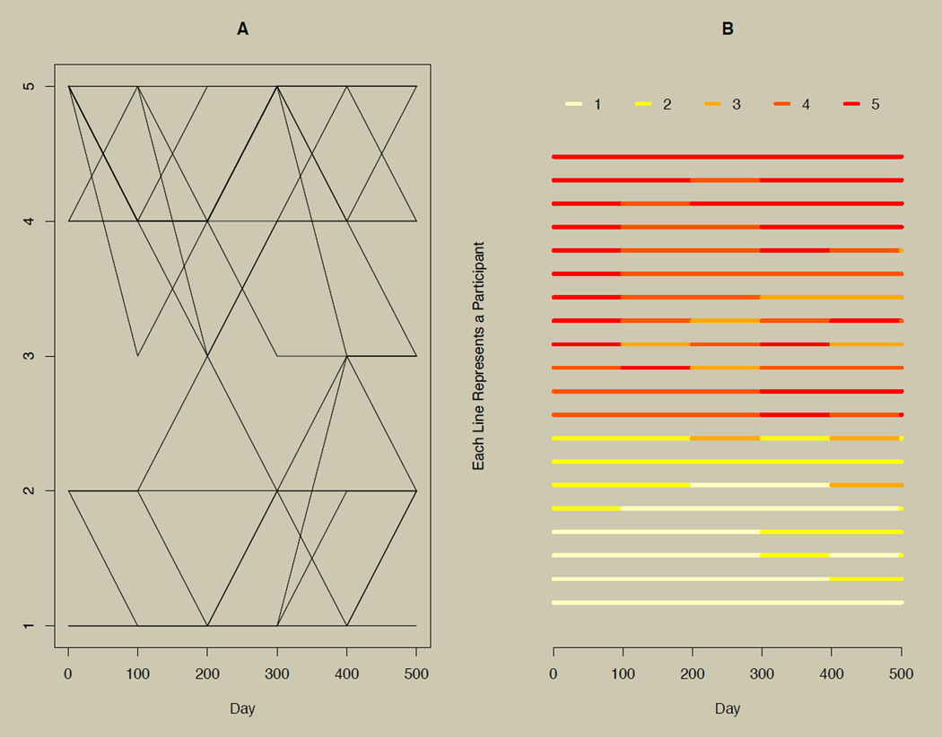
We propose a horizontal line plot for exploring categorical longitudinal and time series data. The plot is illustrated for 20 participants in panel B of Figure 4. As a point of reference, panel A of Figure 4 shows the growth curves for the same data. The horizontal line plot uses shade or color instead of vertical position to indicate changes on a categorical variable over time, and each line represents a participant. Interpolation is achieved by carrying the current observation forward until just before the next observation. This convention leads to a short final time point, as seen on the right side of panel B in Figure 4. The overall plot is obtained by simply stacking each participant’s line. Varying times of observation can also affect the edges of the plot, as discussed later in the section on individually varying times of observation. Peng (2008) proposed plots of this type for continuous multivariate time series data, although Peng’s approach required the categorization of the continuous data.
Figure 4. A growth curve plot with the complementary horizontal line plot.
Panel A: A growth plot of categorical longitudinal data with six time points. Panel B: Horizontal line plots of the data presented in Panel A, where shade (or color) rather than vertical position is used to distinguish changes in responses.
Simply stacking indivdual data is unlikely to elucidate patterns. Patterns are more likely to be found after some logical sorting of the data. Other researchers have recognized the importance of sorting individuals in the continuous multivariate time series context (Swihart et al., 2010). In the section on sorting (page 6), we describe methods for sorting the proposed plots.
We used the R (R Development Core Team, 2009) package longCatEDA (Tueller, 2013) to create the horizontal line plot for categorical longitudinal and time series data illustrated in panel B of Figure 4. R is freely available and runs on all major operating systems. A simple internet search will lead new users to several websites dedicated to getting started in R, including instructions for installing packages such as longCatEDA from the internet.
The next two sections describe the longCatEDA package and the crucial role of sorting in fully utilizing this exploratory data analysis technique. We then provide several simulated data examples illustrating how the horizontal line plot readily generalizes to large samples, comparisons of subgroups, explorations of unobserved subgroups or heterogeneity, large numbers of observations (i.e., time series data), individually varying times of observation, and missing data. We follow with an example using real data from the CATIE. Our example uses alcohol consumption data in adults with schizophrenia to illustrate the use of the horizontal line plot and growth mixture modeling (GMM).
The longCatEDA R Package
We used the longCatEDA R package (Tueller, 2013) to create the horizontal line plot illustrated in panel B of Figure 4. In what follows, all R code will appear in bold and an alternative font (e.g., longCatEDA()). Users unfamiliar with R will find several good orientations to the program by searching the internet for “basic R tutorials.”
The longCatEDA program is built on three primary functions:
longCat() is a function for creating an R object of the class lc.1 The primary input the user provides to the function is the data to be plotted in the form of a matrix or data frame. Users can, optionally, input individually varying times of observation, labels for the data, and labels for the time points. The longCat function checks the data for conformity of inputs and returns an lc object. In R, type ?longCat for documentation and example(longCat) for examples.
longCatPlot() is a function for plotting an object of the class lc. In addition to taking an lc object as an input, there are several options for controlling the look and color of the resulting horizontal line plot. In R, type ?longCatPlot for details and example(longCatPlot) for examples. Type example(colChoose) for examples of different preset color schemes (including grayscale). Note that users can create and apply their own color schemes to the function.
sorter() is a function for sorting data in an object of the class lc. If data are not sorted by this function, longCatPlot calls sorter on the fly. sorter can also be used to introduce user-specified orders for sorting the data and for specifying groups on which longCatPlot will stratify the resulting graphic. Type ?sorter in R for documentation and example(sorter) for examples. The sorting algorithm is described in the next section.
These and other functions are documented online (Tueller, 2013). The longCatEDA package has been tested in 32- and 64-bit R versions 2.15.2 through 3.0.3 on 32- and 64-bit Windows operating systems. Users have reported the package working as expected on iOS platforms.
There are many resources on the internet for getting started in R. After downloading R, the command install.packages("longCatEDA") will install the longCatEDA package. An internet search for “installing r packages” will provide additional help if needed. During each R session, the package can be loaded by typing library(longCatEDA). To get started, the commands ?longCat and ?longCatPlot will bring up documentation. Depending on your installation, this will either bring up help inside the R GUI or open the documentation page as an HTML document in your default web browser. Code examples, with accompanying data, are provided at the bottom of the documentation. These examples can be run in R by using the example() function. To illustrate, typing example(longCat) in R will replicate Figure 4, and example(longCatPlot) replicates Figure 5 described in the next section. In summary, the following code will replicate Figure 4 (although R may prompt the user for additional inputs depending on their installation):
| install.packages("longCatEDA") |
| library(longCatEDA) |
| ?longCat |
| example(longCat) |
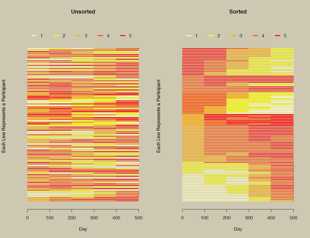
Figure 5. The horizontal line plot without and with sorting.
The plot on the left illustrates the horizontal line plot without sorting using the data of Figure 2E. The plot on the right replots the data on the left after sorting.
To replicate the functionality of example(longCatPlot) by hand, type or paste the following into R (note that the octothorpe ‘#’ designates comment lines):
| # set up the lc object needed to replicate |
| # Figure 4, herein |
| times <− c(1,100,200,300,400,500) |
| figure3 <− longCat(example2cat, times) |
| # object summary |
| summary(figure3) |
| # re-create Figure 4, herein |
| par(mfrow=c(1,2), bg='cornsilk3') |
|
longContPlot(example2cat, times, ylim=c(1,5), main='Growth Curves', ylab='', xlab='Days') |
|
longCatPlot(figure3, lwd=4, main='Horizontal Line Plot', colScheme='heat') |
| par(mfrow=c(1,1), bg='transparent') |
A General Sorting Algorithm
The left panel of Figure 5 applies the longCatPlot function to the data from Figure 2, panel E (which is a five-level categorized version of Figure 2 panel B), but does not sort the data. The right panel of Figure 5 shows the same data, but the data were sorted prior to plotting. The right panel illustrates overall patterns of increasing and decreasing trajectories more clearly than the unsorted left panel of Figure 5. This illustrates how indispensable sorting is to the new plotting technique.
The sorter function is built on the basic principle of first concatenating each participant’s data into a character (or string) variable, and then sorting by the unique patterns of observed data. In the presence of individually varying times of observation, data are secondarily sorted by each participant’s pattern of time (or duration) in each state. The effect of short durations can be minimized by requesting that the algorithm ignore any durations less than a specified amount of time. In the presence of a grouping variable, data are sorted by group first, then by response pattern, then by individually varying times of observation (if present). The function allows users to specify a subset of columns on which to sort the data. This procedure is useful when some time points are more important than others, such as sorting only by time points after treatment starts in a randomized trial. The function also allows users to provide their own ordering variable.
By default, the concatenated variable used for sorting is converted to a numeric variable. In the presence of different numbers of observations or missing data, this results in cases with no missing data always having a larger value than cases with missing data. For example, where NA is the default missing flag in R, if participant 1 has data c(1, 2, 3, NA, 5) and participant 2 has data c(5, 4, 3, 3, 2), the resulting concatenated variables will be 1235 and 54332. To minimize the effect of different numbers of observation, these values are by default rescaled to 1.235 and 5.432 prior to sorting. In the authors’ experience, using this rescaling typically provides a clearer plot in the presence of missing data (or at worst does nothing), although the user can turn off this default.
Although the built-in sorting algorithm has good general utility, users may want to provide their own sorting or grouping of the data based on covariates or modeling results. When data are grouped by an additional observed categorical variable (e.g., gender or race) or clustered using some other method (e.g., hierarchical clustering or latent class models), users can apply the group option of the sorter function. Data can also be sorted based on continuous observed or estimated latent variables (e.g., estimated growth factor scores from a growth model) using the customSort option of the sorter function. Type ?sorter in R for documentation and example(sorter) to see the example provided at the bottom of the documentation.
To replicate Figure 5, use the following:
| # replicate Figure 5 |
| par(mfrow=c(1,2), bg='cornsilk3') |
| times <− c(1,100,200,300,400,500) |
| f3lc <− longCat(example3, times) |
| f3lc$sorted <− TRUE |
| f3lc$data.sorted <− f3lc$data |
|
longCatPlot(f3lc, main='Unsorted', colScheme='heat', lwd=2) |
| f3lc <− longCat(example3, times) |
|
longCatPlot(f3lc, main='Sorted', colScheme='heat', lwd=2) |
In general, the options of the sorter function support the iterative process of exploratory data analysis, clustering and/or modeling, and visual display of the results.
Illustrations of the Horizontal Line Plot
The illustrations in this section utilize a single simulated data set or subsets from it. We simulated 500 time points (where t = 1,2,…,500) for three groups (n = 1,667 each, for an N of 5,001) from a multivariate normal distribution. We specified the mean vectors for the three groups such that the first group starts high and decreases linearly. The second group starts lower than the first group and increases linearly. The third group starts lower than the second group and increases at an increasing rate. The three groups can be seen in panels B and C of Figure 2. The covariance matrices had 1 on the diagonal, and the correlations on the diagonal were set to .25 for all time points within all three groups. We then categorized the data into five-level categorical variables (as was done to the data in the upper panels of Figure 2 to obtain the data in the lower panels of Figure 2).
Large Numbers of Participants
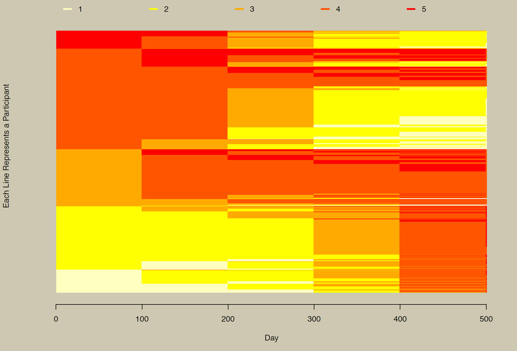
Figure 6 plots all 5,001 participants for six approximately equally spaced time points selected from the 500 generated time points, and assumes that group membership is not known a priori. The figure allows us to visually recapture the three groups observed in their continuous conterparts as seen in panel B of Figure 2. The top section of Figure 6 has participants in the linearly decreasing group (dark to light colors), the middle section has the linearly increasing group, and the bottom section has the nonlinearly increasing group (abrupt change from light to dark colors at the right end of the plot).
Figure 6. The horizontal line plot with large numbers of participants.
Illustration of the horizontal line plot for 5,001 participants. Three groups in the simulated data can be inferred from this plot (compare with Figure 2B and Figure 7).
The color scheme mimics a heat map, where lighter shades correspond to lower values on the categorical outcome and darker shades correspond to higher values. See the documentation for the colChoose function for additional color schemes or run example(colChoose) in R to see the preset color options. User-specified colors can also be used. Users might select color schemes with greater contrast if the goal is to differentiate between individuals in addition to seeing overall patterns, or when categorical data are unordered (e.g., nominal longitudinal data).
Observed and Unobserved Subgroups
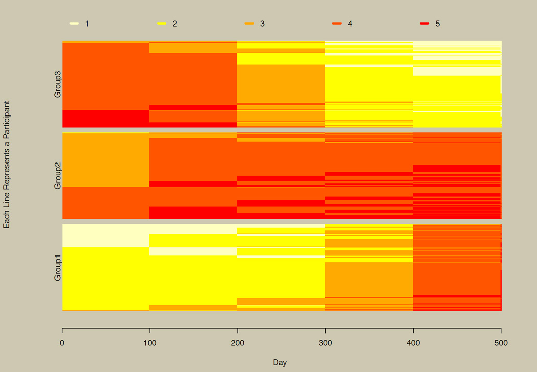
When group membership is known, differences in the three groups can be seen easily, as shown explicitly in Figure 7. As noted above, the longCatPlot function sorts data on the fly if the sorter function is not explicitly used. When users wish to view the plot stratified by groups, they must use the sorter function directly, providing grouping information and, optionally, group labels.
Figure 7. Stratified horizontal line plot.
Figure 6 repeated and stratified by group.
When group membership is unobserved, as is often hypothesized when using the growth mixture model (Muthén & Shedden, 1999), plotting is a useful exploratory step in determining how many unobserved groups may be needed to account for heterogeneity in the trajectories, as illustrated in the prior section. With continuous data, plotting every participant can often obscure patterns, and several random subsets might be plotted instead. With categorical data and the longCatEDA package, it may be useful more often to plot the entire data set. This is illustrated by comparing Figure 7 with Figure 6. The three observed groups in Figure 7 can be picked out in Figure 6, although ordering is not exactly the same, since the sorting algorithm employed in Figure 6 did not have the benefit of known group membership.
A plot similar to Figure 7 (using less data to run faster) can be generated using the following example code from the documentation for the sorter function:
| # Figure similar to Figure 7 |
|
par(mfrow=c(1,1), bg='cornsilk3', mar=c(5.1, 4.1, 4.1, 8.1), xpd=TRUE) |
| times <− c(1,100,200,300,400,500) |
| lc <− longCat(example3, times) |
|
group <− sample(1:3, nrow(example3), replace=TRUE) |
| grouplc <− sorter(lc, group=group) |
|
cols <− longCatPlot(grouplc, groupBuffer=.15, main='Grouped Data', colScheme='heat', lwd=2, legendBuffer=0) |
|
legend(600, 130, legend=1:5, col=cols, lty=1, lwd=2) |
|
par(bg='transparent', mar = c(5, 4, 4, 2) + 0.1, xpd=FALSE) |
Large Numbers of Time Points and Multivariate Time Series Data
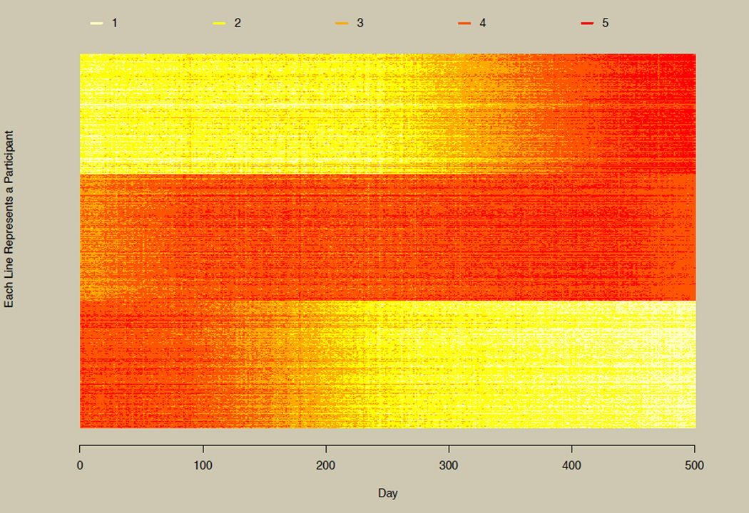
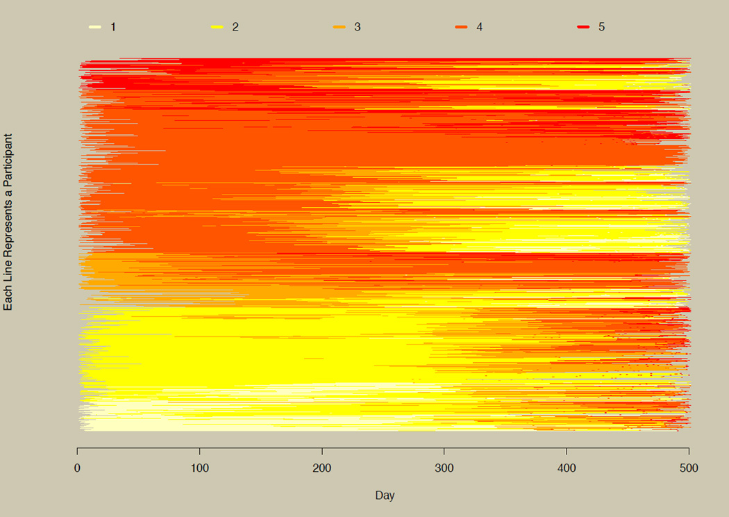
As the number of time points becomes large, researchers may find themselves switching from more traditional longitudinal models to models for intensive longitudinal designs (Walls & Schafer, 2003), nonlinear dynamical systems (Boker, 2012; Deboeck, 2011), multivariate time series models (Brockwell & Davis, 2002), and newer extensions of multivariate time series models such as dynamic factor analysis (Zhang & Nesselroade, 2007) and structural equation models for multivariate time series (Zhang, Chow, & Ong, 2011). Figure 8 illustrates this by plotting 600 randomly selected participants from the simulated data set at all 500 time points. Here, the three groups shown in panel B of Figure 2 and in Figure 7 are quite obvious, illustrating how more time points can drastically improve the understanding of the underlying longitudinal phenomenon. Users with very large data sets should be aware that plots similar to Figure 8 are time-consuming to produce, and result in graphics files that take a large amount of computer memory. For example, when all 5,001 participants were plotted at all 500 time points, the run time was approximately 1 hour on a 64-bit Windows 7 desktop with 64-bit R, resulting in a nearly 15 MB PDF file. Run time can be reduced by saving the plot directly to a file rather than plotting on the native graphics device in R. This is descibed in the example section of the documentation for the longCatPlot function (type ?longCatPlot to bring up this documentation).
Figure 8. Horizontal line plot with multivariate time series data.
Illustration of the horizontal line plot for time series data with 600 participants and 500 time points.
Individually Varying Times of Observation
Figure 9 uses all 5,001 participants, as was done in Figures 5 and 6, but with six time points randomly selected separately for each participant. Since participants have different start and end times, the left and right edges of the graph are jagged. When comparing Figure 9 to Figure 7, similar general patterns are apparent, although they are somewhat obfuscated by the individually varying times of observation. To help deal with this complication, the sorting algorithm sorts on patterns of time points as well as on patterns of the observed variable, as described in the section on sorting (p. 6). Type ?sorter in R for complete details on the options of the sorting function.
Figure 9. Horizontal line plot with individually varying times of observation.
Illustration of the horizontal line plot with the data from Figure 6 and individually varying times of observation.
To produce a simplified version of Figure 9, use the following code from the examples in the documentation for the longCat function:
| # illustrate individually varying times |
| # of observation |
|
y <− matrix(sample(1:5, 500, replace=TRUE), 100, 5) |
| t <− matrix(runif(600, 1, 3), 100, 6) |
|
times <− cbind(t[,1], t[,1]+t[,2], t[,2]+t[,3], t[,3]+t[,4], t[,4]+t[,5]) |
| endt <− t[,6] |
| lc <− longCat(y, times=times, endt=endt) |
|
par(mfrow=c(1,1), bg='cornsilk3', mar=c(5.1, 4.1, 4.1, 10.1), xpd=TRUE) |
|
cols <− longCatPlot(lc, legendBuffer=0, groupBuffer=0, main='Individually Varying Times of Observation') |
|
legend(7.5, 100, legend=lc$factors, lty=1, col=cols, lwd=2) |
|
par(bg='transparent', mar = c(5, 4, 4, 2) + 0.1, xpd=FALSE) |
Unique Numbers of Observations and Missing Data
Participants in a study may have different numbers of observations for various reasons. Although this may be by design, it is most often due to dropout or other patterns of missing data. Fortunately, modern modeling techniques such as (latent) growth curve models, longitudinal multilevel models, and mixed-effects models (Singer & Willett, 2003) can deal with missingness under missing at random (MAR) assumptions (Rubin, 1976). Being able to visualize missingness can make important contributions to assessing the appropriateness of missing data assumptions made by modeling techniques being considered for a given research question.
One way to do this is to stratify by categorical covariates (as illustrated in Figure 7) or sort by continuous covariates that may be related to missingness. When doing so reveals patterns in the missingness, the covariates on which the plot was stratified or sorted should be included to support the MAR assumptions made by many longitudinal models.
Applications to Nonlongitudinal Categorical Data
The methods described herein also have practical utility for data where the order of the variables may be arbitrary, such as items from a scale or items used in factor analysis or item response theory models. This is especially useful as the combination of the number of items and number of response options becomes large. Rather than labeling the time points, item labels can be provided to the longCat function.
Because the ordering of the items may be arbitrary, users should consider different orderings of the columns of the data when exploring patterns in the data. Sorting the items by increasing or decreasing mean values is a recommended starting point. For example, in R a data matrix x with three variables (columns) can be sorted using y <− x(,c(3,1,2)), where 3,1,2 is the desired ordering of columns. The new data matrix y can then be used as an input to the longCat function. After factor analytic or item response theory modeling, items may be ordered by factor loading or item difficulty, and participants could be ordered by estimated factor or ability scores.
CATIE Data Illustration
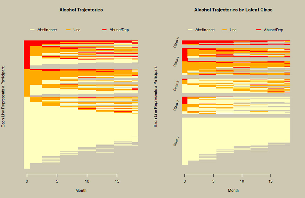
Researchers using the CATIE data suspected that there was improvement over time and that there was heterogeneity in the alcohol trajectories. However, neither of these hypotheses was supported using the growth curve plot of Figure 1. Prior to modeling the data, the horizontal line plot was used to explore the data, as shown in the left panel of Figure 10. The ability to appropriately visualize the alcohol trajectories revealed patterns of both improving and deteriorating alcohol behavior. Missing data patterns are also clearly seen in Figure 10. In addition, the left panel of Figure 10 revealed data aspects that required special modeling considerations, most notably the large number of cases who were abstinent or abusing for the entire study period and had no intraindividual variation or, as groups, had no interindividual variation. This was addressed by specifying a nonuser class with very large thresholds and a user class with very small thresholds for the three-level variables in Mplus (Muthén & Muthén, 2012), and constraining other model parameters to reflect the lack of variation. This allowed these two classes, along with the freely estimated classes, to be regressed on important demographic covariates when estimating the GMM.
Figure 10. Horizontal line plot of the CATIE data.
The left panel illustrates an exploratory application of the horizontal line plot prior to modeling the CATIE data. The right panel shows the horizontal line plot stratified by latent classes resulting from growth mixture modeling of the CATIE alcohol data.
The GMM process indicated that a model with five classes fit best (see Van Dorn et al., 2013, for full details of the modeling process). The right panel of Figure 10 shows the alcohol trajectories stratified by latent class, revealing patterns such as consistent abstinence, decreasing use, increasing use, and persistent abuse/dependence. Comparing the left panel of Figure 10 with Figure 1 demonstrates how the horizontal line plot dramatically improves understanding over simply using the growth curve with categorical data. In summary, this illustrates how the horizontal line plot implemented in the longCatEDA package can be used in initial EDA, in turn informing the modeling process, and then be used to report modeling results.
Discussion
Graphical EDA and reporting are important steps in the research process, and our work addresses a lack of adequate methods for plotting growth curves for categorical longitudinal or time series data. We demonstrated how categorical states represented by color (or shade) can be combined with a horizontal line plot to address the limitations of existing graphical approaches. The horizontal line plot scales well to large numbers of participants, stratification or subgroups, large numbers of time points or time series data, individually varying times of observation, and missing data, making it generally applicable for exploratory analysis and reporting of categorical longitudinal or time series data.
Acknowledgments
Funded by the National Institute on Drug Abuse (NIDA), Longitudinal Substance Use Trajectories for Persons with Schizophrenia, award number 1R03DA030850 (Van Dorn and Tueller) and the National Institute on Alcohol Abuse and Alcoholism (NIAAA), Predictive Models of Alcohol Consumption, award number R03 AA019775 (Bobashev and Tueller).
Biographies
Stephen J. Tueller, PhD, is a Quantitative Psychologist at RTI International. His research interests are graphical exploratory data analysis, latent variable mixture modeling, simulation methodologies, and measurement invariance in multiple group models.
Richard A. Van Dorn, PhD, is a Senior Mental Health Services Researcher at RTI International. His research focuses on the evaluation of longitudinal substance use and mental health outcomes for adults with mental illnesses.
Georgiy V. Bobashev, PhD, is a Senior Data Scientist at RTI International. His methodological research focuses on predictive models with applications to health outcomes, predominantly substance use and risky behavior.
Footnotes
In object-oriented programming languages such as R, a class is a template for creating data objects. The lc class contains all the necessary data in the required format for the longCatPlot function. The longCat function puts the user’s data into a data of the lc class, alleviating the need for the user to know how to format the data.
References
- Alper BE. PhD thesis. Santa Barbara: University of California; 2008. Visualization of Categorical Time-Series Data Sets. [Google Scholar]
- Boker SM. Handbook of research methods in psychology. Vol. 3. Washington, DC: American Psychological Association; 2012. Dynamical systems and differential equation models of change; pp. 323–333. [Google Scholar]
- Brockwell PJ, Davis RA. Introduction to time series and forecasting. 2nd. New York: Springer; 2002. [Google Scholar]
- Deboeck PR. The handbook of research methods for studying daily life. New York, NY: Guilford Press; 2011. Modeling non-linear dynamics; pp. 440–458. [Google Scholar]
- Desmarais SL, Van Dorn RA, Sellers BG, Young MS, Swartz MS. Accuracy of self-report, biological tests, collateral reports and clinician ratings in identifying substance use disorders among adults with schizophrenia. Psychology of Addictive Behaviors. 2013;27(3):774–787. doi: 10.1037/a0031256. [DOI] [PMC free article] [PubMed] [Google Scholar]
- Feldman BJ, Masyn KE, Conger RD. New approaches to studying problem behaviors: A comparison of methods for modeling longitudinal, categorical adolescent drinking data. Developmental Psychology. 2009;45(3):652–676. doi: 10.1037/a0014851. [DOI] [PMC free article] [PubMed] [Google Scholar]
- Foster SD. Graphical diagnostics for Markov models for categorical data. Journal of Computational and Graphical Statistics. 2011;20(2):355–374. [Google Scholar]
- Gelman A, Bois F. Analysis of nonrandomly censored ordered categorical longitudinal data from analgesic trials: Comment. Journal of the American Statistical Association. 1997;92(440):1248–1250. [Google Scholar]
- Muthén B, Shedden K. Finite mixture modeling with mixture outcomes using the EM algorithm. Biometrics. 1999;55(2):463–469. doi: 10.1111/j.0006-341x.1999.00463.x. [DOI] [PubMed] [Google Scholar]
- Muthén LK, Muthén BO. Mplus user’s guide. 7th. Los Angeles, CA: Muthén & Muthén; 1998–2012. [Google Scholar]
- Peng RD. A method for visualizing multivariate time series data. Journal of Statistical Software. 2008;25(Code Snippet 1):1–17. [Google Scholar]
- R Development Core Team. R: A language and environment for statistical computing. Vienna, Austria: R Foundation for Statistical Computing; 2009. [Google Scholar]
- Rubin DB. Inference and missing data. Biometrika. 1976;63:581–592. [Google Scholar]
- Singer JD, Willett JB. Applied longitudinal data analysis: Modeling change and event occurrence. Oxford, UK: Oxford University Press; 2003. [Google Scholar]
- Stroup TS, McEvoy JP, Swartz MS, Byerly MJ, Glick ID, Canive JM, Lieberman JA. The National Institute of Mental Health clinical antipsychotic trials of intervention effectiveness (CATIE) project. Schizophrenia Bulletin. 2003;29(1):15–31. doi: 10.1093/oxfordjournals.schbul.a006986. [DOI] [PubMed] [Google Scholar]
- Swanson JW, Swartz MS, Van Dorn RA, Elbogen EB, Wagner HR, Rosenheck RA, Lieberman JA. A national study of violent behavior in persons with schizophrenia. Archives of General Psychiatry. 2006;63(5):490–499. doi: 10.1001/archpsyc.63.5.490. [DOI] [PubMed] [Google Scholar]
- Swihart B, Cao B, James BD, Strand M, Schwartz BS, Punjabi NM. Lasagna plots: A saucy alternative to spaghetti plots. Epidemiology. 2010;21:621–625. doi: 10.1097/EDE.0b013e3181e5b06a. [DOI] [PMC free article] [PubMed] [Google Scholar]
- Tueller SJ. longCatEDA: Package for plotting categorical longitudinal and time-series data. R package version 0.17. 2013 http://cran.rproject.org/web/packages/longCatEDA/index.html.
- Van Dorn RA, Desmarais SL, Tueller SJ, Jolley JM, Johnson KJ, Swartz MS. Drug and alcohol trajectories among adults with schizophrenia: Data from the CATIE study. Schizophrenia Research. 2013;148(1–3):126–129. doi: 10.1016/j.schres.2013.05.006. [DOI] [PMC free article] [PubMed] [Google Scholar]
- Walls TA, Schafer JL. Models for intensive longitudinal data. Oxford, UK: Oxford University Press; 2003. [Google Scholar]
- Wei CH. Visual analysis of categorical time series. Statistical Methodology. 2008;5(1):56–71. [Google Scholar]
- Zhang G, Chow S-M, Ong AD. A sandwich-type standard error estimator of SEM models with multivariate time series. Psychometrika. 2011;76:77–96. [Google Scholar]
- Zhang Z, Nesselroade JR. Bayesian estimation of categorical dynamic factor models. Multivariate Behavioral Research. 2007;42:729–756. [Google Scholar]


