Abstract
A best‐practice summary and hands‐on guide on how to most usefully display your data in graphs.

In the first part of this article series, I discussed general guidelines for analyzing the results of scientific experiments (Klaus, 2015). The next step is the graphical representation of the results. The importance of data presentation should not be underestimated as figures are a key component of both data analysis and publications. Graphics are an important analytical tool as they can help to reveal patterns and illustrate differences. The appropriate plotting of data can also strengthen or even replace more formal statistical procedures, such as hypothesis tests. In the context of scientific publications, figures should guide the reader through the article and provide a clear and precise representation of the experimental results.
In this article, I will focus primarily on key principles and good practices for presenting small‐to‐medium datasets with the aim of comparing results from different experimental groups. As a general rule, authors should show as much of the actual data as possible instead of summarizing datasets via means or variances. Even larger datasets can be displayed efficiently using an appropriate plot; bars and boxes to visualize summary statistics can serve as additional visual guides. To adapt the methods described in this article, readers can download a supplementary “notebook” (see Code EV1) with code to generate the plots in the R language (R Core Team, 2015). Additionally, this web tool (http://embojserver.embl.de) generates the bee swarm plots and dot plots discussed later in the article. Apart from the topics discussed in this article, there are many more aspects that require attention. The “Scientific Figure Design Course” material by the Bioinformatics unit of the Babraham Institute (Babraham Bioinformatics, 2015) and the book by Tufte (1983) are valuable references.
I start with a discussion of displaying small‐scale experimental datasets. Let us assume that we have a fluorescent marker for detecting a recombination event in bacterial cells. We study a wild‐type strain and three different mutant strains and use three replicates for each mutant. We calculate the rate of recombination for each strain by dividing the number of recombinant bacteria by the total number of bacteria. Our raw data are therefore ratios:
| Rep_1 | Rep_2 | Rep_3 | |
|---|---|---|---|
| WT | 37.7 | 29.2 | 39 |
| MT_1 | 9.3 | 11.7 | 14.4 |
| MT_2 | 5.9 | 7.8 | |
| MT_3 | 15.2 | 19.4 | 17.2 |
I first apply a logarithmic transformation to distribute these ratios more symmetrically along the Y‐axis and to stabilize their variance. The base 2 (log_2) is usually chosen, because the scale is directly interpretable for log‐fold changes: A value of 1 means half as much, while + 1 means twice as much, + 2 four times as much, and so on. The raw data already show that the mutants have a decreased recombination rate relative to wild type. We can visualize this by using a typical bar chart often seen in publications, where the bar represents the mean of the data, and error bars denote the 95% confidence interval (Fig 1A).
Figure 1. Presenting experimental data using bar charts.
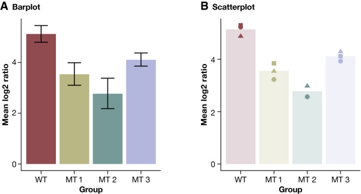
(A) Presenting small‐scale data using bar charts. Error bars represent 95% confidence intervals for the mean. (B) Scatter plot to show small‐scale data. The bars show the mean as in (A).
The main issue with bar charts is that these display only summary statistics; the raw data and its distribution are invisible. This can distort both interpretation and presentation of data, because very different datasets can generate the exact same bar chart (Weissgerber et al, 2015; Fig 1). Moreover, as bar charts are based on summary statistics, they hide outliers, bimodality, and unequal sample sizes. Summary statistics should therefore only be displayed when there are enough data to summarize. Otherwise, it is better to simply show the raw data (Weissgerber et al, 2015). Nonetheless, data summaries can serve as a valuable visual guide if these are combined with the raw data.
This is illustrated by the one‐dimensional scatterplot of the same data in Fig 1B. It combines raw data as individual dots with a transparent bar to represent the mean. The height of the bar allows the reader to immediately see that the mutants show a reduced recombination rate. In addition, the source data tell us that the within‐group variability of the data is approximately the same across groups and that the data distribution is symmetric. Both aspects would be hard to deduce from the bar chart in Fig 1A. The addition of source data allows the display of more information in the same amount of space. Another advantage of a scatterplot is that additional error bars are not needed as the data variability can be inferred directly from the plot itself.
While bar charts are not ideal for visualizing numerical data, they are well suited for representing data that consist of several categories rather than as numerical values. By way of example, we can use a bar chart to display the composition of the Zyxin gene sequence:
| A | C | G | T |
|---|---|---|---|
| 1285 | 2635 | 2013 | 1332 |
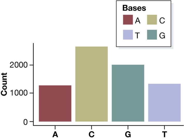
We can immediately see a certain CG bias in the gene; that is, Cs and Gs are overrepresented. Categorical data such as these are often plotted as a pie chart, which represents counts as corresponding areas (Fig 2). This can be misleading, as a pie chart uses two dimensions to represent one‐dimensional data. Additionally, it is more difficult for the human perception to compare areas than lengths: Looking at the pie chart in Fig 2, it seems that C appears almost twice as frequently as G in the Zyxin gene, while in fact it only appears 30% more often. It is much easier for readers to see this difference in a bar chart (Fig 3).
Figure 2. Pie chart of categorical data: Base frequencies of the Zyxin gene.
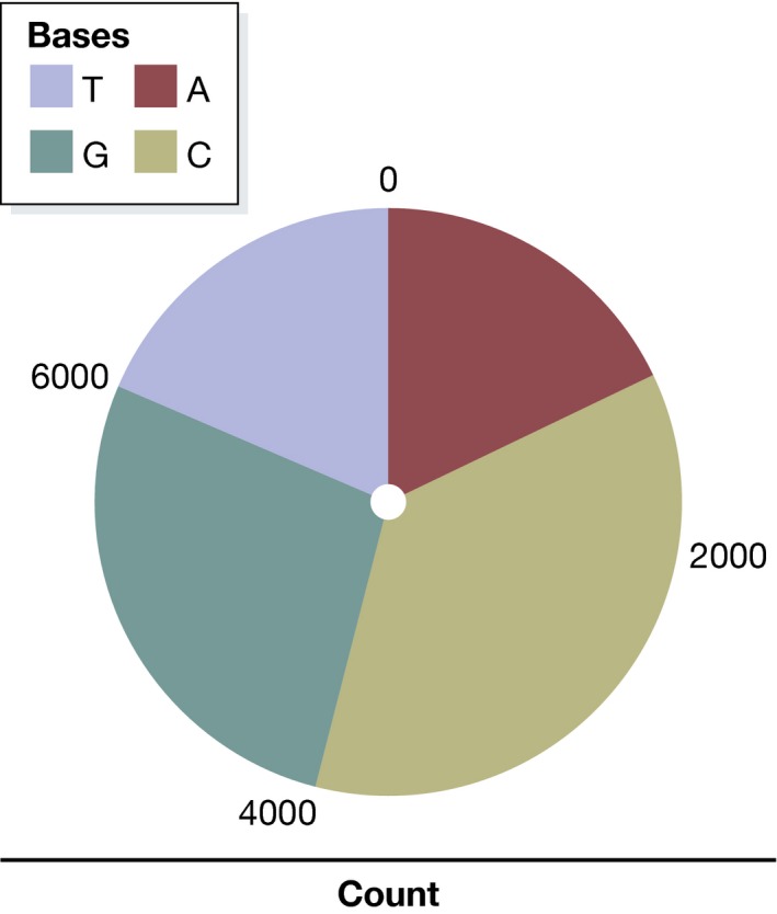
Figure 3. Bar chart of categorical data: Base frequencies of the Zyxin gene.
A scatterplot is useful for displaying small datasets, but what about visualizing medium‐sized ones (for instance, 20 replicates per group)? A slight modification in the ordinary scatterplot, the “beeswarm” plot, shows again individual values, but spaces data points with similar or identical values horizontally to separate them visually to avoid overplotting. The larger number of 20 replicates also makes it possible to add graphical representations of data variability. In general, variance is much harder to estimate than the mean: With less than 10 samples per experimental group, it rarely makes sense to report a variance, since it will be very imprecise unless special shrinkage‐type estimators are used. However, with 20 samples in each group, we can estimate the variability much more reliably.
Figure 4 shows different possibilities for presenting data in a beeswarm plot. In panel (A), the boxes show the 95% confidence interval for the mean, based on the standard error of the mean (SEM), which indicates how much one can “trust” the estimated mean. Since the estimated mean value improves the more data we have, the standard error will converge toward zero as the sample size increases. For the initial dataset with only 3 replicates per condition, the standard error for the WT group is 0.08, while it is about ten times lower in our 20‐replicate dataset (cf. Fig 1). The SEM is closely related to statistical testing since the statistic for a one‐sided t‐test essentially is mean/SEM. Therefore, presenting the SEM can be useful if for instance fold changes are plotted: It indicates whether a (log) fold change is significantly different from zero. On the other hand, formal statistical testing is often performed anyway, making the display of the standard error redundant. Thus, plots like those in panels (B–D) are usually more informative than summaries based on the SEM, as they show the actual variation in the data in various ways.
Figure 4. A beeswarm plot with different variability‐boxes.
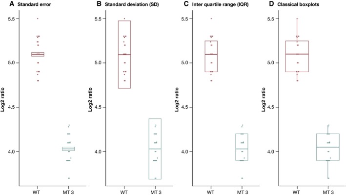
Data points with similar/identical values are spaced out horizontally to avoid overplotting. (A) Data shown as mean per condition plus their corresponding 95% confidence intervals based on the standard error. (B) Mean ± 1.96 times the standard deviation (SD). This represents an interval around the mean that contains 95% of the data, if the data are normally distributed. (C) Mean + the third and first quartile. This is a variant of panel (B), which is less sensitive to outliers. It is overall very similar to (D), where a boxplot visualizes the median and the quartiles after outlier removal.
In panel (B), the bars show the mean +/− 1.96 times the standard deviation: the interval that covers 95% of the data on average, assuming that the dataset shows a normal distribution (the factor 1.96 is inherent to the normal distribution and not dependent on the individual dataset). Panels (C) and (D) show alternatives to mean and standard deviation based on the quartiles of the data that are less sensitive to outliers. We replace the standard deviation by the first and third quartiles in (C) and finally show “boxplots” in panel (D) that display the first and third quartiles of the data and outliers as single points. Boxplots and their variants are often recommended for data visualizations in biology, and a web tool to produce them is readily available (Spitzer et al, 2014). However, since boxplots also rely on specific summary statistics, they are not suitable for bimodal datasets that contain two distinct subpopulations (Fig 5).
Figure 5. Boxplot (A) and beeswarm plot (B) for simulated bimodal data, where the majority of the data points are close to either zero or one.
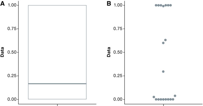
Clearly, the boxplot gives a distorted view of this data.
Following the principle of plotting as much of the raw data as possible, the question is how we can extend this to larger datasets. A dot plot (Wilkinson, 1999) is a good visualization technique for such cases. As the names suggests, it displays individual observations as a dot. In contrast to the beeswarm plot, it avoids overplotting by binning (instead of jittering) data points: Each individual data point is displayed, but points in the same bin are arranged horizontally. The dot size depends on the bin width: As the sample size increases, the dot size will decrease accordingly, which makes this tool suitable for very large datasets. Dot plots accurately reflect “gaps” and outliers in the data, which are often hidden in plots that are based on only summary statistics. An example for a sample size of 100 with overlaid boxplots is given in Fig 6.
Figure 6. A dot plot with transparent boxplots for 100 samples per condition.
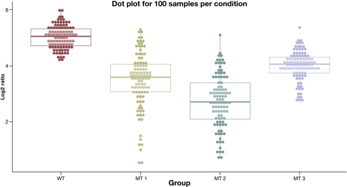
A dotplot displays individual observations as a dot. In contrast to the beeswarm plot, it avoids overplotting by binning (instead of jittering) data points: Points in the same bin are arranged horizontally.
The examples in this article show that it is very helpful to display source data as much as possible. Bars and boxes representing only statistical summaries can often serve as a valuable visual guide (cf. Figs 1, 4 and 6), but they can also be misleading (Fig 5) and should therefore only rarely be used in isolation.
The choice of an appropriate color palette is also important for data representation and one should consider color blindness (Wong, 2011) as well. Here, I use a color‐blind‐safe qualitative palette with colors of equal colorfulness (chroma) and similar brightness (luminance) so as not to highlight specific experimental groups. Zeileis et al (2009) discuss the choice of color palettes in great detail, and the Color Brewer website (Brewer, 2013) is a good starting point for selecting a suitable scheme.
Another important point is the aspect ratio of the plot. Commonly, graphics should use the “landscape” format. A good rule of thumb is to create plots that are ca. 50% wider than tall. Nonetheless, the aspect ratio also has to reflect the scaling of the data. For example, when plotting two numerical data vectors against each other in a scatterplot, an aspect ratio of one is important to avoid a distorted view.
In conclusion, combining summary‐based graphics, such as bars and boxes, with the actual raw data, commonly used data visualizations can be sensibly extended. Table 1 summarizes the recommendations. I also highly recommend Stern (2015) as further reading, which develops similar ideas in the context of scientific talks.
Table 1.
Summary of the representations recommended in this column
| Data type | Sample size | Recommended plot + visual aid |
|---|---|---|
| Numerical | Low (< 10) | Scatterplot (+ bars representing the mean) |
| Medium (11–40) | Beeswarm plot (+ error boxes, representing variance) | |
| Large (> 41) | Dot plot + boxplots as visual aid | |
| Categorical | Bar charts |
In the next article, I will introduce statistical testing, with a focus on the comparison of two experimental groups.
Conflict of interest
The author declares that he has no conflict of interest.
Supporting information
References
- Babraham Bioinformatics (2015), Scientific Figure Design Course, http://www.bioinformatics.babraham.ac.uk/training.html#figuredesign
- Brewer CA (2013), Color Brewer. http://www.ColorBrewer.org
- Klaus B (2015) Statistical relevance—relevant statistics, part I. EMBO J 34: 2727–2730 [DOI] [PMC free article] [PubMed] [Google Scholar]
- R Core Team (2015) R: A Language and Environment for Statistical Computing. Vienna, Austria: R Foundation for Statistical Computing; [Google Scholar]
- Spitzer M, Wildenhain J, Rappsilber J, BoxPlot R, Tyers M (2014) a web tool for generation of box plots. Nat Methods 11: 121–122 [DOI] [PMC free article] [PubMed] [Google Scholar]
- Stern D (2015) How To Give a Talk ‐ Principle 3 ‐ Show Your Data. http://www.howtogiveatalk.com/blog/principle-3-show-your-data
- Tufte ER (1983) The Visual Display of Quantitative Information. Cheshire, CT, USA: Graphics Press; [Google Scholar]
- Weissgerber TL, Milic NM, Winham SJ, Garovic VD (2015) Beyond bar and line graphs: time for a new data presentation paradigm. PLoS Biol 13: e1002128 [DOI] [PMC free article] [PubMed] [Google Scholar]
- Wilkinson L (1999) Dot plots. Am Stat 53: 276–281 [Google Scholar]
- Wong B (2011) Color blindness. Nat Methods 8: 441 [DOI] [PubMed] [Google Scholar]
- Zeileis A, Hornik K, Murrell P (2009) Escaping RGBland: selecting colors for statistical graphics. Comput Stat Data Anal 53: 3259–3270 [Google Scholar]
Associated Data
This section collects any data citations, data availability statements, or supplementary materials included in this article.
Supplementary Materials


