Abstract
Although the measurements of clinical outcomes for cancer treatments have become diverse and complex, there remains a need for clear, easily interpreted representations of patients’ experiences. With oncology trials increasingly reporting non-time-to-event outcomes, data visualization has evolved to incorporate parameters such as responses to therapy, duration and degree of response, and novel representations of underlying tumor biology. We review both commonly used and newly developed methods to display outcomes in oncology, with a focus on those that have evolved to represent complex datasets.
Graphs and figures allow the illustration and visualization of data to demonstrate an intervention or treatment effect in oncology treatments. The ability to display data figuratively enables rapid interpretation of sometimes complex information: There are known educational benefits from the addition of pictures, graphs, or diagrams to text. Mayer refers to this enhanced learning as the multimedia effect (1). However, there is also the risk of obscuring or diluting information through oversimplification. The maxims of visualizing quantitative information remain as important as ever, and we must strive to impart the “maximum amount of information, in the smallest space, using the minimum amount of ink” (2). A review of published randomized controlled trials that were taken from year 2006 to 2007 showed most trials report one to three figures, with a mean of 2.3 figures per article (3). The four most common types were forest plots, Kaplan-Meier curves, flow diagrams, and graphs to show repeated measures over time (usually as a line graph with time on the abscissa).
Here, we describe the graphical representations of data seen most commonly in oncology research presentations/publications and focus on some of the newer, creative additions that attempt to convey data graphically, particularly in the context of high-dimensional companion molecular datasets that often accompany modern clinical trials.
Graphical Representation to Illustrate Data on Overall Survival or Progression-Free Survival
Most phase III trials are often powered to detect a progression-free or overall survival endpoint. The Kaplan-Meier curve remains one of the most important visualizations for analysis of survival data in oncology and is highlighted in this section.
Kaplan-Meier Curves
Kaplan-Meier curves allow comparison of survival outcomes (eg, alive/dead, free of disease/relapsed) in different groups over time. They have become ubiquitous within the oncology literature. This representation was established in 1958 by Edward L. Kaplan and Paul Meier, who published a seminal paper on how to deal with incomplete observations, for example, survival after an intervention in patients treated at different time points (ie, time-to-event data) (4). The Kaplan-Meier estimate is particularly useful when applied to two groups of subjects on different treatments, and their statistical differences in survival can be estimated by the log-rank test or Cox proportional hazards modeling (followed by the Wald or likelihood ratio tests to evaluate specific coefficients in the model). It is important to note that in certain cancer types, especially with the advent of new targeted therapies, there may be a proportion of patients who remain alive or free from disease after long periods of follow-up. This is reflected as a non-zero tail probability in the Kaplan-Meier curves (5).
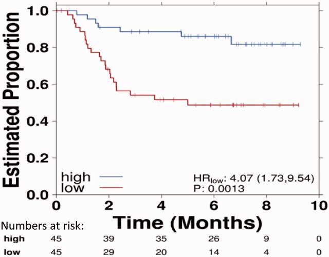
Kaplan-Meier estimates require the assumption that censored individuals have the same prospects of survival as those who continued to be followed. The estimate is univariate and may not take into account many factors that can influence collection of survival data. This can lead to unreliable survival estimates, such as loss to follow up, withdrawal from study, and alternative outcome than the event of interest. Censoring occurs when information on time-to-event is not obtainable because of loss to follow-up or nonoccurrence of the event of interest before the end of study period. It is important to note that many oncology studies are not able to follow up all patients for the full duration until all patients experienced the event of interest (event time of interest) as some patients may enter the study at later time points. When patients are censored, this is illustrated by the presence of a vertical tick mark on the curve (Figure 1), which leads to a reduction of sample size of patients at risk after the censorship and lower reliability of the curve over time (6).
Figure 1.
Kaplan-Meier curves comparing survival data for two treatments with vertical tick marks representing censoring. Note that toward the tail of both curves censoring increases. The number of subjects in each group and at each time point is given numerically, as are the hazard ratio, confidence interval, and P value. CI = confidence interval; HR = hazard ratio.
The degree of censoring can depend on the rate of recruitment and how closely the patients are followed; for example, participants lost to follow-up during the study are censored. The Kaplan-Meier method assumes that censoring is noninformative and independent of survival, which may not be true because the number of patients at risk at any time point should be representative of the population at the same time (7). It is important to question how the study was conducted and the efficacy of the intervention if there were a high number of patients withdrawing from the study, leading to a large number of patients censored in the analysis. Most statistical methods for analyzing time-to-event data assume that the censored patients have survival that is similar to that of the uncensored patients. The key solutions are imputation, sensitivity analysis (via best/worst-case scenarios), and explicit testing of the drop-out as a study end point (8).
The most common summary statistic for describing patterns and comparisons between the Kaplan-Meier curves is the hazard ratio, which gives a relative event rate in the groups. It is important to note that statistically significant differences in survival can occur between two groups, but the absolute difference in survival between them may nevertheless be clinically insignificant. That is, it is critical to distinguish statistical and clinical significance; the latter generally requires the former, in combination with a statistically significant effect-size. For example, in the AVAiL study, which compared the addition of a vascular endothelial growth factor inhibitor (bevacizumab) or placebo to first-line platinum doublet chemotherapy, a statistically significant benefit of adding bevacizumab was seen on progression-free survival (hazard ratio [HR] = 0.75, 95% confidence interval [CI] = 0.60 to 0.90, P = .03). However, the actual difference in the median was less than a month and did not translate to an overall survival benefit, suggesting a lack of clinically significant benefit despite statistical significance (9).
Graphical Representations of Treatment Effect
Interpreting treatment effects in cancer clinical trials is crucial to review the relative therapeutic efficacy between different groups. Forest plots, funnel plots, and violin plots are examples of graphical representations of treatment effect. They are described in this section.
Forest Plots
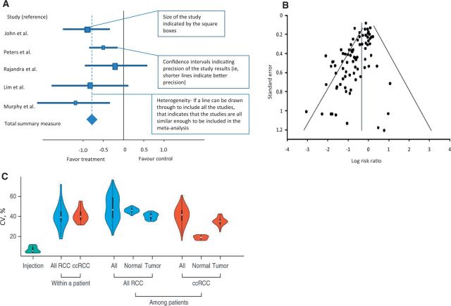
Forest plots have been used since the 1970s (10) although the name appears to have been coined in the 1990s and derives from the appearance of this representation as a “forest” of lines (11,12). They are used to show the relative treatment effect of an intervention between groups within the larger cohort. The effect size is defined as the magnitude of the difference between treatment groups whereas the P value reveals whether an effect exists but does not reveal the size of the effect (13). In meta-analyses, forest plots allow the effect size of all studies to be easily visualized together in one figure. Forest plots constitute several horizontal lines, which represent the 95% confidence interval, and a central symbol in the middle of the line segment, which represents a point estimate that is usually the median or mean (Figure 2A). Where difference between means is presented, null has the value of zero (0) and the x scales are normal, but if ratios are presented (ie, odds ratio), null has a value of 1 and the scales are logarithmic. The central line represents the null hypothesis, and the direction of the effect of treatment depends on which side of the line the central point lies on. The summary overall measure of effect is often represented by a diamond symbol below individual measures (See Figure 2A for explanation on interpretation of a forest plot for systemic review) (14).
Figure 2.
Forest plots, funnel plots, and violin plots as examples of graphical representations of treatment effect. A) Example of a forest plot used in systemic review. B) Illustrations of funnel plot asymmetry. Log of the risk ratios was plotted against the standard error of the risk ratio of each study to identify asymmetry in the distribution of trials. Gaps in the funnel plot suggest potential publication bias. Figure courtesy of Ritchie et al. (21). C) Example of violin plots shows the distribution of coefficient of variation (CV) values from injection replicates, within-patient proteomic variation based on all renal cell carcinoma (RCC), and clear cell renal cell carcinoma, and among-patient variation based on all RCC reproduced from Guo et al. Rapid mass spectrometric conversion of tissue biopsy samples into permanent quantitative digital proteome maps (28). ccRCC = clear cell renal cell carcinoma; RCC = renal cell carcinoma.
Forest plots are useful in considering the behaviors of subgroups within a larger dataset. For example, the benefit for a particular treatment may only be small in a large population, but separating out and analyzing the effect of the therapy in different subgroups may sometimes identify those who may benefit more. Such analyses can be subject to error, especially where small numbers of data points are present and confidence intervals are therefore wider than for the entire group (15). Although forest plots are commonly used in research, the quality, style, and content of forest plots can vary. Post hoc subgroup analysis should also be interpreted with caution and should, at best, be used as hypothesis-generating. When data is classified into different small subgroups, it is important not to over interpret the results as the power of individual subgroup analyses is usually low (16). Schriger et al. studied 129 Cochrane reviews and 171 non-Cochrane reviews (17). They found forest plots to be always present in Cochrane reviews and that they were standardized but often contained three or fewer studies. Sixty percent of non-Cochrane forest plots depicted at least four or more studies, and important information such as the weighting of each study, tests for overall effect, and heterogeneity were often omitted (17). There are also other limitations to using forest plots; for example, the use of symbol areas to convey study weights may not be optimal. There may be difficulty in decoding symbol areas (ie, size of the boxes) to allow for an accurate comparison of study weights, and big symbol areas may obscure other important information on the plot (18).
Funnel Plots
Funnel plots were first introduced in 1984 by Light and Pellemer (19). They are scatter plots of the effect estimates from individual studies against some measure of each study's size or precision (20). A symmetrical funnel shape plot would give an indication of an appropriately sampled dataset whereas an asymmetrical funnel plot would imply possible publication bias or heterogeneity between studies (Figure 2B) (21). The scatter should be because of sampling variation alone with larger studies showing narrower spread at the top compared with smaller studies scattering more widely at the base of the funnel (22,23).
Funnel plots are increasingly used to compare studies in order to check for publication bias and identify outliers. They are therefore used mainly in meta-analyses. Caution must be taken when interpreting funnel plots as a clear definition of precision, and effect in constructing the funnel plot may affect the shape of the plot, leading to discrepancies (24,25). There are several reasons that can lead to asymmetry of the funnel plot, including selection bias, publication bias, true heterogeneity, data irregularities, artefact, or chance (22). Asymmetry of the funnel plot only implies the potential for those sources that may affect its shape but does not provide guidance in teasing out the specific cause, which can be extremely challenging. An example of funnel plot asymmetry could be seen in smaller studies with a higher proportion of patients in the high-risk groups. The patients in the high-risk groups may tend to have a higher response rate to the study treatment arm compared with the patients in the normal or low-risk groups. This could lead to funnel plot asymmetry because of risk differences with variation in the number of patients in each group, rather than bias (26).
Violin Plots
The violin plot is a way of plotting numeric data, which essentially combines the box plot and the density trace or histogram into a single display that reveals structure within the data (27). This synergistic combination allows for display of the distributional characteristics of different batches of data. It is named a violin plot as this statistical display can give rise to the graphic appearance of a violin if the population has a bimodal distribution (Figure 2C) (28). The plots contain markers for the median of the data and a box indicating the interquartile range.
Violin plots provide an indication of the shape of the distribution and demonstrate the presence of clusters in the data, which highlights the variation in the distribution (27). However, the violin plot does not allow easy comparison across different datasets between treatment groups and is prone to exaggerate the influence of extreme outliers as they may not give an assessment of the number of data points.
Graphical Representations of Tumor Response
Waterfall plots, spider plots, and swimmer’s plots are effective ways to display individual patient tumor changes and response changes over the course of treatment and are discussed in this section.
Waterfall Plots
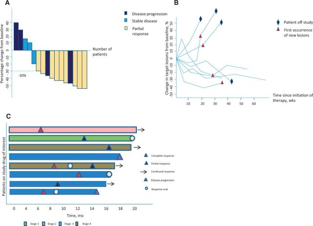
Waterfall plots are increasingly used in early-phase oncology clinical trials as a powerful visualization of individual patients’ responses to an intervention or therapy. Waterfall plots are most commonly used to show the maximal percentage change of a tumor measurement after treatment. Each vertical bar represents an individual patient, and tumor response can be easily interpreted as shrinkage if it is below the baseline and tumor progression if it is above. Patients’ responses are typically sorted horizontally by magnitude from left to right in descending order, allowing for a cascading expression of the intervention’s activity and can be colored by clinical or molecular characteristics (eg, stage or mutation status) (29,30). This graduated representation summarizes the typical response size, the fraction of patients experiencing benefit, and also gives insight into the interpatient heterogeneity of response (Figure 3A).
Figure 3.
Waterfall plots, spider plots, and swimmer’s plot as examples of graphical representations of tumor response. A) Waterfall plot with each vertical bar representing an individual subject. Tumor shrinkage is denoted by the direction of the bars from baseline, with tumor progression if it is above and regression if below zero. RECIST measurement criteria can also be applied, with a partial response indicated by a decrease of at least 30% (dashed line) and progression a change of greater than 20% from baseline. B) Spider plot depicting tumor burden (assessed as the longest linear dimension) over time. Similar to a waterfall plot, a response is indicated by a reduction in measurements below the baseline. C) Swimmer plot demonstrating treatment duration, the time point at which a response to treatment began, continued, and ended, whether or not the subject was considered a durable responder, and the disease stage at baseline.
Despite their popularity, there are several concerns with the use of waterfall plots in representing clinical data. Shao et al. reviewed published waterfall plots to investigate variability in criteria used to define them and found that they are influenced by interobserver measurement errors of tumor size. They recommended that waterfall plots should be generated only after central review of imaging by radiologists trained in Response Evaluation Criteria in Solid Tumours 1.1 (RECIST) measurement (31). Waterfall plots depict only the best on-study change in tumor burden relative to baseline for each individual patient and cannot represent the kinetics or dynamics of tumor growth (32). Some physicians may incorrectly infer that treatment response and especially the magnitude of response will automatically translate into actual patient benefit. However, this is often not the case, particularly where initial responses are mitigated by rapid tumor adaptation and progression. There are many studies that have demonstrated that objective response rate (ORR), defined as either a partial or complete response by RECIST, does not correlate with overall survival (OS). For example, in clinical trials of second-line chemotherapy for patients with advanced gastric cancer, Shitara et al. compared OS and other endpoints, finding no association between ORR and OS (P = .38) (33). Hotta et al. compared cisplatin-based chemotherapy with carboplatin-based chemotherapy for the management of advanced non–small cell lung cancer with cisplatin-based chemotherapy showing superior objective response rates but failed to demonstrate statistically significant survival advantage as compared with carboplatin-based chemotherapy (34). Another issue with waterfall plots is that they do not show changes over time. If a tumor initially grows then shrinks, the waterfall can only capture the one point in time. They are therefore not very useful when evaluation of a treatment may alter over repeated time points, as occurs with some immunotherapies. Given this, it would be judicious to restrict use of waterfall plots to early-phase trials where response is a signal of efficacy supporting further phase II or III trials.
Spider Plots
Spider plots have more recently entered oncology publications to depict changes in tumor measurements over time relative to baseline tumor burden. The way data is represented generates a pattern similar to the legs of a spider (Figure 3B). These plots allow the viewer to follow the longitudinal variations of tumor burden, which is often crucial when studying immunotherapeutic agents, where tumor burden may transiently increase before reducing over time (35). Spider plots depict the duration of effect from commencement of therapy; a longer plateau of the curve below the baseline may represent a more durable treatment response. Additional information can be incorporated by exploiting coloring and shape of the final point, as well as the line style and line color, giving great flexibility.
However, there may be missing information from spider plots if a patient’s data were not captured entirely, especially in those who progressed or died early on the trial. They may therefore give a visual overestimation of treatment effect because of this survivorship bias. Therefore, spider plots only provide good visual qualitative assessment but do not allow for formal statistical inference (32). Furthermore, spider plots are less interpretable when there are large numbers of patients as it grows difficult to follow individual lines, especially when they cross.
Given the intricacies of each data point, spider plots are not useful when comparing results for large numbers of patients over a long period of time. They are therefore increasingly utilized in phase I studies or to elaborate the response in a selected subgroup.
Swimmer Plot
A swimmer (or swim-lane) plot aims to show multiple pieces of information about a given dataset in one plot (36). Swimmer plots have gained popularity as manner of clearly describing the fluctuating relationship between objective tumor response (eg, RECIST measurements) and patient survival. Analogous to waterfall plots, each patient is represented as a single bar, in this case horizontal. But rather than using tumor response as the other axis, swimmer plots use time and overlay the patient’s bar with multiple other pieces of information that enrich and qualify basic time-to-event metrics (36). By setting a clear symbol legend to depict patients’ response to therapy, one is able to review the timeframes of treatment, the point at which a response to treatment occurred, and determine which patients achieved a longer duration on treatment. This information on the duration of treatment may be important for therapy that would be continued without a specific duration as long as the patient has stable disease or objective response. A longer duration of treatment would suggest better tolerability and treatment outcomes. Additional graphical symbols (Figure 3C) can depict the type of response (partial vs complete), when the onset of benefit took place, and the duration of the benefit. Similar to spider plots, they allow various treatment response metrics to be visualized over time in a small number of patients; however, they become cluttered and uninformative if too many subjects are included or too many variables are included. By convention, patients are sorted on the basis of duration of treatment. The swimmer’s plot allows for a clear graphical display of the duration of response and reveals which patients continue to benefit from the treatment. This is important in immunotherapies where a proportion of patients may have an objective response or disease stabilization initially but are able to remain on the therapy for a long duration of time.
Graphical Representations to Illustrate Cancer Genotypes and Phenotypes
With the enormity and complexity of genomic information, graphical representations such as heatmaps and circos plots allow these data to be conveyed effectively and are discussed in this section.
Heatmaps
Heatmaps are a data visualization tool that uses color to represent data values in a two-dimensional image. They can be used to map where the clusters of areas of interest are to identify patterns and trends that are increasingly used to depict complex data such as mRNA or protein abundances, but to also organize high-dimensional data for easy visualization by the reader.
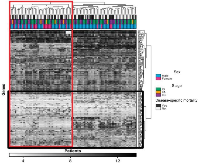
The columns in a heat map correspond to individual tumor samples, and the rows often represent genes or transcripts of interest, with the colors representing expression level or mutation status (Figure 4) (37). Heatmaps are commonly used to simplify complex datasets. It was estimated that 30.4% of all original research articles published in 2012 from five leading journals, including Nature Biotechnology, Cancer Cell, Genome Research, Genome Biology, and Molecular & Cellular Proteomics contained at least one heatmap (38). Plotting a heatmap can now be performed easily via algorithms (such as R or Stata) or via statistical clustering packages. The clustering of heatmaps is a surprisingly challenging problem, with no clear procedure for finding the appropriate clustering metrics, and the display depends on the choice of distance metric, choice of linkage method, and even the clustering algorithm used itself (39,40). This leads heatmaps to have different displays based on minor choices made by the analyst and does limit their robustness as a visualization technique. Not all heatmaps need to be clustered: They can form a useful representation for any matrix of data. A recently developed enhancement to the heatmap is the dotmap, where a background value represents statistical significance, and the size of a circle in the foreground represents the effect size. The color of the circle gives the direction of the effect size. This allows representation of four-dimensional data within a heatmap (41,42).
Figure 4.
Heat map distilling complex gene expression and correlating it with clinical data. Each tile within a row represents the expression level of a specific gene, with darker tones indicating higher expression levels. Each patient sample is shown as a column, and two clusters of genes and patients have been defined (vertical rectangle). The boxed cluster contains more women with less disease specific mortality. Clusters of genes that group together according to expression are also shown in the horizontal rectangle.
Circos Plots
Next-generation sequencing has resulted in large amounts of data from genome-wide analysis that are difficult to conceptualize as individual genetic changes (43). Rapid genome sequencing has allowed comparisons to be made with a referent human sequence and scientists to discover new genomic areas of interest that may impact on cancer evolution. Visualizing data in a circular format (Figure 5) allows for flexibility in illustrating connections between different positions, depicts regions of interactions, and represents large amount of complex data better than the tabulated format (44). The ease of creating large and complex genomic maps allows one to compare sequences of interest to existing genome or sequence collections. Circos plots excel at showing genome rearrangements (particularly translocations) and copy number alterations, as well as global genomic instability. While they provide an overall map of the complexity of an individual genome, it is difficult to appreciate specific mutations, which may be the underlying driver for some tumors. Further, they artificially exaggerate the linkages between certain chromosome pairs that are more distant on the circle and can be difficult to compare in-depth because of the low base-pair resolution. Low base-pair resolution may indicate that it is difficult or even impossible to visualize small events or to distinguish those that are nearly adjacent (ie, the “resolution” of the plot may be too low for discerning neighboring events at base-pair level).
Figure 5.
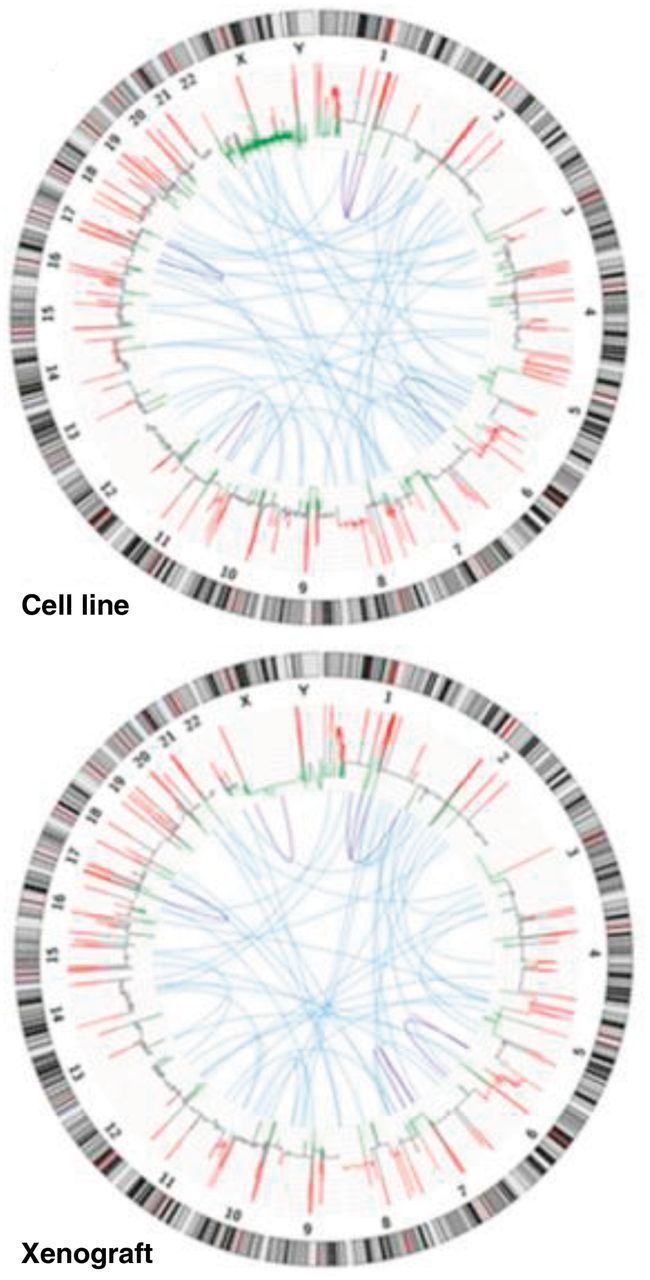
Circular visualization of a next-generation sequence analysis of a cancer xenograft model compared with its cell line (NCI-H209). Reproduced from Rosello et al. (44). Copy number variations (red = gain; green = loss) were calculated based on normal lymphocyte DNA as a control. Inter- and intrachromosomal rearrangements are represented in blue (interchromosomal) and purple (intrachromosomal).
Graphical Representations to Illustrate Connectedness and Relatedness in Cancer
Over the last few years, there has been a drive for new and improved methods for conveying complex scientific data in manuscripts and at conference presentations, channels that enable more rapid digestion of information. This section aims to highlight some innovative graphs and plots to describe complex pathways or relationships in cancer management.
Transit Map Diagrams
With new molecular therapies and immunotherapies becoming available in addition to traditional chemotherapy, there is a need for more comprehensive diagrams to describe patients’ complex treatment choices and options. As different patients have different paths of management dependent on the molecular drivers present, a transit map diagram may therefore be a more informative representation (Figure 6) compared with using conventional flow diagrams (45,46). Transit map diagrams allow the viewer the ease of a visual aid for the variable steps in a complex pathway. These map out the turn-wise approach for different choices and their interactions. The variety of choices for various drug combinations could be highlighted with each arm of the pathway to illustrate the different targets. While this does not quantify the clinical impact (effect size) of the various treatments or the sequence in which these treatments can or should be taken, it does allow visualization of the possibilities that now face each patient and their health care team. To date, transit map diagrams are by definition annotated and manually curated in a supervised fashion and not algorithmically generated.
Figure 6.
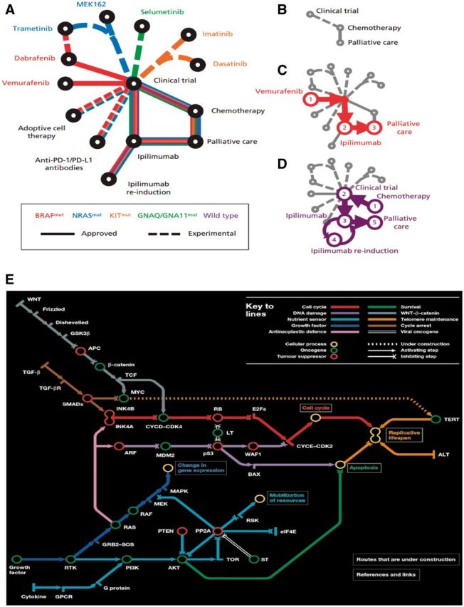
Transit and subway map diagrams allow for visual simplification of successive steps in a complex pathway. A) Example of transit map diagram courtesy of Gedye et al. New treatments for metastatic melanoma (45). A) Schematic of newly approved (solid lines) and experimental (dashed lines) treatments for patients with metastatic melanoma. The patient’s treatment is personalized according to the underlying driver mutation (eg, NRAS-mutant). B) Historically, few treatments were available for melanoma. Examples of treatment progressions are shown for (C) patients with BRAF-mutant melanoma or (D) patients without an identifiable driver mutation (wild-type). PD-1 = programmed cell death protein 1, PD-L1 = programmed cell death 1 ligand 1. E) Subway map designed by Claudia Bentley. Reproduced from Hahn et al. A subway map of cancer pathways (46). These maps simplify complex pathways but show key steps and resultant effects, such as apoptosis.
Network Analysis Diagrams
In situations where strength and frequency of connection between different items of interest are to be displayed, network analysis may offer a new, innovative way of data visualization. The vertex represents each factor that is being studied, and the size of the vertex is proportional to the efficacy of the factor. The lines connecting each vertex can represent the strength or character of the connections, eg, the thicker the line, the stronger the connection. As with transit map diagrams, network graphs only highlight the variety of pathways and targets but struggle to quantify the degree of effect other than the arbitrary strength of connection via the thickness of the line connecting one item to another. In contrast to transit map diagrams, network diagrams are algorithmically generated via a variety of computational methods (eg, www.genemania.org). Network analysis is often used to illustrate multidimensional “-omics” datasets such as genomics, transcriptomics, and metabolomics (Figure 7A) but can also be used to represent any group of interconnected variables such as academic authorship (Figure 7B) (47,48).
Figure 7.
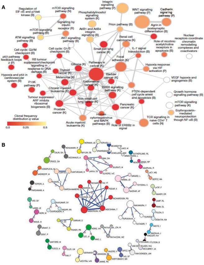
Network graphs as examples of graphical representations to illustrate connectedness and relatedness in cancer. A) Network analysis of recurrently mutated genes in triple-negative breast cancer (47). This network analysis diagram shows significantly overrepresented pathways defined from genes mutated across multiple patients. Color indicates the frequency of clones in individual patients and the size of node the frequency across patients of that group of mutations. B) Network graph representing the 36 cohesive oncology co-authorship network, 2001–2010 reproduced from Shao et al. Analysis of oncology research from 2001 to 2010: a scientometric perspective (48). One vertex represents one author. The vertex size is proportional to the productivity of the author while the thickness of the lines indicates the strength of connection between two authors. The thicker the line between the two vertices, the closer the relationship is. The value between two vertices represents the frequency of cooperation instances.
Conclusions and Directions
We have highlighted some of the graphs, plots, and representations (summarized in Table 1) that have emerged as useful tools to enhance data visualization and interpretation of increasingly nuanced and complex patient outcomes in cancer. In many situations, conventional methods of delivering information are still employed (eg, Kaplan-Meier curves) and novel representations are also presented to give a more comprehensive and enriched appreciation of patients’ experiences. Likewise, increasingly complex translational data is mandating novel methods of data visualization to allow communication to nonspecialists and stakeholders. There is a rapid improvement in the graphics capabilities of statistical software packages, which is enabling the ready preparation of complex plots by both researchers and clinicians. As new treatment paradigms emerge and tumor biology is increasingly understood, it is likely that more striking and original methods of displaying data and conveying information will be developed. If these developments enable easy and rapid interpretation of data then, like Kaplan-Meier curves, they are likely to be used throughout the oncology literature like popular art pervades advertising.
Table 1.
Comparison between different types of graphical representations
| Type of visual display | Utility and pros | Cons |
|---|---|---|
| Graphical representation to illustrate data on overall survival or progression-free survival | ||
| Kaplan-Meier curves | Allows estimation of survival and comparison of two treatment groups based on selected categories | Univariate analysis, which may be confounded by censoring differences between groups |
| Graphical representations of treatment effect | ||
| Forest plots | Helps determine behaviors of different subgroups within a larger dataset | Subject to error if there are only small number of data points within subgroup analysis resulting in false interpretation |
| Funnel plots | Scatter plots of the effect estimates that can give an indication of heterogeneity | Shape of the plot is dependent on number of patients recruited in different risk groups |
| Violin plots | Indication of clusters within the data that highlight the variation in distribution | Does not allow easy comparison across different datasets |
| Graphical representations of tumor response | ||
| Waterfall plots | Summarizes the typical response size and the fraction of patients experiencing benefit. Reveals interpatient heterogeneity of response | Only shows one measurement in time, and tumor response size may not represent actual patient benefit in terms of overall survival or progression-free survival |
| Spider plots | Allows visualization of data points across time rather than at a specified time point | Does not allow for formal statistical inference, difficult to interpret if large number of data points |
| Swimmer plots | Tumor response and timeframe of response displayed | May become cluttered and uninformative if too many subjects are included or too many variables are included |
| Graphical representations to illustrate cancer genotypes and phenotypes | ||
| Heat maps | Allows complex data to be grouped according to thousands of individual data points, thereby allowing patterns within the data to be visualized | Clustering is based on multiple data points, which may dilute the effects of individual data points such that it is lost within the volume of data |
| Circos plots | Allows visualizing complex genome data in one plot, allows visualization of the interaction between genomic regions in addition to genome gains/losses | Highly complex plots without ability to focus on specific genomic regions |
| Graphical representations to illustrate connectedness and relatedness in cancer | ||
| Subway diagrams | Visual simplification of successive steps in a complex pathway | Does not quantify impact or efficacy of each step in the pathway |
| Network analysis graphs | The vertex represents each factor that is being studied, and size of the vertex is proportional to the efficacy of the factor | Unable to quantify degree of effect other than via thickness of the links drawn in the diagram |
Modern clinical cancer research relies increasingly on the communication of complex data. The community needs to develop a graphical vocabulary that allows for easy and familiar communication. Standardizing our graphical representations and understanding their strengths and weaknesses is a key element to reach that goal. Journals could play a key role here, standardizing features like colors used to describe stage, histology, or chromosomes, or the symbols used in plots like swim plots. Bringing consensus to data representation will speed the ability of both clinicians and researchers to rapidly and correctly interpret the increasingly complex data arising from modern cancer clinical trials.
To quote Edward Tufte, “The commonality between science and art is in trying to see profoundly—to develop strategies of seeing and showing” (49).
Funding
Thomas John received a National Health and Medical Research Council (NHMRC) Early Career Fellowship. Puey Ling Chia received an International Association for the Study of Lung Cancer (IASLC) Fellowship and The University of Melbourne Australian Postgraduate Award.
Note
The study funders had no role in the writing of the review or decision to submit it for publication.
References
- 1.Mayer RE. The promise of multimedia learning: using the same instructional design methods across different media. Learning and Instruction [Internet]. 2003;13(2):125–139. [Google Scholar]
- 2.Tufte ER. The visual display of quantitative information. Cheshire, CT: Graphics Press; 1986. [Google Scholar]
- 3.Pocock SJ, Travison TG, Wruck LM. Figures in clinical trial reports: current practice & scope for improvement. Trials. 2007;8:36. [DOI] [PMC free article] [PubMed] [Google Scholar]
- 4.Kaplan EL MP. Nonparametric estimation from incomplete observations. J Am Stat Assoc. 1958; 53:457–481. [Google Scholar]
- 5.Chen TT. Statistical issues and challenges in immuno-oncology. J Immunother Cancer. 2013;1:18. [DOI] [PMC free article] [PubMed] [Google Scholar]
- 6.Goel MK, Khanna P, Kishore J. Understanding survival analysis: Kaplan-Meier estimate. Int J Ayurveda Res. 2010;1(4):274–278. [DOI] [PMC free article] [PubMed] [Google Scholar]
- 7.Rich JT, Neely JG, Paniello RC, Voelker CC, Nussenbaum B, Wang EW. A practical guide to understanding Kaplan-Meier curves. Otolaryngol Head Neck Surg. 2010;143(3):331–336. [DOI] [PMC free article] [PubMed] [Google Scholar]
- 8.Shih W. Problems in dealing with missing data and informative censoring in clinical trials. Curr Control Trials Cardiovasc Med. 2002;3(1):4. [DOI] [PMC free article] [PubMed] [Google Scholar]
- 9.Reck M, von Pawel J, Zatloukal P, et al. Phase III trial of cisplatin plus gemcitabine with either placebo or bevacizumab as first-line therapy for nonsquamous non-small-cell lung cancer: AVAil. J Clin Oncol. 2009;27(8):1227–1234. [DOI] [PubMed] [Google Scholar]
- 10.Freiman JA, Chalmers TC, Smith H, Jr, Kuebler RR. The importance of beta, the type II error and sample size in the design and interpretation of the randomized control trial. Survey of 71 “negative” trials. N Engl J Med. 1978;299(13):690–694. [DOI] [PubMed] [Google Scholar]
- 11.Bijnens L, Colette L, Ivanov A, Hoctin Boes G, Sylvester R, ed. Can the forest plot be simplified without losing relevant information in meta-analyses? Communication at the meeting of the SCT; 1996 Pittsburgh, PA, 5–8 May 1996. Control Clin Trials. 1996;17(2S):124. [Google Scholar]
- 12.Lewis S, Clarke M. Forest plots: trying to see the wood and the trees. BMJ. 2001;322(7300):1479–1480. [DOI] [PMC free article] [PubMed] [Google Scholar]
- 13.Sullivan GM, Feinn R. Using Effect Size-or Why the P Value Is Not Enough. J Grad Med Educ. 2012;4(3):279–282. [DOI] [PMC free article] [PubMed] [Google Scholar]
- 14.Explanation on interpretation of a forest plot for systemic review. Health Sciences Library 2014. http://www.hsl.unc.edu/services/tutorials/ebm/forestplot.pdf, assessed 15 January 2015.
- 15.DeVita VT, Lawrence TS, Rosenberg SA, DePihjo RA, Weinburg RA, ed. DeVita, Hellman, and Rosenberg's Cancer: Principles & Practice of Oncology, 9th ed LIPPINCOTT WILLIAMS & WILKINS, a WOLTERS KLUWER business; 2011. [Google Scholar]
- 16.Sun X, Briel M, Busse JW, et al. Credibility of claims of subgroup effects in randomised controlled trials: systematic review. BMJ. 2012;344:e1553. [DOI] [PubMed] [Google Scholar]
- 17.Schriger DL, Altman DG, Vetter JA, Heafner T, Moher D. Forest plots in reports of systematic reviews: a cross-sectional study reviewing current practice. Int J Epidemiol. 2010;39(2):421–429. [DOI] [PubMed] [Google Scholar]
- 18.Foster GA, Goldsmith GH. Problems Commonly Associated With Forest Plots Addressed Using High Resolution Graphics in SAS. http://www2.sas.com/proceedings/sugi31/139-31.pdf, assessed 15 January 2015.
- 19.Light RJ, Pillemer DB. Summing up: The Science of Reviewing Research. Cambridge, MA: Harvard University Press; 1984. [Google Scholar]
- 20.Sterne JA, Sutton AJ, Ioannidis JP, et al. Recommendations for examining and interpreting funnel plot asymmetry in meta-analyses of randomised controlled trials. BMJ. 2011;343:d4002. [DOI] [PubMed] [Google Scholar]
- 21.Ritchie ML, Romanuk TN. A meta-analysis of probiotic efficacy for gastrointestinal diseases. PloS One. 2012;7(4):e34938. [DOI] [PMC free article] [PubMed] [Google Scholar]
- 22.Egger M, Davey Smith G, Schneider M, Minder C. Bias in meta-analysis detected by a simple, graphical test. BMJ. 1997;315(7109):629–634. [DOI] [PMC free article] [PubMed] [Google Scholar]
- 23.Begg CB, Berlin JA. Publication bias and dissemination of clinical research. J Natl Cancer Inst. 1989;81(2):107–115. [DOI] [PubMed] [Google Scholar]
- 24.Tang JL, Liu JL. Misleading funnel plot for detection of bias in meta-analysis. J Clin Epidemiol. 2000;53(5):477–484. [DOI] [PubMed] [Google Scholar]
- 25.Lau J, Ioannidis JP, Terrin N, Schmid CH, Olkin I. The case of the misleading funnel plot. BMJ. 2006;333(7568):597–600. [DOI] [PMC free article] [PubMed] [Google Scholar]
- 26.Sterne JA, Egger M. Funnel plots for detecting bias in meta-analysis: guidelines on choice of axis. J Clin Epidemiol. 2001;54(10):1046–1055. [DOI] [PubMed] [Google Scholar]
- 27.Hintze JLN, Ray D. Violin Plots: A Box Plot-Density Trace Synergism. Am Statistician. 1998;52(2). [Google Scholar]
- 28.Guo T, Kouvonen P, Koh CC, et al. Rapid mass spectrometric conversion of tissue biopsy samples into permanent quantitative digital proteome maps. Nat Med. 2015;21(4):407–413. [DOI] [PMC free article] [PubMed] [Google Scholar]
- 29.Christensen D. Better Understand Oncology Clinical Trial Data With This Quick Reference Guide 2014. http://connect.ons.org/ons-connect-blog/better-understand-oncology-clinical-trial-data-with-this-quick-reference-guide, assessed 15 January 2015.
- 30.Gillespie TW. Understanding waterfall plots. J Adv Pract Oncol. 2012;3(2):106–111. [PMC free article] [PubMed] [Google Scholar]
- 31.Shao T, Wang L, Templeton AJ, et al. Use and misuse of waterfall plots. J Natl Cancer Inst. 2014;106(12). [DOI] [PubMed] [Google Scholar]
- 32.LoRusso PM, Anderson AB, Boerner SA, Averbuch SD. Making the investigational oncology pipeline more efficient and effective: are we headed in the right direction? Clin Cancer Res. 2010;16(24):5956–5962. [DOI] [PubMed] [Google Scholar]
- 33.Shitara K, Matsuo K, Muro K, Doi T, Ohtsu A. Correlation between overall survival and other endpoints in clinical trials of second-line chemotherapy for patients with advanced gastric cancer. Gastric Cancer. 2014;17(2):362–370. [DOI] [PubMed] [Google Scholar]
- 34.Hotta K, Matsuo K, Ueoka H, Kiura K, Tabata M, Tanimoto M. Meta-analysis of randomized clinical trials comparing Cisplatin to Carboplatin in patients with advanced non-small-cell lung cancer. J Clin Oncol. 2004;22(19):3852–3859. [DOI] [PubMed] [Google Scholar]
- 35.Wolchok JD, Hoos A, O'Day S, et al. Guidelines for the evaluation of immune therapy activity in solid tumors: immune-related response criteria. Clin Cancer Res. 2009;15(23):7412–7420. [DOI] [PubMed] [Google Scholar]
- 36.Stacey D., Phillips IHC, Princeton NJ. Swimmer Plot: Tell a Graphical Story of Your Time to Response Data Using PROC SGPLOT. PharmaSUG. 2014; 2014. [Google Scholar]
- 37.Schroeder MP, Gonzalez-Perez A, Lopez-Bigas N. Visualizing multidimensional cancer genomics data. Genome Med. 2013;5(1):9. [DOI] [PMC free article] [PubMed] [Google Scholar]
- 38.Deng W, Wang Y, Liu Z, Cheng H, Xue Y. HemI: a toolkit for illustrating heatmaps. PLoS One. 2014;9(11):e111988. [DOI] [PMC free article] [PubMed] [Google Scholar]
- 39.Kettenring JR. The Practice of Cluster Analysis. J Classification. 2006;23(1):3–30. [Google Scholar]
- 40.Wilkinson L, Friendly M. The History of the Cluster Heat Map. Am Statistician. 2009;63(2):179–184. [Google Scholar]
- 41.Ewing AD, Houlahan KE, Hu Y, et al. Combining tumor genome simulation with crowdsourcing to benchmark somatic single-nucleotide-variant detection. Nat Methods. 2015;12(7):623–630. [DOI] [PMC free article] [PubMed] [Google Scholar]
- 42.Lalonde E, Ishkanian AS, Sykes J, et al. Tumour genomic and microenvironmental heterogeneity for integrated prediction of 5-year biochemical recurrence of prostate cancer: a retrospective cohort study. Lancet Oncol. 2014;15(13):1521–1532. [DOI] [PubMed] [Google Scholar]
- 43.Ledford H. Big science: The cancer genome challenge. Nature. 2010;464(7291):972–974. [DOI] [PubMed] [Google Scholar]
- 44.Rossello FJ, Tothill RW,, Britt K, et al. Next-generation sequence analysis of cancer xenograft models. PloS One. 2013;8(9):74432. [DOI] [PMC free article] [PubMed] [Google Scholar]
- 45.Gedye C, Hogg D, Butler M, Joshua AM. New treatments for metastatic melanoma. CMAJ. 2014;186(10):754–760. [DOI] [PMC free article] [PubMed] [Google Scholar]
- 46.Hahn W, Weinberg R. A subway map of cancer pathways. Nat Rev Cancer. 2002. [DOI] [PubMed] [Google Scholar]
- 47.Shah SP, Roth A, Goya R, et al. The clonal and mutational evolution spectrum of primary triple-negative breast cancers. Nature. 2012; in press. [DOI] [PMC free article] [PubMed] [Google Scholar]
- 48.Shao H, Yu Q, Bo X, Duan Z. Analysis of oncology research from 2001 to 2010: a scientometric perspective. Oncol Rep. 2013;29(4):1441–1452. [DOI] [PubMed] [Google Scholar]
- 49.Zachry M, Thralls C. An Interview with Edward R. Tufte. Tech Comm Quart. 2004;13(4):447–462. [Google Scholar]


