

Abstract
New representations of tree-structured data objects, using ideas from topological data analysis, enable improved statistical analyses of a population of brain artery trees. A number of representations of each data tree arise from persistence diagrams that quantify branching and looping of vessels at multiple scales. Novel approaches to the statistical analysis, through various summaries of the persistence diagrams, lead to heightened correlations with covariates such as age and sex, relative to earlier analyses of this data set. The correlation with age continues to be significant even after controlling for correlations from earlier significant summaries.
Key words and phrases: Persistent homology, statistics, angiography, tree-structured data, topological data analysis
1. Introduction
Statistical analysis is particularly challenging when the sample points are not vectors but rather objects with more intrinsic structure. In the present case, each data point is a tree, embedded in 3-dimensional space, with additional attributes such as thickness. Background and additional information concerning these data objects, which represent arteries in human brains (isolated via magnetic resonance imaging [Aylward and Bullitt (2002)]), occupy Section 2. Earlier analyses of this data set have correlated certain features with age and produced hints of sex effects (Section 2.1).
Topological data analysis (TDA) reveals anatomical insights unavailable from earlier approaches to this data set (Section 3). In particular, TDA shows age to be correlated with certain measures of how brain arteries bend through space (Sections 3.1 and 3.2). This contrasts with a previous study [Bullitt et al. (2010)] that correlates age with total artery length and, furthermore, the TDA correlations are independent of that earlier one (Section 3.3). TDA in our context also finds stronger sex effects than the only other study [Shen et al. (2014)] to find any sex difference at all (Section 3.4).
Two TDA methods (Section 4) allow us to quantify the bending of arteries in space. One of our methods records how the connectedness of the subset of the vessels beneath a given horizontal plane changes as the plane rises from below the brain to above it (Section 4.1). Another of our methods records the evolution of independent loops contained in the ε-neighborhood of the tree as ε increases from 0 to ∞ (Section 4.2). Each method encodes the topological information contained in a given tree as a persistence diagram, which is a finite set of points above the main diagonal in the positive quadrant of the Cartesian plane. These diagrams are turned into feature vectors in a variety of ways, resulting in several statistical analyses, detailed in Section 5.
2. Brain artery trees
Each data point in this study is a geometric construct that represents the tree of arteries in the brain of one person. More precisely, the data result from a tube-tracking vessel segmentation algorithm that was applied to 3-dimensional Magnetic Resonance Angiography (MRA) images followed by a combination of automatic and manual assembly into trees. Aylward and Bullitt (2002) and Aydin et al. (2009) describe this process. A visual rendering of one such reconstructed tree is shown in Figure 1. The full data set consists of n = 98 such trees, with subject ages from 18 to 72. While the long-term goal of study is to develop methods for exploring stroke tendency, and perhaps to develop diagnostics for brain cancer based on vasculature, pathological cases were deliberately excluded before MRA scanning, the purpose being to understand variation in the population of nonpathological cases. The central goal of this study is to characterize correlations between these brain diagnostics and the two covariates, age and sex.
Fig. 1.
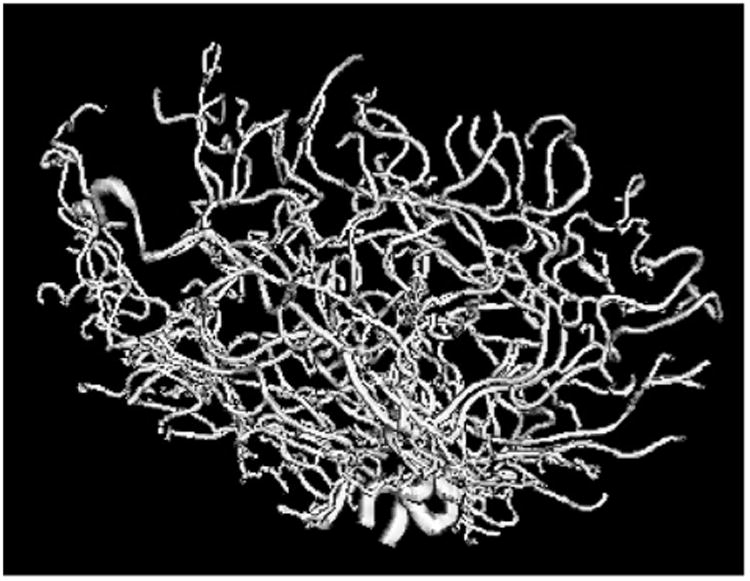
Tree of arteries from the brain of one person, showing one data object. Thickest arteries appear near the bottom. Arteries bend, twist and branch through three dimensions, which results in meaningful aspects of the data being captured by persistent homology representations. The resolution is 0.5 × 0.5 × 0.8 mm3.
2.1. Earlier analyses
Bullitt et al. (2010) studied simple summaries of each data tree, such as overall branch length and average branch thickness. These were both seen to be significantly correlated with age. Their approach can be refined through better use of the large amount of additional information available in this rich data set, such as the tree topologies, and also the multiple individual branch locations, structures, widths and so on. Early approaches to this, such as Wang and Marron (2007) or Aydin et al. (2009), chose to focus solely on the combinatorics of the branching structure, ignoring other aspects such as thickness or the geometry of the 3-dimensional embedding. The latter paper found statistically significant age effects. These age effects were studied more deeply using the notion of tree smoothing developed by Wang et al. (2012).
Shen et al. (2014) approach this data set using representations of planar binary trees via Dyck paths, which arise in branching processes [Harris (1952)]. The bijection represents each planar binary tree as a function of one real variable, allowing application of standard asymptotic methods when trees are viewed as random objects. Adaption to the brain artery tree data set had the goal of making available the large array of methods available for Functional Data Analysis (FDA), where the data objects are curves such as graphs of univariate functions; see Ramsay and Silverman (2002) and Ramsay (2006). Dyck path analysis of the brain tree data found more significant correlation with age as well as the first indication of a significant sex effect.
A drawback of the above approaches to tree data analysis is that they require 2-dimensional embedding of the given 3-dimensional tree structure, as noted in Aydin et al. (2009), Section 2.1 and Shen et al. (2014), Section 2.1. For each non-leaf node, a choice must be made as to which child node goes on the left and which goes on the right (if the tree is not binary, then an ordering of the node's children is required). While ad hoc methods were used to reasonable effect in those papers, it is natural to suspect that they result in loss of statistical efficiency. This issue can be seen as an instance of the correspondence problem: planar embedding necessarily violates any consistent, anatomically meaningful assignment of 3-dimensional features across objects in this data set.
An approach to overcoming this problem is based on the concept of the phylogenetic tree from evolutionary biology; see Holmes (1999) and Billera, Holmes and Vogtmann (2001). A major challenge in applying this idea to a set of brain artery trees is that phylogenetic trees require a fixed underlying set of leaves, while brain artery trees have leaves that appear where the vessel thickness passes below the imaging resolution of MRA, locations of which vary across cases. Skwerer et al. (2014) attempted to resolve this problem by using additional cortical surface information plus a correspondence technique to produce a common set of landmarks, which became the leaves. They found statistically significant age and gender effects, some of which were stronger than those previously found.
Additional treatments of tree-structured data objects did not analyze this data set. For instance, Feragen et al. (2011) developed an approach that avoids both the planar embedding and fixed-leaf-set problems, and Nye (2011) invented an analogue of principal component analysis for phylogenetic trees. Hotz et al. (2013), followed by Barden, Le and Owen (2013, 2014), investigated surprising nonstandard central limit theory in phylogenetic tree spaces. Finally, an analysis [Wright et al. (2013)] of a different, and smaller, set of MRA brain artery images also found a connection between vessel length and healthy aging.
3. Persistent homology analysis of brain arteries
In this paper we use topological data analysis (TDA); see Edelsbrunner and Harer (2010) for a good introduction. We postpone to Sections 4 and 5 a review of precise definitions of key terms from TDA and the detailed extraction of useful features for statistical analysis. This section contains an intuitive description of these features, and a description of the striking age and sex effects found using this new feature set. We also demonstrate that these effects are independent of coarser geometric measures, such as total artery length or average branch thickness, used in the earliest analyses [Bullitt et al. (2010)].
3.1. Intuition
The methodology developed here provides a direct and quantitative description, in the form of numerical features usable for statistical analysis, of the way arterial structure occupies space within the 3-dimensional geometry of the brain. We illustrate some of what this means here, with the aid of the tree in Figure 2.
Fig. 2.

A MATLAB rendering of the brain artery tree of Patient 1. Indicated by the thick grey curve is one of the loops formed by thickening the artery tree within the brain. Also found are some of the loops and bends made by the artery tree within the 3-dimensional geometry of the brain.
Notice a large S-shaped bend in the arterial structure near the bottom of Figure 2. Bends such as these, and other much tighter bends, occur throughout the tree. The technique of zero-dimensional persistent homology locates these bends and measures their sizes, which is returned as a sequence p1 > p2 > … of non-negative numbers, where pi is the size (in mm) of the ith largest bend in a particular brain.
For a different flavor of geometry, imagine gradually thickening each artery so that the tree begins to fill the 3-dimensional space containing it. Loops start to form (for example, the one outlined in thick grey in the figure) and then eventually fill in. The time between when a loop forms and when it fills in is called its persistence. The technique of one-dimensional persistent homology locates these loops and measures their persistences (again in mm), resulting in another sequence q1 > q2 > … of non-negative numbers.
Rigorous definitions of the above terms are given in the next two sections. For the rest of this section, we suppress such details and focus on the analysis of features derived from persistence.
3.2. Age effects
Figure 3 depicts a first population-level view of the sets of numbers p1, …, p100 across the entire data set of n = 98 brain trees. Two out of three panels in each row contain a set of n = 98 overlaid curves, each of which is a parallel coordinates plot [see Inselberg (1997)]: the coordinates of each data vector are plotted as heights on the vertical axis as a function of the index, in this case i = 1, …, 100. Color denotes age via a rainbow scheme starting with magenta for the youngest (19), ranging smoothly through blue, green, yellow to red for the oldest (79). The upper left panel shows the data curves. Potential age structure is already apparent, with blues nearer the top and reds nearer the bottom.
Fig. 3.

PCA of vector representations. Raw data, mean and mean residuals are in the top row. Other rows show loadings and scores for the first 3 PCs, that is, modes of variation. Rainbow colors indicate age. Correlation of PC1 and age is apparent, with warmer colors generally at the bottom and cooler colors generally at the top.
As shown by Ramsay and Silverman (2002) and Ramsay (2006), Principal Component Analysis [PCA, see Joliffe (2005)] can reveal deeper structure in a sample of curves. PCA starts at the center of the data: the mean shown as a curve in the top center panel. Variation about the mean is studied through the mean residuals, which are the data curves minus the mean, shown in the top right panel. PCA next investigates modes of variation by finding orthogonal projections in the curve space that represent maximal amounts of variation. Projections corresponding to the first principal component (PC) are shown in the left panel of the second row, which gives a more focused impression of younger people on the top and older people near the bottom. In PCA terminology, this is called a loadings plot because each curve is merely a multiple of the first eigenvector, whose entries are called loadings. The shape of the curve gives insight concerning this principal component (or mode of variation). In this case the variation is all values moving in unison, being either large or small together. The center plot in the second row shows the remaining variation, after subtracting the first component from the centered residuals. Careful study of the vertical axes shows much less variation there. The second row right panel shows the PC1 scores as horizontal coordinates of points (with age ordering for the vertical coordinates) in corresponding rainbow colors. These scores are the coefficients of the projections shown in the left panel; they show a clear correlation between age and PC1.
The second PC explains as much variation in the data as possible among directions orthogonal to PC1, similarly for PC3 (orthogonal to both earlier directions) in the bottom row. Neither PC2 nor PC3 seems to have much visual connection with age, suggesting that most age effects have been captured by PC1.
The left portion of Figure 4 depicts an alternate PCA view of the data in a scores scatterplot, where the scores are the coefficients of the projections. Here each symbol represents a person (same rainbow coding for age color scheme as in Figure 3), with the PC1 score plotted on the vertical axis and the PC2 score on the horizontal. This scatterplot is the most variable two-dimensional projection of the data and thus is generally useful for understanding relationships between data objects. Here the rainbow color suggests an age gradient in the horizontal (PC1) direction. This figure also allows study of sex using symbols, with females represented by circles and males by plus signs. No gender differences can be visualized here, but there may be higher dimensional patterns which are hidden, since Figure 4 is only a two-dimensional view of a 100-dimensional data space. This issue is explored more deeply at the end of this section.
Fig. 4.

Left: Scatterplot of PC1 vs. PC2. Shows joint distribution of scores. Main lesson is PC1 appears strongly correlated with age, but PC2 does not. Middle: PC1 vs. age for the zero-dimensional topological features verifies strong correlation of PC1 with age. Right: PC1 vs. age for the one-dimensional topological features exhibits even stronger correlation.
A more direct study of the correlation between PC1 and age appears in the middle portion of Figure 4, which plots the PC1 score as a function of age. The correlation is visually present, and the Pearson correlation of ρ = 0.53 reflects it. A simple Gaussian-based hypothesis test against the null hypothesis of no correlation shows a strongly significant p-value < 10−7.
The same analysis can be repeated for the loop-persistence-based numbers q1, …, q100. The key result is shown on the right of Figure 4, namely, that the correlation between PC1 and age is even stronger for this feature set: ρ = 0.61 with a p-value < 10−10.
3.3. Total artery length
Bullitt et al. (2010) demonstrated that younger patients tend to have longer total artery length L. This might lead the reader (as it led us) to justifiable skepticism about the novelty of our findings. More precisely, we quantify the sizes of artery bends and loops at different scales, and these sizes could plausibly be controlled by the total artery length of the tree.
To ensure we were not merely applying a complicated TDA machine to detect a simple geometric phenomenon, we performed a more sophisticated analysis. For each i, linear regression between the variables pi and L yields a residual p̂i. Replacing pi by p̂i in the analysis from Section 3.2 results in an equally strong Pearson correlation of ρ = 0.52, with a p-value on the order of 10−8.
Geometrically motivated methods to control for effects of total artery length yield similarly negligible increases or decreases in Pearson correlation and p-value. These methods simply divide the numbers pi by (i) L or (ii) √L or (iii) before running the analysis in Section 3.2. The exponents on L correspond to physical models where vessel length (i) scales according to total linear skull size, (ii) has constant flux (i.e., number of arteries passing) through each unit of cross-sectional area, or (iii) remains constant per unit volume.
The strength and significance of correlation after controlling for total length breaks new ground in the analysis of the brain artery data. In particular, the persistent homology analysis here is sensitive to genuine multi-scale geometrical structure in the arterial systems; it does not simply reflect coarse size aspects of the data.
Controlling for total length in the one-dimensional persistence analysis from Section 3.2 yields decidedly weaker (but still non-negligible) age correlation: replacing the qi features with their residuals q̂i, after running a linear regression between each qi and L, results in Pearson correlation ρ = 0.35.
3.4. Sex effects
We also studied sex difference in brain artery structure. Figure 4 (left) provides a preliminary view: male cases are indicated by plus signs, females by circles. As noted in Section 3.2, meaningful sex difference is not apparent in this plot, perhaps because PC1 seems to be driven more by the independent age difference. However, in high-dimensional data analysis, simple visualization of the first few PC components is frequently revealed to be an inadequate method of understanding all important aspects of such data, because it is driven entirely by variation.
A way to focus on desired effects in a higher dimension is to calculate the arithmetic mean of the vectors (p1, …, p100) corresponding to male subjects, to do the same for the female subjects, and then compute the Euclidean distance between these means in ℝ100. The size of this mean difference alone does not tell much as a raw number, but a simple permutation test on the mean-difference statistic reveals more: randomly reassign the 98 vectors into two groups of equal size, compute the difference between the means of the two groups, and repeat this procedure 1000 times. This method has been called DiProPerm in Wei et al. (2015), and is illustrated in Figure 5. In our test, 119 of the reassignments led to a larger mean-difference than the original male–female split, giving an unimpressive estimated p-value of 0.1. However, repeating the entire procedure for the loop-vectors (q1, …, q100) gives a more compelling p-value of 0.03.
Fig. 5.

Illustration of DiProPerm results on the one-dimensional persistence features. The left panel shows the result of projecting the data onto the direction vector determined by the means, suggesting some difference. The results of the permutation test are shown on the right, with the proportion of simulated differences that are bigger than that observed in the original data giving an empirical p-value.
In Section 5 we demonstrate that a more thorough analysis of feature selection results in even lower p-values for sex difference. These results are stronger than those in Shen et al. (2014), the only other study to find a statistically significant sex difference in this data set.
4. Topological data analysis methods
We now give a more thorough discussion of the TDA methods we used. Edelsbrunner and Harer (2010) and Carlsson (2009) are good background sources for TDA. Chazal et al. (2009) give a fully detailed and rigorous exposition.
A persistence diagram provides a compact two-dimensional record of the geometric and topological changes that occur as an object in space is built in stages. The applications in this paper involve the simplest type of persistence diagram, which tracks the appearance and disappearance of connected components in a filtered graph, as well as a slightly more complicated diagram, which tracks the formation and destruction of loops in a thickening object. This section contains a fully rigorous description of the first type of diagram, a broadly intuitive description of the second, and the details of how our initial artery tree data objects produce both types. Interpretation of these diagrams across a population requires the statistical analysis outlined in Section 5, but the current section demonstrates, via a few examples, the major features they are meant to isolate.
4.1. Height functions and connected components
4.1.1. Graphs and critical values
Let G be a graph: a set V of vertices with specified pairs from V joined by edges. Fix a real-valued function h : V → ℝ. For simplicity of exposition, assume h(v) = h(w) only if v = w. As a working example, let G be the graph on the left side of Figure 6, and let h(v) be the height of vertex v as measured in the vertical direction. Extend h to a function on the edge set by setting h((v, w)) = max(h(v), h(w)) for each edge (v, w) of G.
Fig. 6.

On the left, a graph G. The function h measures height in the vertical direction, and the persistence diagram Dgm0(h) is shown on the right. The coordinates of the dots are, reading from right to left, (h(A), ∞), (h(B), h(H)), (h(C), h(F)) and (h(D), h(E)).
The persistence diagram Dgm0(h) takes G and h as input and returns as output a multi-scale summary of the component evolution of the threshold sets of h. This output is robust with respect to small perturbations of h, as shown in Cohen-Steiner, Edelsbrunner and Harer (2007), Section 3. We now give a precise mathematical description of how persistence diagrams are robust to such perturbations.
For each real number r, define G(r) to be the full subgraph on the vertices with h-value at most r. For example, in Figure 6, G(r) is empty if r < h(A) and G(r) = G whenever r ≥ h(H). The graph G itself consists of only one connected component, but we are far more interested in what happens for values of r between h(A) and h(H). To that end, label the vertices v1, …, vN by ascending order of h-value, choose real numbers ri such that h(vi) < ri < h(vi+1), and set G(i) = G(ri). Define the lower link L(i) of the vertex vi to be the set of vertices adjacent to vi that have lower h-value than vi does. Persistent homology records how the connected components of G(i) evolve as i increases. In particular, the number β0(i) of connected components of G(i) is easily extracted from persistent homology.
Observe that G has a nested sequence of subgraphs, starting with the empty subgraph,
| (4.1) |
New components appear and then join with older components as the threshold parameter increases. For the graph in Figure 6, four snapshots in this evolution appear in Figure 7.
Fig. 7.

Four threshold sets for the function shown in Figure 6, with increasing threshold value from left to right. The component born at the far left only dies as it enters the far right, while the much shorter-lived component born left of center dies entering the very next step.
If β0(i) = β0(i − 1), then h(vi) is a regular value; this happens precisely when L(i) is a single vertex. Otherwise, h(vi) is a critical value. In Figure 6 the critical values are the h-values of the letter-labeled vertices. When h(vi) is a critical value, precisely one of the following two things happens upon passage from G(i − 1) to G(i):
β0(i) = β0(i − 1) + 1: this happens when L(i) is empty. In this case, a new component Ci is born at h(vi), and we associate Ci with vi for the rest of its existence. The first birth in our example happens at h(A), where the threshold graph changes from the empty set to a single vertex. Subsequent component births can be seen in the far left and center left of Figure 7.
β0(i) = β0(i − 1) − k for some integer k ≥ 1: this happens when L(i) consistsof k + 1 vertices. In this case, k components die at h(vi); the only one that remains alive is the one associated to the vertex in L(i) with lowest h-value. For example, referring again to Figure 7, the components born at the far left and center left die when entering the far right and center right, respectively.
4.1.2. Persistence diagrams
The evolution of connected components is compactly summarized in the persistence diagram Dgm0(h), a multiset of dots in the plane ℝ2, that is, meaning that each dot occurs with positive integer (or infinite) multiplicity. A dot of multiplicity k at the planar point (a, b) indicates that k components are born at h-value a and die at h-value b. A component that is born at a but never dies corresponds to a dot (a, ∞) in the diagram, so ℝ2 is extended to allow such points. All of the dots in Dgm0 lie above the major diagonal y = x, since birth must always precede death. For technical reasons that will become clear in Section 4.1.3, we also add a dot of infinite multiplicity at each point (x, x) on the major diagonal itself. The diagram for our example is on the right side of Figure 6. We note that all off-diagonal dots have multiplicity 1 in this example.
The persistence of a dot u = (a, b) is defined to be pers(u) = b − a, the vertical distance to the major diagonal. Each such dot corresponds to a component C that
is not present in any of the graphs below threshold value a,
exists as its own independent component for every threshold value between a and b, and
joins with another component, born at or before a, exactly at the threshold value b.
Hence, the persistence b – a indicates the lifetime of this feature as an independent component. The actual geometric meaning of this lifetime can vary. For example, in Figures 6 and 7, the small-persistence dot u = (h(D), h(E)) points to the existence of a small wobble in the graph, as seen by the height function h. On the other hand, the large-persistence dot v = (h(C), h(F)) reflects an arm of the tree that is very long, again as measured in the vertical direction.
A general heuristic says that the features corresponding to small-persistence dots are likely to be caused by noise. A small change in the values of h, for example, could remove the small wobble that u indicates. This interpretation can be given more rigor by the Stability Theorem described below. That said, there is no guarantee of persistence being correlated with importance, just with reliability. Indeed, one of the findings in Section 5 is that dots of not-particularly-high persistence have the most distinguishing power in our specific application.
4.1.3. Stability
Consider the left side of Figure 8, which shows two functions f (black) and a noisy version g (grey) defined on the same interval. In this case, imagine that G is a simple path and the curves drawn indicate function values as height. Examining the right side of the same figure, the major features of the two diagrams are fairly close, the only difference being the extra grey dots that lie near the diagonal, corresponding to the low-persistence wobbles in the graph of g.
Fig. 8.
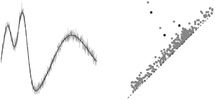
On the left, functions f and g, shown in black and grey, respectively. On the right, their persistence diagrams: the f-diagram consists of stars and the g-diagram consists of dots. The optimal bijection between Dgm0(g) and Dgm0(f) matches the three high-persistence star-classes together, and it matches the extra low-persistence dot-classes to the black diagonal.
There are several sensible metrics on the set of all persistence diagrams, but all of them see these diagrams as being close to one another. For example, let D and D′ be two diagrams and choose a number p ∈ [1, ∞). For each bijection ϕ : D → D′, define its cost to be
Such bijections always exist, due to the infinite multiplicity of every diagonal dot in each diagram. The pth Wasserstein distance Wp(D, D′) between the two diagrams is the infimum cost Cp(ϕ) as ϕ ranges over all possible bijections. Many technical results [Cohen-Steiner et al. (2010) give the most complete results] all basically say that, under mild conditions, Wp(Dgm0(f), Dgm0(g)) ≤ K‖f − g‖∞.
4.2. Thickening and loops
We now describe one-dimensional persistence diagrams. Let 𝕐 be a compact subset of some Euclidean space ℝD. For each non-negative α ∈ ℝ, define 𝕐α to be the set of points in ℝD whose distance from 𝕐 is at most α. As α increases, loops appear and then subsequently fill in. The birth and death times of these loops are plotted as dots in the plane, and the multiset of all such dots forms the one-dimensional persistence diagram Dgm1(𝕐).
4.2.1. Example
Suppose that 𝕐 is the point cloud shown on the left of Figure 9. Each 𝕐α is the union of closed balls of radius α centered at the points of 𝕐; one such thickening is depicted in the middle of the same figure. The persistence diagram Dgm1(𝕐) is on the right.
Fig. 9.

Point cloud to persistence diagram.
To explain the diagram, pretend that 𝕐 has been sampled from an underlying space suggested by the point cloud. The two dots of highest persistence correspond to the two larger loops; the one with later birth time corresponds to the leftmost loop, which reflects the sparser density of sampling there. The smaller loops are indicated by the two dots of next highest persistence. Finally, the group of dots that sit almost on the diagonal are caused by little loops that quickly come and go as the points thicken, as the result of holes between small, increasingly overlapping convex sets. Dots like these would appear no matter what shape underlies the point cloud.
4.2.2. Stability
As with connected components, these loop diagrams are stable with respect to perturbations of the input, in the following sense. The Hausdorff distance dH(𝕐, 𝕐′) between two compact sets is the smallest ε such that and 𝕐′ ⊆ 𝕐ε. The stability results referred to above imply that Wp(Dgm1(𝕐), Dgm1(𝕐′)) ≤ K · dH(𝕐, 𝕐′). A powerful consequence of this result arises when 𝕐′ is a small but dense subsampling of 𝕐: stability ensures that the persistence diagram Dgm1(𝕐) can be well approximated by the diagram derived from the subsample, a fact we apply in our analysis of brain artery trees.
4.3. From trees to diagrams
The trees under study here can be found in the supplementary material [Pieloch et al. (2016)]. More precisely, each tree is represented as a MATLAB .mat file that gives the (x, y, z)-coordinates of each vertex and the adjacency matrix. The files contain other data, such as branch thickness, but that additional information is not used in our topological analysis. Pipelines for running all of the analyses on the persistence diagrams can be found at the same link.
For persistence via connected components, our function h on each tree T is height: the value h(v) at each vertex v = (x, y, z) is its third coordinate z, and on each edge (u, v) the value is h(u, v) = max{h(u), h(v)}. We computed Dgm0(h) as in Section 4.1, with a simple and fast union-find algorithm, running in O(N log N)—a few seconds per tree—where N is the number of vertices of T. We computed Dgm0(h) as in Section 4.1, with a simple and fast union-find algorithm, running in O(N log N) time (a few seconds per tree), where N is the number of vertices of T. To compute the one-dimensional diagram from the original tree is much harder. Fortunately, one-dimensional persistence for a thickening point cloud behaves well under subsampling (see Section 4.2.2), so one-dimensional persistence on a sampled tree with 3000 nodes took roughly one minute.
The running time for one-dimensional persistence is much slower, so we did not compute the full-resolution persistence diagrams Dgm1(T) associated to the thickening of each tree T within the brain. Instead, we subsampled each tree branch to produce a set of 3000 total vertices per tree; each diagram then took a bit less than a minute to compute. In contrast, each tree in the original data set has on the order of 105 vertices, spread among roughly 200–300 tree branches. The stability theorem for persistent homology provides theoretical guarantees for our subsampling procedure.
Figure 10 shows the results of this analysis on the brain tree of a 24-year-old subject: from left to right are the brain tree, the 0-dimensional diagram and the 1-dimensional diagram. Compare this to Figure 11, which shows a 68-year-old subject. Some qualitative differences might be noticed from these two diagrams, but to give them any quantitative backing requires actual statistical analysis of the diagram population, which we describe in the next section.
Fig. 10.

Persistent homology data objects from a 24-year-old. Left: brain tree. Middle: zero-dimensional diagram. Right: one-dimensional diagram.
Fig. 11.

Persistent homology data objects from a 68-year old. Left: brain tree. Middle: zero-dimensional diagram. Right: one-dimensional diagram.
5. Detailed analysis of brain artery data
The methods in prior sections generate persistence diagrams to summarize brain artery trees. From there, statistical analysis can proceed either with further summarization or without. As the analysis in Section 3 shows, vector-based summaries can capture substantial structure while maintaining the possibility to apply the full range of standard statistical analyses. This section describes our approach in more detail and then examines the effect of changes in feature selection.
Our admittedly ad hoc method to turn diagrams into feature vectors is justified somewhat by the nature of the geometry it is intended to capture, but also by the excellent age and sex effects it reveals. Other approaches to the same problem include analyzing the diagram as an image, as in Bendich et al. (2014), or basing features on more sophisticated algebraic geometry, as advocated in Adcock, Carlsson and Carlsson (2013).
We settled on vector-based analyses as a middle ground. In general, simple numerical summaries, such as total persistence or total number of dots, miss too much useful information to be potent. At the opposite extreme, it is possible to work directly with populations of persistence diagrams, basing the analysis on metrics such as the Wasserstein metric Wp in Section 4.1.3. For example, Gamble and Heo (2010) found interesting structure using multidimensional scaling with a Wp-dissimilarity matrix computed from a set of persistence diagrams, each one associated with a set of landmarks on a single tooth. One could go further, using methods such as the Fréchet mean approach of Mileyko, Mukherjee and Harer (2011) or Munch et al. (2015) to find the center of the data followed by multidimensional scaling to analyze variation about the mean. We opted not to go that route because computation of the Wp-metric is generally expensive.
Two other possibilities, which we have not yet investigated, would be to use Bubenik's theory of persistence landscapes [Bubenik (2015)] to translate the problem into one of functional data analysis or to experiment with recently developed kernel methods for persistence diagrams by Reininghaus et al. (2015).
Initial approach
For each of the n = 98 zero-dimensional persistence diagrams, we computed the persistence of each dot; recall a dot has coordinates (b, d), where b is birth and d is death, and that its persistence is d − b. We then sorted these persistences in descending order and picked the first 100 to produce a vector (p1, p2, …, p100) for each brain. In other words, the ith coordinate of this vector represents the size of the ith largest “bend” in the brain, as measured in the vertical direction. The same procedure on the one-dimensional diagrams led to the vector (q1, q2, …, q100), in which the number qj represents the size of the jth most persistent loop in the brain. Both sets of vectors were used in the age and sex analyses in Section 3.
Feature scale
Are the observed age correlations being driven more by the high persistence features or by the lower-scale ones? In addition, does restricting to the 100 most persistent dots miss useful information? To pursue these questions, we created the following sets of vectors, for each pair of positive integers n < N ≤ 200:
pn,N = (pn, …, pN) ∈ ℝN−n+1,
qn,N = (qn, …, qN) ∈ ℝN−n+1.
In this notation, the original vectors used in our analysis were p1,100 and q1,100.
Extensive analysis of this feature set led to the heat map shown in Figure 12. The horizontal and vertical axes indicate n and N, respectively, while the color at coordinates (n, N) shows the age correlation value ρ(n, N) obtained by running our analysis on the vectors pn,N. Color in the lower diagonal part of the plot codes correlation, ranging from very dark red (lowest) through hotter colors to white (highest correlation). The bottom of the color range is 0.29 and the top is 0.56, chosen to maximize use of the color scale.
Fig. 12.
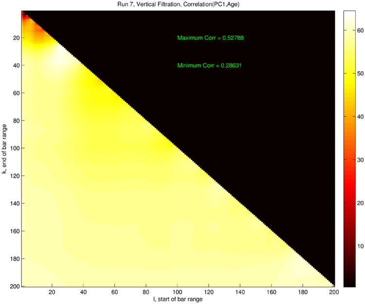
Age correlation heat map for features extracted from zero-dimensional persistent homology analysis. Color indicates the value of the function ρ(n, N), which is the age correlation derived from the vectors pn,N, with n on the horizontal axis and N on the vertical. The upper-right black triangle is meaningless, as n > N does not lead to a vector in our scheme.
Figure 12 contains a lot of useful information. First, the small red area in the upper left indicates that the highest persistence features alone had far less distinguishing power with respect to age; indeed, the two highest persistences p1 and p2 lead only to an age correlation of ρ = 0.26. On the other hand, the rest of the lower triangle shows a fairly uniform—and high—age correlation, leading to the surprising conclusion that one need only include some of the more medium-scale persistence features to obtain good age effects. In fact, the length of the 28th longest bar alone is a numerical feature that yields near-optimal correlation. The same analysis performed on the one-dimensional features produced a remarkably similar pattern, not shown here.
The medium scale at which age correlation is optimized suggests a reason why, in the initial stages of our connected component analysis (Section 4.1), we found negligible differences in the strength of correlation or significance upon filtering in various directions other than upward. Probably it is due to the stochastic nature of blood vessel formation in the brain at the relevant scale: while large features common to all human brains might have natural ventral-dorsal orientation—such might be the case for major arteries that branch from the circle of Willis and arch up to the top of the brain and back down—the medium-sized features driving the observed correlations are apparently random enough to be devoid of natural orientation, statistically speaking.
Recall from Section 3 that a permutation test on the vectors q1,100 found a significant (p = 0.031) separation between male and female subjects. One can also calculate the sex-difference significance p(n, N) obtained by running an identical analysis on the vectors qn,N. The resulting pattern is similar to the findings for age correlation, but even more stark. Analyses that use only the most persistent loops do not give clear sex separation; for example, p(1, 2) is only 0.21. On the other hand, every single value of p(n, N) with N > 30 lands below the significance level of 0.05, with the minimum value being p(189, 192) = 0.013. The heat map in Figure 13 displays all of these values at once (darker is lower, and hence more significant), and the near uniformity of the sex-difference significance is evident.
Fig. 13.
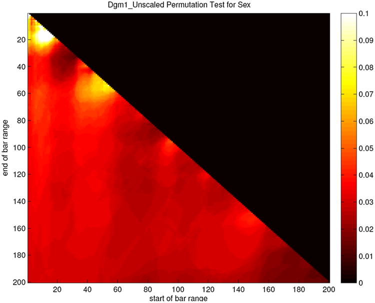
Sex-difference significance heat map for features extracted from one-dimensional persistent homology analysis. Color indicates the value of the function p(n, N), which is the significance, derived via permutation test, of the difference between the male and the female vectors qn,N, with n on the horizontal axis and N on the vertical. The upper-right black triangle is meaningless, as n > N does not lead to a vector in our scheme. To provide good contrast between the values, a color scheme running from 0.1 (white) to 0 (black) was chosen. A few values are actually above 0.1 and are simply shown as white in this scheme.
6. Discussion
This paper takes analysis of the brain artery tree data in the entirely new direction of persistent homology. This topological data analysis approach to tree representation gives stronger results than those from alternative representations used in earlier studies and is the first to find significant results even after controlling for total artery length.
The lessons here are intended to suggest the power of these tools, rather than to be anatomically conclusive, so multiple comparison issues have not been taken into account. Our aim was to emphasize the main ideas. The important issue of multiplicity should be considered carefully, and we leave it as future work. Interesting future work is to apply these powerful new methods to other data sets of tree-structured (or otherwise 1-dimensional) objects, such as the airway data set of Feragen et al. (2013).
Finally, we recall that the original data objects under consideration in this paper were not the actual sets of arteries in 98 human brains; rather, they were the outputs of 98 runs of the tube-tracking algorithm from Aydin et al. (2009). Like all algorithms that process raw data, that algorithm introduces artifacts, leading to the worry that analysis of its output data objects may be picking up more on error than on signal. In our case, this worry applies to the zero-dimensional analysis, which looks at component evolution in a given tree. In contrast, the loop analysis thickens a point sample from each tree into three-dimensional space, so the stability theorem for persistent homology ensures that replacing the given tree with a slightly modified version—even one whose connectivity properties differ from the output of the tube-tracking algorithm—does not cause great changes in the persistence diagram. An interesting new paper by Molina-Abril and Frangi (2014) uses persistent homology methods to aid in artifact-reduction in the actual “upstream” production of the artery trees. It would be valuable to run our analytical methods on these new data objects to see if significant changes result.
Acknowledgments
We thank the anonymous reviewers for their many helpful comments. Ideas for this paper arose from discussions at the Mathematical Biosciences Institute (MBI, DMS-09-31642) and the Statistical and Applied Mathematical Sciences Institute (SAMSI, DMS-11-27914). Pieloch thanks the Data+undergraduate research program, run by the Information Initiative at Duke (iiD) and the Social Science Research Institute (SSRI) for hosting him during Summer 2014. The magnetic resonance brain images from healthy volunteers used in this paper were collected and made available by the CASILab at The University of North Carolina at Chapel Hill and were distributed by the MIDAS Data Server at Kitware, Inc.
Footnotes
Supported in part by NSF Grant DMS-1001437 for Miller, by NSF Research Training Grant NSF-DMS-1045133 for Pieloch, and by NIMH Grant 2T32MH014235 for Skwerer.
Supplementary Material: Supplement to “Persistent homology analysis of brain artery trees” (DOI: 10.1214/15-AOAS886SUPP; .zip). This archive contains brain tree data, persistence diagrams and statistical analysis pipeline for the paper.
Contributor Information
Paul Bendich, Department of Mathematics, Duke University, Durham, North Carolina 27708, USA.
J. S. Marron, Department of Statistics and Operations Research, University of North Carolina, Chapel Hill, North Carolina 27599, USA.
Ezra Miller, Department of Mathematics, Duke University, Durham, North Carolina 27708, USA.
Alex Pieloch, Department of Mathematics, Duke University, Durham, North Carolina 27708, USA.
Sean Skwerer, Email: sean.skwerer@yale.edu, Department of Biostatistics, Yale School of Public Health, New Haven, Connecticut 06510, USA.
References
- Adcock A, Carlsson E, Carlsson G. The ring of algebraic functions on persistence bar codes. 2013 2013. Available at arXiv:1304.0530. [Google Scholar]
- Aydin B, Pataki G, Wang H, Bullitt E, Marron JS. A principal component analysis for trees. Ann Appl Stat. 2009;3:1597–1615. MR2752149. [Google Scholar]
- Aylward S, Bullitt E. Initialization, noise, singularities, and scale in height ridge traversal for tubular object centerline extraction. IEEE Trans Med Imag. 2002;21:61–75. doi: 10.1109/42.993126. [DOI] [PubMed] [Google Scholar]
- Barden D, Le H, Owen M. Central limit theorems for Fréchet means in the space of phylogenetic trees. Electron J Probab. 2013;18(25):25. MR3035753. [Google Scholar]
- Barden D, Le H, Owen M. Limiting behaviour of Fréchet means in the space of phylogenetic trees. 2014 Preprint. Available at arXiv:1409.7602v1. [Google Scholar]
- Bendich P, Chin S, Clarke J, deSena J, Harer J, Munch E, Newman A, Porter D, Rouse D, Strawn N, Watkins A. Topological and statistical behavior classifiers for tracking applications. 2014 Preprint. Available at arXiv:1406.0214. [Google Scholar]
- Billera LJ, Holmes SP, Vogtmann K. Geometry of the space of phylogenetic trees. Adv in Appl Math. 2001;27:733–767. MR1867931. [Google Scholar]
- Bubenik P. Statistical topological data analysis using persistence landscapes. J Mach Learn Res. 2015;16:77–102. MR3317230. [Google Scholar]
- Bullitt E, Zeng D, Mortamet B, Ghosh A, Aylward SR, Lin W, Marks BL, Smith K. The effects of healthy aging on intracerebral blood vessels visualized by magnetic resonance angiography. Neurobiol Aging. 2010;31:290–300. doi: 10.1016/j.neurobiolaging.2008.03.022. [DOI] [PMC free article] [PubMed] [Google Scholar]
- Carlsson G. Topology and data. Bull Amer Math Soc (N S) 2009;46:255–308. MR2476414. [Google Scholar]
- Chazal F, Cohen-Steiner D, Glisse M, Guibas LJ, Oudot S. Proc of the 25th Ann ACM Symp on Comput Geom. ACM; New York: 2009. Proximity of persistence modules and their diagrams; pp. 237–246. [Google Scholar]
- Cohen-Steiner D, Edelsbrunner H, Harer J. Stability of persistence diagrams. Discrete Comput Geom. 2007;37:103–120. MR2279866. [Google Scholar]
- Cohen-Steiner D, Edelsbrunner H, Harer J, Mileyko Y. Lipschitz functions have Lp-stable persistence. Found Comput Math. 2010;10:127–139. MR2594441. [Google Scholar]
- Edelsbrunner H, Harer JL. Amer Math Soc. Providence, RI: 2010. Computational Topology: An Introduction. MR2572029. [Google Scholar]
- Feragen A, Lauze F, Lo P, deBruijne M, Nielson M. Computer Vision—ACCV 2010 Lecture Notes in Computer Science. Vol. 6493. Springer; Berlin: 2011. Geometries on spaces of treelike shapes; pp. 160–173. [Google Scholar]
- Feragen A, Lo P, deBruijne M, Nielson M, Lauze F. Toward a theory of statistical tree-shape analysis. IEEE Trans Pattern Anal Mach Intell. 2013;35:2008–2021. doi: 10.1109/tpami.2012.265. [DOI] [PubMed] [Google Scholar]
- Gamble J, Heo G. Exploring uses of persistent homology for statistical analysis of landmark-based shape data. J Multivariate Anal. 2010;101:2184–2199. MR2671209. [Google Scholar]
- Harris TE. First passage and recurrence distributions. Trans Amer Math Soc. 1952;73:471–486. MR0052057. [Google Scholar]
- Holmes SP. Phylogenies: An overview. IMA Vol Math Appl. 1999;112:81–118. [Google Scholar]
- Hotz T, Huckemann S, Le H, Marron JS, Mattingly JC, Miller E, Nolen J, Owen M, Patrangenaru V, Skwerer S. Sticky central limit theorems on open books. Ann Appl Probab. 2013;23:2238–2258. MR3127934. [Google Scholar]
- Inselberg A. Proc of the IEEE Symp on Information Visualization. IEEE Xplore Online Library; 1997. Multidimensional detective; pp. 100–107. [Google Scholar]
- Joliffe I. Principal Component Analysis. Wiley Online Library; 2005. [Google Scholar]
- Mileyko Y, Mukherjee S, Harer J. Probability measures on the space of persistence diagrams. Inverse Probl. 2011;2722:124007. MR2854323. [Google Scholar]
- Molina-Abril H, Frangi AF. Topo-geometric filtration scheme for geometric active contours and level sets: Application to cerebrovascular segmentation. Medical Image Computing and Computer-Assisted Intervention Lec Notes in Computer Science. 2014;8673:755–762. doi: 10.1007/978-3-319-10404-1_94. [DOI] [PubMed] [Google Scholar]
- Munch E, Turner K, Bendich P, Mukherjee S, Mattingly J, Harer J. Probabilistic Fréchet means for time varying persistence diagrams. Electron J Stat. 2015;9:1173–1204. MR3354335. [Google Scholar]
- Nye TMW. Principal components analysis in the space of phylogenetic trees. Ann Statist. 2011;39:2716–2739. MR2906884. [Google Scholar]
- Pieloch A, Marron JS, Skwerer S, Bendich P. Supplement to “Persistent homology analysis of brain artery trees”. 2016 doi: 10.1214/15-AOAS886SUPP. [DOI] [PMC free article] [PubMed] [Google Scholar]
- Ramsay JO. Functional Data Analysis. Wiley Online Library; 2006. [Google Scholar]
- Ramsay JO, Silverman BW. Applied Functional Data Analysis: Methods and Case Studies. Springer; New York: 2002. MR1910407. [Google Scholar]
- Reininghaus J, Huber S, Bauer U, Kwitt R. A stable multi-scale kernel for topological machine learning. Proc IEEE Conf on Computer Vision and Pattern Recognition. 2015:4741–4748. [Google Scholar]
- Shen D, Shen H, Bhamidi S, Muñoz Maldonado Y, Kim Y, Marron JS. Functional data analysis of tree data objects. J Comput Graph Statist. 2014;23:418–438. doi: 10.1080/10618600.2013.786943. MR3215818. [DOI] [PMC free article] [PubMed] [Google Scholar]
- Skwerer S, Bullitt E, Huckemann S, Miller E, Oguz I, Owen M, Patrangenaru V, Provan S, Marron JS. Tree-oriented analysis of brain artery structure. J Math Imaging Vision. 2014;50:126–143. MR3233139. [Google Scholar]
- Wang H, Marron JS. Object oriented data analysis: Sets of trees. Ann Statist. 2007;35:1849–1873. MR2363955. [Google Scholar]
- Wang Y, Marron JS, Aydin B, Ladha A, Bullitt E, Wang H. A non-parametric regression model with tree-structured response. J Amer Statist Assoc. 2012;107:1272–1285. MR3036394. [Google Scholar]
- Wei S, Lee C, Wichers L, Li G, Marron JS. Direction-projection-permutation for high dimensional hypothesis tests. J Comput Graph Statist. 2015 To appear. [Google Scholar]
- Wright SN, Kochunov P, Mut F, Bergamino M, Brown KM, Mazziotta JC, Toga AW, Cebral JR, Ascoli GA. Digital reconstruction and morphometric analysis of human brain arterial vasculature from magnetic resonance angiography. Neuroimage. 2013;15:170–181. doi: 10.1016/j.neuroimage.2013.05.089. [DOI] [PMC free article] [PubMed] [Google Scholar]