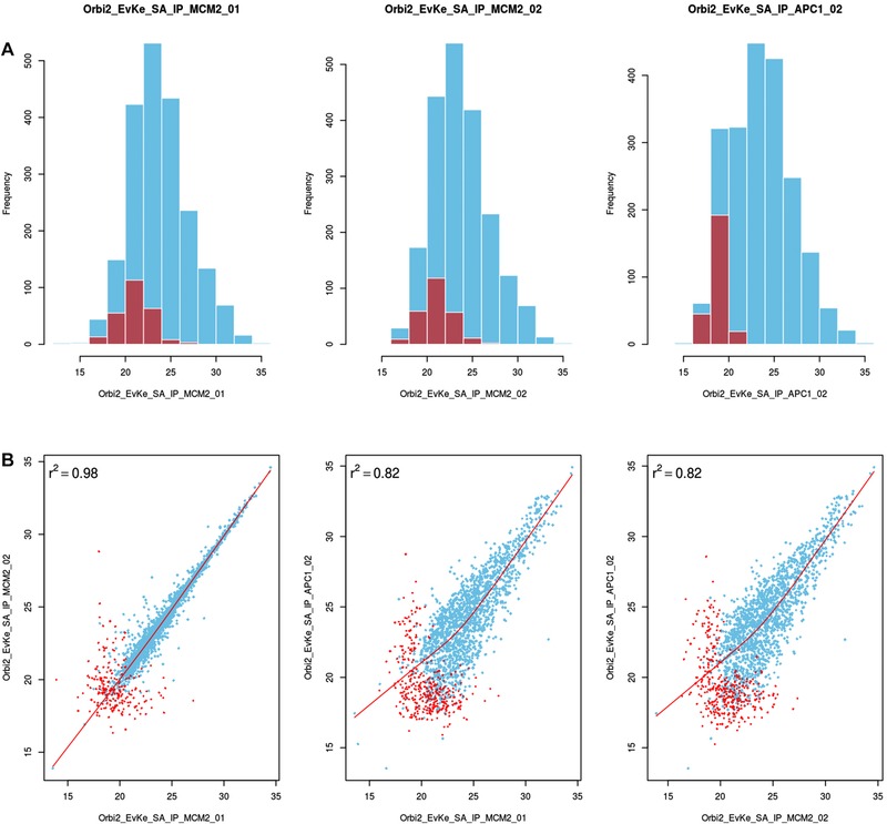
Figure 2.

QC plot using a dataset from budding yeast study (sample data in msVolcano) 14 (A) top row displaying the distribution of the raw values (LFQ intensites ‐ in blue) overlaid with the distribution of imputed values (in red) per LFQ column selected. For contrast, comparisons are done between unrelated sample replicates, which immediately become apparent in these plots and will also help the user to catch possible errors or sample mix‐ups. (B) 2×2 scatter plots between the chosen LFQ columns with local regression (lowess) displayed as a red line with Pearson's correlations coefficient. For the visual aestheticity, the number of scatter plots are restricted to the number of histograms displayed above them.
