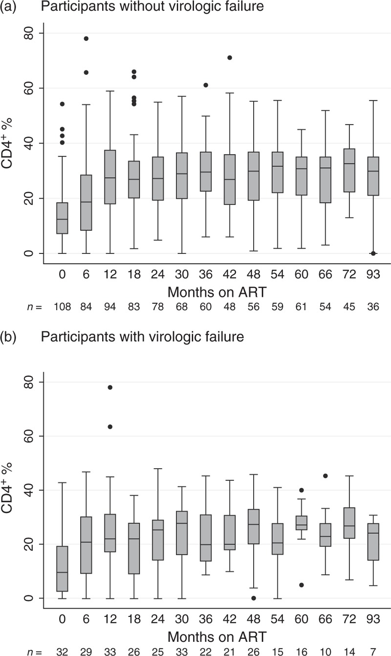
Fig. 2.
CD4+ T-cell percentage recovery among the 213 children analysed within this study.

The horizontal line within each box represents the median CD4+ cell percentage, the top and bottom of the box mark the 75th and the 25th percentiles, respectively. The upper and lower bound of the whiskers represent the largest and lowest values within the 75th percentile + 1.5 × IQR and the 25th percentile − 1.5 × IQR, respectively. Data points beyond these intervals are shown as filled circles and represent outliers. (a) All participants with virologic success are represented in the plot, showing a stable CD4+ percentage recovery after ART initiation. (b) Participants with virologic failure are illustrated within this plot, showing an initial CD4+ percentage recovery, which is less stable than the one from patients without virologic failure, though. The time on ART always includes the interval from the previous month up to the one indicated below the axis (e.g. 6≥ 0 and ≤6). ART, antiretroviral therapy.
