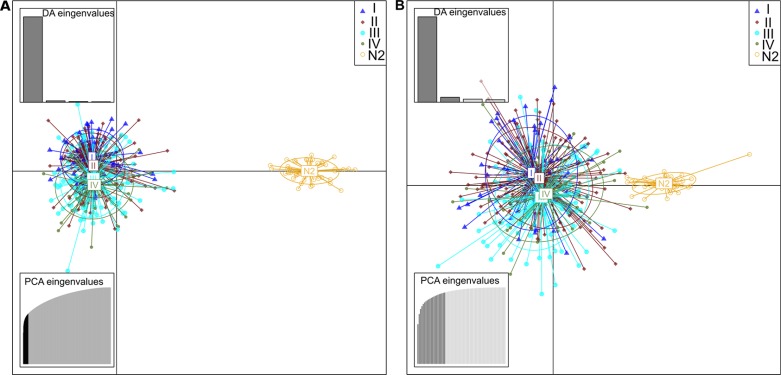
Figure 5. Scatterplots resulted from DAPC analysis of TCGA data.
These scatterplots show the first two principal components of the DAPC of data simulated according to hierarchical islands model. Clusters are shown by different colours and ellipses, while dots represent individual samples–N2 represent normal samples from affected individuals, and the groups I to IV are the corresponding I–IV stage CRC samples. The chart A is referring to DM CpG that emerged from previous analysis of N1xCRC datasets and the chart B were performed with CpGs related to the CRC networks DMH.

