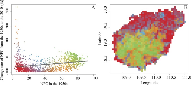
Figure 5. The site-specific relationships between NFC and its change rate (A), and the distribution pattern of change rate (B) from the 1950s to the 2010s.
Green represents high NFC (≥60%) in the 1950s and had NFC increased from the 1950s to the 2010s; Red represents low NFC (≤20%) in the 1950s and had NFC decreased from the 1950s to the 2010s.

