
Figure 1. Distribution of Cytokine Responses in Normal and Low Responders.
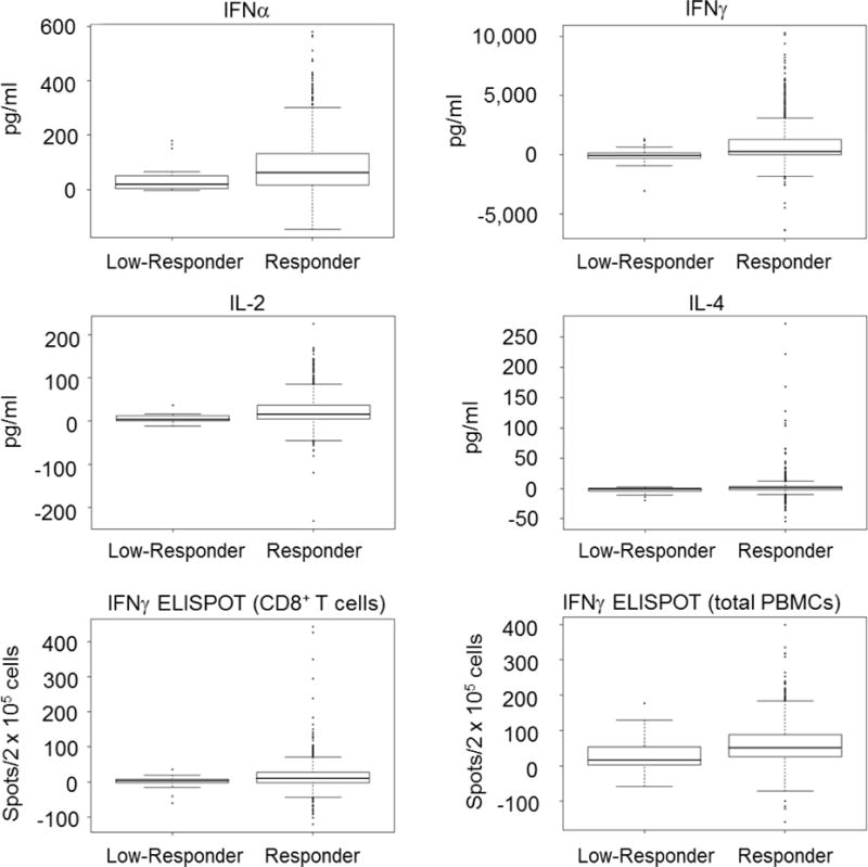
Box plots show secretion levels (in pg/ml) for the indicated cytokines. The thick horizontal bar inside the box represents the median level of cytokine secretion, the lower and upper limits of the box define the 25th and 75th percentile, respectively. The whiskers extending from the plots represent 1.5X the interquartile ranges with black dots representing data points outside of the 1.5X IQR limit. The bottom two panels show ELISPOT results (spot forming units per 2 × 10⁵ cells) for both CD8+ T cells and total PBMCs.