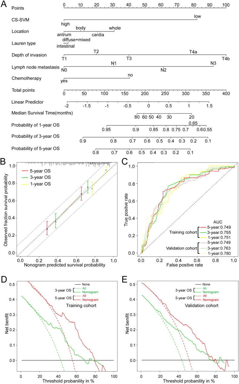
Fig. 6.
Nomogram to predict 1-, 3- and 5-year survival probability in gastric cancer. (A) Nomogram for predicting proportion of GC patients with OS after surgery. (B) Plots depict the calibration of each model in terms of agreement between predicted and observed outcomes. Model performance is shown by the plot, relative to the 45-degree line, which represents perfect prediction. All predictions lie within a 7.5% margin of error (within the dashed line). (C) Time-dependent ROC curves by nomogram for 1-, 3- and 5-year OS probability in the training cohort and validation cohort. (D) (E) Decision curve analysis for the nomogram. The y-axis measures the net benefit. The red and blue solid line represents the nomogram for 3, 5-year OS. The dotted line represents the assumption that all patients have 3, 5-year OS. Thin black line represents the assumption that no patients have 3, 5-year OS. The net benefit was calculated by subtracting the proportion of all patients who are false positive from the proportion who are true positive, weighting by the relative harm of forgoing treatment compared with the negative consequences of an unnecessary treatment.(Vickers et al., 2008) Here, the relative harm was calculated by (pt/[1 - pt]). “pt” (threshold probability) is where the expected benefit of treatment is equal to the expected benefit of avoiding treatment; at which time a patient will opt for treatment informs us of how a patient weighs the relative harms of false-positive results and false-negative results ([a–c]/[b–d] = [1 - pt]/pt); a - c is the harm from a false-negative result; b–d is the harm from a false-positive result. a, b, c and d give, respectively, the value of true positive, false positive, false negative, and true negative.(Vickers et al., 2008).

