Abstract
In diffusion tensor imaging, structural connectivity between brain regions is often measured by the number of white matter fiber tracts connecting them. Other features such as the length of tracts or fractional anisotropy (FA) are also used in measuring the strength of connectivity. In this study, we investigated the effects of incorporating the number of tracts, the tract length, and FA values into the connectivity model. Using various node-degree-based graph theory features, the three connectivity models are compared. The methods are applied in characterizing structural networks between normal controls and maltreated children, who experienced maltreatment while living in postinstitutional settings before being adopted by families in the United States.
Keywords: : brain connectivity, diffusion tensor imaging, electrical circuits, maltreated children, meta analysis, node degree
Introduction
Diffusion tensor imaging (DTI) is a noninvasive imaging modality that is often used to characterize the microstructure of biological tissues by using magnitude, anisotropy, and anisotropic orientation associated with diffusion (Basser et al., 1994). It is assumed that the direction of greatest diffusivity is most likely aligned to the local orientation of the white matter fibers. Traditionally, scalar measures such as fractional anisotropy (FA) and mean diffusivity obtained from DTI have been used for quantifying clinical populations at the voxel level (Barnea-Goraly et al., 2004; Basser and Pierpaoli, 1996; Daianu et al., 2013; Jones et al., 2006; Roberts et al., 2005; Smith et al., 2006). Various tractography methods have been developed to visualize and map out major white matter pathways in individuals and brain atlases (Basser et al., 2000; Catani et al., 2002; Conturo et al., 1999; Lazar et al., 2003; Mori et al., 1999, 2002; Thottakara et al., 2006; Yushkevich et al., 2007). The tractography can yield additional connectivity metrics that describe the localized variations in connectivity strength as a form of network graphs. The tractography-based whole brain network analysis has shown considerable promise in quantifying neural pathways in various populations (Daianu et al., 2013).
The strength of connection from one gray matter region to another is often measured by counting the number of fiber tracts connecting the two regions in predefined parcellations (Daianu et al., 2013; Gong et al., 2009). A problem with the simple tract counting approach might be the neglect of both the distance between the regions and FA values. There have been few modifications and variations to the simple tract counting method in the literature. Skudlarski and colleagues (2008) used a weighting scheme that penalizes indirect longer connections. The connectivity between two parcellations is given by tract counts that are normalized by the volumes of regions of interest (ROI) (Van Den Heuvel and Sporns, 2011). Kim and colleagues (2015) and Van Den Heuvel and Sporns (2011) used the mean FA values along the tracts as the measure of connectivity. However, it is unclear whether there is an optimal connectivity measure, or whether different approaches meaningfully impact results.
In this study, connectivity methods based on tract count, length, and FA values are compared. The tract length and its FA-value-based methods are using an electrical circuit model as an analogy, where the strength of connection corresponds to the resistance of the circuit. Although electrical circuit models were never used for modeling brain networks at the macroscopic level except by Chung and colleagues (2012), they were often used in a wide variety of mostly biological networks that are not related to any electrical circuit. Starting with Doyle and Snell (1984), numerous studies formulated graphs and networks as electrical circuits (Chandra et al., 1996; Tetali, 1991). Segev and colleagues (1985) used an electrical circuit model to model the electrical behavior of neurons. Electrical resistance models are also used in genetic networks (Leiserson et al.; Suthram et al., 2008). In particular, Yeger-Lotem and colleagues (2009) and Basha and colleagues (2013) formulated a minimum-cost network flow in genetic networks, which is related to electrical resistance.
For comparisons between the three methods, graph theoretical features based on node degree is investigated. The node degree, which counts the number of connections at a node, is probably the most fundamental graph theoretic feature used in network analysis. The node degree is used directly and indirectly, defining many other graph theoretic features (Bullmore and Sporns, 2009; Fornito et al., 2016). The node degree and its probability distribution will be investigated in detail. To complement the comparisons, the strength of connectivity will also be contrasted by comparing two different samples: normal controls (NCs) and maltreated children, who experienced severe early life stress and maltreatment.
Early and severe childhood stress, such as experiences of abuse and neglect, have been associated with a range of cognitive deficits (Loman et al., 2010; Pollak, 2008; Sanchez and Pollak, 2009) and structural abnormalities (Gorka et al., 2014; Hanson et al., 2012, 2013; Jackowski et al., 2009) years after the stressors. However, little is known about the underlying biological mechanisms leading to cognitive problems in these children (Pollak et al., 2010). Four studies have reported alterations in prefrontal white matter in children exposed to early stress (De Bellis et al., 2002; Hanson et al., 2012, 2013; Hanson et al., 2015). Other studies have suggested that early stress may cause larger hippocampal white matter volume (Tupler and De Bellis, 2006) or smaller cerebellar volume (Bauer et al., 2009). The extant literature has been based on ROI-based volumetry or univariate vowel-wise morphometric techniques to characterize anatomical differences between groups. Network approaches may allow for a richer and fuller characterization of specific neural circuits, facilitating a greater understanding of brain and behavioral alterations after child maltreatment. In this study, we describe three network analysis frameworks and demonstrate the potential utility by applying them to DTI comparisons of children exposed to early life stress and maltreatment.
Methods
Subjects
The study consisted of 23 children who experienced documented maltreatment early in their lives, and 31 age-matched NC subjects. All the children were recruited and screened at the University of Wisconsin-Madison. The maltreated children were raised in institutional settings, where the quality of care has been documented as falling well below the standard necessary for healthy human development. For the controls, we selected children without a history of maltreatment from families with similar current socioeconomic statuses. The exclusion criteria included, among many others, abnormal IQ(<78), congenital abnormalities (e.g., Down syndrome or cerebral palsy), and fetal alcohol syndrome. The average age for maltreated children was  years whereas that of controls was
  years. This particular age range was selected since this development period is characterized by major regressive and progressive brain changes (Hanson et al., 2013; Lenroot and Giedd, 2006). There were 10 boys and 13 girls in the maltreated group and 18 boys and 13 girls in the control group. Groups did not differ on age, pubertal stage, sex, or socioeconomic status (Hanson et al., 2013). The average amount of time spent by children in institutional care was
  , with a range from 3 months to 5.4 years. Children were on average
  when they were adopted, with a range of 3 months to 7.7 years. Table 1 summarizes the participant characteristics. Additional details about the recruitment strategy and participant characteristics can be found in Hanson and colleagues (2013).
Table 1.
Study Participant Characteristics
| Maltreated | Normal controls | Combined | |
|---|---|---|---|
| Sample size | 23 | 31 | 54 |
| Sex (males) | 10 | 18 | |
| Age (years) | 11.26 ± 1.71 | 11.58 ± 1.61 | |
| Duration (years of institutionalization) | 2.5 ± 1.4 (0.25 to 5.4) | ||
| Time of adoption (years) | 3.2 ± 1.9 (0.25 to 7.7) |
Preprocessing
DTI was collected on a 3T General Electric SIGNA scanner (Waukesha, WI) by using a cardiac-gated, diffusion-weighted, spin-echo, single-shot, EPI pulse sequence. Diffusion tensor encoding was achieved by using 12 optimum noncollinear encoding directions with a diffusion weighting of 1114 s/mm2 and a non-DW T2-weighted reference image. Other imaging parameters were TE = 78.2 ms, three averages (NEX: magnitude averaging), and an image acquisition matrix of  over a field of view of
  mm2. The details on other image acquisition parameters are given in Hanson and colleagues (2013). The acquired voxel size of 2 × 2 × 3 mm was interpolated to 0.9375 mm isotropic dimensions in-plane on the scanner during the image reconstruction by using the zero-filled interpolation. This is a loss-less interpolation, and there is no added blurring. The scanner setting was used in our previous studies (Chung et al., 2015; Hanson et al., 2013). To minimize field inhomogeneity and image artifacts, high-order shimming and fieldmap images were collected by using a pair of non-EPI gradient echo images at two echo times: TE1 = 8 ms and TE2 = 11 ms.
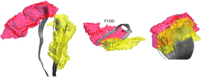
DTI processing follows the pipeline established in the previous DTI studies (Hanson et al., 2013; Kim et al., 2015). DTI was corrected for eddy current-related distortion and head motion via FSL software (www.fmrib.ox.ac.uk/fsl), and distortions from field inhomogeneities were corrected by using custom software based on the method given in Jezzard and Clare (1999) before performing a nonlinear tensor estimation using CAMINO (Cook et al., 2006). Spatial normalization of DTI data was done by using a diffeomorphic registration strategy (Joshi et al., 2004; Zhang et al., 2007) DTI-ToolKit (DTI-TK; www.nitrc.org/projects/dtitk). A population-specific tensor template was constructed. FA was calculated for diffusion tensor volumes diffeomorphically registered to the study-specific template. Tractography was done in the normalized space by using the TEND algorithm and warped into the study template (Lazar et al., 2003). We used Anatomical Automatic Labeling (AAL) with 116 parcellations (Tzourio-Mazoyer et al., 2002) (Fig. 1). The AAL atlas was warped to the study template via the diffeomorphic image registration. The two end points of fiber tracts are identified with respect to 116 parcellations, and the tract lengths are computed. Any tracts that do not pass through two given parcellations are removed. Tracts passing through only one parcellation are also removed.
FIG. 1.
White matter fiber tracts connecting two regions in Anatomical Automatic Labeling (AAL) with 116 parcellations. The labels for parcellations are FAG (left precentral), FAD (right precentral), F1OF (left frontal mid orbital), F1OG (right frontal mid orbital), SMAG (left superior motor area), and SMAD (right superior motor area).
Structural connectivity matrices
To have a more integrative method for dealing with tract counts and lengths, we start with the arithmetic and harmonic means. Given measurements  , their arithmetic mean
  is given by the usual sample mean, that is,
 |
The tract count and its mean are based on the arithmetic addition. The harmonic mean  of
of  is given by
 |
The harmonic mean is given by the reciprocal of the arithmetic mean of reciprocal of measurements:
 |
The harmonic mean has been mainly used in measuring the rates of a physical system, such as the speed of a car (Zhang et al., 1999), resistance of electrical circuits (Chung, 2012). Beyond physical systems, it has been used in k-means clustering (Zhang et al., 1999), where the harmonic k-mean is used instead of the usual arithmetic mean. The harmonic mean has been also used in the integrated likelihood for the Bayesian model selection problem (Raftery et al., 2006). Whenever we deal with rates and ratio-based measures such as resistance, the harmonic mean provides a more robust and accurate average compared with the arithmetic mean and is often used in various branches of sciences. The use of harmonic means can naturally incorporate the length of tracts in connectivity.
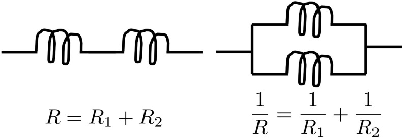
Motivated by Doyle and Snell (1984), the DTI brain network can be analogously modeled as an electrical system consisting of series and parallel circuits (Fig. 2). Each fiber tract may be viewed as a single wire with resistance R that is proportional to the length of the wire. If two regions are connected through an intermediate region, they form a series circuit. In the series circuit, the total resistance R is additive, so we have
 |
FIG. 2.
Left: series circuit. Right: parallel circuit.
where Rk is the resistance of the k-th tract. If multiple fiber tracts connect two regions, they form a parallel circuit, where the total resistance is
 |
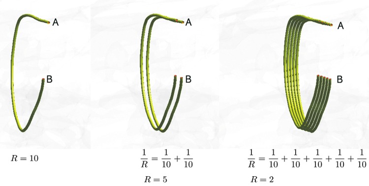
The total resistance of a series circuit is related to the arithmetic mean of tract lengths. On the other hand, the total resistance (1) of a parallel circuit is related to the harmonic mean. Any complex parallel circuits in an electrical system can be simplified by using a single wire with the equivalent resistance. Hence, we can simplify whole-brain fiber tracts into a smaller number of equivalent tracts in the model. The reciprocal of the resistance is then taken as the measure of connectivity. Smaller resistance corresponds to stronger connectivity. Figure 3 shows examples of parallel circuits. If all the tracts are 10 cm in length, the total resistance becomes 10, 5, and 2 as the number of tracts increases to 1, 2, and 5, respectively. The corresponding connectivities between A and B are 0.1, 0.2, and 0.5. Thus, if all the tract lengths are the same, the resistance-based connectivity is proportional to tract counts. Figure 4 shows various toy networks. The corresponding resistance matrices are given next.
FIG. 3.
Multiple fiber tracts connecting the regions A and B are modeled as a parallel circuit. The resistance in a wire is proportional to the length of the wire. As more tracts connect the regions in parallel, the resistance decreases and the strength of connection increases. In this example, we let the resistance of each tract equal the length of the tract. If all the tracts are 10 cm in length, the total resistance becomes 10, 5, and 2 as the number of tracts increases to 1, 2, and 5, respectively. The connectivity between A and B is defined as the reciprocal of resistance. The corresponding connectivities are 0.1, 0.2, and 0.5.
FIG. 4.
Toy networks with different connectivity resistance. The numbers between nodes indicate the length of tracts.

The resistance between indirectly connected nodes is  . The most redundant network has the smallest resistance. The reciprocal of the resistance is taken as the strength of connectivity.
The electronic circuit model can be used in constructing a simplified but an equivalent brain network. The two end points of tracts are identified. All the parallel tracts between any two regions are identified and replaced with a single tract with the equivalent resistance. This process completely removes all the parallel circuits. At the end, the simplified circuit forms a graph with the resistances as the edge weights.
Consider a tract  consisting of n control points
  that are obtained through tractography algorithms. Consider an inverse map
  that maps the control point pj onto the unit interval as
 |
where  is the Euclidean distance. This is the ratio of the arc length from the point p1 to pj, to p1 to pn. We let this ratio be tj. We assume
  . The ordering of the control points is also required in obtaining smooth one-to-one mapping. We parameterize the tract on a unit interval:
 |
Then, the total length  of the tract
  is given by
 |
and discretely approximated as
 |
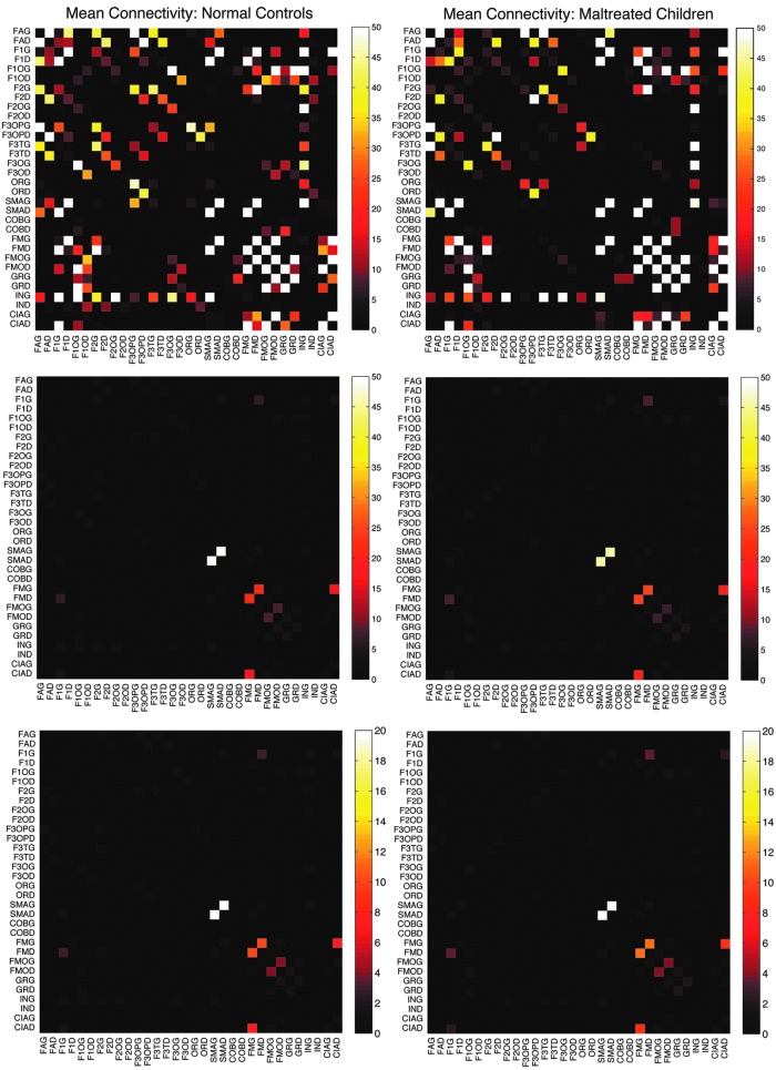
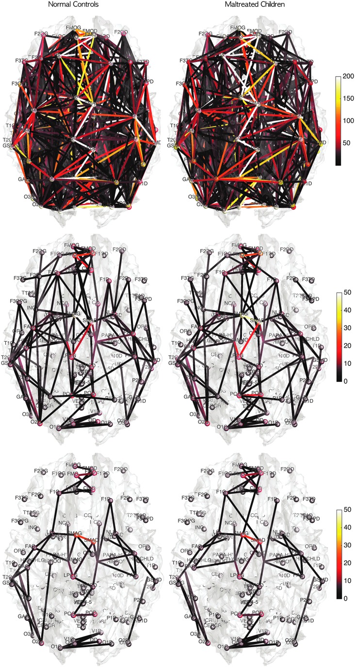
The connectivity matrices are subsequently determined by computing the resistance between parcellations (Fig. 5-middle). We took the reciprocal of the resistance between the nodes as entries of the connectivity matrix. Smaller resistance corresponds to stronger connection. The method replaces a collection of parallel circuits with a single equivalent circuit. This process completely removes all the parallel circuits and simplifies the complex parallel circuits into a simple circuit. The simplified circuit naturally forms a three-dimensional graph with the resistances as the edge weights. Figure 6-middle shows the mean connectivities by using the graph representation.
FIG. 5.
Top: mean connectivity matrices for first 32 nodes for normal controls (left) and maltreated children (right) using tract counts. Middle: the proposed electrical resistance-based connectivity matrices. Although there are connectivity differences, strong connections are consistently shown in the two populations, indicating the robust nature of the processing pipelines. The highest connectivity is shown between SMAG (left superior motor area) and SMAD (right superior motor area) in both the groups. Bottom: resistance-based mean connectivity matrices that incorporate FA values. FA, fractional anisotropy.
FIG. 6.
Mean connectivity of normal controls and maltreated children in the graph representation. The color of nodes and edges corresponds to the connectivity strength in terms of tract counts (top), electrical resistance (middle), and electrical resistance with FA values (bottom). Although there are connectivity differences, strong connections are consistently shown in all three models.
FA can be also used in constructing the connectivity matrix. FA may provide additional structural information that the tractography alone may not provide. Note that most parcellations are located in the gray matter regions, where the fiber tract starts and ends, so FA values are expected to be very low at the nodes. The mass center of each parcellation is taken as a node of the network. The mean FA value at the node positions is  . In fact, at each node position, the two-sample t-statistic did not yield any group differences at
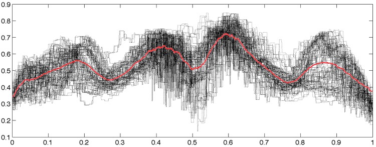
  significance. However, along the tracts, it is expected that FA values are higher and they may influence the connectivity. Figure 7 shows an example of how FA values change along 108 tracts between the left superior motor area (SMAG) and the right superior motor area (SMAD).
FIG. 7.
FA values along 108 tracts between the left superior motor area (SMAG) and the right superior motor area (SMAD) displayed in Figure 1. The tracts are reparameterized between 0 and 1 from the left to the right hemisphere. The red line is the average of FA values of all the tracts.
We incorporated FA values along the fiber tracts as follows. By identifying voxels that tracts are passing through, we were able to linearly interpolate the FA values along the tracts. If the FA value is larger at a certain part of a tract, it is more likely that the segment of the tract has been more stably estimated. Thus, the resistance of a tract segment can be modeled as inversely proportional to the FA value but proportional to the length of the segment  at the point:
 |
Note that we are using the reciprocal of the resistance as a tract connectivity metric C, that is,
 |
So heuristically, the larger the FA value, the stronger the connectivity in the tract segment. Subsequently, the total resistance R of the whole tract is defined as
 |
If the tractography processing is properly done, it is not possible to have a zero FA value along the obtained tracts, so the integral (3) is well defined. The integral (3) is discretized as
 |
In our study, the step size  is fixed at 0.1 mm. Thus,
 |
This is the weighted version of the resistance that incorporates FA values. The connectivity matrices are then similarly determined by computing the reciprocal of the weighted resistance between parcellations (Figure 5-bottom). Smaller resistance corresponds to stronger connection. The pattern of connectivity matrices is almost identical to the connectivity without FA values, although the scale and local variations differ slightly.
How tract counts and length-based connectivity are related
So far, we have presented three methods for constructing connectivity matrices in DTI. However, it is unclear as to how they are related and whether they will give consistent statistical results at the end. Suppose there are k tracts between two parcellations. Suppose all the tract lengths are identical as L. Then, the tract count-based connectivity gives the connectivity strength k. The length-based connectivity gives the connectivity strength  . Under the ideal situation of the same tract length, the tract length-based connectivity is proportional to the tract count-based connectivity. For the incorporation of FA values to the connectivity, if we assume the identical FA values along the tract, we have
  as connectivity. All three methods are proportional to each other. Thus, in the ideal situation of the same tract length and FA values, the final statistical analyses for three methods would be identical since most statistical test procedures are scale invariant.
The difference arises in practice where the tract lengths are all different. This is a difficult problem that we cannot theoretically address. To begin to deal with this issue, we checked the robustness of the tract length-based method in relation to the tract count method. To determine the robustness of the tract length-based metric, we calculated the relative error in comparison to traditional tract count-based connectivity in the tract mislabeling problem.
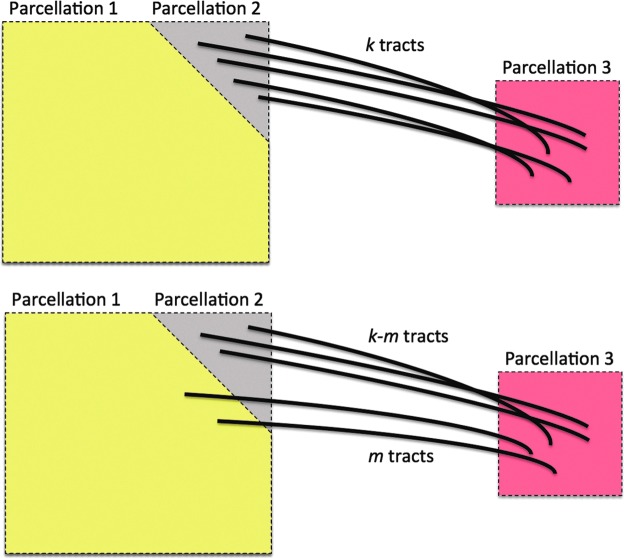
Figure 8 shows a schematic of a possible tract mislabeling problem. Assume k number of tracts are passing through between parcellations 2 and 3 (top). In the traditional connectivity metric, tract count is used as the strength of connectivity. So, the expected connectivity is  . However, m number of tracts might be mislabeled to pass through parcellations 1 and 3 (bottom). So, the observed connectivity is given by
  . The relative error in the tract count-based connectivity is then
  . Let us determine the relative error for the tract length-based connectivity metric.
FIG. 8.
Schematic showing a possible tract mislabeling problem. k number of tracts are expected to pass through between parcellations 2 and 3 (top). However, m number of tracts might be mislabeled to pass through parcellations 1 and 3 (bottom).
Suppose the i-th tract has length Li. The average tract length between the parcellations will be denoted as
 |
The resistance of the i-th tract is then given by
 |
where  measures the difference from the mean. Subsequently, the expected total resistance is given by
 |
Since  , the expected total resistance is approximately
 |
ignoring the cubic and other higher order terms. Similarly, the observed resistance for  tracts is given by
 |
Hence, the relative error of the new connectivity metric is given by
 |
The terms  and
and  are sufficiently relatively small and the relative error is approximately
  , which is the relative error in the tract count-based connectivity. Thus, we expect the error variability in the tract length-based connectivity to scale proportionally to that of the tract count-based method. So most likely, all the methods will perform similarly in testing the connectivity differences at the edge level by using the two-sample t-test since the t-test is scale invariant.
Degree distributions
So far, we have explored the issue of how to build weighted structural networks by using three DTI features: tract length, counts, and FA values. Here, we show how to apply existing, often used graph theoretical features on such networks. The graph theoretic features are too numerous to apply here. A review on other graph measures can be found in Bullmore and Sporns (2009). Probably the most often observed characteristic of the complex network is the scale-free property (Song et al., 2005). Thus, we will mainly explore whether structural brain networks also follow scale-free dynamics among others using node degrees and degree distributions (Bullmore and Sporns, 2009).
The degree distribution  , probability distribution of the number of edges k in each node, can be represented by a power law with a degree exponent
  that is usually in the range
  for diverse networks (Bullmore and Sporns, 2009; Song et al., 2005):
 |
Such networks exhibit the gradual decay of tail regions (heavy tail) and are said to be scale free. In a scale-free network, a few hub nodes hold together many nodes; whereas in a random network, there are no highly connected hub nodes. The smaller the value of  , the more important the contribution of the hubs in the network.
Few previous studies have shown that the human brain network is not scale free (Gong et al., 2009; Hagmann et al., 2008; Zalesky et al., 2010). Hagmann and colleagues (2008) reported that degree decayed exponentially, that is,
 |
where  is the rate of decay (Fornito et al., 2016). The smaller the value of
  , the more important the contribution of the hubs in the network.
Gong and colleagues (2009) and Zalesky and colleagues (2010) found that the degree decayed in a heavy-tailed manner by following an exponentially truncated power law
 |
where  is the cut-off degree at which the power law transitions to an exponential decay (Fornito et al., 2016). This is a more complicated model than the previous two models.
A direct estimation of the parameters from the empirical distribution is challenging due to the small sample size in the tail region. This is probably one of the reasons that we have conflicting results. To avoid the issue of sparse sampling in the tail region, the parameters are estimated from cumulative distribution functions (CDFs) that accumulate the probability from low to high degrees and reduce the effect of noise in the tail region. For the exponentially truncated power law, for instance, the two parameters  are estimated by minimizing the sum of squared errors (SSE) by using the L2-norm between theoretical CDF
  and empirical CDF
  :
:
 |
The estimated best model fit can be further used to compare the model fits among the three models. Much of the existing literature on graph theory features mainly deals with the issue of determining whether the brain network follows one of the laws mentioned earlier (Fornito et al., 2016; Gong et al., 2009; Hagmann et al., 2008; Zalesky et al., 2010). However, such a model fit was not often used for actual group-level statistical analysis. Given two groups, as in our study, we can fit one specific power model for each group. For instance, the exponential decay model can be fitted for each group separately and different parameter estimates can be obtained. Then, one may test whether the parameters are statistically different between the groups.
Results
Node degrees
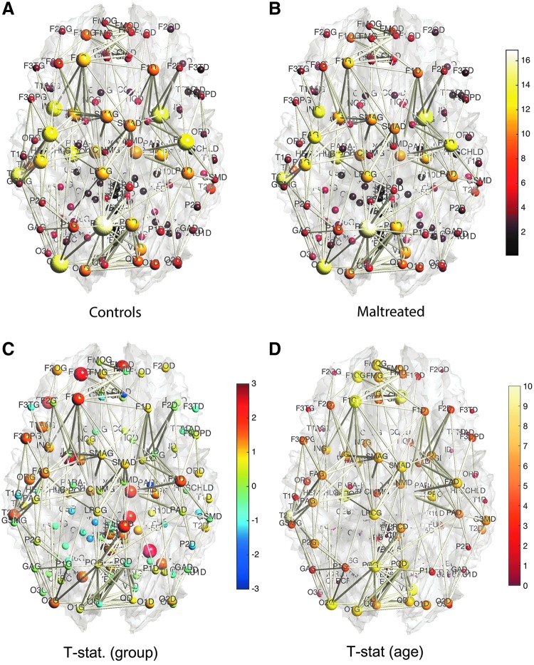
Based on the three network construction methods, we computed the connectivity matrices. The connectivity matrices are binarized in such a way that any nonzero edges are assigned value one. This results in the adjacency matrices. Since the three connectivity methods only differ in the strength of the connectivity, the zero entries of the connectivity matrices exactly correspond across three connectivity matrices. Thus, the three adjacency matrices are identical. The degrees are then computed by summing the rows of the adjacency matrices. Figure 9 shows the mean node degrees for all 116 nodes for each group. The edges are the mean of the adjacency matrices above 0.5. We tested whether there are any group differences in node degrees by using the two-sample t-test (controls–maltreated). The maximum and minimum t-statistics are 2.95 (p = 0.0024) and −2.08 (p = 0.021). However, none of the nodes show any statistical significance after accounting for multiple comparisons by using the false discovery rate (FDR) correction at 0.05.
FIG. 9.
(A, B) The node size and color correspond to the mean degree in each group. The edges are the average of the mean degrees of the two nodes thresholded at 0.5. There are consistent degree patterns across the groups, although there are local differences. (C) The two-sample t-statistic of the degree differences (controls—maltreated). There is no statistically significant node after the FDR correction at 0.05 level. (D) t-Statistic of age effect while accounting for sex and group variables. There is no significant reduction in node degree, so only positive t-statistic values are shown. Most nodes passed FDR at 0.05, showing a widespread connectivity increase in children. FDR, false discovery rate.
We also looked at the effects of age and sex on node degrees. We tested the significance of sex while taking age and group as nuisance covariates in a general linear model. We did not detect any effect of sex at an FDR at 0.05. We also tested the significance of group difference while accounting for age and sex. We did not detect any group difference at an FDR at 0.05. However, we detected widespread age effects while accounting for sex and group variables at an FDR at 0.05 (Fig. 9D). Almost all nodes (107 nodes out of total 116 nodes) showed statistically significant degree increases. There was no significant reduction in node degree, so only positive t-statistic values are shown in the figure.
Due to the large variability associated with node degree, we were not able to differentiate subtle group differences locally, although there is a consistent pattern of higher degree nodes in the controls. A more sophisticated approach is needed to see the degree differences. For this purpose, we investigated the degree distribution.
Degree distributions
We propose a two-step procedure for fitting node degree distribution. The underlying assumption of the two-step procedure is that each subject follows the same degree distribution law but with different parameters. In the first step, we need to determine which law the degree distribution follows at the group level. This is done by pooling every subject to increase the robustness of the fit. In the second step, we determine subject-specific parameters.
Step 1
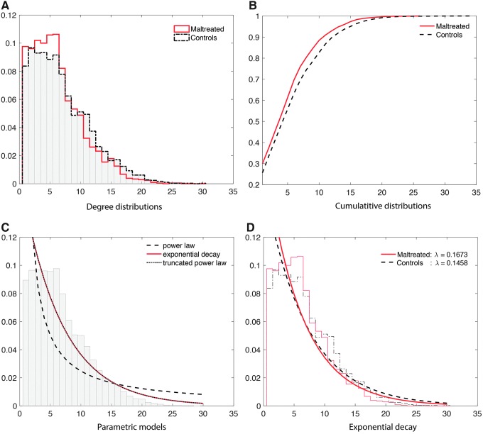
This is a group-level model fit. Figure 10A shows the degree distributions of the combined subjects in each group. To determine whether the degree distribution follows one of the three laws, we combined all the degrees across 54 subjects. Since high-degree hub nodes are very rare, combining the node degrees across all subjects increases the robustness of the fit. This results in a much more robust estimation of degree distribution. At the group-level model fit, this is possible. The maltreated subjects had a higher concentration in low-degree nodes whereas the controls had high-degree nodes. Thus, the controls had a much higher concentration of hub nodes. This pattern is also observed in the CDFs for each group (Fig. 10B). Again, the maltreated subjects clearly show a higher cumulative probability at a lower degree.
FIG. 10.
(A) Degree distributions of all the subjects combined in each group. The normal controls have heavier tails for high-degree nodes, indicating more hub nodes. The maltreated children show a much larger number of low-degree nodes. (B) The CDFs of all the subjects in each group. (C) Three-parametric model fit on the CDF of the combined 54 subjects. (D) The exponential decay model is fitted in each group. The estimated parameters are significantly different (p < 0.02). CDF, cumulative distribution function.
The CDFs of three laws were then fitted in the least-squares fashion by minimizing the SSE between the theoretical and empirical CDFs of the combined 54 subjects. The best fitting model for the power law was when  , that is,
 |
with  . For the exponential decay law, the best model was when
  , that is,
 |
with  . For the truncated power law, the best model was when
  , that is,
 |
with  . Note that the best truncated power law collapses to the exponential decay when
  . Thus, our data support the exponential decay model as the degree distribution. Figure 10C shows the three estimated models. Note that the best truncated power law model is identical to the best exponential decay model for our data.
Step 2
This is the subject-level model fit. We determined that the degree distribution follows the exponential decay model at the group level. In the second step, we fitted the exponential decay model for each subject separately to see whether there was any group difference in the estimated parameters. The estimated parameters were  for the maltreated children and
  for the controls. As expected, the controls showed a slightly heavier tail compared with that of the maltreated children (Fig. 10D). The two-sample t-test was performed on the parameter difference, obtaining significant results (t-stat.
 , p < 0.02). The controls had higher-degree hub nodes, which are nodes with a high degree of connections (Fornito et al., 2016).
Table 2 shows the list of 13 most connected nodes in the combined group in decreasing order. The numbers are the average node degrees in each group. We combined all the subjects in the two groups and computed the mean degree for each node. Then, we selected 13 highest mean degree nodes. All the 13 most connected nodes showed higher degree values in the controls without an exception.
Table 2.
Thirteen Most Connected Hubs in the Combined Group
| Label | Parcellation name | Combined | Controls | Maltreated |
|---|---|---|---|---|
| PQG | Precuneus-L | 16.11 | 16.87 | 15.09 |
| NLD | Putamen-R | 14.96 | 15.26 | 14.57 |
| O2G | Occipital-Mid-L | 14.44 | 15.52 | 13.00 |
| T2G | Temporal-Mid-L | 4.30 | 15.16 | 13.13 |
| HIPPOG | Hippocampus-L | 13.15 | 13.94 | 12.09 |
| FAD | Precentral-R | 12.85 | 14.00 | 11.30 |
| ING | Insula-L | 12.56 | 13.61 | 11.13 |
| FAG | Precentral-L | 12.43 | 13.45 | 11.04 |
| PQD | Precuneus-R | 12.00 | 12.03 | 11.96 |
| PAG | Postcentral-L | 11.89 | 12.52 | 11.04 |
| NLG | Putamen-L | 11.39 | 11.68 | 11.00 |
| F1G | Frontal-Sup-L | 11.22 | 12.13 | 10.00 |
| HIPPOD | Hippocampus-R | 11.15 | 11.90 | 10.13 |
They are sorted in the descending order of the degree. The controls have more connections without any exception.
Inference on connectivity strength
Based on the tract counts, lengths, and FA values, the connectivity matrices were computed. Instead of thresholding the connectivity matrices, we looked at whether there were any network differences at the edge level. Given 116 parcellations, there are totally  possible edges connecting them. If all edges are connected, they form a complete graph. However, few AAL parcellations are directly connected to each other. For our study, there are on average 1813 edges connected across 116 regions. This reduces the number of tests in multiple comparisons as well as in performing localized node-level statistical inference. Figure 5 shows the mean connectivity for the first 32 nodes for the three methods. Figure 6 shows the graph representation of the connectivity matrices in each group.
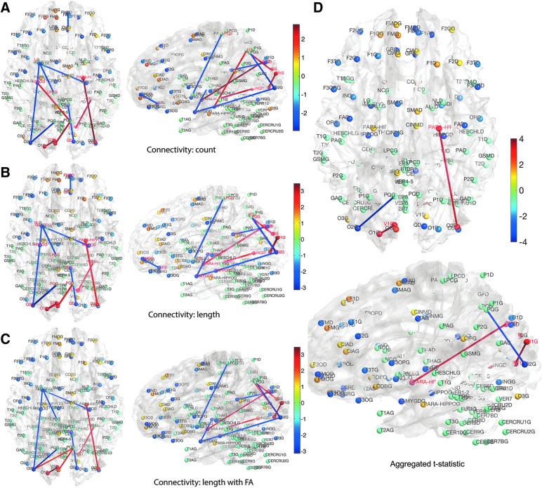
We determined the statistical significance of the mean connectivity difference between the groups by performing the two-sample t-test (maltreated–controls). Only the connections that have p-value less than 0.05 (uncorrected) are shown in Figure 11 for all three methods (Fig. 11A–C). For the tract count method, max. t-stat.  (p = 0.0034) and min. t-stat.
  (p =
(p =  ). For the length-based method, max. t-stat.
  (p = 0.0004) and min. t-stat.
  (p =
(p =  ). For the length-based method with FA, max. t-stat.
  (p = 0.0006) and min. t-stat.
  (p =
(p =  ). Although there are major similarities between the three methods, no edge passed the multiple comparisons correction by using an FDR at 0.05. Even at an FDR at 0.1 level, no edge was detected.
FIG. 11.
(A–C) t-Statistic results (maltreated—controls) for three different connectivity methods. Only the connections at the p-value less than 0.01 (uncorrected) are shown. None of the edges pass FDR even at 0.1. All three methods give similar results, showing the robustness and consistency. (D) The three t-statistic maps are aggregated to form a single t-statistic. None of the edges pass FDR at 0.05. Only the edges passing FDR at 0.1 are shown.
Although there is no signal detected by using the three methods after multiple comparisons correction, they are all giving similar connectivity maps. Thus, we propose to integrate the three maps, by constructing the summary statistics map that aggregates the three t-statistics maps. We propose to use the sum of t-statistics that have been often used to aggregate multiple studies and samples and in meta analysis (Fan et al., 2004; Reimold et al., 2006). Previously, independently distributed t-statistics were used but the approach can be extended to dependent t-statistics that account for a more accurate variance estimate (Billingsley, 1995).
Suppose a collection of possibly dependent t-statistic maps  is given. We assume the degrees of the freedom (d.f.) of each t-statistic map is sufficiently large, that is, d.f. ≥30. In our study, three t-statistic maps have 52 as the degrees of freedom. The t-statistics for large degrees of freedom are very close to the standard normal distribution, that is,
  . For n identically distributed possibly dependent t-statistics
  , the variance of the sum
  is approximately given by
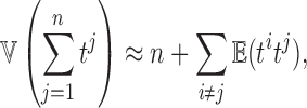 |
where  is the correlation between ti and tj. We used the fact
  . Then, we have the aggregated statistic T given by
 |
If the statistics tj are all independent, since tj are close to the standard normal distribution,  . The dependency increases the variance estimate and reduces the aggregated statistic value. Unfortunately, it may be difficult to estimate the correlation directly since only one t-statistic map is available for each tj. For our study, three dependent t-statistics maps are available. Thus, the variance is bounded between
  and
and  , and the aggregated t-statistic value is bounded between
  and
and  . Unfortunately, it may not be easy to estimate the correlations directly since only one t-statistic map is available for each tj. In this study,
  is empirically estimated by pooling over the entries of t-statistic maps ti and tj. The result of the aggregated t-statistic map is given in Figure 11D. Max. t-stat.
  (p-value
  ), and min. t-stat.
  (p =
(p =  ). Only the edges that passed FDR at 0.1 are shown, but none of them passed FDR at 0.05.
We looked at the effects of age and sex in the analysis. We tested the significance of sex by taking age and group as nuisance covariates in a general linear model. We did not detect any effect of sex in all three methods as well as the aggregated t-statistic at an FDR at 0.05. We also tested the significance of group difference by taking age and sex as nuisance covariates. We did not detect any group difference in all three methods and the aggregated t-statistic at an FDR at 0.05. However, we did detect significant and widespread age effects while accounting for sex and group variables in all three methods and the aggregated t-statistic even at a very stringent FDR at 0.01 (Fig. 12). Many major connections seem to show a significant increase in connectivity strength. There is no significant reduction in connectivity, so only positive t-statistic values are shown in the figure.
FIG. 12.
t-statistic map of age effect while accounting for gender and group variables for (A) tract count (B) tract length-based electrical circuit model (C) electrical circuit model with FA and (D) aggregated t-statistic map of all three methods.
Discussion and Conclusion
Here, we presented a new integrative connectivity model for DTI, investigating three different DTI connectivity features: tract count, length, and FA values. The proposed integrative method can model the length of tracts as the resistance in the electrical circuit; it can also incorporate FA values into the model. The electrical circuit models with and without FA values are then compared against the popular tract count method in characterizing connectivity in the maltreated children. The connectivity was quantified at both the node and edge levels.
Linking graphs to electric networks is not a new idea. In Doyle and Snell (1984), graph edge weights between nodes i and j are modeled as conductance  , which is the inverse of resistance, that is,
 |
Then, the random walk on the network is defined as a Markov chain with transition probability
 |
where  is the sum of all conductance of edges connecting node i. The denominator has the effect of normalizing the conductance into a proper probability measure. The transition probability matrix
  can then be used as a connectivity matrix. However, this is not the only way to normalize the conductance
  to make it a probability. Instead of normalizing locally at each node (a column- or row-wise normalization), one alternative is to normalize globally by dividing the numerator by either
  or
or  . Since the statistical analyses we used are scale invariant, we should obtain exactly the same results if such global normalization were performed.
The proposed model is more of an analogy that is based on an existing electrical circuit model. DTI-based brain networks at the macroscopic level may not follow the physical laws of electrons passing through a wire. It was not our intention to mimic the actual electrons in neuronal fibers by using electrical circuits. We tried to come up with a mathematical model that can incorporate tract counts, lengths, and FA values into a single connectivity metric and the electrical circuit model seems to be a reasonable model to use. There can be many possible combination of methods to construct connectivity in DTI. Unless we test for every possible combination, it may be difficult to address the problem. More research is needed to identify the most representative connectivity measure that incorporates various structural properties obtained from DTI. In this article, we showed that within some degree, normalizations may not really matter to the final statistical maps and all three methods produced similar results.
To demonstrate that the proposed method gives reasonably consistent results against the existing tract count method, we performed a theoretical error analysis in “How Tract Counts and Length-Based Connectivity Are Related” section and have shown that the error variability in the resistance method scales proportionally to that of the tract count method. This guarantees that the resulting statistical maps are more or less similar to each other. Since the statistics are scale invariant, it is expected that we will have similar connectivity maps, as shown in Figures 11 and 12, where A (count), B (length), and C (length with FA) are almost identical. Denote  , and t3 as the t-statistics maps from the tract count, length-based, and FA-value-based methods, respectively. For the two-sample t-test on group variables, we have
  . For the t-statistics on age while accounting for group and sex, we have
  . So even though three different connectivity metrics are used, we end up with almost identical connectivity maps.
We determined that the structural brain network follows the exponential decay law. However, Gong and colleagues (2009) reported that the brain follows the more complicated truncated exponential power law by comparing the goodness of fit of the model by using R2-value. The truncated exponential power law has two parameters, whereas the exponential decay law has one parameter. The exponential decay law is a special case of the truncated exponential power law when  . Thus, the truncated exponential power law will fit better than the exponential decay law for any data. However, in our data, the
  and the truncated exponential power law collapsed to the exponential decay law. For other datasets, in general, the truncated exponential power law will fit better.
The group-level statistical results show very similar network differences, although they did not identify any significant edges by using an FDR at 0.05. Although few previous connectivity studies incorporated tract lengths and FA values (Skudlarski et al., 2008; Kim et al., 2015), we found that the inclusion of additional DTI features into the connectivity model does not really change the final statistical results much. All these DTI features are likely linearly scaling up. Since most statistics are scale invariant, we may obtain similar results. To integrate the similar but different statistical maps, we employed a meta-analytic framework to aggregate the results into a single statistical map. This method seemed to boost signals when there are weak.
Acknowledgments
This work was supported by NIH Research Grants MH61285, MH68858, MH84051, MH100031, U54 HD090256, and UL1TR000427 and Brain Inititative Grant EB02285.
Author Disclosure Statement
No competing financial interests exist.
References
- Barnea-Goraly N, Kwon H, Menon V, Eliez S, Lotspeich L, Reiss A. 2004. White matter structure in autism: preliminary evidence from diffusion tensor imaging. Biol Psychiatry 55:323–326 [DOI] [PubMed] [Google Scholar]
- Basha O, Tirman S, Eluk A, Yeger-Lotem E. 2013. Responsenet2. 0: revealing signaling and regulatory pathways connecting your proteins and genesnow with human data. Nucleic Acids Res 41 (W1):W198–W203 [DOI] [PMC free article] [PubMed] [Google Scholar]
- Basser P, Mattiello J, LeBihan D. 1994. MR diffusion tensor spectroscopy and imaging. Biophys J 66:259–267 [DOI] [PMC free article] [PubMed] [Google Scholar]
- Basser P, Pajevic S, Pierpaoli C, Duda J, Aldroubi A. 2000. In vivo tractography using dt-mri data. Magn Reson Med 44:625–632 [DOI] [PubMed] [Google Scholar]
- Basser P, Pierpaoli C. 1996. Microstructural and physiological features of tissues elucidated by quantitative-diffusion-tensor MRI. J Magn Reson 111:209–219 [DOI] [PubMed] [Google Scholar]
- Bauer P, Hanson J, Pierson R, Davidson R, Pollak S. 2009. Cerebellar volume and cognitive functioning in children who experienced early deprivation. Biol Psychiatry 66:1100–1106 [DOI] [PMC free article] [PubMed] [Google Scholar]
- Billingsley P. 1995. Convergence of Probability Measures, 3rd edition. New York: John Wiley & Sons [Google Scholar]
- Bullmore E, Sporns O. 2009. Complex brain networks: graph theoretical analysis of structural and functional systems. Nature Rev Neurosci 10:186–98 [DOI] [PubMed] [Google Scholar]
- Catani M, Howard R, Pajevic S, Jones D. 2002. Virtual in vivo interactive dissection of white matter fasciculi in the human brain. NeuroImage 17:77–94 [DOI] [PubMed] [Google Scholar]
- Chandra A, Raghavan P, Ruzzo W, Smolensky R, Tiwari P. 1996. The electrical resistance of a graph captures its commute and cover times. Comput Complex 6:312–340 [Google Scholar]
- Chung M. 2012. Computational Neuroanatomy: The Methods. Singapore: World Scientific [Google Scholar]
- Chung M, Adluru N, Lainhart J, Lange N, Alexander A. 2012. Electrical circuit model for white matter fiber tracts in diffusion tensor imaging. In 18th Annual Meeting of the Organization for Human Brain Mapping (OHBM), page 7250 [Google Scholar]
- Chung M, Hanson J, Ye J, Davidson R, Pollak S. 2015. Persistent homology in sparse regression and its application to brain morphometry. IEEE Trans Med Imaging 34:1928–1939 [DOI] [PMC free article] [PubMed] [Google Scholar]
- Conturo T, Lori N, Cull T, Akbudak E, Snyder A, Shimony J, et al. 1999. Tracking neuronal fiber pathways in the living human brain. Natl Acad Sci USA 96:10422–10427 [DOI] [PMC free article] [PubMed] [Google Scholar]
- Cook P, Bai Y, Nedjati-Gilani S, Seunarine K, Hall M, Parker G, Alexander D. Camino: open-source diffusion-MRI reconstruction and processing. In 14th Scientific Meeting of the International Society for Magnetic Resonance in Medicine, 2006 [Google Scholar]
- Daianu M, Jahanshad N, Nir T, Toga A, Jack CR, Weiner MW, Thompson P. 2013. Breakdown of brain connectivity between normal aging and Alzheimer's disease: a structural k-core network analysis. Brain Connect 3:407–422 [DOI] [PMC free article] [PubMed] [Google Scholar]
- De Bellis M, Keshavan M, Shifflett H, Iyengar S, Beers S, Hall J, Moritz G. 2002. Brain structures in pediatric maltreatment-related posttraumatic stress disorder: a sociodemographically matched study. Biol Psychiatry 52:1066–1078 [DOI] [PubMed] [Google Scholar]
- Doyle P, Snell J. 1984. Random Walks and Electric Networks. Washington, DC: Mathematical Association of America [Google Scholar]
- Fan J, Tam P, Woude G, Ren Y. 2004. Normalization and analysis of cDNA microarrays using within-array replications applied to neuroblastoma cell response to a cytokine. Proc Natl Acad Sci USA 101:1135–1140 [DOI] [PMC free article] [PubMed] [Google Scholar]
- Fornito A, Zalesky A, Bullmore E. 2016. Fundamentals of Brain Network Analysis. New York: Academic Press [Google Scholar]
- Gong G, He Y, Concha L, Lebel C, Gross DW, Evans AC, Beaulieu C. 2009. Mapping anatomical connectivity patterns of human cerebral cortex using in vivo diffusion tensor imaging tractography. Cereb Cortex 19:524–536 [DOI] [PMC free article] [PubMed] [Google Scholar]
- Gorka A, Hanson J, Radtke S, Hariri A. 2014. Reduced hippocampal and medial prefrontal gray matter mediate the association between reported childhood maltreatment and trait anxiety in adulthood and predict sensitivity to future life stress. Biol Mood Anxiety Disord 4:12. [DOI] [PMC free article] [PubMed] [Google Scholar]
- Hagmann P, Cammoun L, Gigandet X, Meuli R, Honey C, Wedeen VJ, Sporns O. 2008. Mapping the structural core of human cerebral cortex. PLoS Biol 6:e159. [DOI] [PMC free article] [PubMed] [Google Scholar]
- Hanson J, Adluru N, Chung M, Alexander A, Davidson R, Pollak S. 2013. Early neglect is associated with alterations in white matter integrity and cognitive functioning. Child Dev 84:1566–1578 [DOI] [PMC free article] [PubMed] [Google Scholar]
- Hanson J, Chung M, Avants B, Rudolph K, Shirtcliff E, Gee J, et al. 2012. Structural variations in prefrontal cortex mediate the relationship between early childhood stress and spatial working memory. J Neurosci 32:7917–7925 [DOI] [PMC free article] [PubMed] [Google Scholar]
- Hanson J, Knodt A, Brigidi B, Hariri A. 2015. Lower structural integrity of the uncinate fasciculus is associated with a history of child maltreatment and future psychological vulnerability to stress. Dev Psychopathol 27:1611–1619 [DOI] [PMC free article] [PubMed] [Google Scholar]
- Jackowski A, de Araújo C, de Lacerda A, de Jesus M, Kaufman J. 2009. Neurostructural imaging findings in children with post-traumatic stress disorder: brief review. Psychiatry Clin Neurosci 63:1–8 [DOI] [PMC free article] [PubMed] [Google Scholar]
- Jezzard P, Clare S. 1999. Sources of distortion in functional MRI data. Hum Brain Map 8:80–85 [DOI] [PMC free article] [PubMed] [Google Scholar]
- Jones D, Catani M, Pierpaoli C, Reeves S, Shergill S, O'Sullivan M, et al. 2006. Age effects on diffusion tensor magnetic resonance imaging tractography measures of frontal cortex connections in schizophrenia. Hum Brain Map 27:230–238 [DOI] [PMC free article] [PubMed] [Google Scholar]
- Joshi SC, Davis B, Jomier M, Gerig G. 2004. Unbiased diffeomorphic atlas construction for computational anatomy. NeuroImage 23:151–160 [DOI] [PubMed] [Google Scholar]
- Kim W, Adluru N, Chung M, Okonkwo O, Johnson S, Bendlin B, Singh V. 2015. Multi-resolution statistical analysis of brain connectivity graphs in preclinical Alzheimers disease. NeuroImage 118:103–117 [DOI] [PMC free article] [PubMed] [Google Scholar]
- Lazar M, Weinstein D, Tsuruda J, Hasan K, Arfanakis K, Meyerand M, et al. 2003. White matter tractography using tensor deflection. Hum Brain Map 18:306–321 [DOI] [PMC free article] [PubMed] [Google Scholar]
- Leiserson M, Eldridge J, Ramachandran S, Raphael B. 2013. Network analysis of GWAS data. Curr Opin Genet Dev, 23:602–610 [DOI] [PMC free article] [PubMed] [Google Scholar]
- Lenroot R, Giedd J. 2006. Brain development in children and adolescents: insights from anatomical magnetic resonance imaging. Neurosci Biobehav Rev 30:718–729 [DOI] [PubMed] [Google Scholar]
- Loman M, Johnson A, Westerlund A, Pollak S, Nelson C, Gunnar M. 2010. The effect of early deprivation on executive attention in middle childhood. J Child Psychiatry Psychol 81:224–236 [DOI] [PMC free article] [PubMed] [Google Scholar]
- Mori S, Crain B, Chacko V, van Zijl P. 1999. Three-dimensional tracking of axonal projections in the brain by magnetic resonance imaging. Ann Neurol 45:256–269 [DOI] [PubMed] [Google Scholar]
- Mori S, Kaufmann W, Davatzikos C, Stieltjes B, Amodei L, Fredericksen K, et al. 2002. Imaging cortical association tracts in the human brain using diffusion-tensor-based axonal tracking. Magn Reson Med 47:215–223 [DOI] [PubMed] [Google Scholar]
- Pollak S. 2008. Mechanisms linking early experience and the emergence of emotions: illustrations from the study of maltreated children. Curr DirPsychol Sci 17:370–375 [DOI] [PMC free article] [PubMed] [Google Scholar]
- Pollak S, Nelson C, Schlaak M, Roeber B, Wewerka S, Wiik K, et al. 2010. Neurodevelopmental effects of early deprivation in post-institutionalized children. Child Dev 81:224–236 [DOI] [PMC free article] [PubMed] [Google Scholar]
- Raftery A, Newton M, Satagopan J, Krivitsky P. 2006. Estimating the integrated likelihood via posterior simulation using the harmonic mean identity. Memorial Sloan-Kettering Cancer Center, Department of Epidemiology and Biostatistics Working Paper Series. Working Paper 6 [Google Scholar]
- Reimold M, Slifstein M, Heinz A, Mueller-Schauenburg W, Bares R. 2006. Effect of spatial smoothing on t-maps: arguments for going back from t-maps to masked contrast images. J Cereb Blood Flow Metab 26:751–759 [DOI] [PubMed] [Google Scholar]
- Roberts T, Liu F, Kassner A, Mori S, Guha A. 2005. Fiber density index correlates with reduced fractional anisotropy in white matter of patients with glioblastoma. Am J Neuroradiol 26:2183–2186 [PMC free article] [PubMed] [Google Scholar]
- Sanchez M, Pollak S. 2009. Socio-emotional development following early abuse and neglect: challenges and insights from translational research. Handbook Dev Soc Neurosci 17:497–520 [Google Scholar]
- Segev I, Fleshman J, Miller J, Bunow B. 1985. Modeling the electrical behavior of anatomically complex neurons using a network analysis program: passive membrane. Biol Cybernet 53:27–40 [DOI] [PubMed] [Google Scholar]
- Skudlarski P, Jagannathan K, Calhoun V, Hampson M, Skudlarska B, Pearlson G. 2008. Measuring brain connectivity: diffusion tensor imaging validates resting state temporal correlations. Neuroimage 43:554–561 [DOI] [PMC free article] [PubMed] [Google Scholar]
- Smith S, Jenkinson M, Johansen-Berg H, Rueckert D, Nichols T, Mackay C, et al. 2006. Tract-based spatial statistics: voxelwise analysis of multi-subject diffusion data. NeuroImage 31:1487–1505 [DOI] [PubMed] [Google Scholar]
- Song C, Havlin S, Makse H. 2005. Self-similarity of complex networks. Nature 433:392–395 [DOI] [PubMed] [Google Scholar]
- Suthram S, Beyer A, Karp RM, Eldar Y, Ideker T. 2008. eQED: an efficient method for interpreting eQTL associations using protein networks. Mol Syst Biol 4:162. [DOI] [PMC free article] [PubMed] [Google Scholar]
- Tetali P. 1991. Random walks and the effective resistance of networks. J Theor Probab 4:101–109 [Google Scholar]
- Thottakara P, Lazar M, Johnson S, Alexander A. 2006. Probabilistic connectivity and segmentation of white matter using tractography and cortical templates. NeuroImage 29:868–878 [DOI] [PubMed] [Google Scholar]
- Tupler L, De Bellis M. 2006. Segmented hippocampal volume in children and adolescents with post traumatic stress disorder. Biol Psychiatry 59:523–529 [DOI] [PubMed] [Google Scholar]
- Tzourio-Mazoyer N, Landeau B, Papathanassiou D, Crivello F, Etard O, Delcroix N, et al. 2002. Automated anatomical labeling of activations in SPM using a macroscopic anatomical parcellation of the MNI MRI single-subject brain. NeuroImage 15:273–289 [DOI] [PubMed] [Google Scholar]
- Van Den Heuvel M, Sporns O. 2011. Rich-club organization of the human connectome. J Neurosci 31:15775–15786 [DOI] [PMC free article] [PubMed] [Google Scholar]
- Yeger-Lotem E, Riva L, Su L, Gitler A, Cashikar A, King O, et al. 2009. Bridging high-throughput genetic and transcriptional data reveals cellular responses to alpha-synuclein toxicity. Nature Genet 41:316–323 [DOI] [PMC free article] [PubMed] [Google Scholar]
- Yushkevich P, Zhang H, Simon T, Gee J. 2007. Structure-specific statistical mapping of white matter tracts using the continuous medial representation. In IEEE 11th International Conference on Computer Vision (ICCV), pages 1–8 [Google Scholar]
- Zalesky A, Fornito A, Harding I, Cocchi L, Yücel M, Pantelis C, Bullmore E. 2010. Whole-brain anatomical networks: does the choice of nodes matter? NeuroImage 50:970–983 [DOI] [PubMed] [Google Scholar]
- Zhang B, Hsu M, Dayal U. 1999. K-harmonic means-a data clustering algorithm. Hewlett-Packard Labs Technical Report HPL-1999-124
- Zhang H, Avants B, Yushkevich P, Woo J, Wang S, McCluskey L, et al. 2007. High-dimensional spatial normalization of diffusion tensor images improves the detection of white matter differences: an example study using amyotrophic lateral sclerosis. IEEE Trans Med Imaging 26:1585–1597 [DOI] [PubMed] [Google Scholar]


