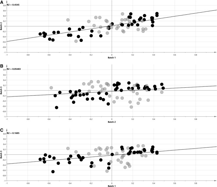
Fig. 3.
SUS plot analysis of p(corr) vectors from the first and second batch (a), the second and third batch (b), and the third and first batch (c). Metabolites with the same change direction from all batches studied are indicated in black; the dashed line is the regression line; R 2 regression coefficient

