

Abstract
Objective
To evaluate the efficacy for consumers of two potential enhancements to the Medicare Plan Finder (MPF)—a simplified data display and a “quick links” home page designed to match the specific tasks that users seek to accomplish on the MPF.
Data Sources/Study Setting
Participants (N = 641) were seniors and adult caregivers of seniors who were recruited from a national online panel. Participants browsed a simulated version of the MPF, made a hypothetical plan choice, and reported on their experience.
Study Design
Participants were randomly assigned to one of eight conditions in a fully factorial design: 2 home pages (quick links, current MPF home page) × 2 data displays (simplified, current MPF display) × 2 plan types (stand‐alone prescription drug plan [PDP], Medicare Advantage plan with prescription drug coverage [MA‐PD]).
Principal Findings
The quick links page resulted in more favorable perceptions of the MPF, improved users’ understanding of the information, and increased the probability of choosing the objectively best plan. The simplified data display resulted in a more favorable evaluation of the website, better comprehension of the displayed information, and, among those choosing a PDP only, an increased probability of choosing the best plan.
Conclusions
Design enhancements could markedly improve average website users’ understanding, ability to use, and experience of using the MPF.
Keywords: Cognitive burden, decision tools, medical consumerism, Medicare plan choice, Medicare Plan Finder
Report cards on health plans aimed at consumers typically contain an enormous amount of information (AQA Reporting Workgroup 2014). This approach appears to assume that (1) multiple plan attributes must be considered to reach a good decision; and (2) when consumers are presented with all relevant information about their plan options, they will reach a good decision by synthesizing information about plan type, benefit design, costs, and an array of performance indicators for each of the available plans.
However, cognitive science has shown that people can process only a limited number of variables per choice (Jacoby 1977; Malhotra 1982). When faced with too much information or complex decisions involving trade‐offs, people tend to consider information selectively and rely on cognitive shortcuts (Bettman, Luce, and Payne 2008). These shortcuts can help reduce the strain that often results from having too much information to consider (Kaplan, Wanshula, and Zanna 1993; Suri and Monroe 2003; Mata and Nunes 2010); however, they can also undermine a decision maker's own interests by leading him or her to miss or ignore important information (Hwang and Lin 1999; Lurie 2004; Finucane et al. 2005).
The complexity of a decision‐making task increases dramatically with the number of choices (Bettman, Luce, and Payne 2008). Health care consumers may have dozens of plans to compare on dozens of attributes. For example, the Medicare prescription drug program offers beneficiaries about 30 options on average (Hoadley, Cubanski, and Neuman 2015). It is unsurprising that Medicare beneficiaries are often overwhelmed and report difficulty synthesizing the information to make a choice (Jewett and Hibbard 1996). If an abundance of choices and choice attributes leads decision makers to selectively consider information in ways that undermine their interests (e.g., to get the best health care at the least cost), then they are liable to make choices that are suboptimal.
Several experiments show that simpler displays of health plan data result in better comprehension and better choices. For example, Greene and Peters (2009) simplified information on plan quality by listing only attributes on which plans differed. They also reduced the information that appeared in any one cell of the display table and arranged plans from most to least generous based on costs and benefits (rather than alphabetically, as in the control condition). The simplified display improved comprehension of the data among more literate and numerate consumers but not among consumers with low literacy and numeracy. Uhrig et al. (2006) found that streamlining data comparing hospitals increased choices of high‐quality hospitals. These and other studies (e.g., Hibbard et al. 2002; Hanoch et al. 2009) support the notion that simplifying displays of quality data helps health care consumers make better choices by improving comprehension and engagement.
Information‐laden report cards also pose navigational challenges for consumers, especially if they require multiple steps before delivering the information that consumers are seeking (Koyani, Bailey, and Nall 2006). Web‐based report cards that require consumers to input information up front may frustrate users by requiring a lengthy process with no clear relationship to their goals in visiting the site. To keep users engaged, research suggests that it may be helpful to present content that fits with users’ goal(s) when they first enter the site (Farkas and Farkas 2000). A prominently placed description of what users can do on the website's home page is likely to engage those who might find the site useful—if that description indeed fits with users’ goals (Fowles et al. 2000; Koyani, Bailey, and Nall 2006; Nielsen and Loranger 2006).
Current Study
The Medicare Plan Finder (MPF) on the Medicare.gov website contains extensive data on plans’ costs, benefits and coverage, and quality. It allows users to view data about the range of plans available to them, including managed care (Medicare Advantage) plans that offer prescription drug coverage (MA‐PD plans) and stand‐alone prescription drug plans (PDPs) available to beneficiaries enrolled in Original (Fee‐for‐Service) Medicare. Despite the impressive amount of data gathered on the MPF (or perhaps because of it), average users perceive it to be complex and poorly constructed for locating needed information and selecting a plan (Czaja, Sharit, and Nair 2008). Medicare beneficiaries aged 65 and older often avoid using the MPF because they have difficulty identifying information that is important to them (Jacobson et al. 2014). The design of the MPF reflects a compromise between the extensive information to which counselors and customer service representatives want easy access and the simpler designs average users need to navigate easily on tasks they undertake (Booth 2016). As more beneficiaries use the Internet, CMS anticipates increasing need to support average consumers (Booth 2016). We conducted an experiment to investigate features that might reduce information complexity and provide a more user‐friendly and task‐oriented website.
To help beneficiaries use the MPF directly to make choices, we designed two potential enhancements. The first was a simpler alternative to the current MPF data display, designed to make it easier to evaluate and manipulate plan data (Hibbard et al. 2002; Uhrig et al. 2006; Greene and Peters 2009). The second was an alternative to the current MPF landing (home) page. This alternative “quick links” home page was designed to provide a succinct explanation of the most common uses of MPF data and, more important, direct paths to data based on the tasks visitors most often want to accomplish—browsing, comparing, and enrolling.
We tested these features using an experiment that randomized participants to view a website that (a) had as its starting point either the quick links home page or the then‐current MPF home page, and (b) presented plan data either via a simplified data display or via the then‐current MPF data display. Participants browsed the website, made a hypothetical plan choice, and then reported their perceptions of the site and experiences making a choice. We examined the impact of these features for choices among MA‐PD plans and PDPs, the latter of which are significantly less complex in their benefits. We hypothesized that for both types of plans, the quick links home page and simplified data display would facilitate high‐quality decision making and lead to more favorable opinions of the website.
Methods
Participants
Participants (N = 641) were randomly selected members of KnowledgePanel, a web‐enabled survey panel of over 50,000 households (GfK 2013). The panel is recruited from an address‐list sampling frame covering 97 percent of U.S. households and represents key U.S. population demographics. The panel includes those without Internet access by providing them with a free netbook computer and Internet service in return for participation.
Half of participants were seniors (65 and older, the standard age for Medicare eligibility), and half were “caregivers” (adults who had ever helped a Medicare beneficiary with decisions about health insurance). All seniors were eligible to participate, regardless of their Medicare enrollment; younger adults aged 35–59 were eligible as caregivers. The RAND institutional review board approved the research protocol.
Design Features Tested in the Experiment
The enhanced website features developed for this study were designed iteratively through a process that involved gathering information and feedback from the CMS website and communication teams and pilot testing the enhancements with 18 consumers. We describe the nature and purpose of these enhancements below.
Quick Links Home Page
The MPF home page on www.Medicare.gov circa March 2012 was dominated by two stacked boxes that presented “general plan search” and “personalized plan search” options (Appendix SA2). The personalized search required users to enter detailed personal information to facilitate presentation of customized estimates of plans’ costs and benefits. A general search required users to choose their current plan from a list, and, optionally, to indicate their current prescription drugs and preferred pharmacy. Users could then “refine” their plan results by using filters to narrow or expand the list of plans. A drawback of this approach—which we attempted to address with our simplified data display—is that users may not be familiar with the plan attributes they could use to filter or the consequences of applying filters. After filtering plan results (or not), a user could click a button to “continue to plan results.” Besides the options to conduct general and personalized plan searches, the MPF home page presented a box of “additional tools” to “Find and Compare Medigap Policies,” “Search by Plan Name or ID,” “Enroll Now,” “Find Formularies in Your Area,” or access a “Medicare Complaint Form.” No further explanation of these functions appeared on the home page.
The quick links page that we developed for testing mimicked the overall style of the MPF home page (see Appendix SA3). Listed prominently on the quick links page were five pathways corresponding to the objectives consumers most often seek to pursue on the MPF, including “See What Plans Are Available in My Area,” the pathway that was the focus of the experiment. Clicking on a pathway brought up a callout box that explained the purpose and initial step required to follow the pathway. The callout box that appeared when participants clicked “See What Plans Are Available in My Area” explained the purpose of the pathway simply: “Browse a list of health and PDPs that are available to people in your area. Use filters to narrow the list by cost and coverage.” Beneath this statement was a field in which users were asked to enter their zip code, followed by a button (“Find Plans”) that users could click to find available plans. The next three steps mimicked the actual MPF site. These steps required users to indicate any prescription drugs they were taking (participants were told which drugs to enter), select their preferred pharmacy (participants were told which pharmacy to enter), and then, at their option, narrow their plan results by specifying which types of plans they wanted to see. Importantly, this final step (filtering plans) was only seen by participants assigned to view the current MPF data display (see Experimental Design). For participants assigned to view the simplified data display, the option to narrow search results was incorporated into the data display.
Simplified Data Display
The simplified data display (Appendix SA4) was designed to reduce the amount of information displayed and facilitate plan comparisons by making the data more manageable. To limit the amount of information in the cells of the display, we moved some information from the cells of the original MPF display to the column headers of the simplified display. Other information deemed less important (e.g., prorated costs for the initial enrollment year) was omitted entirely. We also reduced the information in each cell of the data table by providing information on only one variable per column. Finally, we incorporated a filtering feature that allowed users to see the distribution of values for each plan attribute and customize the content of the display. Filters were presented for plan type, monthly premium, annual deductible, coverage options, and plan rating. The table's content shifted as each filter was applied or removed so that users could see how their choice set was restricted as their preferences were applied.
Experimental Design
Participants were randomly assigned within each of two strata (seniors, caregivers) to one of eight conditions in a fully factorial design: 2 home pages (quick links, current MPF) × 2 types of data display (simplified, current MPF) × 2 plan types (MA‐PD, PDP). Table 1 summarizes these eight conditions.
Table 1.
Overview of Experimental Design
| Condition | Home Page | Data Display | Plan Type |
|---|---|---|---|
| 1 | Quick links | Simplified | MA‐PD |
| 2 | Quick links | Simplified | PDP |
| 3 | Quick links | Current MPF | MA‐PD |
| 4 | Quick links | Current MPF | PDP |
| 5 | Current MPF | Simplified | MA‐PD |
| 6 | Current MPF | Simplified | PDP |
| 7 | Current MPF | Current MPF | MA‐PD |
| 8 | Current MPF | Current MPF | PDP |
MA‐PD, Medicare Advantage plan offering prescription drug coverage; MPF, Medicare Plan Finder; PDP, standalone prescription drug plan.
Procedures
Participants completed a pre‐exposure questionnaire, reporting on their experience choosing a Medicare health plan, exposure to health care quality information, use of the Internet to seek health information, health status, and health care utilization. The questionnaire also measured patient activation via an adapted version of the 13‐item Patient Activation Measure (Hibbard et al. 2005). Participants were then given instructions for the plan choice task and directed to a simulated version of the MPF website. Participants were asked to compare a set of fictitious plans and make a hypothetical choice. Participants were told to take as much time as they would like and to approach the information as if they were actually choosing a plan. When they were finished, participants completed a postexposure questionnaire that asked about their experiences with and reactions to the MPF.
Plan Data
MA‐PD plan attributes in the simplified display included plan type, total estimated annual costs, monthly premium, annual deductible, the extent of doctor choice offered by the plan, whether all of the beneficiary's drugs are on the plan's formulary, whether the selected pharmacy falls within the plan's network, and an overall quality rating (1–5 stars; see Appendix SA4). PDP plan attributes included all of these variables except doctor choice. Monthly premium and annual deductible costs were only for prescription drugs, whereas for MA‐PD plans, cost information was provided for both the health plan and prescription drug portions of the plan. The current MPF display included the same information shown in the simplified display.
In each condition, participants were shown 10 plans of their assigned type (MA‐PD or PDP). Three plans scored high on quality (five stars on the overall quality rating), three plans scored in the middle (three stars), and four plans scored low (two stars, given that one star is rare in practice). Each quality stratum contained a low‐, medium‐, and high‐cost plan (the low‐quality stratum had two high‐cost plans). Cost data were based on actual data from a single mid‐sized market area. Participants were not given the option of seeing customized cost estimates based on their health care needs. Plan benefits were kept constant. Thus, the only characteristics that distinguished the plans were cost and quality.
Outcome Measures
Choice of Best Plan (Decision Quality)
Plan choice was captured via web‐tracking software. Participants who chose to enroll (hypothetically) in the one plan that was both low cost and high quality (five stars) were deemed to have made the best choice from a value standpoint. Of all the plans that participants were given to consider, the only plan that cost less than the “best” plan was one that cost less by a very small amount but that was of much lower quality (two vs. five stars).
Survey Measures
The postexperiment questionnaire included items measuring participants’ confidence in their choice, overall evaluation of the website, ratings of its navigability and usability, evaluation of the usefulness of the home page, ratings of how easy it was to understand the information about plans, and satisfaction with the information given. The questionnaire also included six questions measuring comprehension of the data display from the website (reproduced in the questionnaire). For detailed descriptions of measures, see Appendix SA5.
Analytic Approach
For each outcome measure, we conducted a three‐way analysis of variance (ANOVA) that included the following predictors: type of home page, type of data display, plan type, and all two‐ and three‐way interactions involving these three variables.
Results
Sample Characteristics
A total of 641 members of the Knowledge Panel enrolled in the study. The average age of seniors (n = 315) was 72.4 years (SD = 6.2); the average age of caregivers (n = 326) was 49.2 years (SD = 7.3). Additional detail about the sample, including a comparison of seniors and caregivers on characteristics other than age, can be found in Table 2.
Table 2.
Sample Characteristics, Subgroups Defined by Participant Type, Availability of Tracking Data, and Plan Choice
| Variable | Participant Type | Tracking Data Available | Plan Choice Made | |||
|---|---|---|---|---|---|---|
| Senior (N = 315) | Caregiver (N = 326) | No (N = 252) | Yes (N = 389) | No (N = 201) | Yes (N = 188) | |
| Female, % | 48.3 | 51.2 | 47.2 | 51.4 | 44.3 | 59.0** |
| Age (in years), % | ||||||
| 35–44 | 0 | 31.6*** | 18.3 | 14.8 | 15.4 | 13.8 |
| 45–54 | 0 | 34.4*** | 18.7 | 16.7 | 20.9 | 12.2 |
| 55–64 | 0 | 34.0*** | 14.3 | 19.3 | 17.9 | 20.7 |
| 65–74 | 68.3 | 0*** | 32.1 | 34.4 | 30.8 | 38.3 |
| 75+ | 31.7 | 0*** | 16.7 | 15.0 | 14.9 | 14.9 |
| Racial/ethnic group, % | ||||||
| Hispanic | 5.4 | 16.0** | 11.5 | 10.3 | 10.9 | 9.6 |
| White, non‐Hispanic | 82.9 | 56.4*** | 59.5 | 75.8*** | 76.1 | 75.5 |
| Black, non‐Hispanic | 5.1 | 19.6*** | 19.0 | 8.2*** | 9.0 | 7.4 |
| Other race, non‐Hispanic | 2.9 | 4.6 | 6.0 | 2.3** | 2.0 | 2.7 |
| Two or more races, non‐Hispanic | 3.8 | 3.4 | 4.0 | 3.3 | 2.0 | 4.8 |
| Education, % | ||||||
| High school diploma or less | 44.1 | 41.4 | 49.2 | 38.6*** | 43.8 | 33.0 |
| Some college | 27.9 | 33.4 | 31.3 | 30.3 | 28.4 | 32.4 |
| 4‐year college degree or more | 27.9 | 25.2 | 19.4 | 31.1*** | 27.9 | 34.6 |
| Household income ($), % | ||||||
| <20,000 | 12.4 | 27.9*** | 27.4 | 15.7*** | 19.4 | 11.7* |
| 20,000–49,999 | 31.4 | 28.2 | 32.1 | 28.3 | 28.9 | 27.7 |
| 50,000–99,999 | 34.9 | 27.3** | 26.6 | 33.9* | 31.8 | 36.2 |
| 100,000 or higher | 21.3 | 16.6 | 13.9 | 22.1** | 19.9 | 24.5 |
| Patient activation, M (SD) | 4.14 (0.68) | 3.89 (0.92)*** | 3.90 (0.88) | 4.09 (0.77)** | 4.02 (0.87) | 4.17 (0.64)* |
| No. of visits to a doctor, past year, M (SD) | 3.12 (1.68) | 2.90 (1.94) | 2.87 (1.78) | 3.10 (1.84) | 3.16 (1.81) | 3.02 (1.87) |
| Self‐rated health,a M (SD) | 3.38 (0.93) | 3.11 (1.04)** | 3.22 (0.95) | 3.25 (1.03) | 3.23 (1.03) | 3.28 (1.03) |
| Use of Internet to look for health or medical information, past year,b M (SD) | 1.54 (0.86) | 2.13 (1.11)*** | 1.70 (1.03) | 1.92 (1.03)** | 1.88 (1.09) | 1.96 (0.98) |
| Use of Internet to get information on doctors' plans, hospitals, past year,b M (SD) | 1.30 (0.65) | 1.93 (1.05)*** | 1.56 (0.94) | 1.65 (0.92) | 1.67 (0.99) | 1.63 (0.86) |
| Attention paid to information about health or medical topics on the Internet,c M (SD) | 2.11 (0.97) | 2.63 (0.99)*** | 2.19 (1.08) | 2.49 (0.95)** | 2.43 (0.99) | 2.56 (0.91) |
1 = poor, 2 = fair, 3 = good, 4 = very good, 5 = excellent.
1 = less than every few months, 2 = every few months, 3 = once a month, 4 = once a week or more.
1 = not at all, 2 = a little, 3 = some, 4 = a lot.
*p < .05; **p < .01; ***p < .001.
Available Data
All 641 participants completed the pre‐ and postexposure questionnaires. Unexpectedly, tracking data were recorded for only 389 (61 percent) of these participants. Furthermore, although all participants were instructed to register a plan choice by clicking on the “Enroll” button, only 188 of the 389 participants with tracking data did so. Compared with participants who were not tracked, participants who were tracked were more often white; had higher household incomes, educational attainment, and patient activation; and were more likely to have used the Internet to look for health or medical information and to have paid attention to such information (Table 2). Among participants who were tracked, choosing (vs. not choosing) a plan was significantly associated with being female, having a higher household income, and having higher patient activation. This nonrandom selection into subsamples who were tracked and made a plan choice did not, however, confound our experimental results: Multinomial logistic regressions predicting experimental condition from demographics and patient activation (i.e., the characteristics associated with the nonrandom selection) within these two subsamples showed that there was no relationship between these characteristics and experimental condition (both p values >.68).
Analyses of use of filtering features and plan choice (vs. no choice) were restricted to the 389 participants for whom we have tracking data. Analyses predicting choice of the best plan were restricted to the 188 tracked participants who made a plan choice. Analyses of outcomes measured by the postexposure questionnaire (e.g., confidence in plan choice) were restricted to the subsample of participants who definitely looked at the test site and followed the task instructions—those who chose a plan. We consider the implications of this decision for the generalizability of results in the Discussion. The only exception to this approach involved the measure of comprehension of the data display. Because the judgment task on which this measure is based was contained entirely within the postexposure questionnaire (i.e., it did not require actually visiting the site or choosing a plan), we used all available data on this measure.
Effects of the Quick Links Home Page
Table 3 summarizes ANOVA results pertaining to the effects of the quick links home page, both overall and within each plan type. Among participants who chose a plan, those who began on the quick links page were more likely to choose the best plan than were those who began on the MPF home page (61 percent vs. 46 percent; p = .03). Participants who began on the quick links page also more favorably assessed the navigability/usability of the website in general (p = .045; Cohen's d = 0.29) and rated the home page as more useful (p < .001; d = 0.50). Compared with participants who began on the current MPF home page, participants who began on the quick links page reported that the information on the site was easier to understand (p = .054; d = 0.28). Finally, participants who began on the quick links page tended to be more satisfied with the information given, but this trend was only marginally significant (p = .058; d = 0.28).
Table 3.
Effects of Home Page on Outcomes, Overall and by Plan Type
| N | Home Page | Home Page × Plan Type Interaction p | |||||||
|---|---|---|---|---|---|---|---|---|---|
| Current | Quick Links | p | MA‐PD Plan | PDP Plan | |||||
| Current | Quick Links | Current | Quick Links | ||||||
| Chose best plan (%) | 188 | 46 | 61 | .03 | 52 | 59 | 40 | 64 | .26 |
| Confidence in plan choicea | 188 | 1.92 (0.07) | 2.05 (0.06) | .17 | 1.90 (0.09) | 2.10 (0.08) | 1.94 (0.11) | 2.00 (0.09) | .44 |
| Overall evaluation of websiteb | 188 | 3.55 (0.12) | 3.68 (0.11) | .44 | 3.72 (0.16) | 3.80 (0.15) | 3.38 (0.19) | 3.56 (0.17) | .76 |
| Website perceived as navigable/usablec | 188 | 3.40 (0.11) | 3.71 (0.10) | .045 | 3.51 (0.15) | 3.75 (0.13) | 3.28 (0.17) | 3.66 (0.15) | .64 |
| Home page perceived as informatived | 188 | 2.97 (0.08) | 3.34 (0.07) | <.001 | 3.05 (0.10) | 3.45 (0.09) | 2.88 (0.12) | 3.24 (0.11) | .86 |
| Easy to understand information about planse | 188 | 3.20 (0.13) | 3.55 (0.12) | .054 | 3.23 (0.17) | 3.64 (0.15) | 3.18 (0.20) | 3.46 (0.18) | .72 |
| Satisfaction with information about plansf | 188 | 3.46 (0.12) | 3.76 (0.10) | .058 | 3.50 (0.15) | 3.80 (0.14) | 3.50 (0.15) | 3.73 (0.16) | .99 |
| Usefulness of choice attributesg | 188 | 2.77 (0.10) | 2.86 (0.90) | .47 | 2.76 (0.13) | 2.85 (0.11) | 2.77 (0.15) | 2.87 (0.13) | .97 |
| Comprehension of data displayh | 649 | 4.21 (0.09) | 4,28 (0.09) | .59 | 3.90 (0.13) | 3.93 (0.13) | 4.52 (0.14) | 4.63 (0.13) | .76 |
| Use of filters (%) | 389 | 23 | 26 | .53 | 21 | 25 | 25 | 27 | .85 |
Statistically significant p values are shown in bold for emphasis. Simple main effects of display type and display type × plan type interactions are reported in Table 4. The two‐way interaction between home page and display type and the three‐way interaction between home page, display type, and plan type were not statistically significant for any outcome, and so these are not tabled.
1 = not at all confident, 5 = extremely confident.
1 = definitely would not use/recommend, 5 = definitely would use/recommend.
1 = very difficult, 5 = very easy to find information you were looking for, use the website in general, choose a plan.
Home page gave 1 = no idea at all to 4 = a very clear idea about what information was available on the website.
1 = very difficult, 5 = very easy.
1 = very dissatisfied, 5 = very satisfied with information about plans given on the website.
1 = very difficult to 5 = very easy to distinguish among plans, averaged across plan attributes.
Number of correct responses (range 0–6) to three relatively easy and three relatively difficult comprehension questions.
Effects of the Simplified Data Display
Table 4 summarizes ANOVA results pertaining to the effects of the simplified data display, both overall and within each plan type. The type of data display had no significant overall effect on choice of the best plan, p = .57. However, there was a significant two‐way interaction (p = .02) between type of plan and type of data display (Figure 1). The simplified display provided an advantage (+13 percent) over the current MPF data display for those choosing a PDP. Fifty‐eight percent of participants who saw the simplified display chose the best PDP versus 45 percent of participants who saw the current MPF data display. The simplified display was disadvantageous (−21 percent), however, for those choosing an MA‐PD plan. Forty‐five percent of those who saw the simplified display chose the best MA‐PD plan versus 66 percent of participants who saw the current display.
Table 4.
Effects of Data Display on Outcomes, Overall and by Type of Plan
| N | Data Display | Data Display × Plan Type Interaction p | |||||||
|---|---|---|---|---|---|---|---|---|---|
| Current | Simplified | p | MA‐PD Plan | PDP Plan | |||||
| Current | Simplified | Current | Simplified | ||||||
| Chose best plan (%) | 188 | 56 | 51 | .57 | 66 | 45 | 45 | 58 | .02 |
| Confidence in plan choicea | 188 | 1.94 (0.07) | 2.03 (0.06) | .93 | 1.96 (0.09) | 2.04 (0.09) | 1.92 (0.11) | 2.02 (0.09) | .87 |
| Overall evaluation of websiteb | 188 | 3.37 (0.12) | 3.86 (0.11) | .004 | 3.59 (0.15) | 3.93 (0.15) | 3.15 (0.19) | 3.78 (0.17) | .40 |
| Website perceived as navigable/usablec | 188 | 3.38 (0.11) | 3.72 (0.11) | .02 | 3.48 (0.14) | 3.78 (0.14) | 3.28 (0.17) | 3.66 (0.15) | .78 |
| Home page perceived as informatived | 188 | 3.12 (0.08) | 3.20 (0.07) | .43 | 3.30 (0.10) | 3.20 (0.10) | 2.93 (0.12) | 3.19 (0.11) | .09 |
| Easy to understand information about planse | 188 | 3.10 (0.13) | 3.65 (0.13) | .002 | 3.15 (0.16) | 3.72 (0.16) | 3.05 (0.20) | 3.58 (0.18) | .90 |
| Satisfaction with information about plansf | 188 | 3.55 (0.12) | 3.68 (0.11) | .41 | 3.59 (0.15) | 3.71 (0.15) | 3.51 (0.18) | 3.65 (0.16) | .94 |
| Usefulness of choice attributesg | 188 | 2.63 (0.10) | 3.00 (0.09) | .006 | 2.61 (0.12) | 3.00 (0.12) | 2.65 (0.15) | 3.00 (0.13) | .86 |
| Comprehension of data displayh | 649 | 4.11 (0.09) | 4.39 (0.09) | .04 | 3.79 (0.13) | 4.05 (0.13) | 4.44 (0.13) | 4.72 (0.13) | .93 |
| Use of filters (%) | 389 | 18 | 32 | .002 | 15 | 31 | 20 | 32 | .66 |
Statistically significant p values are shown in bold for emphasis. Simple main effects of display type and display type × plan type interactions are reported in Table 4. The two‐way interaction between home page and display type and the three‐way interaction between home page, display type, and plan type were not statistically significant for any outcome, and so these are not tabled.
1 = not at all confident, 5 = extremely confident.
1 = definitely would not use/recommend, 5 = definitely would use/recommend.
1 = very difficult, 5 = very easy to find information you were looking for, use the website in general, choose a plan.
Home page gave 1 = no idea at all to 4 = a very clear idea about what information was available on the website.
1 = very difficult, 5 = very easy.
1 = very dissatisfied, 5 = very satisfied with information about plans given on the website.
1 = very difficult to 5 = very easy to distinguish among plans, averaged across plan attributes.
Number of correct responses (range 0–6) to three relatively easy and three relatively difficult comprehension questions.
Figure 1.
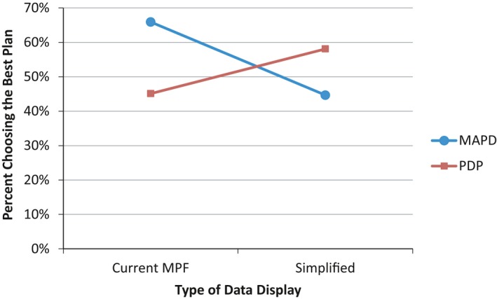
Percent of Participants Choosing the Best (Highest Quality and Lowest Cost) Plan as a Function of Type of Data Display and Type of Plan Considered
- Note. MAPD, Medicare Advantage plan offering prescription drug coverage; MPF, Medicare Plan Finder; PDP, stand‐alone prescription drug plan.
Participants who saw the simplified display evaluated the website more favorably overall than did participants who saw the current display (p = .004; d = 0.39). Participants who saw the simplified display also assessed the navigability/usability of the website more favorably (d = 0.31), thought the information was easier to understand (d = 0.46), and perceived the choice attributes to be of greater use in deciding among plans (d = 0.43), all p values <.02. Display type did not affect participants’ evaluation of the home page (p = .43).
Finally, among the larger group of participants who answered questions about the simplified or current MPF data display in the postexperimental questionnaire, participants who saw the simplified display demonstrated significantly greater comprehension of the information in the display than did participants who saw the current MPF display (p = .04; d = 0.16).
Use of Filters
Those who used filters were more likely to choose a plan and to choose the best plan. Of those who used filters, 68 percent selected a plan, compared with 42 percent of those who did not use filters (p < .001). Among those who made a plan choice, 64 percent of those who used filters chose the best plan compared with 49 percent of those who did not use filters (p = .04). Display type had a significant effect on the use of filters (p = .002); participants who saw the simplified display were more likely to use filters than participants who saw the current MPF display (32 percent vs. 18 percent). The home page had no effect on use of filters (p = .57).
Sensitivity Analysis
We conducted a sensitivity analysis to investigate the possibility that the effects of our MPF design enhancements depend on the characteristics that distinguished those who chose a plan from those who did not: patient activation, household income, and gender. In particular, we conducted a series of four‐way analyses of variance (ANOVAs) to investigate the main and interactive effects of home page type, data display type, plan type, and each of the three participant characteristics. To fit the ANOVA framework and simplify the analysis, we dichotomized patient activation and household income on the basis of median splits of the distributions of these variables in the full sample. The outcome measures included the six variables for which we restricted the main analysis to plan choosers rather than including all participants for whom we had tracking data: overall evaluation of the website, perceived navigation/usefulness of the website, ease of understating information provided, satisfaction with information about plans, and the perceived usefulness of choice attributes. Full results of these analyses, which we briefly summarize here, are presented in Appendix SA6.
For all six outcome measures, there was a statistically significant three‐way interaction between patient activation, home page, and type of data display (Table A.5.1). Inspection of the condition means revealed that, for participants high in patient activation, each MPF design enhancement on its own represented a substantial improvement over the status quo MPF site; presenting both enhancements together did not improve upon the advantage achieved by either enhancement on its own (see Figures A.5.1–A.5.6). In contrast, for participants low in patient activation, neither enhancement on its own resulted in an improvement over the status quo MPF site; the two enhancements together, however, produced a substantial improvement in terms of how these participants evaluated the website. Our sensitivity analysis also revealed evidence of moderation by household income. For three of the six outcome measures, there was an interaction (two significant and one marginally significant; Table A.5.2) between household income and type of home page such that the quick links page resulted in a substantial improvement among low‐income participants but not among high‐income participants. Inspection of the condition means revealed that the quick links home page raised low‐income participants’ evaluations of the MPF site up to where high‐income participants’ evaluations were in the absence of this enhancement (Figures A.5.7–A.5.9). Income did not moderate the four main effects of the simplified data display that were observed in the full sample of plan choosers. Finally, gender did not moderate the effects of either enhancement alone or in combination.
Discussion
The MPF is one of the principal tools through which CMS provides information that Medicare beneficiaries, caregivers, and others can use to make high‐quality decisions when choosing health plans. During the annual open enrollment period, the MPF receives hundreds of thousands of visitors daily (Centers for Medicare & Medicaid Services 2013), and there is some evidence that it improves beneficiaries’ choices: both first‐time enrollees in Medicare Advantage plans and those switching plans are more likely to select plans that have better quality ratings (Reid et al. 2013). Yet beneficiaries report difficulty using the site (Czaja, Sharit, and Nair 2008; Jacobson et al. 2014). If the MPF's complexity leads to errors in consumer decision making, its ability to aid consumer decision making and spur quality improvement efforts is diminished.
In this experiment, we tested two potential enhancements to the MPF: (1) a quick links page designed to orient users to how they can use the tool to achieve specific goals, and (2) a simplified data display designed to make information easier to understand and evaluate. The quick links page had clear positive effects on several subjective outcomes (e.g., perceived navigability and usability of the website); it also increased the proportion choosing the objectively best plan by 33 percent.
The effects of the simplified data display on attitudes, perceptions, and comprehension were consistent across plan type; for both PDPs and MA‐PD, participants who saw the simplified versus the standard data display found the information to be more understandable, evaluated the website more favorably, saw the choice attributes as more useful for decision making, and demonstrated substantially greater comprehension of the information displayed. However, the effects of the simplified data display on choice of the best plan varied markedly by plan type. For those choosing a PDP, the positive effects of the simplified display on attitudes, perceptions, and comprehension translated into an increased probability of choosing the best plan; for those choosing an MA‐PD plan, the simplified display had the opposite effect. While our data do not directly explain why this unexpected result occurred, we note that the simplified MA‐PD display necessarily included much more information than was required for the simpler PDP plans, and that as a result, the column containing quality information was narrower, with the header “Overall Plan/Quality” split into two lines. This may have reduced the visual prominence of the quality information in the MA‐PD display relative to the PDP display, where “Overall Plan Quality” appeared on a single line in a wider column. Regardless of whether this specific design feature accounts for the observed interaction, the results suggest that the specific ways in which data display are simplified can be critically important in determining how helpful the resulting display will be. We also note that the simplified data display, while more streamlined than the current MPF display, still contained a lot of information and terms that are potentially confusing to some viewers. Further simplification of the display may have yielded a more consistent effect on choice.
Our results also show a strong relationship between the use of filters and quality of plan choice. Use of filters was associated with a 64 percent probability of choosing the best plan versus a 46 percent probability of choosing the best plan among those who did not use filters. This difference may reflect self‐selection, as those who employ filters may have more sophisticated decision skills or other characteristics that also make them more likely to interpret data correctly and make better choices. However, it is also possible that making filters easier to use benefits decision quality. This possibility should be explored in future studies.
This study has several limitations. First, the sample excluded young, disabled beneficiaries (16 percent of the Medicare population) who might differ in their familiarity with the Internet and the health care system and might respond differently to the current MPF and the potential enhancements we tested. Second, the large number of participant whom we were not able to track may have reflected that we did not restrict eligibility for this study based on prior Internet use. Diversity of experience with the Internet, and perhaps of equipment, may have contributed to the unexpectedly large proportion of participants from whom we were not able to capture tracking data. Those represented in our tracking data may have been more likely to have up‐to‐date computer hardware and software. If there was a technical reason why users were not captured (e.g., disabled JavaScript), such problems would likely be with older operating systems and browsers that have not been recently updated. Certainly, those represented in our tracking data have higher levels of education and income, characteristics that might be associated with how up‐to‐date their equipment and software was as well as their comfort with the task.
Among participants we were able to track, we found sharp differences between those who chose a plan as instructed and those who left the site without doing so. There were differences in income and patient activation associated with choosing a plan, as well as gender differences, with women more likely to choose a plan than men. Our sensitivity analysis revealed that two of these characteristics, income and patient activation, moderated the effects of our MPF design enhancements in important ways. In general, our analysis suggests that greater assistance may be required in the way of display simplification and navigational aids for consumers who are socioeconomically disadvantaged and relatively less activated compared with consumers who are socioeconomically advantaged and relatively more activated.
Finally, it is important to acknowledge that the MPF represents a compromise between designs for two very different audiences—beneficiaries themselves and the people to whom they turn for assistance. Although one goal CMS has for the MPF is to help beneficiaries make informed decisions through direct interaction with the website, another goal is to ensure that specialist users (e.g., 1‐800‐Medicar(e) call center representatives and a State Health Insurance Assistance Program counselors) have convenient access to the information they need to assist beneficiaries. Given that most beneficiaries still prefer to interact with a human consultant rather than with a website, the design of the MPF is currently tailored more toward meeting the needs of the specialist user (Booth 2016). Although the website features we tested may enhance utility of the site for specialist users as well as beneficiaries, our study was not designed with the specialist users in mind. As more beneficiaries become comfortable with web‐based tools, it may be increasingly feasible for CMS to shift the design of the MPF toward providing the best experience for the average user.
These limitations notwithstanding, results of this experiment demonstrate that marked improvement can be made through presentational enhancements to the online MPF tool, not only in the average users’ experience of the website but also in their understanding and ability to use comparative information to make good decisions when choosing plans. Considering that this tool potentially affects the health care decisions of one‐sixth of the nation, these effects may be large enough to yield meaningful changes in the responsiveness of health plan enrollments to plan quality and cost.
Supporting information
Appendix SA1: Author Matrix.
Appendix SA2: Screen Shot of Current Medicare Plan Finder Home Page (Circa March, 2012).
Appendix SA3: Quick Links Home Page.
Appendix SA4: Simplified Data Display.
Appendix SA5: Measures Derived from Postexperimental Questionnaire.
Appendix SA6: Sensitivity Analysis.
Acknowledgments
Joint Acknowledgment/Disclosure Statement: This study was funded by the Centers for Medicare & Medicaid Services (CMS) contract HHSM‐500‐2005‐00028I to RAND. Although prior approval and notification by CMS is not required, CMS was provided with an advanced copy of the manuscript as a courtesy.
Disclosures: No authors have conflicts of interest to report.
Disclaimers: None.
References
- AQA Reporting Workgroup . 2014. “The Health Care Quality Reporting Landscape” [accessed on October 10, 2014]. Available at http://www.aqaalliance.org/files/AQA_ReportingWGReport100314.pdf
- Bettman, J. R. , Luce M. F., and Payne J. W.. 2008. “Consumer Decision Making: A Choice Goals Approach” In Handbook of Consumer Psychology, edited by Haugtvedt C. P., Herr P. M., and Kardes F. R., pp. 589–610. New York: Lawrence Erlbaum Associates. [Google Scholar]
- Booth, J. 2016. Personal communication with the Director of the Web and New Media group in the Office of Communications at the Centers for Medicare & Medicaid Services. [Google Scholar]
- Centers for Medicare & Medicaid Services . 2013. Medicare Plan Finder: A Look Back at 2012. CMS National Medicare Training Program (NMTP) Call/Webinar, Woodlawn, MD. [Google Scholar]
- Czaja, S. J. , Sharit J., and Nair S. N.. 2008. “Usability of the Medicare Health Web Site.” Journal of the American Medical Association 300 (7): 790–2. [DOI] [PMC free article] [PubMed] [Google Scholar]
- Farkas, D. K. , and Farkas J. B.. 2000. “Guidelines for Developing Web Navigation.” Technical Communication 47 (3): 341–58. [Google Scholar]
- Finucane, M. L. , Mertz C. K., Slovic P., and Schmidt E. S.. 2005. “Task Complexity and Older Adults’ Decision‐Making Competence.” Psychology and Aging 20 (1): 71–84. [DOI] [PubMed] [Google Scholar]
- Fowles, J. B. , Kind E. A., Braun B. L., and Knutson D. J.. 2000. “Consumer Responses to Health Plan Report Cards in Two Markets.” Medical Care 38 (5): 469–81. [DOI] [PubMed] [Google Scholar]
- GfK . 2013. “KnowledgePanel® Design Summary.” [accessed on October 10, 2014]. Available at http://www.gfk.com/Documents/GfK-KnowledgePanel-Design-Summary.pdf
- Greene, J. , and Peters E.. 2009. “Medicaid Consumers and Informed Decision making.” Health Care Financing Review 30 (3): 25–40. [PMC free article] [PubMed] [Google Scholar]
- Hanoch, Y. , Rice T., Cummings J., and Wood S.. 2009. “How Much Choice Is Too Much? The Case of the Medicare Prescription Drug Benefit.” Health Services Research 44 (4): 1157–68. [DOI] [PMC free article] [PubMed] [Google Scholar]
- Hibbard, J. H. , Slovic P., Peters E., and Finucane M. L.. 2002. “Strategies for Reporting Health Plan Performance Information to Consumers: Evidence from Controlled Studies.” Health Services Research 37 (2): 291–313. [DOI] [PMC free article] [PubMed] [Google Scholar]
- Hibbard, J. , Mahoney E. R., Stockard J., and Tusler M.. 2005. “Development and Testing of a Short Form of the Patient Activation Measure.” Health Services Research 40 (6 Pt 1): 1918–30. [DOI] [PMC free article] [PubMed] [Google Scholar]
- Hoadley, J. , Cubanski J., and Neuman T.. 2015. “Medicare Part D: A First Look at Plan Offerings in 2016” [accessed on February 11, 2016]. Available at http://kff.org/medicare/issue-brief/medicare-part-d-a-first-look-at-plan-offerings-in-2016
- Hwang, M. I. , and Lin J. W.. 1999. “Information Dimension, Information Overload and Decision Quality.” Journal of Information Science 25 (3): 213–8. [Google Scholar]
- Jacobson, G. , Swoope C., Perry M., and Slosar M. C.. 2014. “How Are Seniors Choosing and Changing Health Insurance Plans? Findings from Focus Groups with Medicare Beneficiaries” [accessed on October 10, 2014]. Available at http://kff.org/medicare/report/how-are-seniors-choosing-and-changing-health-insurance-plans
- Jacoby, J. 1977. “Information Load and Decision Quality: Some Contested Issues.” Journal of Marketing Research 14 (4): 569–73. [Google Scholar]
- Jewett, J. J. , and Hibbard J. H.. 1996. “Comprehension of Quality Care Indicators: Differences among Privately Insured, Publicly Insured, and Uninsured.” Health Care Financing Review 18 (1): 75–94. [PMC free article] [PubMed] [Google Scholar]
- Kaplan, M. F. , Wanshula L. T., and Zanna M. P.. 1993. “Time Pressure and Information Integration in Social Judgment: The Effect of Need for Structure” In Time Pressure and Stress in Human Judgment and Decision Making, edited by Svenson O. and Maule A. J., pp. 255–67. New York: Plenum Press. [Google Scholar]
- Koyani, S. J. , Bailey R. W., and Nall J. R.. 2006. “Research Based Web Design & Usability Guidelines” [accessed on February 11, 2016]. Available at http://www.usability.gov/sites/default/files/documents/guidelines_book.pdf
- Lurie, N. H. 2004. “Decision Making in Information‐Rich Environments: The Role of Information Structure.” Journal of Consumer Research 30 (4): 473–86. [Google Scholar]
- Malhotra, N. K. 1982. “Information Load and Consumer Decision Making.” Journal of Consumer Research 8 (4): 419–30. [Google Scholar]
- Mata, R. , and Nunes L.. 2010. “When Less Is Enough: Cognitive Aging, Information Search, and Decision Quality in Consumer Choice.” Psychology and Aging 25 (2): 289–98. [DOI] [PubMed] [Google Scholar]
- Nielsen, J. , and Loranger H.. 2006. Prioritizing Web Usability. New York: New Riders. [Google Scholar]
- Reid, R. O. , Deb P., Howell B. L., and Shrank W. H.. 2013. “Association between Medicare Advantage Plan Star Ratings and Enrollment.” Journal of the American Medical Association 309 (3): 267–74. [DOI] [PubMed] [Google Scholar]
- Suri, R. , and Monroe K. B.. 2003. “The Effects of Time Constraints on Consumers’ Judgments of Prices and Products.” Journal of Consumer Research 30 (1): 92–104. [Google Scholar]
- Uhrig, J. D. , Harris‐Kojetin L., Bann C., and Kuo T. M.. 2006. “Do Content and Format Affect Older Consumers’ Use of Comparative Information in a Medicare Health Plan Choice? Results from a Controlled Experiment.” Medical Care Research and Review 63 (6): 701–18. [DOI] [PubMed] [Google Scholar]
Associated Data
This section collects any data citations, data availability statements, or supplementary materials included in this article.
Supplementary Materials
Appendix SA1: Author Matrix.
Appendix SA2: Screen Shot of Current Medicare Plan Finder Home Page (Circa March, 2012).
Appendix SA3: Quick Links Home Page.
Appendix SA4: Simplified Data Display.
Appendix SA5: Measures Derived from Postexperimental Questionnaire.
Appendix SA6: Sensitivity Analysis.