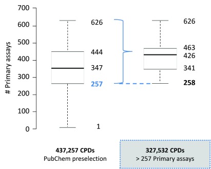
Figure 1. Assay frequency distribution.
The frequency distribution of primary assays is shown in a boxplot format for 437,257 pre-selected PubChem compounds and a subset of 327,532 compounds. The plot gives the smallest number of primary assays (lower whisker), first quartile (lower boundary of the box), median value (thick line), third quartile (upper boundary of the box), and largest number of assays (upper whisker). Outliers are not displayed. The dashed blue line indicates the selection criterion for the compound subset (i.e., tested in more than 257 primary assays).

