Abstract
INTRODUCTION
Cancer is a leading cause of morbidity and mortality in the United States and results in a high economic burden.
OBJECTIVE
To estimate age-standardized mortality rates by US county from 29 cancers.
DESIGN AND SETTING
Deidentified death records from the National Center for Health Statistics (NCHS) and population counts from the Census Bureau, the NCHS, and the Human Mortality Database from 1980 to 2014 were used. Validated small area estimation models were used to estimate county-level mortality rates from 29 cancers: lip and oral cavity; nasopharynx; other pharynx; esophageal; stomach; colon and rectum; liver; gallbladder and biliary; pancreatic; larynx; tracheal, bronchus, and lung; malignant skin melanoma; nonmelanoma skin cancer; breast; cervical; uterine; ovarian; prostate; testicular; kidney; bladder; brain and nervous system; thyroid; mesothelioma; Hodgkin lymphoma; non-Hodgkin lymphoma; multiple myeloma; leukemia; and all other cancers combined.
EXPOSURE
County of residence.
MAIN OUTCOMES AND MEASURES
Age-standardized cancer mortality rates by county, year, sex, and cancer type.
RESULTS
A total of 19 511 910 cancer deaths were recorded in the United States between 1980 and 2014, including 5 656 423 due to tracheal, bronchus, and lung cancer; 2 484 476 due to colon and rectum cancer; 1 573 593 due to breast cancer; 1 077 030 due to prostate cancer; 1 157 878 due to pancreatic cancer; 209 314 due to uterine cancer; 421 628 due to kidney cancer; 487 518 due to liver cancer; 13 927 due to testicular cancer; and 829 396 due to non-Hodgkin lymphoma. Cancer mortality decreased by 20.1%(95% uncertainty interval [UI], 18.2%–21.4%) between 1980 and 2014, from 240.2 (95% UI, 235.8–244.1) to 192.0 (95% UI, 188.6–197.7) deaths per 100 000 population. There were large differences in the mortality rate among counties throughout the period: in 1980, cancer mortality ranged from 130.6 (95% UI, 114.7–146.0) per 100 000 population in Summit County, Colorado, to 386.9 (95% UI, 330.5–450.7) in North Slope Borough, Alaska, and in 2014 from 70.7 (95% UI, 63.2–79.0) in Summit County, Colorado, to 503.1 (95% UI, 464.9–545.4) in Union County, Florida. For many cancers, there were distinct clusters of counties with especially high mortality. The location of these clusters varied by type of cancer and were spread in different regions of the United States. Clusters of breast cancer were present in the southern belt and along the Mississippi River, while liver cancer was high along the Texas-Mexico border, and clusters of kidney cancer were observed in North and South Dakota and counties in West Virginia, Ohio, Indiana, Louisiana, Oklahoma, Texas, Alaska, and Illinois.
CONCLUSIONS AND RELEVANCE
Cancer mortality declined overall in the United States between 1980 and 2014. Over this same period, there were important changes in trends, patterns, and differences in cancer mortality among US counties. These patterns may inform further research into improving prevention and treatment.
Cancer is the second leading cause of death in the United States and globally.1 Moreover, cancer is a major cause of morbidity in the United States1 and is associated with a high economic burden.2 Overall cancer mortality rates have declined in the United States in recent decades; however, major differences in cancer mortality still exist.3
Several studies have reported on the variation in cancer mortality by state.4,5 This variation is at least partially explained by differences in risk factors, socioeconomic factors, and access to high-quality treatment.6 For example, smoking rates have declined in the United States, but this decline varied by location.7 Similarly, while obesity increased in recent years throughout the United States,8 the rate of increase varied widely.9 Moreover, access to health care and the quality of available health care varies tremendously among states and different socioeconomic groups.10
Most previous reports on geographic differences in cancer mortality have focused on variation by state, with less information available at the county level.4 There is a value for data at the county level because public health programs and policies are mainly designed and implemented at the local level. Moreover, local information can also be useful for health care clinicians to understand community needs for care and aid in identifying cancer hot spots that need more investigation to understand the root causes.
Methods
This analysis used methods reported in detail elsewhere.11 A brief description of this approach and its application to cancer mortality is provided below. This research received institutional review board approval from the University of Washington. Informed consent was not required because the study used deidentified data and was retrospective.
Data
Deidentified death records from the National Center for Health Statistics (NCHS)12 and population counts from the Census Bureau,13 the NCHS,14–16 and the Human Mortality Database were used.17 Deaths and population were tabulated by county, age group (0, 1–4, 5–9, …, 75–79, and ≥80 years), sex, year, and (in the case of death data) cause. County-level information on levels of education, income, race/ethnicity, Native American reservations, and population density derived from data provided by the Census Bureau and the NCHS were also used. More detail on these data sources is provided in eTable 1 in the Supplement.
Cause List and Garbage Code Redistribution Methods
The study used the cause list developed for the Global Burden of Diseases, Injuries, and Risk Factors Study (GBD).1 This cause list is arranged hierarchically in 4 levels, and within each level the list is exhaustive and mutually exclusive. eTable 2 in the Supplement lists all causes in the GBD cause list and the International Classification of Diseases, Ninth Revision and International Statistical Classification of Diseases and Related Health Problems, Tenth Revision codes that correspond to each cause. Although the focus of this study is cancers, all causes of death in the GBD cause list were analyzed concurrently.
Previous studies1 have documented the existence of “garbage codes” in death registration data, which may lead to misleading spatial and temporal patterns, as well as misleading ranks among causes, as the percentage of deaths assigned garbage codes varies by location, year, and true underlying cause. This study used garbage redistribution methods developed for the GBD to reallocate deaths assigned garbage codes.1 First, plausible target causes were identified for each garbage code or group of garbage codes. Second, deaths were reassigned to the specified target codes according to proportions derived in 1 of 4 ways: (1) published literature or expert opinion; (2) regression models; (3) according to the proportions initially observed among targets; and (4) for HIV/AIDS specifically, by comparison with years before HIV/AIDS became widespread.
Small Area Models
The study estimated spatially explicit Bayesian mixed-effects regression models for cancer mortality in the GBD hierarchy, separately for males and females. The model for each cause was specified as
where Dj,t,a, Pj,t,a, and mj,t,a are the number of deaths, the population, and the underlying mortality rate, respectively, for county j, year t, and age group a. The model for mj,t,a contained 6 components: an intercept (β0), fixed covariate effects (β1),random age-time effects (γ1,a,t),random spatial effects (γ2,j), random space-time effects (γ3,j and γ4,j,t), and random space-age effects (γ5,j and γ6,j,a). The model incorporated 7 covariates: the proportion of the adult population that graduated high school, the proportion of the population that is Hispanic, the proportion of the population that is black, the proportion of the population that is a race other than black or white, the proportion of a county that is contained within a state or federal Native American reservation, the median household income, and the population density. γ1, γ2, γ3, and γ5 were assumed to follow conditional autoregressive distributions, which allow for smoothing over adjacent age groups and years (γ1) or counties (γ2, γ3, and γ5). γ4 and γ6 were assumed to follow independent mean-zero normal distributions.
Models were fit using the Template Model Builder Package18 in R version 3.2.4.19 Model predictions were then raked (ie, iteratively scaled along multiple dimensions) to ensure consistency between levels of the cause hierarchy and simultaneously ensure consistency with existing national-level estimates from the GBD. After raking, age-standardized mortality rates were calculated using the US 2010 Census population as the standard, and years of life lost were calculated by multiplying the mortality rate by population by life expectancy at the average age at death in the reference life table used in the GBD1 and then summing across all ages. When measuring changes over time, the change was considered statistically significant if the posterior probability of an increase (or decrease) was at least 95%. No explicit correction for multiple testing (ie, across multiple counties) was applied; however, modeling all counties simultaneously is expected to mitigate the risk of spuriously detecting changes due to multiple testing. The study reports mortality rates for lip and oral cavity; nasopharynx; other pharynx; esophageal; stomach; colon and rectum; liver; gallbladder and biliary; pancreatic; larynx; tracheal, bronchus, and lung; malignant skin melanoma; nonmelanoma skin cancer; breast; cervical; uterine; ovarian; prostate; testicular; kidney; bladder; brain and nervous system; thyroid; mesothelioma; Hodgkin lymphoma; non-Hodgkin lymphoma; multiple myeloma; leukemia; and all other cancers combined.
Risk Factors and Population-Attributable Fraction
Full detailed methods for calculating relative risks and population-attributable fractions are available elsewhere.20 Briefly, GBD 2015 used the comparative risk assessment framework developed for previous iterations of the GBD study to estimate attributable deaths, disability-adjusted life-years, and trends in exposure by age group, sex, year, and geography for 79 behavioral, environmental and occupational, and metabolic risks or clusters of risks over the period 1990 to 2015. Two types of risk assessments are possible within the comparative risk assessment framework: attributable burden and avoidable burden. Attributable burden is the reduction in current disease burden that would have been possible if past population exposure had shifted to an alternative or counterfactual distribution of risk exposure. Avoidable burden is the potential reduction in future disease burden that could be achieved by changing the current distribution of exposure to a counterfactual distribution of exposure. Four types of counterfactual exposure distributions have been identified21: (1) theoretical minimum risk; (2) plausible minimum risk; (3) feasible minimum risk; and (4) cost-effective minimum risk. In GBD studies and in this study, the focus was on attributable burden using the theoretical minimum risk level, which is the level of risk exposure that minimizes risk at the population level or the level of risk that captures the maximum attributable burden.
Results
Table 1 shows the number of deaths, years of life lost, and age-standardized mortality rates at the national level as well as the distribution of age-standardized mortality rates at the county level for each cancer. The study reported the number of years of life lost in addition to deaths to account for the fact that many deaths from certain cancers occur at an older age. For example, prostate cancer was the fifth leading cause of death among cancers but the ninth leading cause of cancer years of life lost. Lung, colon, and breast cancer were the top 3 leading causes for all metrics. Lung, colon, and breast cancers also had the largest absolute difference in mortality between counties at the 90th percentile and the 10th percentile. Lung cancer mortality rates were twice as high among counties in the 90th percentile compared with counties in the 10th.
Table 1.
National Deaths, Years of Life Lost (YLLs), Age-Standardized Mortality Rate, and Distribution of Age-Standardized Mortality Rates at the County Level in 2014a
| Cause of Death | National Deaths, YLLs, and Mortality Rate
|
County-Level Mortality Rate
|
||||||||
|---|---|---|---|---|---|---|---|---|---|---|
| No. of Deaths/100 000 Population
|
90th Minus 10th Percentile, No./100 000 Population (Rank)b | 90th/10th Percentile Ratio (Rank)c | ||||||||
| Deaths, No. ×1000 (Rank) | YLLs, No. ×1000 (Rank) | Mortality Rate, No./100 000 Population (Rank) | Minimum | 10th Percentile | Median | 90th Percentile | Maximum | |||
| Neoplasms | 646.0 | 12125.5 | 192.0 | 70.7 | 169.5 | 204.3 | 246.3 | 503.1 | 76.8 | 1.5 |
|
| ||||||||||
| Lip and oral cavity cancer | 6.1 (20) | 124.0 (20) | 1.8 (20) | 0.8 | 1.5 | 1.9 | 2.6 | 8.9 | 1.1 (18) | 1.8 (10) |
|
| ||||||||||
| Nasopharynx cancer | 1.0 (28) | 29.1 (28) | 0.3 (28) | 0.1 | 0.2 | 0.3 | 0.4 | 4.0 | 0.2 (26) | 2.2 (1) |
|
| ||||||||||
| Other pharynx cancer | 3.3 (23) | 73.4 (22) | 1.0 (23) | 0.4 | 0.7 | 1.0 | 1.4 | 4.0 | 0.6 (23) | 1.9 (6) |
|
| ||||||||||
| Esophageal cancer | 17.1 (10) | 350.1 (11) | 5.1 (10) | 2.3 | 4.3 | 5.5 | 6.7 | 10.6 | 2.4 (8) | 1.5 (14) |
|
| ||||||||||
| Stomach cancer | 15.9 (13) | 282.5 (14) | 4.8 (13) | 1.8 | 3.3 | 4.2 | 5.9 | 20.8 | 2.6 (7) | 1.8 (8) |
|
| ||||||||||
| Colon and rectum cancer | 74.3 (2) | 1323.3 (2) | 22.1 (2) | 8.1 | 19.8 | 24.4 | 30.1 | 58.4 | 10.3 (2) | 1.5 (15) |
|
| ||||||||||
| Liver cancer | 23.0 (8) | 481.6 (7) | 6.8 (8) | 2.3 | 4.6 | 6.2 | 8.4 | 37.6 | 3.8 (5) | 1.8 (7) |
|
| ||||||||||
| Gallbladder and biliary tract cancer | 3.9 (22) | 65.1 (23) | 1.1 (22) | 0.5 | 0.9 | 1.1 | 1.4 | 4.2 | 0.4 (25) | 1.5 (18) |
|
| ||||||||||
| Pancreatic cancer | 43.1 (4) | 768.9 (4) | 12.8 (4) | 5.7 | 11.3 | 12.8 | 14.5 | 22.8 | 3.1 (6) | 1.3 (26) |
|
| ||||||||||
| Larynx cancer | 4.5 (21) | 92.7 (21) | 1.3 (21) | 0.4 | 0.9 | 1.3 | 1.9 | 5.6 | 1.0 (20) | 2.1 (4) |
|
| ||||||||||
| Tracheal, bronchus, and lung cancer | 183.0 (1) | 3383.1 (1) | 54.2 (1) | 10.7 | 41.9 | 61.2 | 85.0 | 231.2 | 43.0 (1) | 2.0 (5) |
|
| ||||||||||
| Malignant skin melanoma | 10.1 (17) | 225.7 (16) | 3.0 (17) | 1.0 | 2.5 | 3.4 | 4.2 | 7.2 | 1.7 (13) | 1.7 (12) |
|
| ||||||||||
| Nonmelanoma skin cancer | 3.3 (24) | 53.9 (24) | 1.0 (24) | 0.4 | 0.8 | 1.1 | 1.4 | 2.6 | 0.5 (24) | 1.7 (11) |
|
| ||||||||||
| Breast cancer | 47.9 (3) | 1026.9 (3) | 14.3 (3) | 5.2 | 11.5 | 13.9 | 17.2 | 29.5 | 5.7 (3) | 1.5 (16) |
|
| ||||||||||
| Cervical cancer | 6.6 (19) | 172.1 (18) | 2.0 (19) | 0.6 | 1.3 | 1.9 | 2.8 | 5.2 | 1.4 (16) | 2.1 (3) |
|
| ||||||||||
| Uterine cancer | 7.2 (18) | 131.8 (19) | 2.1 (18) | 0.8 | 1.6 | 2.0 | 2.5 | 4.0 | 0.9 (21) | 1.6 (13) |
|
| ||||||||||
| Ovarian cancer | 15.8 (14) | 313.6 (12) | 4.7 (14) | 1.4 | 3.9 | 4.6 | 5.3 | 7.1 | 1.4 (17) | 1.3 (23) |
|
| ||||||||||
| Prostate cancer | 34.1 (5) | 428.4 (9) | 10.2 (5) | 5.5 | 9.0 | 10.7 | 13.4 | 24.0 | 4.4 (4) | 1.5 (17) |
|
| ||||||||||
| Testicular cancer | 0.4 (29) | 17.4 (29) | 0.1 (29) | 0.1 | 0.1 | 0.1 | 0.2 | 0.7 | 0.1 (29) | 1.8 (9) |
|
| ||||||||||
| Kidney cancer | 15.4 (15) | 301.4 (13) | 4.6 (15) | 2.1 | 4.3 | 5.2 | 6.2 | 9.7 | 1.9 (11) | 1.4 (19) |
|
| ||||||||||
| Bladder cancer | 16.9 (11) | 236.4 (15) | 5.0 (11) | 2.5 | 4.3 | 5.1 | 6.0 | 8.9 | 1.7 (12) | 1.4 (20) |
|
| ||||||||||
| Brain and nervous system cancer | 16.0 (12) | 423.7 (10) | 4.8 (12) | 1.8 | 4.4 | 5.2 | 5.9 | 9.2 | 1.5 (14) | 1.4 (22) |
|
| ||||||||||
| Thyroid cancer | 1.9 (26) | 34.1 (27) | 0.6 (26) | 0.3 | 0.5 | 0.5 | 0.6 | 0.9 | 0.1 (28) | 1.2 (29) |
|
| ||||||||||
| Mesothelioma | 3.3 (25) | 53.3 (25) | 1.0 (25) | 0.4 | 0.6 | 0.9 | 1.4 | 4.9 | 0.7 (22) | 2.1 (2) |
|
| ||||||||||
| Hodgkin lymphoma | 1.3 (27) | 36.0 (26) | 0.4 (27) | 0.2 | 0.3 | 0.4 | 0.5 | 0.8 | 0.1 (27) | 1.4 (21) |
|
| ||||||||||
| Non-Hodgkin lymphoma | 27.9 (7) | 487.4 (6) | 8.3 (7) | 3.9 | 7.5 | 8.6 | 9.8 | 15.8 | 2.3 (9) | 1.3 (24) |
|
| ||||||||||
| Multiple myeloma | 13.0 (16) | 219.0 (17) | 3.9 (16) | 2.0 | 3.5 | 3.9 | 4.5 | 6.6 | 1.1 (19) | 1.3 (25) |
|
| ||||||||||
| Leukemia | 30.0 (6) | 546.2 (5) | 9.0 (6) | 4.2 | 8.4 | 9.6 | 10.6 | 16.6 | 2.2 (10) | 1.3 (28) |
|
| ||||||||||
| Acute lymphoid leukemia | 2.3 | 83.1 | 0.7 | 0.3 | 0.6 | 0.7 | 0.9 | 1.8 | 0.3 | 1.5 |
|
| ||||||||||
| Chronic lymphoid leukemia | 8.8 | 108.9 | 2.6 | 1.1 | 2.4 | 2.9 | 3.3 | 4.3 | 0.9 | 1.4 |
|
| ||||||||||
| Acute myeloid leukemia | 17.0 | 321.6 | 5.1 | 2.3 | 4.7 | 5.3 | 5.9 | 9.4 | 1.2 | 1.3 |
|
| ||||||||||
| Chronic myeloid leukemia | 1.9 | 32.7 | 0.6 | 0.3 | 0.5 | 0.6 | 0.7 | 1.1 | 0.2 | 1.3 |
|
| ||||||||||
| Other neoplasms | 19.5 (9) | 444.3 (8) | 5.9 (9) | 2.7 | 5.5 | 6.2 | 7.0 | 9.9 | 1.5 (15) | 1.3 (27) |
Neoplasms overall and leukemia subtypes are not included in the rankings. Cancer types are ordered as listed in the Global Burden of Diseases, Injuries, and Risk Factors Study cause list (eTable 2 in the Supplement).
Measure of absolute geographic inequality.
Measure of relative geographic inequality.
Table 2 shows the 5-year relative survival for selected cancers from the Surveillance, Epidemiology, and End Results program22,23 (the corresponding age-specific estimates are given in eTable 3 in the Supplement) and the population-attributable fraction from the GBD using the comparative risk assessment approach.20 Although cancer survival improved from 1973 to 2014 for all cancers, 6 cancers (testicular, thyroid, prostate, breast, melanoma, and Hodgkin lymphoma)had a 5-year survival rate of more than 85%. The population attributable fraction of risk factors was the highest for lung and cervical cancer and the lowest for ovarian cancer.
Table 2.
Population-Attributable Fractions (PAFs)20 in 2015 and 5-Year Relative Survival,22,23 1950–2013, by Cancer
| Cancer Typea | PAF in 2015 (95% UI)b | 5-Year Relative Survival, % (95% UI)c | |||||
|---|---|---|---|---|---|---|---|
| 1950–1954d | 1973–1977 | 1978–1982 | 2008–2013 | Absolute Difference Between First and Latest Year of Data | Ratio of (1−Survival/100), Latest Year of Data to First Year of Data | ||
| Neoplasms | 0.50 (0.48–0.52) | 35 | 48.2 (48.0–48.4) | 49.4 (49.2–49.6) | 67.0 (66.8–67.1) | 32.0 | 0.51 |
| Lip and oral cavity cancer | 0.80 (0.75–0.84) | 46 | 61.5 (60.1–62.9) | 61.0 (59.7–62.3) | 66.4 (65.5–67.3) | 20.4 | 0.62 |
| Nasopharynx cancer | 0.79 (0.74–0.83) | 38.0 (33.6–42.3) | 43.4 (39.2–47.4) | 62.7 (60.1–65.2) | 24.7 | 0.60 | |
| Other pharynx cancer | 0.37 (0.31–0.43) | 29.1 (26.9–31.4) | 31.6 (29.6–33.7) | 61.1 (59.8–62.4) | 32.0 | 0.55 | |
| Esophageal cancer | 0.84 (0.76–0.91) | 4 | 4.8 (4.0–5.7) | 5.8 (5.0–6.7) | 18.2 (17.3–19.1) | 14.2 | 0.85 |
| Stomach cancer | 0.41 (0.25–0.62) | 12 | 14.6 (13.8–15.5) | 16.7 (15.8–17.5) | 31.3 (30.5–32.1) | 19.3 | 0.78 |
| Colon and rectum cancer | 0.57 (0.51–0.63) | 37 | 48.8 (48.2–49.4) | 52.3 (51.8–52.9) | 64.9 (64.5–65.3) | 27.9 | 0.56 |
| Liver cancer | 0.81 (0.77–0.85) | 1 | 3.5 (2.6–4.5) | 3.3 (2.5–4.2) | 17.5 (16.9–18.1) | 16.5 | 0.83 |
| Gallbladder and biliary tract cancer | 0.24 (0.15–0.34) | 8.7 (7.1–10.6) | 10.2 (8.4–12.0) | 18.7 (17.0–20.4) | 10.0 | 0.89 | |
| Pancreatic cancer | 0.38 (0.33–0.44) | 1 | 2.6 (2.2–3.0) | 2.7 (2.4–3.1) | 8.0 (7.6–8.4) | 7.0 | 0.93 |
| Larynx cancer | 0.89 (0.83–0.93) | 52 | 65.5 (63.7–67.3) | 66.3 (64.6–67.9) | 61.7 (60.3–63.0) | 9.7 | 0.80 |
| Tracheal, bronchus, and lung cancer | 0.90 (0.89–0.91) | 6 | 11.9 (11.5–12.2) | 12.8 (12.5–13.2) | 18.0 (17.7–18.2) | 12.0 | 0.87 |
| Malignant skin melanoma | 0.00 (0.00–0.00) | 49 | 79.7 (78.4–80.8) | 82.5 (81.5–83.4) | 91.6 (91.1–92.0) | 42.6 | 0.16 |
| Breast cancer | 0.26 (0.21–0.31) | 60 | 74.1 (73.6–74.6) | 75.1 (74.6–75.6) | 89.7 (89.4–89.9) | 29.7 | 0.26 |
| Cervical cancer | 1.00 (1.00–1.00) | 59 | 67.9 (66.6–69.2) | 66.9 (65.5–68.2) | 66.3 (65.4–67.3) | 7.3 | 0.82 |
| Uterine cancer | 0.49 (0.38–0.60) | 72 | 87.3 (86.6–88.0) | 82.5 (81.7–83.3) | 82.7 (82.2–83.2) | 10.7 | 0.62 |
| Ovarian cancer | 0.05 (0.00–0.10) | 30 | 36.2 (34.9–37.4) | 37.7 (36.5–38.9) | 47.2 (46.3–48.1) | 17.2 | 0.75 |
| Prostate cancer | 0.00 (0.00–0.00) | 43 | 65.7 (64.9–66.6) | 70.8 (70.1–71.6) | 98.6 (98.4–98.8) | 55.6 | 0.02 |
| Testicular cancer | 0.00 (0.00–0.00) | 57 | 79.8 (77.7–81.8) | 90.6 (89.1–91.9) | 95.5 (95.0–96.0) | 38.5 | 0.10 |
| Kidney cancer | 0.44 (0.36–0.52) | 34 | 49.2 (47.6–50.7) | 51.1 (49.6–52.5) | 74.4 (73.9–75.0) | 40.4 | 0.39 |
| Bladder cancer | 0.42 (0.33–0.51) | 53 | 71.5 (70.4–72.5) | 75.1 (74.1–76.1) | 77.0 (76.4–77.6) | 24.0 | 0.49 |
| Brain and nervous system cancer | 0.00 (0.00–0.00) | 21 | 20.8 (19.6–22.0) | 23.9 (22.8–25.1) | 33.7 (33.0–34.4) | 12.7 | 0.84 |
| Thyroid cancer | 0.17 (0.10–0.25) | 80 | 91.1 (89.9–92.1) | 92.7 (91.7–93.7) | 98.1 (97.8–98.4) | 18.1 | 0.10 |
| Mesothelioma | 0.79 (0.65–0.89) | 9.4 (6.9–12.4) | 6.9 (5.1–9.1) | 9.1 (7.6–10.8) | −0.3 | 1.00 | |
| Hodgkin lymphoma | 0.00 (0.00–0.00) | 30 | 68.6 (66.8–70.4) | 72.1 (70.4–73.8) | 86.6 (85.7–87.4) | 56.6 | 0.19 |
| Non-Hodgkin lymphoma | 0.00 (0.00–0.00) | 33 | 45.3 (44.1–46.5) | 48.7 (47.6–49.7) | 71.2 (70.7–71.7) | 38.2 | 0.43 |
| Multiple myeloma | 0.00 (0.00–0.00) | 6 | 23.4 (21.8–25.0) | 26.6 (25.1–28.2) | 49.8 (48.7–50.8) | 43.8 | 0.53 |
| Leukemia | 0.25 (0.17–0.34) | 10 | 34.0 (32.9–35.1) | 36.3 (35.3–37.4) | 60.1 (59.4–60.7) | 50.1 | 0.44 |
| Acute lymphoid leukemia | 39.2 (36.3–42.2) | 50.5 (47.6–53.3) | 68.1 (66.7–69.4) | 28.9 | 0.52 | ||
| Chronic lymphoid leukemia | 67.0 (64.7–69.2) | 66.3 (64.1–68.3) | 82.5 (81.2–83.6) | 15.5 | 0.53 | ||
| Acute myeloid leukemia | 6.2 (5.2–7.2) | 7.9 (6.9–9.0) | 27.4 (26.4–28.3) | 21.2 | 0.77 | ||
| Chronic myeloid leukemia | 21.1 (18.8–23.5) | 25.8 (23.3–28.3) | 66.4 (64.6–68.1) | 45.3 | 0.43 | ||
Abbreviation: UI, uncertainty interval.
Cancer types are ordered as listed in the Global Burden of Diseases, Injuries, and Risk Factors Study cause list (eTable 2 in the Supplement).
PAFs are expressed as a proportion.
Five-year relative survival is a measure of the net survival from cancer in the absence of other diseases for at least five years after diagnosis.
95% UIs are not available for 1950–1954 data.
Results for all cancers combined and for 10 specific cancers are presented below and graphically in the Figures, with results for the remaining cancers presented in eFigures 1–23 in the Supplement. The 10 specific cancers highlighted below were chosen because they have either high burden (eg, tracheal, bronchus, and lung cancer), because they are responsive to treatment (eg, testicular cancer), or because screening is an important component of the health system response (eg, breast cancer). For cancers that predominantly or exclusively affect males or females (eg, breast cancer, prostate cancer), results are reported for males or females only, while in all other cases results are presented for both sexes combined. Mortality rates by county for each cancer are available in an online visualization tool (Interactive).
All Cancers
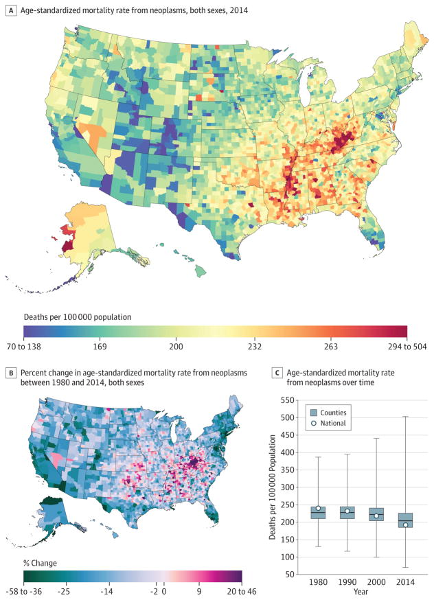
From 1980 to 2014, 19 511 910 cancer deaths were recorded in the United States. Cancer mortality (Figure 1) decreased from 1980 to 2014, with mortality rates dropping from 240.2 (95% uncertainty interval [UI], 235.8–244.1) deaths per 100 000 population in 1980 to 192.0 (95% UI, 188.6–197.7) in 2014, a 20.1% (95% UI, 18.2%–21.4%) decrease. In 1980, the lowest mortality rate was 130.6 (95% UI, 114.7–146.0) deaths per 100 000 population in Summit County, Colorado, while the highest was 386.9 (95% UI, 330.5–450.7) in North Slope Borough, Alaska; in 2014, the lowest was 70.7 (95% UI, 63.2–79.0) deaths per 100 000 population for Summit County, Colorado, and 503.1 (95% UI, 464.9–545.4) in Union County, Florida (eTable 4 in the Supplement). In 2014, there were clusters of high mortality in several areas of the South, in Kentucky, West Virginia, Alabama, and along the Mississippi River, and in Western Alaska. Moreover, there were some high rates in counties in North and South Dakota and Texas, while lower rates were present in Utah and Colorado. There were statistically significant increases in cancer mortality between 1980 and 2014 in 160 counties, with the highest rates of increase observed in Kentucky and scattered across regions of the South.
Figure 1. County-Level Mortality From Neoplasms.
A, Age-standardized mortality rate for both sexes combined in 2014. B, Relative percent change in the age-standardized mortality rate for both sexes combined between 1980 and 2014. In panels A, and B, the color scale is truncated at approximately the first and 99th percentiles as indicated by the range given in the color scale. C, Age-standardized mortality rate in 1980, 1990, 2000, and 2014. The bottom border, middle line, and top border of the boxes indicate the 25th, 50th, and 75th percentiles, respectively, across all counties; whiskers, the full range across counties; and circles, the national-level rate.
Tracheal, Bronchus, and Lung Cancer
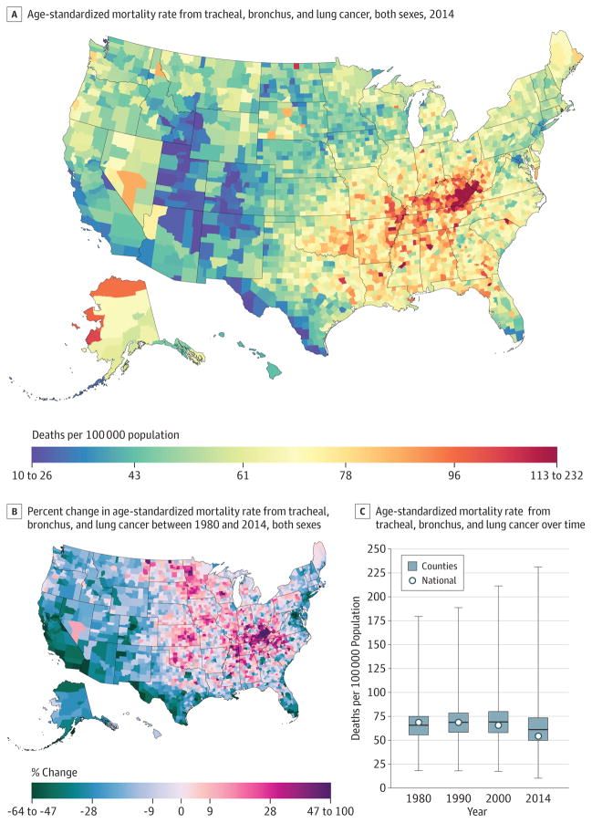
A total of 5 656 423 deaths from tracheal, bronchus, and lung cancer were recorded between 1980 and 2014. Tracheal, bronchus, and lung cancer mortality (Figure 2) declined by 21.0% (95% UI, 17.9%–24.0%) between 1980 and 2014, from 68.6 (95% UI, 66.8–70.3) deaths per 100 000 population to 54.2 (95% UI, 52.7–55.6). The West and Northeast experienced declines in the mortality rate, as did Florida, while increases were observed in the South, Appalachian region, and the Midwest. The largest increase from 1980 to 2014 was observed in Owsley County, Kentucky (99.7%; 95% UI, 73.7%–130.8%), while the greatest decline was observed in Aleutians East Borough and Aleutians West Census Area, Alaska (63.6%; 95% UI, 50.3%–73.5%). High mortality rates in 2014 were clustered in Kentucky and West Virginia. Because national rates peaked in 1988, women in 2215 counties experienced a statistically significant increase in the mortality rate, while this was true for men in only 11 counties. The highest national mortality rate for men was present in 1980, while the peak in mortality rate for women was in 2001. The largest percentage increase (168.3%; 95% UI, 136.4%207.8) from 1980 to the peak in 2001 for women was observed in Marlboro County, South Carolina (mortality rate of 67.1 [95% UI, 61.4–73.5] deaths per 100000 population in 2001). Mortality rates varied from 10.6 (95% UI, 8.6–12.8) in Summit County, Colorado, to 334.9 (95% UI, 300.5–375.2) in Union County, Florida, for males and 10.9 (95% UI, 8.3–13.8) in Summit County, Colorado, to 121 (95% UI, 101.6–142.0) in Owsley County, Kentucky, for females. Low rates were observed along the US border with Mexico and in Utah, Colorado, and parts of Arizona, New Mexico, and Idaho.
Figure 2. County-Level Mortality From Tracheal, Bronchus, and Lung Cancer.
A, Age-standardized mortality rate for both sexes combined in 2014. B, Relative percent change in the age-standardized mortality rate for both sexes combined between 1980 and 2014. In panels A, and B, the color scale is truncated at approximately the first and 99th percentiles as indicated by the range given in the color scale. C, Age-standardized mortality rate in 1980, 1990, 2000, and 2014. The bottom border, middle line, and top border of the boxes indicate the 25th, 50th, and 75th percentiles, respectively, across all counties; whiskers, the full range across counties; and circles, the national-level rate.
Colon and Rectum Cancer
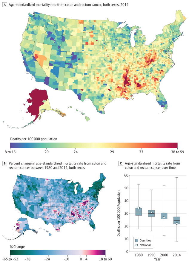
Between 1980 and 2014, 2 484 476 deaths due to colon and rectum cancer were recorded. Mortality from colon and rectum cancer (Figure 3) declined by 35.5% (95% UI, 32.9%–38.0%) from 1980 to 2014, from 34.3 (95% UI, 33.5–35.3) deaths per 100 000 population to 22.1 (95% UI, 21.5–22.8), with the largest decline occurring since 2000. The highest rate of deaths per 100000 population in 2014 was observed in Union County, Florida (58.4; 95% UI, 52.0–65.2), while the lowest was in Summit County, Colorado (8.1; 95% UI, 7.0–9.3). There were clusters of high rates in 2014, with the largest along the Mississippi River in Missouri, Mississippi, Arkansas, and Louisiana, and others in southern Alabama, Alaska, and along the border of West Virginia and Kentucky. Several counties in Nevada, North and South Dakota, and Montana also had high rates. Statistically significant declines in mortality rates from colon and rectum cancers between 1980 and 2014 were observed in most (2420) counties, with the largest declines found in Howard County, Maryland (64.2%; 95% UI, 60.7%–67.4%) and Nassau County, New York (62.3%; 95% UI, 60.1%–64.3%).
Figure 3. County-Level Mortality From Colon and Rectum Cancer.
A, Age-standardized mortality rate for both sexes combined in 2014. B, Relative percent change in the age-standardized mortality rate for both sexes combined between 1980 and 2014. In panels A, and B, the color scale is truncated at approximately the first and 99th percentiles as indicated by the range given in the color scale. C, Age-standardized mortality rate in 1980, 1990, 2000, and 2014. The bottom border, middle line, and top border of the boxes indicate the 25th, 50th, and 75th percentiles, respectively, across all counties; whiskers, the full range across counties; and circles, the national-level rate.
Breast Cancer
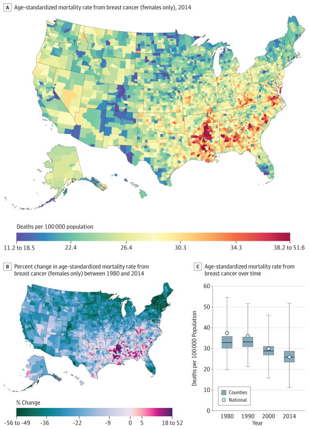
A total of 1 573 593 deaths from breast cancer were recorded between 1980 and 2014. Nationally, breast cancer mortality (Figure 4) decreased by 32.7% (95% UI, 20.8%–37.1%) from 1980 (21.2 [95% UI, 20.2–22.2] deaths per 100 000 population) to 2014 (14.3; 95% UI, 13.6–16.6). The largest decreases from 1980 to 2014 were observed in the Northeast, southern Florida, and parts of the northern Midwest. Most counties (1910) experienced statistically significant declines in the mortality rate among women. Summit County, Colorado (55.3%; 95% UI, 40.5%–66.3%), and Nassau County, New York (54.9%; 95% UI, 58.6%–46.6%), experienced the largest declines in mortality rates for women. Mortality rates for women in 2014 ranged from 11.3 (95% UI, 9.1–13.9) per 100 000 in Summit County, Colorado, to 51.8 (95% UI, 46.8–60.4) per 100 000 in Madison County, Mississippi. Clusters of high rates remained in the southern belt and along the Mississippi River, while lower rates were observed in parts of the West, Midwest, and Northeast.
Figure 4. County-Level Mortality From Breast Cancer (Females Only).
A, Age-standardized mortality rate for females in 2014. B, Relative percent change in the age-standardized mortality rate for females between 1980 and 2014. In panels A, and B, the color scale is truncated at approximately the first and 99th percentiles as indicated by the range given in the color scale. C, Age-standardized mortality rate in 1980, 1990, 2000, and 2014. The bottom border, middle line, and top border of the boxes indicate the 25th, 50th, and 75th percentiles, respectively, across all counties; whiskers, the full range across counties; and circles, the national-level rate.
Prostate Cancer
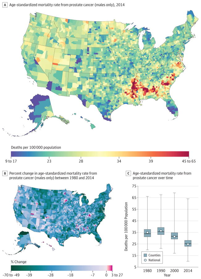
A total of 1 077 030 deaths from prostate cancer were recorded between 1980 and 2014. Prostate cancer mortality (Figure 5) declined by 21.7% (95% UI, 6.3%–31.9%) between 1980 and 2014 from 13.0(95% UI, 8.6–16.1) to 10.2 (95% UI, 8.4–15.7) deaths per 100000. Although many counties (1558) experienced significant declines in mortality rates for men, percentage changes in the male mortality rate between 1980 and 2014 ranged from a 69.4%(95% UI, 52.6%–79.8%) decrease in Aleutians East Borough and Aleutians West Census Area, Alaska, to a 26.1%(95% UI, −7.2% to 83.9%)increase in the mortality rate in Owsley County, Kentucky. In 2014, the rates for men varied from 64.1 (95% UI, 52.0–96.5) deaths per 100000 in Madison County, Mississippi, to 10.0 (95% UI, 7.5–15.4) deaths per 100 000 in Summit County, Colorado. Cluster patterns similar to those of breast cancer rates remained in the southern belt and along the Mississippi River. Alabama, Georgia, South Carolina, and Virginia also had counties with very high rates while counties in southern Florida and along the US border with Mexico had lower rates.
Figure 5. County-Level Mortality From Prostate Cancer (Males Only).
A, Age-standardized mortality rate for males in 2014. B, Relative percent change in the age-standardized mortality rate for males between 1980 and 2014. In panels A, and B, the color scale is truncated at approximately the first and 99th percentiles as indicated by the range given in the color scale. C, Age-standardized mortality rate in 1980, 1990, 2000, and 2014. The bottom border, middle line, and top border of the boxes indicate the 25th, 50th, and 75th percentiles, respectively, across all counties; whiskers, the full range across counties; and circles, the national-level rate.
Pancreatic Cancer
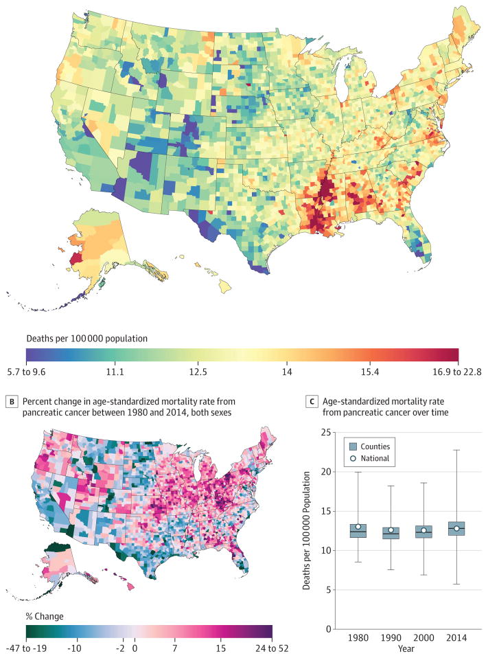
Between 1980 and 2014, 1 157 878 deaths due to pancreatic cancer were recorded. The mortality rate from pancreatic cancer (Figure 6) in 2014 (12.8 [95% UI, 12.4–13.2] deaths per 100 000) was 1.8% (−2.3% to 5.6%) lower than in 1980 (13.0 [95% UI, 12.6–13.4] deaths per 100 000). Across counties, changes from 1980 to 2014 ranged from increases of 51.7% (95% UI, 31.3%–76.4%) in Union County, Florida, to decreases of 46.2% (95% UI, 29.0%–60.3%) in Aleutians East Borough and Aleutians West Census Area, Alaska. Increases were seen across the nation, with clusters of larger increases in Kentucky, Kansas, and northeastern Pennsylvania. Areas of decreasing rates were seen in southern Texas, California, and the Dakotas. By 2014, age-standardized rates were lowest in counties in Colorado, Florida, Arizona, and 2 regions in Texas. The highest rates were observed in the South along the Mississippi River delta and in counties in Alabama, Georgia, North and South Carolina, Virginia, and Kentucky.
Figure 6. County-Level Mortality From Pancreatic Cancer.
A, Age-standardized mortality rate for both sexes combined in 2014. B, Relative percent change in the age-standardized mortality rate for both sexes combined between 1980 and 2014. In panels A, and B, the color scale is truncated at approximately the first and 99th percentiles as indicated by the range given in the color scale. C, Age-standardized mortality rate in 1980, 1990, 2000, and 2014. The bottom border, middle line, and top border of the boxes indicate the 25th, 50th, and 75th percentiles, respectively, across all counties; whiskers, the full range across counties; and circles, the national-level rate.
Uterine Cancer
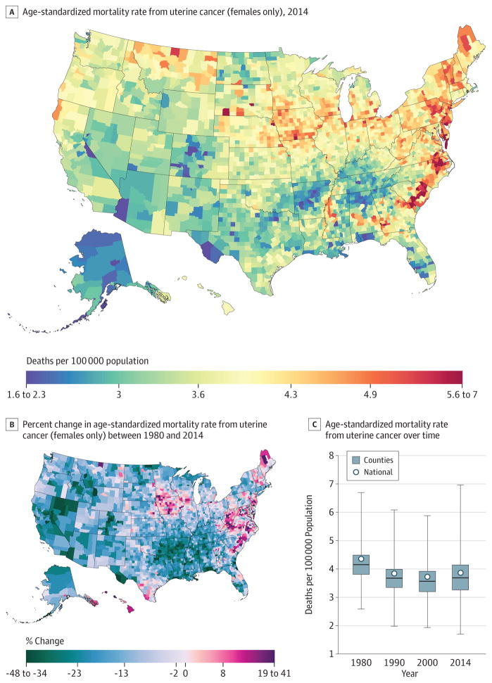
From 1980 to 2014, 209 314 deaths due to uterine cancer were recorded in the United States. Uterine cancer mortality (Figure 7) declined in the United States by 16.1% (95% UI, 5.7%–22.5%) from 2.5 (95% UI, 2.1–2.7) deaths per 100000 in 1980 to 2.1 (95% UI, 1.8–2.3) deaths per 100000 in 2014, but the decline was not steady. Whereas larger declines were seen in many counties in California, Colorado, Nevada, and Arkansas, there were clusters of counties with increasing rates in northern Maine, Iowa, Texas, the Carolinas, Virginia, and West Virginia. In 2014, the highest rates were observed in the regions that saw these increases as well as geographically related areas. In addition, high rates were seen in selected counties in Montana, New Hampshire, and Vermont.
Figure 7. County-Level Mortality From Uterine Cancer (Females Only).
A, Age-standardized mortality rate for females in 2014. B, Relative percent change in the age-standardized mortality rate for females between 1980 and 2014. In panels A, and B, the color scale is truncated at approximately the first and 99th percentiles as indicated by the range given in the color scale. C, Age-standardized mortality rate in 1980, 1990, 2000, and 2014. The bottom border, middle line, and top border of the boxes indicate the 25th, 50th, and 75th percentiles, respectively, across all counties; whiskers, the full range across counties; and circles, the national-level rate.
Kidney Cancer
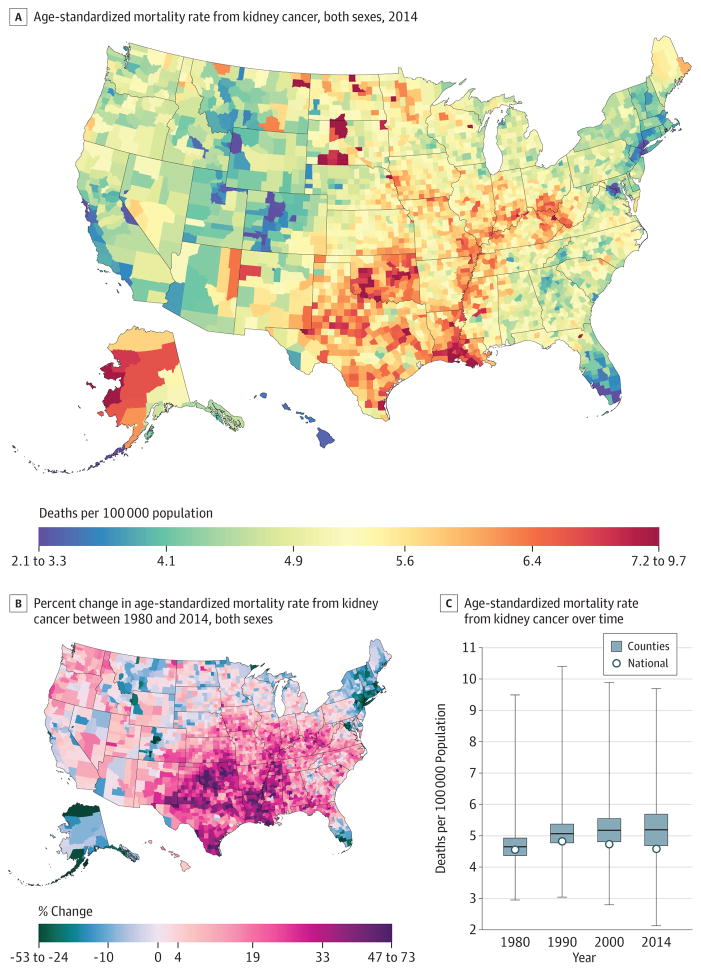
A total of 421 628 deaths due to kidney cancer were recorded between 1980 and 2014. National kidney cancer mortality (Figure 8) in 2014 (4.6 [95% UI, 4.4–4.8] deaths per 100000) was essentially unchanged from 1980 (4.6 [95% UI, 4.4–4.7] deaths per 100000). There were considerable declines in the Northeast and southern Florida and a wide zone of increases covering most counties in the South and Midwest, as well as the Pacific Northwest and Utah. In 1980, the mortality rate ranged from 3.0 (95% UI, 2.5–3.5) per 100 000 in Honolulu County, Hawaii, to 9.5 (95% UI, 7.3–12.2) in Menominee County, Wisconsin, compared with a low of 2.1 (95% UI, 1.7–2.6) in Summit County, Colorado, and a high of 9.7 (95% UI, 7.0–12.9) per 100000 in Buffalo County, South Dakota, in 2014. However, parts of Colorado and south Florida had very low rates. In 2014, several clusters of high mortality rates existed along the Mississippi Delta, Oklahoma, Texas, North and South Dakota, and counties in West Virginia, Ohio, Indiana, and Illinois. High rates were also observed in Alaska, as well as selected counties with large Native American populations in South Dakota, North Dakota, and the Four Corners area.
Figure 8. County-Level Mortality From Kidney Cancer.
A, Age-standardized mortality rate for both sexes combined in 2014. B, Relative percent change in the age-standardized mortality rate for both sexes combined between 1980 and 2014. In panels A, and B, the color scale is truncated at approximately the first and 99th percentiles as indicated by the range given in the color scale. C, Age-standardized mortality rate in 1980, 1990, 2000, and 2014. The bottom border, middle line, and top border of the boxes indicate the 25th, 50th, and 75th percentiles, respectively, across all counties; whiskers, the full range across counties; and circles, the national-level rate.
Liver Cancer
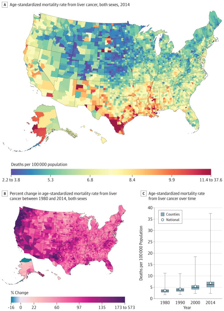
A total of 487 518 deaths due to liver cancer were recorded in the United States between 1980 and 2014. Nationally, mortality rates from liver cancer (Figure 9) increased by 87.6%(95% UI, 77.5%–97.4%) from 3.6 (95% UI, 3.5–3.8) deaths per 100000 in 1980 to 6.8 (95% UI, 6.6–7.1) deaths per 100000 in 2014. In 1980, the mortality rates spanned from 11.2 (95% UI, 7.1–16.6) in Kusilvak Census Area, Alaska, to 1.7 (95% UI, 1.3–2.1) in Summit County, Colorado. In 2014, the highest rate was 37.6 (95% UI, 30.7–44.3) in Anderson County, Texas, while the lowest rate was found to be 2.3 (95% UI, 1.7–3.1) in Summit County, Colorado. Almost all counties (3069) had significant increases in liver cancer death rates, and many of the counties on the West Coast and in New Mexico and West Texas had much larger increases. In 2014, there was a notable cluster of counties along the Mexico border in Texas with high rates; there were also high rates in a number of counties with large Native American populations in South Dakota, New Mexico, and Alaska.
Figure 9. County-Level Mortality From Liver Cancer.
A, Age-standardized mortality rate for both sexes combined in 2014. The color scale is truncated at approximately the first and 99th percentiles as indicated by the range given in the color scale. B, Relative percent change in the age-standardized mortality rate for both sexes combined between 1980 and 2014. The color scale is truncated similarly to panel A at the 99th percentile but not at the first percentile to avoid combining counties with decreases in the mortality rate and counties with increases in the mortality rate into a single group. C, Age-standardized mortality rate in 1980, 1990, 2000, and 2014. The bottom border, middle line, and top border of the boxes indicate the 25th, 50th, and 75th percentiles, respectively, across all counties; whiskers, the full range across counties; and circles, the national-level rate.
Testicular Cancer
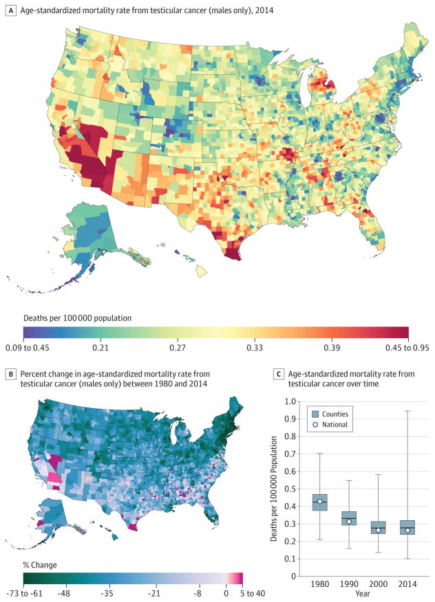
Between 1980 and 2014, 13 927 deaths due to testicular cancer were recorded. At the national level, the mortality rate from testicular cancer (Figure 10) decreased by 36.8% (95% UI, 29.3%–43.2%) between 1980 and 2014 from 0.2 (95% UI, 0.2–0.2) to 0.1 (95% UI, 0.1–0.1) deaths per 100 000 population. Rates of decline in men varied substantially across counties, from a decline of 72.1% (95% UI, 36.2%–88.7%) in Nantucket County, Massachusetts, to an increase of 39.3% (95% UI, −18.9% to 124.3%) in Union County, Florida. Greater declines were concentrated in New England. By 2014, testicular cancer mortality varied substantially across counties, with higher rates present in California and Nevada, as well as clusters in Texas, Missouri, and Michigan. However, lower rates were observed in parts of Colorado, Georgia (around the Atlanta area), the District of Columbia, and Minnesota (around the Minneapolis area).
Figure 10. County-Level Mortality From Testicular Cancer (Males Only).
A, Age-standardized mortality rate for males in 2014. B, Relative percent change in the age-standardized mortality rate for males between 1980 and 2014. In panels A, and B, the color scale is truncated at approximately the first and 99th percentiles as indicated by the range given in the color scale. C, Age-standardized mortality rate in 1980, 1990, 2000, and 2014. The bottom border, middle line, and top border of the boxes indicate the 25th, 50th, and 75th percentiles, respectively, across all counties; whiskers, the full range across counties; and circles, the national-level rate.
Non-Hodgkin Lymphoma
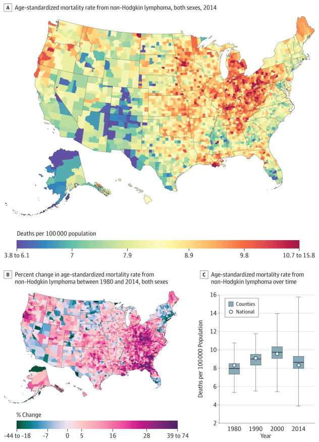
A total of 829 396 deaths due to non-Hodgkin lymphoma were recorded between 1980 and 2014. Nationally, non-Hodgkin lymphoma (Figure 11) mortality was essentially unchanged between 1980 (8.3 [95% UI, 7.7–9.9] deaths per 100 000) and 2014 (8.3 [95% UI, 7.5–9.4] deaths per 100 000). Over the interval 1980 to 2014, age-standardized death rates increased substantially in a cluster of counties in West Virginia and eastern Kentucky and in a belt of counties from Alabama through South Carolina. At the same time, rates were declining in many counties in New England, Nevada, California, Florida, and Alaska. By 2014, low rates were observed in the Four Corners area, Alaska, and some counties on the Texas-Mexico border. Higher rates were interspersed throughout the Midwest, with areas of especially high rates in southern Louisiana, Michigan, Iowa, the Appalachian region, Indiana, Ohio, and Pennsylvania.
Figure 11. County-Level Mortality From Non-Hodgkin Lymphoma.
A, Age-standardized mortality rate for both sexes combined in 2014. B, Relative percent change in the age-standardized mortality rate for both sexes combined between 1980 and 2014. In panels A, and B, the color scale is truncated at approximately the first and 99th percentiles as indicated by the range given in the color scale. C, Age-standardized mortality rate in 1980, 1990, 2000, and 2014. The bottom border, middle line, and top border of the boxes indicate the 25th, 50th, and 75th percentiles, respectively, across all counties; whiskers, the full range across counties; and circles, the national-level rate.
Other Cancers
Lip and oral cavity, nasopharynx, other pharynx, esophageal, stomach, gallbladder and biliary tract, larynx, malignant skin melanoma, nonmelanoma skin cancer, cervical, ovarian, bladder, brain and nervous system cancer, thyroid cancer, mesothelioma, Hodgkin lymphoma, multiple myeloma, leukemia, and other neoplasms are presented in eFigures 1–23 in the Supplement. There were 5600727 deaths attributable to these cancers recorded between 1980 and 2014. Several patterns of differences existed among these cancers. For example, there were clear clusters in the Northeast, parts of northern Idaho and Montana, and parts of Oregon, northern California, and Nevada for bladder cancer mortality. Moreover, large clusters of brain and nervous system cancer were apparent in Washington, Oregon, Kentucky, and Tennessee, while Alaska and the Four Corners area had low rates. Thyroid cancer mortality clusters existed on the United States–Mexico border and in parts of the Dakotas.
Discussion
The study used an innovative, validated small area estimation approach to estimate age-standardized cancer mortality rates for every county in the United States from 1980 to 2014. The findings show large differences in cancer mortality and the presence of clusters of high mortality rates. These local patterns would be masked if a national or a state number were provided. Moreover, the study was able to identify clusters of high rates of change among US counties, which is important for providing data to inform the debate on prevention, access to care, and appropriate treatment. Indeed, monitoring cancer mortality at the county level can help identify worsening incidence, inadequate access to quality treatment, or potentially other etiological factors involved.
The mortality rate from all cancers combined declined in most counties but increased in some. The pattern of changes across counties varied tremendously by type: for some cancers, mortality rates declined in nearly all counties (colon and rectum, larynx, lip and oral cavity, nasopharynx, other pharynx, stomach, gallbladder and biliary tract, breast, cervical, prostate, testicular, Hodgkin lymphoma) or increased in nearly all counties (liver, mesothelioma); for the remaining cancers, rates increased in some counties and declined in others. The policy response from the public health and medical care communities depends on parsing these trends into component factors: trends in cancer incidence driven by known risk factors, unexplained trends in incidence, cancers for which screening and early detection can make a major difference, and cancers for which high-quality treatment can make a major difference.
There are several potential explanations for the high rates of cancer mortality in certain counties and regions. First, cancer incidence could be high due to a combination of risk factor profile and poor prevention and screening programs. Second, cancer detection happens at a late stage because of the interplay of lack of screening, awareness in the population and health care clinicians, and poor access to health care. Third, cancer treatment strategies are poor.
The findings showed large differences in breast cancer mortality rates and their decline from 1980 to 2014. At the national level, previous studies reported a stable increase in breast cancer incidence from 1943 to 1979 followed by a rapid increase from 1980 to 1999 and a sharp decline from 2000.24 Several factors led to this decline in incidence, including earlier detection and improved treatment.25 Several well-known risk factors for breast cancer, such as postmenopausal obesity and alcohol consumption, increased in the past 20 years, while physical activity remained unchanged.9,20,26 There is a need for comprehensive breast cancer care that includes prevention efforts, awareness building, adequate coverage of breast cancer screening, access to care, effective systems for timely and accurate diagnoses, and availability of surgical services, radiotherapy, medical oncology, genetic counseling, and palliative care.
Six cancers had 5-year survival rates (as reported by the Surveillance, Epidemiology, and End Results program) higher than 85%, and these survival rates improved substantially in recent decades22,23: testicular cancer, thyroid cancer, prostate cancer, melanoma, Hodgkin lymphoma, and breast cancer. The results for these cancers can perhaps be used as a marker for access to quality care. For example, 5-year survival of testicular cancer is approaching 96%, suggesting that early detection and treatment are the main drivers behind observed differences. This study showed high mortality rates for testicular cancer in areas bordering Mexico, which have also experienced slower rates of decline than other areas of the country. Several studies have previously reported an increased incidence of testicular cancer among Hispanics, which maybe related to a range of risk exposures27; nevertheless, with such highly effective treatment available, the high rates in these communities raise questions about access to quality care.
When considering prostate cancer survival, the effect of screening, overdiagnosis, and lead-time bias clearly must be taken into account. Current guidelines recommend either against prostate cancer screening28 or to individualize prostate-specific antigen screening for high-risk patients.29 The US Preventive Services Task Force is working on an update of their prostate cancer screening guidelines looking into differences in prostate-specific antigen screening effectiveness within subpopulations, including race.30 It is unclear how much of the mortality difference in counties is based on differences in incidence vs differences in access to treatment. However, given the significant advances that have been made in the treatment of certain cancers, local health care systems have to ensure that these treatment advances are accessible in areas of high incidence.
Smoking is the leading cause of lung cancer incidence and mortality.31 In the United States, smoking rates among women peaked after those among men.7 As a result, the peak in smoking-related cancer mortality also occurred earlier for men than for women. Although tobacco smoking prevalence is declining nationally, it remains very high in parts of the South,7 where there were clusters of high cancer mortality. Also, many rural areas still have high rates of smoking compared with urban areas.7 Moreover, recent studies have shown that cigar smoking and use of smokeless tobacco are increasing in the United States.32 Local efforts to reduce smoking in poor and rural areas are needed to reduce the burden of smoking-related cancer and other diseases.
Obesity is a major risk factor for cancer.20 Rates of overweight and obesity have increased steadily in the United States, and recent studies have shown that adult obesity levels continue to increase.9,33 Moreover, higher obesity rates have been documented in the southern parts of the United States.9 Women and African Americans have the highest rates of overweight and obesity.8 Indeed, obesity is a major health challenge for the United States and may drive differences among counties in health outcomes. Renewed efforts to reduce overweight and obesity are needed with a focus on weight maintenance as a first step.34
Diet is another risk factor for cancer mortality.20 Dietary intake in the United States has not improved much since the 1980s.35 Moreover, fast food quality is not improving, with the exception of french fries.36 Although recent dietary intake studies in the United States show a sign of improvement37 and a decline in consumption of sugar-sweetened beverages,38 US residents are not doing enough to improve their diets. Unfortunately, there are no adequate data on dietary consumption at the local level. The Behavioral Risk Factor Surveillance System39 included few questions on fruit and vegetable consumption, which did not allow a proper dietary analysis. Improving and monitoring dietary intake in the United States should be a priority for local, state, and federal agencies.
This study has several limitations. First, US death registration may not have captured every death, and the population counts and covariates used may be subject to error. Second, garbage codes were reassigned to other causes, which may lead to error in the estimates. Third, the garbage code redistribution methods used in this analysis have not been validated against a gold standard such as autopsy because of insufficient data. Fourth, although the garbage code redistribution methods used in this analysis may be subject to error, this uncertainty is difficult to quantify and has not been accounted for in the reported uncertainty intervals. Fifth, the models smooth mortality rates over space, time, and age and may result in an underestimation of inequalities. However, consistent methods were used to provide cancer mortality over an extended period, allowing health care professionals to compare across time and counties.
Conclusions
Cancer mortality declined overall in the United States between 1980 and 2014. Over this same period, there were important changes in trends, patterns, and differences in cancer mortality among US counties. These patterns may inform further research into improving prevention and treatment.
Supplementary Material
Key Points.
Question
What are the trends and differences in cancer mortality rates among United States counties from 1980 to 2014?
Findings
In this population-based modeling study of deidentified death records from the National Center for Health Statistics, cancer mortality decreased by a relative 20.1% between 1980 and 2014; however, there were substantial differences among counties throughout this period. For many cancers, there were distinct clusters of counties in different regions with especially high mortality.
Meaning
From 1980–2014, there were important changes in trends, patterns, and differences in cancer mortality among US counties.
Acknowledgments
Funding/Support: This work was funded by the Robert Wood Johnson Foundation (grant 72305), the National Institute on Aging (grant 5P30AG047845-02), and John W. Stanton and Theresa E. Gillespie.
Role of the Funder/Sponsor: The funders had no role in the design and conduct of the study; collection, management, analysis, and interpretation of the data; preparation, review, or approval of the manuscript; or decision to submit the manuscript for publication.
Footnotes
Conflict of Interest Disclosures: All authors have completed and submitted the ICMJE Form for Disclosure of Potential Conflicts of Interest and none were reported.
Author Contributions: Dr Murray had full access to all of the data in the study and takes responsibility for the integrity of the data and the accuracy of the data analysis.
Concept and design: Mokdad, Dwyer-Lindgren, Bertozzi-Villa, Charara, Naghavi, Murray.
Acquisition, analysis, or interpretation of data: Mokdad, Dwyer-Lindgren, Fitzmaurice, Stubbs, Bertozzi-Villa, Morozoff, Allen, Naghavi.
Drafting of the manuscript: Mokdad, Dwyer-Lindgren, Charara, Allen.
Critical revision of the manuscript for important intellectual content: Mokdad, Dwyer-Lindgren, Fitzmaurice, Stubbs, Bertozzi-Villa, Morozoff, Naghavi, Murray.
Statistical analysis: Mokdad, Dwyer-Lindgren, Stubbs, Bertozzi-Villa, Allen, Naghavi.
Obtained funding: Mokdad, Murray.
Administrative, technical, or material support: Mokdad, Morozoff, Allen, Murray.
Supervision: Murray.
References
- 1.GBD 2015 Mortality and Causes of Death Collaborators. Global, regional, and national life expectancy, all-cause mortality, and cause-specific mortality for 249 causes of death, 1980–2015: a systematic analysis for the Global Burden of Disease Study 2015. Lancet. 2016;388(10053):1459–1544. doi: 10.1016/S0140-6736(16)31012-1. [DOI] [PMC free article] [PubMed] [Google Scholar]
- 2.Yabroff KR, Lund J, Kepka D, Mariotto A. Economic burden of cancer in the US: estimates, projections, and future research. Cancer Epidemiol Biomarkers Prev. 2011;20(10):2006–2014. doi: 10.1158/1055-9965.EPI-11-0650. [DOI] [PMC free article] [PubMed] [Google Scholar]
- 3.Ryerson AB, Eheman CR, Altekruse SF, et al. Annual report to the nation on the status of cancer, 1975–2012, featuring the increasing incidence of liver cancer. Cancer. 2016;122(9):1312–1337. doi: 10.1002/cncr.29936. [DOI] [PMC free article] [PubMed] [Google Scholar]
- 4.US Cancer Statistics Working Group. United States Cancer Statistics: 1999–2013 Incidence and Mortality Web-Based Report. Atlanta, GA: Department of Health and Human Services, Centers for Disease Control and Prevention, and National Cancer Institute; 2015. [Accessed May 13, 2016]. https://nccd.cdc.gov/uscs/ [Google Scholar]
- 5.Lansdorp-Vogelaar I, Goede SL, Ma J, et al. State disparities in colorectal cancer rates: contributions of risk factors, screening, and survival differences. Cancer. 2015;121(20):3676–3683. doi: 10.1002/cncr.29561. [DOI] [PMC free article] [PubMed] [Google Scholar]
- 6.Albano JD, Ward E, Jemal A, et al. Cancer mortality in the United States by education level and race. J Natl Cancer Inst. 2007;99(18):1384–1394. doi: 10.1093/jnci/djm127. [DOI] [PubMed] [Google Scholar]
- 7.Dwyer-Lindgren L, Mokdad AH, Srebotnjak T, Flaxman AD, Hansen GM, Murray CJ. Cigarette smoking prevalence in US counties: 1996–2012. Popul Health Metr. 2014;12(1):5. doi: 10.1186/1478-7954-12-5. [DOI] [PMC free article] [PubMed] [Google Scholar]
- 8.Ogden CL, Carroll MD, Lawman HG, et al. Trends in obesity prevalence among children and adolescents in the United States, 1988–1994 through 2013–2014. JAMA. 2016;315(21):2292–2299. doi: 10.1001/jama.2016.6361. [DOI] [PMC free article] [PubMed] [Google Scholar]
- 9.Dwyer-Lindgren L, Freedman G, Engell RE, et al. Prevalence of physical activity and obesity in US counties, 2001–2011: a road map for action. Popul Health Metr. 2013;11:7. doi: 10.1186/1478-7954-11-7. [DOI] [PMC free article] [PubMed] [Google Scholar]
- 10.Radley DC, Schoen C. Geographic variation in access to care—the relationship with quality. N Engl J Med. 2012;367(1):3–6. doi: 10.1056/NEJMp1204516. [DOI] [PubMed] [Google Scholar]
- 11.Dwyer-Lindgren L, Bertozzi-Villa A, Stubbs RW, et al. US county-level trends in mortality rates for major causes of death, 1980–2014. JAMA. 2016;316(22):2385–2401. doi: 10.1001/jama.2016.13645. [DOI] [PMC free article] [PubMed] [Google Scholar]
- 12.National Center for Health Statistics. National Vital Statistics System: Multiple Cause of Death Data File, 1980–2014. Hyattsville, MD: National Center for Health Statistics; 2014. [Google Scholar]
- 13.US Census Bureau. [Accessed January 8, 2015];Intercensal county estimates by age, sex, race: 1980–1989. https://www.census.gov/data/datasets/time-series/demo/popest/1980s-county.html.
- 14.National Center for Health Statistics. Bridged-race intercensal estimates of the resident population of the United States for July 1, 1990–July 1, 1999, by year, county, single-year of age (0, 1, 2, ..., 85 years and over), bridged race, Hispanic origin, and sex. [Accessed November 21, 2011];2004 Jul 26; https://www.cdc.gov/nchs/nvss/bridged_race.htm.
- 15.National Center for Health Statistics. Bridged-race intercensal estimates of the resident population of the United States for July 1, 2000–July 1, 2009, by year, county, single-year of age (0, 1, 2, ..., 85 years and over), bridged race, Hispanic origin, and sex. [Accessed October 30, 2012];2012 Oct 26; https://www.cdc.gov/nchs/nvss/bridged_race.htm.
- 16.National Center for Health Statistics. Vintage 2014 postcensal estimates of the resident population of the United States (April 1, 2010, July 1, 2010–July 1, 2014), by year, county, single-year of age (0, 1, 2, ..., 85 years and over), bridged race, Hispanic origin, and sex. [Accessed December 18, 2015];2015 Jun 30; https://www.cdc.gov/nchs/nvss/bridged_race.htm.
- 17.University of California, Berkeley. Max Planck Institute for Demographic Research. [Accessed July 8, 2013];The Human Mortality Database. http://www.mortality.org/
- 18.Kristensen K, Nielsen A, Berg CW, Skaug H, Bell B. TMB: automatic differentiation and Laplace approximation. J Stat Softw. 2016;70(5):1–21. doi: 10.18637/jss.v070.i05. [DOI] [Google Scholar]
- 19.R Core Team. R: A Language and Environment for Statistical Computing. Vienna, Austria: R Foundation for Statistical Computing; 2016. [Accessed March 31, 2016]. https://www.r-project.org/ [Google Scholar]
- 20.GBD 2015 Risk Factors Collaborators. Global, regional, and national comparative risk assessment of 79 behavioural, environmental and occupational, and metabolic risks or clusters of risks, 1990–2015: a systematic analysis for the Global Burden of Disease Study 2015. Lancet. 2016;388(10053):1659–1724. doi: 10.1016/S0140-6736(16)31679-8. [DOI] [PMC free article] [PubMed] [Google Scholar]
- 21.Murray CJ, Lopez AD. On the comparable quantification of health risks: lessons from the Global Burden of Disease Study. Epidemiology. 1999;10(5):594–605. [PubMed] [Google Scholar]
- 22.National Cancer Institute. SEER*Stat Database: Incidence—SEER 18 Regs Research Data + Hurricane Katrina Impacted Louisiana Cases, Nov 2015 Sub (1973–2013 Varying)—Linked to County Attributes—Total U.S., 1969–2014 Counties. [Accessed May 13, 2016];2016 https://seer.cancer.gov/
- 23.National Cancer Institute. SEER Cancer Statistics Review (CSR) 1975–2010, Table 1.4: Summary of Changes in Cancer Mortality, 1950–2010 and 5-Year Relative Survival Rates, 1950–2009 Males and Females, by Primary Cancer Site. [Accessed June 27, 2016]; https://seer.cancer.gov/archive/csr/1975_2010/browse_csr.php?sectionSEL=1&pageSEL=sect_01_table.04.html.
- 24.Toriola AT, Colditz GA. Trends in breast cancer incidence and mortality in the United States: implications for prevention. Breast Cancer Res Treat. 2013;138(3):665–673. doi: 10.1007/s10549-013-2500-7. [DOI] [PubMed] [Google Scholar]
- 25.Berry DA, Cronin KA, Plevritis SK, et al. Cancer Intervention and Surveillance Modeling Network Collaborators. Effect of screening and adjuvant therapy on mortality from breast cancer. N Engl J Med. 2005;353(17):1784–1792. doi: 10.1056/NEJMoa050518. [DOI] [PubMed] [Google Scholar]
- 26.Dwyer-Lindgren L, Flaxman AD, Ng M, Hansen GM, Murray CJL, Mokdad AH. Drinking patterns in US counties from 2002 to 2012. Am J Public Health. 2015;105(6):1120–1127. doi: 10.2105/AJPH.2014.302313. [DOI] [PMC free article] [PubMed] [Google Scholar]
- 27.Ghazarian AA, Trabert B, Graubard BI, Schwartz SM, Altekruse SF, McGlynn KA. Incidence of testicular germ cell tumors among US men by Census region. Cancer. 2015;121(23):4181–4189. doi: 10.1002/cncr.29643. [DOI] [PMC free article] [PubMed] [Google Scholar]
- 28.Moyer VA US Preventive Services Task Force. Screening for prostate cancer: US Preventive Services Task Force recommendation statement. Ann Intern Med. 2012;157(2):120–134. doi: 10.7326/0003-4819-157-2-201207170-00459. [DOI] [PubMed] [Google Scholar]
- 29.American Cancer Society. [Accessed May 13, 2016];American Cancer Society recommendations for prostate cancer early detection. http://www.cancer.org/cancer/prostatecancer/moreinformation/prostatecancerearlydetection/prostate-cancer-early-detection-acs-recommendations.
- 30.US Preventive Services Task Force. [Accessed May 30, 2016];Final research plan: prostate cancer: screening. 2016 Apr; https://www.uspreventiveservicestaskforce.org/Page/Document/final-research-plan/prostate-cancer-screening1.
- 31.Centers for Disease Control and Prevention. State-specific trends in lung cancer incidence and smoking—United States, 1999–2008. MMWR Morb Mortal Wkly Rep. 2011;60(36):1243–1247. [PubMed] [Google Scholar]
- 32.Lauterstein D, Hoshino R, Gordon T, Watkins B-X, Weitzman M, Zelikoff J. The changing face of tobacco use among United States youth. Curr Drug Abuse Rev. 2014;7(1):29–43. doi: 10.2174/1874473707666141015220110. [DOI] [PMC free article] [PubMed] [Google Scholar]
- 33.Ogden CL, Carroll MD, Fryar CD, Flegal KM. Prevalence of Obesity Among Adults and Youth: United States, 2011–2014. [Accessed May 13, 2016];NCHS Data Brief. 2015 Nov;:219. https://www.cdc.gov/nchs/products/databriefs/db219.htm. [PubMed]
- 34.Mokdad AH, Bowman BA, Ford ES, Vinicor F, Marks JS, Koplan JP. The continuing epidemics of obesity and diabetes in the United States. JAMA. 2001;286(10):1195–1200. doi: 10.1001/jama.286.10.1195. [DOI] [PubMed] [Google Scholar]
- 35.Johnston R, Poti JM, Popkin BM. Eating and aging: trends in dietary intake among older Americans from 1977–2010. J Nutr Health Aging. 2014;18(3):234–242. doi: 10.1007/s12603-013-0387-y. [DOI] [PMC free article] [PubMed] [Google Scholar]
- 36.Urban LE, Roberts SB, Fierstein JL, Gary CE, Lichtenstein AH. Sodium, saturated fat, and trans fat content per 1,000 kilocalories: temporal trends in fast-food restaurants, United States, 2000–2013. Prev Chronic Dis. 2014;11:E228. doi: 10.5888/pcd11.140335. [DOI] [PMC free article] [PubMed] [Google Scholar]
- 37.Rehm CD, Peñalvo JL, Afshin A, Mozaffarian D. Dietary intake among US adults, 1999–2012. JAMA. 2016;315(23):2542–2553. doi: 10.1001/jama.2016.7491. [DOI] [PMC free article] [PubMed] [Google Scholar]
- 38.Hert KA, Fisk PS, II, Rhee YS, Brunt AR. Decreased consumption of sugar-sweetened beverages improved selected biomarkers of chronic disease risk among US adults: 1999 to 2010. Nutr Res. 2014;34(1):58–65. doi: 10.1016/j.nutres.2013.10.005. [DOI] [PubMed] [Google Scholar]
- 39.Mokdad AH. The Behavioral Risk Factors Surveillance System: past, present, and future. Annu Rev Public Health. 2009;30:43–54. doi: 10.1146/annurev.publhealth.031308.100226. [DOI] [PubMed] [Google Scholar]
Associated Data
This section collects any data citations, data availability statements, or supplementary materials included in this article.


