Abstract
Heat maps are commonly used to display the spatial distribution of a response observed on a two-dimensional grid. The autoimage package provides convenient functions for constructing multiple heat maps in unified, seamless way, particularly when working with projected coordinates. The autoimage package natively supports: 1. automatic inclusion of a color scale with the plotted image, 2. construction of heat maps for responses observed on regular or irregular grids, as well as non-gridded data, 3. construction of a matrix of heat maps with a common color scale, 4. construction of a matrix of heat maps with individual color scales, 5. projecting coordinates before plotting, 6. easily adding geographic borders, points, and other features to the heat maps. After comparing the autoimage package’s capabilities for constructing heat maps to those of existing tools, a carefully selected set of examples is used to highlight the capabilities of the autoimage package.
Introduction
A heat map is a graphic commonly used to visualize the spatial distribution of a response observed on a two-dimensional grid. For example, a climate scientist may want to visualize the spatial distribution of an aerosol across a grid of locations covering the study area. In general, a heat map can be used to display response variation as a function of two covariates varying in a grid-like pattern, such as the tensile strength of a substance as a function of heat and pressure. Each grid point in a heat map is associated with a polygon, and each polygon is colored using a color scheme related to the level of the response at each grid point. The plot of colored polygons is an image or heat map. A color scale relating the colors to their associated levels often accompanies the image. For clarity, we use the term image to refer to the plot of colored polygons alone and the term heat map to refer to the combination of image(s) and color scale.
The autoimage package (French, 2017) makes it easy to plot a sequence of heat maps with straight-forward, native options for projection of geographical coordinates. The package makes it simple to add lines, points, and other features to the images, even when the coordinates are projected. The package allows for seamless creation of heat maps for data on regular or irregular grids, as well as data that is not on a grid.
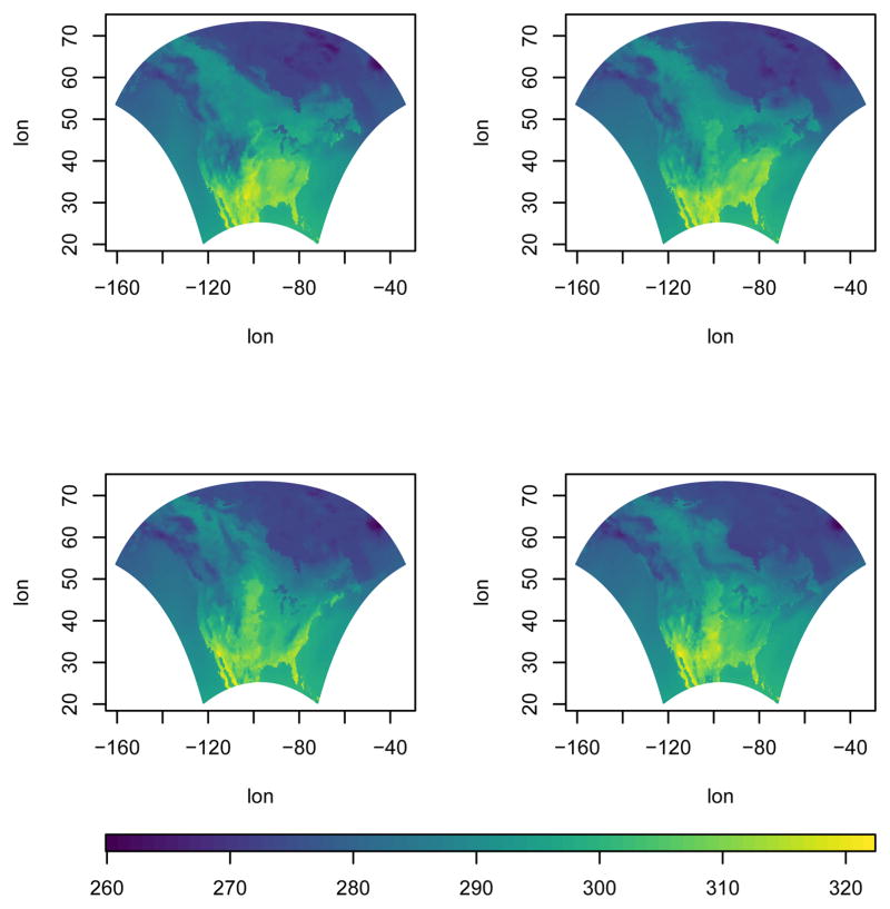
As a quick introduction to some of the autoimage package’s capabilities, we utilize the narccap data included in the autoimage package. The narccap data set comes from the North American Regional Climate Change Assessment Program (Mearns et al., 2009, 2012; Mearns and others, 2007, updated 2012), which is a program designed to model climate scenarios in North America (the United States, Canada, and northern Mexico) by coupling regional and global climate models. Specifically, the narccap data are the maximum daily surface air temperature (abbreviated tasmax) in degrees Kelvin (K) for the five consecutive days between May 15, 2041 and May 19, 2041. The data were simulated using the Canadian Regional Climate Model (Caya and Laprise, 1999) forced by the Community Climate System Model atmosphere-ocean general circular model (Collins et al., 2006). The data set contains lon, a 140 × 115 matrix of longitude coordinates, lat, a 140 × 115 matrix of latitude coordinates, and tasmax, a 140 × 115 × 5 array, where each element of the third dimension of the array corresponds to the tasmax measurements of the respective day. We create the heat map shown in Figure 1 for the first four days of the narccap data by executing the command
Figure 1.
A heat map for the first four days of the narccap data.
autoimage(lon, lat, tasmax[,,1:4])
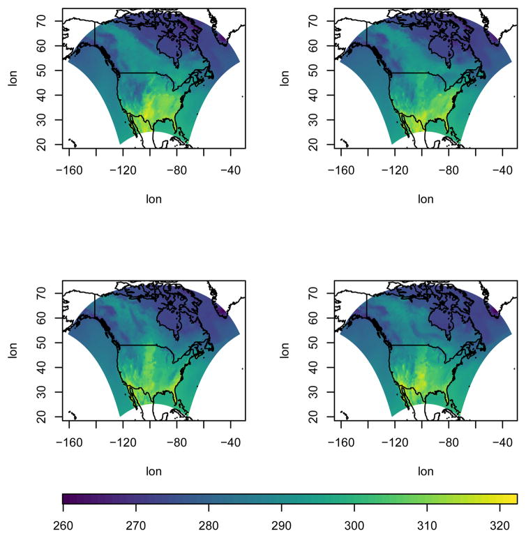
The outline of the United States and Mexico are somewhat noticeable in the images of Figure 1, but this would be easier to see if the relevant national borders of the countries were included. This is accomplished in Figure 2, which is created by specifying a map in the previous command:
Figure 2.
A heat map for the first four days of the narccap data, along with the relevant national borders.
autoimage(lon, lat, tasmax[,,1:4], map = “world”)
Images and heat maps can be created in R using functions from several different R packages. We discuss six functions in more detail. They are
the image function in the graphics package,
the filled.contour function in the graphics package,
the image.plot function in the fields package (Nychka et al., 2016),
the levelplot function in the lattice package (Sarkar, 2008),
the spplot function in the sp package (Pebesma and Bivand, 2005),
and the geom_tile function in the ggplot2 package (Wickham, 2009).
In the next section, we compare the native capabilities of these tools with those of the autoimage package. We define the native capabilities of a function or package to be the capabilities of the function or package without loading additional packages or requiring additional user code. This will be followed by a section demonstrating the main capabilities of the autoimage package. We will conclude with a brief summary of conclusions in the final section.
Tools for creating heat maps in R
We now compare the capabilities of existing tools for creating heat maps in R.
We begin by discussing the image function included in the graphics package. This function is included in a standard R installation. The image function produces an image without a color scale. While one can discern spatial patterns from the plotted image, one cannot determine the magnitude of the response values without knowing more about the coloring scheme. Naturally, members of the R community have provided solutions to add this functionality. For example, the spatstat package (Baddeley and Turner, 2005) extends the image function using S3 methods to automatically include a color scale with the image when an im class object is plotted. The image function requires the responses to be on a regular grid. Specifically, if x and y are each an increasing sequence of values, then the coordinates of a regular grid are obtained by considering all combinations of the elements in x and y. Regular grids frequently become irregular when rotated or transformed to a different coordinate system. This is common for longitude/latitude coordinates that are transformed using a projection. When a matrix of images is desired, the user can modify the mfrow argument of the par function in the graphics package and then plot a sequence of images. However, the matrix of images will not include individual color scales or a common color scale. The image function has no capabilities related to coordinate projection. Existing images can be added to using standard graphics functions such as lines and points. It is worth noting that the standard R installation also includes a heatmap function in the stats package, but this displays a different result than the image function. The heatmap function documentation indicates that the heatmap function produces, “… a false color image … with a dendrogram added to the left side and to the top. Typically, reordering of the rows and columns according to some set of values (row or column means) within the restrictions imposed by the dendrogram is carried out.” Consequently, a heat map is sometimes called an image plot by researchers whose data analysis is primarily done in R. We will continue to use the more general terminology “heat map” to describe this type of graphic in what follows.
The filled.contour function in the graphics package produces an image with a vertical color scale on the right side of the image. The algorithm used to color the polygons in the filled.contour function differs slightly from the image function, but produces similar results. The filled.contour function requires the responses to be on a regular grid. The filled.contour function cannot natively produce a sequence of heat maps with a common color scale or individual color scales because of the function internally calls the layout function. Coordinate projection is not natively supported by the filled.contour function. An existing image can be added to using graphics functions such as lines, points, or text.
Another popular tool for creating heat maps in R is the image.plot function in the fields package. The image.plot function retains the strengths of the image function while providing additional functionality. The image.plot function automatically includes a color scale with the plotted image. More uniquely, the image.plot function can natively produce heat maps for data observed on an “irregular grid”. Let x be an r × c matrix of x coordinates and y be an r × c matrix of y coordinates. Then x and y define an irregular grid if x[i,j]≤ x[i+1,j], y[i,j]≤ y[i+1,j], x[i,j]≤ x[i,j+1], and y[i,j]≤ y[i,j+1] for all valid choices of i and j. The image.plot function can be used to construct a matrix of heat maps with individual color scales by specifying the mfrow argument of the par function and calling image.plot the desired number of times. The image.plot function cannot natively create a matrix of images with a common color scale. Though the image.plot function includes functionality to create images for geographically-referenced irregular grids, it does not include any native functionality for projecting coordinates. Features can be added to existing images using the lines, points, and related functions.
The lattice package provided the first well-known alternative to the base graphics system in R. The lattice package produces heat maps using the levelplot function. Images produced by the levelplot function automatically include a color scale. The levelplot function can only produce heat maps for responses observed on a regular grid. The levelplot function can natively create a matrix of heat maps sharing a common color scale. To obtain a matrix of heat maps with individual color scales, one must combine a sequence of levelplot function calls with the grid.arrange function in the gridExtra package (Auguie, 2016). The levelplot function includes no functionality related to coordinate projection. Adding lines, points, or other features is usually accomplished by defining an appropriate panel function.
The sp package provides powerful classes for representing geographically-referenced data. The sp package can produce heat maps automatically for SpatialGriddedDataFrame class objects using the spplot function. The spplot function produces heat maps by extending the levelplot function in the lattice package, and the two functions have similar feature sets. One major difference between the two functions is that the sp package includes coordinate projection information within the SpatialGriddedDataFrame, so the spTransform function in the sp package can be used to easily project coordinates to a different system. However, if the projected set of coordinates is not regular, the spplot function will no longer produce a heat map for the transformed data, but will instead produce a scatterplot of colored points with a related color scale.
The grammar of graphics plotting system implemented in the ggplot2 package continues to grow in popularity. A heat map can be constructed using ggplot2 by combining the geom_tile geometry (or the geom_rect or geom_raster geometries) with a ggplot object. The heat map automatically includes a color scale with the image. Similar to the image, levelplot, and spplot functions, the ggplot2 package requires locations to be on a regular grid. A matrix of images sharing a common color scale can be created directly in ggplot2 using facet_wrap or facet_grid. A matrix of heat maps with individual color scales can be created by supplementing ggplot2 with additionality functionality provided by the gridExtra or cowplot (Wilke, 2016) packages. The coord_map function can be used to natively project geographic coordinates on a regular grid to an irregular grid. Additional features can be added to the images by specifying the appropriate geometry calls when creating the heat maps. These additional features are automatically projected if the coord_map function is utilized.
The autoimage package was created to easily produce a sequence of heat maps while natively working with projected coordinates, even when the data are not on a regular grid. The autoimage package utilizes the base R graphics system (like the image, filled.contour, and image.plot functions) to quickly and straightforwardly create heat maps. The autoimage function is the most important function in the autoimage package. The autoimage function automatically supplies a color scale with the constructed image(s). The autoimage function can automatically create heat maps for responses on an irregular grid, similar to the image.plot function. In fact, the autoimage function relies on the poly.image function from the fields package to create heat maps for this type of data, which is the function used by the image.plot function for the same purpose. Additionally, the autoimage package can natively create heat maps for non-gridded data by automatically interpolating the surface onto a regular grid before plotting using the akima package (Akima and Gebhardt, 2015). The autoimage function can create a matrix of heat maps with either individual or shared color scales automatically, without the use of additional user code or R packages. Additionally, functionality for coordinate projection is available automatically in the autoimage function using the mapproject function in the mapproj package (McIlroy, 2015). Additional features can be added to the plotted images (even for projected coordinates) using the plines, ppoints, ptext, and related functions available in the autoimage package.
We now summarize the similarities and differences between the native functionality of the autoimage package and the previous tools discussed. Most of the tools automatically include a color scale with the plotted image, similar to the autoimage function. The lattice, sp, and ggplot2 packages can create a sequence of heat maps with a common color scale. The image.plot function can be used in combination with the par function to create a matrix of heat maps with individual color scales. The lattice, sp, and ggplot2 packages can be used in combination with the gridExtra package to produce a matrix of heat maps with individual color scales. The autoimage function has native functionality for creating a matrix of heat maps with either a common or individual color scales. In contrast, only the autoimage and image.plot functions can natively create heat maps for data on an irregular grid. Additionally, only the autoimage package can natively create heat maps for non-gridded data (by automatically interpolating the responses onto a regular grid before plotting). The sp, ggplot2, and autoimage packages support coordinate projection of longitude/latitude coordinates, though only the ggplot2 and autoimage packages can produce heat maps if the projected coordinates result in an irregular grid. Table 1 summarizes the features of the heat map-generating tools mentioned above. If a feature is not natively available, but becomes available by using a relevant package or function, then the appropriate tool is listed.
Table 1.
Feature comparison for several functions and packages used for creating heat maps. “x” indicates the tool natively includes that feature. A function or package name indicates that the functionality is easily obtainable using that function or package.
| Package or function name | Color scale | Irregular grid | Nongridded data | Shared color scale | Individual color scales | Coordinate projection |
|---|---|---|---|---|---|---|
| image | ||||||
| filled.contour | x | |||||
| fields | x | x | par | |||
| lattice | x | x | gridExtra | |||
| sp | x | x | gridExtra | x | ||
| ggplot2 | x | x | gridExtra | x | ||
| autoimage | x | x | x | x | x | x |
The feature set for creating heat maps using the ggplot2 package largely overlaps with the autoimage package, especially if additional packages are used to extend the functionality of ggplot2. A user may wonder whether the the autoimge package has any other advantages that would support its use over the more well-known and broadly capable ggplot2 package. As previously mentioned, ggplot2 requires that the original (unprojected) data be observed on a regular grid, while the autoimage package supports heat map creation for data on regular and irregular grids, as well as non-gridded data. Another advantage of the autoimage package is that it renders a sequence of heat maps for projected coordinates faster than the ggplot2 package. In order to compare the speed of heat map generation using the autoimage and ggplot2 packages when natively projecting the coordinates before plotting, we constructed a matrix of 36 heat maps (with a common color scale) using coordinates observed on a regular 116×50 grid and projected the coordinates using the Lambert projection. Creating the heat maps on a mid-2012 MacBook Pro with a 2.6 GhZ Intel Core i7 processor and 16 GB of RAM took roughly 4 seconds using the autoimage package, but over 12 minutes using the ggplot2 package. This is by no means an exhaustive timing comparison, but the result suggests that when coordinate projections are utilized in creating a matrix of heat maps, the autoimage package can render the plot more quickly than the ggplot2 package.
autoimage examples
We now examine the capabilities of the autoimage package in more detail. The most important functions in autoimage are the pimage and autoimage functions. We illustrate the basic usage of these functions using two data sets: the first is the irregularly-gridded narccap data previously discussed, while the second is a set of non-gridded geochemical measurements for 960 locations in the state of Colorado. The Colorado geochemical measurements were obtained by the United States Geological Survey (USGS) as a baseline for the natural variation in soil geochemistry in Colorado (Smith and Ellefsen, 2010). The data are stored as a data frame with 960 rows and 31 columns. easting, northing, latitude, and longitude variables are provided in the data frame, as well as Aluminum ( Al), Calcium ( Ca), Iron ( Fe), and many more chemical measurements. The Colorado data are available in the co data set in the gear package (French, 2015).
The autoimage function is a generalization of the pimage function, so we discuss the pimage function first.
Basic usage of the pimage function
The most important arguments of the pimage function are x, y, and z. x and y are the coordinate locations and z is the responses associated with the coordinates. x, y, and z can have differing formats depending on the type of data to be plotted. If the data are observed on a regular grid, then z will be a matrix with dimensions matching the dimensions of the grid and x and y will be vectors of increasing values that define the grid lines. If the data are observed on an irregular grid, then z will be a matrix with dimensions matching the dimensions of the grid, and x and y will be matrices whose coordinates specify the x and y coordinates of each value in z. If the data are not on a grid, then x and y will be vectors specifying the coordinate locations, and z will be the vector of responses at each coordinate. If the data are not on a grid, then the data are automatically interpolated onto a grid before plotting. The command
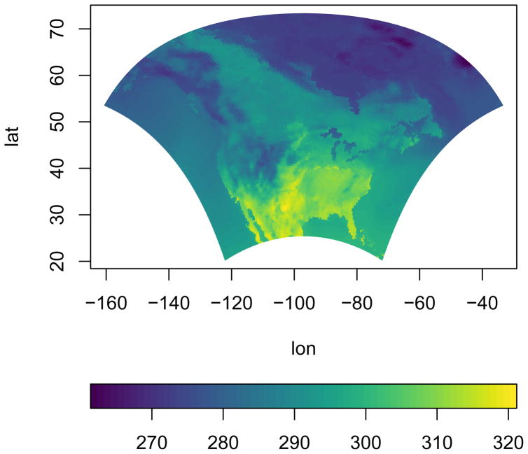
pimage(x = lon, y = lat, z = tasmax[,,1])
is used to create a heat map of the tasmax measurements for the first day of the narccap data. This heat map is shown in Figure 3. Recall that the narccap data are observed on an irregular grid. A heat map of the Aluminum measurements for the non-gridded co data set is created by executing the commands
Figure 3.
A heat map of the tasmax measurements for the first day of the narccap data.
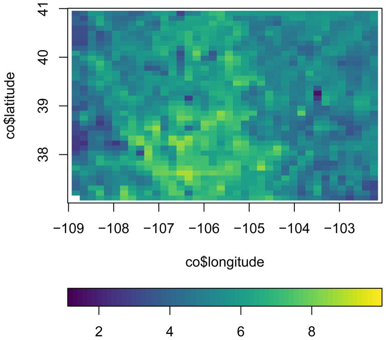
data(co, package = ‘gear’)
pimage(co$longitude, co$latitude, co$Al)
with the resulting heat map shown in Figure 4.
Figure 4.
A heat map of the Aluminum measurements for the co data set.
We now discuss other basic arguments used by the pimage function.
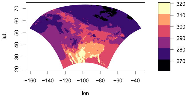
The first two arguments we discuss are the col and legend arguments. The color scheme used for coloring a heat map is of great importance. The default color scheme used in the autoimage package is the viridis color scheme from the viridisLite package. This color scheme is, “… designed in such a way that [it] will analytically be perfectly perceptually-uniform, both in regular form and also when converted to black-and-white. [It is] also designed to be perceived by readers with the most common form of color blindness.” (Garnier, 2016) The color scale can be modified by passing a vector of colors to the col argument through the ellipses argument ( …), as in the image function in the graphics package. The orientation of the color scale can be changed using the legend argument. The default value is legend = ‘horizontal’, which produces a color scale horizontally underneath the image. The color scale can be removed by specifying legend = ‘none’ or can be placed vertically along the right side of the image by specifying legend = ‘vertical’. A heat map of the first day of narccap tasmax measurements with a vertical color scale using 6 colors from the magma color palette in the viridisLite package is created by executing the command
pimage(lon, lat, tasmax[,,1], col = viridisLite::magma(6), legend = ‘vertical’)
The resulting heat map is shown in Figure 5.
Figure 5.
A heat map of the tasmax measurements for the first day of the narccap data using a custom color scheme and vertical color scale.
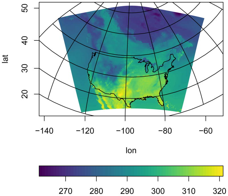
We now discuss arguments related to coordinate projection and adding geographic maps to an image. Longitude and latitude coordinates can be projected before plotting by specifying the proj, parameters, and orientation arguments. When specified, the coordinates are projected using the mapproject function in the mapproj package. proj specifies the name of the projection to utilize (the default is ‘none’, i.e. no projection). The parameters argument specifies the parameter values of the chosen projection, and orientation can be used to change the orientation of the projection. See the mapproject function in the mapproj function for more details regarding these arguments. Several geographic maps can be automatically added to the image by specifying the map argument. The available geographic maps come from the maps package (Brownrigg et al., 2016), and include the world, usa, state, county, france, nz (New Zealand), italy, lakes, and world2 maps. Interested users can find more details about these maps in the maps package. We now create a heat map with projected coordinates for the first day of narccap tasmax measurements. We utilize the Bonne projection using 45 degrees as the standard parallel. We also add a geographic map of the continental United States (U.S.). Note that a grid is automatically added to the image because latitude and longitude parallels are not straight for most projections. The command
pimage(lon, lat, tasmax[,,1], proj = ‘bonne’, parameters = 45, map = ‘usa’)
produces the heat map in Figure 6.
Figure 6.
A heat map of the tasmax measurements for the first day of the narccap data using projected coordinates with an added geographic map of the continental U.S.
The last major argument to the pimage function is the lratio argument. This argument controls the relative height or width of the color scale in comparison with the main plotting area. Increasing lratio increases the thickness of the color scale, while decreasing lratio decreases the thickness of the color scale.
Additional customizations to heat maps produced by the pimage function can be made via the ellipses ( …) argument. This includes adding custom geographic maps and points to the image, customizing the grid lines created when the coordinates are projected, further customizing the appearance of the color scale, and customizing the axis labels. These customizations are discussed in detail in the vignette included in the autoimage package, which can be accessed by executing the command vignette(‘autoimage’).
Basic usage of the autoimage function
We next discuss the autoimage function, which generalizes the pimage function to create a heat map with a sequence of images. The arguments for the autoimage and pimage functions are mostly the same, and we replicate their discussion only when necessary.
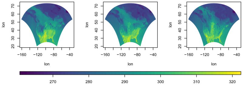
The structure of the z argument for the autoimage function may vary slightly from the pimage function. Specifically, if multiple gridded images are to be constructed, then z will be a three-dimensional array instead of a matrix. Each element of the third dimension of z corresponds to the matrix of gridded values for each image. If images for multiple non-gridded variables are to be constructed, then z will be a matrix where each column corresponds to a different variable. The autoimage function automatically constructs a sequence of images with a common color scale. If individual color scales are desired for each image, then the common.legend argument can be set to FALSE. The size argument can be used to specify the layout of the sequence of images, similar to the mfrow argument of the par function in the graphics package. If this is not specified, the autosize function in the autoimage package is used to automatically choose the layout, with a tendency to produce a layout closer to square dimensions. We produce a 1×3 matrix of images with a common color scale for the narccap data using the command
autoimage(lon, lat, tasmax[,,1:3], size = c(1, 3))
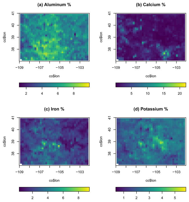
as shown in Figure 7. Similarly, we create a 2×2 layout of images for the Colorado geochemical measurements by passing 4 columns of the co data frame to the autoimage function. The values of each variable have substantially different ranges, so we use individual color scales for each image. Titles are added to each image using the main argument by providing a character vector whose length matches the number of plotted images. Executing the command
Figure 7.
A heat map of the narccap data set tasmax measurements in a 1×3 layout.
autoimage(co$lon, co$lati, co[,c(‘Al’, ‘Ca’, ‘Fe’, ‘K’)], common.legend = FALSE,
                  main = c(‘(a) Aluminum %’, ‘(b) Calcium %’, ‘(c) Iron %’, ‘(d) Potassium %’))
produces Figure 8.
Figure 8.
A heat map of various geochemical measurements taken in Colorado.
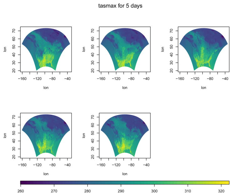
It is natural to add a common title to a heat map with multiple images. This can be accomplished by passing the desired title to the outer.title argument. The title will be added in the outer margin of the resulting heat map. The size of the outer margins should be specified using the oma argument of the par function of the graphics package before adding the common title. However, a sensible choice for the size of the outer margins is automatically made by the autoimage package if this is not specified by the user. We create the heat map of narccap tasmax measurements shown in Figure 9 by executing the command
Figure 9.
A heat map of the NARCCAP tasmax measurements with a common title.
autoimage(lon, lat, tasmax, outer.title = ‘tasmax for 5 days’)
Additional customizations to heat maps produced by the autoimage function can be made via the ellipses ( …) argument. In addition to the customizations mentioned in the context of the pimage function, this includes the ability to change the appearance of the common title. These customizations are discussed in detail in the vignette included in the autoimage package, which can be accessed by executing the command vignette(‘autoimage’).
Richer plots using the autolayout and autolegend functions
Suppose we want to add custom features to a sequences of images, with each image receiving different features. One can create a richer sequence of images using the autolayout and autolegend functions.
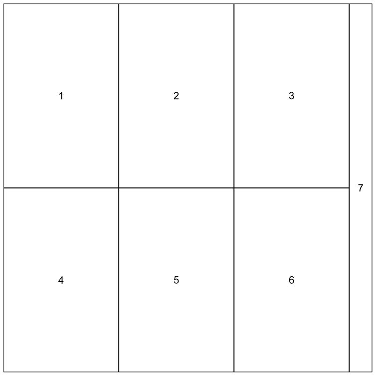
The autolayout function partitions the graphic device into the sections needed to create a sequence of images. The most important function arguments include size, legend, common.legend, and lratio, which correspond to the same arguments in the pimage and autoimage functions. The outer argument specifies whether a common title will be utilized in the plot. The default is outer = FALSE, indicating that no common title will be added to the plot. When autolayout is called, numbers identify the plotting order of the sections, though these can be hidden by setting show = FALSE. As an initial example, we create a 2×3 matrix of images with a common vertical color scale. The command
autolayout(c(2, 3), legend = ‘v’)
produces the plot in Figure 10.
Figure 10.
A 2×3 matrix of plotting regions with a common vertical legend created by the autolayout function.
After creating the layout of a complicated heat map using the autolayout function, the images should be created using the pimage function while specifying legend = ‘none’. After the desired image or set of images is created, one can automatically add the appropriate legend by calling autolegend. The autolegend function recovers relevant color scale parameters from the most recent pimage call. Consequently, if a common legend is desired, it is important to specify a common zlim argument among all relevant pimage calls.
Various features can be added to the images using the ppoints, plines, ptext, psegments, parrows, and ppolygon functions. These are analogues of the points, lines, text, segments, arrows, and polygon functions in the graphics package, to be used with images containing projected coordinates.
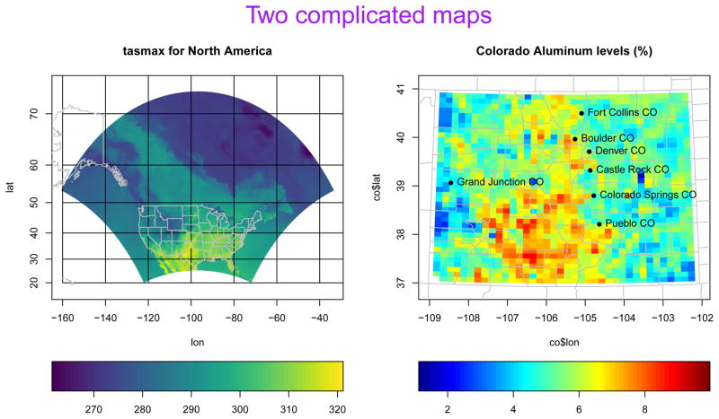
We provide an (unrealistic, but informative) example of the kinds of plots these functions can be used to create. Suppose we wish to create a heat map for both the narccap and Colorado geochemical data sets. We desire to add a geographic map for each state in the U.S. for the narccap data while using the Mercator projection to transform the coordinates before plotting. We desire to plot the Aluminum measurements for the Colorado data. We want a custom color scale similar to the jet color scheme in Matlab. We desire to project the coordinates before plotting using the Bonne projection with a reference latitude of 39 degrees. We also desire to add geographic maps of the relevant U.S. counties to the map, along with labels for select Colorado cities. Lastly, we will add a large, purple title to the two heat maps.
We begin by obtaining some of the relevant information for these plots. The borders for the continental U.S. states is available in the state map in the maps package. However, we must extract the borders of Alaska and Hawaii from the world map in the maps package. Executing the commands
data(worldMapEnv, package = ‘maps’)
hiak <- maps::map(‘world’, c(‘USA:Hawaii’, ‘USA:Alaska’), plot = FALSE)
loads and extracts the borders for Hawaii and Alaska. The results are stored in a list named hiak with named vectors x and y containing the coordinates of the borders. Each state border is separated by an NA value. The commands
data(us.cities, package = ‘maps’)
codf <- us.cities[us.cities$country.etc == ‘CO’, ]
codf <- codf[c(3, 5, 7:10, 18), ]
loads the us.cities data set from the maps package, extracts the Colorado cities from this data set, then stores a small sample of these Colorado cities in the codf data frame. Information related to the name, longitude, and latitude of each city is included in the data frame.
Having obtained the relevant information, we setup a 1×2 matrix of images with individual horizontal color scales and an area for a common title using the command:
autolayout(c(1, 2), legend = “h”, common.legend = FALSE, outer = TRUE)
We now create a heat map for the first day of NARCCAP tasmax measurements using the command
pimage(lon, lat, tasmax[,,1], legend = ‘none’, proj = ‘mercator’,
             map = ‘state’, lines.args = list(col = ‘grey’))
Note that legend = ‘none’ since this will be added afterward using the autolegend function. The Mercator projection was chosen via the proj argument, and the state geographic map was added. The color of the geographic map was changed by passing the lines.args argument to pimage. The lines.args argument is a named list with components matching the arguments of the lines function in the graphics package, and changes the appearance of any geographic maps plotted using the pimage function. We next add the state borders for Hawaii and Alaska using the plines function, title the heat map, and add the color scale to the image by executing the following commands:
plines(hiak, proj = ‘mercator’, col = ‘grey’)
title(‘tasmax for North America’)
autolegend()
Note the specification of the projection and line color in the plines function call.
Next, we construct the image for the Colorado Aluminum measurements using the commands
pimage(co$lon, co$lat, co$Al, map = ‘county’, legend = ‘none’,
             proj = ‘bonne’, parameters = 39, paxes.args = list(grid = FALSE),
             col = fields::tim.colors(64), lines.args = list(col = ‘grey’))
Note the custom color scheme specified by the col argument. Also, the paxes.args argument is passed to the pimage function to suppress the grid lines that would normally be plotted when a projection is used. The locations and names of the Colorado cities are added to the image using the commands
ppoints(codf$lon, codf$lat, pch = 16, proj = ‘bonne’)
ptext(codf$lon, codf$lat, labels = codf$name, proj = ‘bonne’, pos = 4)
A title and color scale are added to the image using the commands
title(‘Colorado Aluminum levels (%)’)
autolegend()
Lastly, we specify a large common title for the heat maps using the mtext function in the graphics package. Specifically, we execute the command:
mtext(‘Two complicated maps’, col = ‘purple’, outer = TRUE, cex = 2)
The plot resulting from the commands listed in this section is shown in Figure 11.
Figure 11.
A complicated set of heat maps created using the autolayout and autolegend functions.
Summary
We have introduced the autoimage package for constructing heat maps. The autoimage package natively supports: 1. automatic inclusion of a color scale with the plotted image, 2. construction of heat maps for responses observed on regular or irregular grids, as well as non-gridded data, 3. construction of a matrix of heat maps with a common color scale, 4. construction of a matrix of heat maps with individual color scales, 5. projecting coordinates before plotting, 6. easily adding geographic borders, points, and other features to the heat maps. We believe that the breadth of native features, simplicity, and speed of the autoimage package make it a unique contribution to the R user community in comparison with other R tools that can be used for creating heat maps. We note however that the autoimage package is a specialized tool and is limited to the construction of heat maps. This is in contrast to other plotting packages mentioned earlier, such as the lattice, sp, and ggplot2 packages, which have many plotting capabilities unrelated to heat maps.
A number of additional features and heat map customizations are available in the autoimage package, but were not discussed in order to shorten the length of this article. Additional discussion and examples may be found in the documentation of the autoimage package. A more detailed introduction to the capabilities of the autoimage package can be accessed by executing the command vignette(‘autoimage’). Additionally, a vignette comparing some of the heat map capabilities of the autoimage and ggplot2 packages can be accessed be executing the command vignette(‘ggplot2-comparison’).
The source code for the autoimage package is publicly hosted at https://github.com/jpfrench81/autoimage. Bugs and other issues may be reported there. Additionally, interested parties are encouraged to submit improvements for the autoimage package at the GitHub repository listed above.
Acknowledgments
This autoimage package was created for research supported by NSF Grant DMS-1463642 and NIH Grant R01 CA157528. This package would not have been created without inspiration from the internals of the image.plot function in the fields package written by Doug Nychka and from the image.scale.2 function written by Marc Taylor and discussed at http://menugget.blogspot.com/2013/12/new-version-of-imagescale-function.html.
Bibliography
- Akima H, Gebhardt A. Akima: Interpolation of Irregularly and Regularly Spaced Data. 2015 https://CRAN.R-project.org/package=akima. R package version 0.5–12.
- Auguie B. gridExtra: Miscellaneous Functions for “Grid” Graphics. 2016 https://CRAN.R-project.org/package=gridExtra. R package version 2.2.1.
- Baddeley A, Turner R. Spatstat: An R package for analyzing spatial point patterns. Journal of Statistical Software. 2005;12(6):1–42. http://www.jstatsoft.org/v12/i06/ [Google Scholar]
- Brownrigg R, Minka TP, Deckmyn A. Maps: Draw Geographical Maps. 2016 https://CRAN.R-project.org/package=maps. R package version 3.1.0.
- Caya D, Laprise R. A semi-implicit semi-Lagrangian regional climate model: The Canadian RCM. Monthly Weather Review. 1999;127(3):341–362. [Google Scholar]
- Collins M, Booth BB, Harris GR, Murphy JM, Sexton DM, Webb MJ. Towards quantifying uncertainty in transient climate change. Climate Dynamics. 2006;27(2–3):127–147. [Google Scholar]
- French J. Gear: Geostatistical Analysis in R. 2015 https://CRAN.R-project.org/package=gear. R package version 0.1.1.
- French J. Autoimage: Multiple Heat Maps for Projected Coordinates. 2017 https://CRAN.R-project.org/package=autoimage. R package version 1.3. [PMC free article] [PubMed]
- Garnier S. viridisLite: Default Color Maps from ‘matplotlib’ (Lite Version) 2016 https://CRAN.R-project.org/package=viridisLite. R package version 0.1.3.
- McIlroy D. Mapproj: Map Projections. 2015 https://CRAN.R-project.org/package=mapproj. R package version 1.2–4. Packaged for R by Ray Brownrigg and Thomas P Minka and transition to Plan 9 codebase by Roger Bivand.
- Mearns LO, et al. National Center for Atmospheric Research Earth System Grid data portal. Boulder, CO: 2007. The North American Regional Climate Change Assessment Program dataset. updated 2012. Data downloaded 2016-08-12. [Google Scholar]
- Mearns LO, Gutowski W, Jones R, Leung R, McGinnis S, Nunes A, Qian Y. A regional climate change assessment program for North America. EOS, Transactions American Geophysical Union. 2009;90(36):311–311. [Google Scholar]
- Mearns LO, Arritt R, Biner S, Bukovsky MS, McGinnis S, Sain S, Caya D, Correia J, Jr, Flory D, Gutowski W, et al. The North American regional climate change assessment program: Overview of phase i results. Bulletin of the American Meteorological Society. 2012;93(9):1337–1362. [Google Scholar]
- Nychka D, Furrer R, Paige J, Sain S. Fields: Tools for Spatial Data. 2016 https://CRAN.R-project.org/package=fields. R package version 8.3–6.
- Pebesma EJ, Bivand RS. Classes and methods for spatial data in R. R News. 2005;5(2) http://cran.r-project.org/doc/Rnews/ [Google Scholar]
- Sarkar D. Lattice: Multivariate Data Visualization with R. Springer-Verlag; New York: 2008. http://lmdvr.r-forge.r-project.org. [Google Scholar]
- Smith DB, Ellefsen KJ. Technical report. U.S. Geological Survey; 2010. Soil geochemical data for the Wyoming landscape conservation initiative study area: Data series 510. http://pubs.usgs.gov/ds/510/ [Google Scholar]
- Wickham H. Ggplot2: Elegant Graphics for Data Analysis. Springer-Verlag; 2009. http://ggplot2.org. [Google Scholar]
- Wilke CO. Cowplot: Streamlined Plot Theme and Plot Annotations for ‘ggplot2’. 2016 https://CRAN.R-project.org/package=cowplot. R package version 0.6.1.


