Abstract
Risk scores play an important role in clinical medicine. With advances in information technology and availability of electronic healthcare record, scoring systems of less commonly seen diseases and population can be developed. The aim of the article is to provide a tutorial on how to develop and validate risk scores based on a virtual dataset by using R software. The dataset we generated including numeric and categorical variables and firstly the numeric variables would be converted to factor variables according to cutoff points identified by the LOESS smoother. Then risk points of each variable, which are related to the coefficients in logistic regression, are assigned to each level of the converted factor variables and other categorical variables. Finally, the total score is calculated for each subject to represent the prediction of the outcome event probability. The original dataset is split into training and validation subsets. Discrimination and calibration are evaluated in the validation subset. R codes with explanations are presented in the main text.
Keywords: Scoring system, risk stratification, LOESS smoothing
Introduction
One of the main task during medical practice is risk stratification and triage. For cardiovascular diseases, the risk stratification is of vital importance for accurate allocations of prophylaxis and therapeutic interventions. In the emergency department, the triage of patients is also essential to make the most use of limited resources. Scoring system is the most useful tool for such purpose. In cardiovascular diseases, the well-known examples are the Framingham risk score and QRISK2 (1,2), which can help to estimate the 10-year risk of cardiovascular events. For critically ill patients, there is also a variety of scoring systems such as simplified acute physiology score (SAPS) II, acute physiological score (APS) III, Logistic Organ Dysfunction system (LODS), Sequential Organ Failure Assessment (SOFA), Oxford Acute Severity of Illness Score (OASIS) and quick SOFA (qSOFA) (3-7).
The development of these scores requires large sample sizes from multiple centers. Due to rapid advances in information technology and extensive use of electronic healthcare records, more and more individual patient data are available to investigators (8). As a result, there is increasing interest on developing prediction scores in some less common diseases and special subgroups, which was impossible decades ago due to limited sample size. However, there is a lack of step-by-step tutorials on how to develop prediction scores. The present article aimed to provide a detailed description of how to develop prediction score using R (version 3.3.2).
The rationale for using R software
R is a language and environment designed for statistical analysis and data management. It is freely available at https://cran.r-project.org/. All functionalities required for the development of scoring system are available by using relevant packages. For instance, one important task in assigning points to a continuous variable is to find cutoff values to split it into intervals. It requires non-parametric LOESS smoothing technique to describe the relationship between the variable and the outcome. The ggplot2 package is a useful plotting system to visualize the relationship between continuous variable and the probability of the outcome event. Furthermore, the R syntax for the overall process of data management and statistical analysis are all documented, which plays a crucial role during manuscript revision and cross checking.
Data simulation
The following codes create a dataset containing five variables, including a binary mortality outcome mort.y, two factor variables and two numeric variables. The smoking variable has three levels “never”, “ever” and “smoking”. The gender variable has two levels “male” and “female”.
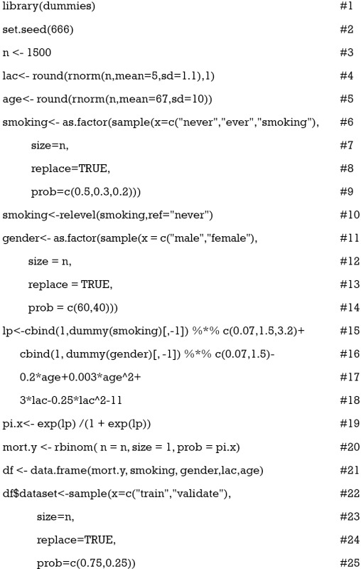
Line 1 calls the library() function to load the namespace of the package dummies and attach it on the search list. Line 2 sets an arbitrary seed to make the results fully reproducible. Line 3 defines the sample size of the working example. Line 4 generates a continuous variable called “lac” (lactate), which is assumed to be normally distributed with the mean of 5 and standard deviation of 1.1. The variable age is created in the same way. Smoking is created as a factor variable with three levels. Line 8 makes the sampling among the three levels with replacement. The prob argument receives a vector of probability for sampling the three levels (line 9). Line 10 makes the “never” level as the base reference, which is essential in regression analysis. Gender is created as a factor variable in the same way. However, note that the vector of values assigned to prob argument in line 14 does not sum to one. It is equivalent to assign a vector c(0.6, 0.4). Line 15 creates a linear predictor of the regression equation. Here we use dummy() function to convert factor variable into dummy variables. The symbol “%*%” is the matrix operator for multiplication. We assigned linear predictors conveniently for each variable. For example, the coefficient 1.5 corresponding to the level “ever” can be interpreted as an increase of 1.5 units in linear predictor scale for ever smokers as compared to never smokers. A quadratic function opening upward is assigned to age in line 17. The function between linear predictor and variable lac is a parabola opening downward (line 18). Line 19 converts linear predictor into probability by logit transformation, and line 20 generates an outcome variable mort.y which follows a binomial distribution. Line 21 combines all variables into a data frame. The whole dataset is split into training and validation subsets by using sample() function (line 22). Three quarter of the sample is used for training and the remaining one quarter is used for validation.
LOESS smoothing curves for numeric variables
A challenge in developing scoring system is to convert numeric variable to points. Since numeric variables may not be linearly associated with mortality probability, simple method to cut them into quartiles or quintiles can cause problem. One solution is to plot probability of outcome events against the numeric variable of interest, by using LOESS smoothing function (9). LOESS is a locally weighted scatterplot smoothing technique. Along the x-axis, more weight is given to points near the point whose response is being estimated. Since it is a non-parametric technique, it requires no assumption and let the data tell the relationship between response and predictor variables. Here LOESS smoothing curves are examined to identify cut points of a numeric variable that are associated with remarkable changes in the risk of the outcome. These cut points divide the numeric variable into several intervals, and a score will be assigned to each interval.
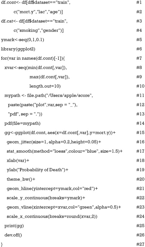
Lines 1 to 4 separate the numeric variables from factor variables because they would be treated differently. A vector called ymark is created to label y axis with values that are clinically relevant (line 5). We require ggplot2 package for drawing the LOESS curves (line 6) (10). Next, we use a for loop to draw the LOESS curves. In reality, there could be dozens of numeric variables to be considered, thus use the loop function may help to simplify the codes. Within the loop, a vector object xvar is created as axis labels (lines 8 to 10). Because all produced curves need to be automatically saved to the computer disc, we specify the path (“/Users/apple/score”) for saving in lines 11 to 13. Users can specify their preferred path by substituting the contents within the double quotes. The names of saved plots can be defined using paste() function, and the suffix of the plots are “.pdf”. The pdf() function starts graphic device driver for producing Portable Document Format (PDF) graphics. Lines 15 to 25 constitute the main body of the plot function. The ggplot() function first declares the data frame df.cont for a graphic, and then specifies a set of aesthetics intended to be common throughout all subsequent layers (line 15). The geom_jitter() function adds a small amount of variation to the location of each point (line 16). Otherwise, all points would be located at 0 or 1 and overlap with each other. The argument alpha makes the points transparent and height argument specifies the amount of vertical jitter. The function stat_smooth() adds a LOESS smoother with the argument method=“loess” (line 17). Line 21 adds horizontal lines at specified points at y-axis to facilitate determination of cut points. Vertical lines are added with geom_vline() function for the same purpose (line 23). Line 25 prints the ggplot object called “gg”, and line 26 shuts down the current device.
Choosing cut points and base reference
After running the above R codes, you will find two PDF files at your saving path called “plot_age.pdf” and “plot_lac.pdf” (Figures 1 and 2).
Figure 1.
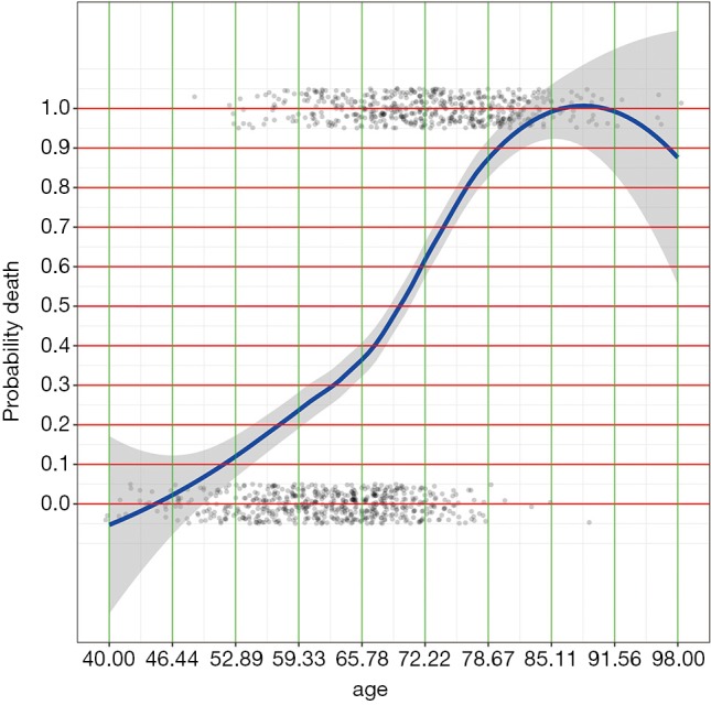
LOESS smoothing curve plotting the probability of death against age. Note the age is not linearly associated with the probability and we need to identify cut points at which y value changes the most.
Figure 2.
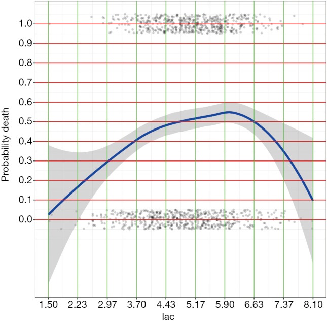
LOESS smoothing curve plotting the probability of death against lac.
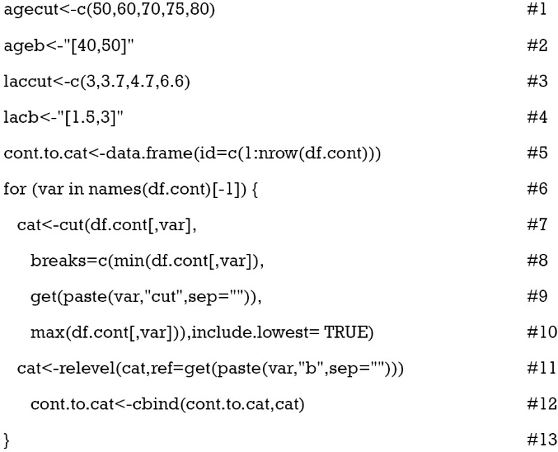
By examining the Figures 1 and 2, cut points for age and lac are chosen (lines 1 and 3). The base reference corresponds to a range with the lowest mortality risk. They are 40 to 50, and 1.5 to 3 for age and lac, respectively. Note that the lowest value should be included in square brackets. Then we need to convert the numeric variable to factor variables by cut points we have just chosen. Again, a for loop is employed for the ease of adaptation to the situation when there is a large number of numeric variables (line 6). Within the loop the cut() function (line 7) is used and the cut points are passed to the function using breaks argument. Note that the minimum and maximum values of the numeric variable should also be added (lines 8 and 10). The cut points in between are accessed with get() function (line 9). Then the base level of newly produced factor variable should be reset by referring to the base reference level determined previously (line 11). Line 12 combined returned factor variables together one by one (e.g., one cycle produces one variable).
Calculating scores for each level
Now that numeric variables have been converted to factor variables, scores for each level can be obtained by fitting a logistic regression model.
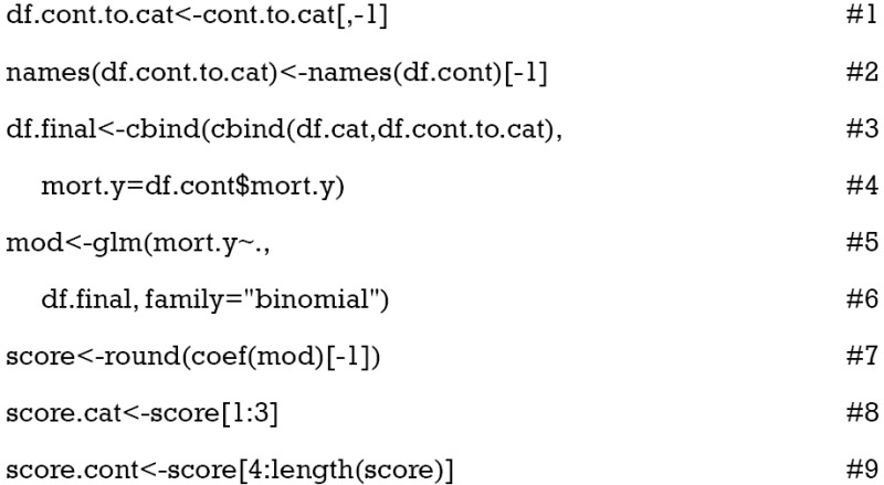
Lines 1 and 2 rename the factor variables that have just been converted from numeric variables. The first variable is created without meaning and dropped here (line 1). Similarly, the first variable in df.cont is mort.y, which is also dropped. Then we combined converted factor variables and original categorical variables to form a data frame that will be used in logistic regression model. Next, the logistic regression model is fit with glm() function (line 5). Note that the family argument should be “binomial” to fit a logistic regression model (line 6). Coefficients of the regression model can be accessed with coef() function. Also, the coefficient is rounded off to the nearest integer (line 7). The scores are further divided into those for factor variables and those for numeric variables (lines 8 and 9). Now we can take a look at the points assigned to each category.
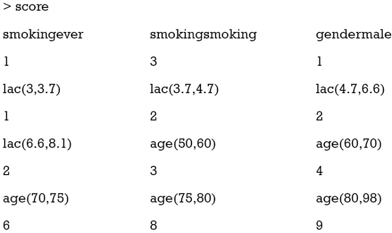
It appears that ever smoker takes 1 point, and current smoker takes 3 points. For age groups, those older than 80 takes 9 points and younger patients such as those younger than 60 but older than 50 take 3 points. The base levels, younger than 50 for age and less than 3 for lac, take zero point.
Calculating scores for numeric variables
The total score will be calculated for each patient in both training and validation cohorts. We need to convert the score to a probability of mortality outcome. Also, the discrimination and calibration of the score should be evaluated in the validation cohort. Now let’s see how to calculate total score for each patient. The manipulation of strings in R looks a little difficult for newbies, interested readers can consult the reference for more details (http://www.gastonsanchez.com/HandlingandProcessingStringsinR.pdf). Here we just explain some symbols relevant to the current example.
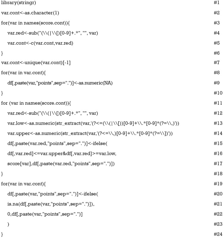
In the vector score.cont, the original numeric variable names are followed by a range with brackets, which needs to be reduced to its original name. Someone may ask why not directly call variable names from the original df.cont. For the current study, there is no problem with this method, but for others only statistically significant variables in logistic regression model would be selected. In other words, not all continuous variables will be used as score components. In such a circumstance, the use of this automated for loop will simplify the work (line 3). The sub() function replace the first occurrence of a pattern in a given text (line 4). That is to reduce the names in score.cont to their original variable names. Brackets “(” and “[” are metacharacters that if their literal meanings are wanted, one needs to escape them with a double backslash “\\”. The vertical bar “|” is a logical operator for OR. “[0-9]” matches any digits that appear following brackets. The plus “+” symbol is a qualifier which indicates that the preceding item (e.g., digits in the example) will be matched one or more times. The period symbol “.” matches any single character. The following symbol “*” indicates the preceding item will be matched zero or more times. Note that the returned object var.cont from the loop may contain duplicated variable names because each numeric variable contains more than one range. Thus, the unique() function is used to drop duplicated variable names (line 7). The for loop beginning from line 8 creates variable names (e.g., age.points and lac.points) for the points of each numeric variable in the whole dataset (df) and fills them with NA values. Then age.points and lac.points will be assigned specific numeric values depending on the values in age and lac variables (line 11). Within the for loop, the upper and lower limits are extracted from variable names in score.cont. Then the limits are compared to the values of corresponding variables in df data frame (lines 15 to 18). The function ifelse() is employed to assigned points to each range (line 15). At last, all base levels are given zero point (line 19 to 23).
Calculate scores for factor variables and take a sum
Calculating points for factor variables are similar to that for numeric variables because the latter has been converted to factor variables.
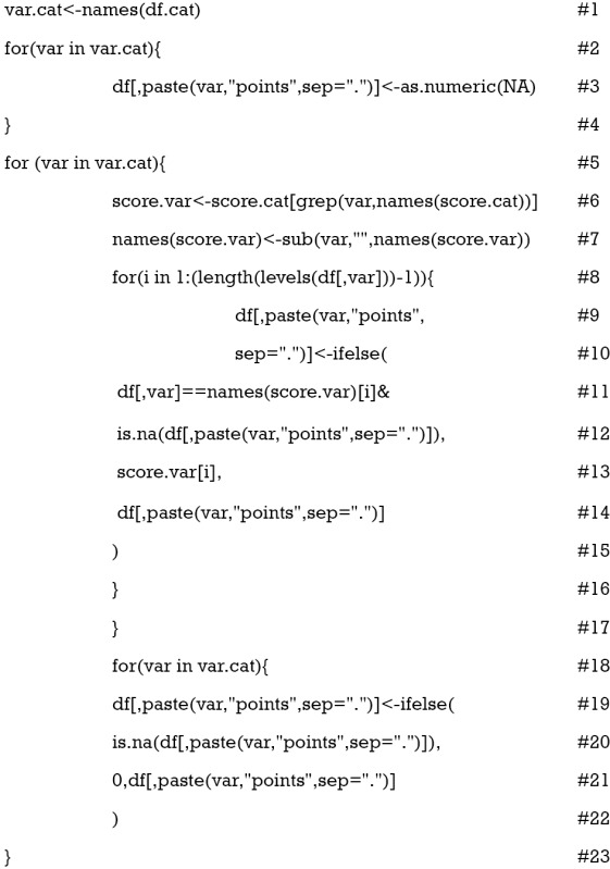
Suppose all categorical variables are included as component scores, then we don’t need to extract variable names with a loop function. Line 1 extracts all categorical names and saves them to an object var.cat. Lines 2 to 4 create empty variables for categorical points, and they are named “smoking.points” and “gender.points”. Some factor variables contained several levels and we need to loop through all levels (lines 8 to 16). With the ifelse() function, we assigned points for each level of individual patient (lines 10 to 14). Note that we only replace NA values (line 12). The process loops through all factor variables (line 5). Next, we need to replace all base reference with zero point (lines 18 to 23).
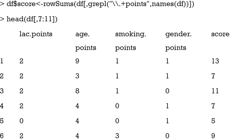
The last step is to sum all component points to a total score that can be used for risk stratification. As it is noted that all component points have the suffix “.points”, we sum all variables with this suffix. The grepl() function matches a pattern in a string vector and returns a logical vector. Then we can take a look at the results. To save space, only component points and total scores are shown.
Converting the score to probability of mortality and comparing it to observed number of deaths
Converting the score to relevant probability of the outcome event is clinically meaningful. The score is used in logistic regression model to estimate the coefficient of the score. Then the regression equation is used to predict the probability of outcome events, given the scores of individual patients.
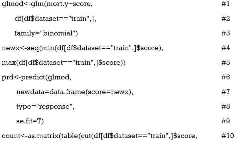
Logistic regression model is fit with glm() function by passing “binomial” to the family argument (lines 1 to 3). The object newx is a vector of score values ranging from minimum to the maximum at an increasing step of 1. The predict() function is used to estimate predicted probability at each value of score (line 6). The type of prediction, by default, is on the scale of linear predictor. The “response” type is on the scale of the response variable (line 8). The argument se.fit is set to be true to obtain standard error (line 9). The object count is a matrix containing the number of survivors and non-survivors for each score value (lines 10 to 14).
Visualization of the relationship between scores and probability of outcome events
Barplot is used to show the number of survivors and non-survivors, stratified by scores. Also, the predicted probability of outcome event is depicted on the same plot.
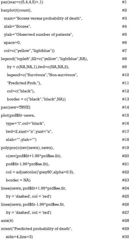
The function par() is used to set graphical parameters so that the number of lines (e.g., more lines will make the margin wider) on four sides of the plot can be specified (line 1). The first argument of barplot() is a matrix of values describing bars (line 2). Values in a column of the matrix count correspond to the height of stacked sub-bars making up the bar. The argument col gives a vector of colors for sub-bars (line 7). The legend() function is to add a legend to the plot. Here, we add the legend to the top left and the boxes for survivors and non-survivors are filled with colors consistent with sub-bars (line 8). The last element of the fill argument is to add a line corresponding to predicted probability, and no color is assigned to it (line 8). Both lty and lwd are arguments for the probability line and NA value is passed to boxes (line 9). The legend argument gives a vector of characters for the description of sub-bars and the line. The border argument specifies the border color of the boxes (line 13).
The argument new in the par() function is set to true so that the next high-level plotting command will not clean the previous plot (line 14). This is essential if one wants to plot two high-level plots on the same figure. This time the fitted probability values are plotted against the score values (line 15). The x and y axes are suppressed (line 17), and there is no label for both axes (line 18). The polygon() function draws the confidence interval for the predicted probability of death (line 19). Also, two dashed lines are added to the lower and upper limits of the confidence interval (lines 24 to 27). The axis() function adds an axis to the current plot on the right side which is on the scale of probability (line 28). The mtext() function adds text to the right margin of the current plot (line 29). The “line=3” argument indicates the text is added to the third margin line. The margin lines start from 0 counting outward (line 30). The results are shown in Figure 3.
Figure 3.
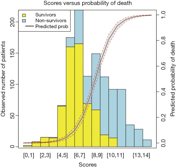
Predicted probability of death versus the number of observed survivors and non-survivors.
Validation of the score
Score validation involves the evaluation of discrimination and calibration of the model. The discrimination evaluates the ability of the score to distinguish between survivors and non-survivors, and is typically represented by the area under receiver operating characteristics (AUC). The calibration evaluates the agreement between predicted and observed risks.
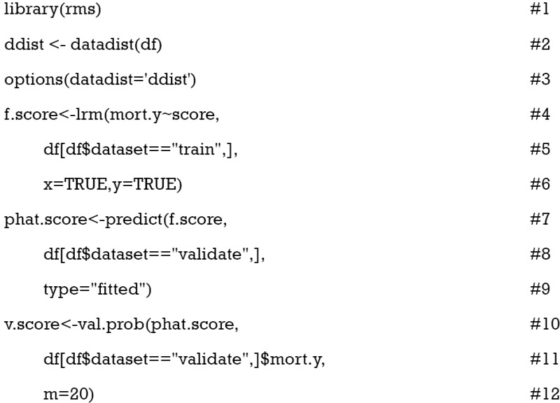
The rms package is employed for the evaluation of model validation. The datadist() function determines summaries of variables for effect and plotting ranges (line 2). The distribution summaries for all variables are stored before model fit, and are applicable for subsequent plots. Logistic regression model is fit for the training dataset with lrm() function. Note the x and y arguments are set to be true, causing the expanded design matrix and response variables to be returned under the names x and y, respectively (line 6). The predict() function returns predicted probability for the validation cohort (line 7). The val.prob() function is used to validate predicted probability against binary outcomes. It receives a vector of predicted probability that is returned by predict() function, and a vector of binary mortality outcomes (line 10).
The results are shown in Figure 4. The predicted probability is plotted against the observed probability and the deviation from the ideal line indicates a difference between predicted and observed risks (11). A variety of statistics are displayed on the top left. For example, Dxy refers to the Somer’s rank correlation, whose value equals 1 when all pairs of the variables agree (12). C (ROC) is the area under ROC curve and is an index of discrimination.
Figure 4.
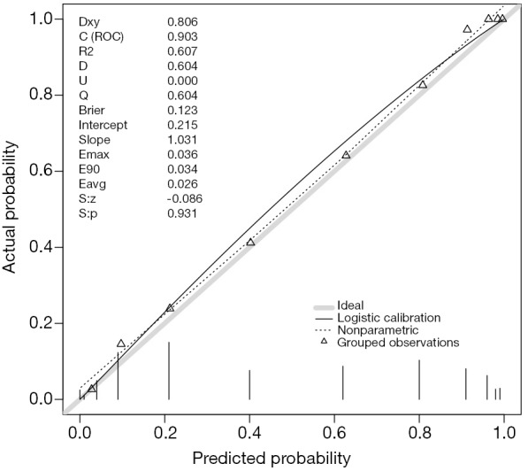
The predicted probability is plotted against the observed probability. A variety of statistics are displayed on the top left.
Acknowledgements
None.
Footnotes
Conflicts of Interest: The authors have no conflicts of interest to declare.
References
- 1.Anderson KM, Odell PM, Wilson PW, et al. Cardiovascular disease risk profiles. Am Heart J 1991;121:293-8. 10.1016/0002-8703(91)90861-B [DOI] [PubMed] [Google Scholar]
- 2.Hippisley-Cox J, Coupland C, Vinogradova Y, et al. Predicting cardiovascular risk in England and Wales: prospective derivation and validation of QRISK2. BMJ 2008;336:1475-82. 10.1136/bmj.39609.449676.25 [DOI] [PMC free article] [PubMed] [Google Scholar]
- 3.Le Gall JR, Lemeshow S, Saulnier F. A new Simplified Acute Physiology Score (SAPS II) based on a European/North American multicenter study. JAMA 1993;270:2957-63. 10.1001/jama.1993.03510240069035 [DOI] [PubMed] [Google Scholar]
- 4.Minne L, Abu-Hanna A, de Jonge E. Evaluation of SOFA-based models for predicting mortality in the ICU: A systematic review. Crit Care 2008;12:R161. 10.1186/cc7160 [DOI] [PMC free article] [PubMed] [Google Scholar]
- 5.Le Gall JR, Klar J, Lemeshow S, et al. The Logistic Organ Dysfunction system. A new way to assess organ dysfunction in the intensive care unit. ICU Scoring Group. JAMA 1996;276:802-10. 10.1001/jama.1996.03540100046027 [DOI] [PubMed] [Google Scholar]
- 6.Johnson AE, Kramer AA, Clifford GD. A new severity of illness scale using a subset of Acute Physiology And Chronic Health Evaluation data elements shows comparable predictive accuracy. Crit Care Med 2013;41:1711-8. 10.1097/CCM.0b013e31828a24fe [DOI] [PubMed] [Google Scholar]
- 7.Raith EP, Udy AA, Bailey M, et al. Prognostic Accuracy of the SOFA Score, SIRS Criteria, and qSOFA Score for In-Hospital Mortality Among Adults With Suspected Infection Admitted to the Intensive Care Unit. JAMA 2017;317:290-300. 10.1001/jama.2016.20328 [DOI] [PubMed] [Google Scholar]
- 8.Riley RD, Ensor J, Snell KI, et al. External validation of clinical prediction models using big datasets from e-health records or IPD meta-analysis: opportunities and challenges. BMJ 2016;353:i3140. 10.1136/bmj.i3140 [DOI] [PMC free article] [PubMed] [Google Scholar]
- 9.Cleveland WS. Robust Locally Weighted Regression and Smoothing Scatterplots. J Am Stat Assoc 2012;74:829-36. 10.1080/01621459.1979.10481038 [DOI] [Google Scholar]
- 10.Ito K, Murphy D. Application of ggplot2 to Pharmacometric Graphics. CPT Pharmacometrics Syst Pharmacol 2013;2:e79. 10.1038/psp.2013.56 [DOI] [PMC free article] [PubMed] [Google Scholar]
- 11.Steyerberg EW, Vergouwe Y. Towards better clinical prediction models: seven steps for development and an ABCD for validation. Eur Heart J 2014;35:1925-31. 10.1093/eurheartj/ehu207 [DOI] [PMC free article] [PubMed] [Google Scholar]
- 12.Somers RH. A New Asymmetric Measure of Association for Ordinal Variables. Am Sociol Rev 1962;27:799-811. 10.2307/2090408 [DOI] [Google Scholar]


