Abstract
With greater pressures of providing high-quality care at lower cost due to a changing financial and policy environment, the ability to understand variations in care delivery and associated outcomes and act upon this understanding is of critical importance. Building on prior work in visualizing health-care event sequences and in collaboration with our clinical partner, we describe our process in developing a multiple, coordinated visualization system that helps identify and analyze care processes and their conformance to existing care guidelines. We demonstrate our system using data of 5,784 pediatric emergency department visits over a 13-month period for which asthma was the primary diagnosis.
Keywords: Visual analytics, information visualization, health informatics, visual process mining, conformance, pediatric emergency medicine
1. INTRODUCTION
Visualizing healthcare event sequences derived from clinical and administrative claims data has been a topic of growing interest to information visualization researchers [20, 6]. Conceptualizing sequential healthcare activities as “careflow” has become widespread in visualization research [14] and healthcare systems engineering research [12]. A key motivation behind this body of research is to understand how care is delivered to an individual or a group of patients, with the aim to identify common care delivery patterns, bottlenecks, and best practices [4]. With greater pressures of providing high-quality care at lower cost due to a changing financial and policy environments, the ability to understand variations in care and associated outcomes and act upon this understanding is of critical importance [21].
[18] provide a comprehensive overview to different interactive information visualization approaches for exploring and querying electronic health records of individual as well as collection of patients. Exemplary visualization systems at the individual patient level include LifeLines [16], KHOSH-PAD [7], and Midgaard [2]; at the cohort level examples include Lifelines2 [22], Similan [25], LifeFlow [24], Outflow [23], and VisCareTrails [11]. However, there are still many open challenges in visualizing time-oriented healthcare data, including the scalable analysis of patient cohorts and variations in care [1]. Recently, visual analytics approach is being actively applied to comparison between actual care process and guideline care process for a single patient [5] or a patient cohort [8].
Our research builds on and integrates many different aspects of prior and focuses on the design and development of a multiple coordinated visualization system that helps identify and analyze variation of care processes and their conformance to existing care guidelines. Our use context is pediatric asthma care in emergency departments. This paper describes our journey in designing and implementing our system in collaboration with our clinical partner. We conclude with implications and next steps.
2. DATA
Our dataset includes all pediatric ED visits over a 13-month period for which asthma was the primary diagnosis. For each of these 5,784 visits we obtained information regarding administrative events, clinical respiratory test events, laboratory test events and medication administration events with their date/timestamps. We also received detailed demographic, charge, and provider-related information for each visit. A summary of the data is provided in Table 1. For this study we focused only on the visualization of laboratory and medication-related events for patients grouped based on laboratory tests or medications. We ignored administrative events since they are performed for almost all patients. The data was received as comma separated value (csv) files split into several tables as a relational database. The visit.csv file contained 5,785 visit observations and had 143 attributes, including demographic information and administrative timestamps. The medications.csv and labresult.csv files contained information regarding medication and lab-related date/timestamps, respectively.
Table 1.
Descriptive Summary of Patient Population Data (n=5,784)
| Gender | Male | 3575 (61.8%) |
| Female | 2209 (38.2%) | |
| Age | 0–18 months | 562 (9.7%) |
| 18–36 months | 1048 (18.1%) | |
| 3–6 years | 1682 (29.1%) | |
| >6 years | 2492 (43.1%) | |
| Acuity | ESI 1 | 3 (0.1%) |
| ESI 2 | 1516 (26.2%) | |
| ESI 3 | 2913 (50.4%) | |
| ESI 4 | 1283 (22.2%) | |
| ESI 5 | 62 (1.1%) | |
| Unknown | 7 (0.1%) | |
| Disposition | Discharge | 3,995 (69.1%) |
| Admit to Ward | 1,598 (27.6%) | |
| Admit to ICU | 140 (2.4%) | |
| Admit to OR | 47 (0.8%) | |
| Transfer | 4 (0.1%) |
3. DESIGN REQUIREMENTS
We conducted in-depth field studies and interviews with seven clinicians, health informaticians, and care quality improvements managers with significant work experience to derive design requirements for a care process visualization tool. All participants had significant decision support experience and basic knowledge of data visualization techniques. Cumulatively, this group of practitioners provided a significant level of expertise needed to inform the design of our system. The results of our field study led to the identification of a number of core requirements that drove our system development.
Provide a performance summary. All participants emphasized the need for a single page summary dashboard of key performance metrics. One clinician noted that “this summary should help provide an overview to everything that matters about that patient population.”
Enable interactive specification of a patient population. Three participants suggested that the ability to specify a patient population based on clinical and demographic characteristics for analysis was important. They also suggested that it would be good to save these customized patient populations for subsequent analysis.
Provide multiple, coordinated visualizations. Five of the participants encouraged us to develop multiple, coordinated visualizations that provided complementary insights into the same underlying dataset. As one quality improvement manager commented “it is important to see the data from different perspectives to gain triangulated insights.”
Enable comparisons between patient populations. Six participants encouraged us to develop visualizations that would compare the care processes of patient populations.
Provide data in table view. Interestingly, despite the perceived value of visualizations, all participants also wanted to see the raw data in a sortable table format, partly because they were compatible with spreadsheets formats.
4. SYSTEM
Based on this user and task analysis, we developed a web-based visualization system that enabled clinicians and quality managers to explore care processes and their conformance to guidelines. The initial version of the system provided a single graph-based visualization using a semantic substrate approach [3]. While most users felt the visualization was intuitive and user-friendly, it lacked the ability to deeply analyze and compare care processes of patient populations because it focused on visualizing individual careflows and comparing two careflows from separate two individuals [10]. We thus decided to fundamentally redesign our system incorporating the knowledge we gained building and evaluating the first version.
The system interface (see Figure 1) is divided into two regions. At the top is the navigation bar that allows the clinicians to switch between visualizations and access the performance summary page. A menu icon at the top left allows a user to see, on-demand, what patient population has been selected and what filters have been applied. The bottom frame is dedicated to the display of visualizations. Within each visualizations, there are tabs that allow switching between subvisualizations.
Figure 1.
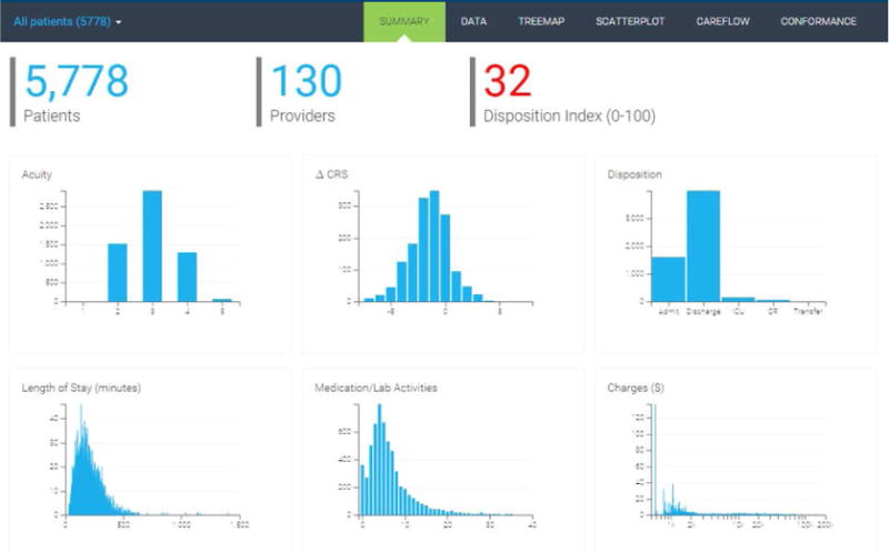
System interface and dashboard of six key performance metrics for the selected cohort. In this example, we are summarizing performance metrics for a cohort of 5,778 patients, who were seen by 130 unique providers, and has a disposition index of 32. At the top is the navigation bar that allows users to click to a different visualization or switch to the cohort comparison mode.
4.1 Visualizations and Interactions
4.1.1 Summary Charts and Tables
The summary chart page provides three patient cohort descriptors and interactive histograms to represent the distribution of six key performance variables (see Figure 1). The patient cohort descriptors include the total number of patients, the number of providers for these patients, and an overall disposition index. The key performance variables include acuity, change in CRS (clinical respiratory score), disposition (Admit, Discharge, ICU (intensive care unit), OR (operating room), Transfer), the length of stay (in minutes), number of medication/lab activities, and total charges ($). We used cross-filters to enable users to brush over one chart and see the corresponding changes appear in the other performance charts (see Figure 2).
Figure 2.
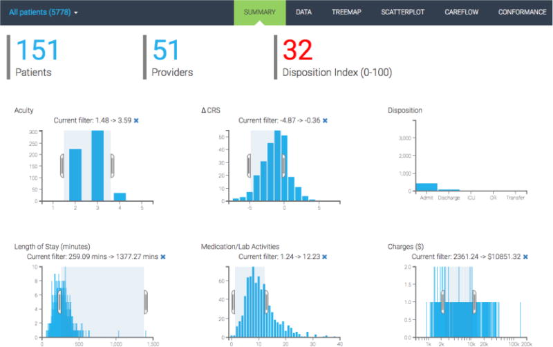
Screenshot showing cross filter applied to the patient population.
The main dashboard affords to show comparison between two selected cohorts. Figure 3 demonstrates a concrete example of such comparison between patients with beginning CRS>3 (Cohort A; blue) and patients with beginning CRS<3 (Cohort B; orange). Clinically speaking, Cohort A is sicker than Cohort B. We use blue and orange colors to distinguish between the two cohorts. Six visualizations of key metrics show stacked charts. Inspection of the six panels of stacked charts already validates some intuitions and provides additional insights about the selected cohorts. The acuity level of Cohort A is actually lower than that of Cohort B, which is counter-intuitive and potentially revealing fundamental differences between acuity and CRS measures. Cohort A experiences larger drop in CRS than Cohort B as there is little room for improving CRS for patients in Cohort B. The discharge-to-admission ratio is much higher for Cohort B, while the length of stay per ED visit episode is much longer for Cohort A. Patients in Cohort B receive less medications and lab tests, thus are billed less amount of total charges.
Figure 3.
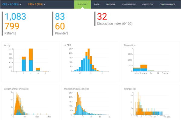
Two cohort comparison.
The table view in Figure 4 complements the summary charts by providing in-depth inspection into the data on three different levels of aggregation. At the patient level, users are able to browse individual patients and their clinical conditions and charges. The provider-level summary table shown in Figure 4 provides performance summary of each care provider. In this view, the average of three key performance metrics are displayed: the change in CRS, total charges, and the disposition types. Lastly, the activity summary table lists averages of the metrics computed per activity. Search box on the top right allows for quick identification of the data points of interest.
Figure 4.
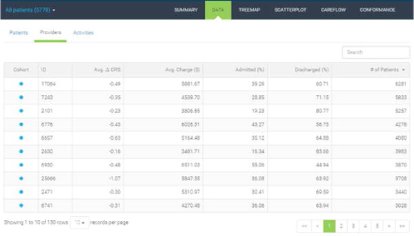
Provider-level performance summary.
4.1.2 Treemap
The treemap representation captures the hierarchical distribution of medications and laboratory tests (see Figure 5). The treemap is zoomable and provides breadcrumb information to allow users to navigate back quickly. Cells can be sized and color-encoded by different variables. These variables include the number of occurrences of the activity, the number of patients, the average charge, the average change in clinical respiratory scores, and the average acuity level. Cell color scales are chosen corresponding to the scale of the selected variable.
Figure 5.
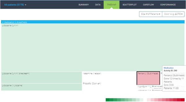
Activity treemap.
4.1.3 Scatterplot
The scatterplot allows users to specify two variables of interest and plot the associated data points in x–y space (see Figure 6). Users can select two variables using the dropdown menus at the top. Given the possible data density for some patient populations, we provide users the ability to zoom and pan across the data. Data points are color-encoded using the corresponding cohort color. In this case, we select the number of activities as x-axis and the length of stay as y-axis. We clearly see an overall positive correlation with some variations between the two variables as expected. We also observe a few outliers that may warrant further case-by-case examination to gain insights for process improvement.
Figure 6.
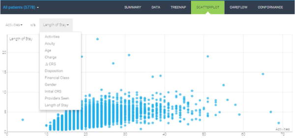
Scatterplot of two selected variables.
4.1.4 Sankey Diagram
The Sankey diagrams are suited to display flows between interconnected networked processes [17, 19]. Figure 7 shows the Sankey diagram of frequent care subprocesses computed by the PrefixSpan algorithm [13]. The algorithm takes in the threshold value as a parameter. Subprocesses experienced by at least a certain portion of the patients in a cohort are returned by the algorithm as frequent subprocesses. The level of abstraction and granularity is another input dimension in our Sankey diagram. In the case shown in Figure 7, we use 5% of the cohort as the threshold and treat activities in the same activity group as one object. Our implementation of the Sankey diagram takes into account only the order of the subprocesses not continuous time interval between activities, which is shown in the regularly placed and vertically aligned nodes in the figure.
Figure 7.
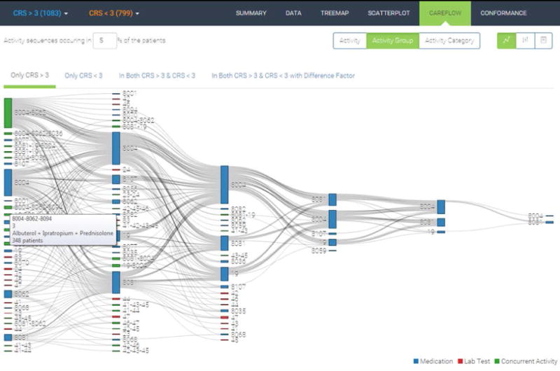
Sankey diagram of frequent subprocesses.
When two cohorts—Cohort A (CRS>3) and Cohort B (CRS<3)—are selected as in Figure 7, we extract frequent subsequences for four distinct groups: (1) only in Cohort A, (2) only in Cohort B, (3) both in Cohort A and B, and (4) exclusively in Cohort A and B. Overall, clinicians are interested in learning which subprocesses are associated with a certain cohort of patients. Groups 1 and 2 are straightforward to understand. Using the set notation, those subprocesses are from A\B and B\A. Group 3 represents the intersection between the two cohorts, i.e., A ∩ B. Lastly, Group 4 means the union of exclusive subprocesses, i.e., (A\B) ∪ (B\A).
The extracted frequent subprocesses are merged into a Sankey diagram as shown in the figure in [15]. A typical Sankey diagram consists of multiple layers placed horizontally. Layers represent the order of activities in each frequent subprocess. Blocks (or rectangles) in each layer represent care activities. Blue and red blocks correspond to activity types: medication and lab test result, respectively. Green blocks denote concurrently occurring activities. Block size is proportional to the number of patients who go through the care activity and each flow is also scaled by the number of patients following a certain path. Hovering over a block or a flow triggers a pop-up box displaying the detailed information about the item.
Each care activity is assigned a unique identifying number such as 8004, 8062, or 19. For example, activity 8004 (medications classified as Albuterol) is the most frequent starting point among the frequent care subprocesses. Major portions of the patients who receive activity 8004 keep receiving 8004 followed by another 8004 or receive 19 or 8081. As such, the Sankey diagram is useful to quickly identify major flow elements in complex interconnected patterns.
4.1.5 Conformance Flowchart
Conformance computation requires a preset pathway guideline for care process developed based on the actual clinical practice. The Children’s Healthcare of Atlanta (CHOA) developed such a pathway guideline based on a few clinical severity measures. The CRS is the main factor that prescribes which type of care process a patient must receive. We convert the original pathway guideline into a decision tree. Diamond boxes denote branch nodes based on certain criteria. White rectangular boxes check whether a certain medication or lab test is given to patients. Gray rectangular boxes are terminal nodes where final compliance scores are computed. For each patient, we compute compliance score as the number of conforming activities divided by the total number of activities. Alternatively, the compliance score can be defined simply as the ratio of patients who receive the care strictly following the pathway guideline to the total number of patients. We implement zooming and panning functionalities into the conformance flowchart so as to possibly accommodate large guideline flowchart.
To illustrate, the first diamond box divides patients by their age. Those with age less than 18 months are not the targets of the pathway guideline and are thus excluded from compliance score computation. Next, depending on the first CRS measurement, patients receive different sets of medications and treatments. In our particular case, required medications are additive from low to high severity. The lowest bracket (CRS 0–2) should receive only albuterol; the next lowest bracket (CRS 3–5) should receive albuterol and dexamethasone; the second highest bracket (CRS 6–8) should receive albuterol, dexamethasone, and ipratropium; the most severe group should receive all three medications and magnesium sulfate. These types of conformance checks based on CRS repeats up to three times. Patients receiving non-conforming medications or lab tests are collected at one of the intermediate gray rectangular boxes.
4.2 System Usage
One of the key design considerations of our revised tool was to keep the overall workflow simple. A user begins by selecting one of three options to start the analysis: create/modify a patient cohort, analyze a patient cohort, or compare a patient cohort.
4.2.1 Creating and Modifying Patient Cohorts
Users frequently want to analyze a specific group of patients. To facilitate this, we provide an interactive visual functionality to create and modify patient cohorts based on demographic (age, gender), process (length of stay, number activities), clinical (acuity, initial CRS), health outcome (change in CRS, total charge, disposition), and financial payment characteristics (payor, financial class). By using small cross-linked, range-selectable charts to depict the distribution of each of these characteristics, a user is able to dynamically observe how the patient population changes following certain selections and hone in on a population of interest. After a desired patient group is selected, users can save it for future use. A sortable list of all patient cohorts, including their name and brief description, is provided for quick access or modification. Our implementation of cohort selection mechanism focuses on using traditional visual elements such as histogram in order for clinicians to quickly comprehend cohort characteristics. There is a recent study that focuses on visualizing filtering logic and process employing advanced visual elements such as bar charts embedded in a treemap [9].
4.2.2 Analyzing Care Processes of a Patient Cohort
A user selects either a predefined/created cohort from a dropdown menu in the navigation bar. The entry in the dropdown menu includes the cohort name and the number of patients in the cohort in parenthesis (e.g. Female with Acuity >2 (1,083)). The user first sees the summary page for an overall performance overview and can navigate to the other visualizations using the navigation bar at the top.
4.2.3 Comparing Care Processes of Patient Cohorts
Similar to the analysis of a single patient cohort, a user selects two patient groups from two dropdown menus. The two patient groups and the corresponding data points in all visualizations are color-differentiated (Cohort 1: blue; Cohort 2: orange). We explored different ways of encoding the data, but color-differentiation resulted in the best usability and effectiveness following an informal evaluation. In the treemap view, we provide one treemap for each cohort. We considered many different ways to either integrate data into a single treemap, but it proved to be less effective. We also considered placing treemaps side-by-side, but due to space constraints and desire to maintain appropriate representation rations, we ultimately decided to “stack” the two treemaps. Each treemap is zoomable and cell size and color can be chosen from a dropdown menu. Hovering over each cell provides details about that activity, including number of times it was performed on number of patients. In the scatterplot, we integrate the different patient cohort data points into a single chart. Moreover, in addition to using different colors, we also used different shapes to encode the two groups. Patient cohort 1 thus was encoded using blue, round markers, while cohort 2 was encoded using orange, diamond markers. We explored different visual encodings (size, shape), but these proved to be most effective. Given that data points could overlap, we applied some transparency to each marker. A bit more involved was the visualization design of two patient cohort careflows using Sankey diagrams. We contemplated many different designs, including the integration of two patient cohorts into one Sankey diagram. This however made the diagrams virtually unreadable and very cluttered. Following deep discussions with our clinical partners, we opted to use a tabbed approach for denoting different careflows. The tabs correspond to the cohorts as follows: Cohort1, Cohort2, careflows present in both Cohort1 and Cohort2, and careflows present in both Cohort1 and Cohort2 with a difference factor. By providing these options, we allowed users to deeply explore which careflows were unique in each cohort, where they overlapped, and which were most common.
5. PRELIMINARY RESULTS
A meticulous user study for the target user group is necessary for a visual analytics system because lack of validation with real users makes it hard to estimate the real value of such systems. We are planning to conduct a formal, broad value-based evaluation of our system with clinicians and care quality managers. The objective is to assess whether the system provides novel insights, supports routine tasks, and enables confidence in the underlying data. We are also planning to examine the scalability of our system using an expanded pediatric emergency department dataset from broader patient population as well as other hospitals.
Preliminary results and evaluation with our clinical collaborators, however, suggest that out multiple coordinated process visualizations provide important insights into the underlying pediatric asthma care processes in the ED. The new simplified user interface with the navigation bar at the top (rather than at the side) and cross-linked performance charts struck a nice response with the participants. Practitioners particularly liked the ability to see the variation in care processes and their corresponding mapping to the guidelines. However, it was also clear from the response that clinicians also wanted the ability to perform deep queries along with general descriptive analytics, including the ability to explore questions such as “given a specific activity what are all possible prior process paths that could have lead to it?” This suggests the need for visual query based system. We aim to incorporate some of these more advanced features into future versions of our system. Particularly regarding the conformance flowchart, we plan to implement multiple views for different stakeholders in the care processes including not only patients and clinicians but also hospital administrators because they may have different perspectives on defining what good outcome is. Lastly, we plan to enhance semantic zooming functionalities in order for the system to be able to handle a larger patient data set than the current one.
Figure 8.
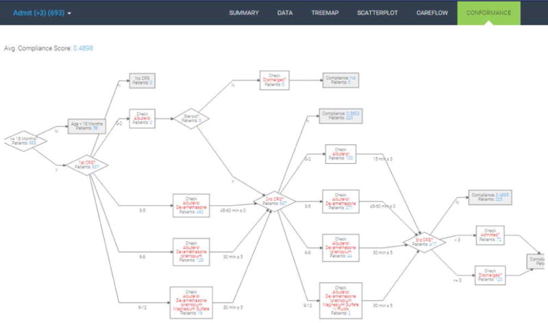
Conformance evaluation flowchart.
CCS Concepts.
Human-centered computing → Visual analytics; Information visualization; Visualization systems and tools;
Social and professional topics → Personal health records;
Applied computing → Health informatics;
Acknowledgments
This research was supported in part by Children’s Health-care of Atlanta, the Institute of People & Technology, and the Tennenbaum Institute. We would like to thank Prof. Nicoleta Serban, Dr. Burton Lesnick, Dr. Jim Bost, and Dr. Beth Schissel for feedback on the system and paper. This research is supported by the National Science Foundation Graduate Research Fellowship Program under Grant No. DGE-1148903. This research is also supported by grant U54EB020404 awarded by the National Institute of Biomedical Imaging and Bioengineering (NIBIB) through funds provided by the trans-NIH Big Data to Knowledge (BD2K) initiative (www.bd2k.nih.gov).
Footnotes
ADDITIONAL AUTHORS
Additional authors: Dr. Vikas Kumar (Computer Science, Georgia Tech, email: vkumar@gatech.edu), Robert Pienta (Computational Science & Engineering, Georgia Tech, email: rpienta@gatech.edu), and Minsuk Kahng (Computational Science & Engineering, Georgia Tech, email: kahng@gatech.edu).
Contributor Information
Rahul C. Basole, Georgia Tech, School of Interactive Computing, Atlanta, GA USA.
Hyunwoo Park, Georgia Tech, School of Industrial & Systems Engineering, Atlanta, GA USA.
Mayank Gupta, Georgia Tech, School of Computer Science, Atlanta, GA USA.
Mark L. Braunstein, Georgia Tech, School of Interactive Computing, Atlanta, GA USA.
Duen Horng Chau, Georgia Tech, School of Computational Science & Engineering, Atlanta, GA USA.
Michael Thompson, Children’s Healthcare of Atlanta, Atlanta, GA USA.
References
- 1.Aigner W, Federico P, Gschwandtner T, Miksch S, Rind A. Challenges of time-oriented data in visual analytics for healthcare. IEEE VisWeek Workshop on Visual Analytics in Healthcare. 2012:4. [Google Scholar]
- 2.Bade R, Schlechtweg S, Miksch S. Proceedings of the SIGCHI conference on Human factors in computing systems. ACM; 2004. Connecting time-oriented data and information to a coherent interactive visualization; pp. 105–112. [Google Scholar]
- 3.Basole RC, Braunstein ML, Kumar V, Park H, Kahng M, Chau DHP, Tamersoy A, Hirsh DA, Serban N, Bost J, et al. Understanding variations in pediatric asthma care processes in the emergency department using visual analytics. Journal of the American Medical Informatics Association. 2015;22(2):318–323. doi: 10.1093/jamia/ocu016. [DOI] [PubMed] [Google Scholar]
- 4.Basole RC, Braunstein ML, Sun J. Data and analytics challenges for a learning healthcare system. Journal of Data and Information Quality (JDIQ) 2015;6(2–3):10. [Google Scholar]
- 5.Bodesinsky P, Federico P, Miksch S. Proceedings of the 13th International Conference on Knowledge Management and Knowledge Technologies. ACM; 2013. Visual analysis of compliance with clinical guidelines; p. 12. [Google Scholar]
- 6.Caban JJ, Gotz D. Visual analytics in healthcare–opportunities and research challenges. Journal of the American Medical Informatics Association. 2015;22(2):260–262. doi: 10.1093/jamia/ocv006. [DOI] [PubMed] [Google Scholar]
- 7.Combi C, Portoni L, Pinciroli F. Artificial intelligence in medicine, pages. Springer; 1999. Visualizing temporal clinical data on the www; pp. 301–311. [Google Scholar]
- 8.Federico P, Unger J, Amor-Amorós A, Sacchi L, Klimov D, Miksch S. Gnaeus: utilizing clinical guidelines for knowledge-assisted visualisation of ehr cohorts. EuroVis Workshop on Visual Analytics (EuroVA 2015) 2015 [Google Scholar]
- 9.Krause J, Perer A, Stavropoulos H. Supporting iterative cohort construction with visual temporal queries. IEEE Transactions on Visualization and Computer Graphics (VAST), Preprint. 2015 doi: 10.1109/TVCG.2015.2467622. [DOI] [PubMed] [Google Scholar]
- 10.Kumar V, Park H, Basole RC, Braunstein M, Kahng M, Chau DH, Tamersoy A, Hirsh DA, Serban N, Bost J, et al. Exploring clinical care processes using visual and data analytics: challenges and opportunities. Proceedings of the 20th ACM SIGKDD conference on knowledge discovery and data mining workshop on data science for social good. 2014 [Google Scholar]
- 11.Lins L, Heilbrun M, Freire J, Silva C. Viscaretrails: Visualizing trails in the electronic health record with timed word trees, a pancreas cancer use case. Proc IEEE Visual Analytics in Health Care (VAHC) Workshop. 2011 [Google Scholar]
- 12.Park H, Clear T, Rouse WB, Basole RC, Braunstein ML, Brigham KL, Cunningham L. Multilevel simulations of health delivery systems: A prospective tool for policy, strategy, planning, and management. Service Science. 2012;4(3):253–268. [Google Scholar]
- 13.Pei J, Han J, Mortazavi-Asl B, Pinto H, Chen Q, Dayal U, Hsu MC. icccn. IEEE; 2001. Prefixspan: Mining sequential patterns efficiently by prefix-projected pattern growth; p. 0215. [Google Scholar]
- 14.Perer A, Gotz D. CHI’13 Extended Abstracts on Human Factors in Computing Systems. ACM; 2013. Data-driven exploration of care plans for patients; pp. 439–444. [Google Scholar]
- 15.Perer A, Wang F. Proceedings of the 19th international conference on Intelligent User Interfaces. ACM; 2014. Frequence: Interactive mining and visualization of temporal frequent event sequences; pp. 153–162. [Google Scholar]
- 16.Plaisant C, Milash B, Rose A, Widoff S, Shneiderman B. Proceedings of the SIGCHI conference on Human factors in computing systems. ACM; 1996. Lifelines: visualizing personal histories; pp. 221–227. [Google Scholar]
- 17.Riehmann P, Hanfler M, Froehlich B. Information Visualization, 2005. INFOVIS 2005. IEEE Symposium on. IEEE; 2005. Interactive sankey diagrams; pp. 233–240. [Google Scholar]
- 18.Rind A, Wang TD, Wolfgang A, Miksch S, Wongsuphasawat K, Plaisant C, Shneiderman B. Interactive information visualization to explore and query electronic health records. Foundations and Trends in Human-Computer Interaction. 2011;5(3):207–298. [Google Scholar]
- 19.Schmidt M. The sankey diagram in energy and material flow management. Journal of industrial ecology. 2008;12(1):82–94. [Google Scholar]
- 20.Shneiderman B, Plaisant C, Hesse BW. Improving healthcare with interactive visualization. Computer. 2013;46(5):58–66. [Google Scholar]
- 21.Smith M, Saunders R, Stuckhardt L, McGinnis JM, et al. Best care at lower cost: the path to continuously learning health care in America. National Academies Press; 2013. [PubMed] [Google Scholar]
- 22.Wang TD, Plaisant C, Quinn AJ, Stanchak R, Murphy S, Shneiderman B. Proceedings of the SIGCHI conference on Human factors in computing systems. ACM; 2008. Aligning temporal data by sentinel events: discovering patterns in electronic health records; pp. 457–466. [Google Scholar]
- 23.Wongsuphasawat K, Gotz D. Outflow: Visualizing patient flow by symptoms and outcome. IEEE VisWeek Workshop on Visual Analytics in Healthcare, Providence, Rhode Island, USA. 2011 [Google Scholar]
- 24.Wongsuphasawat K, Guerra Gómez JA, Plaisant C, Wang TD, Taieb-Maimon M, Shneiderman B. Proceedings of the SIGCHI Conference on Human Factors in Computing Systems. ACM; 2011. Lifeflow: visualizing an overview of event sequences; pp. 1747–1756. [Google Scholar]
- 25.Wongsuphasawat K, Shneiderman B. Visual Analytics Science and Technology, 2009. VAST 2009. IEEE Symposium on, pages. IEEE; 2009. Finding comparable temporal categorical records: A similarity measure with an interactive visualization; pp. 27–34. [Google Scholar]


