. 2018 Jan 30;7:e29518. doi: 10.7554/eLife.29518

Figure 2. Transcriptional profiling of cells during naïve reprogramming.

(A) Schematic representation of reprogramming intermediate collection at different time points, as indicated. hiF-T cells were first cultured in conventional hESM with dox for 6 days and then switched to 5iLAF culture medium supplemented with dox until day 20. Cells with or without dox treatment for four additional days were collected. (B) MDS analysis of RNA-seq data during the naïve reprogramming process. (C) Line plots showing transcriptional dynamics of differentially expressed genes during the naïve reprograming process. Genes were grouped by k-means clustering. Gray shades represent a 95% bootstrap confidence interval around the mean value. (D) Heatmaps showing the expression patterns of genes with pre-implantation signatures in both the naïve and primed reprogramming process. (E) Correlation analysis of transcriptional profiles between naïve reprogramming and the embryonic development process, with the Pearson correlation coefficient of each pair shown on each cell of the heatmap. (F) Immunostaining images of pluripotency-related marker expression in the reprogramming cells at indicated time points during naïve and primed reprogramming. Scale bar, 50 μm.

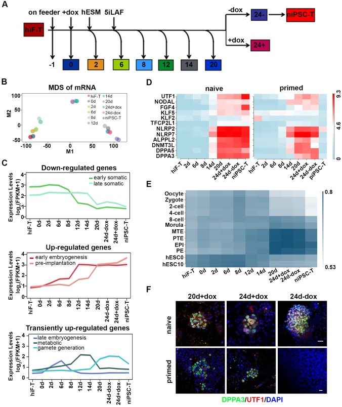
Figure 2.

Figure 2—figure supplement 1. Transcriptional profiling of naïve pluripotency reprogramming cells.

Figure 2—figure supplement 1.

(A) Correlation analysis (left panel) ad cell clustering analysis (right panel) of transcriptional profiles at different time points during naïve reprograming. (B) Bar plot showing dynamic changes in differentially expressed (DE) gene numbers of two adjacent time points during naïve reprogramming. (C) Expression dynamics of epiblast-specific genes and primed-specific genes during naïve reprogramming relative to those in the primed reprogramming process. (D) Bar plot showing the absolute expression values of OTX2 and ZIC2 genes in the naïve and primed reprogramming processes. Error bars represent a 95% confidence interval around the mean value.
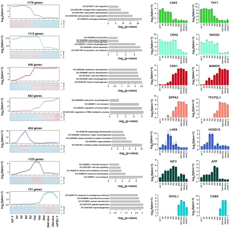
Figure 2—figure supplement 2. Expression dynamics of gene clusters in Figure 2C.

Figure 2—figure supplement 2.

Detailed description of Figure 2D gene clusters with specific expression patterns. Line plot and heatmap (left panels) showing expression patterns of each cluster during naïve reprograming. Grey shades represent a 95% confidence interval around the mean value; Bar plot (middle panels) showing enrichment of p-value of representative GO term of each cluster; Bar plot (right panels) showing expression dynamics of selected genes across naïve reprogramming time course.