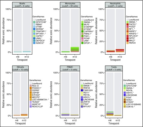
Figure 4.
Relative abundance of cell clones. Stacked bar graphs showing the relative sonic abundance, scaled as a proportion of the total. Data are separated by cell type with side-by-side comparison of time points for visualization of longitudinal changes. The 10 most abundant integration sites for each cell type are emphasized by uniquely colored bars and named by the nearest gene, indicated in the “GeneNames” key. The genes are marked with symbols to indicate further information about the integration site/gene as follows: *, the site is within a transcription unit; ∼, the site is within 50 kb of a cancer related gene; !, the gene is associated with lymphoid cancers in humans. The remaining low-abundance integration sites are indicated in gray (LowAbund). The cutoff values for binning clones as low abundance are indicated at the top of each cell-type panel.

