Abstract
The rapid expansion of flow cytometry applications has outpaced the functionality of traditional manual analysis tools used to interpret flow cytometry data. Scientists are faced with the daunting prospect of manually identifying interesting cell populations in 50-dimensional datasets, equalling the complexity previously only reached in mass cytometry. Data can no longer be analyzed or interpreted fully by manual approaches. While automated gating has been the focus of intense efforts, there are many significant additional steps to the analytical pipeline (e.g., cleaning the raw files, event outlier detection, extracting immunophenotypes). We review the components of a customized automated analysis pipeline that can be generally applied to large scale flow cytometry data. We demonstrate these methodologies on data collected by the International Mouse Phenotyping Consortium (IMPC).
Keywords: flow cytometry, automated analysis, bioinformatics
1. Introduction
The current standard approach for analyzing and interpreting flow cytomtery data involves 2D dot plots and Boolean gates in which cell populations are sequentially selected for further analysis based on gates regions drawn manually [2]. The large number of possible pairs of parameters (e.g., 350 markers or 7:18e+23 potential subsets with 50 markers) can make manual gating both extremely labour intensive and time consuming for high dimensional data [2, 3]. However, this increase in dimensionality has enabled previously unknown cell populations to be identified [4].
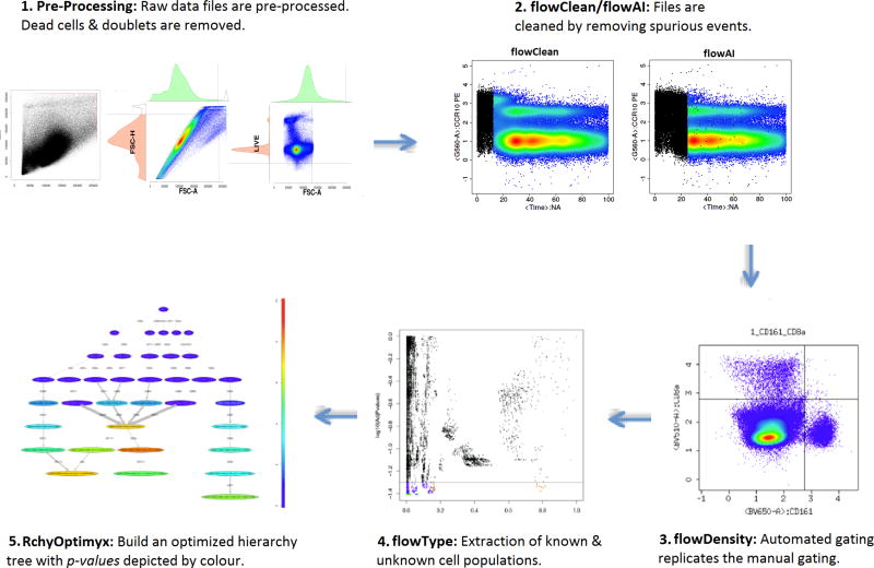
The automated analysis pipeline (Figure 1) we will describe is generalizable to any flow cytometry (FCM) dataset. Our aim is to demonstrate the comparison between manual and automated analysis and how automated analysis generally exceeds the performance of manual analysis in terms of results and time savings.
Figure 1.
A typical R based automated analysis pipeline. 1. Raw data files are pre-processed where dead cells and doublets are removed. 2. flowClean or flowAI is used to clean the data by removing spurious events. 3. Automated gating replicates the manual gating using flowDensity [6]. flowDensity identifies predefined cell subsets based on the density distribution of the parent cell population. It estimates the region around each cell population using characteristics of the marker density distribution. 4. Extraction of known and unknown cell populations uses flowType [7], where all channels are thresholded into positive, negative, and neutral populations. 5. In the last step once the significant immunophenotypes are extracted, RchyOptimyx [8] is used to build an optimized hierarchy tree showing only significant gating pathways with p-value depicted by colour.
We use datasets from the Wellcome Trust Sanger Institute (WTSI) and King’s College London (KCL) generated as part of the International Mouse Phenotyping Consortium (IMPC) project. Even though we have the full sequence of many mammalian genomes, the function of most genes remains unknown. The IMPC, a $900 million open-access health research project involving 15 centres across 5 continents is aiming to address this knowledge gap [5]. This global infrastructure is creating 20,000 knockout mouse strains, characterizing each strain through a standardized phenotyping protocol, integrating the data to existing mouse and human disease resources, and finally providing strains and phenotype data for use by the research community. One component of this effort is immunophenotyping of spleen and other organs by FCM, generating approximately 77,000 FCS files. We demonstrate how automated analysis tools can perform quality checking, automated gating, and biomarker identification.
There are three aims for the FCM analysis in the context of the IMPC, generalizable to other studies:
Detect batch effects and outliers at both sample and dataset level.
Enumerate cell populations using both supervised and semi-supervised computational analysis.
Identify cell populations significantly different between sample groups (e.g., knockout lines and wild type controls.
All the tools that will be discussed in this paper are written in R, a programming language for statistical computation and graphics. It provides high level graphics, interfaces to other languages and debugging facilities. R has been widely used in the development of tools for computational analysis of FCM dataset [2], with more than 70% of the tools available for FCM analysis written in this language. These tools cover a broad spectrum of processing steps, not limited to data wrangling, quality checking, automated gating (27 tools approximately covering both supervised and unsupervised cell population identification), biomarker identification and visualization. Most of these tools are made available by the bioinformaticians at no cost to the research community and include open source code and unrestrictive software licensing. Many of the tools have been developed to address similar analysis objectives via different approaches. They might provide optimal results for different datasets, such that there is no “right” or “best” tool, and using several algorithms in combination might yield even better results and exceed the possibilities offered by manual analysis [2]. In addition, many of these tools perform one specific task and don’t try to solve the entire analysis pipeline. This allows tools to be combined and swapped in and out with new advances, while keeping other parts of the pipeline intact. Since most of these tools are developed in R, their common infrastructure facilitates this. These tools can be integrated into FlowJo, FCSExpress, and CytoBank (popular commercial analysis software packages).
In this paper, we do not intend to present a unified tool which would incorporate all the tools used in the various stages of the pipeline under one umbrella. This is because as mentioned earlier, for any one stage, there are more than one possible tool at each step and using combination of them might yield better results than manual analysis. In addition, the pipeline is modular, thus allowing users to swap in newly developed tools. This pipeline requires users to have some capabilities in R, which can be attained either by learning the language, collaborating with people who knows R, or bringing onto the team a bioinformatician with requisite experience.
Most of the FCM related packages are dependent on flowCore which provides basic infrastructure and functions to deal with FCM data. It defines important FCM data classes, a few of which are listed below [9, 10]:
flowFrame: a class for storing observed quantitative properties for a population of cells from an FCM experiment
flowSet: a class for storing FCM raw data from quantitative cell-based assays
compensate: class and methods to compensate for spillover between channels by applying a spillover matrix to a flowSet or a flowFrame assuming a simple linear combination of values
transform: a class for transforming flow-cytometry data by applying scale factors
filter: a class for representing filtering operations to be applied to flow data
A goal in automated analysis is to apply the same pipeline on all the FCS files in a dataset, without file-specific tweaking that often occurs with manual analysis (Figure 1). Using this approach, the final results are more robust, and more importantly reproducible. The WTSI & KCL dataset had complete and in depth analysis available, allowing benchmarking of automated analysis in order to demonstrate performance. However gating, in the absence of some external outcome, lacks such a robust and reproducible gold standard and is benchmarked as the current state-of-the-art.
2. Data
The WTSI & KCL dataset comprised 10–14 dimensional FCS files divided into 5 panels and 3 organs (spleen, mesenteric lymph node, and bone marrow) collected over a period of more than three years. Separate pipelines were developed for the 3 organs and applied to
> 2000 knockout FCS files
> 600 wild type FCS files
> 500 knockout mouse lines
Table 1 shows the markers used for each of the 5 panels. The T cell, B cell, and Myeloid panels each had two sets of data collected from the spleen and mesenteric lymph node organs. With these markers, 45 cell populations were targeted from the T cell panel, 25 from the B cell panel, 22 from the Myeloid panel, 21 from the Bone marrow panel, and 35 from the P2 panel (Table A.3 lists the identified cell populations).
Table 1.
The 5 panels of WTSI & KCL datasets and their respective markers (arranged in alphabetical order).
| T cell | B cell | Myeloid | Bone Marrow | P2 |
|---|---|---|---|---|
|
| ||||
| CD4 | B220 | CD11b | B220 | CD5/Ly6G |
| CD5 | CD5 | CD11c | BP1 | CD11b |
| CD8a | CD21/35 | CD45 | CD3 | CD11c |
| CD25 | CD23 | CD86 | CD11b | CD19 |
| CD44 | CD45 | CD103 | CD24 | CD21/35 |
| CD45 | CD95 | CD317 | CD43 | CD23 |
| CD62L | CD138 | F4/80 | CD45 | CD161 |
| CD161 | GL7 | Lin (CD3, CD19, CD161) | CD138 | Ly6C |
| GITR | IgD | Ly6C | GR1 | MHCII |
| KLRG1 | IgG1 | Ly6G | IgD | |
| TCRδ | IgM | MHCII | IgM | |
3. Methodology
Automated analysis pipelines can generally be divided into pre-processing, quality checking, cell population identification (using supervised, semi-supervised or unsupervised automated gating), biomarker identification and visualization (Figure 1). Like manual analysis, automated analysis is also performed on a per tissue and per panel basis.
3.1. Pre-processing
It is important that metadata information linking to the data (FCS files) be made available. Usually this is provided in the form of spreadsheets, and contain information such as sex, assay date, birth date, treatment and outcome, or phenotype such as survival time for each sample. This can then be combined to link detailed information on each FCS file. In addition, it is important that metadata files have a unique ID that matches to the FCS files. This enables the identification of duplicates within the dataset. The metadata spreadsheet also is very important for the pipeline because when the results are sent back to the biologists, the metadata information can be included with each FCS file and its respective result. This makes it easier for the biologists to comprehend the results for each file.
The first step of pre-processing ensures that metadata and FCS files are compatible and eliminates duplicate and corrupted files from further analysis. Further, files that deviate in the data content (number of channels, set of markers etc.) and amount of data (lower than defined by user cell number) are identified and might be removed or reassessed.
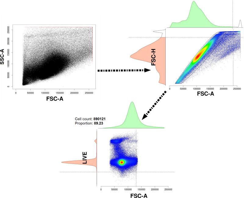
In the next step, doublets and dead cells are removed from each file. Then a global frame is created by storing 1000 random cells from each FCS file of the dataset. The estimateLogicle() function of the flowCore package is used on the global frame to automatically estimate the logicle transformation based on the data. This logicle transformation is then used as a scale factor for the transformation of each FCS file, which acts as an advantage for display of FCM data, before they proceed through the next stages in the pipeline (Figure 2).
Figure 2.
The pre-processing of the FCS files removing dead cells and doublets. The step starts with raw and unprocessed cells (2A). Dead cells and doublets are next removed (2B), thus resulting in cells (2C) ready for processing in the next step in the pipeline (quality checking).
3.2. Quality checking
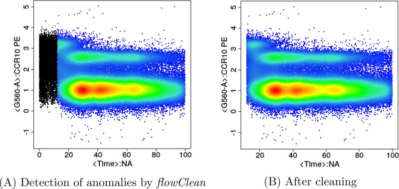
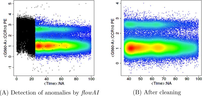
Once the files pass the pre-processing stage, they go through a quality checking stage. Two approaches flowClean [11] (Figure 3) and flowAI [12] (Figure 4) are two freely available R-based tools that identify anomalous events and clean the data by removing them.
Figure 3.
Quality check using flowClean to identify anomalous events clean the data. This is an FCS file downloaded from FlowRepository.org [14].
Figure 4.
Quality check using flowAI to identify anomalous events and clean the data. This is the same FCS file shown in Figure 3 downloaded from FlowRepository.org.
flowClean is an algorithm that tracks subset frequency changes within an FCM sample during acquisition, and flags time periods with fluorescence deviations leading to the emergence of false populations. Anomalous time periods are reported as a new parameter and added to a revised data file, allowing users to easily review and exclude those events from further analysis [11]. flowAI is the only other currently available algorithm which cleans FCS files from unwanted events. It is not only an automatic method that adopts algorithms for the detection of anomalies, but it also has a graphical user interface implemented in an R/Shiny application, which makes it interactive. flowAI checks and removes spurious events that derive from abrupt changes in the flow rate, instability of signal acquisition, and outliers in the lower limit and margin events in the upper limit of the dynamic range [12]. However flowAI can on occasion remove more events than necessary when compared to flowClean (Figures 3 and 4).
3.3. Cell population identification (automated gating)
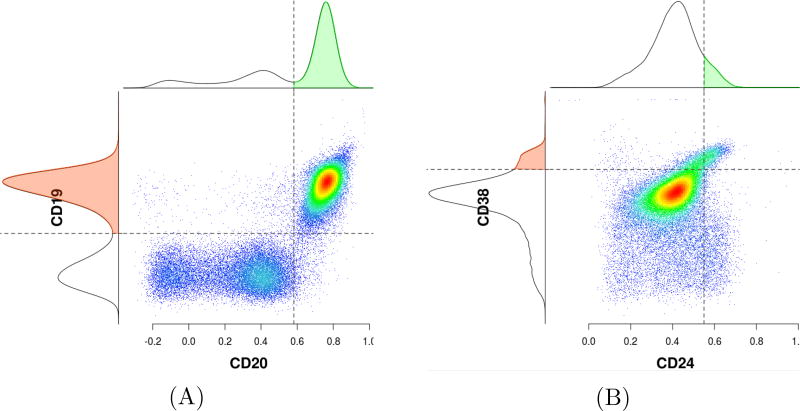
Automated gating algorithms can generally be broken down into supervised and unsupervised approaches. Supervised learning is based on training a data sample from data source with correct classification already assigned [15]. In a supervised approach, the data scientist acts as a guide to teach the algorithm what conclusions it should arrive at. Examples of tools based on supervised learning method include flowDensity [6], where parameters can be fixed by the user (though it can also be run in a default mode, but with poorer results) and DeepCyTOF, a standardization approach for gating, based on deep learning techniques and means parameterizing [16]. Supervised analysis methods can be customized on a per-population basis and thus have the advantage of being designed to more closely match manual analysis, which is often the goal of a researcher. For analytical pipelines where the user’s goal is to automate the manual gating and mimic it, supervised analysis is recommended. For best performance this requires being provided with the gating strategy (that is, the sequence of gates) and using this to optimize the identification of each cell population of interest, using manual gating analysis results on a subset of files as a benchmark for performance. This approach tends to outperform unsupervised approaches. OpenCyto [30] can be used as an alternative to flowDensity. The larger OpenCyto platform includes flowDensity. flowDensity is a supervised clustering algorithm which aims to gate predefined cell populations of interest where the gating strategy is known. It automates the current practice of manual 2D gating and adjusts the gates for each FCS data file individually [6], based on parameters set globally for all files. flowDensity identifies these predefined cell subsets based on characteristics of the marker density distribution (e.g., number, height, width of peaks, and slope of the distribution curve). A 2D gate consists of two channels (dimensions) or in other words, a phenotype with two markers. In addition, the corresponding expression level for each channel is given. For example, in Figure 5A phenotypes “CD19+CD20+”, “CD19+CD20−”, “CD19−CD20+”, and “CD19−CD20−” have markers CD19 and CD20 with expression values “positive” and “negative” (example adapted from the vignette of flowDensity package). Parameters can be adjusted on a population-specific basis when extra information apart from the intrinsic density profile is available (e.g., desired percentile cut-off, number of standard deviations from the peak).
Figure 5.
Automated gating using flowDensity, which identifies predefined cell subsets based on the density distribution of the parent cell population.
deGate() is a built-in function in flowDensity which is used to tweak the parameters in order to set the correct gating threshold for each population. deGate() outputs an integer value (vector) of cutoff(s), that is, threshold(s), on the specified channel. The following code is adapted from the vignette of flowDensity, which shows deGate() and its parameters. Lines preceded with the symbol ‘#’ refer to comments in R and have been added for better understanding.

Table A.4 in Appendix A shows the details of the arguments of deGate().
Once the gating thresholds are found, they are used as input parameters for flowDensity,
flowDensity(obj, channels, position, gates, …)
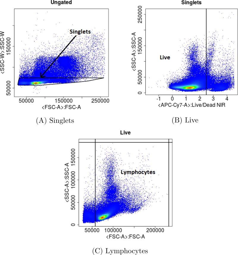
For better understanding of how deGate() calculates the gating thresholds and how these thresholds are used as parameters in flowDensity to gate and find specific populations, we will look into snippets of our codes (written in R), which is used for gating the T cell panel of the WTSI & KCL dataset. In addition we also present the 2D gating plots (Figure 6) generated by flowDensity as part of the result of running the extracted codes. During the initial writing of the code for getting the thresholds by using the various parameters of the deGate() function of flowDensity, it is generally based on a handful of data files selected randomly, which acts as representative of the entire dataset. Once the script works for these selected files in finding the correct thresholds, it is applied to the entire dataset to find the gating thresholds. A FCS file from the WTSI & KCL T cell panel has been added as Supplemental material (see Appendix A for details), so that the provided R codes can be tested to generate the bi-variate plots of Figure 6.
Figure 6.
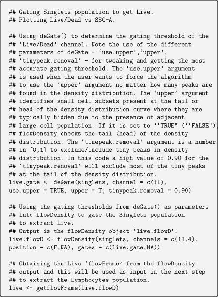
2D plots generated after running Code Parts 01–03. deGate() of flowDensity is used to generate the gating thresholds which are used for gating the ungated population to extract the singlets population in 6A. Singlets are then further gated by using the gating threshold of the Live/Dead channel to obtain the Live population in 6B. In 6C, the Live population is gated by using the thresholds of the channels FSC-A and SSC-A, generated by deGate() to extract the lymphocyte population.
Code Part 01 - For 2D gating plot refer to Figure 6A
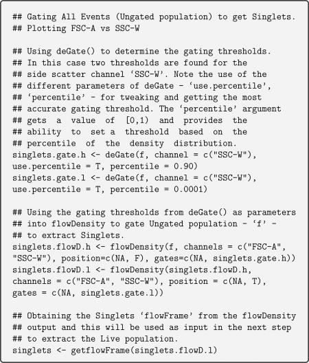
Code Part 02 - For 2D gating plot refer to Figure 6B
Code Part 03 - For 2D gating plot refer to Figure 6C
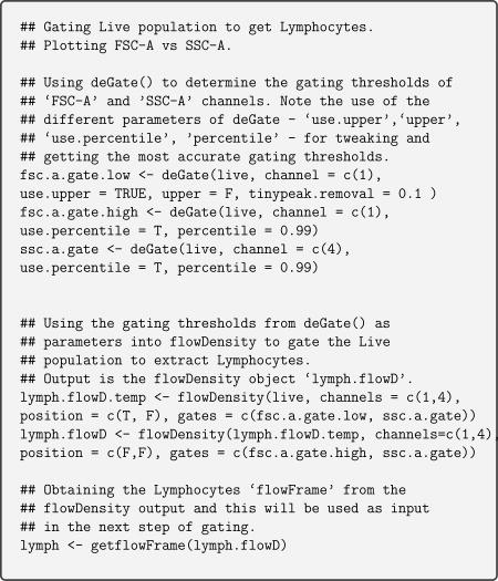
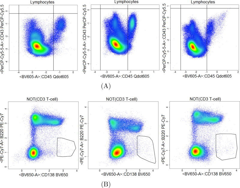
Figure 7 illustrates flowDensity automated gating of populations, with two markers in bi-variate plots, similar to what is seen in manual gating. Gating thresholds are not static, they move objectively to gate the correct cell subsets for each file (Figure 7A). flowDensity also identifies very rare cell subsets (Figure 7B).
Figure 7.
flowDensity automated gating of populations in bi-variate plots, similar to what is seen in manual gating. The gates of flowDensity move objectively as the population moves. The gating thresholds of the CD43 and CD45 markers changes as the distribution and density of the lymphocyte population changes from one sample to another, thus gating the correct CD45 population (6A). In addition, flowDensity can identify very rare cell populations (Plasma cells in 6B).
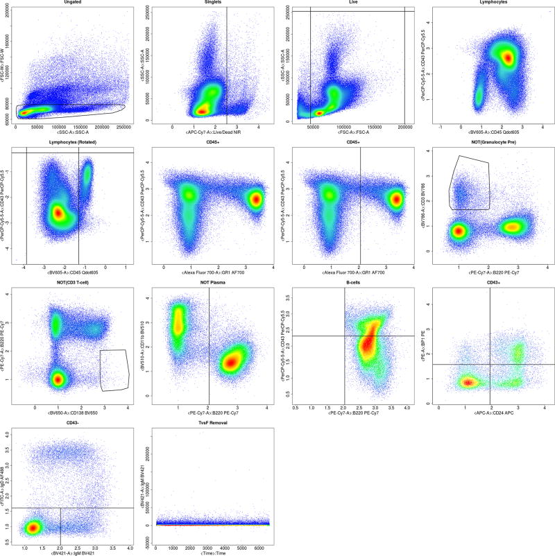
flowDensity can accept control data (e.g., FMO controls) for each channel used in gating. When a control sample is included, the gating threshold is calculated based on the control population. The user first sets the desired gating thresholds on the control data, and these gating thresholds are later applied to the data files corresponding to that control data file. Appendix A Figures A.15 and A.16 illustrates how complete automated gating plots by flowDensity look like once they are complete along with the proportions and event counts for each populations saved in spreadsheets.
Unsupervised learning algorithms identify patterns in input data without user training. The lack of direction in unsupervised learning algorithm can sometimes be advantageous, since it enables the algorithm to look for patterns that have not been previously considered [15]. Examples of unsupervised learning algorithms have been based on k-means clustering, principal and independent component analysis, and association rules. In the analysis of big FCM data, unsupervised approaches use clustering methods to detect cell populations. Clustering analysis may be performed on data from a single biological sample, on data from multiple samples on a per-sample basis, or on combined data from multiple samples. Detected clusters or cell populations can then be analyzed individually or compared across samples. Unsupervised procedures allow previously unknown cell populations to be described in an unbiased, data-driven manner. This type of exploratory analysis is difficult with manual gating, especially when analyzing high-dimensional data [17]. Many unsupervised algorithms have been developed and evaluated through FlowCAP community-based challenges[18, 19]: FLOCK [20], flowClust [21], flowMeans [22], flowMerge [23], flowPeaks [24], immunoClust [25], PhenoGraph [26], SamSPECTRAL [27], and SWIFT [28]. A recent review by Weber and Robinson [17] identified FlowSOM [29], as the current best approach for unsupervised analysis.
Once the results of the cell population identification analysis is ready, calculating the variations between manual and automated gating is the next step in moving the pipeline into production use. This is done by calculating the coefficient of variation (CV) [31] for each population within a dataset for both manual and automated analysis and then these CVs are compared population by population.
3.4. Biomarker discovery
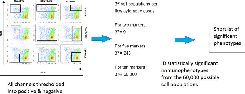
After gating, the next step in the pipeline is biomarker discovery step, with the goal to identify cell populations that are significantly associated with an outcome of interest, in the case of our example dataset cell populations that are at different proportions in KO mice versus WT. The approach is generalizable to any case where samples can be divided into two groups based on some outcome of interest such as different disease types [32], time to onset of symptoms [33], or different sample types [34]. The approach can be based on any approach to identify cell populations but we recommend basing this on flowDensity (discussed in Section 3.3) as the final results will be easily interpretable by the biologist. Channels were thresholded into positive, negative, and neutral populations using the tool flowType [7]. Therefore, for any number of markers (M) used as input parameters in flowType, the number of possible cell populations generated is 3 to the power of M. As an example, if there are 10 markers, the gating thresholds of these 10 markers would generate 310, that is, approximately 60,000 populations, based on the manually specified thresholds. 60,000 cell populations is a large number, therefore the chance of getting false positive hits is high; hence, the next task is to filter this large set of populations to identify significant immunophenotypes. The Wilcoxon rank sum test [35] is used followed by p-value adjustment [36]. For the p-value adjustment, the Benjamini–Hochberg procedure is used [37]. Cell populations with p-value of 0.05 and less are considered as significant and those greater are screened out. A large percentage of cell population is excluded because they have very few events. Populations are excluded when both wild type and knockout population sizes have less than 200 cell counts (this threshold of 200 cells is further discussed in details later). This helps to reduce the 60,000 cell populations set into a much smaller one (Figure 8).
Figure 8.
High dimensional biomarker discovery using flowType
An alternate to Wilcoxon rank sum test is a multiple group comparison test such as one-way analysis of variance (ANOVA) or Kruskal–Wallis test, which could be applied for centres where there are more than one set of WTs (the groupings of the WTs are based on how and where the experiments have been carried out). Once a statistically significant p-value (usually meaning p < 0.05) is returned, a post hoc test can be applied to determine between exactly which two datasets the difference lies. A few such post hoc tests include, Tukey’s Honestly Significant Difference Test (Tukey–Kramer test), Newman–Keuls test, Boneferroni’s test, Dunnett’s test, Scheffe’s test, Dunn’s test and so on [38].
In order to address the question if there is an agreement between the assessment techniques of WTs and KOs, intraclass correlation coefficient (quantitative method) or Bland-Altman plot (graphical method in which the difference between two variables x and y is plotted against the mean of x and y) can be applied [38]. Since FCM datasets involve time versus fluorescence analysis, statistical analysis involving a difference between time-to-event trends between the WTs and KOs can also be applied. A few such applicable tests are Cox-Mantel test, Gehans (generalized Wilcoxon) test, or log-rank test [38].
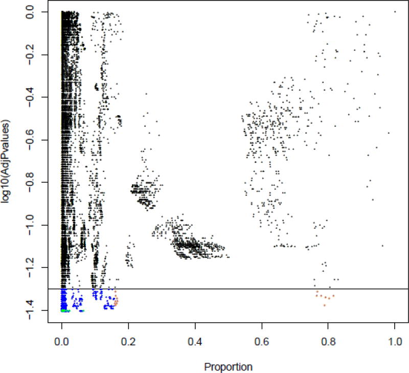
As part of further screening to identify significant immunophenotypes, Figure 9 shows a bi-variate plot where the x-axis is the average cell proportion over all mice of a particular knockout line and the y-axis is the log10 of the adjusted p-value. The black horizontal line signifies the adjusted p-value of 0.05 (value of −log10(0.05) = 1.30) and any dots below this line colored as blue in this plot symbolize significant cell populations, that is, populations with adjusted p-value < 0.05. The blue dots with orange outlines are the 15 populations with the largest effect size (that is, significant cell populations with the highest proportions). The blue dots with green outlines are the 15 most significant populations, that is, cell populations with the lowest adjusted p-values. In some knockouts, populations which fall in both categories were also found. Such cell populations were marked and highlighted separately.
Figure 9.
A plot of log10(adjusted p-values) for a particular knockout vs the average proportion over all mice. The black horizontal line signifies the adjusted p-value of 0.05 (value of −log10(0.05) = 1.30) and any dots below this line colored as blue symbolizes significant cell populations, that is, populations with adjusted p-value < 0.05. The orange rings highlight the 15 populations with the largest effect size (that is, significant cell populations with the highest proportions). The green rings highlight the populations that have the lowest adjusted p-values.
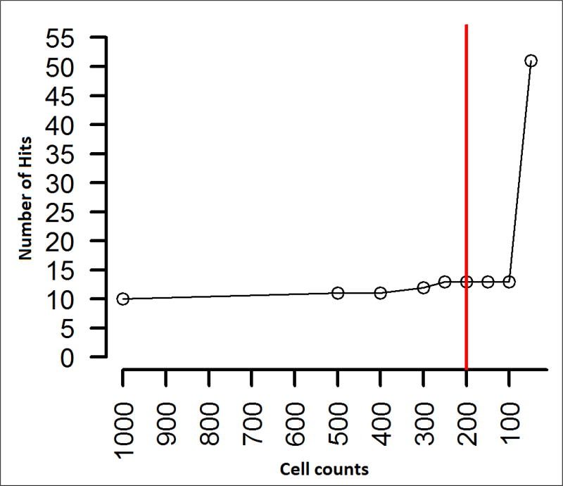
Extremely rare cell populations are often identified as being statistically significant (Figure 9). These are often identified by the co-expression of 12 or more markers in combinations not commonly seen, making hypothesis to their biological function a challenge. For this study, cell populations with less than 200 events were discarded as the number of significant phenotypes identified increased sharply when including populations with very few events, likely indicating a raise in false positive hits (Figure 10). Setting a threshold based on how many events are enough or if they are real is a perplexing problem in FCM analysis due to its uniqueness among all other biological technologies by providing an enormous number of measurements on which to base conclusions [39]. Thresholding out smaller cell populations focuses attention on populations with 6–8 markers in the label which are more easily understood. However, the threshold of 200 cells we used for this study may cause the loss of some biologically meaningful cell populations, and was used in our first pass analysis to identify the hits of most interest to our collaborators, and taken in consultation with them. Given sufficient time and resources all significant hits of potential interest for any study should be further investigated.
Figure 10.
Setting the threshold to a minimum of 200 cell counts for each population.
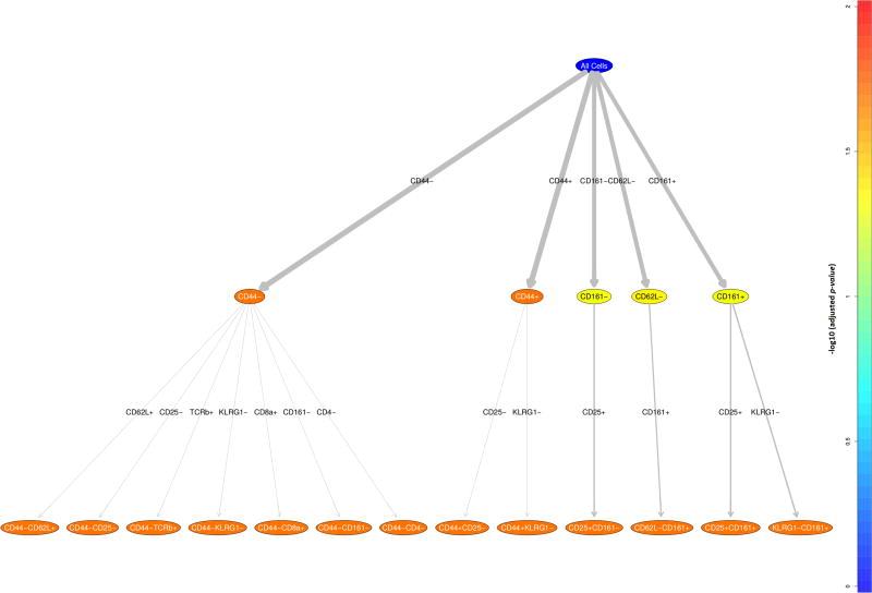
Once the significant immunophenotypes are extracted, RchyOptimyx [8] is used to build an optimized hierarchy tree with colour associated to the magnitude of importance of the parameter (Figure 11 where adjusted p-values are visualised by colour).
Figure 11.
Optimized Cellular Hierarchy using RchyOptimix to visualize the most significant immunophenotypes.
Cell populations are arranged in a hierarchy starting from all cells, with more significant populations (i.e. populations with lower adjusted p-values) colored yellow and orange while the less significant ones are colored blue (Figure 11).
4. Results
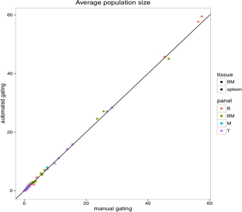
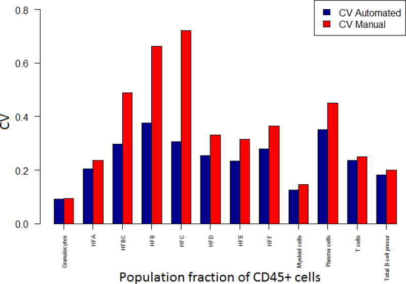
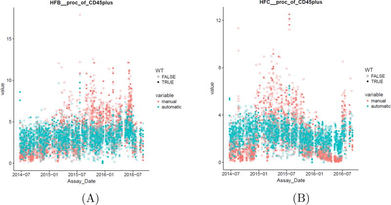
When the automated results were compared with that of the manual analysis, high correlation was observed between the two approaches (Figures 12 and 13) (Note that this statement will be revised at the proof stage by adding citation). The CV of the populations (WTSI & KCL bone marrow dataset) in Figure 13 are expressed as fractions of CD45+ cells and it can be seen that the CV for automated analysis is lower than that of manual gating for all the populations. In addition, automated gating reduced variations seen over time for manual gating (Figure 13, Appendix A Figure A.17). A manuscript on the comparison between the automated and manual analysis results of the WTSI & KCL datasets are in preparation by the KCL team in London, UK, where greater details are provided on how the automated analysis superseded the manual analysis.
Figure 12.
High correlation between automated and manual results (aggregated spleen and bone marrow datasets of WTSI & KCL).
Figure 13.
Comparison of coefficient of variations of automated versus manual results (WTSI & KCL bone marrow dataset).
4.1. Additional outcomes
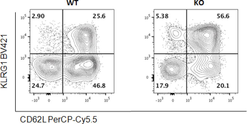
Phenodeviant mice were observed at a frequency of approximately 20% of the total knockout lines analyzed for the WTSI & KCL subset of the IMPC data. One example was a hit in an activated NK cell subset, which was not identified during the manual analysis (see Figure 14).
Figure 14.
Hit in an activated NK cell subset, identified by unsupervised analysis step and which has not been detected by manual analysis.
4.2. Time requirements & Efficiency
Automated gating can offer considerable time savings. The time spent on the initial setup of the pipeline is more or less the same for manual and automated analysis. Once this setup is completed, the time spent in tweaking the manual analysis can be 5–15 minutes/FCS file. This information is based on the time taken by the KCL team in London, UK who did the manual analysis on the WTSI & KCL dataset. On the other hand, for automated analysis, run time is 5 seconds per file with no manual intervention required, resulting in the same gates. This represents a time saving of 533 working days for the WTSI & KCL dataset.
5. Conclusion
The methodologies we have presented in this paper are generalizable to any FCM dataset. The same pre-processing pipeline is used for most centres without individual customization and our computational tools can find cell populations relatively similar to those identified by manual gating. High correlations were seen between manual and automated analysis with automated gating on the whole reducing variations seen over time. In addition, novel biomarkers can be identified using automated analysis that would be missed by even thorough manual analysis due to the limitations in exploring high dimensional datasets. Automated gating also resulted in considerable time savings.
6. Software Availability
All the tools discussed in this paper are written in R and are freely available in Bioconductor [40] or from the developers own private repository.
Table 2.
The various R-based tools that have been discussed in this paper and used in our automated pipeline.
| Name | Availability | Function |
|---|---|---|
|
| ||
| flowClean | Free (Bioconductor) | Removes anomalous events & cleans FCS files |
| flowAI | Free (Bioconductor) | Removes anomalous events & cleans FCS files |
| flowDensity | Free (Bioconductor) | Automated density-based cell population identification |
| flowType | Free (Bioconductor) | Phenotyping FCM assays |
| RchyOptimyx | Free (Bioconductor) | Cellular hierarchy optimization for FCM |
Highlights.
Customized automated analysis pipeline that can be applied to large scale flow cytometry data is proposed.
Detect batch effects and outliers at both sample and dataset level
Enumerate cell populations using both supervised and semi-supervised computational analysis.
Identify cell populations significantly different between knockout lines and wild type controls.
Acknowledgments
This work was supported by a NSERC-CREATE scholarship (AR), Genome-Canada (252FLO Brinkman), NSERC, GenomeBC, Wellcome Trust (3i consortium project, grant 100156/Z/12/Z), and NIH (1 R01 GM118417-01A1).
Appendix A. Supplementary Data
An FCS file from the WTSI T cell panel can be downloaded from: link for the FCS file will be added for download.
Table A.3.
The 5 panels of WTSI datasets and their cell populations. The T cell, B cell, and the Myeloid panel were used to characterise both spleen and mesenteric lymph nodes.
| T cell | B cell | Myeloid | Bone Marrow | P2 |
|---|---|---|---|---|
|
| ||||
| All Events | All Events | All Events | All Events | All Events |
| Singlets | Singlets | Singlets | Singlets | Singlets |
| Live | Live | Live | Live | Live |
| Lymphocytes | Lymphocytes | Lymphocytes | Lymphocytes | Lymphocytes |
| CD45 | CD45 | CD45+ | CD45+ | Granulocytes |
| Autofluorecence | P2 | Lineage neg | Granulotcyte Pre | NOT(Granulocytes) |
| NOT(P2) | NOT Autofluorecence | Lin- Mac- | NOT(Granulotcyte Pre) | Monocytes |
| gd T-cells | B-cells | RP Macrophages | CD3 T-cells | NOT(Monocytes) |
| GD Resting | B1 B-cells | Neutrophils 2 | NOT(CD3 T-cells) | Eosinophils |
| GD Effector | B2 B-cells | Eosinophils 3 | Plasma | NOT(Eosinophils) |
| GITR GD T-cells | GC | Ly6G− | NOT Plasma | CD161+ |
| GD KLRG1+ | Late GC | Monocytes Ly6c hi | Myeloid Pre | NK-cells |
| GD CD5+ | Early GC | NOT(Monocytes Ly6c hi) | B-cells | NK immature Ly6C+ |
| GD Naive | NOT(GC) | pDC | CD43+ | NK mature Ly6C+ |
| NOT(gd T-cells) | MZ+MZP B-cells | NOT pDC | HFA | NK immature Ly6C− |
| CD5+ | MZP B-cells | cDC | HFB | NK mature Ly6C− |
| P2a | MZ B-cells | CD8A Type DC | HFC | NKT-cells |
| ab T-cells | Transitional B-cells | CD103+ DC | CD43− | NKT CD11b− Ly6C+ |
| CD4+ T-cells | Transitional-2 | CD11B+ CD86Lo | HFD | NKT CD11b+ Ly6C+ |
| T-helper cells | Transitional-1 | Misc | HFE | NKT CD11b− Ly6C− |
| CD4 Resting/Naive | Fo B-cells | Misc CD11b positive | HFF | NKT CD11b+ Ly6C− |
| CD4 Effector | FoI | Misc CD11b negative | NOT(CD161+) | |
| CD4+ KLRG1+ T-cells | FoII | T-cells | ||
| Tregs | Plasma cells | Ly6C+ T-cells | ||
| Treg Resting/Naive | IgG+ Memory B-cells | NOT(T-cells) | ||
| Treg Effector | cDC | |||
| Treg KLRG1+ | cDC CD8 type | |||
| CD8a+ T-cells | cDC CD11b+ | |||
| CD8 Naive | B-cell | |||
| CD8 Effector | B1 B-cells | |||
| CD8 KLRG1+ | B2 B-cells | |||
| CD8 Resting | MZB | |||
| CD5+ CD4/CD8 | Transitional(pre-B) | |||
| CD4− NKT-cells | Follicular B-cells | |||
| CD4− NKT Resting/Naive | P1 | |||
| CD4− NKT Effector | ||||
| CD4− NKT KLRG1+ | ||||
| CD4+ NKT-cells | ||||
| CD4+ NKT Resting/Naive | ||||
| CD4+ NKT Effector | ||||
| CD4+ NKT KLRG1+ | ||||
| NK cells | ||||
| NK Resting/Naive | ||||
| NK Effector | ||||
| NK KLRG1+ | ||||
Table A.4.
Arguments of the built-in function deGate - adapted from the vignette of flowDensity
| Arguments | |
|---|---|
| flow.frame | a ‘FlowFrame’ object. |
| channel | a channel’s name or its corresponding index in the ‘flow.frame’. |
| n.sd | an integer coefficient for the standard deviation to determine the threshold based on the standard deviation if ‘sd.threshold’ is TRUE. |
| use.percentile | if TRUE, forces to return the ‘percentile’th threshold. |
| percentile | a value in [0,1] that is used as the percentile. The default value is 0.95. |
| upper | if TRUE, finds the change in the slope at the tail of the density curve, if FALSE, finds it at the head. Default value is set to ‘NA’. |
| use.upper | Logical. If TRUE, forces to return the inflection point based on the first (last) peak if upper=F (upper=T). Default value is set to ‘FALSE’. |
| talk | Logical. If TRUE, Prints a message if only one peak is found, or when inflection point is used to set the gates. |
| alpha | a value in [0,1) specifying the significance of change in the slope being detected. This is by default 0.1, and typically need not be changed. |
| sd.threshold | if TRUE, uses ‘n.sd’ times standard deviation as the threshold. Default value is set to ‘FALSE’. |
| graphs | if TRUE, generates density distribution plot plus its corresponding threshold. |
| all.cuts | if TRUE, returns all the identified cutoff points, i.e. potential thresholds for that channel. Default value is set to ‘FALSE’. |
| tinypeak.removal | A number in [0,1] to exclude/include tiny peaks in density distribution. |
| adjust.dens | The smoothness of density in [0,Inf] to be used in density(.). The default value is 1 and should not be changed unless necessary. |
Figure A.15.
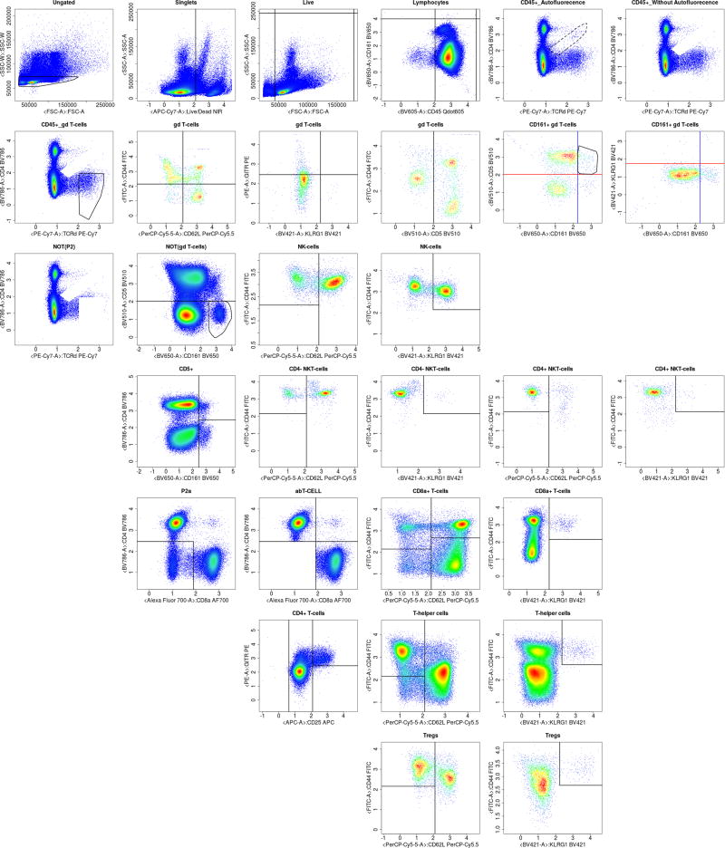
Complete automated gating of a sample WTSI & KCL T cell spleen organ data.
Figure A.16.
Complete automated gating of a sample WTSI & KCL bone marrow data.
Figure A.17.
Automated gating compared to manual gating reduced variations seen over time. Hardy Fractions population from the WTSI & KCL bone marrow dataset.
Footnotes
Publisher's Disclaimer: This is a PDF file of an unedited manuscript that has been accepted for publication. As a service to our customers we are providing this early version of the manuscript. The manuscript will undergo copyediting, typesetting, and review of the resulting proof before it is published in its final citable form. Please note that during the production process errors may be discovered which could affect the content, and all legal disclaimers that apply to the journal pertain.
References
- 1.Coppola M, Dolecki MN. [2017-09-27];BD Launches BD FACSymphony™ High-Speed Cell Analyzer to Enable Identification and Analysis of Rare Cell Types. 2016 http://www.bd.com/en-us/company/news-and-media/press-releases/feb-8-2016-bd-launches-bd-facsymphony-high-speed-cell-analyzer-to-enable-identification-and-analysis-of-rare-cell-types.
- 2.Kvistborg P, Gouttefangeas C, Aghaeepour N, Cazaly A, Chattopadhyay PK, Chan C, Eckl J, Finak G, Hadrup SR, Maecker HT, et al. Thinking outside the gate: single-cell assessments in multiple dimensions. Immunity. 2015;42(4):591–592. doi: 10.1016/j.immuni.2015.04.006. [DOI] [PMC free article] [PubMed] [Google Scholar]
- 3.Bendall SC, Nolan GP, Roederer M, Chattopadhyay PK. A deep profiler’s guide to cytometry. Trends in immunology. 2012;33(7):323–332. doi: 10.1016/j.it.2012.02.010. [DOI] [PMC free article] [PubMed] [Google Scholar]
- 4.Roederer M, Brenchley J, Betts M, De Rosa S. Flow cytometric analysis of vaccine responses: how many colors are enough? Clinical Immunology. 2004;110(3):199–205. doi: 10.1016/j.clim.2003.11.015. [DOI] [PubMed] [Google Scholar]
- 5. [2017-09-11];The Adult and Embryonic Phenotype Pipeline. http://www.mousephenotype.org/impress.
- 6.Malek M, Taghiyar MJ, Chong L, Finak G, Gottardo R, Brinkman RR. flowDensity: reproducing manual gating of flow cytometry data by automated density-based cell population identification. Bioinformatics. 2015;31(4):606–607. doi: 10.1093/bioinformatics/btu677. [DOI] [PMC free article] [PubMed] [Google Scholar]
- 7.O’Neill K, Jalali A, Aghaeepour N, Hoos H, Brinkman RR. Enhanced flowType/RchyOptimyx: a Bioconductor pipeline for discovery in high-dimensional cytometry data. Bioinformatics. 2014;30(9):1329–1330. doi: 10.1093/bioinformatics/btt770. [DOI] [PMC free article] [PubMed] [Google Scholar]
- 8.Aghaeepour N, Jalali A, O’Neill K, Chattopadhyay PK, Roederer M, Hoos HH, Brinkman RR. RchyOptimyx: cellular hierarchy optimization for flow cytometry. Cytometry Part A. 2012;81(12):1022–1030. doi: 10.1002/cyto.a.22209. [DOI] [PMC free article] [PubMed] [Google Scholar]
- 9.Ellis B, Haaland P, Hahne F, Le Meur N, Gopalakrishnan N, Spidlen J, Jiang M. flowCore: basic structures for flow cytometry data. R package version. 1(0) [Google Scholar]
- 10.Hahne F, LeMeur N, Brinkman RR, Ellis B, Haaland P, Sarkar D, Spidlen J, Strain E, Gentleman R. flowCore: a Bioconductor package for high throughput flow cytometry. BMC bioinformatics. 2009;10(1):106. doi: 10.1186/1471-2105-10-106. [DOI] [PMC free article] [PubMed] [Google Scholar]
- 11.Fletez-Brant K, Špidlen J, Brinkman RR, Roederer M, Chattopadhyay PK. flowClean: Automated identification and removal of fluorescence anomalies in flow cytometry data. Cytometry Part A. 2016;89(5):461–471. doi: 10.1002/cyto.a.22837. [DOI] [PMC free article] [PubMed] [Google Scholar]
- 12.Monaco G, Chen H, Poidinger M, Chen J, de Magalhães JP, Larbi A. flowAI: automatic and interactive anomaly discerning tools for flow cytometry data. Bioinformatics. 2016;32(16):2473–2480. doi: 10.1093/bioinformatics/btw191. [DOI] [PubMed] [Google Scholar]
- 13.Tenenbaum JB, De Silva V, Langford JC. A global geometric framework for nonlinear dimensionality reduction. science. 2000;290(5500):2319–2323. doi: 10.1126/science.290.5500.2319. [DOI] [PubMed] [Google Scholar]
- 14.Spidlen J, Breuer K, Brinkman R. Preparing a Minimum Information about a Flow Cytometry Experiment (MIFlowCyt) compliant manuscript using the International Society for Advancement of Cytometry (ISAC) FCS file repository (FlowRepository.org) Current protocols in cytometry. 2012:10–18. doi: 10.1002/0471142956.cy1018s61. [DOI] [PubMed] [Google Scholar]
- 15.Sathya R, Abraham A. Comparison of supervised and unsupervised learning algorithms for pattern classification. International Journal of Advanced Research in Artificial Intelligence. 2013;2(2):34–38. [Google Scholar]
- 16.Li H, Shaham U, Stanton KP, Yao Y, Montgomery RR, Kluger Y. Gating mass cytometry data by deep learning. Bioinformatics. 2017:btx448. doi: 10.1093/bioinformatics/btx448. [DOI] [PMC free article] [PubMed] [Google Scholar]
- 17.Weber LM, Robinson MD. Comparison of clustering methods for high-dimensional single-cell flow and mass cytometry data. Cytometry Part A. 2016;89(12):1084–1096. doi: 10.1002/cyto.a.23030. [DOI] [PubMed] [Google Scholar]
- 18.Aghaeepour N, Finak G, Hoos H, Mosmann TR, Brinkman R, Gottardo R, Scheuermann RH, F. Consortium, D. Consortium et al. Critical assessment of automated flow cytometry data analysis techniques. Nature methods. 2013;10(3):228–238. doi: 10.1038/nmeth.2365. [DOI] [PMC free article] [PubMed] [Google Scholar]
- 19.Aghaeepour N, Chattopadhyay P, Chikina M, Dhaene T, Van Gassen S, Kursa M, Lambrecht BN, Malek M, McLachlan G, Qian Y, et al. A benchmark for evaluation of algorithms for identification of cellular correlates of clinical outcomes. Cytometry Part A. 2016;89(1):16–21. doi: 10.1002/cyto.a.22732. [DOI] [PMC free article] [PubMed] [Google Scholar]
- 20.Qian Y, Wei C, Eun-Hyung Lee F, Campbell J, Halliley J, Lee JA, Cai J, Kong YM, Sadat E, Thomson E, et al. Elucidation of seventeen human peripheral blood B-cell subsets and quantification of the tetanus response using a density-based method for the automated identification of cell populations in multidimensional flow cytometry data. Cytometry Part B: Clinical Cytometry. 78(S1) doi: 10.1002/cyto.b.20554. [DOI] [PMC free article] [PubMed] [Google Scholar]
- 21.Lo K, Hahne F, Brinkman RR, Gottardo R. flowClust: a Bioconductor package for automated gating of flow cytometry data. BMC bioinformatics. 2009;10(1):145. doi: 10.1186/1471-2105-10-145. [DOI] [PMC free article] [PubMed] [Google Scholar]
- 22.Aghaeepour N, Nikolic R, Hoos HH, Brinkman RR. Rapid cell population identification in flow cytometry data. Cytometry Part A. 2011;79(1):6–13. doi: 10.1002/cyto.a.21007. [DOI] [PMC free article] [PubMed] [Google Scholar]
- 23.Finak G, Bashashati A, Brinkman R, Gottardo R. Merging mixture components for cell population identification in flow cytometry. Advances in Bioinformatics. 2009 doi: 10.1155/2009/247646. [DOI] [PMC free article] [PubMed] [Google Scholar]
- 24.Ge Y, Sealfon SC. flowPeaks: a fast unsupervised clustering for flow cytometry data via K-means and density peak finding. Bioinformatics. 2012;28(15):2052–2058. doi: 10.1093/bioinformatics/bts300. [DOI] [PMC free article] [PubMed] [Google Scholar]
- 25.Sörensen T, Baumgart S, Durek P, Grützkau A, Häupl T. immunoClust-An automated analysis pipeline for the identification of immunophenotypic signatures in high-dimensional cytometric datasets. Cytometry Part A. 2015;87(7):603–615. doi: 10.1002/cyto.a.22626. [DOI] [PubMed] [Google Scholar]
- 26.Levine JH, Simonds EF, Bendall SC, Davis KL, El-ad DA, Tadmor MD, Litvin O, Fienberg HG, Jager A, Zunder ER, et al. Data-driven phenotypic dissection of AML reveals progenitor-like cells that correlate with prognosis. Cell. 2015;162(1):184–197. doi: 10.1016/j.cell.2015.05.047. [DOI] [PMC free article] [PubMed] [Google Scholar]
- 27.Zare H, Shooshtari P, Gupta A, Brinkman RR. Data reduction for spectral clustering to analyze high throughput flow cytometry data. BMC bioinformatics. 2010;11(1):403. doi: 10.1186/1471-2105-11-403. [DOI] [PMC free article] [PubMed] [Google Scholar]
- 28.Mosmann TR, Naim I, Rebhahn J, Datta S, Cavenaugh JS, Weaver JM, Sharma G. SWIFT-scalable clustering for automated identification of rare cell populations in large, high-dimensional flow cytometry datasets, Part 2: Biological evaluation. Cytometry Part A. 2014;85(5):422–433. doi: 10.1002/cyto.a.22445. [DOI] [PMC free article] [PubMed] [Google Scholar]
- 29.Van Gassen S, Callebaut B, Van Helden MJ, Lambrecht BN, Demeester P, Dhaene T, Saeys Y. FlowSOM: Using self-organizing maps for visualization and interpretation of cytometry data. Cytometry Part A. 2015;87(7):636–645. doi: 10.1002/cyto.a.22625. [DOI] [PubMed] [Google Scholar]
- 30.Finak G, Frelinger J, Jiang W, Newell EW, Ramey J, Davis MM, Kalams SA, De Rosa SC, Gottardo R. OpenCyto: an open source infrastructure for scalable, robust, reproducible, and automated, end-to-end flow cytometry data analysis. PLoS computational biology. 2014;10(8):e1003806. doi: 10.1371/journal.pcbi.1003806. [DOI] [PMC free article] [PubMed] [Google Scholar]
- 31.Brown CE. Applied multivariate statistics in geohydrology and related sciences. Springer; 1998. Coefficient of variation; pp. 155–157. [Google Scholar]
- 32.Craig FE, Brinkman RR, Eyck ST, Aghaeepour N. Computational analysis optimizes the flow cytometric evaluation for lymphoma. Cytometry Part B: Clinical Cytometry. 2014;86(1):18–24. doi: 10.1002/cyto.b.21115. [DOI] [PubMed] [Google Scholar]
- 33.Aghaeepour N, Chattopadhyay PK, Ganesan A, O’neill K, Zare H, Jalali A, Hoos HH, Roederer M, Brinkman RR. Early immunologic correlates of HIV protection can be identified from computational analysis of complex multivariate t-cell flow cytometry assays. Bioinformatics. 2012;28(7):1009–1016. doi: 10.1093/bioinformatics/bts082. [DOI] [PMC free article] [PubMed] [Google Scholar]
- 34.Villanova F, Di Meglio P, Inokuma M, Aghaeepour N, Perucha E, Mollon J, Nomura L, Hernandez-Fuentes M, Cope A, Prevost AT, et al. Integration of lyoplate based flow cytometry and computational analysis for standardized immunological biomarker discovery. PloS one. 2013;8(7):e65485. doi: 10.1371/journal.pone.0065485. [DOI] [PMC free article] [PubMed] [Google Scholar]
- 35.Haynes W. Encyclopedia of Systems Biology. Springer; 2013. Wilcoxon rank sum test; pp. 2354–2355. [Google Scholar]
- 36.Westfall PH, Young SS. Resampling-based multiple testing: Examples and methods for p-value adjustment. Vol. 279. John Wiley & Sons; 1993. [Google Scholar]
- 37.Benjamini Y, Hochberg Y. Controlling the false discovery rate: a practical and powerful approach to multiple testing. Journal of the royal statistical society. Series B (Methodological) 1995:289–300. [Google Scholar]
- 38.Nayak BK, Hazra A. How to choose the right statistical test? Indian journal of ophthalmology. 2011;59(2):85. doi: 10.4103/0301-4738.77005. [DOI] [PMC free article] [PubMed] [Google Scholar]
- 39.Roederer M. How many events is enough? Are you positive? Cytometry Part A. 2008;73(5):384–385. doi: 10.1002/cyto.a.20549. [DOI] [PubMed] [Google Scholar]
- 40.Gentleman RC, Carey VJ, Bates DM, Bolstad B, Dettling M, Dudoit S, Ellis B, Gautier L, Ge Y, Gentry J, et al. Bioconductor: open software development for computational biology and bioinformatics. Genome biology. 2004;5(10):R80. doi: 10.1186/gb-2004-5-10-r80. [DOI] [PMC free article] [PubMed] [Google Scholar]


