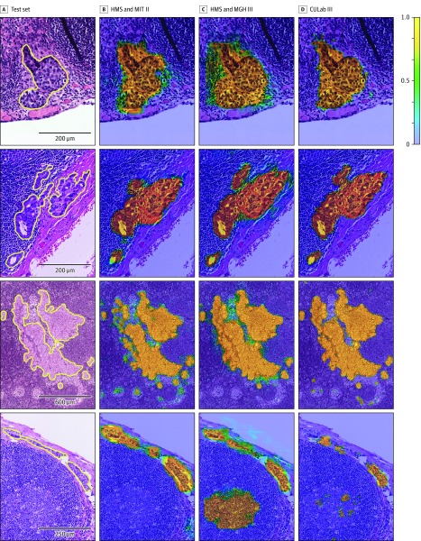
Figure 2. Probability Maps Generated by the Top 3 Algorithms From the CAMELYON16 Competition.
For abbreviations, see the legend of Figure 3. The color scale bar (top right) indicates the probability for each pixel to be part of a metastatic region. For additional examples, see eFigure 5 in the Supplement. A, Four annotated micrometastatic regions in whole-slide images of hematoxylin and eosin–stained lymph node tissue sections taken from the test set of Cancer Metastases in Lymph Nodes Challenge 2016 (CAMELYON16) dataset. B-D, Probability maps from each team overlaid on the original images.

