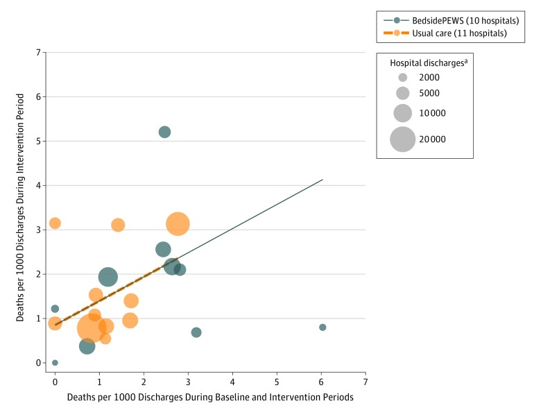
Figure 2. Mortality by Hospital.
All-cause hospital mortality rates during the baseline and intervention periods are presented by hospital. Each circle represents a hospital. The circle center reflects the coordinates of the baseline and intervention mortality rates. The colored lines represent the linearized fitted relationships between mortality during the baseline and intervention periods for the BedsidePEWS intervention hospitals (dashed orange line) and usual care hospitals (solid blue line). The estimated difference in the slopes between the BedsidePEWS (slope = 0.57) and the usual care group (slope = 0.53) was not statistically significantly different from 0 (P = .94). In the analysis, the slopes were assumed to be equal. In Supplement 3, eFigure 1 provides linkage of these hospital-level mortality data to additional information about the individual hospitals contained in eTables 2 and 3.
aThe circle size is proportional to the number of discharges during the intervention period of that hospital. Thus hospitals with larger circles are contributing more data and will have narrower 95% CIs for the true values of their mortality rates.

