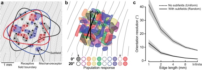
Figure 5. Neural mechanisms for edge orientation processing.
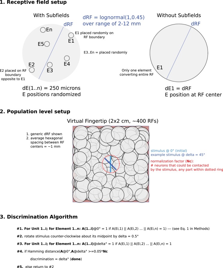
(a) Schematic of a 5 × 5 mm square area on the skin surface. The gray lines and circles represent papillary ridges and mechanoreceptive end organs, respectively. Three colors of filled dots represent the mechanoreceptors (e.g. Meissner corpuscles) innervated by one of three first-order tactile neurons, the shaded area behind subsets of these mechanoreceptors represent subfields and the color-matched contour represents that neuron’s receptive field boundary. (b) Top: Same format as (a) but showing color-coded subfields for 10 first-order tactile neurons. Note the high amount of receptive field overlap and subfield intermingling and that, in practice, even this representation is simplified as any point on the fingertip skin would activate ~36 of the relevant first-order tactile neurons (Vallbo and Johansson, 1984) (20 fast-adapting type 1: FA-1; 16 slow-adapting type 1: SA-1). The two edges (2 mm long) are superimposed on the layout are centered at the same location but differ in orientation by 20˚. Bottom: Activation pattern of the population of neurons in the cartoon above. Neurons are filled if the edge touches any of its subfields and unfilled otherwise. Arrows point to two neurons that change their state for the two edge orientations. (c) Output of our model, relating subfields to the neuronal populations’ ability to signal edge orientation (ordinate) as a function of edge length (abscissa). Here we directly contrast two synthetic populations where: (1) each unit has a uniform receptive field by virtue of being connected to one receptive element the same size as its receptive field and (2) each unit has subfields by virtue of being connected to a random number (2–64) of receptor elements (each 250 μm in diameter). Each simulation was repeated 100 times for each edge length. The lines indicate the mean and the shaded areas represent the 95% confidence interval.


