Abstract
Inpatient management of insulin-dependent diabetes (IDD) is a complex task that requires clinicians to cognitively process information across distinct domains in different locations of the electronic medical record (EMR). Current data displays are not optimized to support insulin management by end users. We sought to develop a set of user-centered displays of capillary glucose data and insulin dose to improve inpatient management of IDD. Our proposed conceptual data display prototype is designed to simplify the presentation and visualization of key information needed for treatment decisions. The goal is also to enhance clinician’s ability to identify opportunities to optimize insulin dosing and decrease end users’ cognitive load and error rates.
Keywords: Diabetes Mellitus, Blood Glucose, Data Display
Introduction
Glycemic control in hospitalized patients with type 2 diabetes is associated with improved outcomes [1]. Although inpatient diabetes management is a common task in clinical practice, glycemic control is often suboptimal. Physician management of inpatient diabetes involves three core tasks: a) reviewing Capillary Blood Glucose (CBG) data; b) interpreting values in relation to insulin dosing and meal intake, and c) determining if a change in treatment plan is necessary.
Unfortunately, data needed to support insulin adjustments are sub-optimally organized and displayed in the electronic medical record. For example, capillary glucose measurements are reported in the laboratory results, insulin dosing and administration are presented in the medication administration record, and the relationship of glucose readings to meal intake is derived from electronic time-stamps on the glucose readings as they relate to insulin orders. This requires processing and integration of data from multiple locations, multitasking, and attention switching [2]. Given the limited memory span of 7 ± 2 [3], mental juggling between tasks can diminish information processing speed, resulting in inefficiencies in completing a common, routine clinical task, duplication of effort, physician burnout, and potentially suboptimal diabetes management in the inpatient setting.
Novel approaches are needed for representing and consolidating the inpatient diabetes mangement data into intelligent displays. In this paper, we focused on the treatment of hospitalized patients treated with basal-bolus insulin who undergo routine CBG monitoring before breakfast/lunch/dinner and at bedtime. Our proposed display will assist clinicians with the review and interpretation of CBG values by merging data (CBG results, CBG time, and insulin administration) from multiple EMR dimensions into a single location.
Background
Iatrogenic, unintentional Adverse Drug Events (ADEs) are among the most common causes of inpatient complications in the United States [4]. Hospital-acquired ADEs extend the length of stay, result in higher healthcare costs, and may cause tragic loss of life [5–6]. Injected medications, including insulin, account for 63% of ADEs and about 50% are believed to be preventable [7]. Injectable drugs are associated with an estimated 1.2 million preventable inpatient ADEs resulting in an average annual increase of $600,000 per hospital [8]. There is great concern about the high risk of preventable hypoglycemia related to insulin use [8]. Integrated data displays are needed to improve inpatient glucose control, improve safety, and increase clinician efficiency.
Fonda et al. [9], conducted a focus group study with diabetes patients to understand patients’ needs and tasks to inform the design and functionality of a diabetes personal health application. Although this study focused on outpatient diabetes self-management by patients, not providers, core principles from this study were used to inform the development of our inpatient display. In this study, patients reported that the collection, recording, and collating of glucose data for diabetes management is a burdensome process. To help address this, researchers highlighted the need for actionable, understandable, timely information to support glucose management – especially as it relates to interactions with medications, diet, and lifestyle. Fonda et al. [9] utilized flexible and reusable gadgets built on web-based applications within the data display portal, to integrate data from different domains into a consolidated display. For example, the “glucose gadget” displays data from glucose monitors, the electronic medical record, or patient-entered data on a temporal graph. The extensible “gadget” concept suggested our proposed dimensional flexibility. Kumar et al. [10] developed an approach to utilize remotely collected data from continuous glucose monitors, import, and store them into EMR flowsheets, and interface with a novel data display (GluVue). In feasibility testing, the GluVue efficiently collated large volumes of data and improved clinicians’ and patients’ ability to identify opportunities to improve glucose management [11]. It was this concept of novel display of outpatient glucose data that further informed our ideas relating to potential applicability to management of inpatients as well.
Theoretical Framework and Methods
Our proposed data display was based on three visualization theories—distributed cognitive theory, relational data display framework, and Gestalt’s priciples. Glucose-insulin visuals were created using Tableau® 9.3. The following sections will describe theories and their applications in our display.
Distributed Cognitive Theory
When clinicians interact with computers, their cognition is distributed in two spaces—internal and external. The internal space represents clinician factors such as attention, memory, knowledge, experience, language, reasoning, and decision-making. The external space represents computer factors, such as user interface design, screen navigation, and data exhibition and organization, among others [12]. For improved decision-making, we aimed to reduce distributed cognitive load related to short-term memory and data display interface.
Clinicians process external, visual information by recognition and recall. Our informal task analysis done for design purposes by the authors, from the perspective of a physician’s task of inpatient management of insulin dosing of patients with Type II diabetes indicates that current physician-EMR interactions and information processing flow require 13 steps to make decisions and are discussed as follows. Our intention is to use this analysis to define the framework that informs our proposed design, which will undergo evaluation during future iterations.
The physician’s undivided attention is needed to process information and navigate the EMR.
The physician retrieves a laboratory screen to view the results; the lab screen icon/menu corresponds to an external representation.
S/he consults the tabular display on Table 1 to read the CBG level; the tabular layout constitutes an external representation.
S/he perceives CBG levels as high/normal/low, referred as pattern recognition, which is an example of an internal representation.
Prior knowledge stored in long-term memory is then applied to understand CBG patterns, diagnostic, and treatment criteria, all of which are derived from an internal representation. Abnormal CBG values may necessitate insulin adjustment.
The physician then assigns abnormal CBG values to short-term memory.
S/he switches task and attention to locate medication screen in the EMR.
S/he retrieves medication screen located on a separate tab in the EMR.
S/he consults the tabular display on Table 2 to read the insulin dose.
S/he perceives insulin levels as high/appropriate/low, referred as pattern recognition.
Prior knowledge stored in long-term memory is then applied to understand insulin dosage, diagnostic, and treatment criteria.
Again, knowledge is combined with the recalled CBG level, and a decision is made about a dose change.
If adjustment is needed, medication order entry screen is consulted, if not, monitoring continues.
Table 1.
Description of CBG Values by Date, Finger-Stick Time, and Finger-Stick Event
| Date | Day | Finger-Stick Time (24 hr) | Finger-Stick Time (Event) | CBG Levels (mg/dl) |
|---|---|---|---|---|
| 9/18/2016 | Day 1 | 6:00 | Pre-Breakfast | 82 |
| 9/18/2016 | Day 1 | 12:00 | Pre-Lunch | 172 |
| 9/18/2016 | Day 1 | 18:00 | Pre-Dinner | 191 |
| 9/18/2016 | Day 1 | 22:00 | Bedtime | 220 |
| 9/19/2016 | Day 2 | 6:00 | Pre-Breakfast | 118 |
| 9/19/2016 | Day 2 | 12:00 | Pre-Lunch | 160 |
| 9/19/2016 | Day 2 | 18:00 | Pre-Dinner | 175 |
| 9/19/2016 | Day 2 | 22:00 | Bedtime | 190 |
| 9/20/2016 | Day 3 | 6:00 | Pre-Breakfast | 94 |
| 9/20/2016 | Day 3 | 12:00 | Pre-Lunch | 185 |
| 9/20/2016 | Day 3 | 18:00 | Pre-Dinner | 167 |
| 9/20/2016 | Day 3 | 22:00 | Bedtime | 191 |
Table 2.
Description of Insulin Dose by Date, Day, Injection Time, and Subcutaneous Insulin Dose
| Date | Day | Injection Time (24 hr) | Injection Time (Event) | Insulin Dose (Units/d) |
|---|---|---|---|---|
| 9/18/2016 | Day 1 | 6:00 | Pre-Breakfast | 6 |
| 9/18/2016 | Day 1 | 12:00 | Pre-Lunch | 12 |
| 9/18/2016 | Day 1 | 18:00 | Pre-Dinner | 14 |
| 9/18/2016 | Day 1 | 22:00 | Bedtime | 30 |
| 9/19/2016 | Day 2 | 6:00 | Pre-Breakfast | 6 |
| 9/19/2016 | Day 2 | 12:00 | Pre-Lunch | 12 |
| 9/19/2016 | Day 2 | 18:00 | Pre-Dinner | 14 |
| 9/19/2016 | Day 2 | 22:00 | Bedtime | 30 |
| 9/20/2016 | Day 3 | 6:00 | Pre-Breakfast | 6 |
| 9/20/2016 | Day 3 | 12:00 | Pre-Lunch | 12 |
| 9/20/2016 | Day 3 | 18:00 | Pre-Dinner | 14 |
| 9/20/2016 | Day 3 | 22:00 | Bedtime | 30 |
The entire process is delayed since two screens have to be consulted with several numbers in mind. Repetition of the process for different patients results in the unnecessary investment of time, click-burden, and stress. To reduce mental strain related to the recall, we eliminated the internal/intrinsic tasks linked to short-term memory by reducing the external/extrinsic load. A single, integrated screen model is created by merging two relational tabular displays that will limit the decision-making steps to 6, described as follows:
The physician’s undivided attention is needed to process information and navigate the EMR.
The physician retrieves an integrated data display screen to view glucose-insulin values.
S/he consults the new graphical displays that are introduced in the results section below.
S/he perceives CBG levels as high/normal/low, referred as pattern recognition in context with high/appropriate/low insulin levels.
Prior knowledge stored in long-term memory is then applied to understand CBG-insulin patterns, diagnostic, and treatment criteria. Abnormal CBG values may necessitate insulin adjustment.
If adjustment is need, medication order entry screen is consulted, if not, monitoring continues.
Relational Data Display Framework
A common theme across papers surveyed, beginning with Hutchins et al. [13] in 1985, and as recently as Gong et al. [14] in 2009, is that the closer the internal representations of a task are to the external representations depicted through the dimensions of a relational display, the more successfully a clinician user can complete a search task and reach their goal [13–15]. More specifically, the proximity of scale between the represented and representing dimensions, particularly when numerical clinical data are involved, is key in providing the optimal displays [14]. This is also implicitly noted in the work of Bauer and colleagues [16] in that maximizing the degree of external representations, both as tables and graphs, can improve clinician understanding and subsequent action, though the representational effect is always a factor in creating a disparity between clinicians’ understanding of the data.
Properties of the display are determined by properties of its dimensions. Dimensional properties are measured in scales. The four scales types include nominal, ordinal, interval, and ratio. Nominal scale is the lowest form of measurement scale. The numeric values classify characteristics of people, objects, or events into categories. Ordinal scales have categories arranged in some meaningful order without magnitude. In interval scales, the distance between ordered category values are equal. Ratio scales are most precise level of measurement and possess magnitude, equal intervals, and an absolute zero. The scales selected for our project are given in Table 3.
Table 3.
Dimensional Properties and Rationale
| Dimensions | Representational Dimensional Scale | Representing Dimensional Scale | Rationale |
|---|---|---|---|
| Day | Interval | Interval | The CBG values recorded each day are associated with a date that corresponds to the requirements for interval scale in the visualization. |
| Time | Interval | Ordinal | Points in time itself are interval in scale, however, each of the four-time points in the visualization have only category and magnitude, but do not occur at equal intervals, nor is there an absolute zero value possible since we are still only observing points in time. |
| CBG | Ratio | Ratio | The values for CBG are all categorical, have magnitude, equal interval, and could potentially have a value of absolute zero. |
| Insulin | Ratio | Ratio | The values for insulin are all categorical, have magnitude, equal interval, and could potentially have a value of absolute zero. |
Gestalt’s Principles of Visual Perception
Relational and/or graphical displays that optimally align the cognition and perceptions of innately distinct objects into related groups can minimize clinicians’ cognitive load while maximizing memory and recall [17]. Four Gestalt’s principles enhance cognition and improve decisions including similarity, proximity, connection, and enclosure.
Method of Evaluation for Design Purposes
An initial inspection was conducted by the authors and then an extended to group of 13 with extensive experience in the clinical informatics domain. The inspection was informal in nature, with the intention of soliciting empirical responses to guide further development.
Results
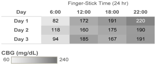
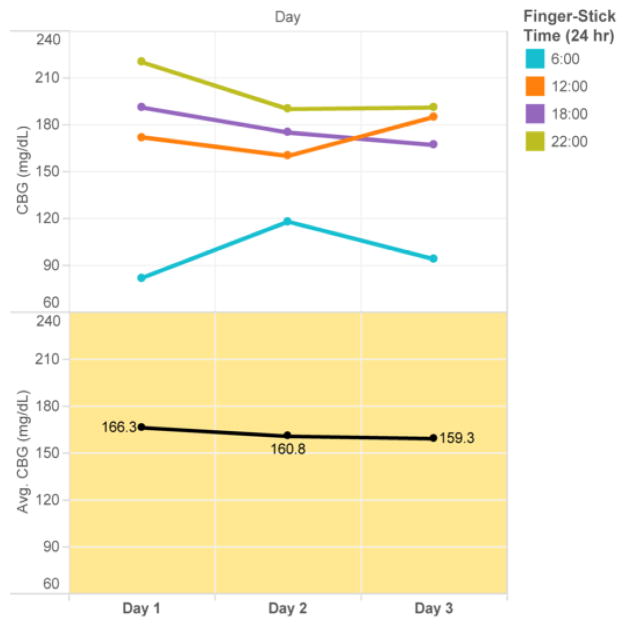
The goal of the highlighted table in Figure 1 is to facilitate pattern recognition of high and low values. The display is grouped based on Gestalt’ similarity principle. The grey CBG gradient filter is grouped based on similarity and proximity to display the glycemic values. Color distinguishes abnormal values for selective attention and hastening information processing, aligning with distributed cognition principles. We also introduced the dimension of time as an ordinal scale, according to relational data display principles. The goal of the line chart in Figure 2 is to display longitudinal CBG values stratified by time of day on the top panel and average daily glucose value on the bottom panel. This display improves upon current glucose displays in the EMR which are most commonly time-ordered tabular displays that do not clearly group values at similar time points (i.e. breakfast values at 6 am are not grouped together but time-ordered between 22:00 values and 12:00 values). Consistent color patterns are chosen to highlight correlated data across the graphs (i.e. all 06:00 glucose values are blue). The display is grouped based on Gestalt’s law of similarity, proximity, connection, and enclosure, as well as building on the distributed cognition principle of proximity compatibility.
Figure 1.
Highlight table: CBG Broken Down by Finger-Stick Time vs. Day
Figure 2.
Line chart: the Trends of CBG and Average of CBG for Day
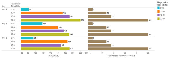
The goal of horizontal bar chart in Figure 3 is to display both the capillary glucose reading and the corresponding insulin dose administered at the concurrent time point. This allows clinicians to correlate the insulin dose with the corresponding glucose reading to assess the appropriateness of the dosing. For example, the 30 units of insulin administered at 22:00 achieves adequate control at 06:00 (glucose range 82–118 mg/dL); however, the 14 units administered at 18:00 with dinner does not match the carbohydrate intake at dinner, as reflected by the elevated readings at 22:00 (range 190–220 mg/dL). The display is grouped using Gestalt’s similarity, proximity, and enclosure principles. Distributed internal and cognitive load is reduced by merging two disparately located data tables on a single screen.
Figure 3.
Horizontal Bar Chart: CBG and Subcutaneous Insulin Dose for Each Finger-Stick Ttime Broken Down by Dday
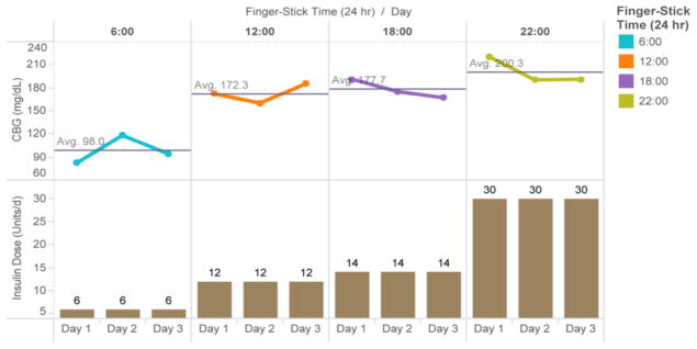
The goal of the line chart-vertical bar chart in Figure 4 is to displays the average glucose for each time period and the insulin dose administered at that time. This display is particularly important because clinicians often want to trend summary glucose data over several days prior to adjusting insulin dosing. This helps avoid over or under reacting to any single value. However, it still allows for easy recognition of hypoglycemia, an important safety concern, along with the dose of insulin administered that may be potentially related to the low glucose value. The display is grouped based on Gestalt’s law of grouping and the distributed cognitive load is lowered by merging table 1 & 2. The inherent relational data display principles are also applied in further representation of internal dimensions as external dimensions depicted in such a way as to reduce the difficulty of clinician understanding and appropriate intervention.
Figure 4.
Line Chart-Vertical Bar Chart: the Trends of CBG and Subcutaneous Insulin Dose for Day Broken Down by Finger-Stick Time
From the initial inspections by the authors, as well as the empirical evaluations of the extended informatics group, the set of theory-grounded data display was well received. Figure 4 below was especially commented as the easiest to interpret, because “having insulin doses and glucose values displayed in proximity reduced the need for screen switching and internal representation, appreciated by clinicians.”
Discussion
Optimized management of patients with insulin dependent diabetes in the hospital setting is critical to improved patient outcomes since such patients have increased morbidity, mortality, and longer lengths of stay. Clinicians must monitor patients’ capillary blood glucose level and insulin dosage, which necessitates information from different parts of an EMR system to analyze and intervene cognitively. Today’s prevailing EMR data displays are inadequate to meet clinicians’ cognitive needs, due to data storage in different places within the system that interrupt cognition or presented in tabular formats that make it challenging to identify actionable trends. This also increases cognitive load, reduces intellectual performance, increases errors, and ultimately results in sub-optimal task completion [18]. Our belief is that if related variables required for management of diabetic patients are well represented externally via a relational data display harnessing principles of distributed cognition, then the clinician tasked with managing glycemic management will have less cognitive load and fewer potential interruptions from information foraging, which may lower or eliminate associated cognitive costs.
Limitations and Future Work
Although the proposed display is grounded in theory, the development team has the complementary expertise in clinical, informatics and programming skills. It is essential to conduct a formal evaluation regarding its effectiveness and efficiency in clinical practice. Future work including a fuller analysis of task, users, representation, and function is necessary to inform experimental design as proposed by Zhang et al. [19]. This will provide further user feedback prior to formal experimental testing. Additional work will include options to change the representing dimension for time from an ordinal to an interval scale to expand the evaluation of variables across a wider time span.
To determine the proposed display’s effectiveness in clinical practice and potential to decrease cognitive load, it will need to be integrated into an EMR. Only then can the implementation, usability, and effectiveness be evaluated. Study results and user feedback will inform ongoing opportunities for improvements in the data display and identify additional clinical variables amenable to similar relational displays.
Conclusion
Overall, our proposed insulin-glucose data display strategy seeks to: reduce the intrinsic load by minimizing the screen navigation task and clicks, reduce the extrinsic/external load by merging insulin dosage and glucose level tables into one display, and reduce the extrinsic and germane load. Theory-based relational information displays using principles of cognition, distributed cognitive tasks, and Gestalt theory can help address challenges in inpatient glucose management. All told, design collaborations between informaticians, computer programmers, and clinicians are essential to solving common clinical problems.
Acknowledgments
Dr. Bowen was supported by the National Institute of Diabetes, Digestive, and Kidney Diseases (NIH/NIDDK K23 DK104065). Dr. Gong was in part supported by The Agency for Healthcare Research & Quality (1R01HS022895), and University of Texas System Grants Program (#156374).
References
- 1.Umpierrez GE, Hellman R, Korytkowski MT, et al. Management of hyperglycemia in hospitalized patients in non-critical care setting: an endocrine society clinical practice guideline. J Clin Endocrinol & Met. 2012;97:16–38. doi: 10.1210/jc.2011-2098. [DOI] [PubMed] [Google Scholar]
- 2.Fougnie D. The relationship between attention and working memory. In: Johansen NB, editor. New research on short-term memory. New York, NY: Nova Biomedical Books; 2008. pp. 1–45. [Google Scholar]
- 3.Miller GA. The Magical Number Seven, Plus Or Minus Two: Some Limits on Our Capacity for Processing Information. The Psychological Review. 1956;63:81–97. [PubMed] [Google Scholar]
- 4.Sawarkar A, Keohane CA, Maviglia S, et al. Adverse Drug Events caused by Serious Medication Administration Errors. BMJ Quality & Safety. 2012;21:933–938. doi: 10.1136/bmjqs-2012-000946. [DOI] [PMC free article] [PubMed] [Google Scholar]
- 5.Classen DC, Pestotnik SL, Evans R, et al. Adverse drug events in hospitalized patients: Excess length of stay, extra costs, and attributable mortality. Journal of American Medical Association. 1997;277:301–306. [PubMed] [Google Scholar]
- 6.Weiss AJ, Elixhauser A, Bae J, Encinosa W. Statistical Briefs. Vol. 158. Agency for Healthcare Research and Quality; Rockville, MD: 2013. Origin of Adverse Drug Events in U.S. Hospitals, 2011. The HCUP report: Healthcare cost and utilization project (HCUP) [PubMed] [Google Scholar]
- 7.Adverse events in hospitals: national incidence among Medicare beneficiaries. Washington, D.C: Department of Health and Human Services, Office of Inspector General; 2010. [Google Scholar]
- 8.Lahue BJ, Pyenson B, Iwasaki K, et al. National Burden of Preventable Adverse Drug Events Associated with Inpatient Injectable Medications: Healthcare and Medical Professional Liability Costs. American Health & Drug Benefits. 2012;5:1–10. [PMC free article] [PubMed] [Google Scholar]
- 9.Fonda SJ, Kedziora RJ, Vigersky RA, Bursell SE. Combining iGoogle and personal health records to create a prototype personal health application for diabetes self-management. Telemedicine and e-Health. 2010;16:480–489. doi: 10.1089/tmj.2009.0122. [DOI] [PubMed] [Google Scholar]
- 10.Kumar RB, Goren ND, Stark DE, et al. Automated integration of continuous glucose monitor data in the electronic health record using consumer technology. Journal of the American Medical Informatics Association. 2016:1–6. doi: 10.1093/jamia/ocv206. [DOI] [PMC free article] [PubMed] [Google Scholar]
- 11.GluVue. A real-time clinical decision support tool for interpreting blood glucose data. 2016. [Google Scholar]
- 12.Zhang J, Norman DA. Representations in distributed cognitive tasks. Cognitive Science. 1994;18:87–122. [Google Scholar]
- 13.Hutchins E, Hollan J, Norman D. Direct manipulation interfaces. Human-Computer Interaction. 1985;1:311–338. [Google Scholar]
- 14.Gong Y, Zhang J. Toward A human-centered hyperlipidemia management system: The interaction between internal and external information on relational data search. Journal of Medical Systems. 2011;35:169–177. doi: 10.1007/s10916-009-9354-x. [DOI] [PubMed] [Google Scholar]
- 15.Bauer DT, Guerlain S, Brown PJ. The design and evaluation of a graphical display for laboratory data. Journal of the American Medical Informatics Association. 2010;17:416–424. doi: 10.1136/jamia.2009.000505. [DOI] [PMC free article] [PubMed] [Google Scholar]
- 16.Zhang J. A representational analysis of relational information displays. International Journal of Human - Computer Studies. 1996;45:59–74. [Google Scholar]
- 17.Palmer SE. Vision Science: Photons to Phenomenology. Massachusetts Institute of Technology Press; Cambridge, Massachusetts, USA: 1999. [Google Scholar]
- 18.Mayer RE, Moreno R. Educational psychologist. Taylor & Francis; 2003. Nine ways to reduce cognitive load in multimedia learning. [Google Scholar]
- 19.Zhang J, Walji MF. TURF: Toward a unified framework of EHR usability. Journal of Biomedical Informatics. 2011;44:1056–1067. doi: 10.1016/j.jbi.2011.08.005. [DOI] [PubMed] [Google Scholar]


