

Abstract
The hospital to home care admission process is when nurses make important decisions about the post-transition episode, including medication reconciliation, plan of care, future visit patterns, and the inclusion of other disciplines. It is not clear how nurses get and use information to support decision-making. We conducted a focus group case study with six admitting home health nurses at a rural agency in Pennsylvania. We analyzed the data using thematic analysis and using our enhanced custom high level node-link diagram that highlights the relationships between decisions, tasks and information themes and sub-themes. The visualizations will be evaluated via review with home care subject matter experts.
Introduction
Home health agencies admit 11 million patients per year to home care1 with demand growing due to an aging population living longer with multiple chronic diseases and patient preferences for home care over facility-based care.2,3 Home care patients tend to be vulnerable older adults; 30% experience a readmission to the hospital within 60 days and many are readmitted to the hospital within the first two weeks of discharge.1 The hospital to home care admission process, when nurses make critical care planning decisions about the post transition episode, is therefore critical to quality healthcare and to reducing hospital readmissions.3,4 However, nurses’ information needs and how nurses obtain and use information for decision making during home care admission are currently poorly understood. What is known is that information relevant to a safe transition and developing the plan of care is often lacking at the start of home care. In fact, home care nurses receive only half of the recommended data.5 Missing, incomplete, or incorrect information is likely to impact the quality of the care plan which in turn may effect quality of care and patient outcomes.
This paper presents focus group findings of home care nurses’ tasks, information needs and decisions during the admission process. These findings will be integrated with those from observational studies and case reviews that are in progress in order to develop recommendations to enhance the home care admission process and to inform health information technology standards for home health agency electronic health record (EHR) systems. In addition to leading to home care domain related EHR requirements, this work introduces methods to support the analysts who seek to understand how nurses make decisions in relation to the information and tasks, and to facilitate the communication of findings to stakeholders including the home health agency nurses and other subject matter experts. Time with subject matter experts is precious and thus having supporting methods such as data visualization to represent the key issues for discussion is helpful.
A focus group was conducted at a rural Pennsylvania home care agency that uses a point of care EHR system. With respect to the home care domain, the focus group was designed to explore four main clinical decisions at the home care admission:
Medication reconciliation (process of creating an accurate list of medications that the patient should take and comparing that list against the physician’s discharge orders and the medications in the home);
Plan of care (orders for assessment, education, and performance for the problems that the nurse has decided need to be addressed in the care episode);
Visit timing and frequency (the next skilled nursing visits following the admission and the total number of follow-up visits); and
Inclusion of other disciplines (“Services”) in addition to skilled nursing (additional agency services needed, e.g., physical therapy, social work) in the care plan.
To understand the associated tasks and information needed to make the four clinical decisions, we developed a custom node-link diagram visualization. The short term goal was to support the review of focus group findings with subject matter experts. The longer term goal was to inform health information technology standards. A node-link diagram, sometimes called a network diagram, is a visual representation that shows relationships using links (also called edges) between nodes (also called vertices). Nodes are generally represented as shapes with or without text labels. Links are represented as lines between the nodes. According to Knuth, versions of node-link diagrams have been used since the 1200s.6 These diagrams have proliferated in use across many domains and with many types of representations, including health informatics.7 The links can be undirected showing association, or they can be directed showing the direction of the relationship. Arrows are typically displayed on the links to indicate direction.
This manuscript presents a focus group case study executed to identify the relationships between admission nurses’ decisions, tasks, and information gathering and use. It presents our enhanced node-link diagram concept developed to represent the qualitative findings from the focus group. The concept was informed by collaboration between experts in the clinical decision making process and human factors professionals. This manuscript introduces the features in the enhanced node-link diagram and presents visualization guidelines for how to instantiate each feature in order to highlight findings considered significant by clinical experts. The focus group data are presented with prototype visualizations that meet the guidelines. The manuscript presents a discussion of the use of the designed representations and highlights future work.
Methods
The Drexel University Institutional Review Board approved this study.
Participants
All participants provided informed consent. The study took place with six admitting registered nurses working in a free-standing, small, rural agency that serves a majority white population with lower socio-economic status. When conducting admissions, the clinicians at this agency at the time of the focus group used a laptop-based commercial EHR from Allegheny Software Publisher that is widely used in rural agencies in the region.
Focus Group Data Collection Procedure
The participating agency limited the focus group data collection period to 75 minutes. The researchers designed the focus protocol with this limitation in mind.
The researchers developed a demographic data collection instrument and a set of open-ended focus group questions. The demographic instrument was modeled based on the demographic data collection section of the EHR Nurse Satisfaction Survey which assessed clinician satisfaction with EHR impact on clinical process.8 Respondents documented their age, gender, ethnicity, race, job title, prior experience with EHRs, years of experience in health care, and self-assessment of computer knowledge.
The open-ended questions were developed based on the team’s experience.9–11 The questions focused on the admission decision making process and how nurses use the EHR and other information to document the care plan and medication reconciliation. The care plan defined the problem list or priorities that the agency will address, the timing of the next visit and the total number of visits, and inclusion of the other disciplines in addition to skilled nursing. Nurses were specifically asked about the start of care visit:
What tasks they needed to complete for each of the clinical decisions (i.e., medication reconciliation, visit pattern and frequency, care planning, services needed); and
Whether the task generated information they needed for the related clinical decision.
KB, an experienced focus group moderator and home care researcher, led the focus group. She elicited detailed responses from participants following the initial responses. All responses were recorded, including responses not related to the questions posed. As participants responded to the moderator-posed questions, responses were written on flip charts that were adhered to the meeting room walls for ease of reference. Using the participant input, researchers used colored circles to code tasks and decisions by topic (see an example in Figure 1). Visual display of the documented responses provided opportunity for member-checking and respondent feedback. Researchers also documented in field notes. In addition, the focus group was recorded using digital voice recorders.
Figure 1.
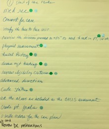
Example flip chart page for the “Start of Care tasks” with activities and color-coded circles representing the associated four clinical decisions (e.g., blue represents plan of care decision, green represents visit timing and frequency decision).
A 30 minute follow-up phone call with two focus group members addressed member-checking and elicited responses for questions that were not addressed during the 75-minute focus group. For the follow-up call, the team selected focus group members who had contributed the most responses during the focus group and who were demographically representative of the agency’s nurses.
Data Visualization
The main nodes are decisions, tasks, and information gathered and/or used. In the diagram, nodes are grouped by category (decisions, tasks, and information) and listed in vertical columns. Each category is color-coded. This organization supports the analyst to see the list of decisions, tasks, and information elements. The redundant coding (use of columns and color coding of the node shape) help to differentiate one category from the other.
Links are used to represent associations between nodes. The vertical edge of the node is proportional to the number of links adjacent to that edge. Directed links indicate whether information is generated or used. For example, if the directed link is from a task to information, then the task generates the information.
In qualitative analysis, a concept may be decomposed into lower level concepts. For example, an information node theme such as “Patient” may have many sub-themes. Representing all of the sub-themes can be useful in some cases but in other cases, it can make a visualization very cluttered. In order to leverage the design concept of overview plus detail,12 node themes that have sub-themes have indicators. Optionally, the number of sub-themes as well as the sub-themes themselves can be displayed.
Nodes and links were identified based on the thematic analysis data. To produce the diagrams, the nodes defined from the qualitative analysis were entered into an Excel Spreadsheet (Microsoft Inc.). Each node was associated with a text description for display purposes and related identifiers. Columns identified the links between nodes.
To generate the data visualization, we used Lucidchart (Lucid Software) to represent the nodes (i.e., decisions, tasks, information) and links (relationships). After the nodes and links were displayed, annotations related to the subthemes were added. Some changes (e.g., spacing of nodes, path of links) were made to the images to improved readability.
Data Analysis
We analyzed the focus group products (i.e., transcripts, visually recorded documentation) with thematic content analysis and presented the analysis using the developed data visualization. All data in response to the open-ended focus group questions was included in the analysis. We presented data from different perspectives to yield synergistic insights.
Thematic analysis is used to inductively analyze data to identify descriptive or topical categories. It involves familiarization of the data to identify themes that emerge, grouping of similar concepts, and consistent coding of all such occurrences. Using principles of thematic content analysis, AH, a nurse and experienced qualitative coder, analyzed inductively the transcribed audio recordings of the focus group sessions to identify descriptive or topical categories. Each theme was labeled as per the framework: as a decision, task, or information. AH created a codebook detailing the rules and definitions of the nodes that emerged. Three authors (SP, AH, PS) participated in the coding process of the focus group transcript. SP used the codebook to assign themes to 50% of the transcript. Two authors (SP, AH) discussed differences in individual coding and updated the codebook and coding until 80% inter-rater reliability was established. AH then updated the second half of the transcript according to the updated codebook. PS joined the coders to oversee the updated theme assignment of the second half of the transcript and codebook.
NVivo (QSR International), a qualitative data analysis software, was used to organize themes that emerged from the focus group transcript. AH and PS identified similar concepts in the transcript, and combined them under assigned aliases under the related theme. Using NVivo, concepts were categorized under the appropriate sub-node (child theme) of the associated larger concepts(s) (parent theme). Parent themes categorized under a clinical decision or a task were to be represented in the node-link diagram as linked concepts.
The team met to review the qualitative analyses and results. The team discussed all themes that emerged and the diagram showing all themes related to all of the clinical decisions and also the start of care process. The team grouped similar themes within each category (tasks, information) based on the underlying concept (e.g., patient characteristics, caregiver characteristics, home characteristics). Team members (AH, YY, PS) grouped information themes into aggregated themes which reflected the underlying concept. To improve presentation and readability, additional diagrams were generated showing the themes related to each separate clinical decision. Information subthemes were listed in versions of diagrams for the clinical decisions. KB led the team in review of the clinical relevance and validity of the node-link diagram analysis findings.
Results
Participants
The focus group nurses were RNs and care managers, white, young (median age of 32 years) and majority female. They had some experience with EHRs (median of 3 years) and in health care (median of 6 years).
Thematic analysis
The thematic analysis was clustered around the four clinical decisions as well as the start of care process. The focus group identified 28 tasks (Figure 2). For the clinical decisions, the Visit Timing and Frequency decision was associated with 11 related tasks, the Plan of Care decision with 14 tasks, Medication Reconciliation with four, and the Other Services with six. The Start of Care was associated with 22 tasks.
Figure 2.
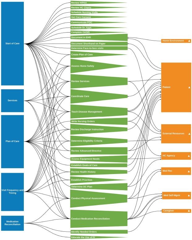
Enhanced node-link diagram of four clinical decisions and start of care. Nodes are organized by type (decision, task, and information). Node side height indicates the number of links. Direction links indicate information generation or use. Triangles indicate that information themes can be decomposed into sub-themes.
The focus group identified seven themes of information generated from tasks to make clinical decisions:
Patient (e.g., vital signs);
Resources external to the home (e.g., insurance coverage);
Home environment (e.g., clutter);
Medication reconciliation;
Medication self-administration;
Caregiver; and
Home care agency resources (e.g., services, policies and procedures).
These information themes were distributed among clinical decisions, with some information types occurring in more than one clinical decision. The seven information themes contained 51 sub-themes. Of these sub-themes, 38 were distributed in the seven information themes as follows (details appear in Figure 2): 22 in Patient Information, 3 Medication Reconciliation, 5 Medication Self-Management, 2 Home Care Agency Resources, External Resources, 1 Home Environment, and 1 Caregiver. The remaining 13 sub-themes were not related to a task and were not shown in the visualizations. Almost all these sub-themes were patient sub-themes (e.g., allergies, baseline function, admission indication), with one external resource theme (i.e., community resources needed). With respect to Medication Reconciliation, the focus group participants clarified that this clinical decision has two main aspects: 1) comparison of the patient’s medications to the discharge documentation medication list (drug name, dosage, frequency, and route) and 2) medication self-management (e.g., the patient understanding and ability to self-manage the medication (e.g., self-administration)).
Node-link analysis
The node-link diagram shown in Figure 2 with the abbreviations in Table 2 characterizes the relationships between tasks, information, and clinical decisions. Figure 2 was designed to show the high level findings from the focus group. Figures 3 and 4 were designed to highlight specific design features related to the decomposition of information into sub-themes. Each diagram has three columns: nodes in the same category are organized by vertical position. The left column shows the clinical decisions of interest in the study. The middle column contains the tasks. The right column shows the nodes of information grouped into the aggregated themes. The color of the node indicates node type taxonomy (e.g., clinical decision nodes are blue). The horizontal links between nodes indicate associations between tasks, information, and decisions. The vertical edge of the node is proportional to the number of links adjacent to that edge and can indicate prominent tasks and information. Directed links were included when relevant. For example, if the flow is from task to information, then the task generates the information. An example of the opposite direction is a cluttered home (information) which is a reason for the nurse to document in the EHR outside the home (task).
Table 2.
Abbreviations in Figures
| Abbreviation | Name |
|---|---|
| HIPAA | Health Insurance Portability and Accountability Act |
| HC | Health Care |
| POC | Plan of Care |
| OASIS | Outcome and Assessment Information Set |
| EHR | Electronic Health Record |
| DC | Discharge |
| IV | Intravenous therapy |
| Med Rec | Medication Reconciliation |
| Med Self-Mgmt | Medication Self-management |
Figure 3.
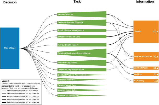
Enhanced node-link diagram of plan of care clinical decision information. The total number of information sub-themes of an information theme is indicated with the number next to the triangle in the information theme node rectangle. For a task-information theme pair, the number of shared information sub-themes is indicated by the line style thickness of the associated link
Figure 4.
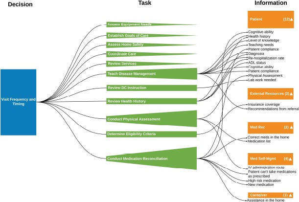
Visualization of visit timing and frequency decision showing information sub-themes
Figure 2, as a high level summary, illustrates a number of design features. Regarding the clinical decisions, the Start of Care, Plan of Care, and Visit nodes have longer vertical sides (indicating more links) than the Medication Reconciliation and Services nodes. Among the 28 tasks, the majority have nodes with sides of shorter height (nodes with few links) meaning that there is a small set of information types associated with the tasks. The few task nodes with sides having larger height are: Medication Reconciliation; Disease Management Teaching; Obtain Health History; Conduct Review of Services; the Physical Assessment; and Document in the EHR. These tasks thus are associated with many different types of information. Eleven task nodes do not link to an information node and this lack of associations is apparent in the figure. During the focus group no associated information was mentioned for these tasks: participants did not mention generating or using information types.
Among the seven information themes, the Patient theme dominates with respect to the number of tasks that generate information. This is as expected as the purpose of the admission is to assess the patient’s situation and needs in order to develop the plan of care.
To support analysis for each clinical decision, we created a separate node-link diagram. Plan of Care (Figure 3) includes 13 tasks and 5 information themes (27 sub-themes). The Conduct Medication Reconciliation task node has the most links to information types and thus its longer left side is salient in the figure. Five tasks did not connect to an information theme and thus come to point on the left side. These pointed sides are also salient and may indicate where further discussion with subject matter experts is warranted. The information group with the most associations was Patient, as expected.
Links between task and information nodes have different line thickness to indicate the number of associated subthemes. For example, the task, Establish the Goal of Care, was associated with 5 information sub-themes (Diagnosis, Other Therapy Needed, Patient’s Desired Outcomes, Pre-Hospitalization Baseline, OASIS, and Start Of Care Assessment). Having an ability to be able to drill down into the sub-themes is the focus of the visualization in Figure 4.
Visit Frequency and Timing had 11 tasks, six of which linked to an information theme (Figure 4). This clinical decision had five information themes and 21 information sub-themes. The information theme, Caregiver, appeared in only this diagram. This situation is clear in Figure 2 as there is only one link to this node. However, in Figure 2 it is not clear which decision is relevant. Of special interest were task nodes with fewer links (and thus shorter sides) than expected. In addition, there were task nodes with no links to information nodes. Team members knowledgeable of home care admissions (KB, PS, EB) identified cases where the visualization results did not match their observations of admissions or their knowledge of the admission process. One would expect, for example, that the Assess Home Safety task would link to the information theme Home Environment. The team was cognizant that sparse or absent links may have been due to data collection limitations (75-minute period).
As in Figure 3, Figure 4 includes the number of links between tasks and sub-themes, as indicated by line width. Figure 4 also includes the specific information sub-themes associated with the tasks in the information nodes. While somewhat cluttered, this representation showed, for example, that information sub-themes such as Health History and Diagnosis can be generated from multiple tasks. This type of analysis would be more difficult to conduct without the sub-theme data.
The diagram for Services (not included as a separate figure herein for space reasons) includes very few nodes, having only six tasks and no information themes. This finding related to Services was unexpected, as in our admission nurse observations, we documented the nurse receiving an intake form with specific information pertaining to the services ordered by the physician. For example, we expected to see the Services decision linked to the task, Review the Home Care Chart, which was linked to the information item, Home Care Agency Resources.
The medication reconciliation diagram (not included as a separate figure for space) included four tasks and three information themes. Two tasks (Educate the Use of IV and Medication Reconciliation) did not link to information. However, we would have expected the task of Educate the Use of IV to link to the Patient information node, to ascertain the patient’s medication self-management capability.
Start of Care (SOC) (not included for space) contained the most tasks, which was expected as the SOC is the main purpose of the nurse’s visit. However, 11 tasks linked exclusively to SOC did not link to an information group. The diagram indicated that the SOC involved many tasks to gather a plethora of information.
Discussion
We investigated home care nurses’ information needs during the admission with qualitative data derived from a focus group. We developed a custom node-link diagram visualization of the themes that emerged related to admission nurses’ tasks and information related to four clinical decisions. The node-link analysis revealed the relationships between tasks, information, and decisions as well as highlighted cases where more data may need to be collected.
From an analyst’s perspective, the visualizations help to answer a number of types of questions. The first are exploratory questions. Information emerges from the node-link diagrams which the analyst may not have noticed otherwise. For example, information about the home environment was sparse (Figure 2). In our observations of home care admissions, nurses often identified the need for occupational therapy. Those therapists would assess the safety of the home in a separate visit. This lack of a connection in the node-link diagram, for example, highlights the need to ensure that the nurse assumes that another clinician (e.g., occupational therapist) is responsible for surveying the home environment. This assumption is based on the nurse’s expectation that the therapist would contribute to an assessment of patient safety.
The second type of question is related to our interpretation of the data, and checking back with the subject matter experts to verify what the data suggest. As indicated in Figure 1, there are many ways links between categories of information can be represented. In Figure 1 relationships were identified using colored circles. During the focus group, the nurses were reminded what the colors represented. The data visualization graphics may be more informative to the nurses as compared to a flip chart, spreadsheet or table. Also it allows patterns to be identified using perceptual abilities. For example, the Visit Timing and Frequency diagram (Figure 4) indicates the Caregiver information theme is linked to Conduct Medication Reconciliation. However, there is no link from Conduct Physical Assessment to Caregiver, contrary to our observations during nurse assessment of patient functional status related to activities of daily living (e.g., ability to bath, toilet). Here, the nurse could be shown the gap (the lack of a link) and asked if the physical assessment task was conducted to garner information about the caregiver situation.
Another type of question is related to admission workflow: showing where the nurse was expending effort to do something that may better be achieved by another entity or process. For example, the nurse obtains eligibility criteria information (e.g., insurance coverage, homebound status) from the patient during the start of care (Figure 2). Obtaining this information does not require clinical expertise, nor does the task generate information used by the nurse. After member-checking, this finding might indicate a change in workflow or a need for interoperability which could be incorporated in a requirements document. Similarly, the diagrams indicate where the nurse conducted many tasks (e.g., start of care, plan of care) which did not produce information needed for the admission.
The fourth type of question is relevant to the methods used to collect information. In this case, did our focus group data collection method provide a consistent set of information? For example, the Medication Reconciliation task is associated with decisions and information, and occurs among all clinical decisions and Start of Care (see five links going into the node in Figure 2). Member checking would inform the team whether the occurrence of different information related to medication reconciliation distributed among the four clinical decisions was meaningful or was an artifact of how the question was asked. Another method question is whether the numerous tasks and the sparse Services diagram indicate that the 75-minute data collection may not have been enough time. The data visualization does suggest where the gaps in data are, so that during the next data collection the team can probe further.
Our custom visualization includes design features to support the production of unique node-link diagrams (Table 1). In this case study, we presented different combinations of the design features in Figures 3 and 4. In future work, we will evaluate the efficacy of the visualizations in check backs with the home care agency. Future work should investigate the implementation of the design guidelines in Table 1 with respect to usability as well as extending the set of features included. We can develop additional representation guidelines related to the links, such line color or line style, and related to the nodes, such as symbol shape, to represent additional features.
Table 1.
Visualization Features
| Features | Representation |
|---|---|
| Decisions that nurses make during the start of care | Rectangle with decision name |
| Tasks that nurses complete to make each decision | Rectangle with task name |
| Information that nurses use to make each decision | Rectangle with information element name |
| Association between tasks and decisions | Link |
| Association between tasks and information | Link |
| Number of tasks associated with each decision | Decision node rectangle height |
| Number of decisions associated with each task | Task node height (left side of isosceles trapezoid/triangle) |
| Number of information themes associated with each task | Quadrilateral height (right side of isos-celes trapezoid/triangle) |
| Number of tasks associated with an information element | Information node height |
| Directional flow between task and information (indicating that a task either generates information or uses information) | Arrows |
| Indication that a theme can be decomposed into sub-themes | Filled triangle |
| Number of sub-themes that compose an information theme | A number associated with information theme |
| Number of sub-themes of information theme that are associated with a task | Link line style thickness (the more sub-themes, the thicker the line style) |
| The sub-themes that compose an information theme | List |
Conclusion
We developed a custom information visualization to characterize the decision-making process of home care nurses during admission. This visualization has advantages, compared to other methods such as a flow chart, information flow diagram, or decision ladder13 that respectively show detailed process information for an individual activity, how information is communicated, and decompositions of decision sequences and short cuts that can be taken in the process. The node-link diagram can be synergistic with those techniques and be helpful in answering other types of questions. An advantage of the information visualization method was that it provided a high-level view of themes and relationships of clinical decisions, tasks, and information. This high-level representation enabled us to have a systematic understanding of the decision-making process, i.e., how information is used (and not used) in multiple tasks and decisions. Detailed diagrams with information about sub-themes helped to highlight information used across tasks. We anticipate that the data visualization method will be useful outside of healthcare in domains that have limited numbers of decisions, tasks, and information elements, for those seeking to map information-related decision-making.
Acknowledgements
This research is supported by the Agency for Healthcare Research and Quality (AHRQ) Grant # R01 HS024537. The authors thank Wei Quan for encoding data visualizations that were used in an earlier version of this manuscript. They also thank the home care agency and the participants. And the authors thank the anonymous reviewers who encouraged the authors to improve upon the originally submitted data visualizations.
References
- 1.National Association for Home Care and Hospice. Basic statistics about home care no. 202.547.7424. Ntl Assoc Home Care. 2010. pp. 1–21.
- 2.Parker E, Zimmerman S, Rodriguez S, Lee T. Exploring best practices in home health care: A review of available evidence on select innovations. Home Health Care Management & Practice. 2013;26:17–33. [Google Scholar]
- 3.Bowles KH, Pham J, O’Connor M, Horowitz DA. Information deficits in home care: A barrier to evidence- based disease management. Home Health Care Mngmt Pract. 2010 Dec;22(4):278–285. [Google Scholar]
- 4.Anderson Helms LB, Black S, Myers DK. A rural perspective on home care communication about elderly patients after hospital discharge. Western Journal of Nursing Research. 2000;22(2):225–243. doi: 10.1177/019394590002200208. [DOI] [PubMed] [Google Scholar]
- 5.Anderson M. A, Helms L. An assessment of discharge planning models: Communication in referrals for home care. Orthopaedic Nursing. 1993;12(4):41–49. doi: 10.1097/00006416-199307000-00012. [DOI] [PubMed] [Google Scholar]
- 6.Knuth Donald E. “Two thousand years of combinatorics”. In: Wilson Robin, Watkins John J., editors. Combinatorics: Ancient and Modern. Oxford University Press; 2013. pp. 7–37. [Google Scholar]
- 7.Merrill J, Sheehan B, Carley K, Stetson P. Transition networks in a cohort of patients with congestive heart failure: A novel application of informatics methods to inform care coordination. App Clin Inform. 2015;6(3):548–564. doi: 10.4338/ACI-2015-02-RA-0021. [DOI] [PMC free article] [PubMed] [Google Scholar]
- 8.Sockolow PS, Lehmann HP, Bowles KH, Weiner JP. Are nurses happier after an electronic health record is implemented at a nurse-managed practice for the elderly? CIN. 2009;27(5):330–331. [Google Scholar]
- 9.Sockolow P, Bass E. J, Eberle C. L, Bowles K. H, Sermeus W, Procter P.M, Weber P. Homecare nurses’ decision-making during admission care planning. Nursing Informatics 2016: Studies in Health Technology and Informatics. 2016 Jun 25-29;:28–32. Geneva, Switzerland. [PubMed] [Google Scholar]
- 10.Sockolow PS, Bowles KH, Adelsberger MC, Chittams JL, Liao C. Challenges and facilitators to adoption of a point-of-care electronic health record in home care. Home Health Care Services Quarterly. 2013;192:939. doi: 10.1080/01621424.2013.870098. [DOI] [PMC free article] [PubMed] [Google Scholar]
- 11.Sockolow PS, Bowles KH, Adelsberger M, Liao C, Chittams JL. Impact of home care electronic health record on clinician satisfaction, timeliness of clinical documentation and reimbursement, and patient outcomes. Applied Clinical Informatics. 2014;5(2):445–462. doi: 10.4338/ACI-2013-12-RA-0106. [DOI] [PMC free article] [PubMed] [Google Scholar]
- 12.Shneiderman Ben. Visual Languages. Proceedings, IEEE Symposium on Human Factors in Computing Systems. IEEE; 1996. “The eyes have it: A task by data type taxonomy for information visualizations.”; pp. 336–343. [Google Scholar]
- 13.Rasmussen J. Models of mental strategies in process plant diagnosis. In: Rasmussen J, Rouse W B, editors. Human detection and diagnosis of system failures. New York, NY: Plenum Press; 1981. pp. 241–258. [Google Scholar]