. 2018 Jul 17;7:e35471. doi: 10.7554/eLife.35471

Figure 4. Genes located in hotspot regions.

(A) Histogram showing the number of genes located in the hotspot regions. (B) A hotspot on chromosome VIII maps to the gene STB5. From top to bottom: the general region on the chromosome, the empirical frequency distribution of hotspot peak locations from 1000 bootstrap samples (Materials and methods), locations of BY/RM sequence variants (red: variants with ‘high’ impact such as premature stop codons (McLaren et al., 2016); orange: ‘moderate’ impact such as nonsynonymous variants; grey: ‘low’ impact such as synonymous or intergenic variants), and gene locations. The light blue area shows the 95% confidence interval of the hotspot location as determined from the bootstraps. The red line shows the position of the most frequent bootstrap marker. (C) Genes for which the BY allele at the STB5 hotspot is linked to lower expression are enriched for STB5 transcription factor (TF) binding sites in their promoter regions. The figure shows enrichment results for all annotated TFs (grey dots), with the strength of enrichment (odds ratio) on the x-axis vs. significance of the enrichment on the y-axis. The STB5 result is highlighted in red.

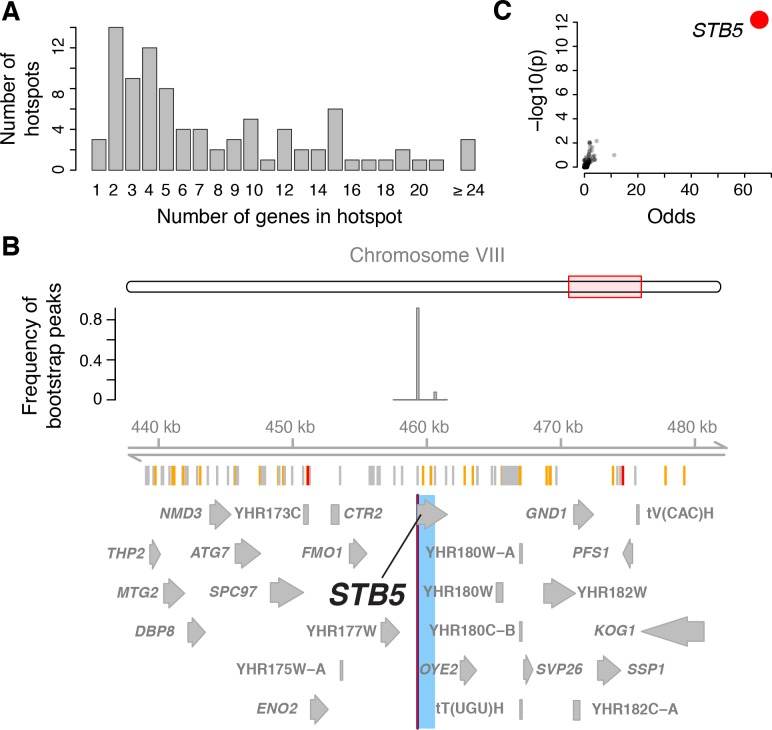
Figure 4.

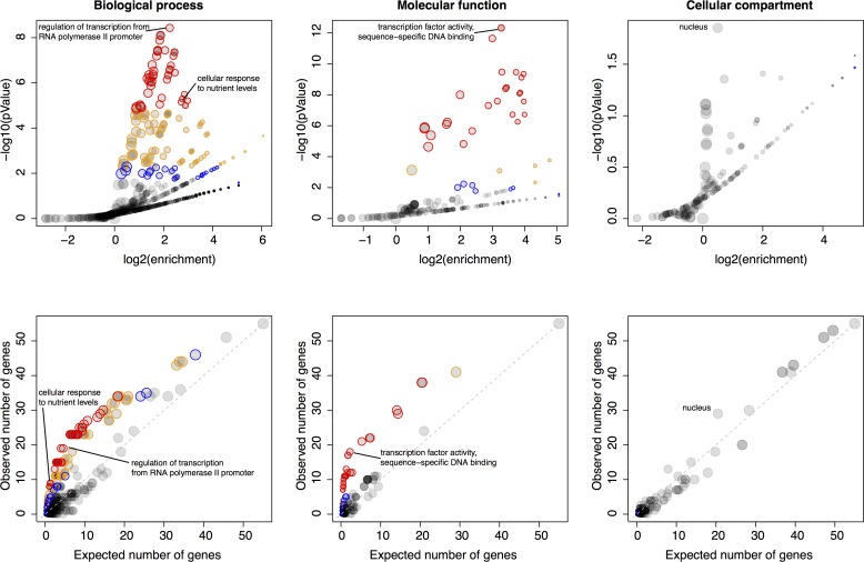
Figure 4—figure supplement 1. Gene ontology (GO) enrichments of genes located in hotspots.

Figure 4—figure supplement 1.

For each major GO category of ‘Biological Process’, ‘Molecular Function’, and ‘Cellular Compartment’, the figure shows two panels. The most significant GO term as well as GO terms discussed in the main text are indicated. Top panels: Relationship between strength (x-axis) and significance (y-axis) of the GO enrichment. Each GO term is plotted as a dot, with size scaled as a function of the number of terms in the GO group. Note how the relationship between enrichment strength and significance depends on GO category size. Different levels of significance are indicated by colored circles. With decreasing stringency, these colors indicate: Red: p<0.05 after Bonferroni correction for the number of GO terms tested; Orange: permutation-based p<0.005, corresponding to an FDR of 5% (Materials and methods), Blue: GO term specific permutation-based p<0.01. Bottom panels: The number of genes in each GO term expected to be significant based on GO category size (x-axis) vs. the number of genes in each GO term observed to be significant. Color codes are as in the top panels. The diagonal line indicates observations that match the expectation.
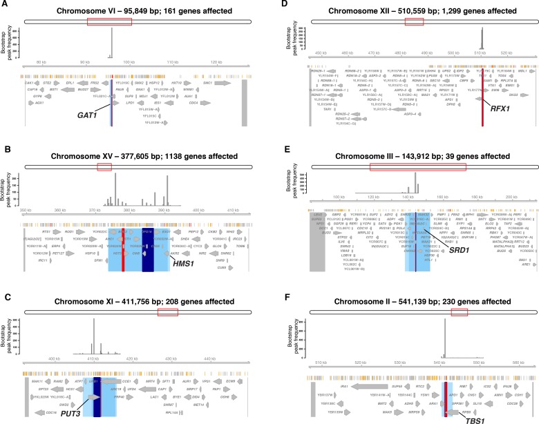
Figure 4—figure supplement 2. Hotspots at six transcription factor genes with damaging mutations.

Figure 4—figure supplement 2.

Each panel shows the region surrounding one hotspot containing (A) GAT1, (B) HMS1, (C) PUT3, (D) RFX1, (E) SRD1, and F) TBS1. Panel elements are as in Figure 4. Blue area shows the 90% confidence interval of hotspot location, and lighter blue areas shows the 95% confidence interval. The entire region tested in the bootstrap analysis is delimited by two markers shown as grey lines at the outer edges of the plots. These markers and the peak markers are padded to span all variants that are in perfect linkage disequilibrium with the given marker.
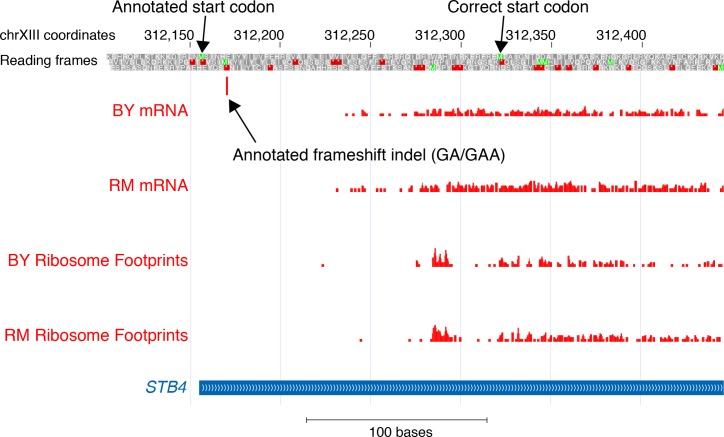
Figure 4—figure supplement 3. mRNA and translation at STB4.

Figure 4—figure supplement 3.

The figure shows the position of the first base in aligned reads from mRNA sequence and ribosome profile data (Albert et al., 2014a) in BY and RM. The annotated frameshift is located in a region without any mRNA or ribosome footprint reads. The annotated (presumably incorrect) and the likely correct start codon of STB4 are indicated.
Figure 4—figure supplement 4. The ERC1 hotspot.

Figure 4—figure supplement 4.

(A) The region surrounding the ERC1 hotspot. Legend as in Figure 4B. The entire region tested in the bootstrap analysis is delimited by two markers shown as grey lines at the outer edges of the plots. These markers and the peak markers are padded to span all variants that are in perfect linkage disequilibrium with the given marker. (B) A visual representation of the top 50 genes affected by the hotspot. Each gene is shown as a dot, with size scaled as a function of the size of the effect of the hotspot on the gene. We show genes with lower expression linked to the BY allele. Genes with a local eQTL anywhere in the region tested in the bootstrap analysis are indicated by orange circles. Edges between genes indicate co-expression in a gene regulatory network (Zhang and Kim, 2014). Blue edges: positive co-expression, red edges: negative co-expression. Note the group of genes with methionine-related functions, including MET17.