. 2018 Aug 14;7:e34848. doi: 10.7554/eLife.34848

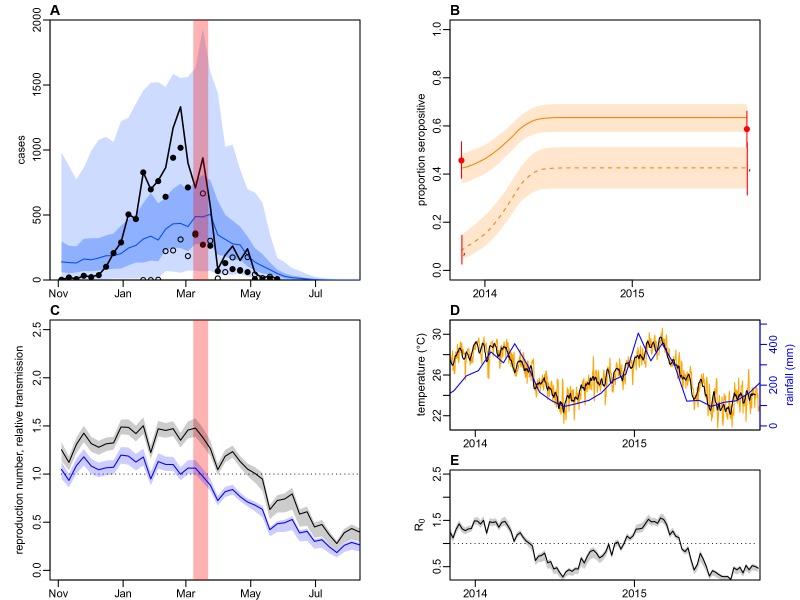
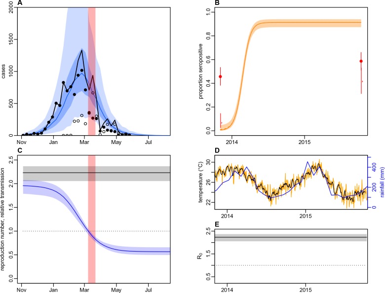
Figure 5. Impact of climate and control measures on DENV transmission during 2013/14, using a model jointly fitted to surveillance and serological data from Central Division.

(A) Model fit to surveillance data. Solid black dots, lab tested dengue cases; black circles, DLI cases; black line, total cases. Blue line shows median estimate from fitted model; dark blue region, 50% credible interval; light blue region, 95% CrI; red region shows timing of clean-up campaign. (B) Pre- and post-outbreak DENV immunity. Red dots show observed MIA seroprevalence against DENV-3 in autumn 2013 and autumn 2015; hollow dots, under 20 age group; solid dots, 20+ age group; lines show 95% binomial confidence interval. Dashed orange line shows model estimated rise in immunity during 2013/14 in under 20 group; solid line shows rise in 20+ group; shaded region shows 95% CrI. (C) Estimated variation in transmission over time. Red region, timing of clean-up campaign; green line, relative transmission as a result of control measures. Black line, basic reproduction number, R0; blue line, effective reproduction number, R, accounting for herd immunity and control measures. Shaded regions show 95% CrIs. Dashed line shows the R=1 herd immunity threshold. (D) Average monthly rainfall (blue lines) and daily temperature (orange line, with black line showing weekly moving average) in Fiji during 2013–15. (E) Change in R0 over time. Shaded regions show 95% CrIs.

Figure 5.

Figure 5—figure supplement 1. Illustration of model variation in transmission as a result of climate and control.

Figure 5—figure supplement 1.

(A) Daily average temperature in Fiji during 2013/14; black line shows 7 day moving average (B) Average monthly rainfall in Fiji between 2003and 2014; thick lines show 2013/14 season. (C) Assumed relationship between temperature and mean vector lifespan (Mordecai et al., 2017). Blue lines show maximum and minimum temperature observed in Fiji during the 2013/14 season. (D) Relationship between temperature and extrinsic incubation period. (E) Relationship between temperature and probability of vector-to-human transmission. (F) Relationship between temperature and probability of human-to-vector transmission. (G) Relationship between temperature and daily biting rate. (H) Relationship between temperature and vector density (normalised to value at 25°C). (I) Relationship between rainfall and vector density (normalised to value at 400 mm). Solid line shows K^=0.01, dashed line, K^=1, dotted line, K^=100. (J) Illustrative example of a sigmoidal drop in transmission after clean-up campaign introduced on 8th March 2014. Here we assume a decline of 50%; in the model analysis this parameter is fitted, along with the gradient and timing of the decline. Red region shows timing of clean-up campaign.

Figure 5—figure supplement 2. Dynamics of DENV transmission during 2013/14, using a model jointly fitted to surveillance and ELISA serological data from Central Division.

Figure 5—figure supplement 2.

(A) Model fit to surveillance data. Solid black dots, lab tested dengue cases; black circles, DLI cases; black line, total cases. Blue line shows median estimate from fitted model; dark blue region, 50% credible interval; light blue region, 95% CrI; red region shows timing of clean-up campaign. (B) Pre- and post-outbreak DENV immunity. Red dots show observed MIA seroprevalence against DENV-3 in autumn 2013 and autumn 2015; hollow dots, under 20 age group; solid dots, 20+ age group; lines show 95% binomial confidence interval. Dashed orange line shows model estimated rise in immunity during 2013/14 in under 20 group; solid line shows rise in 20+ group; shaded region shows 95% CrI. (C) Estimated variation in transmission over time. Red region, timing of clean-up campaign; green line, relative transmission as a result of control measures. Black line, basic reproduction number, R0; blue line, effective reproduction number, R, accounting for herd immunity and control measures. Shaded regions show 95% CrIs. Dashed line shows the R=1 herd immunity threshold. (D) Average monthly rainfall (blue lines) and daily temperature (orange line, with black line showing weekly moving average) in Fiji during 2013–15. (E) Change in R0 over time. Shaded regions show 95% CrIs.
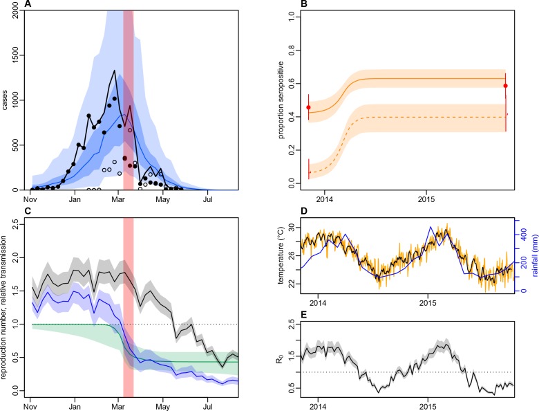
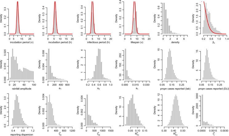
Figure 5—figure supplement 3. Posterior parameter estimates for the model with climate and control measures.

Figure 5—figure supplement 3.

Histograms show the estimated posterior distributed from the MCMC chain, discarding burn in iterations, for each parameter in Table 7. Red lines show prior distributions if informative priors were used for that parameter.

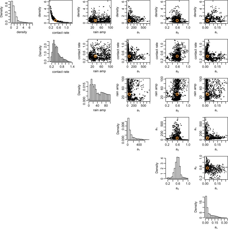
Figure 5—figure supplement 4. Correlation between posterior distributions of transmission rate parameters.

Figure 5—figure supplement 4.

Black dots show samples from the joint posterior distribution, with median given by orange circle. Histograms show the marginal posterior for each parameter.

Figure 5—figure supplement 5. Dynamics of DENV transmission during 2013/14, using a model jointly fitted to surveillance and MIA serological data from Central Division, with only climate-based variation in transmission.

Figure 5—figure supplement 5.

(A) Model fit to surveillance data. Solid black dots, lab tested dengue cases; black circles, DLI cases; black line, total cases. Blue line shows median estimate from fitted model; dark blue region, 50% credible interval; light blue region, 95% CrI; red region shows timing of clean-up campaign. (B) Pre- and post-outbreak DENV immunity. Red dots show observed MIA seroprevalence against DENV-3 in autumn 2013 and autumn 2015; hollow dots, under 20 age group; solid dots, 20+ age group; lines show 95% binomial confidence interval. Dashed orange line shows model estimated rise in immunity during 2013/14 in under 20 group; solid line shows rise in 20+ group; shaded region shows 95% CrI. (C) Estimated variation in transmission over time. Red region, timing of clean-up campaign; green line, relative transmission as a result of control measures. Black line, basic reproduction number, R0; blue line, effective reproduction number, R, accounting for herd immunity and control measures. Shaded regions show 95% CrIs. Dashed line shows the R=1 herd immunity threshold. (D) Average monthly rainfall (blue lines) and daily temperature (orange line, with black line showing weekly moving average) in Fiji during 2013–15. (E) Change in R0 over time. Shaded regions show 95% CrIs.
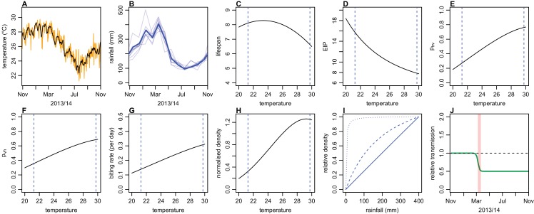
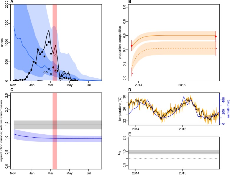
Figure 5—figure supplement 6. Dynamics of DENV transmission during 2013/14, using a model jointly fitted to surveillance and MIA serological data from Central Division, without time-varying transmission.

Figure 5—figure supplement 6.

(A) Model fit to surveillance data. Solid black dots, lab tested dengue cases; black circles, DLI cases; black line, total cases. Blue line shows median estimate from fitted model; dark blue region, 50% credible interval; light blue region, 95% CrI; red region shows timing of clean-up campaign. (B) Pre- and post-outbreak DENV immunity. Red dots show observed MIA seroprevalence against DENV-3 in autumn 2013 and autumn 2015; hollow dots, under 20 age group; solid dots, 20+ age group; lines show 95% binomial confidence interval. Dashed orange line shows model estimated rise in immunity during 2013/14 in under 20 group; solid line shows rise in 20+ group; shaded region shows 95% CrI. (C) Estimated variation in transmission over time. Red region, timing of clean-up campaign; green line, relative transmission as a result of control measures. Black line, basic reproduction number, R0; blue line, effective reproduction number, R, accounting for herd immunity and control measures. Shaded regions show 95% CrIs. Dashed line shows the R=1 herd immunity threshold. (D) Average monthly rainfall (blue lines) and daily temperature (orange line, with black line showing weekly moving average) in Fiji during 2013–15. (E) Change in R0 over time. Shaded regions show 95% CrIs.
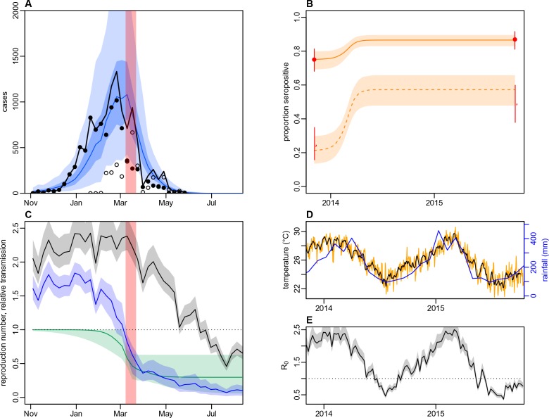
Figure 5—figure supplement 7. Dynamics of DENV transmission during 2013/14, using a model fitted only to surveillance data from Central Division, without time-varying transmission.

Figure 5—figure supplement 7.

(A) Model fit to surveillance data. Solid black dots, lab tested dengue cases; black circles, DLI cases; black line, total cases. Blue line shows median estimate from fitted model; dark blue region, 50% credible interval; light blue region, 95% CrI; red region shows timing of clean-up campaign. (B) Pre- and post-outbreak DENV immunity. Red dots show observed MIA seroprevalence against DENV-3 in autumn 2013 and autumn 2015; hollow dots, under 20 age group; solid dots, 20+ age group; lines show 95% binomial confidence interval. Dashed orange line shows model estimated rise in immunity during 2013/14 in under 20 group; solid line shows rise in 20+ group; shaded region shows 95% CrI. (C) Estimated variation in transmission over time. Red region, timing of clean-up campaign; green line, relative transmission as a result of control measures. Black line, basic reproduction number, R0; blue line, effective reproduction number, R, accounting for herd immunity and control measures. Shaded regions show 95% CrIs. Dashed line shows the R=1 herd immunity threshold. (D) Average monthly rainfall (blue lines) and daily temperature (orange line, with black line showing weekly moving average) in Fiji during 2013–15. (E) Change in R0 over time. Shaded regions show 95% CrIs.