Abstract
Since the first publications coining the term RNA-seq (RNA sequencing) appeared in 2008, the number of publications containing RNA-seq data has grown exponentially, hitting an all-time high of 2,808 publications in 2016 (PubMed). With this wealth of RNA-seq data being generated, it is a challenge to extract maximal meaning from these datasets, and without the appropriate skills and background, there is risk of misinterpretation of these data. However, a general understanding of the principles underlying each step of RNA-seq data analysis allows investigators without a background in programming and bioinformatics to critically analyze their own datasets as well as published data. Our goals in the present review are to break down the steps of a typical RNA-seq analysis and to highlight the pitfalls and checkpoints along the way that are vital for bench scientists and biomedical researchers performing experiments that use RNA-seq.
Keywords: RNA sequencing, transcriptomics, bioinformatics, data analysis
RNA sequencing (RNA-seq) was first introduced in 2008 (1–4) and over the past decade has become more widely used owing to the decreasing costs and the popularization of shared-resource sequencing cores at many research institutions. The increased popularity of RNA-seq has led to a fast-growing need for bioinformatics expertise and computational resources. In order for bench scientists to correctly analyze and process large datasets, they will need to understand the bioinformatics principles and limitations that come with the complex process of RNA-seq analysis. Although RNA-seq analysis can be incredibly powerful and can uncover many exciting new findings, it differs from the usual analyses bench scientists are used to in that it comes as a very large dataset that cannot be interpreted without extensive analysis.
The protocol of RNA-seq starts with the conversion of RNA, either total, enriched for mRNA, or depleted of rRNA, into cDNA. After fragmentation, adapter ligation, and index ligation, each cDNA fragment is subsequently sequenced or “read” using a high-throughput platform. Raw read data then are demultiplexed, aligned, and mapped to genes to generate a raw counts table, at which point the data often are handed over to the bench researcher to start his or her own analysis. No true consensus exists yet on the most appropriate pipeline for RNA-seq data processing; however, there are numerous online semiautomated tools available, such as BaseSpace (Illumina), MetaCore (Thomson Reuters), or Bluebee (Lexogen). Although these tools generate principal component analysis (PCA) plots, display heat maps, and run differential gene expression analysis without the assistance of a bioinformatician, they do not allow users to fully assess the quality of their data, determine the accuracy of their own analysis, and tailor the analysis to their biological question, which can lead to misinterpretation of the dataset. It is important for investigators to understand how to approach their dataset, to appreciate the characteristics of their dataset, and to watch for weaknesses in the data that may limit the ability to draw conclusions. In addition, it is imperative that each dataset be analyzed de novo, in the sense that thresholds and methods must be adapted anew, which cannot be achieved by using generic online apps or tools.
For the purposes of this methods paper, we used an example dataset from an experiment within our research group in which naive murine alveolar macrophages were compared with those isolated from transplanted lungs 2 and 24 hours postreperfusion. We present our analysis using this dataset to describe a user-friendly approach to RNA-seq analysis for a bench scientist.
Methods
Mice and Reagents
Male Cx3cr1gfp/+ mice on a C57BL/6 background and wild-type BALB/c mice aged 12–14 weeks were used. All mice were housed in a specific pathogen–free facility. All reagents were certified endotoxin free by the manufacturer. All studies were conducted in compliance with guidelines of the Northwestern University Animal Care and Use Committee.
Murine Single-Lung Transplant
Transplants were performed between allogeneic mismatched donor–recipient pairs as described previously (5). Specifically, donor lungs from Cx3cr1gfp/+ mice were used as allografts and implanted into wild-type BALB/c recipients. In brief, donor mice were heparinized and flushed antegrade through the pulmonary artery, the trachea were ligated after lungs were recruited, and then the heart-lung block was harvested and kept at 4°C for a 2-hour period of cold ischemia. Anastomoses for the single left lung transplant were completed using the cuffed technique through a left thoracotomy; the lung was reperfused and re-recruited; and then the thoracotomy was closed in layers. Mice were weaned from the ventilator and extubated during recovery once they were ambulatory. At specified time points after reperfusion, recipient mice were killed, and the lung allograft was harvested.
Tissue Digest and Single-Cell Preparation
Lungs were processed for single-cell suspensions as described previously (5). Briefly, the right ventricle was flushed with 10 ml of ice-cold Hanks’ balanced salt solution, then the lungs were infiltrated with a tissue digestion mixture containing collagenase D (Roche) and DNase I (Roche). A combination of mechanical dissociation using the GentleMACS (Miltenyi Biotec) and enzymatic digestion at 37°C for 30 minutes was performed. Samples were then enriched using CD45 microbeads (Miltenyi Biotec) and AutoMACS system (Miltenyi Biotec) before antibody staining.
Fluorescence Activated Cell Sorting
See Table E1 in the data supplement for antibodies and dilutions used for staining of single-cell suspension and Figure E1 for the gating strategy for sorting of alveolar macrophages. Cells were sorted into magnetic-activated cell sorting buffer at 4°C using a BD FACSAria II SORP four-laser flow cytometer (BD Biosciences).
RNA Isolation and Library Preparation
Freshly sorted cells were pelleted immediately, resuspended in 100 μl of PicoPure Extraction Buffer (Thermo Fisher Scientific), and then stored at −80°C. RNA isolation was performed using the PicoPure RNA isolation kit (Thermo Fisher Scientific), and samples with high-quality RNA (RNA integrity number, >7.0) as measured using the 4200 TapeStation (Agilent Technologies) were used for library preparation. The mRNA was obtained from total RNA using NEBNext Poly(A) mRNA magnetic isolation kits (New England BioLabs), and cDNA libraries were subsequently prepared using the NEBNext Ultra DNA Library Prep Kit for Illumina (New England BioLabs). Libraries were sequenced on a NextSeq 500 platform using a 75-cycle single-end high-output sequencing kit (Illumina). Sequencing yielded libraries with an average size of 8 million reads after alignment. RNA-seq analysis was based on uniquely aligned reads.
Demultiplexing, Alignment, and Normalization
Reads were demultiplexed (bcl2fastq), and fastq files were aligned to the mm10 mouse genome (TopHat2 [6]) and mapped to genes (HTSeq [7]) using the Ensembl gene annotation. Pairwise comparisons between the various conditions were run using a negative binomial generalized log-linear model through the glmLRT fit function in edgeR (8, 9).
Data Availability
The RNA-seq data reported in this article has been deposited in NCBI’s Gene Expression Omnibus (GEO) and are accessible through GEO Series accession number GSE116583.
Results
Experimental Design and Approach
A major goal of RNA-seq analysis is to identify differentially expressed and coregulated genes and to infer biological meaning for further studies. Source material can be cells cultured in vitro, whole-tissue homogenates, or sorted cells. The ability to interpret findings depends on appropriate experimental design, implementation of controls, and correct analysis. Every effort should be made to minimize batch effect, because small and uncontrolled changes in an environment can result in identification of differentially expressed genes (DEGs) unrelated to the designed experiment. Sources of batch effect can occur during the experiment, during the RNA library preparation, or during the sequencing run and include but are not limited to those listed in Table 1. Once a well-designed and controlled experiment is performed, a structured approach to the dataset allows for quality control followed by unbiased analysis of the data. In the present analysis, we use an approach that includes setting low count filtering, establishing a noise threshold, checking for potential outliers, running appropriate statistical tests to identify DEGs, clustering of genes by expression pattern, and testing for gene ontology (GO) enrichment. For each of these analysis components, we aim to highlight important checkpoints and quality controls that will streamline and strengthen data analysis, avoid bias, and allow investigators to maximally use their datasets.
Table 1.
Sources of Batch Effect and Proposed Strategies to Mitigate Them
| Source | Strategy to Mitigate Batch Effect | |
|---|---|---|
|
Experiment | ||
| User | Minimize users or establish interuser reproducibility in advance. | |
| Temporal | Harvest cells or kill animals at the same time of day. | |
| Harvest controls and experimental conditions on the same day. | ||
| Environmental | If samples are to be collected in batches, minimize the time between batch collections. | |
| Use intraanimal, littermate, and cage mate controls whenever possible. | ||
|
RNA isolation and library preparation | ||
| User | Minimize users or establish interuser reproducibility in advance. | |
| Temporal | Perform RNA isolation on the same day, and avoid separate isolations over several days or weeks. | |
| Handle all samples in the same fashion (e.g., for freeze–thaws). | ||
| Environmental | Isolate RNA batches and prepare libraries using standard precautions to minimize contamination. | |
|
Sequencing run |
||
| Temporal | Sequence controls and experimental conditions on the same run. | |
For this tutorial, we use a dataset comprising three groups of alveolar macrophages that were studied in a murine model of lung transplantation during the first 24 hours of reperfusion. This approach (of which we make no claims of originality and refer the reader to an excellent review by Conesa and colleagues [10] outlining the major steps of RNA-seq data analysis) allows the investigator to probe the data in an unbiased manner in an effort to identify transcriptional signatures and to enable further downstream analyses.
Determining Intra- and Intergroup Sample Variability and Outliers
When assessing variability within the dataset, it is preferable that the intergroup variability, representing differences between experimental conditions in comparison with control conditions, is greater than the intragroup variability, representing technical or biological variability. A global overview of the data allows for the characterization of variation between replicates and whether investigator-defined experimental groups show actual differences between groups (a group being a set of replicates from the same condition or of the same cell type). One way to visualize the variation in a dataset is through PCA (11). PCA takes a large dataset as input and reduces the number of gene “dimensions” to a minimal set of linearly transformed dimensions reflecting the total variation of the dataset. The results are commonly presented as a two-dimensional plot in which data are visualized along axes that describe the variation within the dataset, known as the principal components (PCs). PC1 describes the most variation within the data, PC2 the second most, and so forth. The variation represented by each PC can be calculated as a percentage of the total variance and visualized by a scree plot. If the first two PCs do not capture the majority of the variance, it may be helpful to generate additional two-dimensional PCA plots displaying other PCs. In this way, a PCA plot may help to visualize grouping among replicates and aid in identifying technical or biological outliers.
Another approach to determining inter- and intragroup variability is to calculate distance as represented by correlation between samples. Two commonly used measures of correlation are the Pearson’s coefficient and the Spearman’s rank correlation coefficient (12–14), which describe the directionality and strength of the relationship between two variables. The Pearson’s correlation reflects the linear relationship between two variables accounting for differences in their mean and SD, whereas the Spearman’s rank correlation is a nonparametric measure using the rank values of the two variables. The more similar the expression profiles for all transcripts are between two samples, the higher the correlation coefficient will be. These correlation coefficients are calculated between all samples and can be visualized as either a table or a heat map, allowing the investigator to assess whether replicates (technical or biological) group together. In addition to allowing an assessment of variability, both PCA and sample correlation analysis can help to identify outliers that were not excluded during upstream steps such as alignment. For instance, a sample that aligned well and demonstrated good read depth might make it to this step of the pipeline; however, a PCA or correlation analysis may identify this library as a mislabeled or contaminated sample, clustering the outlier within another group. It is also possible that a correctly labeled sample will fall out as a biological outlier, such as if it was collected from an animal that was believed to have received a challenge but did not show symptoms. In summary, these analyses provide a global overview of all samples, allow for determination of outliers, and present data in an easy-to-digest format to the investigator and reader.
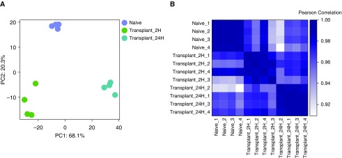
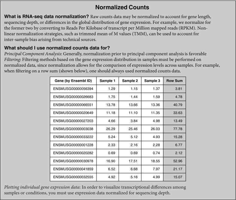
Using our alveolar macrophage dataset, we show a PCA plot and a heat map of Pearson’s correlation across alveolar macrophage samples: naive, transplant 2 hours postreperfusion, and transplant 24 hours postreperfusion sample groups (Figure 1A). Both the PCA plot and the Pearson’s correlation heat map were generated using normalized reads per kilobases of transcript per 1 million mapped reads (RPKM) counts (see Normalized Counts box). The PCA demonstrated expected grouping among replicates within samples and sample groups spread across the two PCs. PC1 accounts for 68.1% of the variance, and PC2 accounts for an additional 20.3%. The scree plot (Figure E2) confirmed that the majority of the variance within the dataset was described by the first two PCs. Although the PCA plot emphasizes intergroup variability, the Pearson’s correlation analysis (Figure 1B) provides an overview of all the variation between samples showing a correlation value of r > 0.9 (Table 2), consistent with each group belonging to the same cell type.
Figure 1.
Assessing inter- and intragroup variability. (A) Principal component (PC) analysis plot displaying all 12 samples along PC1 and PC2, which describe 68.1% and 20.3% of the variability, respectively, within the expression data set. PC analysis was applied to normalized (reads per kilobases of transcript per 1 million mapped reads) and log-transformed count data. (B) Pearson’s correlation plot visualizing the correlation (r) values between samples. Scale bar represents the range of the correlation coefficients (r) displayed.
Table 2.
Results of Pearson’s Correlation Analysis
| Sample | Naive_1 | Naive_2 | Naive_3 | Naive_4 | Transplant_2H_1 | Transplant_2H_2 | Transplant_2H_4 | Transplant_2H_3 | Transplant_24H_2 | Transplant_24H_1 | Transplant_24H_3 | Transplant_24H_4 |
|---|---|---|---|---|---|---|---|---|---|---|---|---|
| Naive_1 | 1 | 0.9986 | 0.9989 | 0.9953 | 0.9689 | 0.9517 | 0.9818 | 0.9348 | 0.9214 | 0.963 | 0.9606 | 0.9674 |
| Naive_2 | 0.9986 | 1 | 0.9993* | 0.9957 | 0.9716 | 0.9524 | 0.9808 | 0.9317 | 0.921 | 0.9609 | 0.9585 | 0.9641 |
| Naive_3 | 0.9989 | 0.9993 | 1 | 0.9939 | 0.9698 | 0.9511 | 0.9798 | 0.9304 | 0.9243 | 0.9643 | 0.9625 | 0.9676 |
| Naive_4 | 0.9953 | 0.9957 | 0.9939† | 1 | 0.9728 | 0.9541 | 0.9849 | 0.9413 | 0.9089 | 0.9497 | 0.9453 | 0.956 |
| Transplant_2H_1 | 0.9689 | 0.9716 | 0.9698 | 0.9728 | 1 | 0.9936 | 0.9929 | 0.978† | 0.9591 | 0.9702 | 0.9684 | 0.9752 |
| Transplant_2H_2 | 0.9517 | 0.9524 | 0.9511 | 0.9541 | 0.9936* | 1 | 0.9877 | 0.9915 | 0.9688 | 0.9718 | 0.9701 | 0.9768 |
| Transplant_2H_4 | 0.9818 | 0.9808 | 0.9798 | 0.9849 | 0.9929 | 0.9877 | 1 | 0.9812 | 0.9521 | 0.9727 | 0.9701 | 0.9806 |
| Transplant_2H_3 | 0.9348 | 0.9317 | 0.9304 | 0.9413 | 0.978 | 0.9915 | 0.9812 | 1 | 0.952 | 0.9543 | 0.9519 | 0.964 |
| Transplant_24H_2 | 0.9214 | 0.921 | 0.9243 | 0.9089‡ | 0.9591 | 0.9688 | 0.9521 | 0.952 | 1 | 0.9895 | 0.9891 | 0.9846 |
| Transplant_24H_1 | 0.963 | 0.9609 | 0.9643 | 0.9497 | 0.9702 | 0.9718 | 0.9727 | 0.9543 | 0.9895 | 1 | 0.998 | 0.9961 |
| Transplant_24H_3 | 0.9606 | 0.9585 | 0.9625 | 0.9453 | 0.9684 | 0.9701 | 0.9701 | 0.9519 | 0.9891 | 0.998* | 1 | 0.9975 |
| Transplant_24H_4 | 0.9674 | 0.9641 | 0.9676 | 0.956 | 0.9752 | 0.9768 | 0.9806 | 0.964 | 0.9846† | 0.9961 | 0.9975 | 1 |
The most correlated and least correlated samples within each group were selected on the basis of the following.
Highest r value, representing the most correlated samples, within each group.
Lowest r value, representing the least correlated samples, within each group.
Lowest correlation r value, representing the least correlated samples, within the entire dataset.
Filtering Out Noise
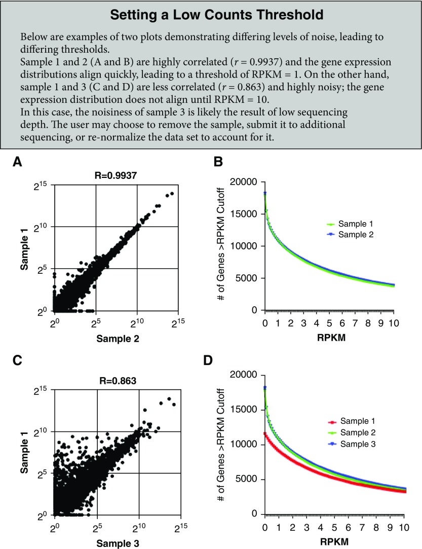
After outliers are excluded and variability is assessed, an analysis of the distribution of expressed genes can be helpful to determine a threshold for low expression based on sample-to-sample variation caused by technical factors, referred to as noise. One approach to viewing variability between samples is to generate a scatterplot comparing the normalized (RPKM) expression values for all genes in two different samples (see Setting a Low Counts Threshold box panels A and C for additional information) to visualize their similarity or correlation; this provides a more detailed view of genes driving the correlation. By comparing the similarity of expression across different ranges between replicates, the user can assess the level of noise. Another approach to determining a threshold for expression above noise is to compare the number of genes expressed at different cutoffs across all samples. This can be done by quantifying genes with expression above a given RPKM value in each sample (see Setting a Low Counts Threshold box panels B and D for additional information). To define the low expression or noise threshold, the user should decide on an RPKM cutoff when the sample lines begin to look similar. This approach takes into account a variety of factors, including sequencing depth, batch effects, and technical variability. The resulting threshold not only will impact the number of genes to be trimmed from the original dataset but may also affect the interpretation of individual gene expression graphs. For example, if the RPKM expression values for a given gene across two time points are plotted and show an expression change from 0.5 to 6 RPKM, one might believe this is a significant increase. However, taking into consideration the threshold for noise being set at 10 RPKM, the user cannot draw any conclusions for the expression change from 0.5 to 6 RPKM.
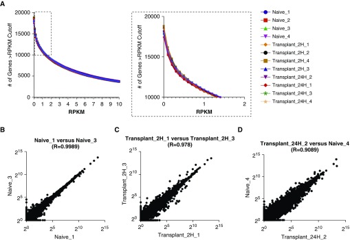
Our dataset shows high consistency in gene expression distribution among samples (Figure 2A), which is likely the result of the high read coverage and low technical variability across samples. Variation between samples can also be minimized by sequencing all samples on the same sequencing run, assuming a technically successful run. Moreover, plotting and comparing gene expression distribution for all samples, Figure 2A allows the investigator to define a threshold for low counts. In our example dataset, this cutoff was set at an RPKM expression value of 1 because this was the point at which all samples started to align and displayed distribution curves, as shown in the inset in Figure 2A.
Figure 2.
Determining a low count threshold. (A) The number of genes at a given reads per kilobases of transcript per 1 million mapped reads (RPKM) value for each sample (bins = 120; bin size = 0.1). Inset box enlarged at right highlights a subsection of the figure that was used to define an RPKM cutoff of 1 (bin size = 0.1). (B–D) Scatterplots comparing the expression of individual genes between two samples for (B) most correlated samples within a group (r = 0.9989), (C) least correlated samples within a group (r = 0.978), and (D) least correlated samples within the data set (r = 0.9089). Data are plotted on a log2 scale.
Alternatively, as depicted in Figures 2B and 2C, in which the expression level (in log2 RPKM) of each gene is plotted for biological replicates, the apparent similarity between samples decreases as intragroup variability (as defined by the correlation coefficient; Table 2) increases. Moreover, if replicates from two different groups are plotted (as an example of an error or mislabeling of a replicate), the correlation further decreases (Figure 2D). This can help guide the investigator to determine a threshold below which count values might become more difficult to interpret because replicates display higher levels of noise.
The above steps allow for genes with low expression levels that represent noise to be excluded before proceeding with analysis. This number does not need to be fixed or defined a priori and may change depending on the goals of the analysis, but it should remain constant throughout analysis. In general, a less stringent cutoff allows for more noise or “false positives” in the downstream analysis, and verification of findings should be performed. In contrast, high stringency may reduce sensitivity and lead to the removal of genes of interest. On the basis of the RPKM = 1 cutoff, we defined our thresholds for low count filtering as the number of samples in the dataset (n), because hypothetically an RPKM value of 1 for each sample would not prove to be useful for interpretation and further analysis. Therefore, we set our row sum filters to 12 for the “all-samples” dataset and 6 for the “most correlated” and “least correlated” datasets.
Identification of DEGs and Visualization
After the initial quality control steps, outlier removal, and filtering, the data are ready for analysis. We begin by defining DEGs with two general approaches: 1) pairwise comparison between two groups and 2) variance across groups. Various online resources and software are publicly available that allow for this type of analysis. Regardless of the tool being used, it is important to note that the investigator needs to filter out low counts beforehand. Even if a protocol has been established (e.g., by using an R script pipeline), it is important to always check and adjust filtering cutoffs before proceeding with the analysis.
Pairwise comparison
There are several tools that identify pairwise DEGs, such as edgeR (8, 9), DESeq (15), and cuffdiff (16–19). In the present analysis, we use edgeR to assess whether there are statistically significant DEGs between two groups using a negative binomial model. This pairwise comparison tests the null hypothesis for each gene that the two groups have equal expression distribution (i.e., the gene is not differentially expressed) and will reject this hypothesis if the two groups demonstrate significant different expression distributions (i.e., the gene is in fact differentially expressed). The resulting data table assigns P values, adjusted P values (calculated using the Benjamini-Hochberg false discovery rate [FDR] method to adjust for multiple hypothesis testing), and log2 fold changes for each gene. It should be noted that although unadjusted P values are computed, they are not commonly used or interpreted, because they do not account for multiple hypothesis testing.
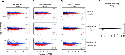
Because our dataset consisted of three separate conditions or groups, we ran three pairwise comparisons using the negative binomial generalized linear model in edgeR, glmLRT, with the raw count data table as our input (see Raw Counts box) (8). The output data tables consisting of log2 fold change for each gene as well as corresponding P values are shown in Tables E2–E4. It can be helpful to generate an MA plot in which the log2 fold change for each gene is plotted against the average log2 counts per million, because this allows for the visual assessment of the distribution of genes for each pairwise comparison (Figure 3A). An MA plot is similar to a volcano plot in that it displays the log2 fold change against the −log10 P value. In our initial pairwise comparison, we compared all three groups against one another, leading to three comparisons and using all four replicates, yielding a large number of up- and downregulated genes.
Figure 3.
The effect of group size and intragroup variance on ability to identify differentially expressed genes. MA plots showing average logarithmically transformed counts per million (CPM) versus the log2 fold change for pairwise comparisons between the Transplant 2H versus Naive (top row), Transplant 24H versus Naive (middle row), and Transplant 24H versus Transplant 2H (bottom row) groups. Pairwise comparisons were run using (A) all four replicates per group, (B) the two most correlated replicates, (C) the two least correlated replicates, or (D) randomized data in which two replicates from the Naive group and two replicates from the Transplant 2H group were combined into each group. Up- and downregulated differentially expressed genes with a false discovery rate less than 0.05 are shown in blue and red, respectively.
Raw Counts
A raw counts table gives the raw reads mapped to each gene (rows) for each sample (column). One approach to filter out genes with low counts that represent background noise is by calculating the row sum for each gene across all libraries and removing any gene with a row sum below the chosen threshold.
When do I use raw counts data?
Some software packages are designed to take raw counts as input. For example, EdgeR, a package to identify pairwise differentially expressed genes, requires raw count data as input. Then, the algorithm internally accounts for both sequencing depth and inter-sample variation in the calculation of differential expression.
To illustrate the effect that group size and intragroup variance have on the identification of DEGs, we also ran pairwise comparisons using just two replicates, choosing first the most and then the least correlated pairs within each group based on the previously calculated correlation (see Table 2 and Figures 3B and 3C). Both comparisons using two replicates demonstrate fewer DEGs than the full four replicates. (Figures 3B and 3C). Moreover, the number of DEGs across the least correlated replicates was lower than for the most correlated comparison. This decline in the number of significant DEGs highlights the effect of the smaller group size on the power of the analysis: A smaller group size increases the variance in gene expression, resulting in less confidence and thus increasing (nonsignificant) P values. We use randomized data, in which replicates across different conditions were pooled, to simulate the case in which there are no underlying differences between groups and the null hypothesis is true for all genes (Figure 3D).
Variance across groups
For our second approach, we used ANOVA to estimate the variance of genes across all groups. ANOVA tests for DEGs between any set of groups with the null hypothesis that the mean gene expression is equal across all groups. The result is a P value representing the significance of the variation across groups compared with within groups without defining directionality or which groups are variable. We did not set a limit for fold change in expression at this point, although this can be done if the user desires to further restrict the analysis to genes with a high magnitude of change. To limit our analyses to findings that were less likely to be due to chance, we again used the Benjamini-Hochberg FDR method with a threshold of significance at 0.05 (20). Other modifications that are more stringent can be used, and here again, a less stringent cutoff may introduce more “noise” and “false positives.”
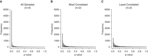
Using our dataset, we ran ANOVA with four replicates in each of the three groups, as well as on the most and least correlated groups with n = 2. The resulting P values were plotted as a histogram (Figure 4) in which each bar represents the number of genes with a P value in the given bin (bin size = 0.01). For the four-replicates comparison, the frequency of significant P values was the highest, with nearly 8,000 P values less than 0.05 (Figure 4A). Using the most and least correlated groups with n = 2 yielded approximately 5,000 and 3,500 P values less than 0.05, respectively (Figures 4B and 4C). These examples highlight that both group size and intragroup variability can impact the results of the analysis.
Figure 4.
Distribution of ANOVA P values for (A) all (n = 4), (B) most correlated (n = 2), and (C) least correlated (n = 2) replicates. P values were distributed into 100 bins between 0 and 1, with each bar representing a 0.01 increase.
Clustering
The two most common clustering methods used for RNA-seq data analysis are hierarchical and k-means clustering (see Clustering box). The most common form of hierarchical clustering is a bottom-up agglomerative approach that organizes the data into a tree structure without user input by starting with each data point as its own cluster and iteratively combining them into larger clusters or “clades.” In contrast, k-means clustering requires the investigator to define the number of clusters (k) a priori, and data are then sorted into the cluster with the nearest mean. It is possible to assess a range of k-values to decide how to best capture the trends. In addition, various tools such as Silhouette exist to help the investigator determine the ideal k-value, but some subjectivity remains (21). By adjusting the k, the investigator may set the degree of granularity they would like to achieve with the data. For either approach, the user must specify the distance metric by which data points are considered similar. Typically, Pearson’s correlation is used, and this is generally the default in software designed for RNA-seq analysis. Both approaches are widely used, and both aid the investigator in identifying groups of genes that display similar expression patterns, allowing for further downstream analyses. The clusters can then be used as input for an analysis of functional enrichment (see next section).
Clustering
Why do we use clustering on RNA-seq data?
Clustering of RNA-seq data may be used to identify patterns of gene expression by grouping genes based on their distance in an unsupervised manner. Clustering RNA-seq data is used as an exploratory tool that allows the user to organize and visualize relationships between groups of genes, and to select certain genes for further consideration.
Hierarchical clustering
The most commonly used hierarchical clustering approach is a form of agglomerative, or bottom-up, clustering that iteratively merges clusters (originally consisting of individual data points) into larger clusters or “clades”.
K-means clustering
Data points are iteratively partitioned into clusters based on the minimum distance to the cluster mean. The number of clusters (k) is set by the investigator.
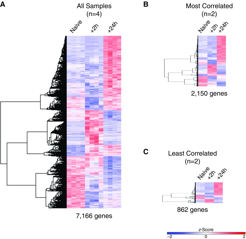
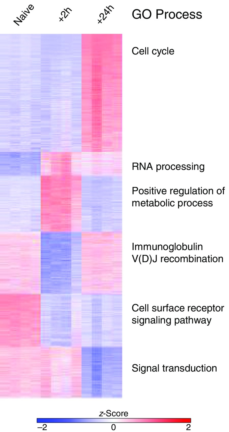
After obtaining lists of genes that were differentially expressed (adjusted P < 0.05) across the three conditions by ANOVA, we used these genes as input for clustering to define the prevalent patterns of gene expression. A heat map provides a way to visually assess the results of clustering on the data, enabling the investigator and reader to observe trends of expression for genes across populations, treatment conditions, or time points. In general, a larger number of DEGs can help increase the potential for granularity in clustering. Using all four replicates for each group resulted in a list of 7,166 genes derived by ANOVA (FDR, <0.05) (Figure 5A). As shown in Figures 5B and 5C, a smaller group size (n = 2), regardless of intragroup variability, resulted in a significantly lower number of genes, with the most correlated samples (n = 2 per group) yielding a list of 2,150 genes and the least correlated samples yielding just 862 genes. Hierarchical clustering of the DEGs identified in all three conditions led to the same overall structure of clustering, but some smaller clusters were lost in Figures 5B and 5C. Next, we used k-means clustering (Figure 6) and identified six clusters (k = 6) in our heat map consisting of n = 4 groups, and we used these six gene lists for functional enrichment analysis.
Figure 5.
Effect of group size and intragroup variance on ability to identify gene clusters. Hierarchical clustering performed on differentially expressed genes defined by ANOVA with a false discovery rate less than 0.05. (A) Using all replicates per group, 7,166 genes were clustered. (B) Most and (C) least correlated samples resulted in input lists of 2,150 and 862 genes, respectively. The z-score scale bar represents relative expression ±2 SD from the mean.
Figure 6.
k-Means clustering and Gene Ontology (GO) enrichment analysis using the top differentially expressed genes. k-Means clustering was performed on the data set containing all samples (n = 4/group), and the top GO process from each cluster is shown.
GO Enrichment Analysis
Functional enrichment analysis is a method to assign biological relevance to a set of genes and can be performed using a variety of online and downloadable tools, such as gene set enrichment analysis (22, 23), Enrichr (24, 25), DAVID (26, 27), or GOrilla (28). These tools analyze the lists of genes provided by the user (in our case, genes assigned to a given cluster, but this could also be done on pairwise DEGs or another analysis) and identify annotated sets of genes that are enriched within the list. In our analysis, we use GOrilla, a publicly available GO enrichment tool (http://cbl-gorilla.cs.technion.ac.il) (28), which compares a target list of genes to a background set of genes, to assess the significance of enrichment for previously annotated and defined processes (GO terms). The resulting GO terms may describe biological processes, molecular functions, or cellular components; these terms can vary from very general (e.g., activation of the innate immune response) to very specific (e.g., antigen processing and presentation of endogenous peptide antigen via major histocompatibility complex class II [GO:0002491]) (29, 30). GOrilla is also able to perform enrichment analysis on a single, ranked gene list.
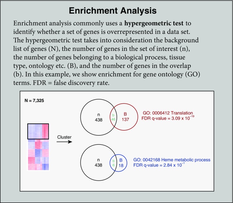
The significance of the enrichment is assessed using the hypergeometric test, which is calculated from background (the total number of genes in the analysis; N), the number of genes in the target set (n), the number of genes associated with a GO term (B), and the overlap (the number of genes identified in the target list that are also found in the GO term; b). The P value reflects the likelihood that an overlap greater than or equal to that observed could occur by chance. As one might expect, this means that the P value is directly impacted by the magnitude of all four terms: N, B, n, and b. It is important to note that neither of these scores pertains to the difference in gene expression levels, but instead the scores describe the enrichment of genes in the target set within a given GO term (see Enrichment Analysis box). The investigator should give thought to the choice of background genes; including all known genes will likely yield apparent enrichment of general processes that are not relevant to the biological question and mask interesting findings. For our analysis, we used the sets of genes resulting from k-means clustering of the full set of 7,166 DEGs (k = 6) and chose to list processes with adjusted P < 0.05 (Figure 6). For example, we found that cell cycle was enriched in cluster 1. In this analysis, our background N was the full set of 7,166 genes, the n was the number of genes in each cluster, B was the number of genes assigned to the GO term, and b was the overlap. Ultimately, identification of enriched processes allows the investigator to generate hypotheses about important drivers of the changes between groups. However, it is important for the investigator to remain aware of the fact that enrichment tools never take into account gene RPKM expression values, and thus the adjusted P values reported in GO enrichment analysis are unrelated to actual gene expression changes.
Visualization of Individual Genes
A key part of RNA-seq analysis is the identification of individual genes or groups of genes that describe differences among groups. Although enrichment analysis can provide the investigator with useful information regarding pathways and GO terms that are differentially affected, it does not provide any information regarding the actual up- or downregulation of gene expression. To allow the investigator to visualize and assess the transcriptional changes at the gene level, the expression of individual genes must be plotted. At this level, the investigator can assess the efficacy of their analysis in recovering genes of interest. Moreover, querying individual genes of interest may allow the investigator to define interesting signatures beyond those given by the GO annotation. For example, differentially expressed transcription factors may yield clues as to how the transcriptional signatures are regulated and define the investigator’s sought-after “novel signature.” Transcription factors that are up- or downregulated may have accompanying epigenomic changes, and other high-throughput sequencing assays such as ChIP-seq (chromatin IP sequencing) and ATAC-seq (assay for transposase-accessible chromatin sequencing) can be used to further elucidate their role (31, 32). Chromatin profiling can help reveal both temporal and spatial expression changes (33). Key genes should be validated using Western blotting or qPCR, and claims of causation should be supported by functional studies or genetic ablation, preferably restricted to the cell type or lineage of interest to reduce confounding effects from the microenvironment and neighboring cells.
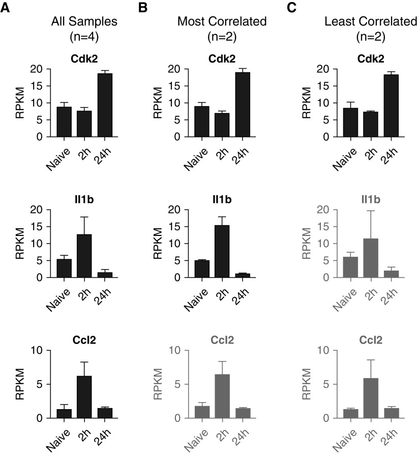
After our enrichment analysis, we identified several key cytokines and proteins of interest among the DEGs. We first visualized the exonic mapping of reads for these genes of interest using the Integrative Genomics Viewer (34, 35) (Figure E3). This view also provides an intuitive look at how the gene expression level is calculated and demonstrates the agreement across replicates. Interestingly, although some key genes were identified as significantly differentially expressed using all four replicates for each group (Figure 7A), once the group size was reduced to the two most-correlated samples (Figure 7B), statistical significance was lost. Moreover, with the increased intragroup variability of the least correlated samples, several more genes were excluded (Figure 7C). Specifically, although Cdk2 (ENSMUSG00000025358) was present in all three datasets, Il-1b (ENSMUSG00000027398) was identified only in the first two datasets but was absent from the “least correlated” DEG list. Moreover, Cdk2 (ENSMUSG00000035385) was only found when analysis was run using four replicates instead of two per group. These data highlight the effects of group size and variability on enrichment and identification of individual genes that show transcriptional differences between groups. For definition of terms, see Glossary box.
Figure 7.
Individual gene analysis. RPKM expression values for the Cdk2, Il1b, and Ccl2 genes are shown for the datasets containing (A) all samples (n = 4/group), (B) most correlated replicates (n = 2/group), and (C) least correlated replicates (n = 2/group). Although all three genes were identified as differentially expressed genes (DEGs) from the full (n = 4) dataset in Figure 6, Ccl2 was not among the DEGs in the “most correlated” comparison, owing to an ANOVA false discovery rate greater than 0.05, and neither Il1b nor Ccl2 was a DEG in the “least correlated” comparison. Genes that were not DEGs in the designated dataset are displayed in gray.
Glossary
| Raw counts | Raw counts are the direct output from a pipeline, obtained after trimming, demultiplexing, alignment, and mapping. Raw count values generally are whole numbers and will not contain decimals. |
| Normalized counts | Raw counts that are normalized by accounting for gene length, sequencing depth, or expression distribution. |
| False discovery rate (FDR), q value, adjusted P value | These terms describe the same concept, namely a P value that has been adjusted to account for multiple hypothesis testing. |
| PCA | Principal component analysis (PCA) reduces data dimensionality and describes variation using principal components (PCs). |
| Benjamini-Hochberg (BH) adjustment | A method of calculating the FDR by limiting the expected ratio of false-positive results, or type I errors, in the results. The adjustment is calculated by ranking P values, calculating individual BH values, and comparing the BH values with P values. |
| RPKM | Reads per kilobases of transcript per 1 million mapped reads. RPKM is calculated as follows: [number of mapped reads]/[(transcript length/1,000)/(total reads)/106)]. |
| FPKM | Fragments per kilobases of transcript per 1 million mapped reads. FPKM is calculated as follows: [number of fragments]/[(transcript length/1,000)/(total reads)/106)]. |
| CPM | Counts per million. CPM does not account for gene or transcript length. |
Conclusions and Discussion
With the advent of RNA-seq protocols and a plethora of packages and online tools for data analysis, it is important to have a basic understanding of how these codes, tools, and apps manipulate the data, as well as to be able to view and interpret data at each step to ensure reliability and avoid bias. In the present review, we provide a simplified overview that describes some basic, established methods for RNA-seq analysis and demonstrate how some important dataset characteristics, such as group size and intragroup variability, can affect downstream analysis. We have discussed how to identify and set a threshold to filter out “noise” and low counts, how to identify DEGs using two different approaches, how clustering algorithms define transcriptional signatures, and how gene enrichment analyses highlight relevant processes.
We have highlighted steps and checkpoints that will aid the investigator in reducing bias and misinterpretation of data, but in the end, it is the investigator’s responsibility to step back and remain vigilant when interpreting the results of their analysis. The investigator should question whether the results make sense in the context of the biological question and the underlying data. Furthermore, it is important for the investigator to remain cautious and aware of the fact that many automated apps and tools provided online to perform the RNA-seq analysis are prone to error and misinterpretation, particularly if the user does not fully understand the steps taken or the statistical test that underlies the analysis. As we highlight throughout this paper, it is important to understand when to use raw versus normalized counts, and how to set thresholds for “noise,” which can significantly impact the interpretation of changes in gene expression. Moreover, using these tools without understanding their output (e.g., adjusted P values provided with functional enrichment) can lead the user to misinterpret data. Although there is no doubt that RNA-seq is a powerful tool, careful data analysis is of the utmost importance. It must be remembered that interpretation of almost all the steps of the analysis remain subjective, and it is thus researchers’ responsibility to be their own strongest critics.
Footnotes
Supported by National Institutes of Health (NIH)/National Institute of Diabetes and Digestive and Kidney Diseases grant T32DK077662 (S.F.C.), NIH/National Heart, Lung, and Blood Institute (NHLBI) grants HL128194 and HL071643 (K.M.R.) and HL125940 (A.B.), matching funds from the Thoracic Surgery Foundation (A.B.) and the American Society of Transplant Surgeons Foundation (S.F.C.), and U.S. Department of Defense grant W81XWH-15-1-0214 (E.T.B.). The Winter laboratory is funded by the Northwestern Memorial Foundation Dixon Award, the Arthritis National Research Foundation, and the American Lung Association.
Author Contributions: C.M.K., S.F.C., K.M.R., E.T.B., and D.R.W.: contributed to conception and design; S.F.C., M.A. and A.B.: contributed to data collection; and C.M.K., S.F.C., E.T.B., and D.R.W.: contributed to analysis and interpretation.
This article has a data supplement, which is accessible from this issue’s table of contents at www.atsjournals.org.
Originally Published in Press as DOI: 10.1165/rcmb.2017-0430TR on April 6, 2018
Author disclosures are available with the text of this article at www.atsjournals.org.
References
- 1.Lister R, O’Malley RC, Tonti-Filippini J, Gregory BD, Berry CC, Millar AH, et al. Highly integrated single-base resolution maps of the epigenome in Arabidopsis. Cell. 2008;133:523–536. doi: 10.1016/j.cell.2008.03.029. [DOI] [PMC free article] [PubMed] [Google Scholar]
- 2.Nagalakshmi U, Wang Z, Waern K, Shou C, Raha D, Gerstein M, et al. The transcriptional landscape of the yeast genome defined by RNA sequencing. Science. 2008;320:1344–1349. doi: 10.1126/science.1158441. [DOI] [PMC free article] [PubMed] [Google Scholar]
- 3.Mortazavi A, Williams BA, McCue K, Schaeffer L, Wold B. Mapping and quantifying mammalian transcriptomes by RNA-Seq. Nat Methods. 2008;5:621–628. doi: 10.1038/nmeth.1226. [DOI] [PubMed] [Google Scholar]
- 4.Holt RA, Jones SJ. The new paradigm of flow cell sequencing. Genome Res. 2008;18:839–846. doi: 10.1101/gr.073262.107. [DOI] [PubMed] [Google Scholar]
- 5.Zheng Z, Chiu S, Akbarpour M, Sun H, Reyfman PA, Anekalla KR, et al. Donor pulmonary intravascular nonclassical monocytes recruit recipient neutrophils and mediate primary lung allograft dysfunction. Sci Transl Med. 2017;9:eaal4508. doi: 10.1126/scitranslmed.aal4508. [DOI] [PMC free article] [PubMed] [Google Scholar]
- 6.Kim D, Pertea G, Trapnell C, Pimentel H, Kelley R, Salzberg SL. TopHat2: accurate alignment of transcriptomes in the presence of insertions, deletions and gene fusions. Genome Biol. 2013;14:R36. doi: 10.1186/gb-2013-14-4-r36. [DOI] [PMC free article] [PubMed] [Google Scholar]
- 7.Anders S, Pyl PT, Huber W. HTSeq—a Python framework to work with high-throughput sequencing data. Bioinformatics. 2015;31:166–169. doi: 10.1093/bioinformatics/btu638. [DOI] [PMC free article] [PubMed] [Google Scholar]
- 8.McCarthy DJ, Chen Y, Smyth GK. Differential expression analysis of multifactor RNA-Seq experiments with respect to biological variation. Nucleic Acids Res. 2012;40:4288–4297. doi: 10.1093/nar/gks042. [DOI] [PMC free article] [PubMed] [Google Scholar]
- 9.Robinson MD, McCarthy DJ, Smyth GK. edgeR: a Bioconductor package for differential expression analysis of digital gene expression data. Bioinformatics. 2010;26:139–140. doi: 10.1093/bioinformatics/btp616. [DOI] [PMC free article] [PubMed] [Google Scholar]
- 10.Conesa A, Madrigal P, Tarazona S, Gomez-Cabrero D, Cervera A, McPherson A, et al. A survey of best practices for RNA-seq data analysis. Genome Biol. 2016;17:13. doi: 10.1186/s13059-016-0881-8. [DOI] [PMC free article] [PubMed] [Google Scholar]
- 11.Ringnér M. What is principal component analysis? Nat Biotechnol. 2008;26:303–304. doi: 10.1038/nbt0308-303. [DOI] [PubMed] [Google Scholar]
- 12.Soper HE, Young AW, Cave BM, Lee A, Pearson K. ON the distribution of the correlation coefficient in small samples. Appendix II to the papers of “Student” and R. A. Fisher: a cooperative study. Biometrika. 1917;11:328–413. [Google Scholar]
- 13.Hauke J, Kossowski T. Comparison of values of Pearson’s and Spearman’s correlation coefficients on the same sets of data. Quaest Geogr: J Adam Mickiewicz Univ. 2011;30:87–93. [Google Scholar]
- 14.Fieller EC, Hartley HO, Pearson ES. Tests for rank correlation coefficients. I. Biometrika. 1957;44:470–481. [Google Scholar]
- 15.Anders S, Huber W. Differential expression analysis for sequence count data. Genome Biol. 2010;11:R106. doi: 10.1186/gb-2010-11-10-r106. [DOI] [PMC free article] [PubMed] [Google Scholar]
- 16.Trapnell C, Williams BA, Pertea G, Mortazavi A, Kwan G, van Baren MJ, et al. Transcript assembly and quantification by RNA-Seq reveals unannotated transcripts and isoform switching during cell differentiation. Nat Biotechnol. 2010;28:511–515. doi: 10.1038/nbt.1621. [DOI] [PMC free article] [PubMed] [Google Scholar]
- 17.Roberts A, Trapnell C, Donaghey J, Rinn JL, Pachter L. Improving RNA-Seq expression estimates by correcting for fragment bias. Genome Biol. 2011;12:R22. doi: 10.1186/gb-2011-12-3-r22. [DOI] [PMC free article] [PubMed] [Google Scholar]
- 18.Roberts A, Pimentel H, Trapnell C, Pachter L. Identification of novel transcripts in annotated genomes using RNA-Seq. Bioinformatics. 2011;27:2325–2329. doi: 10.1093/bioinformatics/btr355. [DOI] [PubMed] [Google Scholar]
- 19.Trapnell C, Hendrickson DG, Sauvageau M, Goff L, Rinn JL, Pachter L. Differential analysis of gene regulation at transcript resolution with RNA-seq. Nat Biotechnol. 2013;31:46–53. doi: 10.1038/nbt.2450. [DOI] [PMC free article] [PubMed] [Google Scholar]
- 20.Benjamini Y, Hochberg Y. Controlling the false discovery rate: a practical and powerful approach to multiple testing. J R Stat Soc Series B Stat Methodol. 1995;57:289–300. [Google Scholar]
- 21.Rousseeuw PJ. Silhouettes: a graphical aid to the interpretation and validation of cluster analysis. J Comput Appl Math. 1987;20:53–65. [Google Scholar]
- 22.Mootha VK, Lindgren CM, Eriksson KF, Subramanian A, Sihag S, Lehar J, et al. PGC-1α-responsive genes involved in oxidative phosphorylation are coordinately downregulated in human diabetes. Nat Genet. 2003;34:267–273. doi: 10.1038/ng1180. [DOI] [PubMed] [Google Scholar]
- 23.Subramanian A, Tamayo P, Mootha VK, Mukherjee S, Ebert BL, Gillette MA, et al. Gene set enrichment analysis: a knowledge-based approach for interpreting genome-wide expression profiles. Proc Natl Acad Sci USA. 2005;102:15545–15550. doi: 10.1073/pnas.0506580102. [DOI] [PMC free article] [PubMed] [Google Scholar]
- 24.Chen EY, Tan CM, Kou Y, Duan Q, Wang Z, Meirelles GV, et al. Enrichr: interactive and collaborative HTML5 gene list enrichment analysis tool. BMC Bioinformatics. 2013;14:128. doi: 10.1186/1471-2105-14-128. [DOI] [PMC free article] [PubMed] [Google Scholar]
- 25.Kuleshov MV, Jones MR, Rouillard AD, Fernandez NF, Duan Q, Wang Z, et al. Enrichr: a comprehensive gene set enrichment analysis web server 2016 update. Nucleic Acids Res. 2016;44:W90–W97. doi: 10.1093/nar/gkw377. [DOI] [PMC free article] [PubMed] [Google Scholar]
- 26.Huang DW, Sherman BT, Lempicki RA. Systematic and integrative analysis of large gene lists using DAVID bioinformatics resources. Nat Protoc. 2009;4:44–57. doi: 10.1038/nprot.2008.211. [DOI] [PubMed] [Google Scholar]
- 27.Huang DW, Sherman BT, Lempicki RA. Bioinformatics enrichment tools: paths toward the comprehensive functional analysis of large gene lists. Nucleic Acids Res. 2009;37:1–13. doi: 10.1093/nar/gkn923. [DOI] [PMC free article] [PubMed] [Google Scholar]
- 28.Eden E, Navon R, Steinfeld I, Lipson D, Yakhini Z. GOrilla: a tool for discovery and visualization of enriched GO terms in ranked gene lists. BMC Bioinformatics. 2009;10:48. doi: 10.1186/1471-2105-10-48. [DOI] [PMC free article] [PubMed] [Google Scholar]
- 29.Ashburner M, Ball CA, Blake JA, Botstein D, Butler H, Cherry JM, et al. The Gene Ontology Consortium. Gene ontology: tool for the unification of biology. Nat Genet. 2000;25:25–29. doi: 10.1038/75556. [DOI] [PMC free article] [PubMed] [Google Scholar]
- 30.The Gene Ontology Consortium. Expansion of the Gene Ontology knowledgebase and resources. Nucleic Acids Res. 2017;45:D331–D338. doi: 10.1093/nar/gkw1108. [DOI] [PMC free article] [PubMed] [Google Scholar]
- 31.Buenrostro JD, Giresi PG, Zaba LC, Chang HY, Greenleaf WJ. Transposition of native chromatin for fast and sensitive epigenomic profiling of open chromatin, DNA-binding proteins and nucleosome position. Nat Methods. 2013;10:1213–1218. doi: 10.1038/nmeth.2688. [DOI] [PMC free article] [PubMed] [Google Scholar]
- 32.Meyer CA, Liu XS. Identifying and mitigating bias in next-generation sequencing methods for chromatin biology. Nat Rev Genet. 2014;15:709–721. doi: 10.1038/nrg3788. [DOI] [PMC free article] [PubMed] [Google Scholar]
- 33.Winter DR, Jung S, Amit I. Making the case for chromatin profiling: a new tool to investigate the immune-regulatory landscape. Nat Rev Immunol. 2015;15:585–594. doi: 10.1038/nri3884. [DOI] [PubMed] [Google Scholar]
- 34.Robinson JT, Thorvaldsdóttir H, Winckler W, Guttman M, Lander ES, Getz G, et al. Integrative genomics viewer. Nat Biotechnol. 2011;29:24–26. doi: 10.1038/nbt.1754. [DOI] [PMC free article] [PubMed] [Google Scholar]
- 35.Thorvaldsdóttir H, Robinson JT, Mesirov JP. Integrative Genomics Viewer (IGV): high-performance genomics data visualization and exploration. Brief Bioinform. 2013;14:178–192. doi: 10.1093/bib/bbs017. [DOI] [PMC free article] [PubMed] [Google Scholar]
Associated Data
This section collects any data citations, data availability statements, or supplementary materials included in this article.
Data Availability Statement
The RNA-seq data reported in this article has been deposited in NCBI’s Gene Expression Omnibus (GEO) and are accessible through GEO Series accession number GSE116583.


