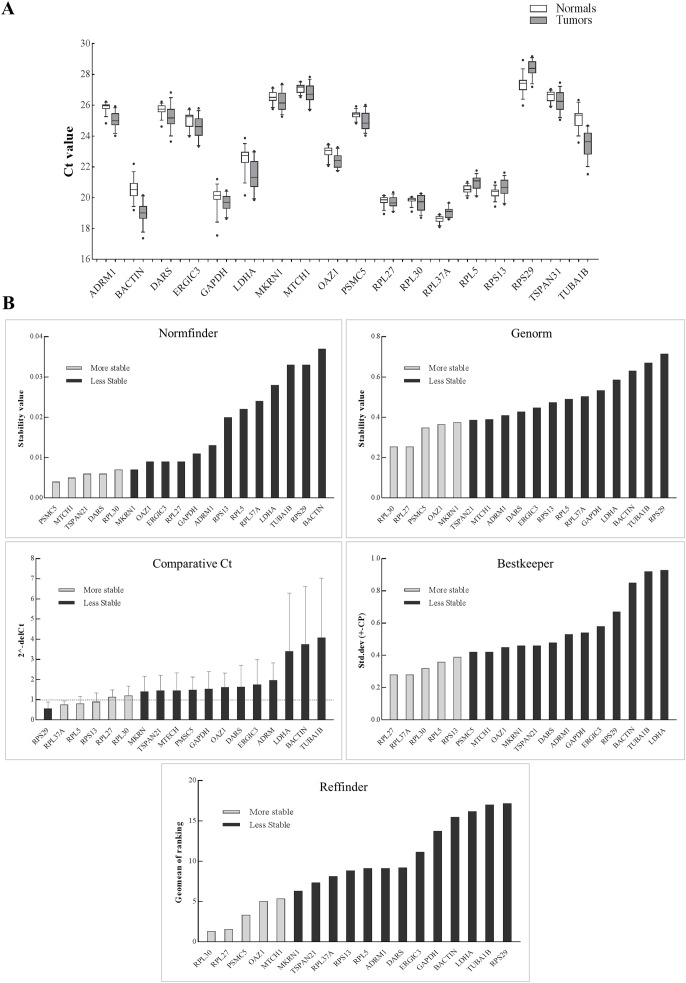
Figure 2. Expression of genes in the discovery set across tumors and normal samples.
(A) The Ct values were generated from qPCR experiments and plotted as box plots with median values as lines and boxes indicating 10–90 percentile values and whiskers as the maximum and minimum values. Ranking of 18 genes using different tools (B). Y-axis for different tools represents: stability value (Genorm, Normfinder), standard deviation ± (CP) (Bestkeeper), 2−(deltaCt) (Comparative Ct method) and geomean of ranking (RefFinder). The columns in light grey represent stable genes across tumors and normal samples.

