

Abstract
Recent studies of economic inequality almost always separately examine income inequality, consumption inequality, and wealth inequality, and hence, these studies miss the important synergy between the three measures explicit in the life-cycle budget constraint. Using the Panel Study of Income Dynamics (PSID), we study inequality in three dimensions, focusing on the conjoint distributions of income, consumption, and wealth for the same individuals. We find that the trends in inequality in income, consumption, and wealth similarly increase between 1999 and 2013. We examine the pairwise distributions of our measures using the average propensity to consume and the wealth-income ratios. Using the longitudinal nature of the PSID, we follow people over this period and find mobility is similar using income, consumption and wealth. We conclude that while all three types of inequality are rising, wealth increasingly acts as a buffer to cushion income changes, which could reduce mobility – both intra- and inter-generational mobility.
Keywords: Inequality, mobility, income, consumption, wealth
Growing interest in economic inequality and mobility continues to dominate the headlines. In 2013, President Obama spoke about inequality and mobility, reiterating a theme from earlier speeches. He said: “…this increasing inequality is most pronounced in our country, and it challenges the very essence of who we are as a people.” And the Chair of the Federal Reserve System, Janet Yellen (2014), in a speech to the Boston Federal Reserve Bank, stated that both income and wealth inequality were rising in the United States and that such increases called into question American beliefs in equality of opportunity.1 As for consumption, another measure of well-being and the preferred welfare measure for most economists, Bill Gates (Gates, 2014), commenting on Piketty (2014) suggested that “It’s not that we should ignore the wealth and income data. But consumption data may be even more important for understanding human welfare.” Hence income, wealth and consumption are all three important gauges of inequality in economic status and their effects on social and economic mobility.
Most research shows, and Yellen (2014) stresses, there has been a large increase in income and wealth inequality. Saez and Zucman (2014) and Wolff (2014) find that income and wealth inequality are highly related. Piketty (2014) makes this point more dramatic by arguing that the increase in income inequality yields more wealth inequality, which in turn increases income inequality. Fisher, Johnson and Smeeding (2015) find that consumption inequality is about 80 percent as large as disposable income inequality and that the rise in consumption inequality was two-thirds that of income inequality in the United States from 1984 to 2011.
Income, consumption, and wealth distributions inform our perceptions of inequality. Yet most research on inequality limit analysis to just one of these variables. Even the studies using more than one almost invariably do so one at a time.2 The most influential studies on income inequality examine income alone (Piketty and Saez, 2003; CBO, 2011). Those studying consumption inequality compare the trends in consumption inequality and income inequality, but the focus is on the univariate distributions and not the conjoint distribution (Fisher et al., 2015; Attanasio and Pistaferri, 2014, Aguiar and Bils, 2015). Similarly, wealth inequality is studied by itself or with income inequality, but the focus is on the univariate distributions (Saez and Zucman, 2014; Wolff, 2016, Pfeffer and Schoeni, 2016). In contrast, The Report by the Commission on the Measurement of Economic Performance and Social Progress (Stiglitz et al., 2009 pg. 33) states: “…the most pertinent measures of the distribution of material living standards are probably based on jointly considering the income, consumption, and wealth position of households or individuals.” And recommendation 4 states: “Give more prominence to the distribution of income, consumption and wealth.”3
Studying these measures separately misses the important synergy between the three measures explicit in the life-cycle budget constraint. An increase in income held by the top of the distribution means that consumption and/or wealth of the top also increases. The joint distribution between any two, and more importantly the conjoint distribution amongst all three, provides more information than any of the univariate distributions. The concern is whether the increases over time in all three are similar, or whether the rankings across countries are similar. Recent evidence shows that the levels of income, consumption and wealth inequality are different, with wealth inequality greater than income, which is greater than consumption (see Figure 1). One must also ask, how does inequality of income translate to consumption or wealth? Alternatively, if one increases and another remains constant – what does that mean about well-being or the effects of inequality on social mobility? Piketty (2014) suggests that increases in wealth inequality translate to increases in income inequality; “…many shocks to the wealth trajectories of families can contribute to making the wealth distribution highly unequal (indeed, in every country and time period for which we have data, wealth distribution within each age group is substantially more unequal than income distribution…).” Alternatively, Krueger and Perri (2006) show that the increased availability of financial markets could suggest that increases in income inequality do not lead to increases in consumption inequality.
Figure 1:
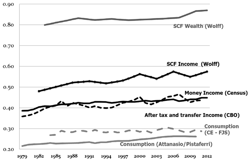
Gini index for a variety of measures – income, consumption and wealth
Following Fisher et al. (2015b) in their study of inequality in three dimensions, we focus here on the conjoint distributions of income, consumption, and wealth for the same individuals. Here we examine all three measures of inequality using the 1999-2013 Panel Study of Income Dynamics (PSID). The PSID allows for longitudinal analysis and intra- and inter-generational mobility issues not feasible with any other dataset.4
We first compare the level and trend in inequality in income, consumption, and wealth (or net worth) in the Panel Study of Income Dynamics from 1999-2013, and find that, similar to other research, all three measures similarly increase during this period. Then we examine the pairwise distributions of our measures using the average propensity to consume (APC) and the wealth-to-income ratios and evaluate how these have changed over time. Finally, we use the longitudinal aspect of the PSID to follow people over time and find that mobility is similar using income, consumption and wealth. Future work will examine how the changes in income and consumption are affected by changes in wealth and calculate the marginal propensities to consume for various levels of wealth.
The results improve our understanding of inequality in the United States since 1999 by exploring the joint relationship between various measures of economic inequality. The results indicate that the correlation between the three measures is high, but not perfect. Therefore, the individuals who comprise the top in any one measure do not necessarily comprise the top in another measure. Further, individuals who comprise the top in one year do not necessarily stay in the top over many years. While there is stickiness at both the top and the bottom of individual measures, fluidity also exists, especially as the ranking of one measure relates to the ranking of another. Therefore, the picture of inequality proposed here both aligns with previous research in that it is rising, but also improves the clarity by incorporating the relationship between various measures of economic well-being that comprise inequality.
Differences in the measures
The differences in income, consumption and wealth across the income distribution provide insight into why it is necessary to look at income, consumption, and wealth together rather than individually. Previous research (see Fisher et al., 2015a) shows that the APC falls with income and is extremely high for the low-income households. Alternatively, wealth increases with income, and yields extremely high wealth-to-income ratios at the highest percentiles. As a result, consumption inequality is less than income inequality, and income inequality is less than wealth inequality. This suggests that households at the bottom of the income distribution appear relatively better off using consumption as a measure of inequality at any point in time, because consumption exceeds income (and wealth) in the lower ends of the conjoint distributions.5 And high-income households are better off using wealth to measure relative well-being than either income or consumption because amassed wealth can be used for future consumption and for transfers across generations. Hence, our perception of relative well-being changes depending on whether we use consumption, income, or wealth.
Some have estimated the flow value of wealth to add to income in order to incorporate wealth into a measure of economic well-being (Burkhauser et al., 2012; Smeeding and Thompson, 2011). But regardless of the flow values, the build-up of stocks of wealth presents opportunities and advantages (or in the case of debt, disadvantages) that may in the end be more important than any flows, as Piketty (2014) argues. In our data, wealth clearly accumulates over time and financial wealth is especially prevalent in the top strata of the wealth distribution. Wealth buildup takes place when large shares of national income go to top income families (top 3-5 percent) who have APCs of around 0.5-0.6. In these cases, high wealth and high income does not translate into consumption that is relatively as high. And so the question is what happens to unconsumed income, how does it accumulate and for what purposes, and how is economic well-being affected for such high-income and high-wealth households? None of the current analyses of inequality have fully captured the full effect of wealth on consumption and income by considering all three measures of well-being simultaneously for the same households. We know, however, that each gives a differing and important perspective on the distribution of economic well-being when considering the effects of inequality on say educational attainment of off-spring, intergenerational mobility, or even health.6
Figure 1 shows a variety of measures of inequality from 1979 through the most recent data available for each series – one measure of wealth inequality, three measures of income inequality and two measures of consumption inequality. As shown, all measures have increased in the past two or three decades. The money income measure is produced by the U.S. Census Bureau, and includes cash incomes received on a regular basis (exclusive of certain money receipts such as capital gains) and before payments for personal income taxes, but gross of cash income transfers such as social security. This is the most commonly referenced income measure, dating back to 1967 for households, with adjustments for household size. This measure suggests the income inequality Gini for the United States increased from .39 in 1979 to .44 in 2007 and .46 in 2012.7
A second income measure shown in Figure 1 is from the U.S. Congressional Budget Office (CBO, 2011). The CBO merges CPS household survey data with tax records, so it gives us a more accurate picture of incomes at the very top of the distribution. According to this measure, the Gini for household income increased from .37 in 1979 to .49 in 2007. The CBO series with the more comprehensive income and an accurate top end suggests a steeper rise in inequality than does the Census series. Note that since this CBO series suggests the importance of capital income and capital gains, it also makes the case for why changes in wealth are an important cause of growing inequality. The final income measure uses SCF income, which includes capital gains and oversamples the high end of the income distribution using an IRS list sample (see Wolff, 2014). Given its more complete and more accurate coverage of the wealthy and high income (Dettling et al., 2015), the SCF income inequality measure is higher than the other measures, yet shows a similar rise in inequality. All three income Ginis increase over this period. If the purpose is to argue that inequality in the United States is rising or not, all income measures regardless of source yield the same conclusion. If the question is by how much it is rising, that depends on the series used.
Figure 1 also shows two measures of consumption inequality using both the CE (Fisher et al., 2015) and PSID (Attanasio and Pistaferri, 2014). Both show an increase between 1985 and 2006, but consumption inequality fell (or remained flat) during the Great Recession, and has only started to increase again in the last few years. As with income and consumption, various researchers have examined inequality in wealth. Wolff (2016) reports Gini coefficients for wealth using the SCF, which also increase during this period. Showing the changes in wealth held by the top 5 percent, Yellen (2014) also shows rising wealth inequality across the SCF years.
In summary, all three measures of well-being matter, with wealth inequality higher than income inequality, which is higher than consumption inequality. Consumption and income inequality have diverged since 2007 (Fisher et al., 2015), mainly due to the fall in house prices. Consumption from assets, especially housing, rose in the early 2000s and then fell sharply after the financial crisis (Cooper and Dynan, 2013). The role of assets, debts, and changes in net worth are the key missing elements that connect income and consumption to produce a complete picture of economic inequality. The rise, fall, and change in wealth (net worth) over the past 25 years has been instrumental in financing consumption generally, and schooling, health care, entrepreneurship, and retirement especially.
Data and Definitions
It is important to use a consistent theoretical framework to define these measures. The most comprehensive concept of income and consumption is drawn from the suggestions of Haig and Simons where income represents the capacity to consume without drawing down net worth. Economists have used the equation that income (Y) equals consumption (C) plus the change in net worth (ΔW) as the working definition of Haig-Simons income. No studies use this definition to the fullest extent because no household survey has the necessary variables to create a full measure of Haig-Simons income.8 Our research goal is to have measures of disposable income, consumption, and net worth that are accurate and as closely linked as possible given the data limitations. Our measures of income and consumption do not completely characterize the Haig-Simons income measure. One particular item missing from both income and consumption are government provided in-kind health benefits, which would lead to lower levels of inequality (see Hardy et al. (2015)).
To evaluate all three measures it is important to have one data set with all three measures. Most evaluations use different data sets to examine income inequality or wealth inequality, or consumption vs income inequality. As stated by Heathcote, Perri and Violante (2010),”The conclusion we draw is that one should be very cautious when combining data on inequality in wages and earnings from the CPS or PSID, and data on inequality in net worth from the SCF.” Building on the results of Fisher et al. (2015b) that uses the SCF and imputes consumption, we use the PSID that includes all three measures.
Since 1968, the PSID has collected a broad range of socioeconomic and other information on families on an annual basis and since 1997 on a biannual basis. The PSID first introduced an extensive wealth module in 1984, which was repeated every five years until 1999 and on a biannual basis since then. The PSID first introduced something approaching a full measure of consumption in 1999. Before 1999, the PSID only had spending on food and housing. Thus our analysis starts in 1999 because it is the first year with all three measures in every wave.
Data are collected in the year of the survey; income is reported for the previous taxable year, wealth is reported for the time of interview (the survey year), and consumption is a mixture of time periods. In our analysis, we use the survey year to represent the year for the resource means, and convert measures to constant 2013 dollars, adjust by family size using an equivalence scale given by the square root of family size, and we use the family level file9 and longitudinal weights.10
Total Family Income is the sum total of taxable, transfer, and social security income of the head, wife, and other family units. We use after tax income, by imputing taxes using a model constructed by Kimberlin et al. (2014) using NBER TAXSIM.
Total household wealth is the sum total of eight asset variables minus debt. Asset variables are farm and business, checking and savings, other real estate (i.e. second home, land, rental real estate, or money owed on a land contract), stocks, vehicles, other assets (i.e. life insurance policy), annuity/IRA, and home equity. Up until 2007, debt was total debt. Beginning in 2009, debt is the sum total of debt from farm or business, real estate, credit card, student loan, medical, legal, family loan, or other. While the PSID wealth module also covers all major wealth components—namely, housing wealth, a range of financial and real assets, retirement wealth, and various types of liabilities—it draws on fewer survey items than does the SCF. Total wealth estimates produced from the PSID are comparable to those from the SCF. The primary exception is for the wealthiest 1 to 3 percent of households, which the SCF reaches through its IRS oversample and the PSID does not (Juster, Smith, and Stafford, 1999; Pfeffer, Schoeni, and Andreski, 2013).11
The definition of consumption changes in the PSID. Up until 2003, consumption is the sum total of food,12 housing, transportation, education, and child care. Beginning, in 2005, consumption also includes spending on travel, clothing, other recreation, home repair, home furnishings, and home phones. Hence, we use a consistent measure of consumption over the entire period and include a rental value of home-ownership given by 6 percent of the house value.13
As shown by Andreski et al. (2014), the consumption measure from PSID is similar to that in the CE. Other research also shows the consistency between the PSID and SCF wealth measures as Krueger, Mitman and Perri (2015) confirm that the trends in income and consumption from the PSID are similar to the trends shown in the national accounts from the Bureau of Economic Analysis (BEA).14 Fisher and Johnson (2006) demonstrate that the PSID captures more income than the CE, and Andreski et al. (2014) compare the income levels in the PSID to the CPS. However, Meyer, Mok, and Sullivan (2015) demonstrate that all of the income and consumption surveys do not fully capture the level of government transfers in their income measure.
Results
During this recent 14-year period from 1999-2013, inequality has increased. As shown in Figure 1, using the equivalized money income from the Census Bureau yields an increase in the Gini of 4.6 percent between 1999 and 2012 (with all of the other measures also increasing). Our measures for income, consumption and wealth are shown in Figure 2, and display increases in all three measures (comparable to other measures shown in Figure 1) – consumption Gini increases 6 percent, income increases 9 percent, and wealth increases 6 percent. Similar to Wolff (2016), wealth inequality increases substantially during the Great Recession. These results are similar to those obtained in Fisher et al. (2015b) using the SCF. In fact, the level and trend in wealth inequality using the PSID and SCF are almost identical, even though the SCF captures more wealth than the PSID (see also Pfeffer et al. (2105)), while income and consumption inequality differ due to the slightly different definitions used.
Figure 2:

Gini coefficients for income, consumption and wealth
Top shares
Inequality can also be examined using the share of the resource measure held by the top percentages of each resource (as in Piketty and Saez (2003), Saez and Zucman (2014)). Table 1 shows, the shares for the top 5, 10 and 20 percent for each measure. The increases are more apparent in the changes in the top 20 percent, with the wealth share increasing the most. The shares for the top 5 percent for income and wealth are lower than those found using the SCF (from Fisher et al., 2015b); this is mainly due to the SCF capturing more wealth and income at the top of the distribution than the PSID.15 Thus the rest of the results using the PSID will focus on the top 20 percent
Table 1:
Shares for top 5%, 10% and 20% for income, consumption and wealth
| Top 5% Wealth |
Top 5% Income |
Top 5% Cons |
Top 10% Wealth |
Top 10% Income |
Top 10% Cons |
Top 20% Wealth |
Top 20% Income |
Top 20% Cons |
|
|---|---|---|---|---|---|---|---|---|---|
| 1999 | 51.2 | 18.9 | 16.4 | 64.9 | 29.3 | 26.2 | 79.9 | 45.4 | 41.5 |
| 2001 | 48.8 | 20.7 | 16.1 | 62.8 | 30.9 | 26.1 | 78.8 | 46.4 | 41.5 |
| 2003 | 51.9 | 19.6 | 16.0 | 65.2 | 29.9 | 26.1 | 80.7 | 45.7 | 41.6 |
| 2005 | 49.6 | 22.1 | 16.9 | 64.1 | 32.4 | 27.2 | 80.4 | 47.9 | 42.9 |
| 2007 | 52.3 | 20.4 | 17.7 | 66.2 | 31.1 | 28.0 | 82.1 | 46.9 | 43.8 |
| 2009 | 57.0 | 20.1 | 17.1 | 70.7 | 30.7 | 27.1 | 85.6 | 46.6 | 42.5 |
| 2011 | 53.1 | 19.5 | 17.8 | 69.0 | 30.0 | 27.9 | 85.8 | 46.1 | 43.1 |
| 2013 | 52.7 | 21.2 | 16.5 | 68.6 | 32.0 | 26.8 | 85.6 | 48.2 | 42.4 |
For the top 20 percent of the consumption distribution, we again see an increase in the share of consumption held by the top between 1999 and 2007 and then a fall during the Great Recession, similar to Fisher et al. (2015). The income and wealth shares tend to show a consistent rise over the period, with the income share showing a slight dip after the recession. Wolff (2016), Killewald and Bryan (2016), and Fisher et al. (2015) show that changes in home values substantially affected the change in inequality during the Great Recession.
These separate (or marginal) changes are similar to previous measures of inequality. But as Krueger, Mitman and Perri (2015) state “Although the marginal distributions of earnings, income and wealth are interesting in their own right, the more relevant object for our purposes is the joint distribution of wealth, earnings, disposable income and consumption expenditures.” The PSID allows us to examine the conjoint distribution of all of these measures.
One method to evaluate the joint distribution is to examine the shares of income and consumption held by the top 20 percent of wealth holders. Table 2 shows the separate shares of the other resources held by the top 20 percent of wealth, income and consumption. For example, in 2013 the top 20 percent of wealth holders (with 86 percent of wealth) also have about 37 percent of income and 34 percent of consumption. The percent of consumption held by the top 20 percent of wealth holders increases between 1999 and 2007, and it decreases during the Great Recession, similar to the patterns for consumption inequality found in Fisher et al. (2015). While the share of wealth held by the top 20 percent of wealth holding households increases after 2007, the share of consumption falls slightly while the share of income remains fairly constant suggesting that the wealthy decreased consumption by a greater percentage than lower wealth households over the course of the Great Recession. Another way to consider these relationships is that only 34 percent of consumption can be attributed to the top 20 percent of wealth holders. This is consistent with Krueger, Mitman and Perri (2015) and suggests that a significant amount of consumption occurs outside the wealthy.
Table 2:
Shares of resources within the top 20 percent of income, consumption and wealth
| Top 20% Wealth | Top 20% Income | Top 20% Consumption | |||||||
|---|---|---|---|---|---|---|---|---|---|
| Wealth Share | Income Share | Cons Share | Income Share | Cons Share | Wealth Share | Cons Share | Income Share | Wealth Share | |
| 1999 | 79.9 | 33.1 | 32.4 | 45.4 | 31.9 | 52.3 | 41.5 | 35.3 | 58.2 |
| 2001 | 78.8 | 34.4 | 32.2 | 46.4 | 32.7 | 56.3 | 41.4 | 36.6 | 58.0 |
| 2003 | 80.7 | 33.3 | 33.4 | 45.7 | 33.6 | 57.1 | 41.6 | 36.7 | 60.7 |
| 2005 | 80.4 | 36.4 | 35.9 | 47.9 | 35.4 | 53.3 | 42.9 | 40.2 | 57.3 |
| 2007 | 82.1 | 36.9 | 35.8 | 46.9 | 36.1 | 59.9 | 43.8 | 38.7 | 65.3 |
| 2009 | 85.6 | 34.9 | 34.9 | 46.6 | 33.5 | 50.9 | 42.5 | 36.2 | 55.9 |
| 2011 | 85.8 | 35.1 | 35.2 | 46.1 | 35.4 | 55.6 | 43.1 | 37.5 | 63.5 |
| 2013 | 85.6 | 36.9 | 34.4 | 48.2 | 35.4 | 61.3 | 42.4 | 40.2 | 63.5 |
Because wealth is so skewed toward the top end, those in the top 20 percent of wealth holders are likely better off than those in the top 20 percent of the consumption or income distributions. However, households in the top 20 percent of the consumption distribution appear to be well-off by all three measures. A consistent pattern for the entire time period is that households in the top 20 percent of consumption own slightly more of the wealth than those in the top 20 percent of income, and households in the top 20 percent of consumption earned slightly more income than the top 20 percent of wealth holders.16 Regardless, looking at the top 20 percent of income is less informative than looking at the top 20 percent of wealth or consumption when using all three measures, despite the fact that most of the research attention in the general inequality literature as well as the top shares literature has focused heavily on the top 5 or top 1 percent’s shares of income alone.
Average Propensity to Consume
Another measure of the joint distribution unfolds when considering the APC and wealth-to-income ratios. Figure 3 shows the APCs and wealth-to-income ratios for each income vingtile (each 5 percentile point) using the PSID for 1999, 2007 and 2013.17 These APCs are slightly lower than those found using the CE because the PSID consumption measure captures about 80 percent of CE consumption on average.
Figure 3:
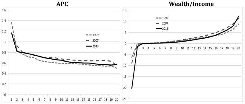
APC and Wealth/Income ratio by vingtile using PSID, 1999, 2007, 2013
Figure 3 confirms that the APC falls and wealth-to-income increases with income. However, there are differences over the years. The APC uniformly increases between 1999 and 2007, except for the bottom vingtile, and then falls in 2013. The wealth-to-income ratio displays a similar pattern for much of the income distribution, except that the highest income households experience an increase in the wealth-to-income between 2007 and 2013. This confirms other research (Yellen, 2014) that the top 5 percent are experiencing much of the gains in wealth as well as income during this latter period.
A third measure of the joint distribution would be the transition matrices for each pair of measures (as in Fisher et al., 2015b). Similar to Fisher et al. (2015b), income and consumption are more highly correlated than income and wealth or wealth and consumption.18 As shown in Fisher et al. (2015a), there are differences in the distribution of each of the measures by age. Specifically, elderly are more likely to be in the top wealth and consumption quintiles. This suggests that the high APCs for higher wealth households at the bottom of the income distribution are in large part due to retirees, and that the joint distributions will be affected by the age distributions.
Intra-generational Mobility
Finally, we can exploit this longitudinal availability of all three measures in the PSID to examine the mobility of people across the various distributions. To examine intra-generational mobility, we restrict the sample to those adults who are aged 25-50 in 1999, and construct transition matrices between 1999 and 2013 for these adults (we also examined mobility between 1999 and 2007, and 2007 and 2013). Fisher and Johnson (2006) used the PSID to show that income mobility and consumption mobility were similar between 1984 and 1999 using an imputed measure of consumption. Table 3 shows the transition mobility matrices for income, consumption and wealth. All three show the standard twin peaks phenomenon seen in the relative mobility literature – with larger percentages remaining in the top and bottom quintiles (see Fisher and Johnson, 2006). These tables suggest that mobility for all three measures is similar. The main difference is in that the stickiness at the top is more apparent in wealth, than in income and consumption. Table 3 shows that 64 percent of people in the top wealth quintile in 1999 remain there in 2013, while only 53 percent for income and 50 percent for consumption remain in the top quintile. The respective percentages remaining in the bottom quintiles are much more evenly split, 51 percent for both income and consumption and 46 percent for wealth.
Table 3:
Mobility transition matrices between 1999 and 2013 by income, consumption and wealth (in percent; each row adds to 100)
| Income (1999-2013) | |||||
| Q1 | Q2 | Q3 | Q4 | Q5 | |
| Q1 | 51 | 28 | 14 | 4 | 3 |
| Q2 | 27 | 29 | 25 | 14 | 5 |
| Q3 | 10 | 21 | 27 | 30 | 12 |
| Q4 | 7 | 15 | 21 | 30 | 27 |
| Q5 | 3 | 8 | 14 | 22 | 53 |
| Consumption (1999-2013) | |||||
| Q1 | Q2 | Q3 | Q4 | Q5 | |
| Q1 | 51 | 25 | 15 | 7 | 2 |
| Q2 | 27 | 28 | 21 | 17 | 7 |
| Q3 | 11 | 24 | 24 | 24 | 17 |
| Q4 | 6 | 16 | 24 | 29 | 25 |
| Q5 | 4 | 7 | 16 | 24 | 50 |
| Wealth (1999-2013) | |||||
| Q1 | Q2 | Q3 | Q4 | Q5 | |
| Q1 | 46 | 32 | 14 | 5 | 3 |
| Q2 | 27 | 33 | 25 | 13 | 4 |
| Q3 | 16 | 22 | 33 | 22 | 6 |
| Q4 | 7 | 9 | 19 | 39 | 25 |
| Q5 | 3 | 4 | 8 | 21 | 64 |
The PSID is viewed as the cornerstone survey to examine mobility (see Haskins et al. (2008) and Pew (2012)). Recently, Pfeffer and Killewald (2015) examined intergenerational wealth mobility and also find that the top is more immobile, with 44 percent of children being in the top wealth quintile at the same age as when their parents were in the top quintile, and 34 percent with both in the bottom wealth quintile at the same age. Given that this is a longer period than 14 years, it could be that extending our results to 25 years (or a generation) may yield similar levels of individual mobility as compared to intergenerational mobility (and this extension is part of future research).
One method to summarize the levels of mobility is to use the Shorrocks mobility index (as in Fisher and Johnson, 2006).19 These summary measures, shown in Table 4, confirm that mobility for all three measures is similar over the 1999-2013 period. This is also similar to the results of Fisher and Johnson (2006) shown in the bottom part of Table 4.20 The Shorrocks index can be interpreted as the proportion of individuals moving across the distribution. Hence, between 1999 and 2013, 77.5 percent of individuals move across the income distribution while 79.4 percent move across the consumption distribution and fewer, 71.3 percent, move across the wealth distribution. As usual, shorter time periods yield less mobility. While consumption mobility is slightly smaller than income mobility in Fisher and Johnson (2006), we find it to be slightly larger in the more recent time periods.
Table 4:
Shorrocks Mobility coefficient, various periods
| Income | Consumption | Wealth | |
|---|---|---|---|
| 1999-2013 | 0.775 | 0.794 | 0.713 |
| 2001-2007 | 0.677 | 0.741 | 0.668 |
| 2007-2013 | 0.664 | 0.731 | 0.674 |
| 1984-1999 (Fisher/Johnson) | 0.815 | 0.819 | |
| 1984-1990 (Fisher/Johnson) | 0.701 | 0.676 | |
| 1990-1999 (Fisher/Johnson) | 0.745 | 0.702 |
Finally, we can examine the mobility for income and consumption by the level of wealth by creating separate mobility matrices for each wealth quintile. Results show that there is less income mobility at lower wealth quintiles. While half of those in the bottom income quintile in 1999 remain in the bottom in 2013, 60 percent of those in the bottom wealth quintile remain in the bottom income quintile in 2013, while only 20 percent of those in the top wealth quintile remain in the bottom income quintile. Wealth creates more stickiness at the top suggesting that intra-generational income mobility decreases with wealth.
While these measures show the stickiness at the bottom and top of the distributions, they also show a fair amount of intertemporal mobility. One manifestation of overall economic inequality comes from the number of people who continuously remain in the top or bottom of the distributions. We can examine the permanency of the lack of mobility by finding the percent of people who are always in the top and bottom quintiles for each period between 1999 and 2013. Table 5 shows the percentage of people who were in the top or bottom quintiles in 1999 and remained there for each period until 2013. As expected, since the period before the recession began (in 2007) is longer, fewer people are stagnant for all years. But for the entire period, 23 percent of people in the bottom income quintile are stuck there for all periods, and 4 percent of people who were in the bottom wealth quintile in 1999 remain stuck in the bottom quintile for all three measures in 2013. Similarly, 8 percent of those people who are in the top quintile in 1999 remain in the top for all three measures for all years.
Table 5:
Percentage of people in the bottom and top quintiles who remain in same quintile for all years between 1999 and 2013
| 1999-2007 | 2007-2013 | 1999-2013 | |
|---|---|---|---|
| Q1 Income | 35.0 | 45.5 | 23.4 |
| Q1 Consumption | 31.5 | 38.2 | 20.3 |
| Q1 Wealth | 32.8 | 28.8 | 16.4 |
| Q5 Income | 37.5 | 47.2 | 27.1 |
| Q5 Consumption | 35.1 | 40.1 | 25.1 |
| Q5 Wealth | 47.0 | 55.7 | 39.0 |
| Q1 for all three | 8.7 | 5.6 | 3.8 |
| Q5 for all three | 12.1 | 15.7 | 8.0 |
As before, the top is stickier; 7.5 percent of people in the top quintile remain in the top quintile of all three measures from 1999-2013, compared to 4 percent in the bottom quintile of all three measures over the same span of years. In fact, 40.7 percent of all people in the top wealth quintile in 1999 remained there for all 8 periods (2001, 2003, 2005, 2007, 2009, 2011, 2013). And 8 percent of people in the top quintile (for one measure) in 1999 remain in the top quintiles for all three measures for all years.
Concluding Remarks
Our work on the conjoint distributions of income, consumption and wealth is just beginning. Inequality in all three measures is rising, but the changes are not perfectly correlated. Many households have relatively high consumption, but low income, suggesting spending out of wealth (or increases in wealth not recorded in standard income definitions). Many high wealth households consume modestly and have lower incomes, suggesting that retirees play a role in what we see here; however, when the elders are removed from the sample in our SCF work (Fisher et al, 2015b) the patterns observed are not much changed. Still, we find a high correlation where 20 percent of all people who are in the top quintile for all three measures in 1999 remain in the top quintile for all three measures in every year between 1999 and 2013, and 10 percent of households who are in the bottom quintile for all three measures are in the bottom quintile for all three measures in every year between 1999 and 2013.
By presenting results using income, consumption, and wealth for the same households, we have improved our understanding of inequality in the U.S. The three measures are not perfectly correlated, but there is much higher correlation in the tails of the distribution, suggesting that uni-dimensional inequality understates the true level of overall economic inequality. Most research on inequality focuses on income alone, but that may well not be the best single measure of inequality. Economists prefer consumption as a measure of permanent income, and wealth incorporates both the ability to increase income and the ability to consume directly. While this paper focuses on the overall population without a complete examination of the differences by age, race or other demographics, future work will follow the methods in Fisher et al. (2015a) to evaluate the demographics of mobility.
Wealth is a stock that can be used to stabilize consumption in times of misfortune, or to increase realized income flows. Because wealth is so highly skewed and becoming more skewed over time, it also allows the wealthy to ensure the economic success of their children. That is, personal and business wealth provides one an ever-increasing cushion against economic misfortune and a dynastic advantage to maintaining one’s social position over time. Eads and Tach (2016) demonstrate that wealth increases family stability, which impacts the well-being of children, and hence, could impact the level of intergenerational mobility. This advantage can also extend across generations providing the ability to save, purchase durables, finance education, and borrow more cheaply. This can also increase the ability to provide more inter-vivos transfers, which affects intergenerational mobility (see Rauscher (2016)). Accumulated wealth clearly leads to benefits for the children of high-wealth households over other children, and thus may compromise equality of opportunity and diminish intergenerational mobility (Fisher et al., 2015a).
Increasing wealth inequality also provides the wealthy with increased ability to use their wealth and power to shape public policy and receive favorable legal treatment and tax treatment (Stiglitz, 2012). One method to shift more benefits to lower and middle-income families could be to modify the personal and child tax exemptions, which are of equal value to all (Smeeding, 2016). This increase in inequality and concentration of power may also lead to lower rates of human capital accumulation, and hence slow economic growth (OECD, 2014). The accumulations of wealth suggest that policy is needed to limit the influence of the wealthy without diminishing overall savings behavior.
Our paper documents the rise in income, consumption and wealth inequality in the U.S. and identifies some of the ways in which these three are correlated. We also argue that the most serious inequality is that of wealth as it influences consumption, income, and tax policy. Since this increase in inequality reduces equality of opportunity and mobility, policy could focus on methods to reduce the concentration of wealth as it passes from generation to generation, and to lessen its impact on mobility and political life.
Footnotes
The views expressed in this research, including those related to statistical, methodological, technical, or operational issues, are solely those of the authors and do not necessarily reflect the official positions or policies of the Federal Reserve Board of Governors, Bremen International Graduate School of Social Sciences (BIGSSS), Stanford University, University of Michigan or the University of Wisconsin-Madison. The authors thank the Russell Sage Foundation and the Washington Center for Economic Growth (WCEG) for their support. All errors of commission and omission are the responsibility of the author alone.
Yellen (2014) remarked “It is no secret that the past few decades of widening inequality can be summed up as significant income and wealth gains for those at the very top and stagnant living standards for the majority. I think it is appropriate to ask whether this trend is compatible with values rooted in our nation’s history, among them the high value Americans have traditionally placed on equality of opportunity.”
One exception is Jäntti, Sierminska, and Smeeding (2008), who model the joint distribution of income and wealth in a cross-national context.
Blundell (2014) in his address to the Royal Statistical Society states the importance of all three measures: “One thing is for sure, the results of the research presented here provide a strong motivation for collecting consumption data, along with asset and earnings data, in new longitudinal household surveys and linked administrative register data.”
In other ongoing comparable work we combine income and wealth in the SCF with consumption in the Consumer Expenditure (CE) Survey databases to pursue similar aims. While the SCF does not follow individuals longitudinally, it does include a special sample of the top one percent of the income and wealth distributions, something missing from the PSID and all other household income or consumption databases. The SCF aggregates compare well with National income and Product Accounts suggesting an important confluence of both macro and microeconomic accounts (Dettling et al., 2015).
Consumption is a better measure of permanent income (see Fisher, et al (2015)); however, another method to obtain a measure of permanent income would be to use a 5-10 year average income measure.
Thompson and Conley (2016) show how wealth inequality affects consumption and health.
This series is adjusted to remove the break in series between 1992-1993 due to survey changes (see Atkinson et al., 2011 and Hardy et al., 2015).
Smeeding and Thompson (2011) discuss the Haig-Simons income measure and construct a “More Complete Income” measure that attempts to account for the realized and unrealized returns on asset income.
Results are similar if we exclude the supplemental low-income (SEO) sample, and restrict the analysis to the SRC sample.
We also compare the cross-section results using the family weights and results are qualitatively similar.
Similar to Wolff (2016), wealth does not include defined benefit retirement or social security holdings. Future work will attempt to include this pension wealth following Devlin-Foltz et al. (2016)
Following Fisher and Johnson (2006) and Attanasio and Pistaferri (2014), we include the amount of food stamps (or SNAP) in the total food consumption.
We also compare the cross-section results using the family weights and results are qualitatively similar.
However, Dettling et al. (2015) suggest that only the SCF has levels of wealth accumulation that correspond well to the national aggregates in the Financial Accounts from the Federal Reserve.
These are also comparable to Krueger et al. (2015) who find the top 10 percent of wealth holds 67.4 percent, income holds 31.7 percent and consumption holds 29.8 percent.
This may be because many higher wealth households are living on retirement incomes, which are below their pre-retirement income levels. As shown in Fisher, et al (2015a), the elderly are more likely to be in the top of the wealth and consumption distribution, and hence, the impacts of the shares may be sensitive to the age distribution of the population.
The figures use the ratios of median income, consumption and wealth for each vingtile.
Results from the PSID are not shown but are available upon request.
The Shorrocks measure for a quintile transition matrix is (5 – sum of main diagonal)/4. A higher Shorrocks number indicates higher mobility. Another measure used in Fisher and Johnson (2006) is the Gini index of mobility.
Since Fisher and Johnson (2006) use a different sample, one cannot make the claim that mobility has fallen between decades even though both sets of results use the PSID.
Contributor Information
Jonathan Fisher, Stanford University.
David Johnson, University of Michigan.
Jonathan Latner, BIGSSS, University of Bremen.
Timothy Smeeding, University of Wisconsin.
Jeffrey Thompson, Federal Reserve Board of Governors.
References
- Andreski P, Li G Samancioglu M and Schoeni R 2014. “Estimates of Annual Consumption Expenditures and Its Major Components in the PSID in Comparison to the CE,” American Economic Review, 104(5): 132–135 [DOI] [PMC free article] [PubMed] [Google Scholar]
- Aguiar M, and Bils M 2015. “Has Consumption Inequality Mirrored Income Inequality?” American Economic Review, 105(9), 2725–2756. [Google Scholar]
- Attanasio O, and Pistaferri L. 2014. “Consumption Inequality over the Last Half Century: Some Evidence Using the New PSID Consumption Measure.” American Economic Review, 104(5): 122–26. [Google Scholar]
- Atkinson A, Piketty T, and Saez E 2011. “Top Incomes in the Long Run of History, Journal of Economic Literature, 49:1, pp 3–71. [Google Scholar]
- Blundell R 2014. “Income Dynamics And Life-Cycle Inequality: Mechanisms and Controversies,” The Economic Journal, 124, 289–318. [Google Scholar]
- Boushey H and Price C 2014. “How are Economic Inequality and Growth Connected?” Washington Center for Equitable Growth. [Google Scholar]
- Burkhauser R, Feng S, Jenkins S, Larrimore J 2012. “Recent Trends in Top Income Shares in the USA: Reconciling Estimates from March CPS and IRS Tax Return Data.”
- Carroll C, Slacalek J, Tokuoka K, and White M 2015. “The Distribution of Wealth and the Marginal Propensity to Consume,” unpublished manuscript.
- Congressional Budget Office. 2011. “Trends in the Distribution of Household Income Between 1979 and 2007,” CBO report. [Google Scholar]
- Cooper D and Dynan K 2015. “Wealth Effects and Macroeconomic Dynamics,” Journal of Economic Surveys, forthcoming. [Google Scholar]
- Council of Economic Advisors, 2012, Economic Report of the President, 2012, GPO. [Google Scholar]
- Dettling LJ, Devlin-Foltz S, Krimmel J, Pack S and Thompson J 2015. “Comparing Micro and Macro Sources for Household Accounts in the United States: Evidence from the Survey of Consumer Finances,” Finance and Economics Discussion Series 2015-086 Washington: Board of Governors of the Federal Reserve System. [Google Scholar]
- Devlin-Foltz S, Henriques A, and Sabelhaus J 2016. “Is the Retirement System Contributing to Rising Wealth Inequality?” this issue.
- Eads A and Tach L, 2016. “Wealth and Inequality in the Stability of Romantic Relationships,” this issue.
- Ermisch J, Jäntti M, and Smeeding TM (eds.). 2012. From Parents to Children: The Intergenerational Transmission of Advantage. New York: Russell Sage Foundation. [Google Scholar]
- Fisher J and Johnson D 2006. “Consumption Mobility in the U.S.: Evidence from two panel data sets,” Topics in Economic Analysis and Policy, Vol 6:1 [Google Scholar]
- Fisher J, Johnson D, and Smeeding TM 2015. “Inequality of Income and Consumption: Measuring the Trends in Inequality from 1984–2011 for the Same Individuals.” Review of Income and Wealth, 61:4, 630–650. [Google Scholar]
- Fisher J, Johnson D, Smeeding T, and Thompson J 2015a. “Demography of Inequality: Income, Wealth and Consumption, 1989–2010, paper presented at Population Association of America, May 2015. [Google Scholar]
- Fisher J, Johnson D, Smeeding T, and Thompson J 2015b. “Inequality in 3-D: Income, Consumption and Wealth,” paper presented at NBER summer institute, July 2015. [Google Scholar]
- Gates B 2014. “Why Inequality Matters,” GatesNotes, October 13, 2014. [Google Scholar]
- Hardy B, Gindelsky M, Fixler D, and Johnson D 2015. “Inequality in America: The Role of National Income, Household Income, and Transfers,” BEA unpublished working paper. [Google Scholar]
- Haskins R, Isaacs J and Sawhill I 2008. “Getting Ahead or Losing Ground: Economic Mobility in America,” Brookings Mobility Project. [Google Scholar]
- Heathcote J, Perri F and Violante G 2010. “Unequal We Stand: An Empirical Analysis of Economic Inequality in the US, 1967-2006”, Review of Economic Dynamics 13, pp 15–51. [Google Scholar]
- Jäntti M, Sierminska E, and Smeeding TM. 2008. How is Household Wealth Distributed? Evidence from the Luxembourg Wealth Study In Growing Unequal, Paris: OECD, pp. 253–271. [Google Scholar]
- Killewald A and Bryan B 2016. “Does Your Home Make You Wealthy?” this issue
- Kimberlin S, Kim J and Shaefer L 2014, “An updated method for calculating income and payroll taxes from PSID data using the NBER’s TAXSIM, for PSID survey years 1999 through 2011, University of Michigan manuscript. [Google Scholar]
- Krueger D, Mitman K, and Perri F 2015. “Macroeconomics and Household Heterogeniety,” forthcoming in Handbook of Macroeconomics. [Google Scholar]
- Krueger D and Perri F 2006. “Does Income Inequality Lead to Consumption Inequality? Evidence and Theory,” Review of Economic Studies, 73, pp. 163–193. [Google Scholar]
- Meyer B, Mok W and Sullivan J 2105 “Household Surveys in Crisis,” NBER Working Paper 21399, July 2015
- OECD. 2014. “Focus on Inequality and Growth” Paris: OECD. [Google Scholar]
- Pew Charitable Trusts, Pursuing the American Dream: Economic Mobility Across Generations, Washington: 2012. [Google Scholar]
- Piketty T 2014. Capital in the Twenty-First Century Belknap Press. [DOI] [PubMed] [Google Scholar]
- Piketty T and Saez E. 2003. “Income Inequality in the United States, 1913-1998,” Quarterly Journal of Economics, 118(1), 1–39. [Google Scholar]
- Pfeffer F, Sheldon D, and Schoeni R 2014. Wealth Levels, Wealth Inequality and the Great Recession. Russell Sage foundation [Google Scholar]
- Pfeffer F and Killewald A 2015. “How Rigid is the Wealth Structure and Why? Inter- and Multigenerational Associations in Family Wealth,” University of Michigan Population Studies Center Research Report 15-845, September 2015
- Pfeffer F and Schoeni R 2016. “Wealth Inequality in the United States: Levels, Trends, Causes, and Consequences,” this issue
- Rausher E. “Passing It On: Parent-to-Adult Child Financial Transfers for School and Socioeconomic Attainment,”. 2016. this issue.
- Saez E and Zucman G 2014. “Wealth Inequality in the United States since 1913: Evidence from Capitalized Income Tax Data,” NBER Working Paper 20625.
- Smeeding TM, and Thompson JP 2011. “Recent Trends in the Distribution of Income: Labor, Wealth and More Complete Measures of Well Being.” Research in Labor Economics May: 1–49. [Google Scholar]
- Smeeding T 2016. “The Case for Reducing Child Poverty in America,” Pathways: Stanford Center on Poverty & Inequality, Stanford University, in press. [Google Scholar]
- Stiglitz JE 2012. The Price of Inequality, W. W. Norton: NY. [Google Scholar]
- Stiglitz JE, Sen A, and Fitoussi J. 2009. Report by the Commission on the Measurement of Economic Performance and Social Progress. United Nations Press, 2009 [Google Scholar]
- Thompson J and Conley D 2016. “Health Shocks and Social Drift: Examining the Relationship between Acute Illness and Family Wealth,” this issue.
- Wolff E. “Household Wealth Trends in the United States, 1962-2013: What Happened over the Great Recession? 2014. NBER Working Paper No. 20733.
- Wolff E 2016. “Household Wealth Trends in the United States, 1962–2013: What Happened over the Great Recession?” this issue.
- Yellen J 2014. “Perspectives on Inequality and Opportunity from the Survey of Consumer Finances,” Remarks at the Conference on Economic Opportunity and Inequality, Federal Reserve Bank of Boston. [Google Scholar]