

Abstract
A variety of methods have been proposed for presenting medical data visually on computers. Discussion of and comparison among these methods have been hindered by a lack of consistent terminology. A taxonomy of medical data presentations based on object-oriented user interface principles is presented. Presentations are divided into five major classes—list, table, graph, icon, and generated text. These are subdivided into eight subclasses with simple inheritance and four subclasses with multiple inheritance. The various subclasses are reviewed and examples are provided. Issues critical to the development and evaluation of presentations are also discussed.
Many different approaches have been taken to the presentation of medical data on computer screens. Every year more papers describing computer displays of medical data are published. Because different groups often use different terminology to describe similar methods, it is not always clear which of these are new methods, which are incremental improvements on existing methods, and which are existing methods applied to new data types. In addition, no single terminology has been identified that could inclusively address all the data presentation methods that have been reported for medical data. To address these limitations, we have developed a terminology and taxonomy based on object-oriented principles for user interface design.1
In discussing medical data presentation, we are using the term “data” in its broad sense to include both single data elements and more complex data structures. We will not distinguish between “data,” “information,” and “knowledge” except to discuss the different presentation demands of the more complex data structures. Much recent literature in medical informatics has focused on the collection and display of complex, non-numeric information such as symptoms and diagnoses. This discussion will reflect that trend, giving special emphasis to newer displays of non-numeric data. The discussion will begin with some background and definitions. We will present a basic class hierarchy, followed by examples and discussion of the various presentation classes. Next will be a discussion of multiple inheritance. Last, some general issues in the development and evaluation of presentations will be discussed.
Scope
The literature on medical data presentation is so vast and diverse that we feel obligated to concede at the outset that this is not a comprehensive review of the field. Although such a work is desperately needed, it would be beyond both the stamina of the authors and the page limits of this journal. The examples cited should not be interpreted as representing necessarily the earliest or best instances of a given class of presentation. Although some historical examples have been used, the majority of the examples have been chosen to represent current practices in medical data presentation. In cases where no medical reference could be found, nonmedical sources have been cited. For further historical examples, we would direct readers to the recent work by Horn,2 as well as the excellent works reviewed by Kosslyn,3 especially those by Bertin4 and Tufte.5
Discussions of data presentation typically divide between the abstract/theoretic and the empirical/practical.3 This work is primarily of the empirical/practical type. Although based on object-oriented theories, our primary goal is to assist those who must choose and implement data presentations. We are also limiting the taxonomy to static computer displays. Sound, motion, and tactile feedback will be addressed briefly in a discussion of multimedia data display but are not included in the present taxonomy. This is obviously an area for further work.
Lastly, we are focusing on the data presentations themselves rather than on related semantic and ontological issues. Although semantics and ontologies have implications for data presentation,6 the first step in discussing these relationships clearly is to develop a nomenclature for presentations that is independent of particular semantic or ontological models. In this way, the relationships can be most flexibly and explicitly described. Similarly, the different cognitive strategies used by clinicians have implications for data presentation.7 To clearly describe these implications, a nomenclature that focuses on the presentations themselves is needed.
Presentation versus Representation
Tang and Patel8 noted that terminology used in discussions of human-computer interaction does not always distinguish between the electronic storage of data and its sensory manifestation by a computer. “Sensory manifestations” are those things that can be perceived by the user's senses. Examples include visual display, sound generation, and tactile feedback. When applied to computer interfaces, the term “representation” has become ambiguous. In an artificial intelligence, or knowledge representation, context it refers to an “account of the knowledge that the overall process exhibits.”9 In contrast, texts on graphics refer to representation as a physical sign system. Jacques Bertin states:
Graphic representation constitutes one of the basic sign-systems conceived by the human mind for the purpose of storing, understanding, and communicating essential information. As a “language” for the eye, graphics benefits from the ubiquitous properties of visual perception.... Graphics is one of the major “languages” applicable to information processing.4
To disambiguate these two very distinct concepts, we will resort to the terminology of Jorna10:
Representation: the internal (person or computer) form of perceptual and propositional information, utilized for inference, computation, and internal storage.
Presentation: a sensory manifestation of information. This may be in any form—tactile, auditory, or visual. It may be static or dynamic. This external manifestation may be used for external storage or transmission.
For example, in a word processing program, electronic impulses in computer memory form a representation of the content of a document. These can be converted into either a paper-based presentation or a screen presentation. The paper-based presentation may then be used to transfer the information to another location or to store the information externally, as on a bookshelf. However, before a reader can process the information, it must first be converted into an internal representation in the reader's mind.
Short Review of Medical Data
This discussion will focus on the presentation of structured medical data. The term “structured” relates to data that is organized for computer analysis and processing. Examples include laboratory results, coded diagnoses, and procedures. This is in contrast to data that may be stored on a computer but cannot be analyzed. For example, a page from a paper medical chart can be scanned and the scanned image stored electronically. Although the image can be displayed on a computer screen, the content of that image can be queried by only very limited means. In a similar manner, many text reports in electronic medical records are stored as simple ASCII code and displayed as “raw” text. Many references discuss the general principles for the display of text on a computer screen,11 and we will not address that here. However, because natural language generation (NLG) makes it possible to convert structured data into text, generated textual presentations will be discussed in that context.
Any discussion of data presentation requires terminology for describing the types of data presented. Roth and Matti12 discuss a data classification for graphic presentation based on the schema of Stevens,13 which has been used for more than half a century. In short, they describe three data types based on the ordering of elements in the domain set:
Quantitative: Elements of the domain set are ordered numerically and equally spaced. This data type subsumes the interval and ratio data types of Stevens13 It includes both discrete values (e.g., number of children) or continuous values (e.g., height). Much of the work in medical data presentation has focused on this type of data.
Ordinal: Elements are still ordered, but the spacing is not necessarily uniform. “Element ordering is peculiar to the semantics of the set.”12 A typical example would be a subjective judgment scale (poor, fair, good, excellent).
Nominal: Elements of the domain set are not ordered. Medical examples would include diseases and medications.
Ordinal and nominal data types are frequently confused. Depending on the semantics of a domain, apparently identical data elements might be either. Depending on the context, the terms “sniffles,” “bronchitis,” and “pneumonia” could either constitute three independent diagnoses or represent an ordinal set from mild to severe. Computer system developers must consider the underlying semantics of a domain when developing or choosing a particular data presentation.
Another type of data that is frequently mentioned but not included here is “binary.” These are data with only two values (e.g., true/false, male/female). Binary was not included as a separate data type because, depending on the particular data, it can be modeled as either ordinal or nominal. For many laboratory test results, the binary (positive/negative) result is ordered, indicating whether the measured value was greater than or less than a given threshold value. Alternatively, it may be nominal, as in whether the patient is male or female. For data presentation, it is important to remember that many, supposedly binary, data sets are actually multivalued nominals. For example, “gender” may include not only “male” and “female” but also “other,” “unknown,” and “ambiguous.”
Current electronic medical records store not only atomic data elements but also relations between these elements, creating more complex data structures. These relations between elements (e.g., HAS_ATTRIBUTE, IS_A, and PART_OF) can be viewed individually as nominal data elements. However, the display of these complex structures presents special challenges. For convenience we will discuss them as a fourth category—complex (or nested) nominal. In this data type, a nominal data element, such as a disease or symptom, is combined with a variable number of modifiers that alter its meaning. In addition, the modifiers can also have modifiers in a nested fashion. Many medical data are inherently nested. A good example is radiologic data. A chest radiograph may describe “a possible increase in a 5 cm nodule.” In this case, a finding (nodule) is modified by a size (5 cm), which is modified by change (increase), which is modified by certainty (possible).
Basic Presentation Classes
Modern graphical user interfaces (GUIs) are typically assembled out of discrete components, termed widgets (discussed in Ebert14) or interface objects1 This is especially true of the newer object-oriented programming languages, such as Java15 In practical terms, it is the task of the system developer to select or develop interface objects that provide the needed data display functions. Similarly, GUIs can be analyzed at the level of individual interface objects16 In classifying various presentations, we applied the object hierarchy approach of Shneiderman's object-action interface model1 Presentation objects were divided into five major classes—list, table, graph, icon, and generated text. These can be further divided into eight subclasses, which are described briefly in ▶. More complex presentation objects can be created by encapsulating one class of presentation object in another or by developing new subclasses that inherit attributes from multiple parent classes. The multiple inheritance is shown in ▶.
Figure 1.

Presentation taxonomy showing the five major classes, eight simple subclasses and four multiple-inheritance subclasses of presentations. This figure is an example of the nested list presentation. Notice that multiple inheritance is difficult to display in this format.
Figure 2.

Directed acyclic graph showing presentation taxonomy. This is a variant of the simple tree graph in which multiple inheritance is allowed. Notice that graphs display multiple inheritance more clearly than does the nested list shown in ▶. NLG indicates natural language generation.
Two primary criteria were used in creating the classes. First, different classes represent different methods of organizing information in the presentation. A list is organized as a sequence. The rows and columns of a table provide two orthogonal groups of categories into which items are placed. Graphs rely on spatial organization. Icons, intrinsically, are discrete symbols representing discrete concepts. Generated text relies on syntactic rules for organization. The second criterion was that the classes mapped closely to common software objects used for data presentation. In this way, the taxonomy would more closely reflect the actual design choices made by system developers.
Lists
Lists are ubiquitous in medicine. The medical record contains lists of diagnoses, procedures, results, and so on. These appear in both computerized and paper-based records.
Simple Lists
The most common method of displaying medical data on a computer is a simple list, such as a list of medications, procedures, diagnoses, or active problems. It has the advantage of being the simplest display format and one of the easiest to program (▶). In object programming environments, lists are typically called listbox or menu objects. One challenge for the developer of list displays is choosing optimal labels for items. Since the amount of time needed to read text is related to the number of characters,17 developing short, concise labels is an obvious goal. Simple lists are also the basic element of most point-and-click menus. Factors like selection frequency must also be considered in the design of menus. User interface texts typically devote significant attention to menu design1,14 Virtually all GUI software tool kits include listbox objects.
Figure 3.

This is an example of a simple list. A patient's problem list.
Nested Lists
Complex nominal data do not display well as simple lists. An example of nested radiologic data was discussed in the section on data types. Because the number of modifiers and the depths of the nesting are variable, this type of data is difficult to display as either a simple list or a table (discussed in the next section). Instead, the relations among findings can be presented in lists by using a formatting convention. The UltraSTAR system uses this approach to display ultrasound findings18,19 This style is preferred by some, but not all, clinicians19,20 Nested lists can also be viewed as an example of encapsulation, in which an element in one list is itself a list. The presentation taxonomy of this paper (▶) is an example of such nested data. An important design question is whether all the sublists will be visible by default or whether user action is required to display the lower-level components. By far the most well known example of nested lists with optionally displayed sublists is the Microsoft Windows display of file directory structure. In this and most other graphical computer interfaces, only the top level of the directory is shown initially. By clicking on any item in the initial list, the user can display the listing of that subdirectory. Many GUI tool kits include nested list objects.
Tables
Tabular presentations are routinely used for the display of numeric data. The most common example is the display of laboratory data. These may be simple tables containing only attribute-value pairs (sodium 150, potassium 5.0), or they may be more complex (▶). Tabular displays are excellent for presenting individual values, but they are less well suited to showing trends and patterns21 Because tables already use both horizontal and vertical dimensions, it is not possible to use simple indenting to provide increased detail. For small data sets, it is possible to place an entire small table in each cell of a larger table. This allows for the presentation of multidimensional data in a two-dimensional table. For larger data sets, a common approach is to allow the user to “drill down” by placing the mouse cursor on an individual cell of the table. When this is done, additional information is displayed either as a “pop-up” display or at the side of the original table. As with lists, most graphical tool kits include basic table objects. Nested tables and dynamic interactions typically require custom programming.
Figure 4.

Table. Laboratory results are frequently displayed in tabular form. This example presents serial results of a common serum electrolyte battery. Notice the creatinine (CR) values in the last column for comparison with the line chart presentation in ▶.
Graphs
Graphs convey information by an arrangement of points (or nodes) and lines (or edges). “Graph” should not be confused, because of the similarity of terms, with “graphical display,” which is often used to mean any presentation containing more than raw ASCII text. Probably the most common graph in medicine is the electrocardiogram, on which voltage is plotted against time. Graphs can be further divided into three types—simple charts, configural charts, and graph notation.
Simple Charts
The term “chart” is used to distinguish this presentation from the more general “graph.” Essentially, charts are arrangements of points and lines in a space of one or more dimensions, where their location conveys a significant information. William Playfair is credited with introducing most of the contemporary forms of charts in his “The Commercial and Political Atlas (cited by Kossly3). Many variations of chart presentations have been developed for medical data. The most common is the simple XY line chart of numeric values versus time22,23 These have been used to show trends in laboratory values (▶). When the individual data points are not part of a set, the plotted points are not connected. This type of chart is often called a “scatter plot.” Another variant of the chart has each data point connected to the baseline or side axis by a bar, resulting in the familiar “bar chart.” Typically, bar charts are used when numeric values are plotted against nominal categories, such as average blood pressure versus race. Although two-dimensional charts are by far the most common, pseudo three-dimensional charts have also been used to display laboratory dat24 (▶). Charts within charts have been used to represent six or more dimensions of financial data25 Such high-dimensional charting has not been reported yet for medical data.
Figure 5.

Line chart, presenting the creatinine values shown in ▶. Notice that the rise and fall of the creatinine level is much more obvious here than in the tabular display. On the other hand, the determination of individual values is more tedious.
Figure 6.

Pseudo three-dimensional chart of laboratory data (after the style of Enlande24). Normalized values are displayed as elevation above a ground plane. Data values are the same as those shown in ▶. The display can be rotated to enable the viewer to see parts hidden behind peaks.
Charts can be difficult to interpret when multiple data series are displayed21 To avoid this problem, some interface developers have placed each series on a separate small chart, in so-called small multiples26 Others have developed composite indices that represent multiple variables and have graphed those27 Some have mixed data of different types (such as medication and neurologic status) on the same graph group26,28 Some work has been done on the automated design of charts based on the data types being displayed29 Increasingly, graphical software tool kits include standard charting objects.
Configural Charts
The term “configural” means that the presentation of the data creates a shape, “configuration,” or “emergent feature”30 that can be recognized31 With a traditional XY line plot, relationships among related data items can be hard to convey. In contrast, a single shape can convey information regarding multiple relations at one time. Although virtually all data presentations have some level of configurality, configural charts are presentations that are specifically designed to facilitate the recognition of underlying patterns in the data. In configural charts, additional features are added to the presentation to make the configural nature of the data explicit.
Unfortunately, the description of this phenomenon in the medical data presentation literature has become so confused as to warrant a short digression. The terms “integral,”32,33 “integrated,”34 “configural,”30,35 and “objectness”36 have all been used interchangeably to describe similar characteristics of data presentations. We agree with Carswell35 and Bennett and Flac31 that these terms refer to distinct concepts.
The literature on “integrality” is most frequently traced to Garner and Felfoldy,37 but an earlier discussion of the phenomenon can be found in Lockheed38 “Integrality” describes the way different visual features of a presentation interact and how these interactions are perceived. For example, if one data set is presented both brighter and differently colored, it will be noticed sooner than if either highlighting method is used alone. Not all visual features demonstrate integrality when combined. Integrality is defined as the extent to which a combination of features enhances performance when the features change in parallel but interferes with performance when they change in opposite directions. The related term, “integrated display,” is a variant that has not achieved widespread use.
Configurality can be traced back nearly five decades to the statistical literature. In 1950, Meeh39 proposed the concept of configural scoring of personality tests. Configural scoring is formalization of the observation that a pattern, or configuration, of values may be clinically significant even though nothing can be inferred from the values independently. A simple medical example would be height and weight in a physical examination. A height of 5 ft. or a height of 6 ft. could be either normal or clinically significant. The same is true for a weight of 100 lb or 200 lb. However, a height of 5 ft and a weight of 200 pounds, or a height of 6 ft. and a weight of 100 pounds would definitely have clinical significance. When applied to presentations, configurality refers to the ability of the viewer to perceive underlying patterns in the data40
The term “object display” was introduced by Wickens36 It describes presentations in which the display components are joined to create a single “object,” typically one with a closed boundary. Common examples include rectangles or other polygons. An interesting paradox is that object displays may not improve users' abilities to perceive patterns in data. In some cases, they are less configural than are traditional bar graphs41,42 Object displays are most successful when the critical data relationship is known in advance and the display is designed to emphasize that relationship43
The idea that presentations could be recognized as a whole was introduced into the medical informatics literature by Cole32 Unfortunately, Cole chose the term “integrality” to describe this characteristic of presentations, adding to the confusion. We believe that configurality is the better term, both for historical reason38,39 and for the most consistency with the human factors literature31,35 Since the intent behind object displays is to improve the recognition of patterns in the data,36 we consider them a subset of configural presentations.
The polar-polygon plot is among the configural charts most frequently used for medical data44,45 ▶ shows a hypothetic polar-polygon plot of results of a routine blood electrolyte test, where one value is out of the normal range. Even before the individual values are recognized, an observer can recognize the general shape of the polygon. To display respiratory data, shading, textures, and grouping have been used to increase the amount of information conveyed by configural presentations46
Figure 7.

Configural chart. This polar-polygon plot presents the results of a serum electrolyte battery. When scales on the individual axes are normalized, patterns are easy to spot. In this example, creatinine is disproportionately high, resulting in a polygon that is skewed in one direction.
As noted before, virtually all presentations demonstrate some degree of configurality. Two characteristics separate configural charts from simple charts. First, configural charts are specifically designed to enhance recognition of particular emergent features that are related to particular decision-making requirements. Second, the software implementation of configural charts, unlike that of simple charts, is rarely supported by standard graphic software packages and, instead, requires custom programming.
Graph Notation
While charts are often excellent for the display of numeric or ordinal data, it is difficult to chart purely nominal data or show the relationships among individual nominal data elements4,29 In contrast to charts, graph notation is a collection of labeled nodes connected by edges. The information is contained in the labels on the nodes and edges and in the topology of the edges, rather than in their location on a coordinate system. To convey the relationships among nominal data items, some variant of a tree structure is often used47,48,49,50 Improved computer graphic capabilities have allowed these trees to be extended to three dimensions6,51 Such tree structures have been used primarily to display the structure of hierarchic vocabularies or knowledge bases, such as the PDQ cancer knowledge resource6 These may have either simple or multiple inheritance52 A tree structure that allows multiple inheritance is called a directed acyclic graph (DAG). The presentation of the taxonomy in ▶ is an example of a DAG. Tree graphs can be used to display patient-specific information related to an underlying knowledge structur53 —e.g., values for an individual patient can be displayed on a decision tree to explain the result of the algorithm for that patient.
Simple graph notations, like the tree graph in ▶, presume that all the edges have the same meaning. In ▶, the meaning is subsumption. More complex notations are needed when the edges differ in meaning. The conceptual graph theory proposed by Sow54 is primarily a knowledge representation language. Conceptual graphs also have a graphical form that can be used to display complex data directly.54,55,56
Computerized tools can also generate such presentations.57 The graph notation presentation of the conceptual graph for the mammography finding “possible increased calcifications in the upper outer quadrant of the right breast” is shown in ▶. Conceptual graphs are well suited to applications in which it is important to explicitly specify the relationships between the data elements.
Figure 8.

Conceptual graph notation of the finding “possible increased calcifications in the upper outer quadrant of the right breast.”
The most common use of graph notation in health care has been in the modeling of system architectures,58 or the process of care,59,60 rather than in the display of individual patient data. (The subject of visual programming languages will be addressed under Iconic Languages.) Recently, a standardized modeling presentation, called the Unified Modeling Language,61 has been developed.
Graph-notation presentations pose two particular challenges for developers. Like tables and lists, graphs typically require labels for nodes (and sometimes for edges). There are no standardized methods for developing compact yet unambiguous labels. The second issue is related to the fact that the nodes and edges occupy only a small portion of the actual display area. The majority of the display actually consists of empty space between the information-bearing nodes and edges. ▶ is only slightly larger than ▶, yet it contains for more detail about the individual classes. Although graphs are well suited to conveying multiple simultaneous relationships between data elements, they may not be well suited to small-format displays, such as those of hand-held devices. Tree graph objects are beginning to be available in some GUI tool kits. It is likely that many implementations of the Unified Modeling Language will be available.61 More complex graph structures, such as conceptual graphs, still typically require significant custom programming.
Icons
The Icon Book62 defines icons as “small pictorial symbols used on computer menus, windows, and screens.” These are most commonly used in computer interfaces to indicate an action62 or a computer object like a data file.63 A reported advantage of icons is that they may be better remembered than are their corresponding text labels.63,64 Two types of icon presentations will be discussed—atomic icons and iconic languages.
Atomic Icons
Atomic icons are the most common type of icon presentation. The term “atomic” refers to neither the size nor the power of the pictorial symbol but rather to the fact that each symbol has only one intended meaning, and multiple symbols are not combined to create more complex meanings. The most common medical use of icons is to identify various buttons in medical applications. Another common use of icons is to draw attention to dangerous conditions or critical data. Atomic icons have also been used to present patientspecific nominal data items. Examples include medication administration,65 major life events in a longitudinal psychology record,66 and obstetric care events.67 Icons are also used in combination with chart displays to identify different data sets or events.23 An iconic history summary (after the style of Stinson and Horowitz66) is shown in ▶. A potential advantage of icons is that they can be placed on a graphical template to present both a nominal data item and its location simultaneously. This will be discussed in the section on annotated templates.
Figure 9.

Icon presentation of a hypothetic psychological history, using icons after the style of Stinson and Horowitz.66 Notice that the arrangement of the overall presentation is that of a chart, where the location of icons in relation to the time axis conveys additional information.
Iconic Languages
By “iconic languages” we mean “visual languages where each visual sentence is a spatial arrangement of icons.”68 (This is in contrast to Horton's definition, in which iconic languages are systematic rules for constructing icons from graphical primitives.62) For both medical and nonmedical applications, iconic languages have been purported to be more universal than textual languages.69,70,71 The best known work on iconic languages is probably Neurath's work on the ISOTYPE system in the 1920s and 1930s.72 Horton noted that this notion of a universal iconic language dates back to Leibnitz, in the 1600s.62 Although some icons, like the international traffic symbols, are very widely recognized, this universality has not been empirically demonstrated in medicine.
Several iconic languages for the presentation of medical data have been reported. The Dynamic Data Icon73 is a system for presenting studies, results, and treatments related to uterine cervical cytology. It is a rectangular graphic composed of 14 iconic components. It is claimed that the language can be learned in “seconds,” although empirical studies have not yet been reported. Another iconic language is the metaphor graphic presentation of tumor registry data (W. G. Cole, unpublished lecture notes, 1988). In this presentation, various characteristics of patients with melanomas are mapped to seven iconic components.
One of the more complex medical iconic languages is the Universal Visual Associative Language for Medicine (UVAL-MED), developed by Preiss et al.64,69 An earlier form of the UVAL-MED was concept graphics (not to be confused with conceptual graphs). In this language, primitive icons representing simple clinical concepts are combined to create more complex clinical concepts (▶). Concept graphics were originally developed as an aid to medical education. Studies of medical students learning nephrology have shown that those students who were presented with both text and concept graphics performed better on a quiz than students who were shown text alone. It is not clear whether concept graphics can be used to present data de novo or whether they work only as a sort of visual mnemonic. Concept graphics have been suggested as the data presentation format for expert systems,74 but no actual generation has been reported.
Figure 10.

Iconic language. Two examples of composite icons from the Universal Visual Associative Language for Medicine (UVALMED). On the left, superimposition is used to construct the concept; that is, “cell” and “increase” icons are superimposed on the “blood” icon to convey increased leukocyte count. Based on the icon primitives, this composite icon might also indicate any polycythemia. On the right, adjacency is used to construct the meaning.
Any discussion of iconic languages must address the issues of syntax and semantics. The ability of subjects to remember pictures better than words in both recall75 and recognition76 settings has been demonstrated. Unfortunately, it is impossible to create a separate icon for every possible concept.77 Languages convey complex concepts by combining simple concepts according to specific syntactic rules. How to best convey complex concepts with graphical presentations is still an open area of research. Two major topics must be considered—the mechanics for combining the icons themselves and the interpretation of the combined symbols.
Although Horton62 makes some suggestions about methods for combining icons, little empirical work has been done on iconic syntax, either methods or limitations. There are two basic “syntaxes” for iconic combination—superimposition and adjacency. Superimposition appears in many international symbols, such as “no smoking,” where a generic “no” icon is placed over the icon for a cigarette. It is also shown in ▶, where the icons for “increase” and “cell” are superimposed on the icon for “blood.” Adjacency is also shown in ▶, where the icon for “danger” is placed next to that for “perforation.”
While individual icons may have specific meanings, the methods for assigning meaning to these combined symbols are less clear77 Berti4 contends that the principal distinction between “graphics” and “language” is that graphics are monosemic. In other words, the meaning of each sign is known a priori and context does not alter meaning. In comparing graphics with language, he states:
A graphic can be comprehended only when the unique meaning of each sign has been specified (by the legend). Conversely, a system is polysemic when the meaning of the individual signs follows and is deduced from consideration of the collection of signs. Signification becomes subjective and thus debatable.”4
Bertin adds that pictures (as opposed to iconic symbols) are polysemic, because the interpretation of a particular picture is, at least slightly, ambiguous. This is consistent with the empirical observation that two radiologists may disagree about the interpretation of a particular image78
Others have also claimed that, unlike text, icons are unambiguous10,70 Icons may be monosemic in Bertin's domain of expertise, which is cartography. Most data types in maps are simple nominals (factory, person, road, lake, etc.) or the numeric sums of these over a geographic area. While monosemy may apply in theory, in practice the potential for ambiguity is obvious62 In ▶, a cross in a circle is used to indicate “hospitalization.” This icon has also been used to mean “first aid,” “ambulance,” “medicine,” and even “target.”
Practical work on iconic languages has generally accepted a certain amount of polysemy. In the Minspeak language,68 an icon-based speech generation system, the meaning of combinations of icons is related to, but not equal to, the additive combination of the individual meanings. Horto62 has a similar but less mathematical approach called “overlap,” in which the meaning of a composite icon is “a symbol of the intersection or overlap of their meanings.” In his example, the combination of “e = mc2,” a benzene ring, and an electrical diagram collectively means “technology.” Although the meaning is suggested, the symbol is clearly polysemic and could have other interpretations including “scientific modeling” or “nonbiological sciences.” In the Icon Text system,77 the impact of context on the interpretation of individual icons approaches that of textual language.
In the UVAL-MED (▶), complex meanings are created out of combinations of atomic icons69 However, the rules of combination are not precisely defined. Consequently, it is not clear how ambiguity is avoided. For example, an icon of a Martini glass indicates alcohol. The current UVAL-MED examples do not differentiate presentation of the fact that alcohol causes liver disease from presentation of the fact that alcohol treats methanol poisoning. In actual use, it often seems that the meaning of icon groups is simply learned rather than re-evaluated at each encounter. The “no smoking” icon is known by most people so well that they recognize it as a unit. They do not need to assemble the meaning out of “cigarette” and “negation.” A complex icon has a meaning that is hinted at, but not defined, by the component parts. The “no smoking” icon shows a lighted cigarette without really specifying what about it is being negated. In the absence of experience, someone might interpret the no smoking icon as meaning “do not leave lighted cigarettes lying around, hold on to them.”
Visual programming languages are a type of iconic language that is receiving considerable interest outside medicine71,79 Visual languages are software environments that allow programmers to define the behavior of hardware and software using icons rather than text. The icons are often arranged using graph notation. These can be used for software development,80 equipment control,81 and physiologic modeling82
Generated Text
Although text is not typically considered a data presentation, it is clearly part of many of the presentations already discussed. Many presentations rely on textual labels to convey much of the information. As noted in the introduction, this taxonomy does not address the display of raw textual reports. Neither does it include the formating and layout of text on a computer screen, which have been described in depth by others11 This section will address the ways that text has been used to present structured medical data. The use of natural language generation makes it possible to generate human-readable text from machine-readable coded data. Such generated text can provide labels for other presentations and serve as a data presentation in its own right.
Generated text has been used in medicine for more than 20 years83 Even so, there are relatively few examples. Production rule-based expert systems can generate textual explanations by backtracking through the rules and listing textual explanations for each step83 Medical logic modules in the Arden Syntax are able to generate explanations through simple template filling84 Several structured data entry programs are able to generate text reports from the data items entered19,85,86,87 The descriptions of these systems typically do not discuss generation methods in detail. One system has been developed to generate patient explanations using a template-filling approach88 A prototype system describing renal calculi has also been reported89
One advantage of generated text for presentation is that language possesses a complex syntax that is well suited to expressing multiple relationships among complex nominal data. Another advantage is that these syntactic structures are already known to native speakers of the language—no special training is needed to interpret the presentation. No studies specifically comparing generated text with other medical data presentations were located in the literature. Although generated text could, theoretically, be used to present virtually any type of data, intuitively it is better suited to conveying complex, subtle relationships among nominal data than to presenting simpler numeric or ordinal data. From a software standpoint, the display of text on the computer is supported by virtually all GUI tool kits. In contrast, the generation of the text from coded data typically requires complex, specialized programs89,90
Multiple Inheritance
As would be expected in almost any object-oriented taxonomy, some subclasses of presentations inherit characteristics from multiple superclasses. Almost any combination could be envisioned. We will limit our discussion to those presentations in which medical examples have been identified.
Annotated Templates
In addition to special symbols and abbreviations written out in text form, paper-based medical records often contain small graphics or sketches with textual or graphic annotation. The “stick figure” used to record reflexe91,92,93,94 (▶) is a well-known example. In pathology, it is customary to include diagrams of complex specimens to illustrate the lesion and identify the tissue blocks submitted for analysis95 Endoscopists make notations of findings on a diagram of the portion of bowel examined96,97
Figure 11.

Annotated template. A stick figure is commonly used to record the reflexes in a neurologic exam. The figure indicates anatomic location, and the number of plus signs indicates the reflex strength. The arrows indicate the results of a test for a Babinski reflex.
Icons can also be used for annotation. In one study, icons were overlaid on a template of the knee to present magnetic resonance imaging results for the knee98 The AHCPR Quality Determinants of Mammograph99 includes a breast outline template for recording the location of findings. Such annotations have been explored as a computer presentation for mammography results100 Notably, some systems that use iconic templates for data entry display the results in textual rather than graphical form101
The GIFIC (Graphical Interface for Intensive Care) syste102 is a different type of annotated template using icons. In this paradigm, a small number of icons represent ordinal values ranging from “very low” to “very high.” The specific meanings of the icons are indicated by their spatial distribution on a silhouette of a patient. In contrast to most annotated templates, the location of the icon does not indicate a specific anatomic location but rather provides only a clue to the meaning. For example, icons in the area of the heart refer to cardiac parameters like pulse or pulmonary artery wedge pressure, whereas icons in the area of the liver refer to liver-related laboratory values like cholesterol or alkaline phosphatase. Because the same ordinal icons are used for all values, there are few visual clues to the meaning of any single icon-location pair. The user must learn the associations. For example, icons superimposed on an arm could represent measurements of mobility, findings on portions of the physical examination, or the status of peripheral intravenous lines. This relates to the issue of metaphor in iconic presentations, which will be discussed later.
Another variant of the annotated template is the shaded graphic display. In this display, a schematic diagram of an anatomic region is used as a template. Portions of the template are shaded in proportion to the amount of measured substance present. This presentation has been used to display radionuclide colonic transit studies103
Medical diagnosis is increasingly image based. Advances in computer systems are raising the possibility of delivering the original image along with the report104,105 This raises the possibility that the optimal display of image-based information would be an annotated image. The annotation of images can be viewed as a subset of annotated templates. The difference is that the template is not fixed, but must be warped to conform to the anatomy of the individual image. Annotated, computer-based images have been used for anatomic pathology reports106 In that system, the pathologist used a computer workstation to annotate digital images of the specimen. It is possible that annotated images will become the preferred mode for presentation of image-based diagnostic results. The computer may eventually interpret and annotate the radiograph, leaving the person to check the results107 To date, however, the major medical use of annotated images has been for education. Many computerized training programs include images with annotations that can be either displayed or hidden, depending on the particular teaching situation108
Basic template annotation can often be performed with minimal modification to existing GUI tool kits, since most support the overlay of one graphic on another. Image annotation, especially automated annotation, is much more complex because of the variations in spatial anatomy among individual clinical images.
Configural Icons
Configural icons have characteristics of both iconic and configural presentations. In configural icons, the values of multiple variables are mapped to various features of an atomic icon. In general, configural icons are best suited to the display of numeric or ordinal data with a small number of potential values. This is because the changes in the icon need to be relatively large to be recognizable. Also, the mapping from variable to icon feature must be memorized in advance.
By far the most famous configural icon presentation is the Chernoff face (▶)109 In this presentation, data values are mapped to features on a face (tilt of eyebrows, smile or frown, size of eyes, head shape, nose shape, etc.). Although initial results with the face displays were promising, later studies have shown that face displays do not always provide better performance33 Although mentioned in almost any discussion of presentations, the face display is not widely used. This may be because a face display can accommodate only about 20 variables110 It is difficult to determine which 20, of the hundreds of potential medical values, should be displayed. In addition, the observer must memorize the mapping, since there is no mapping of physiologic parameters to facial expression that can be reproducibly inferred from basic medical knowledge. Conversely, part of the success of the original experiments on face presentations is thought to be related to the fact that human beings appear to have “hard-wired” facial recognition circuits111 An unusual characteristic of configural icons is that they are often designed so that emotional responses to the appearance of the presentation give clues to the content of the data. In the case of Chernoff faces, the parameters are typically mapped so that normal values result in a “normal and pleasant” appearing face and abnormal values result in a distorted face.
Figure 12.

Configural icons. Chernoff faces show laboratory values mapped to facial features111 Reported mappings include arterial pH as the size of the pupils; BUN, the length of the nose; creatinine, the width of the nose; creatine kinase, the size of the mouth; and lactate dehydrogenase, the smile or frown.
Another configural icon presentation is Elting's “bugs.”112 In this presentation of hospital antibiotic resistance data, “bugs” were displayed either “alive” (upright) or “dead” (inverted) and in different colors to represent resistance and microbial type. Physicians answering questions about the resistance data could do so faster and more accurately with the “bug” presentations than with text or pie chart displays.
A major challenge in developing configural icons is in finding appropriate metaphors. The role of metaphor in data presentation will be handled at greater length in the Discussion section. From an implementation standpoint, configural icons are not included in standard GUI tool kits and typically require significant custom programming.
Annotated Graphs
An annotated graph is similar to a standard graph (discussed earlier), except that the nodes are replaced by other presentations, such as icons or configural presentations. The Graphics Investigation of Familial Information (GRIFFIN) system utilizes a conventional graphical family tree to present pedigree information. However, it replaces the conventional male/female symbol at each node with a small configural presentation or Chernoff face that presents multiple values about each individual113 Annotated graphs can also be viewed as an example of encapsulation, in which the iconic or configural presentation objects are encapsulated in the graph objects. Although more complex than simple graphs, annotated graphs can be implemented using object-oriented software tools more rapidly than they can be developed from scratch.
Notational Text
Notational presentations are written in a general textual layout but contain special abbreviations, symbols, and icons. They share characteristics of both full-text and iconic languages. Notational presentations are examples of sublanguages, the special languages used in particular scientific or technical domains114 The full-text language used by health care providers has previously been shown to be a sublanguage115 Not only have physicians and other caregivers developed such full-text sublanguages, they have also developed compressed notational sublanguages to record data quickly and compactly116 Inspection of any paper medical chart reveals that a large portion of hand-written notes are in this compact, notational form. Typically, the icons are simplified and stylized so that they can be hand-written faster than the corresponding text word. In addition to speeding recording, such notational presentations reduce the number of symbols to be interpreted, potentially speeding recognition17
Books of common abbreviations and symbols are available117 One guide book for medical students noted that, “Abbreviations and acronyms are ubiquitous in hospital records and have almost achieved the status of a foreign language.”94 Common examples include “RRR” for “regular rate and rhythm” on a cardiac examination or the use of arrows to indicate increase or decrease117 Fin94 provides a particularly extreme example:
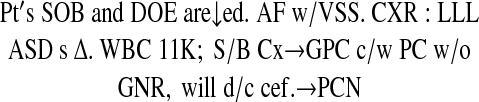 |
This translates into:
The patient's shortness of breath and dyspnea on exertion are diminished. He is afebrile, with stable vital signs. A repeat chest x-ray continues to reveal left lower lobe air space disease without any change from his admission film. His white blood cell count is now 11,000. Because his sputum and blood cultures demonstrated gram-positive cocci (consistent with pneumococcus) without gram-negative rods, we will discontinue his cefuroxime therapy and institute treatment with penicillin instead94
To be fair, Fine cites this particular case as an example of excessive abbreviation. His general admonition is to limit abbreviations to common, standardized ones94,117 Such compressed notations are not only common with physicians, but also nurses93 In addition to textual abbreviations, there are many special symbols that are common in medical notations and are included in some books of abbreviations117 Some specialties, like anesthesia, have their own specific symbols23 Some of the more common medical symbols are noted in ▶.
Figure 13.

Common medical symbols. These are non-ASCII symbols that commonly appear in hand-written medical notes.
Only two examples of notational presentations were located in the medical literature. One was the title of a paper, “Cat 6 mo ↑ symptoms.” This paper contended that physician data entry should be as quick and easy as writing “cat 6 mo ↑ symptoms” but never raises the possibility that data display should be equally simple118 The second example was an analysis of the notations used in mammography116 Other papers probably exist, but electronic retrieval is extremely problematic. Symbols, like ↑ are nonstandard ASCII characters and are not valid search terms. In the cited example, the MEDLINE reference converted ↑ into “increased.” At present, notational presentations are not widely used for computer presentation, but their compactness makes them worth considering. From an implementation standpoint, conventional text display software components can be utilized, but specialized fonts need to be developed and specialized software may be required to map the concepts to the specialized symbols.
Discussion
Some issues about presentations transcend the individual presentation classes. The most obvious among these are issues related to the characteristics of “good” presentations. Related to this are general principles for developing and evaluating presentations.
Metaphor and Intuition
Many of the articles on presentations discuss the need to develop appropriate metaphors.14,21,46,46,119,120,121,122,123 For example, many windowed computer interfaces use a file-folder metaphor for directory structures. To convey the concept of a computer directory structure, an image of a paper file folder is used. By associating familiar objects in the real world with unfamiliar structures in the computer, users are able to borrow inferences from the real world to anticipate the behavior of the computer. In the file-folder metaphor, users can infer from the metaphor that it is possible to place things in directories and take them out. In the same way, they can infer that moving a directory from one place to another also moves the contents of the directory. However, the metaphor is not perfect. Placing a real-world file folder on a photocopier will produce an image of the outside of the folder only. Copying a computer directory duplicates not only the container but also all the contents.
Hutchin121 uses the term “referential distance” to describe how closely the form of the computer presentation matches the meaning of the underlying data representation; the better the presentation, the lower the referential distance. Implicit in the concept of referential distance is that the user, to perform the encoding of meaning, is comparing the presentation to some internal archetypal representation62 These archetypal representations are most likely intrinsic to the particular domain and are based on objects, knowledge structures, and presentations with which the user is already familiar62,119,122 Cole and Stewar46 have used the term “metaphor graphics” to describe presentations designed to “look like corresponding variables in the real world.” The term “metaphor graphic” may be confused with “icon,” but it is a more general concept describing presentations with low referential distances. Examples of metaphor graphics include configural charts,46 iconic languages (W. G. Cole, unpublished lecture notes, 1988), and tabular displays124 Unfortunately, there are no formal measures of metaphor or referential distance. Similarly, there is little formal methodology to aid the developer in discovering the archetypal representations in a domain.
Developing Presentations
There are many guides for the design of graphical user interfaces14,63,125,126 Publications also discuss the selection of appropriate chart types based on data types12,29 In contrast, there is a paucity of methods for developing new presentations. This is especially true for icons, where metaphor is critical. The typical approach to many presentation development problems is to create an initial design, test it on users, collect suggestions, and refine the design. This process is iterated until it is stable, or to the limits of funding. Called rapid prototyping, or iterative design,126 this approach has been paraphrased as “I'll give the user the system. He'll break it. I'll tell him what went wrong.”127 The unanswered question in such methods is where the initial design comes from.
With respect to such interactive design, Goul127 notes that “This may prove to be the quickest path to discovering optimal interfaces... but it may also lead to dead ends.” No empirical evidence, or even theory, suggests that iterations starting from any random design for a presentation will converge on an optimal presentation. Viewed in terms of referential distance, there is no reason to assume that the universe of possible presentation designs is monotonically decreasing to a single minimum referential distance. More likely, there are many local minima. Iterative improvement on some initial designs may lead to a local minimum rather than to the optimal solution. This is not to suggest that iteration is of no benefit. It is safe to say that few interface designs could not be improved with input from users, especially when the test population is representative of the actual users128 The challenge is to develop a good starting point for the iteration.
Some work as been done on automating the design of charts,29 but it is not readily transferrable to other presentations. In spite of the agreement on the value of metaphor, there is a general paucity of metaphor-based methods122 Very general terms are put forth, such as “understand how the thing itself works,” or “identify users' problems.”119 Kuhn and Fran122 (two of the developers of iterative design) noted several years ago that “formal approaches are rare.” The situation has not improved significantly in recent years.
The situation regarding icons is not significantly better: Many references, such as The Icon Book,62 describe good icons and give general principles (such as making them analogous to real objects) but provide little insight on methodologies for developing new icons. The developer of the iconic knee magnetic resonance imaging system noted that there was “no clear reference in the literature that I have found on design of icons, on natural or intrinsic representations, other than very general mention of the problem here and there” (C. Kulikowski, written communication, 1995). Formal methods for developing new presentations are clearly needed.
This lack of formal methods makes regular contact between developers and potential users especially important. It is critical to remember that the way users represent and visualize data in a domain may have little or no relation to the digital representation of the same data in the computer. In the absence of formal methods, informal discussions with potential users can lead to an improved understanding of how users visualize data in a domain. This understanding, in turn, will aid the developer in selecting appropriate presentations.
Evaluating Presentations
Once a presentation has been developed, the next question is whether it is better than a previous presentation. Tuft129 deserves considerable credit for generally raising consciousness about the importance of good data presentation129 Even though some of his principles have not held up under all experimental conditions, his works are still required reading for anyone developing or evaluating presentations3
In addition to general design principles, a variety of formal methods have been applied to the evaluation of data presentations21,31,34,46,131,132 Unfortunately, many medical data presentations are never quantitatively evaluated. Rather, they are developed and shown to potential users. If those users like the new presentation, it is considered a success. Although user preference is important, it does not guarantee performance. In some cases, preference may actually be associated with decreased performance132 In addition to user preference, data presentations are typically evaluated by two quantitative criteria. Latency is the amount of time it takes a user to answer a question based on the information in the presentation. Accuracy is a measure of the correctness of that answer.
We propose another criteria—compactness. While desktop monitors continue to increase in size, a growing number of handheld devices have ever-smaller displays. This creates a demand for ever-smaller presentations. Compactness can be described as the amount of computer display, typically measured as the number of pixels, used for the presentation. When two presentations are equal in latency and accuracy, the better presentation will be the one that requires fewer pixels.
In evaluating presentations, it is important to simulate the actual use as much as possible. Different presentations are better suited to different masks. Molenaa131 noted that “the choice between various display methods often depends on the particular question that the viewer wants answered.” This is particularly true for configural presentations43 Similarly, understanding whether the presentation will be used by novice or experienced users is important. The amount of time needed to look at the legend can determine whether a new presentation is better than an older one21 Novice users will typically spend considerably more time looking at the legend than will experienced users. In the same way, determining whether the user's task is to recognize general trends or retrieve specific data elements is critical, because different presentations are optimal for these tasks21 Although the need to tailor presentations to the particular needs of the user has been well recognized,8,105,125,131,133 it has not been extensively applied to medical data. Configural charts, which have shown value in aviation,134 may be valuable in medical environments with high situation-awareness requirements, such as anesthesia135 Future research should include studies of the effectiveness of various presentations in different health care environments and with different end users.
Multimedia Generation
As noted before, we have not attempted to include multimedia or animated presentations in the present taxonomy. The presentation characteristics of sound and motion can be viewed as additional axes of a multidimensional taxonomy, where this taxonomy is but one axis. Many precomputed multimedia instructional titles are now available108 The Visual Human Projec136,137 is driving further advances in educational multimedia. No example of real-time patient-specific multimedia generation was located in the literature.
Conclusion
Object-oriented components have become the default software methodology for creating presentations of medical data. Typically, a programmer or graduate student is left to choose among the multitude of available interface objects with little or no formal selection criteria. By utilizing the principles of object-oriented interface design,1 we have attempted to present a taxonomy that is applicable to the real-world choices faced by system developers. A single article cannot exhaustively discuss the strengths and weakness of all the possible medical data presentations; however, this taxonomy provides a vocabulary and a context for future discussions.
This work was supported in part by grant LM07079-03 from the National Library of Medicine and by the New York State Science and Technology Foundation.
References
- 1.Shneiderman B. Designing the User Interface: Strategies for Effective Human-Computer Interaction. 3rd ed. Reading, Mass: Addison-Wesley, 1998.
- 2.Horn RE. Visual Language: Global Communication for the 21st Century. Bainbridge Island, Wash: MacroVU, 1998.
- 3.Kosslyn SM. Graphics and human information processing: a review of five books. J Am Stats Assoc. 1985;80(391):499-512. [Google Scholar]
- 4.Bertin J. Semiology of Graphics. Madison, Wis: University of Wisconsin Press, 1983.
- 5.Tufte ER. Envisioning Information. Cheshire, Conn: Graphics Press, 1990.
- 6.Cole WG, Sherertz DD, Tuttle MS, Hsu GT, Fagan LM, Carlson RW. Semantic visualization of oncology knowledge sources. Proc 19th Annu Symp Comput Appl Med Care. 1995:67-71. [PMC free article] [PubMed]
- 7.Kushniruk A, Patel V, Fleiszer D. Analysis of medical decision making: a cognitive perspective on medical informatics. Proc 19th Annu Symp Comput Appl Med Care. 1995:193-7. [PMC free article] [PubMed]
- 8.Tang PC, Patel VL. Major issues in user interface design for health professional workstations: summary and recommendations. Int J Biomed Comput. 1994;34(1-4):139-48. [DOI] [PubMed] [Google Scholar]
- 9.Smith BC. Prologue to “Reflections and Semantics in a Procedural Language.” In: Brachman RJ, Levesque HJ (eds). Readings in Knowledge Representation. San Mateo, Calif: Morgan Kaufman, 1985:31-40.
- 10.Jorna R. A comparison of presentation and representation: linguistic and pictorial. In: van der Veer GC, Mulder G (eds). Human-Computer Interaction: Psychonomic Aspects. Berlin, Germany: Springer-Verlag, 1988:172-85.
- 11.van Nes FL. The legibility of visual display texts. In: van der Veer GC, Mulder G (eds). Human-Computer Interaction: Psychonomic Aspects. Berlin, Germany: Springer-Verlag, 1988:14-25.
- 12.Roth SF, Mattis J. Data characterization for intelligent graphics presentation. Proceedings of the ACM Special Interest Group on Computer Human Interaction (SIGCHI) Conference on Human Factors in Computer Systems. New York: ACM Publications, 1990:193-200.
- 13.Stevens SS. On the theory of scales of measurement. Science. 1946;103(2684):677-80. [DOI] [PubMed] [Google Scholar]
- 14.Eberts RE. User Interface Design. Englewood Cliffs, NJ: Prentice-Hall, 1994.
- 15.Arnold KGJ. The Java Programming Language. 2nd ed. Addison-Wesley, 1997.
- 16.Sears A. Layout appropriateness: a metric for evaluating user interface widget layout. IEEE Transactions in Software Engineering. 1998;19(7):707-19. [Google Scholar]
- 17.Noordman LGM. Visual presentation of text: the process of reading from a psycholinguistic perspective. In: van der Veer GC, Mulder G (eds). Human-Computer Interaction: Psychonomic Aspects. Berlin, Germany: Springer-Verlag, 1988:104-24.
- 18.Bell DS, Greenes RA, Doubilet P. Form-based clinical input from a structured vocabulary: initial application in ultrasound reporting. Proc 16th Annu Symp Comput Appl Med Care. 1992:789-90. [PMC free article] [PubMed]
- 19.Bell DS, Greenes RA. Evaluation of UltraSTAR: performance of a collaborative structured data entry system. Proc 18th Annu Symp Comput Appl Med Care. 1994:216-22. [PMC free article] [PubMed]
- 20.Lafortune M, Breton G, Baudouin JL. The radiological report: what is useful for the referring physician? Can Assoc Radiol J. 1988;39(2):140-3. [PubMed] [Google Scholar]
- 21.Lohse GL. A cognitive model for understanding graphical perception. Hum-Comput Interact. 1993;8:353-88. [Google Scholar]
- 22.Connelly DP, Lasky LC, Keller RM, Morrison DS. A system for graphical display of clinical laboratory data. Am J Clin Pathol. 1982;78(5):729-37. [DOI] [PubMed] [Google Scholar]
- 23.Gravenstein JS. The uses of the anesthesia record. J Clin Monit. 1989;5(4):256-65. [DOI] [PubMed] [Google Scholar]
- 24.Enlander D. Computerized graphic representation of clinical chemistry results. J Clin Pathol. 1981;34:806-8. [DOI] [PMC free article] [PubMed] [Google Scholar]
- 25.Feiner SK, Beshers C. Visualizing n-dimensional virtual worlds with n-Vision. Comput Graphics. 1990;24(2):37-8. [Google Scholar]
- 26.Powsner SM, Tufte ER. Graphical summary of patient status. Lancet. 1994;334:386-9. [DOI] [PubMed] [Google Scholar]
- 27.Hekking M, Lindemans J, Gelsema ES. A computer program for the multivariate and graphical monitoring of acid-base data in an intensive care unit. Proc 19th Annu Symp Comput Appl Med Care. 1995:52-6. [PMC free article] [PubMed]
- 28.Daye K, Lashman D, Pandiani J. Medication history display and evaluation. Proc 18th Annu Symp Comput Appl Med Care. 1994:993. [PMC free article] [PubMed]
- 29.Mackinlay J. Automating the design of graphical presentations of relational information. ACM Trans Graphics. 1986;5(2):110-41. [Google Scholar]
- 30.Bennett KB, Tornquist E. Improving the effectiveness of configural displays through mapped emergent features and color coded graphical elements. Proceedings of the Human Factors Society 35th Annual Meeting. 1991:1584-8.
- 31.Bennett KB, Flach JM. Graphical displays: implications for divided attention, focused attention, and problem solving. Human Factors. 1992;34(5)513-33. [DOI] [PubMed] [Google Scholar]
- 32.Cole WG. Integrality and meaning: essential and orthogonal dimensions of graphical display of data. Proc 17th Annu Symp Comput Appl Med Care. 1993:404-8. [PMC free article] [PubMed]
- 33.Casey EJ. Visual display representation of multidimensional systems: the effect of system structure and display integrality. Proceedings of the Human Factors Society 31st Annual Meeting. 1987:112-5.
- 34.Goettl BP, Wickens CD, Kramer AF. Integrated displays and the perception of graphical data. Ergonomics. 1991;34(8):1047-63. [DOI] [PubMed] [Google Scholar]
- 35.Carswell CM. Integral, configural and unitary graphs. Proceedings of the Human Factors Society 32nd Annual Meeting. 1988:1345-9.
- 36.Wickens CD. The Object Display: Principles and a Review of Experimental Findings. Champaign, III: University of Illinois, Cognitive Psychophysiology Laboratory. 1986:1. Document CPL 86-6 MDA903-83-K-0255.
- 37.Garner WR, Felfoldy GL. Integrality of stimulus dimensions in various types of information processing. Cognit Psychol. 1970;1:225-41. [Google Scholar]
- 38.Lockhead GR. Effects of Dimension Redundancy on Visual Discrimination. J Exp Psychol. 1966;72(1):95-104. [DOI] [PubMed] [Google Scholar]
- 39.Meehl PE. Configural scoring. J Consult Psychol. 1950;14:165-71. [DOI] [PubMed] [Google Scholar]
- 40.Carswell CM, Wickens CD. The perception interaction of graphical attributes: configurality, stimulus homogeneity, and object integration. Percept Psychophys. 1990;47:157-68. [DOI] [PubMed] [Google Scholar]
- 41.Gillie T, Berry D. Object displays and control of dynamic systems. Ergonomics. 1994;37(11):1885-930. [Google Scholar]
- 42.Sanderson PM, Flach JM, Buttigieg MA, Casey EJ. Object displays do not always support better integrated task performance. Hum Factors. 1989;31(2):183-98. [Google Scholar]
- 43.Elvers GC, Dolan NJ. A comparison of the augmented bar display and the object display. Ergonomics. 1995;38(4):777-92. [Google Scholar]
- 44.Goldschmidt AJ, Luz CJ, Giere W, Ludecke R, Jonas D. Multi-dimensional visualisation of laboratory findings and functional test results for analysing the clinical course of disease in medicine. Methods Inf Med. 1995;34(3):302-8. [PubMed] [Google Scholar]
- 45.Hoeke JO, Gelsema ES, Wulkan RW, Leijnse B. Graphical non-linear representation of multi-dimensional laboratory measurements in their clinical context. Methods Inf Med. 1991;30(2):138-44. [PubMed] [Google Scholar]
- 46.Cole WG, Stewart JG. Human performance evaluation of a metaphor graphic display for respiratory data. Methods Inf Med. 1994;33(4):390-6. [PubMed] [Google Scholar]
- 47.Kahn CE, Jr. Graphical knowledge presentation in a MUMPS-based decision-support system. Comput Methods Programs Biomed. 1993;40(3):159-66. [DOI] [PubMed] [Google Scholar]
- 48.Tsuji S, Shortliffe EH. Graphical access to medical expert systems, part I: design of a knowledge engineer's interface. Methods Inf Med. 1986;25(2):62-70. [PubMed] [Google Scholar]
- 49.Klimczak JC, Hahn AW, Sievert M, Mitchell JA. Getting around in a large nomenclature file: browsing SNOMED international. Proc 18th Annu Symp Comput Appl Med Care. 1994:1023. [PMC free article] [PubMed]
- 50.van den Heuvel F, Timmers T, Hess J. SmaCS: smart classification system for the design, maintenance and use of complex terminologies—application in pediatric cardiology. Proc 19th Annu Symp Comput Appl Med Care. 1995:57-61. [PMC free article] [PubMed]
- 51.Tuttle MS, Cole WG, Sherertz DD, Nelson SJ. Navigating to knowledge. Methods Inf Med. 1995;34:214-31. [PubMed] [Google Scholar]
- 52.Cimino JJ, Clayton P, Hripcsak G. Knowledge-based Approaches to the maintenance of a large controlled medical terminology. J Am Med Inform Assoc. 1994;1(1):35-50. [DOI] [PMC free article] [PubMed] [Google Scholar]
- 53.Sox HC, Blatt MA, Higgins KI, et al. Medical Decision Making. Newton, Mass: Butterworth-Heinemann, 1988.
- 54.Sowa JF. Conceptual Structures: Information Processing in Mind and Machine. Reading, Mass: Addison-Wesley, 1984.
- 55.Cyre WR, Balachandar S, Thakar A. Knowledge visualization from conceptual structures. In: Tepfenhart WM, Dick JP, Sowa JF (eds). Conceptual Structures: Current Practices. Berlin, Germany: Springer-Verlag, 1994:273-92.
- 56.Esch JW. Graphical displays and polymorphism. In: Nagle TE, Nagle JA, Gerholz LL, Eklund PW (eds). Conceptual Structures: Current Research and Practice. New York: Ellis Horwood, 1992:127-46.
- 57.Wermelinger M. An X-Windows toolkit for knowledge acquisition and representation based on conceptual structures. In: Pfeiffer H, Nagle TE (eds). Conceptual Structures: Theory and Implementation. Berlin, Germany: Springer-Verlag, 1993:262-71.
- 58.Lobach DF, Gadd CS, Hales JW. Structuring clinical practice guidelines in a relational database model for decision support on the Internet. Proc AMIA Annu Fall Symp. 1997:158-62. [PMC free article] [PubMed]
- 59.Hoffman KJ. Demystifying mental health information needs through integrated definition (IDEF) activity and data modeling. Proc AMIA Annu Fall Symp. 1997:111-5. [PMC free article] [PubMed]
- 60.Zucker J, Chase H, Molholt P, Soliz E, Kahn RM. Conceptual modeling techniques for online curriculum design. Proc AMIA Annu Fall Symp. 1997:1022.
- 61.Rational Software Web site. Available at: http://www.rational.com/uml/index.jtmpl. Accessed Apr 6, 1999.
- 62.Horton WK. The Icon Book. New York: John Wiley, 1994.
- 63.Rogers Y. Icons at the interface: their usefulness. Interact Comput. 1989;1(1):105-17. [Google Scholar]
- 64.Preiss B, Kaltenbach M, Zanazaka J, Echave V. Concept graphics: a language for medical knowledge. Proc 16th Annu Symp Comput Appl Med Care. 1992:515-9. [PMC free article] [PubMed]
- 65.Balas EA, Pryor TA, Hebertson RM, Haug PJ, Twede M. A computer method for visual presentation and programmed evaluation of labor. Obstet Gynecol. 1991;78(3, pt 1):419-23. [PubMed] [Google Scholar]
- 66.Stinson CH, Horowitz MJ. Psyclops: an exploratory graphical system for clinical research and education. Psychiatry. 1993;56(4):375-89. [DOI] [PubMed] [Google Scholar]
- 67.Litt HI, Schmidt DF. Application of the visual chart in an ambulatory OB-GYN clinic. Proc 19th Annu Symp Comput Appl Med Care. 1995:1004.
- 68.Chang SK, Polese G, Orefice S, Tucci M. A methodology and interactive environment for iconic language design. Int J Hum-Comput Studies. 1994;41:683-716. [Google Scholar]
- 69.Preiss B, Echave V, Preiss SF, Kaltenbach M. UVAL-MED: a universal visual associative language for medicine. Proc 18th Annu Symp Comput Appl Med Care. 1994:262-6. [PMC free article] [PubMed]
- 70.Yazdani M, Mealing S. Communicating through pictures. Exeter, England: University of Exeter, 1994;300:1. Department of Computer Science Research Report. [Google Scholar]
- 71.Whitley KN, Blackwell AF. Visual Programming: The Outlook from Academia and Industry. Empirical Studies of Programmers, Seventh Workshop. 1998:180-208.
- 72.Neurath O. International Picture Language. Reading, England: University of Reading, 1978.
- 73.Miller DW. Dynamic data icons: graphical display of uterine cervical cytologic exams, diagnostic studies and treatments. Proc 19th Annu Symp Comput Appl Med Care. 1995:917.
- 74.Wang S, El Ayeb B, Echave V, Preiss B. An intelligent interactive simulator of clinical reasoning in general surgery. Proc 17th Annu Symp Comput Appl Med Care. 1993:419-23. [PMC free article] [PubMed]
- 75.Winograd E, Smith AD, Simon EW. Aging and the picture superiority effect in recall. J Gerontol. 1982;37:70-5. [DOI] [PubMed] [Google Scholar]
- 76.Park DC, Puglisi T, Sovacool M. Memory for pictures, words, and spatial location in older adults: evidence for pictorial superiority. J Gerontol. 1983;38(5):582-8. [DOI] [PubMed] [Google Scholar]
- 77.Beardon C. Discourse structures in iconic communication. Artif Intell Rev. 1995;9:189-203. [Google Scholar]
- 78.Elmore JG, Wells CK, Lee CH, Howard DH, Feinstein AR. Variability in radiologists' interpretations of mammograms. N Engl J Med. 1994;331(22):1493-9. [DOI] [PubMed] [Google Scholar]
- 79.Shu NC. Visual Programming. New York: Van Nostrand Reinhold, 1992.
- 80.Boyle J. A visual environment for the manipulation and integration of JAVA beans. Bioinformatics. 1998;14(8):739-48. [DOI] [PubMed] [Google Scholar]
- 81.Fleming MG. Design of a high-resolution image cytometer with open software architecture. Anal Cell Pathol. 1996;10(1):1-11. [PubMed] [Google Scholar]
- 82.Regan L, Gregory M. Flux analysis of microbial metabolic pathways using a visual programming environment. J Biotechnol. 1995;42(2):151-61. [DOI] [PubMed] [Google Scholar]
- 83.Shortliffe E. Computer-based Medical Consultants: MYCIN. New York: Elsevier, 1976.
- 84.Hripcsak G, Ludemann P, Pryor TA, Wigertz OB, Clayton PD. Rationale for the Arden Syntax. Comput Biomed Res. 1994;27(4):291-324. [DOI] [PubMed] [Google Scholar]
- 85.Kuhn K, Zemmler T, Reichert M, Heinlein C, Roesner D. Structured data collection and knowledge-based user guidance for abdominal ultrasound reporting. Proc 17th Annu Symp Comput Appl Med Care. 1993:311-5. [PMC free article] [PubMed]
- 86.Bluemke DA, Eng J. An automated radiology reporting system that uses HyperCard. AJR. 1994;(1):185-7. [DOI] [PubMed]
- 87.Moorman PW, van Ginneken AM, Siersema PD, van der Lei J, Wilson JH. Evaluation of reporting based on descriptional knowledge. J Am Med Inform Assoc. 1995;2(6):365-73. [DOI] [PMC free article] [PubMed] [Google Scholar]
- 88.Carenini G, Mittal VO, Moore JD. Generating patient-specific interactive natural language explanations. Proc 18th Annu Symp Comput Appl Med Care. 1994:5-9. [PMC free article] [PubMed]
- 89.Abella A, Kender JR, Starren J. Description generation of abnormal densities found in radiographs. Proc 19th Annu Symp Comput Appl Med Care. 1995:542-6. [PMC free article] [PubMed]
- 90.McKeown K, Wish M, Matthews K. Tailoring explanations for the user. Proceedings of the International Joint Conference on Artificial Intelligence. 1985;2:794-8. [Google Scholar]
- 91.Morgan WL, Engel GL. The Clinical Approach to the Patient. Philadelphia, Pa: WB Saunders, 1969.
- 92.Judge RD, Zuidema GD. Methods of Clinical Examination: A Physiological Approach. 3rd ed. Boston, Mass: Little Brown, 1974.
- 93.Fischback FT. Documenting Care: Communication, the Nursing Process and Documentation Standards. Philadelphia, Pa: FA Davis, 1991.
- 94.Fine PL. The Wards: An Introduction to Clinical Clerkships. Boston, Mass: Little Brown, 1994.
- 95.Pillarisetti SG. Surgical pathology report in the era of desk-top publishing. Arch Pathol Lab Med. 1993;117(1):40-2. [PubMed] [Google Scholar]
- 96.Church JM. Endoscopy of the Colon, Rectum, and Anus. New York: Igaku-Shoin, 1995.
- 97.Cotton PB, Williams CB. Practical Gastrointestinal Endoscopy. 2nd ed. Oxford, England: Blackwell Scientific, 1982.
- 98.Abad-Mota S, Kulikowski C, Gong L, et al. Iconic reporting: a new way of communicating radiologic findings. Proc 19th Annu Symp Comput Appl Med Care. 1995:915.
- 99.Bassett LW, Liu TH, Giuliano AE, Gold RH. The prevalence of carcinoma in palpable vs impalpable, mammographically detected lesions. AJR. 1994;(1):21-4. [DOI] [PubMed]
- 100.Starren J. From Multimodal Sublanguages to Medical Data Presentations. New York: Columbia University, 1997.
- 101.Wulfman CE, Rua M, Lane CD, Shortliffe EH, Fagan LM. Graphical access to medical expert systems, part V: integration with continuous-speech recognition. Methods Inf Med. 1993;32(1):33-46. [PubMed] [Google Scholar]
- 102.Lesser MF. GIFIC: a graphical interface for intensive care. Proc 18th Annu Symp Comput Appl Med Care. 1994:988. [PMC free article] [PubMed]
- 103.Notghi A, Mills A, Hutchinson R, Kumar D, Harding LK. Reporting simplified colonic transit studies using radionuclides: clinician friendly reports. Gut. 1995;36(2):274-5. [DOI] [PMC free article] [PubMed] [Google Scholar]
- 104.Schramm C, Goldberg M, Pagurek B. Multimedia radiological reports: creation and playback [published correction appears in J Digit Imaging. 1990;3(1):2]. J Digit Imag. 1989;2(2):106-13. [DOI] [PubMed] [Google Scholar]
- 105.Ratib O. From multimodality digital imaging to multimedia patient record [editorial]. Comput Med Imaging Graph. 1994;18(2):59-65. [DOI] [PubMed] [Google Scholar]
- 106.Schubert E, Gross W, Siderits RH, Deckenbaugh L, He F, Becich MJ. A pathologist-designed imaging system for anatomic pathology signout, teaching, and research. Semin Diagn Pathol 1994;11(4):263-73. [PubMed] [Google Scholar]
- 107.Vyborny CJ, Giger ML. Computer vision and artificial intelligence in mammography. AJR. 1994;(3):699-708. [DOI] [PubMed]
- 108.Jaffe CC, Lynch PJ, Smeulders AW. Hypermedia techniques for diagnostic imaging instruction: videodisk echocardiography encyclopedia. Radiology. 1989;171(2):475-80. [DOI] [PubMed] [Google Scholar]
- 109.Chernoff H. The use of faces to represent points in n-dimensional space graphically. J Am Stats Assoc. 1973;68(342):361-8. [Google Scholar]
- 110.Lott JA, Durbridge TC. Use of Chernoff faces to follow trends in laboratory data. J Clin Monit Comput. 1990;4:59-63. [DOI] [PubMed] [Google Scholar]
- 111.Dennett DC. Consciousness Explained. Boston, Mass: Little Brown, 1991.
- 112.Elting LS, Bodey GP. Is a picture worth a thousand medical words? A randomized trial of reporting formats for medical research data. Methods Inf Med. 1991;30(2):145-50. [PubMed] [Google Scholar]
- 113.Newton CM. An interactive graphics information system for familial data. Proc 16th Annu Symp Comput Appl Med Care. 1992:520-4. [PMC free article] [PubMed]
- 114.Harris Z. Discourse and sublanguage. In: Kittredge R, Lehrberger J (eds). Sublanguage: Studies of Language in Restricted Semantic Domains. Berlin, Germany: Walter de Gruyer, 1982:231-6.
- 115.Sager N. Syntactic formatting of science information. In: Kittredge R, Lehrberger J (eds). Sublanguage: Studies of Language in Restricted Semantic Domains. Berlin, Germany: Walter de Gruyer, 1982:9-26.
- 116.Starren J, Johnson SB. Notations for high-efficiency data presentation in mammography. Proc AMIA Annu Fall Symp. 1996:557-61. [PMC free article] [PubMed]
- 117.Davis NM. Medical Abbreviations: 10,000 Conveniences at the Expense of Communications and Safety. 7th ed. Huntington Valley, Pa: Neil M Davis, 1995.
- 118.Lee M, Niemeyer D, Seilheimer D, Abramson S, Lin Z, Gu M. Cat 6 mo increases symptoms: online physician charting and more. Proc 19th Annu Symp Comput Appl Med Care. 1995:81-5. [PMC free article] [PubMed]
- 119.Erickson TD. Working with interface metaphors. In: Laurel B (ed). The Art of Human-Computer Interface Design. New York: Addison-Wesley, 1990:147-51.
- 120.Harel D. On visual formalisms. Commun ACM. 1988;31(5):415-530. [Google Scholar]
- 121.Hutchins E. Metaphors in interface design. In: Taylor MM, Neel F, Bouwhuis DG (eds). The Structure of Multimodal Dialogue. North-Holland: Elsevier Science, 1989:11-28.
- 122.Kuhn W, Frank AU. A Formalization of the Metaphores and Image-Schemas in User Interfaces. In: Mark DM, Frank AU (eds). Cognitive and Linguistic Aspects of Geographic Space. Netherlands: Kluwer Academic Publishers, 1991:419-34.
- 123.Taylor MM, Neel F, Bouwhuis DG. Introduction: Diagogue and Multimodal Dialogue. In: Taylor MM, Neel F, Bouwhuis DG (eds). The Structure of Multimodal Dialogue. North-Holland: Elsevier-Science, 1989:1-10.
- 124.Cole WG. Three graphical representations to aid Bayesian inference. Methods Inf Med. 1988;27(3):125-32. [PubMed] [Google Scholar]
- 125.Shneiderman B. Designing the User Interface. 2nd ed. Reading, Mass: Addison Wesley, 1992.
- 126.Mullet K, Sano D. Designing Visual Interfaces. Englewood Cliffs, NJ: SunSoft, 1995.
- 127.Gould MD. Elicitation of spatial language to support cross-cultural geographic information systems. In: Mark DM, Frank AU (eds). Cognitive and Linguistic Aspects of Geographic Space. Netherlands: Kluwer Academic Publishers, 1994;1(3):435-48. [Google Scholar]
- 128.Sellers M. Designing for demanding users. Interactions. 1996:55-64.
- 129.Tufte ER. The Visual Display of Quantitative Information. Cheshire, Conn: Graphics Press, 1983.
- 130.Gillian DJ, Richman EH. Minimalism and the Syntax of Graphs. Hum Factors. 1994;36(4):619-44. [Google Scholar]
- 131.Molenaar IW. Displaying statistical information: ergonomic considerations. In: van der Veer GC, Mulder G (eds). Human-computer interaction: psychonomic aspects. Berlin, Germany: Springer-Verlag, 1988:76-88.
- 132.Hubona GS. Evaluating system design features. Int J Hum-Comput Studies. 1996;44:93-118. [Google Scholar]
- 133.Woods DD. The cognitive engineering of problem representations. In: Weir GRS, Alty JL (eds). Human-Computer Interaction and Complex Systems. London, England: Academic Press, 1991:169-88.
- 134.Barnett BJ, Wickens CD. Display proximity in multicue information integration: the benefit of boxes. Hum Factors. 1988;31(1):15-24. [Google Scholar]
- 135.Gaba DM, Howard SK. Situation awareness in anesthesiology. Hum Factors. 1995;37(1):20-31. [DOI] [PubMed] [Google Scholar]
- 136.Lindberg DA, Humphreys BL. The high-performance computing and communications program, the national information infrastructure, and health care. J Am Med Inform Assoc. 1995;2(3):156-9. [DOI] [PMC free article] [PubMed] [Google Scholar]
- 137.Spitzer V, Ackerman MJ, Scherzinger AL, Whitlock D. The visible human male: a technical report. J Am Med Inform Assoc. 1996;3(2):118-30. [DOI] [PMC free article] [PubMed] [Google Scholar]