

Abstract
We present the design and evaluation of an integrated problem solving environment for cancer therapy analysis. The environment intertwines a statistical martingale model and a K Nearest Neighbor approach with visual encodings, including novel interactive nomograms, in order to compute and explain a patient’s probability of survival as a function of similar patient results. A coordinated views paradigm enables exploration of the multivariate, heterogeneous and few-valued data from a large head and neck cancer repository. A visual scaffolding approach further enables users to build from familiar representations to unfamiliar ones. Evaluation with domain experts show how this visualization approach and set of streamlined workflows enable the systematic and precise analysis of a patient prognosis in the context of cohorts of similar patients. We describe the design lessons learned from this successful, multi-site remote collaboration.
Index Terms: Visual analytics, precision medicine, design studies, nomograms, parallel coordinate plots, activity-centered design
1 Introduction
Each year, over 50,000 people in the United States are diagnosed with head and neck cancers [1]. Treatment strategies are complex and can involve multiple courses of therapy with different potential outcomes. With head and neck cancer numbers increasing every year, partly due to viral infections, clinicians aim to develop customized treatment strategies tailored to each individual patient, under a healthcare model termed “precision medicine”.
Unlike epidemiology or public health, which aim to compare the characteristics of different cohorts or groups of subjects, precision medicine proposes the customization of healthcare, with medical decisions, practices, and products being tailored to the individual patient. The customization is based on individual factors collected from cohorts of patients who are similar to the patient under consideration. These factors may include disease markers, treatment options, demographics, and genetic, lifestyle, environmental, laboratory, or quality of life data. These data are not only heterogeneous and large scale, but also locally sparse, as in finance or astronomy, because some patient measurements may be missing, incomplete, or irregularly collected on subjects. Making similarity-based precise recommendations for a specific patient requires novel approaches which blend biomedicine with complex quantitative methodology, and with visual encodings to help explain and operate this complex methodology.
In this work, we present an integrated problem solving environment and set of visual workflows that enable the systematic similarity-based exploration and analysis of individual factors collected from subsets of patients. Our approach intertwines a martingale model and a K Nearest Neighbor approach with visual statistical encodings and visual analysis in order to compute and explain the probability of survival under user-specified constraints. This visual analysis methodology was successfully developed through an interdisciplinary, remote, geographically-distributed collaboration.
The contributions of this work are: 1) a description of the application domain data and tasks, with an emphasis on the multidisciplinary development of precision medicine tools; 2) the design of a novel blend of statistics and visual encodings to compute and explain the probability of survival, based on an existing cohort of patients; 3) the description of novel interactive encodings, interactive nomograms and Kaplan-Meier plots; nomogram encodings reflect the weight of each independent variable’s effect on the dependent variable; 4) an implementation of this approach in a web-based visual therapy explorer, SMART—Smart Multidimensional Adaptive Radiotherapy Treatment (Fig. 1); 4) an evaluation of the resulting workflows and encodings over an existing head and neck cancer repository, with domain experts; 5) a start-to-end description of the design process and of the lessons learned from this successful, multi-site remote collaboration.
Fig. 1.

Patient prognosis for a white female with T4 supraglottic cancer. The Kiviat panel (left) shows the patient along with the five most similar patients in the repository; glyph colors (mapped to the computed survival probability) capture a notable variation of therapy outcomes. The interactive nomogram shows that despite variation in treatment, similar T4 patients (green) have similar low survival outcomes, below 0.5. Two similar patients with higher survival are revealed to be T3-level (purple). The Kaplan-Meier survival over time plot, however, predicts similar trajectories for the T3 and more severe T4 category. The mosaic context confirms that even the T3 female subgroup has low mean survival rates, below 0.5.
2 Background and Related Work
Head & neck cancer treatment
In clinical and research settings, therapy response-driven decisions are made on an ad hoc basis: almost all current therapy decisions after histopathologic diagnosis of head and neck cancer are driven by age, performance status, and clinical staging information (e.g., T3-stage cancer), through the filter of physician knowledge [2], [3]. The current approach is not scalable. Ideally, decision junctures would be approached based on data and knowledge, rather than physician experience or institutional memory alone.
While data repositories collected from cohorts of subjects are available, existing advanced risk prediction models capture in relatively crude fashion oncological outcomes through the use of standard regression-based models [4], [5]. These models do not handle incomplete demographic or laboratory data. Furthermore, these models provide the clinicians with few means of interaction and personalization, limiting their use by physicians.
Visual exploration of patient cohort data
In healthcare, the potential of data visualization has been illustrated in a number of subareas, including patient cohort analysis. Applications span disease evolution statistics extracted from electronic medical records (EMRs) [6], [7], cohort symptom and history comparison [8], [9], [10], cohort medical image attribute comparison [11], [12], [13], and cohort heterogeneous medical data analysis [14], [15]. As often the case in clinician-driven visual analysis based on statistics, the visual encodings in these works include conventional representations such as histograms, bar charts, pie-charts, box plots, radial charts, time-series plots and scatterplots.
While our work also builds on patient cohort data, our focus is on a different problem. Practicing oncologists are not pursuing overview analyses of cohort data in the style of public health or epidemiology studies. They pursue precision analysis of relatively small sets of similar patients. In particular, in this work we focus on: 1) statistical computing of survival probabilities and similarity from heterogeneous, locally-sparse data, and 2) contributing visual encodings and workflows which enable the operation and explanation of the resulting model mechanics. As in the clinician-driven analysis works above, these encodings further need to be adoptable by clinician stakeholders.
High-dimensional data encodings
Patient data are high dimensional. Several works [16], [17], [18], [19], [20], [21] present taxonomies and analyses of high-dimensional visualizations, which include scatterplots, heat maps, mosaic plots, and star plots. Some of the visual encodings that we adapt, with modification, are based on these approaches (mosaic plots, Kiviat diagrams). Other visual encodings (Kaplan Meier survival plots, nomograms) are novel means to interactive visual exploration, and are adopted because they exist, in basic paper form, in the target domain. Paper-based nomograms, in particular, pre-date parallel coordinate plots by a century [22], and differ significantly from them (Section 3.6).
Visual design
Previous works in visualization design theory [23] [24] [25] investigate human-centered design in the context of a narrowly focused set of target users. Kerzner et al. [26] present a design study process for vehicle vulnerability analysis in information sensitive collaborations. Although collocated visual design processes have been previously discussed in these works and others, little is known about the visual design process in the context of geographically distributed, multi-site collaborations, in which complementary-expertise teams contribute components of the problem solving environment. Furthermore, none of these works follow the activity-centered design paradigm (an extension of human-centered-design) [27] adopted in this work.
3 Methods
3.1 Geographically-Distributed Project Setting
The type of complementary expertise, motivation and initiative required to circumvent obstacles related to large-scale, heterogeneous, locally-sparse risk prediction is seldom found at the same geographical location. The environment we describe was developed through a geographically-distributed collaboration with domain experts from several disciplines. In addition to the visualization research group, one expert and his group specialize in head and neck cancer radiotherapy, and two other experts and their respective groups work in high dimensional data management, respectively in biostatistics and machine learning. Each research group corresponds to a different geographical site. Altogether, the team members have over 15 years of experience in interdisciplinary collaborations. However, the high level of expertise required by each field (radiation oncology, biostatistics, big data mining, biomedical visualization) results in limited knowledge overlap between individual research groups.
The collaboration spans four sites, each separated pairwise by 200 to 900 miles, and located in the same time zone. Because of the challenges associated with this type of geographic distribution and span of expertise, we started by setting up collaboration tools, including an up-to-date schedule with deliverables, and by completing an on-line diagnostic survey for geographically distributed collaborations called the Collaboration Success Wizard [28]. The survey probes human factors that may strengthen or weaken a remote collaboration, including mutual expectations, team maturity, and motivations for working together, while the Wizard provides both personal and project-level reports to help build successful and productive collaborative projects. This process enabled the team to identify its core assets, as well as create a list of actionable items to strengthen the project, such as “identifying common grounds” and “articulating precisely the nature of the work”.
3.2 Design Process
Our design process followed an Activity-Centered-Design paradigm [27], [29], which is an extension of the classic Human Centered Design paradigm. The approach places particular emphasis on functional specifications [30] and on user tasks. We adopted this approach because it stems from software engineering principles that have been tested and proven in multi-site settings similar to ours. We implemented this paradigm through an iterative process where the research team met weekly via video conferencing, and quarterly via site visits to confirm requirements and functional specifications, explore prototypes, refine the design, test the software, and verify that evolving requirements were being satisfied. Given the geographically-distributed nature of the collaboration, the design further benefited from a set of integrated tools, including several freely-available cloud-based and web-based collaboration systems.
3.3 Data and Task Analysis
3.3.1 Collocated Data Analysis
The first stage of design, requirement engineering, started with several face-to-face and video conference semi-structured interviews of the radiotherapy and statistics experts, followed by an in-person observation session. Requirement engineering was largely completed during an intense 3-day period of face to face meetings, which included common meals and after-hours discussions. In an unusual approach, the requirements process was a two-way dialog in the style of pair programming [31], [32], in which the group explained repeatedly to a lay, observer audience what the project was trying to accomplish, and through this process clarified their own ideas. The interviews established who the users of the visualization would be and how often it would be used, a prioritized list of the main tasks performed by radiologists and statisticians in the process of therapy planning, the data sources and flow of data through the process, and non-functional requirements such as portability and support for local and remote collaboration.
During the followup observation session, a clinician walked the interviewer through the therapy planning process using a collection of paper and proprietary software tools. We identified together the background roadblocks to cohort-based therapy planning, as highlighted in the earlier sections: dimensionality, heterogeneity, sparsity, opacity of existing, insufficiently predictive statistical tools. We analyzed requirements and wrote the resulting functional specifications for the application, and had the clinicians and the larger team approve the preliminary specifications document.
Beyond the co-expertise research groups, the longer-term target users are cancer radiotherapy clinicians who have collected a repository of head and neck cancer data over several hundred patients they have treated. The cancer data are high-dimensional, sparse and heterogeneous; through brainstorming around a poster board over several days we identified the following key data inputs which play a role in guiding the patient therapy, as well as their categorization:
Demographics. Patient demographics include variables such as gender, age, ethnicity, or functional levels of activity (ECOG), most of which are categorical data.
Disease Descriptors. Cancer descriptors include the site of tumor, the cancer stage, and indicators of the disease spread to the lymph nodes, which are also categorical data. Imaging data was summarized in the repository, however the repository did not include images.
Treatment Descriptors. Treatment variables describe the therapy sequence used, which may include a combination of chemotherapy and radiation therapy, and also the categorical type of local therapy applied—e.g., with organ (larynx) preservation (LP) or without.
Outcome Descriptors. Outcome descriptors typically include the number of months survived by the patient, as well as whether they are still surviving.
From these recorded variables, the goal is to predict the probability of survival of a specific patient. With the exception of the patient age and survival interval and probability, which take continuous numerical values, all variables used in this analysis take discrete, categorical values in a typically small set (2 to 5 possible values). Table 1 summarizes these variables.
TABLE 1.
Dataset Descriptors
| Demographics | Age | Numerical value larger than 0 |
| Gender (2) | Male or female | |
| Ethnicity (5) | White, african-american, hispanic, asian, other | |
| ECOG (4) | 0 to 3 | |
| Therapy Descriptors | Chemotherapy (4) | No chemo, concurrent, induction, or induction+chemoRT |
| Local therapy (3) | LP/chemoRT, LPRT, or LP/RT alone | |
| Cancer Descriptors | Site of tumor (4) | Glottic, Subglottic, Supraglottic, or Transglottic |
| Cancer stage (2) | T3 or T4 | |
| Nodal disease (2) | N+ or N0 | |
| Survival Probability | Numerical value between 0 and 1 | |
| Survival Month | Numerical value larger than 0 | |
3.3.2 Task Analysis
Through repeated interviews with our collaborators and analysis of the resulting interview data, we summarized a list of tasks for analyzing the patient data in head and neck cancer therapy:
Task 1: Given a particular patient, compute and display the most similar patients according to demographics, treatment descriptors, and disease descriptors, along with the patients’ survival probabilities.
Task 2: Show specific information for a particular patient (treatment descriptors, demographics etc.), along with their computed survival probability.
Task 3: Compare the selected patient to the most similar patients in terms of their characteristics and computed survival probability (e.g., survival with age, treatment etc.).
Task 4: Compare trends in the survival probability over time of a specific patient’s subgroup versus another subgroup. E.g., compare the survival probability over 5 years of white T3 patients between those who have and those who have not received chemotherapy.
Task 5: Explore correlations between specific patient (or subgroup) variables and the predicted survival, and indicate the variable contribution to the predicted value. E.g., explore the relationship between ethnicity and computed survival probability for a specific patient.
Task 6: Provide the cohort context for a particular patient survival probability, including the size of the cohort. E.g., display the survival probability of female African-American patients with glottic cancers, along with the cohort size that was used to compute that probability.
While the tasks are numbered here, they are often combined in different sequences along specific workflows to solve higher-level goals such as “Which cancer descriptor has strong influence on the survival of patient A?” or “Which therapy course would yield the best outcome for patient B?”. As also reflected by the tasks above, the clinicians emphasized repeatedly that their interest is in how a specific patient fits into the existing repository, and not in general, public-health style analyses.
3.3.3 Data Preprocessing
To enable risk prediction calculations, we transformed the data to numerical values. Data was extracted from charts of patients who were treated with adjuvant or definitive radiotherapy for locally advanced (stage T3 or T4) laryngeal cancer between 1983 and 2011. Eight prognostic covariates were used in the analysis (i.e. age, sex, ethnicity, Eastern Cooperative Oncology Group (ECOG) performance status, primary site, stage, and details regarding treatment (chemotherapy and local therapy) based on a review of the literature [33] [34] [35] [36] [37].
For all the text-valued attributes, we created a lookup table for all possible values to replace the values with consecutive numeric values (e.g. for sex: 0 = Female, 1 = Male). Missing values were assigned a distinguished value (or NaN). Out of the eight covariates, only age was continuous and was not transformed.
3.4 Visual Encodings
Encoding data with many attributes and yet few values per attribute is not trivial, because, in our experience, graphs with multiple dimensions are typically hard to understand by users who do not have a visualization background. For future ease of distribution, as well as ease of testing, a web-based implementation was also desirable. For these reasons, we pursued a web-based multiple coordinated views paradigm that allowed both separation and integration of the data views along multiple workflows.
Due to the project geographical and time constraints, prototyping took place in a remote setting, punctuated by site visits. A series of low-fidelity prototypes were sketched on paper and in software to illustrate how individual features could be incorporated into an overall design, what tasks could be performed and what interactions could be incorporated. We followed a parallel prototyping approach [38], which has been shown to lead to better design results, in which multiple prototypes were presented to the group. We discussed multiple versions, combinations and permutations of these low-fidelity prototypes with the group, and incorporated their feedback and suggestions in successive iterations.
The final prototype works in two stages, inspired by Van Ham and Perer’s paradigm for large data: “Search, show context, expand on demand” [39], [40]. We note that while powerful, this paradigm has not been well studied outside the domain of large-scale, dense graphs. In our approach, in the first stage, a clinician may either enter the search criteria for their patient, or elect to explore a patient from the existing dataset. The environment then responds with four interactive coordinated views: 1) a search-based Kiviat patient comparison panel; 2) a nomogram explorer–a geometric construction diagram to enable detailed analysis and comparison of survival probabilities; 3) a survival-over-time comparison panel; and 4) a context mosaic plot and filter bar panel. The panels are connected to statistical computation modules that enable filtering and probabilistic calculations on the selected data. We describe below each panel and its associated statistics module.
3.5 Nearest Neighbors Comparison Panel
Categorical Kiviat Diagrams
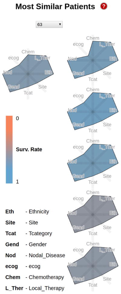
Because clinicians were interested in analyzing similar patients and their response to treatment, the first panel enables similar patient comparison. A small-multiple display of Kiviat diagrams represents the 5 most similar patients to the one selected. The similarity is determined based on a subset of the eight most critical attributes. These attributes can indicate how different patients responded to the same therapy, or how patients with similar traits responded to different treatments.
Once the most similar patients are retrieved by the statistical module described below, their attributes are mapped as follows: in a single Kiviat an axis is assigned to each patient attribute, and the axes are arranged radially. We assign to each possible attribute value a distance from the center, and a closed polygon path is constructed by connecting the points on the axis representing the patient’s attributes to produce a compact representation of a patient. Finally, the color of the Kiviats encodes the survival probability of that patient, from blue (good) to orange (bad). The shape and color encoding captures effectively the variety of outcomes across similar patients (Fig. 2).
Fig. 2.

Example Kiviat panels for three patients (417, 568, 413). Each panel shows on the left the patient currently selected, and on the right the 5 most similar patients. The glyph colors encode the patient survival rate, from good (blue) to worse (orange). While the Kiviats encode few-valued categorical data, as opposed to quantitative, note how the glyph shapes in the small multiple display capture the patient similarity at a glance.
The Kiviat encoding was selected over heatmaps and parallel coordinate plots because of its preattentive features. We note that our encoding extends star plots—typically used to encode quantitative attributes—to few-valued categorical data. Although the mapping enforces a false implicit ordering of non-ordinal data (Asian patients are not “less than” Hispanic patients), the benefits arriving from the preattentive shape comparison clearly outweighed the disadvantage. The Kiviat axis ordering is not an issue here: each Kiviat uses the same axis ordering across patients, resulting in similar polygon shapes for similar patients.
Statistics Module
When a patient is selected, a statistical module executes a K Nearest Neighbor (KNN) algorithm to find the most similar patients in the dataset. To compute patient similarity, the algorithm uses the eight most important features presented in Table 1 (or a subset of these values; to enable therapy exploration, therapy-variables are by default excluded). As the table shows, all the attributes except for age are discrete values with no intrinsic order relation. For example, a white person cannot be said to be closer to a Hispanic than to an Asian. In the case of discrete data like ours, Hamming distance is the preferred measure of similarity; Euclidean or Manhattan distance metrics are not appropriate in this case. Therefore we compute Hamming distance over all the discrete attributes:
| (1) |
where P and Q refer to the patients, |A| is the number of attributes, and Pi refers to the value of the ith attribute of P. Because the Hamming distance is a discrete function with range [0,|A|], we use the age difference as a tiebreaker. The five patients with the smallest distance measures are selected as the nearest neighbors.
The 5-year probability of survival is computed through the nomogram module described below.
Interaction
Details on demand are available by hovering over each Kiviat axis. Further controls allow a user to include or exclude specific variables from the KNN search.
3.6 Interactive Nomogram Panel
Interactive Nomogram
The second component of the environment is an interactive nomogram panel. A nomogram (from Greek “nomos”, law, and “gramme”, line) is a graphical calculating device in the shape of a two-dimensional diagram. The diagram uses a parallel coordinate system: it represents the relations between typically three variables by means of a number of fixed vertical axes, so arranged that the value of one variable can be found by a simple geometric construction, for example, by drawing a straight line intersecting the other scales at the appropriate values.
Nomograms date from 1884 [22] and are commonly used, in paper form, in the target domain. We adapt and extend the nomogram encoding for the purpose of similarity-based therapy planning.
We note that, despite a similar use of parallel coordinates, nomograms differ from the century-later parallel coordinate plots [42] in several important aspects related to their construction and usage. Nomograms are, first and foremost, a precision calculating device, not a general filtering tool—a scalpel, not a sword. Because nomograms are calculating devices, unlike general parallel coordinate plots, the order of the nomogram axes is fixed, and the last axis bears particular meaning by encoding the outcome of interest. Second, the nomogram axes can be, and are in practice, mapped to few-valued categorical attributes, not many-valued attributes. These axes can further be translated vertically and scaled. Third, the height of each nomogram axis is correlated to the weight of that variable into the computation of the outcome. Fourth, because nomograms are employed to analyze one to a few specific individuals, they should not be used to drive other statistical modules, in the style of parallel coordinate plots: the resulting statistics on such few samples would be invalid.
For the order of the first set of axes, we followed the typical clinician descriptor of a new patient: “56 year old male white patient with T3 glottic cancer [...]”, hence age, gender, ethnicity, cancer type, site [...]. The next set of axes encode the treatment plan applied. The last axis (or the “result” of the nomogram) is the outcome of that therapy: the 5-year survival rate. The height of each axis is proportional to the weight of that variable in the outcome calculation, and thus helps give insight into the mechanics of the statistical model on which it is based. Where possible, the vertical tick labels are laid down according to their contribution to the survival probability: for example, in the nomogram plot age goes from high values at the axis bottom towards low values at the axis top, since older age is associated with lower probability of survival. As in general parallel coordinate plots, each patient in the repository becomes a polyline in this coordinate system (Fig. 3).
Fig. 3.

Interactive nomogram for a white female subject with T3 supraglottic cancer, before (top) and after (middle and bottom) axis editing. A filter has been applied along the age axis in all versions. In the top image, a mouse-over highlights one similar patient of interest. In the middle version, a statistician has determined that the gender axis is irrelevant and has removed it. In the bottom version, some axes have been rescaled and translated, in order to generate a cleaner, publishable paper nomogram [41].
Statistics Module
Because the mean survival probability needs to be computed over a 5-year period in the presence of incomplete data, we perform this computation with a martingale model and a statistical algorithm. We first compute offline the estimated 5-year survival from a parametric accelerated failure-time model which assumes a baseline Weibull distribution. Covariates including gender, age, staging, nodal status, ethnicity, location of tumor etc. are assumed to be linearly related to the hazard factor. The hazard factor is the instantaneous probability of dying on any day given the subject were alive the previous day. A proportional hazards model typically assumes the logarithm of the hazard is equal to a linear combination of covariates (e.g., gender, age, staging, etc) [43]. The model is fit using a maximum likelihood approach. The resulting 5-year survival value is mapped to the last axis of the nomogram.
Interaction
The default usage mode for the nomogram is along its original purpose: only the K Nearest Neighbors are shown, and therapy variables are not included in the KNN search. For wider exploration, users may elect to view other patients, or recompute and explore the nearest neighbors using only a subset of the similarity criteria. The Kiviat panel is updated accordingly.
Users can filter the nomogram data by interacting directly with the axes in the chart, or indirectly through a set of axis controls. Clicking and dragging along an axis creates a filter with that selection. The advanced indirect controls allow, in the style of traditional paper-nomogram generation, the removal of specific axes and remapping of the values shown.
Figure 3 illustrates the process of nomogram editing to generate a paper nomogram. The resulting paper nomogram has been recently published and disseminated [41].
3.7 Kaplan Meier Survival Panel
Survival Curves
The use of survival curves in cancer research has a long history [44], [45], [46], [47]. Static survival curves were frequently used by both radiotherapists and statisticians to explain therapy outcome differences across patient groups. A survival curve displays the survival experience of a cohort of patients by showing the survival probability versus time. We blend interactive filtering with a Kaplan Meier survival plot encoding and a statistical module to enable the mining of survival probabilities (Fig. 4).
Fig. 4.

A survival encoding in the style of Kaplan-Meier, showing the different survival probability distributions depending on the cancer stage. For this interactive plot, white patients with supraglottic cancer were selected.
The survival encoding shows how the probability of survival over time changes depending on the different characteristics of the patients. For instance, patients with a T4-stage of cancer tend to have lower chances of survival compared to patients with a T3-stage cancer over the same period of time. The horizontal axis of the graph represents time, while the vertical axis represents the probability of survival of a patient over that period of time. We compute these plots for all the attributes currently selected by the user.
Each plot in the graph represents a different value that the respective attribute can assume, and its color (based on color-brewer2.org) encodes the attribute. Each plot is surrounded by a paler ribbon in the same hue, which represents the 95% confidence interval of our prediction.
Statistics Module
Straightforward estimators of the probability of survival at a certain time point (e.g., the sample percentage of subjects surviving beyond a certain time point) are insufficient when the length of follow-up is variable. For example, when we estimate the survival probability at 5 years for a subject who is only followed for 3 years before the study ends, it is unclear whether the subject would have survived for 5 years. This phenomenon, known as right-censoring, characterizes many biomedical datasets, including the one considered here.
The Kaplan-Meier (or product-limit) estimator of the survival probability is the standard method when the outcome (survival time) may be right-censored due to loss-to-follow-up or study termination. Additionally, the Kaplan Meier estimator is the nonparametric maximum likelihood estimator (MLE) of the survival probability. MLEs are advantageous because they are the (asymptotic) efficient estimator. That is, we cannot do better (in terms of minimizing the mean squared error) than the Kaplan-Meier estimator without making some parametric assumption about the survival distribution.
We calculate the data in the chart using the Kaplan-Meier estimator formula:
| (2) |
where Ŝ(t) is the maximum likelihood estimate, ni is the number of survivors just prior to time ti, and di is the number of deaths occurred at ti.
The confidence interval is calculated as a two standard deviation range around the predicted value, where the standard deviation is computed using Greenwood’s formula:
| (3) |
Interaction
The attribute being analyzed in the survival plot can be changed by choosing from a listbox located above the graph. We do not compute or show a Kaplan plot when the number of patients considered for the plot drops below 5. The plot is linked to other panels (e.g., the nomogram view) through color.
3.8 Cohort Context
Mosaic Plot
The last component of the environment is a context mosaic plot (Fig. 5) [48], which shows the number of patients in the dataset who match the user-specified values for any combination of attributes. The mosaic has two functions: showing a quantitative context of the patient distribution based on the current category selection, and filtering the data if necessary.
Fig. 5.

Mosaic investigation of survival rates and cancer sites context for a Hispanic patient. Left: Glottic cancers (second box from the top, in blue for all ethnicities) indicate high (above 0.52) 5-year mean survival rates across ethnicities. Right: Hispanics, Asian and undetermined ethnicities with glottic cancers have even higher (above 0.69) mean survival rates. However, only the Hispanic group (rightmost column) contains enough samples to warrant further investigation.
The two mosaic axes are mapped to the possible values that a pair of attributes can take, from a sequence of attributes selected by the user. Each combination of values is assigned a tile; the size of the tile is proportional to the percentage of patients with those particular attributes, within the currently selected dataset. The mosaic tiles use the same color scheme as the Kiviats to encode the 5-year survival rate for patients belonging to that group: blue means the mean 5 year survival probability for that group is greater than a user defined threshold; orange means the opposite. The threshold can be interactively modified through a scented widget [49] at the bottom of the mosaic.
The interactive mosaic encoding was selected and streamlined after multiple discussions of prototypes, over a simpler treemap encoding, small multiple scatterplot variations, heatmaps, and textured/multicolored mosaics. Quotes below mark feedback from our biomed collaborators. Heatmaps, a popular encoding in the biomed field, were discarded despite showing large amounts of overview information in a compact form, because “clinicians are interested in how their particular patient fits in, and not in generic overviews”. Small multiple scatterplots took too much screen space and were “hard to read”. In view of the heatmap comments, the treemap encoding was a surprising success, yet lost to the mosaic plot which, after streamlining, was “much clearer and easier to read”.
Filter Bar
A filter bar at the top of the mosaic serves as a navigation reminder: each time a filter is applied to the data through the mosaic, a breadcrumb is added to the bar, showing the attributes added to the current filter. The breadcrumbs are interactive and allow users to disable specific filters (Fig. 1).
Statistics Module
The mosaic is linked to the same statistics module as the nomogram panel. The module computes the 5-year survival rate of each patient.
Interaction
Clicking on a tile filters the data and updates the mosaic: only the patients with the selected combination of attributes will be shown in the updated mosaic. The attributes can be reordered using a popup menu, if the user wishes to explore the data in a different sequence from the default one. Hovering over a tile further displays statistics about that subgroup (such as number of samples and standard deviation) as details on demand.
3.9 Scaffolding
Because medical professionals tend to resist to novel encodings (as documented in our related work), it was important to incorporate in the environment scaffolding components that would ease the interface learning curve. In the overall layout, encodings that exist in paper form in the target domain (nomograms and survival plots) are placed centrally, to provide visual anchors. We link the less familiar representations (Kiviats and mosaic) to these anchors through a linked view paradigm, which has been shown to assist in visual scaffolding [50]. Inspired by similar approaches in successful videogames, we further provide help buttons for each panel, as well as for the entire interface, with on-demand explanations for each visual representation and the interactions available.
Implementation Details
The therapy explorer is built in Javascript, using the D3.js data visualization library. We implemented our own nomogram package, and make it available as open-source (https://github.com/uic-evl/d3.nomogram). The explorer is available at https://uic-evl.github.io/SMART/.
4 Evaluation and Results
Because evaluators and designers were separated over space and time due to the project constraints, we evaluated the therapy explorer through a combination of multiple demonstrations and case studies involving the larger expert team, and several hallway usability tests with novice users. This combined approach enabled faster design cycles than the weekly electronic meetings: novice users captured coarse-level design potential issues, while the experts had final say over design decisions and captured higher-level potential issues. The demonstrations took various forms, from collocated designer-driven demos to collocated novice-driven tests and to expert-driven remote sessions using screen-sharing software.
4.1 Hallway Usability
Hallway usability is a fast, inexpensive method of usability testing in which randomly-selected people—e.g., people passing by in the hallway—are asked to try using a product or service. The approach can help designers identify “brick walls,” problems so serious that users simply cannot advance using the product. In the early stages of design, we employed hallway usability to observe six computer science graduate students use the system. We note that hallway usability tests are in no way large scale user studies, which exceed the scope of visualization design works, but a practical, hands-on approach to improving usability in specific contexts.
We selected a list of reasonably complex tasks for these users (e.g., “Using the tree map representation, display the overall survival probability at 0.5 for a given male Hispanic subject with supraglottic T3-stage cancer”) and gave them the opportunity to use the prototypes after a brief tutorial. We used a think-aloud technique while observing the participants, and used their feedback to improve the design. The approach enabled us, for example, to evaluate informally the workflow benefits of a linked views paradigm as opposed to separate tabs, and the advantages and disadvantages of encodings, for example Kaplan Meier charts, nomograms, treemaps, or mosaic plots.
These tests and feedback indicated, for example, that the workflow was best incorporated in a linked views paradigm (lower time-on-task and fewer clicks), even if this implied less real-estate screen space per encoding, and that in this application mosaic plots were easier to understand than treemaps (higher task success and lower time on task, by a factor as high as 3). Feedback from the domain experts confirmed these findings during both site visits and remote meetings (e.g., “mosaic plots are absolutely better than treemaps in this case”).
4.2 Expert Case Studies and Feedback
To evaluate the effectiveness of the approach, we have completed two case studies together with domain experts. The case studies were completed in separate sessions, two weeks apart; the second case reflects increased user familiarity with the visual representations. Both case studies involved two senior radiotherapists (one of whom is a practicing clinician), a statistician, and a data mining researcher. The therapy explorer was used on a dataset of 632 patients with head and neck cancer. For these two cases, the experts were given direct access to the web-based explorer, and we used screen sharing with turn taking, and a think-aloud technique to analyze their interactions with the environment. The domain experts have been using this work for over a year [41]. The case studies and verbiage reported below have been abbreviated and simplified for a lay audience.
4.2.1 Patient Prognosis and Therapy Exploration
In the first case study, our collaborators analyzed a specific patient in the repository, with particular emphasis on patient similarity and therapy choice (tasks Task 1 – Task 4). The team selected a specific patient, white female with T4 supraglottic cancer.
The group analysis started directly with the Kiviat comparison panel. In fact, a team member was visually browsing through the patient data using the Kiviats, and the subject caught their eye due to the variation of outcomes in her nearest neighbors: the neighbor glyph colors varied from light blue to orange (Fig. 1). The most promising similar case (third from the bottom, in blue) is very similar—also white female supraglottic, low ecog score, etc—, but has T3 supraglottic cancer.
The specialist took note of the demographics of the patient, and proceeded to the mosaic to figure out the context of the patient’s group (white, supraglottic). After interacting with the mosaic, the group noted the T3 female subgroup had particularly low mean survival rates, close to those of the T4 category (Fig 1 mosaic). The Kaplan Meier survival plot also predicted similar trajectories for the T3 and T4 categories. Spurred on by this finding, the analysis moved swiftly to the interactive nomogram panel. After further filtering by gender, T category, and nodal disease, the analysis focused on the two patients most similar to the subject. The group noted with surprise that despite the variation in the treatment course for these patients, the survival outcomes were very similar and fairly low. The clinicians are using these findings to identify high-risk treatment responders.
4.2.2 Hispanic Glottic Therapy Analysis
In this exploratory study, the domain experts hypothesized a potential correlation between Hispanic ethnicity, glottic tumor site, multiple therapy paths, and survival rates for a specific patient (tasks Task 1 through Task 6). This hypothesis marked a departure from the state-of-the-art therapy planning protocol at the clinic, which was primarily based on cancer staging (T3 versus T4).
After selecting the patient characteristics, the radiotherapists’ exploration started with the nomogram panel, while the data mining researcher headed straight to the Kiviat panel, and the statistician zeroed in on the Kaplan-Meier survival plot. After reconvening and interacting as a group with the mosaic plot and the survival slider, it was noted that across all ethnicities, glottic cancers had higher 5-year mean survival rates (Fig. 5 left) than cancers at other sites, and that Hispanics, Asian and undefined ethnicities had even higher 5-year mean rates (Fig. 5 right) than other ethnicities. The details on demand revealed that from these three subgroups, the Hispanic glottic group had sufficient samples present in the repository (23 subjects, as opposed to 1, respectively 5).
Drilling down in this subgroup, the mosaic view confirmed that T3 cancers had higher survival rates than the more advanced stage T4 cancers, as expected. When switching to the Kaplan Meier T-category survival plot, we easily noted, however, that the T4 and T3 ribbons (standard deviation) were both wide and at times overlapping, indicating similar survivals regardless of the cancer staging. As expected, the predicted survival time in months for T3 cases was significantly longer than the one for T4. However, and surprisingly, the advanced-stage T4 cases featured higher probability of survival in the 4 to 17 years survival period than T3 cases (Fig. 6).
Fig. 6.

T-category survival plot for Hispanic glottic cancer cases (T3 in brown, and T4 in pink). The T4 and T3 ribbons (standard deviation) are both wide and at times overlapping. The predicted survival time in months for T3 cases is significantly longer than the one for T4. However, and surprisingly, T4 cases feature higher probability of survival in the middle 4 to 17 years survival period than T3 cases: note that in this 4–17 interval (X axis) the T4 line chart is higher than the T3 line chart.
Next, the group examined the nearest neighbors of the specific Hispanic glottic patient (Fig. 7). As shown in Fig. 7, the six cases are remarkably similar with respect to eight possible variables (Site, TCategory, Gender, Ethnicity, Chemotherapy, NodalDisease, Ecog, LocalTherapy). Furthermore, they all had reasonable survival outcomes, as encoded by the blue shades of the glyphs. Encouraged by this finding, the group used the interactive nomogram to explore correlations between the patient’s age at the time of treatment and the survival rate. Within the patient’s age group, all similar patients with glottic cancer had reasonably high survival rates. Survival rates in the same group lowered dramatically for patients with supraglottic cancer, indicating that the tumor site was an important predictor of treatment success. Follow-up clinical studies will be informed by this observation, and may be used to refine the therapy selection protocol.
Fig. 7.
Kiviat profile for a Hispanic male patient with glottic cancer, and the 5 most similar patients in the repository. The polygon shade encodes the 5-year survival rate (blue is better, grays and browns towards orange are worse). Note how similar the six patients are with respect to 8 variables.
4.2.3 Expert Feedback
The clinicians were enthusiastic about the therapy explorer (“freaking awesome”). The Kiviat encodings, the interactive nomograms, and the interactive survival plots were immediate successes, while the context mosaic was more slowly adopted after a few demonstrations. In addition to the case studies completed with the therapy explorer, the group promptly noticed several anomalies in the dataset that had never been discovered before and turned out to be data copying issues. This confirms the power of this approach even in a challenging task such as outlier detection. The experts further confirmed the value of the explorer as a research and education tool, and are eager to publicize it.
During the evaluation process, we noted that the layout of the panels on the same screen made possible multiple workflows (Fig. 8): 1) left to right, beginning by browsing the patient set to find similarities, followed by context data and comparison of survival, followed by filtering operations, and progressing towards individual patient detailed analysis and survival prediction; 2) right to left, beginning with therapy exploration, then moving on to similarity search etc; 3) middle to either left or right, beginning with the survival plots and followed by similarity search or context analysis; 4) from top to bottom, filtering the patient data in the nomogram, then examining the context of the results, and so on. We note that Marshall and Shipman [51], who have studied the use of tools for collaborative work, observed before that users resist systems that impose formalisms such as structures and procedures. We speculate that the coordinated views paradigm followed in our work supports not only flexible integration of multiple data views, but also flexible workflows.
Fig. 8.

Three of the possible workflows through the explorer, as observed during evaluation with domain experts who had different backgrounds. These observations show how panel layout in a linked views approach enable multiple workflows.
5 Discussion
The case studies and the domain expert feedback indicate that our integrated approach is of significant help in the comparative exploration of treatment outcomes. The evaluation with expert users of varied backgrounds further shows that the therapy explorer is at the same time user-friendly and powerful. Experts could find in just minutes new interesting patterns and even anomalies in a dataset they had explored using different tools for a long time. The novice usage evaluation sessions and an emphasis on scaffolding have further helped in creating an easy to use and clear interface. The result is a compact design which maximizes the use of screen real estate and supports flexible expert workflows.
The statistics-backed interactive nomograms and the interactive survival plot encodings are novel contributions. The exploration of Kiviats and mosaics in the context of few-valued categorical data is further original. The exploration of the design space with an emphasis on an activity-centered design process, and the implementation of the Van Ham and Perer’s mantra in this few-valued context are further novel contributions. The combination of visual encodings in a tool to handle multivariate data in precision medicine is also novel.
The chosen visual encodings have been shown to have complementary strengths. When connected through scaffolding, these multiple encodings and views on the data provided insight into domain problems, steered the investigation, and allowed for the generation of new observations. In this scaffolding context, helpful factors were the fact that static nomograms existed in the target domain. Similarly, the interactive Kaplan Meier survival plots are close to the static plots and error bars common in biomedicine.
In terms of limitations, we note that our precision approach operates on a relatively reduced set of patient markers, none of which include spatial characteristics. Integrating a larger number of markers in both the statistical methods and in the visual representations is an ambitious direction of future work.
A measure of the success of this project is the adoption of the tool for research purposes by our co-authors and their research labs. Reflecting on the design experience in this successful geographically-distributed collaboration, we note the following points:
P1 Sprint requirements engineering: collocated, two-way, sprint-style. The data and task analysis phase can really make or break a geographically distributed visual design project, and as such constitutes the best use of face to face time. This starter set of requirements was generated and refined through peer-programming style interaction, in which the team explained the project, in several rounds, to a lay audience. This two way dialog and mutually-approved document formed a solid foundation for the prototyping stage.
P2 Prototyping and scaffolding: parallel prototyping, domain encodings, and live demos. In our remote, multi-site collaboration—with reduced and strict time available for meetings—parallel prototyping was a key element, as were live demos. We furthermore found success by building upon domain-specific encodings. Using those familiar encodings within a linked view framework served as a visual scaffold, allowing the users to harness and expand their previous analysis experience. We furthermore found that paper prototypes are convenient for fast design iterations, but that sometimes live demos are required to make the case for a particular encoding: for example, mosaics only became a success once interacting with them was possible.
P3 Local/Remote evaluation: combined hallway usability and remote testing. The combination of hallway usability and remote testing methods has allowed for faster design and development cycles, in a collaboration which had to tackle differences in geographical space and expertise. To this end, a web-based implementation was also important for remote testing. Due to the limited time available for e-meetings, it was further important to have scenarios ready to demonstrate the benefits of specific encodings and interactions.
6 Conclusion
In conclusion, we have designed, developed and validated a novel visualization approach to precision medicine that enables the detection of similar patients and then the systematic exploration and comparison of individual factors collected from these groups of similar patients. Our approach integrates a statistical model and a K Nearest Neighbors approach with visual analysis in order to compute and explain the probability of survival under user-specified constraints.
We introduced scalable visual encodings for these data, which are multivariate, heterogeneous and often few-valued. These linked encodings combine statistics-driven nomograms—an interactive parallel plot representation for risk prediction; interactive Kaplan-Meier survival plots—a visual representation for risk evolution over time; Kiviat representations; and statistics-driven mosaics. The combination of these familiar and unfamiliar encodings follows visual scaffolding principles, to support their adoption by the target audience. The statistics-driven encodings we have introduced and documented in this work may find application in other domains that feature risk assessment, for example in finance visualization.
Evaluation with domain experts shows that the combination of these encodings supports streamlined workflows which help radio-therapists quickly identify similar patients and predict outcomes. Last but not least, we described the expert feedback and the design lessons learned from this successful, multi-site remote collaboration. We believe these findings transfer across collaborations, visual designs and application domains.
Acknowledgments
This work was supported by the National Institutes of Health [NCI-R01-CA214825, NCI-R01CA225190]; and the National Science Foundation [NSF-CNS-1625941, NSF-DMS-1557559]. The authors thank all members of the Electronic Visualization Laboratory, all members of the MD Anderson Head and Neck Cancer Quantitative Imaging Collaborative Group, and in particular Hesham Elhalawani and Tommy Sheu.
Biographies
G. Elisabeta Marai received the PhD degree in computer science from Brown University in 2007. She is an Associate Professor in the Electronic Visualization Laboratory, Department of Computer Science, University of Illinois at Chicago. She has received multiple awards for her work in visual computing. She is a senior member of the IEEE.
Chihua Ma received the BSc degree in computer science from Nankai University in 2009 and the MSc degree in electrical and computer engineering from the University of Illinois at Chicago in 2011. She is working toward the PhD degree in the Electronic Visualization Laboratory, University of Illinois at Chicago. Her research focuses on the visualization of multi-scale dynamic biological networks.
Andrew Thomas Burks received the BSc degree in computer science from the University of Illinois at Chicago in 2017. He is working toward the PhD degree in the Electronic Visualization Laboratory, Department of Computer Science, University of Illinois at Chicago. His research focuses on interactive collaborative data exploration and visual analytics. He is a student member of the IEEE.
Filippo Pellolio received the MSc degree in computer science from the University of Illinois at Chicago in 2016. He is currently a software engineer at Google. He has a background in data visualization and is a former member of the Electronic Visualization Laboratory.
Guadalupe Canahuate received her PhD in computer science from the Ohio State University in 2009. She is currently an Assistant Professor in the Department of Computer Science at the University of Iowa. Her research is in Large-scale database systems, data analysis and exploration.
David M. Vock received his PhD in statistics from North Carolina State University in 2012. He is currently an Assistant Professor in the Division of Biostatistics at the University of Minnesota and focuses on developing methods for risk prediction and causal inference.
Abdallah Mohamed currently works at the Division of Radiation Oncology, University of Texas MD Anderson Cancer Center, where he is Lab Director and Clinical Research Scientist. He does research in Radiology and Oncology.
Clifton David Fuller is a clinical radiation oncologist and Associate Professor in the Department of Radiation Oncology, Division of Radiation Oncology, The University of Texas MD Anderson Cancer Center, Houston, TX. His research is in evidence-based personalized radiotherapy techniques by incorporation of novel imaging methodologies.
Contributor Information
G. Elisabeta Marai, Electronic Visualization Laboratory, University of Illinois at Chicago.
Chihua Ma, Electronic Visualization Laboratory, University of Illinois at Chicago.
Andrew T. Burks, Electronic Visualization Laboratory, University of Illinois at Chicago.
Filippo Pellolio, Electronic Visualization Laboratory, University of Illinois at Chicago.
Guadalupe Canahuate, Dept. of Computer Science, University of Iowa.
David M. Vock, Bioinformatics and Statistics Dept., University of Minnesota
Abdallah S.R. Mohamed, MD Anderson Cancer Center, University of Texas
C. David Fuller, MD Anderson Cancer Center, University of Texas.
References
- 1.“http://www.cancer.gov/research/progress/snapshots/head-and-neck,” Retrieved Aug 2016.
- 2.Zhang L, Garden AS, Lo J, Ang KK, Ahamad A, Morrison WH, Rosenthal DI, Chambers MS, Zhu XR, Mohan R, et al. Multiple regions-of-interest analysis of setup uncertainties for head-and-neck cancer radiotherapy. International Journal of Radiation Oncology* Biology* Physics. 2006;64(5):1559–1569. doi: 10.1016/j.ijrobp.2005.12.023. [DOI] [PubMed] [Google Scholar]
- 3.Nakata A, Tateoka K, Fujimoto K, Saito Y, Nakazawa T, Abe T, Yano M, Sakata K, et al. The reproducibility of patient setup for head and neck cancers treated with image-guided and intensity-modulated radiation therapies using thermoplastic immobilization device. International Journal of Medical Physics, Clinical Engineering and Radiation Oncology. 2013;2(04):117. [Google Scholar]
- 4.Perni S, Mohamed A, Garden A, Gunn G, Rosenthal D, Scott J, Fuller C. Impact of pretreatment volumetric tumor growth velocity on oncologic outcomes in oropharyngeal squamous cell cancer. International Journal of Radiation Oncology Biology Physics. 2016;94(4):917–918. [Google Scholar]
- 5.Lewin T, Kim J, Latifi K, Poleszczuk J, Bull J, Byrne H, Torres-Roca J, Moros E, Gatenby R, Harrison L, et al. Proliferation saturation index predicts oropharyngeal squamous cell cancer gross tumor volume reduction to prospectively identify patients for adaptive radiation therapy. International Journal of Radiation Oncology Biology Physics. 2016;94(4):903. [Google Scholar]
- 6.Wongsuphasawat K, Gotz D. Outflow: Visualizing patient flow by symptoms and outcome. IEEE VisWeek Workshop on Visual Analytics in Healthcare; Providence, Rhode Island, USA. American Medical Informatics Association; 2011. pp. 25–28. [Google Scholar]
- 7.Huang CW, Lu R, Iqbal U, Lin SH, Nguyen PA, Yang HC, Wang CF, Li J, Ma KL, Li YCJ, et al. A richly interactive exploratory data analysis and visualization tool using electronic medical records. BMC medical informatics and decision making. 2015;15(1):92. doi: 10.1186/s12911-015-0218-7. [DOI] [PMC free article] [PubMed] [Google Scholar]
- 8.Zhang Z, Gotz D, Perer A. Iterative cohort analysis and exploration. Information Visualization. 2014 p. 1473871614526077. [Google Scholar]
- 9.Chui KK, Wenger JB, Cohen SA, Naumova EN. Visual analytics for epidemiologists: understanding the interactions between age, time, and disease with multi-panel graphs. PloS one. 2011;6(2):e14683. doi: 10.1371/journal.pone.0014683. [DOI] [PMC free article] [PubMed] [Google Scholar]
- 10.Bernard J, Sessler D, May T, Schlomm T, Pehrke D, Kohlhammer J. A visual-interactive system for prostate cancer stratifications. Proceedings of the IEEE VIS Workshop on Visualizing Electronic Health Record Data; 2014. [Google Scholar]
- 11.Maries A, Mays N, Hunt MO, Wong KF, Layton W, Boudreau R, Rosano C, Marai GE. Grace: A visual comparison framework for integrated spatial and non-spatial geriatric data. Visualization and Computer Graphics, IEEE Transactions on. 2013;19(12):2916–2925. doi: 10.1109/TVCG.2013.161. [DOI] [PMC free article] [PubMed] [Google Scholar]
- 12.Steenwijk MD, Milles J, Buchem M, Reiber J, Botha CP. Integrated visual analysis for heterogeneous datasets in cohort studies. IEEE VisWeek Workshop on Visual Analytics in Health Care; 2010. [Google Scholar]
- 13.Klemm P, Oeltze-Jafra S, Lawonn K, Hegenscheid K, Volzke H, Preim B. Interactive visual analysis of image-centric cohort study data. Visualization and Computer Graphics, IEEE Transactions on. 2014;20(12):1673–1682. doi: 10.1109/TVCG.2014.2346591. [DOI] [PubMed] [Google Scholar]
- 14.Turkay C, Lundervold A, Lundervold AJ, Hauser H. Human-Computer Interaction and Knowledge Discovery in Complex, Unstructured, Big Data. Springer; 2013. Hypothesis generation by interactive visual exploration of heterogeneous medical data; pp. 1–12. [Google Scholar]
- 15.Angelelli P, Oeltze S, Haász J, Turkay C, Hodneland E, Lundervold A, Lundervold AJ, Preim B, Hauser H. Interactive visual analysis of heterogeneous cohort-study data. IEEE Computer Graphics and Applications. 2014;(5):70–82. doi: 10.1109/MCG.2014.40. [DOI] [PubMed] [Google Scholar]
- 16.Grinstein G, Trutschl M, Cvek U. High-dimensional visualizations. Proceedings of the Visual Data Mining Workshop, KDD; Citeseer. 2001. [Google Scholar]
- 17.Theus M, et al. Interactive data visualization using mondrian. Journal of Statistical Software. 2003;7(11):1–9. [Google Scholar]
- 18.Theus M. Handbook of data visualization. Springer; 2008. High-dimensional data visualization; pp. 151–178. [Google Scholar]
- 19.Ward MO. A taxonomy of glyph placement strategies for multidimensional data visualization. Information Visualization. 2002;1(3–4):194–210. [Google Scholar]
- 20.Liu S, Maljovec D, Wang B, Bremer P-T, Pascucci V. Visualizing high-dimensional data: Advances in the past decade. Proc Eurographics Conf Visualization. 2015:20 151 115–127. doi: 10.1109/TVCG.2016.2640960. [DOI] [PubMed] [Google Scholar]
- 21.Saary MJ. Radar plots: a useful way for presenting multivariate health care data. Journal of clinical epidemiology. 2008;61(4):311–317. doi: 10.1016/j.jclinepi.2007.04.021. [DOI] [PubMed] [Google Scholar]
- 22.Ocagne Md. Traite de Nomographie. Theorie des abaques. Applications pratiques. Paris: Gauthier-Villars; 1899. [Google Scholar]
- 23.Sedlmair M, Meyer M, Munzner T. Design study methodology: Reflections from the trenches and the stacks. Visualization and Computer Graphics, IEEE Transactions on. 2012;18(12):2431–2440. doi: 10.1109/TVCG.2012.213. [DOI] [PubMed] [Google Scholar]
- 24.McKenna S, Mazur DC, Agutter J, Meyer M. Design activity framework for visualization design. Visualization and Computer Graphics, IEEE Transactions on. 2014;20(12):2191–2200. doi: 10.1109/TVCG.2014.2346331. [DOI] [PubMed] [Google Scholar]
- 25.Munzner T. A nested model for visualization design and validation. Visualization and Computer Graphics, IEEE Transactions on. 2009;15(6):921–928. doi: 10.1109/TVCG.2009.111. [DOI] [PubMed] [Google Scholar]
- 26.Kerzner E, Butler LA, Hansen C, Meyer M. Computer Graphics Forum. 3. Vol. 34. Wiley Online Library; 2015. A shot at visual vulnerability analysis; pp. 391–400. [Google Scholar]
- 27.Marai GE. Activity-centered domain characterization for problem-driven scientific visualization. IEEE Trans on Vis and Computer Graphics. 2018;24(1):913–922. doi: 10.1109/TVCG.2017.2744459. [DOI] [PMC free article] [PubMed] [Google Scholar]
- 28.The Collaboration Success Wizard Website. http://uxpamagazine.org/the-collaboration-success-wizard/
- 29.Norman DA. The Design of Everyday Things. New York, NY, USA: Basic Books, Inc; 2002. [Google Scholar]
- 30.Eswaran KP, Chamberlin DD. Functional specifications of a subsystem for data base integrity. Proceedings of the 1st International Conference on Very Large Data Bases; ACM; 1975. pp. 48–68. [Google Scholar]
- 31.Williams L, Kessler R. Pair programming illuminated. Addison-Wesley Longman Publishing Co., Inc; 2002. [Google Scholar]
- 32.Wray S. How pair programming really works. IEEE software. 2010;27(1):50–55. [Google Scholar]
- 33.Schueneman AJ, Himmelfarb E, Geng L, Tan J, Donnelly E, Mendel D, McMahon G, Hallahan DE. Su11248 maintenance therapy prevents tumor regrowth after fractionated irradiation of murine tumor models. Cancer Research. 2003;63(14):4009–4016. [PubMed] [Google Scholar]
- 34.Cuneo KC, Geng L, Fu A, Orton D, Hallahan DE, Chakravarthy AB. Su11248 (sunitinib) sensitizes pancreatic cancer to the cytotoxic effects of ionizing radiation. International Journal of Radiation Oncology* Biology* Physics. 2008;71(3):873–879. doi: 10.1016/j.ijrobp.2008.02.062. [DOI] [PubMed] [Google Scholar]
- 35.Vlachtsis K, Nikolaou A, Markou K, Fountzilas G, Daniilidis I. Clinical and molecular prognostic factors in operable laryngeal cancer. European Archives of Oto-Rhino-Laryngology and Head & Neck. 2005;262(11):890–898. doi: 10.1007/s00405-005-0916-3. [DOI] [PubMed] [Google Scholar]
- 36.Bernier J, Bentzen SM, Vermorken JB. Molecular therapy in head and neck oncology. Nature reviews Clinical oncology. 2009;6(5):266–277. doi: 10.1038/nrclinonc.2009.40. [DOI] [PubMed] [Google Scholar]
- 37.Sun S, Schiller JH, Spinola M, Minna JD. New molecularly targeted therapies for lung cancer. The Journal of clinical investigation. 2007;117(10):2740–2750. doi: 10.1172/JCI31809. [DOI] [PMC free article] [PubMed] [Google Scholar]
- 38.Dow SP, Glassco A, Kass J, Schwarz M, Schwartz DL, Klemmer SR. Parallel prototyping leads to better design results, more divergence, and increased self-efficacy. ACM Transactions on Computer-Human Interaction (TOCHI) 2010;17(4):18. [Google Scholar]
- 39.Van Ham F, Perer A. search, show context, expand on demand: supporting large graph exploration with degree-of-interest. IEEE Trans on Vis and Computer Graphics. 2009;15(6) doi: 10.1109/TVCG.2009.108. [DOI] [PubMed] [Google Scholar]
- 40.Munzner T. Visualization Analysis and Design. CRC Press; 2014. [Google Scholar]
- 41.Sheu T, Vock D, Mohamed A, Gross N, Mulcahy M, Zafereo M, Gunn G, Garden A, Sevak P, Phan J, Lewin J, Frank S, Beadle B, Morrison W, Lai S, Hutcheson K, Marai G, Canahuate G, Kies M, El-Naggar A, Rosenthal D, Weber R, Fuller C. Conditional survival analysis of patients with locally advanced laryngeal cancer: Construction of a dynamic risk model and clinical nomogram. Nature Scientific Reports. 2017:1–12. doi: 10.1038/srep43928. [DOI] [PMC free article] [PubMed] [Google Scholar]
- 42.Inselberg A. Parallel coordinates for multi-dimensional displays. Spatial information technologies for remote sensing today and tomorrow. 1984:312–324. [Google Scholar]
- 43.Kalbfleisch JD, Prentice RL. The statistical analysis of failure time data. Vol. 360 John Wiley & Sons; 2011. [Google Scholar]
- 44.Berkson J, Gage RP. Survival curve for cancer patients following treatment. Journal of the American Statistical Association. 1952;47(259):501–515. [Google Scholar]
- 45.Pocock SJ, Clayton TC, Altman DG. Survival plots of time-to-event outcomes in clinical trials: good practice and pitfalls. The Lancet. 2002;359(9318):1686–1689. doi: 10.1016/S0140-6736(02)08594-X. [DOI] [PubMed] [Google Scholar]
- 46.Seligson DB, Horvath S, Shi T, Yu H, Tze S, Grunstein M, Kurdistani SK. Global histone modification patterns predict risk of prostate cancer recurrence. Nature. 2005;435(7046):1262–1266. doi: 10.1038/nature03672. [DOI] [PubMed] [Google Scholar]
- 47.Yang JS, Nam HJ, Seo M, Han SK, Choi Y, Nam HG, Lee SJ, Kim S. Oasis: online application for the survival analysis of lifespan assays performed in aging research. PloS one. 2011;6(8):e23525. doi: 10.1371/journal.pone.0023525. [DOI] [PMC free article] [PubMed] [Google Scholar]
- 48.Hofmann H. Exploring categorical data: interactive mosaic plots. Metrika. 2000;51(1):11–26. [Google Scholar]
- 49.Willett W, Heer J, Agrawala M. Scented widgets: Improving navigation cues with embedded visualizations. Trans on Vis and Computer Graphics. 2007;13(6):1129–1136. doi: 10.1109/TVCG.2007.70589. [DOI] [PubMed] [Google Scholar]
- 50.Marai G. Visual scaffolding in integrated spatial and nonspatial visual analysis. The Sixth International Eurovis workshop on Visual Analytics EuroVA15; 2015. pp. 1–5. [Google Scholar]
- 51.Shipman FM, III, Marshall CC. Formality considered harmful: Experiences, emerging themes, and directions on the use of formal representations in interactive systems. Computer Supported Cooperative Work (CSCW) 1999;8(4):333–352. [Google Scholar]