Abstract
Due to mandates from recent legislation, clinical decision support (CDS) software is being adopted by radiology practices across the country. This software provides imaging study decision support for referring providers at the point of order entry. CDS systems produce a large volume of data, providing opportunities for research and quality improvement. In order to better visualize and analyze trends in this data, an interactive data visualization dashboard was created using a commercially available data visualization platform. Following the integration of a commercially available clinical decision support product into the electronic health record, a dashboard was created using a commercially available data visualization platform (Tableau, Seattle, WA). Data generated by the CDS were exported from the data warehouse, where they were stored, into the platform. This allowed for real-time visualization of the data generated by the decision support software. The creation of the dashboard allowed the output from the CDS platform to be more easily analyzed and facilitated hypothesis generation. Integrating data visualization tools into clinical decision support tools allows for easier data analysis and can streamline research and quality improvement efforts.
Keywords: Clinical decision support, Data visualization, Analytics, Informatics
Background
In response to mandates included in the Protecting Access to Medicare Act of 2014 (PAMA 2014) [1], clinical decision support (CDS) tools for imaging orders are being widely implemented by health systems in the USA. These tools use the American College of Radiology appropriateness criteria (ACR AC or appropriateness criteria), which are consensus guidelines rating a variety of possible imaging studies for a given clinical indication. These guidelines are derived by panels of radiologists and other medical specialists. Studies are rated 1–3 for “usually not appropriate,” 4–6 for “may be appropriate,” and 7–9 for “usually appropriate.” Clinical decision support software integrates these scores with the electronic order entry system to provide feedback to ordering providers about the studies they are ordering. By providing this feedback, it is hoped that ordering providers will more consistently select more appropriate studies for their patients.
Our institution was an early adopter of commercial CDS, specifically ACR Select (ACR Select, National Decision Support Company, Madison, WI). As opposed to institution-specific homegrown CDS, commercially available products can be purchased and implemented by any private or academic practice. Our implementation was staged, beginning in July of 2014, the details of which have been reported previously [2].
In addition to providing feedback to the referring provider at the time of order entry, the software also collects data elements including ordering department, provider types, type of study ordered, pediatric versus adult patient, imaging modality, scores of interest, and patient class (inpatient or outpatient), and the ACR appropriateness designation of the studies performed. For every study that triggers the CDS, these data elements are stored on dedicated servers hosted locally within the department of Radiology. In our department, which performs over 400,000 imaging studies per year, including CT, MRI, US, plain film, and nuclear medicine, this results in a large output of data. We hypothesize that there is likely useful information contained in this data that could answer key questions that impact our operations, but that it remains obscured due to lack of an easily accessible and functional interface.
Some questions we believe the data elements output by the CDS could potentially answer include:
How is the overall appropriateness of studies affected by imaging decision support?
Does overall appropriateness of studies vary among departments or providers?
Are certain exams problematic; those are, always returning very high or very low appropriateness scores?
Are there technical issues, such as studies not being scored, or free-text being entered instead of structured indications?
At the time of writing, no commercial user interface was available to allow us to easily answer such questions. In 2016, our vendor began offering a data analytics package to cloud-based customers; however, it is not available to sites like ours which have locally hosted CDS, and it comes at significant additional annual cost.
In summary, we had a large amount of data generated by a relatively new platform that had potentially significant clinical impact but no efficient way of visualizing the data produced to identify the signal in the noise. We sought to develop an interactive dashboard using a commercially available data visualization tool, Tableau (Tableau, Seattle, WA), so that we could monitor the function of our commercial CDS, assess its clinical impact, and determine potential areas in need of quality improvement.
Methods
During our implementation, the CDS tool had no readily accessible interface for analysis of output from the platform. In order to analyze the data, it had to be retrieved from locally hosted servers, which was time intensive and required specialized knowledge. Additionally, access was restricted to a small number of users. In order to facilitate interaction with these data, a dashboard was created using the Tableau software platform. Tableau is a cloud-based analytics platform used for visualization of relational databases and multidimensional arrays.
Order data for all imaging studies, including ordering department, provider types, type of study ordered, pediatric versus adult patient, imaging modality, scores of interest, and patient class (inpatient or outpatient), and the ACR appropriateness designation of the studies performed, were extracted daily from the electronic medical record into the enterprise data warehouse. The enterprise data warehouse is a central repository for collecting data from the electronic medical record, radiology information system, and the clinical decision support software. A query was written to pull all the previously mentioned data elements for reporting into a reporting table. The data columns include the specific data points discussed above as being part of the order data. This query runs daily to refresh the reporting table. This reporting table is the data source for the Tableau workbook. Using the Tableau software, the data fields are arranged into a dashboard in a manner intended to address the aforementioned administrative and clinical questions. The dashboard created is customizable, making it adaptable to changing needs of the imaging department or the rest of the institution.
To protect health information and to maintain HIPAA compliance, the dashboard is intentionally devoid of patient identifiers and access is password protected. Access is available to health system physicians and administrators. Our Tableau-based dashboard was designed for data visualization primarily and does not allow users to access the protected data that feeds it; however, this raw data can be retrieved for a user from the enterprise data warehouse on appropriate request.
Results
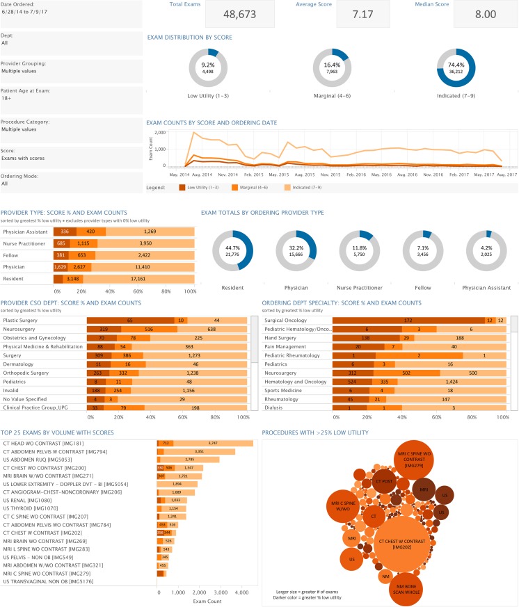
Pre-defined fields display the data automatically, and most panes are also interactive (Fig. 1). By adjusting the date range and other constraints, including ordering department, provider types, pediatric versus adult patient, imaging modality, scores of interest, and patient class (inpatient or outpatient), the user can change the output of the rest of the dashboard. By selecting each part of these figures, the user can further explore the data by displaying an expanded view relevant to the selected category. These features of the graphical user interface make clinically relevant findings more conspicuous.
Fig. 1.
Dashboard layout in Tableau. The pane at the top right displays summary data describing the total number of exams, appropriateness score, and a timeline displaying study volume by score over time. In the middle of the dashboard, the data are displayed in terms of ordering department. The total number of studies falling into each appropriateness category is displayed as well as the percentage of the total. Finally, the bottom two panes provide information regarding specific types of exams. On the left is a breakdown of the most common exams with their appropriateness scores, so the user can search for high-yield issues that affect frequent orders. The total number of studies of each appropriateness category is displayed as well. On the right is a cloud map of studies of which more than 25% were scored as low utility (appropriateness score 1–3, per ACR appropriateness criteria). This can help identify problematic exams that are receiving excessively high frequency of low scores which could be due to technical reasons or which may warrant education in clinical areas
With the graphical interface of the dashboard, data analysis and interpretation are facilitated, allowing for the development and testing of multiple hypotheses. For instance, one general question we sought to answer was whether decision support improved appropriateness scores over time. Using the dashboard, a clear improvement could be seen in the appropriateness scores over time. This is demonstrated in Fig. 2.
Fig. 2.
Timeline feature of the dashboard. Exam volume by appropriateness category can be displayed. In this example, completed exams with appropriateness score in the “low utility” category are displayed. An obvious decline in the volume of “low utility” studies can be observed
To assess the impact of decision support among departments and providers, the dashboard settings can be adjusted to narrow the results to include only relevant groups. In this manner, a particular department or provider type can be interrogated. Comparing the dashboards produced in this way demonstrated that there were differences worth investigating further (Figs. 3 and 4).
Fig. 3.
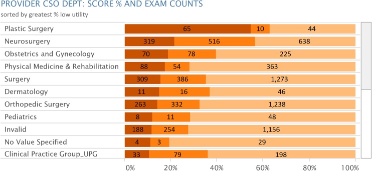
Screenshot of single pane from CDS dashboard demonstrating visualization of ordering department-specific percentages of exams of varying degrees of appropriateness. For confidentiality in this manuscript, the department names are obscured. One department demonstrated 54% of exams of low utility, whereas others (not shown) had only 5% or less exams of low utility. This type of visualization could lead to exploration of these results and if warranted, clinical or technical intervention
Fig. 4.
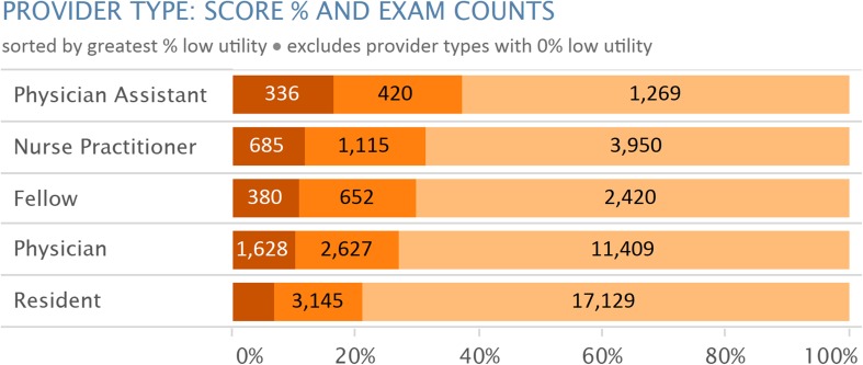
Screenshot of single pane from CDS dashboard demonstrating visualization of provider type-specific percentages of exams of varying degrees of appropriateness. In this example, the constraints of which are not important to this demonstration, the dashboard indicates that physician assistants had a higher percentage of exams (18%) with low utility scores, while residents had the fewest (8%)
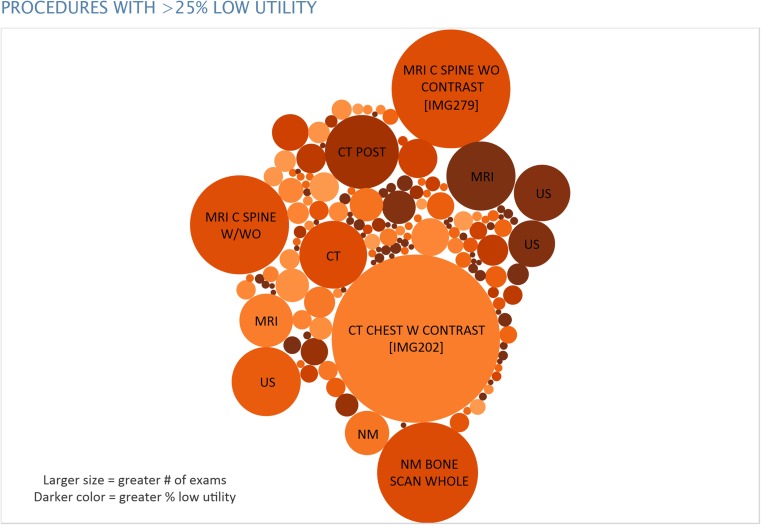
Certain features of the dashboard also allowed for the assessment of technical issues with the software and decision support platform. The lower right pane of the dashboard displays a cloud map of studies with more than 25% scoring low utility (Fig. 5). By using this feature, it is easier to identify particular studies in need of further investigation. In some instances, more collaboration with ordering providers may be needed to improve these scores. Alternatively, these studies may help to identify areas of needed improvement in the appropriateness criteria.
Fig. 5.
Cloud map displaying studies with more than 25% of orders scoring as low utility. Features such as this allow the user to quickly identify exam types in need of further investigation
Further, data integrity and quality control can be improved with use of such a dashboard. During the early implementation of decision support at our institution, a technical error resulted in studies being unscored. The details of this have been discussed previously [2]. Using the dashboard’s timeline feature, the overall study volume was assessed and noted to be dropping despite stable institutional imaging growth (not shown). This alerted the reporting team to the need for deeper investigation and ultimate resolution of the problem.
Discussion
Clinical decision support software is being implemented by practices across the country [2]. These types of software platforms produce vast quantities of data that are difficult to mine for relevant insights. By creating tools to interact with and visualize this data, the data output becomes more actionable and serves as a source for improvement. One method of visualizing a large volume of complex data quickly is through dashboards [3].
Using Tableau, a clinical dashboard was created to display data generated through a commercially available clinical decision support tool. The result was an interactive and customizable interface that allows users to display and analyze appropriateness score data quickly and identify trends more rapidly. The graphical interface of the dashboard we created allows for clinically relevant analysis of the ordering habits of different types of referring providers and departments. In this way, we were able to assess the integrity of the data generated by our commercial CDS tool and to generate hypotheses for testing in subsequent quality improvement efforts.
Tableau is a cloud-based data analytics software platform that allows users to intuitively visualize and analyze large amounts of data. After interfacing with an existing database, such as Microsoft Excel, the software allows the user to create a wide variety of data visualizations including graphs, charts, and complex dashboards.
Data visualization involves the display of data sets in ways that allow for faster and easier interpretation utilizing charts, graphs, or tables displaying two or more variables. By combining several such visualizations, a dashboard can be created. Features of dashboards that make them useful include real-time visualization of data that allow for action or intervention. Since 2000, there has been increasing discussion of data visualization in the literature, with articles describing the use of dashboards to display operational or financial metrics [4, 5]. These administrative dashboards allow managers to concisely view large amounts of data regarding departmental productivity and revenue. In contrast, clinical dashboards, those that provide condensed clinically relevant information to physicians, have been reported in the ICU and OR settings [6].
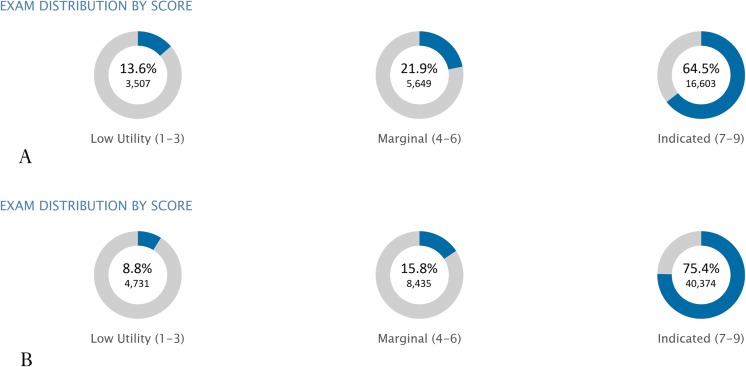
Our dashboard or data visualization tool in Tableau has been operational for over 2 years and includes data extending back to the implementation of our decision support tool integrating into order entry in our electronic health record (Epic, Epic Systems Corporation, Verona, WI) in June 2014. The dashboard allows for dynamic assessment as inputs are changed, so that the end user can analyze the data and answer questions related to the clinical decision support software. The hierarchical structure allows the user to examine the data as a whole, over time to assess the integrity, or to compare subsets of data such as ordering habits of individual departments or different types of providers (e.g., attendings, fellows, residents, and NP/PAs). These comparisons allow for quality assessment and improvement to be streamlined. They also allow for hypothesis generation for research projects. For instance, we noted an improvement in the appropriateness scores of CT scans ordered by residents in the inpatient and emergency department settings after providing them with feedback about their studies through the CDS tool (Fig. 6). These types of analyses can be made in a matter of minutes using this dashboard. We have also been able to detect a technical error that occurred after an electronic health record upgrade because of the drop in overall scored study numbers. As a result of observations such as these, the clinical leadership of the health system has asked that the CDS tool be used in the outpatient setting as well, where it will impact even more providers.
Fig. 6.
Screenshots from CDS dashboard demonstrating visualization of improvement in appropriateness of inpatient and ED patient imaging orders placed by residents after clinical implementation of CDS. a Screenshot of appropriateness of resident CT orders with date range set to only include orders when scores were hidden at the time of ordering. 13.1% of these orders were of “low utility.” b Screenshot of appropriateness of resident CT orders with date range set to only include orders placed after CDS was made available at order entry. The percentage of “low utility” orders improved, decreasing to 3.9%
Conclusions
Clinical decision support platforms produce large volumes of data that are difficult to analyze in raw form; however, using a dashboard to display the data in a user-friendly format allows for the information to be actionable and can lead to quality improvement and identification of further areas of investigation.
Contributor Information
Timothy C. Huber, Phone: 540-588-4293, Email: th8mt@virginia.edu
Arun Krishnaraj, Phone: 434.982.6018, Email: arunk@virginia.edu.
Dayna Monaghan, Phone: 434-982-6859, Email: DM2NB@hscmail.mcc.virginia.edu.
Cree M. Gaskin, Phone: (434) 924-0211, Email: Cree@virginia.edu
References
- 1.Pitts J. H.R.4302 - 113th Congress (2013–2014): Protecting Access to Medicare Act of 2014. https://www.congress.gov/bill/113th-congress/house-bill/4302. Published April 1, 2014. Accessed August 6, 2015.
- 2.Huber Timothy, Gaskin Cree M., Krishnaraj Arun. Early Experience With Implementation of a Commercial Decision-Support Product for Imaging Order Entry. Current Problems in Diagnostic Radiology. 2016;45(2):133–136. doi: 10.1067/j.cpradiol.2015.10.001. [DOI] [PubMed] [Google Scholar]
- 3.Morgan MB, Branstetter BF, Mates J, Chang PJ. Flying blind: using a digital dashboard to navigate a complex PACS environment. J Digit Imaging. 2006;19(1):69–75. doi: 10.1007/s10278-005-8732-2. [DOI] [PMC free article] [PubMed] [Google Scholar]
- 4.West VL, Borland D, Hammond WE. Innovative information visualization of electronic health record data: a systematic review. J Am Med Inform Assoc. 2015;22(2):330–339. doi: 10.1136/amiajnl-2014-002955. [DOI] [PMC free article] [PubMed] [Google Scholar]
- 5.Mansoori Bahar, Novak Ronald D., Sivit Carlos J., Ros Pablo R. Utilization of Dashboard Technology in Academic Radiology Departments: Results of a National Survey. Journal of the American College of Radiology. 2013;10(4):283-288.e3. doi: 10.1016/j.jacr.2012.09.030. [DOI] [PubMed] [Google Scholar]
- 6.Egan Marie. Clinical Dashboards. Critical Care Nursing Quarterly. 2006;29(4):354–361. doi: 10.1097/00002727-200610000-00008. [DOI] [PubMed] [Google Scholar]


