

Abstract
Background:
When a provider orders a test in a pattern that is substantially different than their peers, it may indicate confusion in the test name or inappropriate use of the test, which can be elucidated by initiating dialog between clinicians and the laboratory. However, the analysis of ordering patterns can be challenging. We propose a utilization index (UI) as a means to quantify utilization patterns for individual providers and demonstrate the use of heatmaps to identify opportunities for improvement.
Materials and Methods:
Laboratory test orders by all providers were extracted from the laboratory information system. Providers were grouped into cohorts based on the specialty and patient population. A UI was calculated for each provider's use of each test using the following formula: (UI = [provider volume of specific test/provider volume of all tests]/[cohort volume of specific test/cohort volume of all tests]). A heatmap was generated to compare each provider to their cohort.
Results:
This method identified several hot spots and was helpful in reducing confusion and overutilization.
Conclusion:
The UI is a useful measure of test ordering behavior, and heatmaps provide a clear visual illustration of the utilization indices. This information can be used to identify areas for improvement and initiate meaningful dialog with providers, which will ultimately bring improvement and reduction in costs. Our method is simple and uses resources that are widely available, making this method effective convenient for many other laboratories.
Keywords: Heatmap, laboratory information system, utilization index
INTRODUCTION
From the days that diabetes was diagnosed by bedside urine tasting until today, laboratory techniques were not designed to function in a silo that is isolated from the clinical information gathered at the patients' bedside; rather they are meant to complement clinical diagnosis in a setting of bidirectional information exchange. However, as healthcare becomes more sophisticated, the distance between bedside and laboratory continues to increase, and bidirectional exchange of information continues to become more difficult. This is associated with adverse consequences, such as medical errors, that could have been avoided through better teamwork.
To address the problem of medical errors, the Institute of Medicine issued the report Improving Diagnosis in Health Care (IOM).[1] Of the eight major recommendations included in the report, the #1 recommendation is to facilitate more effective teamwork among the various members of the diagnostic team. To facilitate teamwork and encourage a culture that is less prone to errors, the IOM envision a new approach to patient management. Rather than the paternalistic, physician-centered approach of the previous era in which the clinician was expected to make decisions single-handedly, the IOM envision a future approach that is patient centered. In this approach, all members of the diagnostic team collaborate in an active dialog to promote the patients' best interest.[2] Considering the common estimation that 70% of diagnostic and therapeutic decisions are guided by laboratory data,[3] it is crucial that the laboratory team participate in this patient-centered dialog.
In a recent analysis of all available literature on laboratory error, investigators found that the most errors occur in the preanalytical phase.[4] This reflects the high standard of quality assurance within the walls of today's laboratories, and the difficulties in applying these standards outside the laboratory. The investigators suggest that the most frequent preanalytical errors are represented by an inappropriate choice of laboratory tests or panel of tests. This is easy to imagine – when choosing a test for a given disease in a typical electronic medical record ordering system, the clinicians may be faced with a vast array of similarly named tests. Mistakes at this point are difficult to catch and can have significant consequences. For example, if a patient needs routine HIV screening and HIV phenotyping is ordered instead, it results in poor patient care and poor resource utilization. Yet for many reasons, this and similar examples occur too often. Laboratory tests do not have a standardized name that can be expected across hospitals. If a hospital joins a large health system and begins to send their tests to a central laboratory, each test offered in the hospital's existing electronic ordering system needs to be mapped to a corresponding test that is offered by the laboratory, often resulting in poor matches or ambiguous names. In addition, the description of each test on the electronic ordering system is limited to just a few words. This prompted one clinician to exclaim, “Imagine if you were shopping for clothing on a website that offered hundreds of choices. To save costs, this website eliminated item specifications, photos, and customer reviews, and provided only three-word descriptions for each item. Wouldn't your all of choices be guesswork?”
Due to these challenges, it is valuable for a laboratory director to notice and initiate a conversation when a clinician orders a test in a pattern that may indicate confusion. Our laboratory serves a health system of 24 hospitals, and it was not possible to collect clinical information about individual test orders. Therefore, we needed a method to analyze aggregated laboratory information system (LIS) data for confusion in ordering patterns. With this in mind, we developed a utilization index (UI) to quantify ordering patterns, as defined in Figure 1. In addition, we organized the data in heatmaps to supply a clear visual representation that was easy to interpret.
Figure 1.
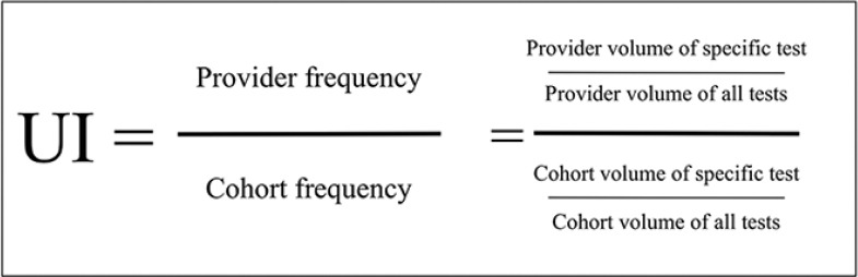
Utilization index: The utilization index represents the frequency of a test order in a specific provider scaled by the frequency in other providers. It is a simple method to identify variability in ordering patterns between providers
MATERIALS AND METHODS
The only materials needed were Microsoft Excel© and a spreadsheet containing ordering clinician and names of tests for all orders placed in the LIS over a given period. These spreadsheets were easily exported from our LIS. We organized all ordering clinicians into cohorts that were based on subspecialty and patient population. We focused on inpatient tests, and we used the hospital unit to determine the patient population. For example, a pediatrician covering the pediatric emergency department would be compared to a cohort of other pediatricians in the pediatric emergency department, while the pediatricians in the NICU, or the surgeon doing consults in the emergency department, would each be assigned to separate cohorts that matched their specialty and patient population. As outlined in Figure 2, we used Microsoft Excel© to calculate the UI, which was defined by the following formula: UI = (provider volume of specific test/provider volume of all tests)/(cohort volume of specific test/cohort volume of all tests). A pivot table was used to generate tables, and conditional formatting was used to visualize the table as a heatmap. It was color-coded so that UIs <1 are blue, with increasingly darker shades of blue with greater deviation from one. UIs >1 are red, with increasingly darker shades of red with greater deviation from one. This analysis was deemed exempt by our Institutional Review Board.
Figure 2.

Workflow: The workflow to calculate utilization indices and create heatmaps involves 12 steps using Microsoft Excel
RESULTS
The heatmap allowed quick visual identification of “hot spots,” and it became clear that certain tests were being ordered in a much higher proportion by specific providers as than in the peer group as a whole. Valuable information was discovered that was appreciated by all stakeholders. As an example, one of our heatmaps is illustrated in Figure 3. This shows providers 1, 2, 5, and 11 as individuals who order “Vitamin D 1,25-dihydroxy” at levels higher than their peers in the inpatient setting. They also under-order “Vitamin D-25 hydroxy”. This indicated confusion in test names. Other tests ordered at higher levels by these providers include selenium, copper, Vitamin A, Vitamin B1, and Vitamin E. Aberrant naming or test availability in provider ordering systems may explain the dichotomous ordering of “Vitamin D-25” versus “1, 25-Vitamin D.”
Figure 3.

Heatmap displaying the utilization index for each provider and test as a tool to identify variations in provider ordering practice. Utilization indices <1.0 are blue, with increasingly darker shades of blue with greater deviation from utilization index = 1.0. UIs that are >1 are red, with increasingly darker shades of red with greater deviation from 1.0. This allows quick visual identification of “hot” and “cold” spots. Utilization index = (provider volume of specific test/provider volume of all tests)/(cohort volume of specific test/cohort volume of all tests)
When an ordering pattern is flagged, a quick investigation will usually reveal the cause. The three most common causes include acceptable variation in ordering practice, nonideal ordering practice, or ambiguous test names in the electronic health record (EHR). To deal with nonideal ordering practice, we have brought the issue to the attention of clinicians in one-on-one conversation and anonymously in larger meetings. To deal with aberrant test names, we had two available options. The preferred option would be to change the test names listed in the EHR to a name that would not be misunderstood. There are times that this may not be possible due to technicalities related to governance of our EHR, and in these cases, the medical director could contact the ordering provider through E-mail with a short clarification and an invitation to continue the conversation by telephone or personal meeting.
Anecdotally, the feedback we have received from this initiative has been positive thus far, with clinicians and the department heads appreciative of this data. Formal collection of feedback data will be the aim of a future study.
Technical background
Development of a utilization index based on term frequency-inverse document frequency
Identifying and reducing inappropriate variation are a powerful approach to improving quality. This forms the basis of Six Sigma, a data-driven approach to quality management. Defects are clearly defined and measured, processes contributing to defects are identified, and the variability of the processes is reduced. In the healthcare arena, Six Sigma has been used in the laboratory since the mid-1990s,[5] and more recently, in healthcare delivery processes.
Based on the principles of Six Sigma, we developed an approach to highlight variability among providers. This involved a UI that measures the test frequency in a specific provider relative to the frequency in all other providers. The idea was inspired by a similar concept known as the term frequency-inverse document frequency (tf–idf) that is commonly used in information retrieval applications. The tf–idf measures the importance of a word or phrase in a single document relative to the importance in other documents. For example, it can be used to detect that the phrase “optimization of healthcare delivery” is used more frequently in a specific article than in other articles in PubMed. Internet search engines are a common application of tf–idf, and more recently, it has been used in user modeling software that characterizes each user to adapt to the user's needs.[6]
In our context, we adapted the concept to compare order frequency in a specific provider to the frequency in other providers of the cohort. The order frequency is calculated by dividing the count of each test order by the total of all tests, and the frequency in each provider is divided by the frequency of the other providers in the cohort as illustrated in Figure 1. The UI will equal one for a provider who orders a test at the same frequency as the average of the cohort. A UI that is <1 indicates a frequency that is less than the cohort, while a UI of >1 indicates a frequency that is greater than the cohort.
DISCUSSION
Review of approaches to improvement of laboratory utilization
In 1999, the IOM issued a report called To Err is Human: Building a Safer Health System which has permanently changed the awareness and culture that medical providers in the United States have toward quality of care.[7] The report determined that 30% of healthcare costs were wasted due to unnecessary and inefficiently delivered services, excess administrative costs, excessively high prices, and missed prevention. IOM's analysis came from comparing high-cost/high-utilization regions of the country with lower cost regions. Higher levels of cost were not correlated with better quality of care. Therefore, by transforming high-cost/high-utilization regions of the country into low-cost/low-utilization regions, enormous savings can be achieved without compromising clinical quality.[8] According to the report, half of the healthcare waste comes from three categories: unnecessary services, inefficiently delivered services, and missed prevention opportunities. Each of these three categories is frequently encountered in the laboratory: tests are ordered unnecessarily, tests are ordered in the incorrect sequence, and abnormal test results are not acted upon. Laboratory test utilization is the umbrella concept that has sought to address quality opportunities in these areas.
We have found that the method described herein to be the most efficient means for our laboratory to address excess utilization. However, there are several other important approaches described in the literature. The Dartmouth Atlas of Health Care is an approach toward qualifying excess utilization in all areas of healthcare, while gatekeepers, audits, clinical decision support tools, and utilization report cards have been used specifically for the utilization of laboratory resources.[9,10,11] Each of these will be reviewed below.
The Dartmouth Atlas of Health Care is perhaps the most well-known application of identifying the areas of excess utilization to improving healthcare. The atlas uses Medicare data to report variations in healthcare delivery and expenditure for each region nationwide. They have shown that while higher spending is not statistically associated with better outcomes, higher spending on more effective care does in fact lead to better outcomes. The goal is to provide high-quality care at low cost through reorganization and standardization of healthcare delivery. Although the Dartmouth Atlas is powerful in identifying problem areas, it cannot be used directly to implement quality improvement because of three challenges. First, since it seeks to compare health quality nationally, its datasets are systematically collected at a national scale. To implement an agile, continuously learning health system, information must be timely and actionable during or before an episode of care, rather than retroactively after a quality gap has manifested itself. Second, the data sources do not necessarily have the requisite granularity for isolating individual patient or clinical care units, which is important to identify and engage the correct stakeholders. Finally, data are divided by patients' geographic location rather than medical needs, and thus lacks the information necessary to distinguish between patients with different underlying diseases. In contrast, ordering data extracted from the LIS at the level of an individual hospital system is stronger in each of these three areas. Thus, the LIS information holds unique and underutilized potential in implementing quality improvement.
A traditional approach in controlling laboratory utilization is to require test approval through a “gatekeeper” before the performance. However, this approach is laborious and frequently results in provider frustration by creating barriers in cases where testing is appropriate. Another approach involves post hoc individual case review; although less intrusive, it is also laborious and has not been seen to be highly effective. A third approach is the Use of clinical decision support which can be effective when properly utilized, but requires extensive clinical expertise to ensure that the support is contextually relevant. Alert fatigue and other more serious unintended consequences have been documented from indiscriminate use of this approach. With each of these approaches, implementation is expensive, and therefore, requires the judicious application to ensure return on investment. Furthermore, these approaches focus on a single test or groups of tests and do not directly address provider practice patterns.
However, the use of utilization report cards or feedback to clinicians regarding their ordering behavior has been shown to be a powerful tool.[12] Punitive strategies involving pairing the data with reimbursement or financial penalties have been shown to add strength; however, as the laboratorians and clinical laboratory professionals we ought to base our feedback on the premise of providing the best possible care to patients, and this can only be achieved through a trusting interprofessional collaboration. Providers often welcome dialog with laboratory personnel, as navigating laboratory orders can be challenging in the current healthcare environment. Thus, the data alone is our most powerful tool and provides many benefits as follows: improved care, reduced cost, and greater provider satisfaction.
Our approach toward the report card is unique in that it does not attempt to determine whether any particular use of a test is “medically correct.” Variation in laboratory test orders is not always a defect. Our approach simply identifies areas that a medical director may want to look at more closely to evaluate whether it is an opportunity for dialog.
Limitations
Our approach has several limitations. We addressed tests ordered for hospitalized patients, and we used the hospital unit to group our ordering providers into cohorts based on the patient population. This would be more challenging and less accurate in outpatient populations. In addition, Microsoft Excel has a maximum of 1,048,576 rows per worksheet, and some laboratories may have more than that amount of orders in a desired period. To deal with this, it would be necessary to download data from the LIS in batches that are consistent with the cohorts. In other words, all emergency department orders must be included in the same batch so that the providers can be compared with their entire cohort. Finally, as discussed above, our approach flags patterns of variation rather than patterns that are incorrect. While this can be viewed as a strength in our approach rather than a weakness, we must keep in mind that a baseline level of acceptable variation is expected based on provider preference and external circumstances. Therefore, thoughtful consideration is required before acting on a hot spot found on the heatmap.
CONCLUSION
In summary, our goal was to develop a simple and quick method to better understand clinical practices and better identify high-value targets for attention at our health system. Through the use of UI and heatmaps, we can have a tool by which to simultaneously increase patient safety, reduce overutilization, and add value to the laboratory realm.
Financial support and sponsorship
Nil.
Conflicts of interest
There are no conflicts of interest.
Footnotes
Available FREE in open access from: http://www.jpathinformatics.org/text.asp?2018/9/1/31/242371
REFERENCES
- 1.Balogh EP, Miller BT, Ball JR. Washington, DC: National Academies Press; 2015. Improving Diagnosis in Health Care. [PubMed] [Google Scholar]
- 2.Graber ML, Rusz D, Jones ML, Farm-Franks D, Jones B, Cyr Gluck J, et al. The new diagnostic team. Diagnosis (Berl) 2017;4:225–38. doi: 10.1515/dx-2017-0022. [DOI] [PubMed] [Google Scholar]
- 3.Hallworth MJ. The ‘70% claim’: What is the evidence base? Ann Clin Biochem. 2011;48:487–8. doi: 10.1258/acb.2011.011177. [DOI] [PubMed] [Google Scholar]
- 4.Bonini P, Plebani M, Ceriotti F, Rubboli F. Errors in laboratory medicine. Clin Chem. 2002;48:691–8. [PubMed] [Google Scholar]
- 5.Hinckley CM. Defining the best quality-control systems by design and inspection. Clin Chem. 1997;43:873–9. [PubMed] [Google Scholar]
- 6.Fischer G. User modeling in human-computer interaction. User Model User Adapt Interact. 2001;11:65–8. [Google Scholar]
- 7.Kohn KT, Corrigan JM, Donaldson MS. Washington, DC: National Academy Press; 1999. To Err Is Human: Building a Safer Health System. [PubMed] [Google Scholar]
- 8.Colla CH, Morden NE, Sequist TD, Schpero WL, Rosenthal MB. Choosing wisely: Prevalence and correlates of low-value health care services in the United States. J Gen Intern Med. 2015;30:221–8. doi: 10.1007/s11606-014-3070-z. [DOI] [PMC free article] [PubMed] [Google Scholar]
- 9.Hauser RG, Quine DB, Ryder A. LabRS: A Rosetta stone for retrospective standardization of clinical laboratory test results. J Am Med Inform Assoc. 2018;25:121–6. doi: 10.1093/jamia/ocx046. [DOI] [PMC free article] [PubMed] [Google Scholar]
- 10.Vidyarthi AR, Hamill T, Green AL, Rosenbluth G, Baron RB. Changing resident test ordering behavior: A multilevel intervention to decrease laboratory utilization at an academic medical center. Am J Med Qual. 2015;30:81–7. doi: 10.1177/1062860613517502. [DOI] [PubMed] [Google Scholar]
- 11.Fang DZ, Sran G, Gessner D, Loftus PD, Folkins A, Christopher JY, 3rd, et al. Cost and turn-around time display decreases inpatient ordering of reference laboratory tests: A time series. BMJ Qual Saf. 2014;23:994–1000. doi: 10.1136/bmjqs-2014-003053. [DOI] [PubMed] [Google Scholar]
- 12.Baird G. The laboratory test utilization management toolbox. Biochem Med (Zagreb) 2014;24:223–34. doi: 10.11613/BM.2014.025. [DOI] [PMC free article] [PubMed] [Google Scholar]