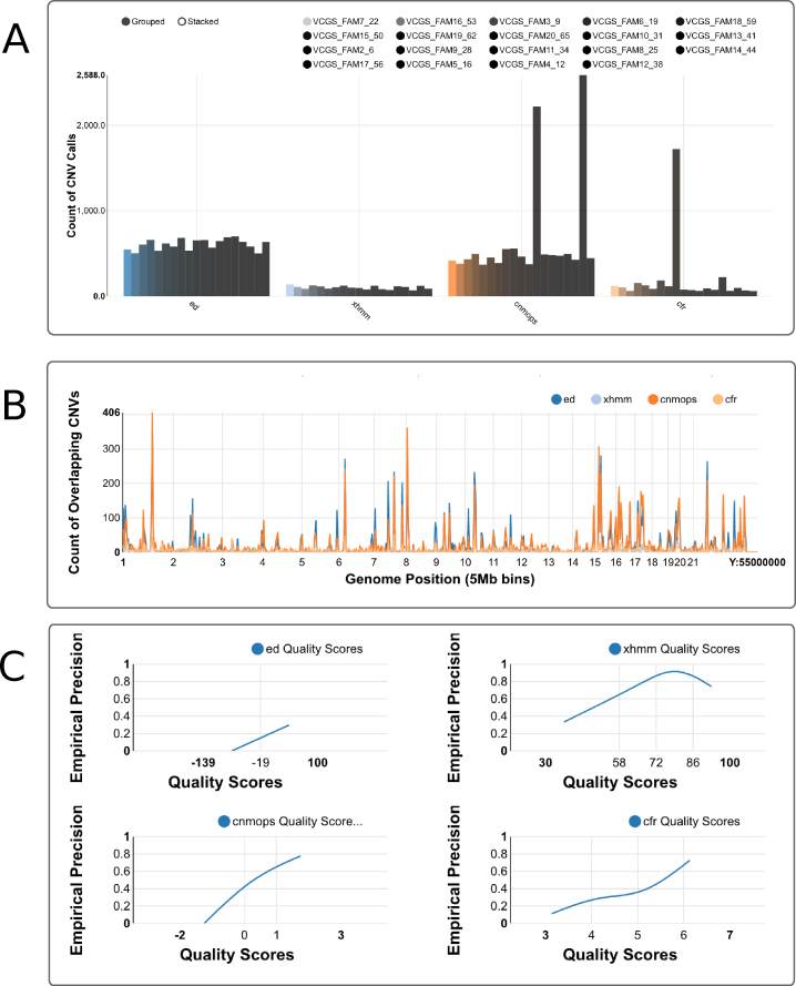
Figure 2:
Screen shots of Ximmer quality and accuracy plots. (A) Sample counts plot showing the number of CNV calls for each sample, grouped by CNV caller. Calls can be stacked to combine all samples together or split into individual samples using the grouped option. (B) Genome distribution plot showing frequency of CNV calls along the genome. (C) Quality score calibration plot showing relationship of empirical precision to quality score. These plots may be viewed at full resolution via the example web site [24].

