Abstract
2D illustration is used extensively to study and disseminate the results of structural molecular biology. Molecular graphics methods have been and continue to be developed to address the growing needs of the structural biology community, and there are currently many effective, turnkey methods for displaying and exploring molecular structure. Building on decades of experience in design, best practices resources are available to guide creation of illustrations that are effective for research and education communities.
Graphical abstract
Introduction
Ever since the discovery that proteins and nucleic acids have defined structures, methods for illustration of biomolecular structures have been developed hand-in-hand with the methods used to determine atomic structures. This was by necessity: visual methods are needed to represent these complex structures during structure solution and for analysis, and methods are needed for presenting structures in print and at scientific meetings. Many forces have shaped the changing aesthetics of molecular graphics, including available technologies, defaults, exemplary work, and the culture of scientific skepticism.
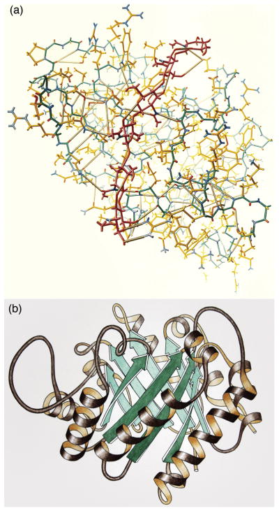
When the first structures of biological molecules were being determined, computer graphics was in its infancy, so much of the earliest molecular illustration was done by hand. For example, Irving Geis created iconic illustrations of the first protein structures, using physical models as his primary source material (http://pdb101.rcsb.org/geis-archive), and Jane Richardson used hand-drawn illustration to codify a new unifying vision about the way proteins fold (Figure 1) 1. However, the specialized talent needed for hand-drawn work and the rapidly growing needs of the structural biology community were major driving forces in the development of new computer graphics hardware, and turnkey molecular graphics software.
Figure 1.
Exemplars of molecular illustration. (a) Illustration of lysozyme by Irving Geis (used with permission from the Howard Hughes Medical Institute (http://www.hhmi.org), all rights reserved). (b) Illustration of triose phosphate isomerase by Jane Richardson.
Computational methods built on this strong tradition of hand-drawn illustration. Programs such as Ortep 2 created computer-generated images built of spheres and cylinders, building on the artistic conventions used in textbook chemical diagrams and in Geis’s labor-intensive protein illustrations. The protein ribbon diagrams developed by Richardson were implemented in illustrative programs such as Molscript 3. Raster-based methods allowed creation of shaded, “photorealistic” renderings of the spacefilling representations developed by Linus Pauling (see, for example, work by Feldmann & coworkers 4).
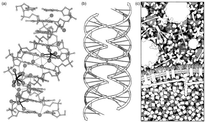
Several applications drove the development of illustrative methods in molecular biology. Print publication was the primary driver, forcing molecular illustration along a path to create clear, interpretable images that would reproduce well at the size of a typical journal or textbook page. In addition, color printing was often prohibitively expensive, and reproduction of grayscale images could be dicey, so black-and-white line methods dominated early work. This lead to the widespread use of pen plotters, followed by printing of postscript files, to create the hard copies needed for publication. At the time, computer graphics methods were limited primarily to representations composed of spheres and cylinders, so images with more complexity were typically drawn by hand. For example, several examples of black-and-white line work from the 1990’s are included in Figure 2.
Figure 2.
Black-and-white line work from the 1990s. (a) Ball-and-stick diagram created with MolScript, showing interaction of a DNA oligonucleotide with water and ions. (b) Hand-drawn diagram of a hypothetical model for the Holliday junction, using the familiar Watson and Crick ladder diagram. (c) Hand-drawn illustration of the molecular structure of a portion of a red blood cell, using highly simplified representations of the molecules.
Today, interactive computer graphics are used extensively in structural biology research, but static 2D molecular illustration remains the primary modality for professional dissemination of results that require visual representation. The lion’s share of research publication is currently presented digitally as downloadable PDF files. This has provided much new freedom, allowing the widespread use of color and advanced approaches to rendering, while still limiting illustration largely to static imagery. Interactive illustrations, such as Kinemages or Jmol/JSmol (http://www.jmol.org), are still in the minority in formal research publication, in spite of their many advantages. When researchers need to show dynamics, they typically include a small animated clip tucked away in the supplemental material. Recent applications in research outreach and education, such as user-generated interactive illustrations at Proteopedia 5, tight integration of interactives in E.O. Wilson’s Life on Earth 6, and facile integration of interactive NGL 7 views at the RCSB Protein Data Bank (www.rcsb.org), are taking a more exploratory approach and showing great advantages, so we can expect to see continued developments in the future.
Current Techniques in 2D Molecular Illustration
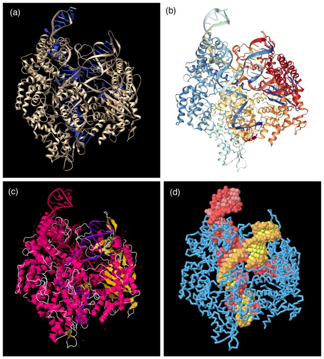
Static 2D images remain the primary visual currency in research publication and textbooks. Fortunately, many user-friendly tools for creation of molecular images are available. The most common approach is to output an image from an interactive molecular graphics program. This is highly effective for many reasons: the programs are free and run on consumer hardware, they are easy to use and provide time-tested defaults while also allowing many options for customizing images (Figure 3). Several excellent reviews of these methods are available 8–10, so we will not enumerate them here, but rather discuss the visualization strategies that are typically used to address the complexity of molecular structures.
Figure 3.
The atomic structure of a Cas9 complex (PDB entry 4un3) displayed with several popular molecular graphics programs. (a) Chimera (hhtp://www.cgl.ucsf.edu/chimera) is designed for research and education, and by default presents an optimized view that highlights specific interactions between ligands (such as the small ion shown in green just right of center) and the macromolecules. (b) NGL (http://proteinformatics.charite.de/ngl) is the central molecular viewer at the RCSB PDB, by default providing a simplified introductory representation with rainbow-colored protein and nucleic acid chains and ball-and-stick for ligands and cofactors. (c) JSmol (http://jmol.sourceforge.net) is an easily scriptable program designed for embedding in websites. By default it provides a standard ribbon representation colored by the local secondary structure, and ball-and-stick for ligands, cofactors and all water molecules. (d) All of these programs provide many options for customizing the representation. For example, five minutes of scripting created this view in JSmol, highlighting the Cas9 protein (blue), the CRISPR RNA (red), and the targeted viral DNA (yellow). The protein is shown with a backbone trace to make the nucleic acid visible in the complex.
Multiple representations depict different physical properties
Molecular graphics is a mature discipline, building on decades of experiment and application. A few useful representations have shown lasting utility, and are included in most molecular graphics software packages. Each is designed to capture a particular physical property of the molecule and its structure. Bond diagrams, which had a long history in chemistry before the first structures of biomolecules were determined, show the covalent bond structure of the molecule. Spacefilling representations were developed by Linus Pauling, initially in the form of physical models, when it became apparent that steric effects were critically important in the structure of polypeptides. Later, a variety of molecular surfaces, such as the solvent accessible surface 11, were developed to probe different modes of molecular interactions. Specialized schematic representations of the DNA double helix 12 and the folding of proteins 1 were developed as biomolecular structures were determined, and researchers needed ways to abstract simpler topological features from their complex atomic structures.
These standard forms of representation are so familiar and so effortlessly displayed with current software that we often don’t stop to question their utility. In some cases, improper choice of representation can lead to a misleading illustration. For example, ribbon or backbone diagrams are often used to present the interaction of biomolecules, which may lead to problems, since they underestimate the steric size of a molecule. A spacefilling representation would be more appropriate, for instance, for an illustration that shows a DNA double helix threading through a protein portal, if issues of steric fit are being presented. Similarly, spacefilling representations largely mask the covalent structure of the molecule, so it may be better to use a wireframe diagram, in spite of the visual complexity that this will add to illustration.
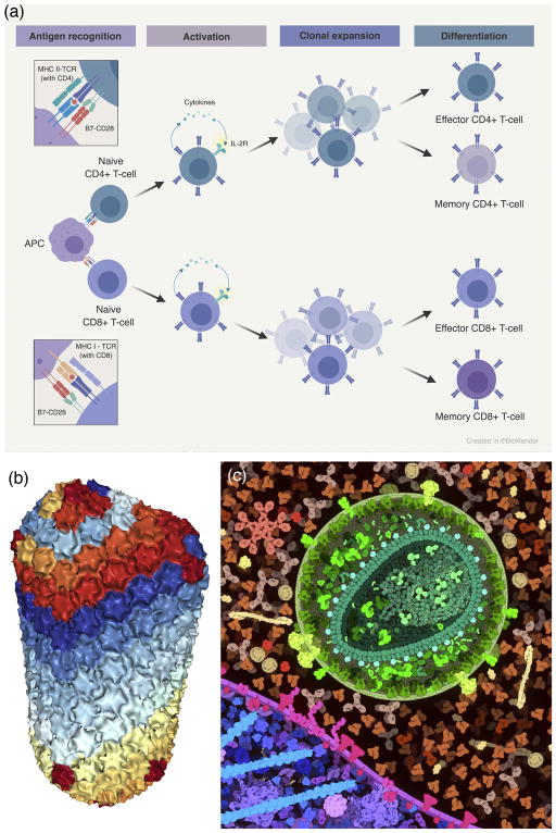
The explosion of data in molecular and cellular biology is creating new challenges for the representations used in molecular illustration. A few trends are showing lasting power. For example, systems biology is providing a new window on the networks of interactions between molecules, and the field is shifting towards more structure-based illustrations of these networks. For many years, illustrations of signaling pathways were created using simple shapes (circles, squares) connected by arrows. With the discovery of defined molecular interactions, sites of modification, scaffolding proteins, and other ultrastructural elements, these diagrams often now incorporate information on the structure and interaction of the molecular players. Often, these are created manually in Photoshop or Powerpoint, and cleaned up by professional illustrators for publications. New software, such as BioRender (http://biorender.io), is now being developed to help streamline the production of these structure-aware diagrams (Figure 4a).
Figure 4.
Simplified representations. (a) BioRender (https://biorender.io) uses a schematic representation to show molecular interactions in immune recognition. Illustration by Eli Lee, used with permission. (b) NGL (http://proteinformatics.charite.de/ngl) uses a coarse molecular surface to display very large structures such as HIV capsid (PDB entry 3j3q). (c) CellPAINT (http://cellpaint.scripps.edu) uses smooth surfaces in an illustration of HIV, blood serum, and the surface of a T-cell.
Structural biology is also getting larger and larger, with the growth of methods in integrative structural biology 13, which requires representations that are appropriate for the level of scale that is being explored. A variety of simplified surfaces have been developed for abstracting the structure of individual subunits within an assembly. For instance, NGL currently calculates solvent-accessible surfaces on a sparse grid to create simplified surfaces for very large assemblies such as viruses and crystal packing diagrams at the RCSB PDB (Figure 4b). In CellPAINT (http://cellpaint.scripps.edu), per-chain coarse molecular surfaces are created in PMV 14 by creating an isosurface around Gaussian-blurred atoms, and used to simplify scenes with thousands of individual proteins (Figure 4c).
Rendering methods allow us to reduce clutter and focus attention
Computer graphics is an active field of research, driven in part by the needs of the scientific community, and increasingly by the entertainment industry. Thus, there is an extensive toolbox of methods for creating effective images from digital data. In molecular graphics, our major challenge is the complexity of the subject, and many methods have been developed and applied for creating interpretable images.
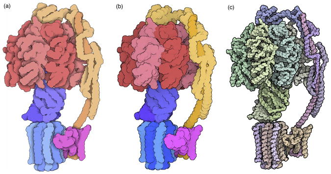
Two different philosophies for rendering an image have shown lasting effectiveness: photorealistic rendering and non-photorealistic rendering. In photorealistic rendering, the goal is to trick the eye into thinking that we are seeing an actual object. The most common approach used in molecular graphics is built around Phong shading 15. The digital model of the molecule (composed of spheres, cylinders, etc.) is placed in a simulated environment with one or more light sources, and the shader computes the coloration, shading, and highlights for the surfaces of this model. In its simplest form, this produces the familiar shiny plastic look that has dominated much of molecular graphics. Many enhancements on this approach have been employed to continue to enhance the “realistic” look of the images, including shadowing, texturing, and ambient occlusion.
Non-photorealistic rendering, on the other hand, takes a more illustrative approach, seeking to simulate how a cartoonist might depict the molecule. The earliest approaches to molecular graphics took this approach, driven largely by the fact that most hardware of the time was limited to creating images composed of lines. The program ORTEP was the first widely-used example, followed by programs such as MolScript that were more tailored for biological molecules. These programs take a vector-based approach, building up a diagram by calculating outlines and intersections explicitly for each model element. As raster hardware became more accessible, image processing techniques were developed to create cartoon images from raster depth maps 16–18. These cartoons generate images akin to those that are created by an artist: they capture the major shape features of the model, creating outlines and small gesture lines for cusps and creases in the structure, but omitting much of the finer detail (Figure 5).
Figure 5.
Cartoon representations of a cryoEM structure of ATP synthase (PDB entry 5ara), (a) using the method of Goodsell and Olson 17, (b) using interactive outlines and screen-space ambient occlusion in the Python Molecular Viewer 14, and (c) using the illustrative options in QuteMol 18. All are rendered using spheres at atom centers, and larger spheres are used in the first two to give a smoother look.
Building on these basic rendering methods, computer graphics software generally also incorporates a wide variety of options to improve the interpretability of the images, including:
clipping planes to simulate a cross section of the scene, allowing users to focus on features in the interior of a large molecule;
depth cueing to focus attention on foreground features, while still retaining the overall context of the features;
perspective projection to give an impression of immersion in the image, or orthographic projection may be used if perception of size relationships is important;
selection methods allow display of only regions or features of interest, for instance, only amino acids the interact directly with a substrate;
different coloring schemes highlight features such as atom type, position in a chain, subunit in a complex, and physical properties;
labels may be displayed to highlight features of interest.
The power of the pencil
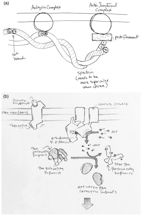
Hand-drawn sketches continue to be useful in science. As succinctly described by Wong and Rikke 19, and building on a lively literature describing the place of sketching in design 20, 21, quick sketches have many advantages (Figure 6). They are immediate and require minimal materials or training, so the barrier is low to get started. We can abandon visual accuracy at the start, and gradually add information as we delve deeper into the subject, filling in the known information and exposing gaps in knowledge. They are also highly collaborative, providing a facile way to share knowledge and explore hypotheses while discussing a topic. Recent research is also reconfirming the utility of sketching in education 22, 23, showing that drawing scientific subjects improves engagement and provides students with hands-on experience with scientific representation, reasoning, and communication.
Figure 6.
Quick hand-drawn sketches are an essential tool in research and design. (a) A sketch used for planning a coarse-grain computational simulation of erythrocyte cytoskeletons. Note the ease of displaying only the key spectrin domains and a provisional approximation of the supercoiling. (b) Sketch used in the design of educational imagery, exploring the level of detail that will be appropriate for the intended audience.
Resources for Best Practices
Everyone has their own talents, and we can often learn to improve our own work by looking to others for inspiration. Fortunately, in the field of scientific illustration, there is a large and diverse body of available work to use for inspiration and examples. In addition, for people who want to make this their primary discipline, there is a vibrant community that focuses on training and supporting science and medical illustration, through, for example, the Association of Medical Illustrators (http://www.ami.org) and the Guild of Natural Science Illustrators (http://www.gnsi.org).
Several authors have been strong advocates for incorporation of effective design strategies in science communication. Edward Tufte, in “The Visual Display of Quantitative Information” 24 and his subsequent books, advocates a seemingly paradoxical design goal: to show as much data as possible, thus allowing creative exploration by the viewer, but at the same time to simplify the image, removing all distracting clutter (in his term, “chartjunk”). He elaborates upon this goal by encouraging designers to account for the “data to ink ratio” in any visual display. Here Tufte is referring to the amount of “ink” (or pixels as may be the case) that describe the data compared with the total amount of “ink” used in the overall display. The books make many suggestions for improving imagery, and are filled with highly successful examples culled from a variety of disciplines. In the book “Visual Strategies” 25, Felice Frankel and co-author Angela DePace take a similar approach, giving practical examples for creating effective illustrations by focusing on methods for composing, abstracting, coloring, layering, and finally refining the presentation.
Insights may also be gained from the information visualization community. Bang Wong and Martin Krzywinski presented a series of “Points of View” articles (http://blogs.nature.com/methagora/2013/07/data-visualization-points-of-view.html) that cover dozens of common information visualization pitfalls and solutions, including issues of clarity and composition. In much the same vein, Colin Ware in “Information Visualization: Perception for Design” 26 provides valuable insights on the science of visual perception and the way in which this impacts the viewer’s interpretation of a visual display. Ware offers guidelines, based upon our understanding of human perception and cognition, for the design and presentation of data displays. In the book “Visualization Analysis and Design” 27, Tamara Munzner takes a similar perception-based approach, offering the reader a comprehensive framework for the design of visualizations.
In the field of molecular graphics, there are also several reports on molecular visualization best practices. Johnson and Hertig 28 provide their insights into the best communication techniques for different types of end users, as well as a concise strategy for planning and executing molecular graphics projects. In “An Introduction of Biomolecular Graphics,” the authors present a short introduction to methods, then present a list of simple rules for creating effective molecular graphics 29.
Based on this material, the current fashion in scientific communication is focused on simplicity and comprehensibility. The subject is whittled down to only the most salient features, and rendering options are chosen to highlight the subject and minimize distractions. This has not, of course, always been the case. In previous centuries, far more decorative elements were added to scientific imagery, occasionally to add context or a human element. And today, far more latitude and artistic license is generally accepted in imagery produced for education and outreach applications.
Artistic License
The culture of science has shaped the types of illustrations that are acceptable for different applications 30. In the primary research literature, illustrations typically act as documentary evidence. They are presented to display data gathered during the study and interpretations of this data. To achieve this goal, illustrations for scientific journals typically require a direct pathway from data (coordinates, etc.) to image, with little room for artistic license. On the other hand, editorial images, such as covers for journals or illustrations for the popular media, often accept far more artistic interpretation, with the goal of telling a scientific story rather than providing documentary evidence for a particular topic.
As is often the case, artistic license isn’t a binary operation: rather, there is continuum ranging from empirically-based visualization, which is strongly driven by data and seeks to minimize artistic license, to interpretive visualization, which is informed by data but allows far more flexibility in generation of imagery. Whether we consciously acknowledge it or not, all scientific illustration incorporates some level of artistic license. Even within peer-to-peer communication, such as the primary literature or conference presentations, there is a small level of artistic license. For example, the simplest scatter plot incorporates many decisions, such as the range and spacing of axes, the size of spots, the choice of data, all of which can influence how the viewer interprets the data.
In molecular illustrations, artistic license is used in many ways. In professional settings, we often begin with a set of atomic coordinates, then make decisions about color and value, representation, and viewpoint to delineate structures and to label and categorize salient features. Most often, a palette of traditional choices is employed--standard atomic or rainbow colors, familiar representations, iconic orientations. This highly formalized artistic license streamlines understanding by the viewer--the conventions are well known, so attention is easily focused on the underlying scientific subject.
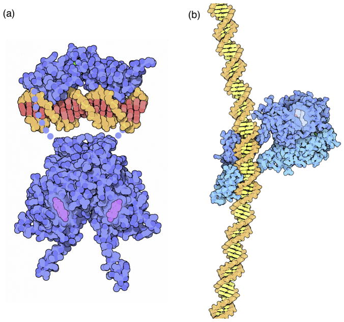
More aggressive artistic license is employed to fill knowledge gaps and to integrate data from different fields and with different levels of scientific support (Figure 7). For example, structures are often obtained for the ectodomains of receptor proteins, but structures are not determined for the transmembrane portions. The illustrator’s task is then to integrate the ectodomain structure with a model for the missing portion. In a research report, this may be shown schematically, or the study may include a detailed modeling study to predict atomic coordinates for the missing portions. For a journal cover or textbook illustration, however, a fully rendered model of the receptor in its membrane context may be more effective for presenting the receptor structure in its signaling environment.
Figure 7.
Artistic license. These two figures of hormone receptors were created with different approaches to artistic license, for two different audiences. (a) Illustration of estrogen receptor for the RCSB PDB “Molecule of the Month” 62. The goal is to show only the portions that are included in the PDB archive, so dots are used to show the connection between domains, and only a small oligonucleotide is shown. (b) Illustration of vitamin D receptor for the book “The Machinery of Life.” The book is designed for general audiences, so a more complete model of the complex was simulated in the illustration, by generating coordinates for the missing peptides and DNA (PDB entries 1a52, 1hcq, 1db1, 1kb6).
Artistic license raises issues of credibility: when interrogating an illustration, it is often difficult to discern what is known, what is hypothesized, and what is speculative. This is particularly relevant now for the field of structural biology, which is currently integrating many new experimental and modeling techniques, each of which ultimately generates a set of atomic coordinates, but with widely different levels of certainty. Effective visual methods to display uncertainty have been developed in some well-defined cases. For example, uncertainty in attributes that may be mapped to individual atoms, such sequence conservation, temperature factors, and local RMSD, are intuitively displayed using variations of color or representation, as in the “render by attribute” function in Chimera 31. However, in many other cases, such as the two illustrations shown in Figure 7, the level of artistic license and our understanding of the level of scientific support for aspects of the illustration must be inferred from the figure caption or accompanying text, and from our knowledge of how traditional forms of illustration have been used in the past. Without adequate transparency and documentation of the design process, scientific visualizations fall short of recognizing their potential as research tools. There is a growing demand for the integration of annotation or referencing to support more transparent exploration of visualization as a research tool 32–34.
Existing standards for image annotation consist primarily of metadata, for example Dublin Core Metadata (http://dublincore.org), or Image Markup Language for image retrieval and browsing, that provide global metadata about the entire image. Efforts to enable regional annotation of images consists largely of tools that enable the viewer to annotate visualizations as a form of cognitive aid to support understanding 35, 36 or as it relates to the development of computer vision systems 37. The popularity of “image tagging” or labelling on social media sites (for example Flickr or Facebook) holds great potential, but this technology has been primarily used for image retrieval or categorization. Similarly, advances in the use of augmented reality to overlay images or physical locations with data holds great potential as a possible vehicle for providing access to regional annotation of visual imagery. To-date, however, this potential has not been widely explored.
Some progress has been made integrating annotation with visualization. For example, StickyNotes 38 and StickyChats 39 are two systems that use the sticky note metaphor to provide context for annotations. StickyNotes was developed specifically for annotating protein visualization, while StickyChats supports asynchronous collaborative annotation. A substantial amount of research in the area of visualization has been dedicated to supporting provenance across a number of different application domains. This work has been aimed at recording computational workflows 40–42 and reasoning processes 43, 44. Among the better known tools in the domain of visualization, is VisTrails, which tracks computational workflow during data analysis and visualization and generates graphical representations of the workflow 40. At the heart of tools like VisTrails is the support of data exploration through traceability and reproducibility of the visualization pipeline. Documentation of workflow and the associated reference material that informs decision making underlying the design of molecular visualization is central to promoting transparency and ensuring credibility in peer-to-peer communication as well as in education and outreach.
Illustration and Education
Illustrations play and essential role in life sciences education and include a wide variety of representations such as drawings, diagrams, photographs, and charts. In biology in particular, visual representations are preferred for communicating relationships and processes that are difficult to describe. This is evidenced by the high concentration of imagery in science textbooks, at times comprising more than half of the content 45, 46. Students are regularly exposed to visual media that span a continuum from the “symbolic” (for example chemical structures or formulae) to the “realistic” (empirical mapping of data). In a comprehensive review of textbook figures, Offerdahl, Arneson, and Byrne 47 established a taxonomy to characterize five general categories of abstraction that are typically used in instructional representations (Figure 8). These include the symbolic (representations using a high level of abstraction and nomenclature that require translation), the schematic (diagrams that use abstract symbols and simple shapes to represent elements, often omitting detail to clarify concepts), graphs (depiction of the relationship between data sets using dots or lines etc. plotted with reference to a set of axes), cartoons (a drawing or computer generated image that provides an optimized view highlighting interactions or structures), and the realistic (representations that closely resemble the original subject).
Figure 8.
Students are routinely required to navigate between many different types of illustrations, ranging from highly symbolic diagrams to realistic photographs.
It is widely assumed in biology education that the perception and understanding of these representations is unproblematic and that students have the competency to read images in the same way that they read text. Just as verbal literacy presupposes the ability to read and write language, visual literacy necessitates the ability to read (understand) and write (draw), demonstrating the capacity to think, learn, and express oneself in terms of images 48–50. Unfortunately biology education does not include training in visual literacy. Rather, students are expected to “catch on” and acquire skills as they learn.
The language of molecular biology uses a number of visual conventions with which students are not familiar. Moreover, these representations assume a high level of prior knowledge of structure and function on the part of the student, that is often lacking. Overly complex or highly realistic visual representations may burden the perceptual system, overwhelming the learner. Conversely, visualizations, by virtue of their capacity to depict complex phenomena with deceptive clarity may instill superficial understanding of the subject matter 51–53. This is certainly true of visual representations that offer schematic and often highly simplified explanation of scientific concepts for the sake of clarity. Indeed, students may develop misconceptions that are reinforced by visual representation 54–56. For example, the ball-and-stick model commonly used to represent molecular structures, while readily understood by biologists, may lead students to conclude that molecules are rigid rather than flexible conformational structures that either fit perfectly or do not fit at all. Similarly, in a study where students were asked to apply their understanding of the potassium ion channel protein to the interpretation of three different representations (ribbon diagram, vines, and hydrophobic/polar representations), they struggled with applying their prior understanding to the interpretation of new representations 57. The point here is that while students’ may understand a biochemical concept, this understanding does not necessarily extend to the successful interpretation of representations describing that concept. These representations require a degree of discursive fluency that students, at this level of study, do not possess.
A related issue involves the use of analogical models to explain the characteristics or behavior of molecules (for example, the lock-and-key model). While analogies may help students to recall the properties of molecular interactions, they fail to communicate the energetic properties of molecules. These depictions also contribute to entrenched beliefs that molecules interact with a high degree of specificity (targeted binding partners). Students, who have tremendous difficulty reconciling dynamic/emergent processes with the efficiency of the cellular system, interpret these depictions literally. They apply intuitive reasoning to understanding complex processes, either by interpreting events, such as binding events, as goal driven (teleological thinking) or by projecting human traits or behaviors upon molecular entities (anthropocentric reasoning). The schematization of abstract phenomena seems necessary for analogical reasoning; however, what a student takes away from an analogy often does not correspond with the intended purpose of the visualization 58.
In considering how we can support students’ understanding of the visual language of science, there are a number of strategies for building visual literacy that may be incorporated into molecular biology curriculum. Rybarczyk 59 suggests that providing opportunities to practice, such as engaging students in discussion of data/figures from primary literature, is essential to increase understanding. As well, this strategy addresses a well-documented need to expose students to science as an evidence-based process, thus bridging the gap between biology instruction and research. Other strategies for building visual literacy include for example, training students to generate their own representations 50, as well as integrating visualizations into assessments 47. Students pay attention to assessments and this would help to enforce the importance of visual literacy as well as reinforcing students’ understanding of the disciplinary practices of scientists 60.
As the multiple fields spanning from chemistry to molecular biology to cellular biology continue to evolve, becoming increasingly integrative and multifaceted, it becomes ever more critical to understand the impact of visual representations upon students understanding. Learning outcomes with an eye toward visual literacy should support students’ acquisition of visual language and disciplinary conventions, and foster their understanding of the ways in which representations across the continuum (from symbolic to realistic) serve to document and inform disciplinary practice.
Looking to the Future
Two-dimensional representations have long been considered the bedrock of communication both in scientific discourse and education. While technological advances have supported the rapid development and implementation of animated, interactive, and simulated representations, 2D representations remain a popular form of currency in peer-to-peer communication. On a practical level, a natural extension of 2D illustration involves the integration of interactivity, a powerful modality that combines the comprehensibility of illustration with the engagement of interaction. Building on previous work with toolkits like Kinemage, JSmol, and Proteopedia, these include a pre-scripted interactive illustration with tight integration of added features such as labels, text, and filtering options, implemented directly within visualization environments.
In education too, with the increasing popularity of e-textbooks, interactives are used to bridge students’ understanding of complex processes and also as a means of presenting highly detailed imagery (for example, by providing users with a mechanism for filtering molecular structures according to their function or location within the cell). An excellent example of this is seen in “E.O Wilson’s Life on Earth” 6. In particular, the second volume of this seven-volume series provides readers with access to a number of these illustrated interactives, affording a modifiable view of highly complex molecular processes and cellular landscapes. Another effective approach used to supplement learning from illustration is the integration of augmented reality (AR). While AR is not necessarily a recent innovation, it hasn’t seen tremendous uptake. However, with improvements to the technology it has shown potential both in education and research as a low cost platform for augmenting static imagery by providing additional in-context information and as a means of simultaneously displaying/overlaying multiple representations.
On a more general level, the field of molecular visualization faces challenges arising from the increased size of input data sets and improvements in atomic level imaging of molecular and integrative structures. This will demand methods for depicting molecular scale phenomena in greater detail and developing forms of representation for communicating these structures with greater perceptual clarity. As well, advancements in imaging will benefit from the development of visualization methods capable of bridging and supporting concurrent interrogation of entities operating along multiple levels of scale (from the atomic to the cellular), such as CellVIEW 61. A consequence of these developments will no doubt foster the continued evolution of a more extensive visual language for molecular biology.
Highlights.
Molecular illustration is widely used for dissemination of structural results.
Best practices for molecular illustration build on decades of prior work.
Illustrations show lasting effectiveness in life science education.
Acknowledgments
This work is supported by R01-GM120604 from the National Institutes of Health (DSG), DBI-1338415 to the RCSB from the National Science Foundation, the National Institutes of Health, the US Department of Energy (DSG) and SIG 13/14 from the Social Sciences and Humanities Research Council (SSHRC) (JJ). This is manuscript #29671 from TSRI.
Footnotes
Publisher's Disclaimer: This is a PDF file of an unedited manuscript that has been accepted for publication. As a service to our customers we are providing this early version of the manuscript. The manuscript will undergo copyediting, typesetting, and review of the resulting proof before it is published in its final citable form. Please note that during the production process errors may be discovered which could affect the content, and all legal disclaimers that apply to the journal pertain.
References
- 1.Richardson JS. The anatomy and taxonomy of protein structure. Adv Protein Chem. 1981;34:167–339. doi: 10.1016/s0065-3233(08)60520-3. [DOI] [PubMed] [Google Scholar]
- 2.Barnes CL. ORTEP-3 for Windows - a version of ORTEP-III with a Graphical User Interface (GUI) J Appl Cryst. 1997;30:568–568. [Google Scholar]
- 3.Kraulis P. MolScript: a program to produce both detailed and schematic plots of protein structures. J Appl Cryst. 1991;24:946–950. [Google Scholar]
- 4.Feldmann RJ, Bing DH, Furie BC, Furie B. Interactive computer surface graphics approach to study of the active site of bovine trypsin. Proc Natl Acad Sci USA. 1978;75:5409–5412. doi: 10.1073/pnas.75.11.5409. [DOI] [PMC free article] [PubMed] [Google Scholar]
- 5.Hodis E, Prilusky J, Martz E, Silman I, Moult J, Sussman JL. Proteopedia - a scientific ‘wiki’ bridging the rift between three-dimensional structure and function of biomacromolecules. Genome Biol. 2008;9:R121. doi: 10.1186/gb-2008-9-8-r121. [DOI] [PMC free article] [PubMed] [Google Scholar]
- 6.Ryan M, McGill G, Wilson EO. EO Wilson’s Life On Earth. Wilson Digital Inc; 2014. [Google Scholar]
- 7.Rose AS, Hildebrand PW. NGL Viewer: A web application for molecular visualization. Nucl Acids Res. 2015;43:W576–579. doi: 10.1093/nar/gkv402. [DOI] [PMC free article] [PubMed] [Google Scholar]
- 8.Kozlikova B, Krone M, Falk M, Lindow N, Baaden M, Baum D, Viola I, Parulek J, Hege HC. Visualization of biomolecular structures: State of the art revisited. Comp Graph Forum. 2017;36:178–204. [Google Scholar]
- 9.O’Donoghue SI, Goodsell DS, Frangakis AS, Jossinet F, Laskowski RA, Nilges M, Saibil HR, Schafferhans A, Wade RC, Westhof E, Olson AJ. Visualization of macromolecular structures. Nat Methods. 2010;7:S42–55. doi: 10.1038/nmeth.1427. [DOI] [PMC free article] [PubMed] [Google Scholar]
- 10.Goddard TD, Ferrin TE. Visualization software for molecular assemblies. Curr Opin Struct Biol. 2007;17:587–595. doi: 10.1016/j.sbi.2007.06.008. [DOI] [PMC free article] [PubMed] [Google Scholar]
- 11.Connolly ML. Solvent-accessible surfaces of proteins and nucleic acids. Science. 1983;221:709–713. doi: 10.1126/science.6879170. [DOI] [PubMed] [Google Scholar]
- 12.Watson JD, Crick FHC. Molecular structure of nucleic acids: A structure for deoxyribose nucleic acid. Nature. 1953;171:737–738. doi: 10.1038/171737a0. [DOI] [PubMed] [Google Scholar]
- 13.Ward AB, Sali A, Wilson IA. Integrative structural biology. Science. 2013;339:913–915. doi: 10.1126/science.1228565. [DOI] [PMC free article] [PubMed] [Google Scholar]
- 14.Sanner MF. Python: A programming language for software integration and development. J Mol Graphics Mod. 1999;17:57–61. [PubMed] [Google Scholar]
- 15.Phong BT. Illumination for computer generated pictures. Commun ACM. 1975;18:311–317. [Google Scholar]
- 16.Namba K, Caspar DLD, Stubbs G. Enhancement and simplification of macromolecular images. Biophys J. 1989;53:469–475. doi: 10.1016/S0006-3495(88)83125-4. [DOI] [PMC free article] [PubMed] [Google Scholar]
- 17.Goodsell DS, Olson AJ. Molecular illustration in black and white. J Mol Graphics. 1992;10:235–240. doi: 10.1016/0263-7855(92)80075-o. [DOI] [PubMed] [Google Scholar]
- 18.Tarini M, Cignoni P, Montani C. Ambient occlusion and edge cueing to enhance real time molecular visualization. IEEE Trans Vis Comput Graph. 2006;12:1237–1244. doi: 10.1109/TVCG.2006.115. [DOI] [PubMed] [Google Scholar]
- 19.Wong B, Kjaegaard RS. Pencil and paper. Nat Methods. 2012;9:1037. doi: 10.1038/nmeth.2223. [DOI] [PubMed] [Google Scholar]
- 20.Ullman DG, Wood S, Craig D. The importance of drawing in the mechanical design process. Comput Graph. 1990;14:263–274. [Google Scholar]
- 21.Brun J, Le Masson P, Weill B. Designing with sketches: The generative effects of knowledge preordering. Design Sci. 2016;2:e13. [Google Scholar]
- 22.Wammes JD, Meade ME, Fernandes MA. The drawing effect: Evidence for reliable and robust memory benefits in free recall. Q J Exp Psychol. 2016;69:1752–1776. doi: 10.1080/17470218.2015.1094494. [DOI] [PubMed] [Google Scholar]
- 23.Ainsworth S, Prain V, Tytler R. Science education. Drawing to learn in science. Science. 2011;333:1096–1097. doi: 10.1126/science.1204153. [DOI] [PubMed] [Google Scholar]
- 24.Tufte E. The visual display of quantitative information. Graphics Press Inc; 1983. [Google Scholar]
- 25.Frankel FC, DePace AH. Visual strategies: A practical guide to graphics for scientists & engineers. Yale University Press; New Haven: 2012. [Google Scholar]
- 26.Ware C. Information visualization: perception for design. Morgan Kaufmann; 2004. [Google Scholar]
- 27.Munzner T. Visualization analysis and design. CRC press; 2014. [Google Scholar]
- 28.Johnson GT, Hertig S. A guide to the visual analysis and communication of biomolecular structural data. Nat Rev Mol Cell Biol. 2014;15:690–698. doi: 10.1038/nrm3874. [DOI] [PubMed] [Google Scholar]
- 29.Mura C, McCrimmon CM, Vertrees J, Sawaya MR. An introduction to biomolecular graphics. PLoS Comput Biol. 2010:6. doi: 10.1371/journal.pcbi.1000918. [DOI] [PMC free article] [PubMed] [Google Scholar]
- 30.Goodsell DS, Johnson GT. Filling in the gaps: Artistic license in education and outreach. PLoS Biol. 2007;5:2759–2762. doi: 10.1371/journal.pbio.0050308. [DOI] [PMC free article] [PubMed] [Google Scholar]
- 31.Pettersen EF, Goddard TD, Huang CC, Couch GS, Greenblatt DM, Meng EC, Ferrin TE. UCSF Chimera--a visualization system for exploratory research and analysis. J Comput Chem. 2004;25:1605–1612. doi: 10.1002/jcc.20084. [DOI] [PubMed] [Google Scholar]
- 32.Iwasa JH. Bringing macromolecular machinery to life using 3D animation. Curr Op Struct Biol. 2015;31:84–88. doi: 10.1016/j.sbi.2015.03.015. [DOI] [PubMed] [Google Scholar]
- 33.Iwasa JH. The scientist as illustrator. Trends Immunol. 2016;37:247–250. doi: 10.1016/j.it.2016.02.002. [DOI] [PMC free article] [PubMed] [Google Scholar]
- 34.Jantzen SG, Jenkinson J, McGill G. Transparency in film: increasing credibility of scientific animation using citation. Nat Methods. 2015;12:293–297. doi: 10.1038/nmeth.3334. [DOI] [PubMed] [Google Scholar]
- 35.Denisovich I. Software support for annotation of visualized data using hand-drawn marks. Proceedings of the Ninth International Conference on Information Visualization; 2005. pp. 807–813. [Google Scholar]
- 36.Groth DP, Streefkerk K. Provenance and annotation for visual exploration systems. IEEE Trans Vis Comput Graphics. 2006;12:1500–1510. doi: 10.1109/TVCG.2006.101. [DOI] [PubMed] [Google Scholar]
- 37.Torralba A, Russell BC, Yuen J. LabelMe: Online image annotation and applications. Proceedings of the IEEE. 2010;98:1467–1484. [Google Scholar]
- 38.Can T, Wang Y, Wang YF, Su J. A distributed protein visualization application. Proceedings of the Third International Conference on Bioinformatics; 2001. pp. 92–99. [Google Scholar]
- 39.Churchill EF, Trevor J, Bly S, Nelson L, Cubranic D. Anchored conversations: Chatting in the context of a document. Proceedings of the SIGCHI Conference in Human Factors in Computing Systems; 2000. pp. 454–461. [Google Scholar]
- 40.Bavoil L, Callahan SP, Crossno PJ, Freire J, Scheidegger CE, Silva T, Vo HT. VisTrails: Enabling interactive multiple-view visualizations. Proceedings of IEEE Visualization. 2005:135–142. [Google Scholar]
- 41.Davidson SB, Freire J. Provenance and scientific workflows. Proceedings of the 2008 ACM SIGMOD International Conference on Management of Data - SIGMOD ‘08; 2008. pp. 1345–1350. [Google Scholar]
- 42.Parker SG, Johnson CR. SCIRun: a scientific programming environment for computational steering. Proceedings of the 1995 ACM/IEEE Conference on Supercomputing; 1995. Article No. 52. [Google Scholar]
- 43.Dou W, Jeong DH, Stukes F, Ribarsky W, Lipford HR, Chang R. Recovering reasoning processes from user interactions. IEEE Computer Graphics and Applications. 2009;29:52–61. doi: 10.1109/mcg.2009.49. [DOI] [PubMed] [Google Scholar]
- 44.Gotz D, Zhou MX. Characterizing users’ visual analytic activity for insight provenance. Proceedings of the IEEE Symposium on Visual Analytics, Science and Technology; 2008. pp. 123–130. [Google Scholar]
- 45.Mayer RE. Illustrations that instruct. Adv Instruct Psychol. 1993;4:253–284. [Google Scholar]
- 46.Tibell LAE, Rundgren C-J. Educational challenges of molecular life science: Characteristics and implications for education and research. CBE Life Sci Ed. 2010;9:25–33. doi: 10.1187/cbe.08-09-0055. [DOI] [PMC free article] [PubMed] [Google Scholar]
- 47.Offerdahl EG, Arneson JB, Byrne N. Lighten the load: Scaffolding visual literacy in biochemistry and molecular biology. Cell Biol Ed. 2017;16:es1. doi: 10.1187/cbe.16-06-0193. [DOI] [PMC free article] [PubMed] [Google Scholar]
- 48.Braden RA, Hortin JA. Identifying the theoretical foundations of visual literacy. J Visual Verbal Lang. 1982;2:37–42. [Google Scholar]
- 49.Lowe RK. Animation and learning: selective processing of information in dynamic graphics. Learning Instruct. 2003;13:157–176. [Google Scholar]
- 50.Schonborn KJ, Anderson TR. The importance of visual literacy in the education of biochemists. Biochem Mol Biol Education. 2006;34:94–102. doi: 10.1002/bmb.2006.49403402094. [DOI] [PubMed] [Google Scholar]
- 51.Chiu JL, Linn MC. Metacognition in science education: Trends in current research. Springer Verlag; 2012. The role of self-monitoring in learning chemistry with dynamic visualization; pp. 133–163. [Google Scholar]
- 52.Linn MC, Chang HY, Chiu JL, Zhang HZ, McElhaney K. Successful remembering and successful forgetting: a Festchrift in honor of Robert A. Bjork. Routledge; 2010. Can desirable difficulties overcome deceptive clarity in scientific visualizations? pp. 239–262. [Google Scholar]
- 53.Shahani VM, Jenkinson J. The efficacy of interactive analogical models in the instruction of bond energy curves in undergraduate chemistry. Chem Educ Res Pract. 2016;17:417–428. [Google Scholar]
- 54.Chi MTH. Commonsense conceptions of emergent processes: Why some misconceptions are robust. J Learning Sci. 2005;14:161–199. [Google Scholar]
- 55.Chi MT, Roscoe RD, Slotta JD, Roy M, Chase CC. Misconceived causal explanations for emergent processes. Cogn Sci. 2012;36:1–61. doi: 10.1111/j.1551-6709.2011.01207.x. [DOI] [PubMed] [Google Scholar]
- 56.Garvin-Doxas K, Klymkowsky MW. Understanding randomness and its impact on student learning: lessons learned from building the Biology Concept Inventory (BCI) CBE Life Sci Educ. 2008;7:227–233. doi: 10.1187/cbe.07-08-0063. [DOI] [PMC free article] [PubMed] [Google Scholar]
- 57.Harle M, Towns MH. Students’ understanding of external representations of the potassium ion channel protein, Part I: Affordances and limitations of ribbon diagrams, vines, and hydrophobic/polar representations. Biochem Mol Biol Education. 2012;40:349–356. doi: 10.1002/bmb.20641. [DOI] [PubMed] [Google Scholar]
- 58.Niebert K, Marsch S, Treagust DF. Understanding needs embodiment: A theory-guided reanalysis of the role of metaphors and analogies in understanding science. Sci Education. 2012;96:849–877. [Google Scholar]
- 59.Rybarczyk B. Visual literacy in biology: A comparison of visual representations in textbooks and journal articles. J College Sci Teaching. 2011;41:106–114. [Google Scholar]
- 60.Momsen J, Offerdahl E, Kryjevskaia M, Montplaisir L, Anderson E, Grosz N. Using assessments to investigate and compare the nature of learning in undergraduate science courses. CBE Life Sci Education. 2013;12:239–249. doi: 10.1187/cbe.12-08-0130. [DOI] [PMC free article] [PubMed] [Google Scholar]
- 61.Le Music M, Autin L, Parulek J, Viola I. cellVIEW: a tool for illustrative and multi-scale rendering of large biomolecular datasets. In: Buhler KLL, John NW, editors. Eurographics Workshop on Visual Computing for Biology and Medicine. The Eurographics Association; 2015. [DOI] [PMC free article] [PubMed] [Google Scholar]
- 62.Goodsell DS, Dutta S, Zardecki C, Voigt M, Berman HM, Burley SK. The RCSB PDB “Molecule of the Month”: Inspiring a molecular view of biology. PLoS Biol. 2015;13:e1002140. doi: 10.1371/journal.pbio.1002140. [DOI] [PMC free article] [PubMed] [Google Scholar]


