Abstract
Background
There exists a challenge of understanding and integrating various types of data collected to support the health of individuals with multiple chronic conditions engaging in cancer care. Data visualization has the potential to address this challenge and support personalized cancer care.
Objective
The aim of the study was to assess the health care practitioners’ perceptions of and feedback regarding visualizations developed to support the care of individuals with multiple chronic conditions engaging in cancer care.
Methods
Medical doctors (n=4) and registered nurses (n=4) providing cancer care at an academic medical center in the western United States provided feedback on visualization mock-ups. Mock-up designs were guided by current health informatics and visualization literature and the Munzner Nested Model for Visualization Design. User-centered design methods, a mock patient persona, and a scenario were used to elicit insights from participants. Directed content analysis was used to identify themes from session transcripts. Means and SDs were calculated for health care practitioners’ rankings of overview visualizations.
Results
Themes identified were data elements, supportive elements, confusing elements, interpretation, and use of visualization. Overall, participants found the visualizations useful and with the potential to provide personalized care. Use of color, reference lines, and familiar visual presentations (calendars, line graphs) were noted as helpful in interpreting data.
Conclusions
Visualizations guided by a framework and literature can support health care practitioners’ understanding of data for individuals with multiple chronic conditions engaged in cancer care. This understanding has the potential to support the provision of personalized care.
Keywords: cancer care facilities, informatics, patient-centered care, patient-generated health data, precision medicine, visualization
Introduction
Background
About 1 out of every 4 people in the United States lives with multiple chronic conditions (MCC), which include cancer and other conditions such as hypertension, diabetes, and heart disease [1]. About 40% of individuals with cancer also live with 1 or more chronic conditions [2]. The attendant complexity and potential confounding factors in managing treatment-intensive illnesses such as cancer among individuals with MCC beg for personalized care approaches. Personalized care, as described in precision medicine and personalized medicine, involves the collaboration between health care practitioners (HCPs) and patients and considers the perspectives, experiences, and health-related data of the person receiving care [3]. A recent Cochrane review suggests that personalized care can support the physical and psychosocial health of individuals with MCC [3], which can include those engaged in cancer care. Person-generated health data (PGHD) such as symptoms, medication use, physical activity, and health goals are important information for personalizing care of MCC. Organizations, including the United States Department of Health and Human Services [4,5] and the Healthcare Information and Management Systems Society [6], recommend that PGHD be captured and used in decision making, care planning, and coordination. Furthermore, mobile technologies can support collection and access to PGHD to support the management of chronic conditions and personalized care [7-12].
Although PGHD is quite varied, it may be collected at a different velocity and magnitude and in different and nonstandard formats [11]. To be useful to HCPs, individuals with MCC (including those engaged in cancer care), and caregivers, the cognitive burden of understanding and synthesizing this information must be minimized, and the opportunity to make good decisions must be maximized. This is particularly pertinent in the care of individuals with MCC engaging in cancer care, which is the scope of the research described in this manuscript. Coordination of cancer care involves many people—the individual engaging in cancer care, their HCPs, caregivers, family, and health care staff—who need to integrate the large amounts of data; these data are used to support understanding of an individual’s health status, completion of health-related tasks, and care-related decision making [13].
Data visualization offers an approach to address this challenge of integrating and using large amounts of data collected to support the personalized care of individuals with MCC engaging in cancer care. Data visualizations are representations of data through the application of visual encodings (eg, position and color) [14-17]. Visualization can leverage a user’s cognitive strengths such as pattern recognition, and it helps them overcome their cognitive limitations including calculating and remembering strings of numbers. This can ultimately support understanding, task completion, and decision making. Visualizations that are designed with guidance from potential end users can be particularly valuable. User-centered design, within the field of human-centered design, is an approach to systems development that involves potential end users to understand their behaviors, tasks, and needs, among other factors [18,19]. User-centered design can help the designer fully render the users’ needs to improve the decisions that the visualizations are meant to support. User-centered design has been used previously in the development of visualizations [20,21] including visualizations of patient-reported outcomes [22,23].
The benefits of data visualizations—supporting understanding, task completion, and decision making—are especially critical in health-related settings such as cancer care facilities. In these settings, data are used to support important, critical, and time-restricted decisions that impact the health of individuals. Data visualizations are increasingly being incorporated into clinical care through integration of dashboards into health record systems. A recent review suggests that dashboards that integrate visualizations have the potential to support the cognitive work and decision making of intensive care unit clinicians [24]. However, there have been few examples of the effective use of person-generated data in personalized cancer care, particularly to enable shared decision making or care coordination [25]. A recent study found that patients with solid tumors who used a Web-based system to report symptoms experienced longer survival compared with usual care [26]. There is also little research on the value of visualizations within systems that integrate patient-generated data in cancer care. A pilot study conducted in Italy suggested that a dashboard that integrated remote monitoring and symptom-tracking data could be useful to HCPs and patients [27]. However, this work did not specifically evaluate the visualizations, and rationales for the visualization designs were not described. Therefore, a gap exists in the literature and practice regarding the development of informatics solutions that integrate and visualize person-generated data to support understanding and decision making regarding personalized cancer care among individuals with MCC.
Prior Work
OnPoint is a mobile app developed by the authors to support care coordination for individuals with MCC [25,28,29]. Previous studies by the authors’ research group that were conducted to support heart failure and oncology patients resulted in the development of a mobile app that featured patient health goals, proactive symptom assessment, comprehensive medication list and medication reconciliation, and tracking for patient and caregiver use. On the basis of this prior work, researchers identified the need for visualization of data collected from the app and integrated into the electronic health record for communication to HCPs. This inspired the study described below.
Study Purpose
The purpose of this study was to assess HCPs’ perceptions of and feedback regarding visualizations developed to support the personalized care of individuals with MCC engaging in cancer care.
Methods
Design, Time Frame, and Setting
This user-centered study took place from May to June 2017 at a large, urban academic medical center in the western United States.
Recruitment of Participants
We sought 8 medical doctors (MDs) and registered nurses (RNs); a sample size considered adequate for this type of qualitative user-centered design study [30-32]. HCPs were either known to the researchers or identified by referral of HCPs who had participated in previous studies in the development of the OnPoint mobile app [25,28,29]. HCPs were eligible to participate if they were potential end users of a health information system to support cancer patients with MCC and HCPs currently providing care to cancer patients.
Visualization Development
Paper mock-ups of data visualizations were developed by UB (author) guided by Munzner Nested Model for Visualization Design [17]. We applied all model constructs (italicized in the following paragraphs) except for the algorithm design construct, which is suited for software development rather than for our focus on presoftware development.
The domain problem addressed was the need to support the care of individuals with MCC engaging in cancer care—the problem addressed by the OnPoint mobile app [25,28,29].
For operation and data type abstraction, we identified operations (tasks) and data types from the previous studies [25,28,29]. These data types were blood pressure (mm Hg), weight (kg), blood glucose levels (mg/dL), medication adherence (medications not taken at the time or frequency as prescribed), and symptoms from the Canadian Oncology Symptom Triage and Remote Support (COSTaRS) practice guides [33,34].
For visual encoding and interaction design, mock-up encodings and designs were guided by literature on (1) visualizing data [14-17,35-44]; (2) health data visualization [23,45-47]; and (3) a mock patient persona and scenario [48,49]. The mock patient was a 56-year-old woman with uterine cancer and type 1 diabetes. She had recurrent work and personal constraints on Thursdays that interfered with taking medications as prescribed and managing her blood glucose levels. This patient also recently experienced weight gain due to fluid retention.
The following visualization mock-ups were created based on the nested model constructs: (1) a 4-week overview of medication adherence, blood pressure, weight, and blood glucose alone (Figure 1) and with pop-ups providing details on demand (Figure 2), (2) a 4-week view of line graphs indicating blood glucose readings alone (Figure 3) and with a pop-up providing details about a specific blood glucose reading (Figure 4), and (3) a 2-week view for blood pressure (Figure 5) and with a pop-up providing details about a specific blood pressure reading (Figure 6). In addition, 3 additional versions of the 4-week overviews of medication adherence, blood pressure, weight, and blood glucose were created (Figures 7-9). Finally, a visualization of self-reported symptoms generated from the COSTaRS protocols was developed (Figure 10).
Figure 1.
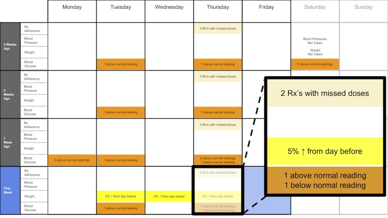
A 4-week overview of medication adherence, blood pressure, weight, and blood glucose.
Figure 2.
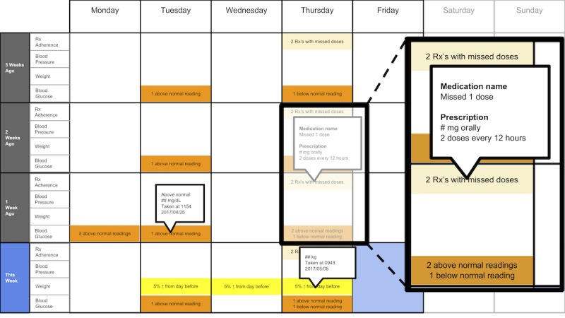
A 4-week overview of medication adherence, blood pressure, weight, and blood glucose with pop-ups providing details on demand.
Figure 3.
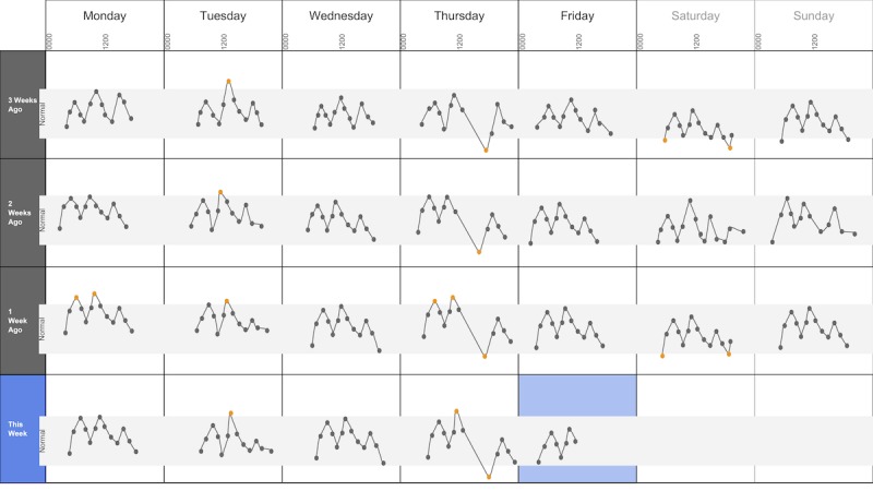
A 4-week view of blood glucose readings alone.
Figure 4.
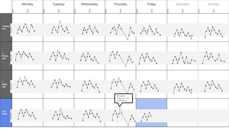
A 4-week view of blood glucose readings alone and with a pop-up providing details about a specific data point.
Figure 5.
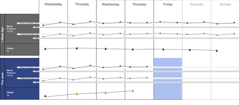
A 2-week view for blood pressure and weight.
Figure 6.
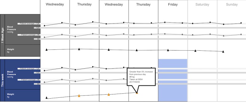
A 2-week view for blood pressure and weight with a pop-up providing details about a specific data point.
Figure 7.
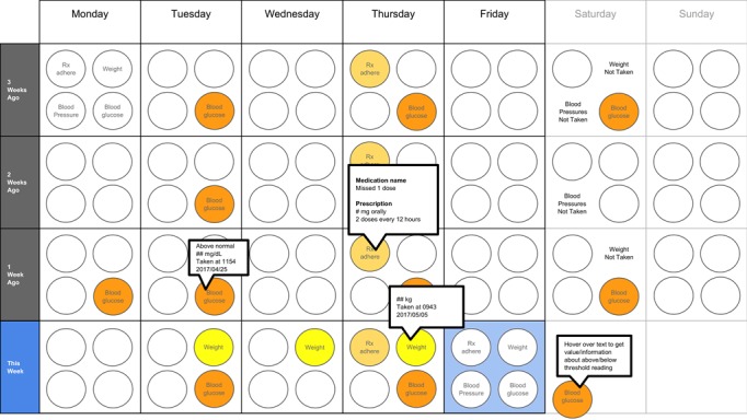
A 4-week overview circle view.
Figure 9.
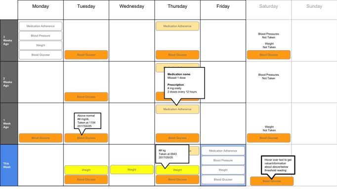
A 4-week overview filled tab view.
Figure 10.
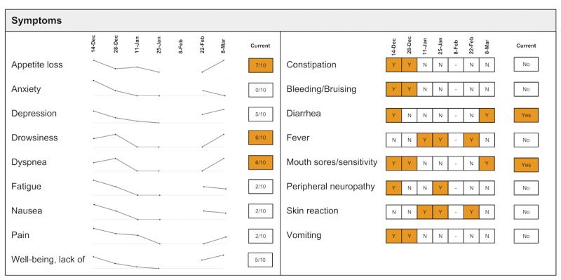
Visualization of patient-generated symptoms that are self-reported using the Canadian Oncology Symptom Triage and Remote Support (COSTaRS) protocols.
Indication of target levels and ranges were shown with lines and colors. For example, in Figures 3 and 4, the gray bands indicate the target blood glucose range (80-130 mg/dL before a meal and <180 mg/dL 2 hours after the start of the meal [50]). In Figures 5 and 6, lines indicate (1) mock patient average systolic and diastolic blood pressure and target blood pressure (120/80 mm Hg [51]). Line graphs were purposefully chosen based on previous research indicating that position and color of dots on a chart (eg, individual glucose readings) can support quantitative interpretation [37-39,41]. Blue, orange, and yellow colors were used because they can be distinguished by individuals with color blindness [52-54].
Measures and Procedures
This study applied user-centered design methods to engage potential end users early in the design process to understand their needs, priorities, and values. UB and SH conducted one-on-one interviews; participants were provided with pens, colored pencils, and markers and encouraged to draw and take notes on the paper visualizations as they reviewed them. They were also prompted throughout the interview to think aloud about what they saw and thought while reviewing the visualizations [55,56].
Interviews were conducted in 3 steps: (1) going through the scenario during which they thought aloud while viewing paper mock-ups and responding to prompts (see Textbox 1 for the scenario), (2) ranking of alternative visualizations of overview mock-ups, and (3) providing overall impressions and usefulness for care coordination. This step sequence was used to guide the participants in using the visualization as they might in their clinical practice, which can help elicit reflection from participants [48].
Scenario used during one-on-one interviews with clinicians to elicit feedback about data visualizations. Information in brackets indicates actions by the researcher conducting the interview.
You have arrived at the clinic before you start seeing patients. You want to see how your first patient of the day is doing. Her name is Deb Lee (age 56 years). Three weeks ago she completed chemotherapy for uterine cancer. She also has type 1 diabetes that was diagnosed in childhood.
-
You have done your typical chart review of Deb’s clinical data using the clinic’s electronic health record. After that chart review of electronic health record data, you want to see how Deb is doing at home. Recently the clinic started supporting patients in collecting data at home. Data include:
if the patient took her medications as prescribed
blood pressure (measured twice a day)
weight (taken once a day)
blood glucose (taken periodically throughout the day using a traditional finger-prick monitor)
These data collected by patients are provided to you first as 4-week summary. [Participant given Figure 1]
You want to know what’s going on with some of the data. You hover over several readings reading to get more information. After you hover, you get this visual. [Participant given Figure 2]
You are concerned about Deb’s blood glucose readings and want to see more details about her readings over the 4 weeks. You click on the most recent reading to get more information. After you click, you get this visual. [Participant given Figure 3]
You’d like to see some specific information about a specific data point. You hover over this orange dot. [Researcher points to dot on “This week,” Thursday at 12:00 pm]
After you hover over it, you get this visual. [Participant given Figure 4]
You are concerned about Deb’s weight readings and want to see details about her readings. You click on the most recent reading to get more information. After you click, you get this visual. [Participant given Figure 5]
You’d like to see some specific information about a specific data point. You hover over this orange dot. [Researcher points to dot for weight on “This week,” Thursday]
After you hover over it, you get this visual. [Participant given Figure 6]
In step 1, participants first viewed an overview of visualization (Figures 1 and 2), then specific measures (Figures 3 and 4), then sought details on demand for those measures (Figures 5 and 6). This approach aligns with Shneiderman Visual Information Seeking Mantra of “Overview first, zoom and filter, then details-on-demand” [42]. While viewing the visualizations, participants explained what they saw, the impression of the patient, what additional information they would want included, what aspects supported their understanding of the patient, and what aspects were confusing.
In step 2, the researcher presented alternate versions of the 4-week overview (Figures 7-9). Ordering of the versions was varied from participant to participant so that the order in which the versions were presented did not influence responses. While viewing the alternate versions, participants described their overall impressions, aspects they perceived as helpful, and aspects they perceived as confusing. Then, the then researcher gave the clinicians the original 4-week overview (Figure 1) and asked participants to order this overview and the alternate versions from most helpful (ranked first) to least helpful (ranked fourth). Participants explained aloud their rationale for the ordering while sorting the versions.
In step 3, participants viewed the visualization that provided summaries of longitudinal patient-reported symptoms (Figure 10). Again, the participants were asked to describe their overall impression of the visualization, aspects that they perceived as helpful in understanding the patient, and aspects they perceived as confusing in understanding the patient. At the end of the interview, the researchers asked whether and how the visualizations could help personalize the care and asked for suggestions.
Interviews were recorded, transcribed, and supplemented by field notes taken by researchers during the interviews. This study was approved by the affiliated institutional review board. All participants provided verbal consent after receiving and reading the study consent form. Participants were provided with a US $50 Amazon gift card for engaging in the interview.
Analyses
Transcripts of participant interviews were analyzed independently by 2 researchers using directed content analysis [57]. Categories used to guide the development of codes and the content analysis were developed from the data and refined as described below. At first, 2 researchers independently coded 3 randomly selected sections of transcripts from different participants to identify themes. The unit of analysis was a distinct idea within a participant’s statement. After each of 3 rounds of independent coding, the researchers discussed how content was coded and any new themes that emerged for which codes needed to be added. After the third round, the researchers concurred that the codes adequately covered all themes, thus yielding the final codebook used for the remainder of transcript coding. Inter-rater reliability was calculated using an estimate of inter-rater reliability as described by Topf [58]. The agreement was 84.5%. The researchers discussed the discrepancies in coding and ultimately came to a consensus for a final inter-rater agreement of 100%. Researchers then independently coded the transcripts using NVivo (v11.4.1, QSR International, Melbourne, Australia). Rankings for preferences of the 4 versions of the overview visualization (Figure 2; Figures 7-9) were tabulated, and mean ranks and SD were calculated for each overview version.
Results
Participants
A total of 8 HCPs participated in the interviews. Out of these, 4 were MDs; 1 was a pain management specialist (participant MD1), and 3 were oncologists (participants MD2, MD3, and MD4), and 4 were RNs (participants RN1, RN2, RN3, and RN4). Each participant provided care to cancer patients in the cancer center. Interviews lasted for approximately 25 to 42 min.
Themes
We identified 7 themes. Of these, 2 themes were not directly relevant to the visualizations; therefore, for the purpose of this paper, we report the following 5 themes: data elements, supportive elements, confusing elements, interpretation, and use of visualization. See Table 1 for descriptions and specific content regarding the themes.
Table 1.
Themes identified from interviews with health care practitioners while evaluating visualizations to support cancer care of an individual with multiple chronic conditions.
| Theme | Description | Specific content regarding the theme |
| Data elements | Existing or future or potential data elements (eg, weight, blood pressure, medication adherence, and symptoms) |
|
| Supportive elements | Aspects of the visualization that supported the participant’s understanding of the patient or that they thought were helpful |
|
| Confusing elements | Aspects of the visualization that the participant does not understand or finds confusing or unhelpful |
|
| Interpretation | Information obtained or conclusions drawn about the patient from the visualization |
|
| Use of visualization | Ways the participant would or could use the visualization |
|
aMD: medical doctor.
bRN: registered nurse.
Data Elements
There were several data elements within the visualizations that participants indicated as useful and supportive for their collaborations with patients. Participants noted the usefulness of measures and behaviors portrayed in Figures 1-6 (eg, weight) and symptoms portrayed in Figure 10 (eg, pain levels). Certain data were noted as being less relevant given their roles (see Table 1). Participants indicated several additional data elements that could be helpful (see Table 1). This included symptoms identified by patients as relevant or important (n=2). For example, MD3 suggested patient-driven modifications of the symptoms list:
Can we plan another category that I want the patient to monitor? For example, if they’re having bleeding-vaginal bleeding-can they use the category of vaginal bleeding to show me...?
MD3
Supportive Elements
Participants described several visual elements that supported their understanding of the patient. The elements included color, the calendar format, use of line graphs, and the ability to get “details on demand.” All participants (n=8) stated that color supported their understanding of the data. Several indicated that icons helped differentiate graphs (n=4) and that the gray bands indicating normal ranges helped identify abnormal data points (n=4). Participants stated that the calendar format and line graphs were helpful because they are accustomed to them (n=4), are used in practice (n=2), and help them see trends (n=8):
[The line graph] gels with what practitioners could be used to...You don’t want to have something too novel where you have some bizarre bar graph or some kind of odd, interesting pattern that’s in 3D...that people haven’t seen.
MD1
Three participants stated that the calendar format allowed them to see trends such as missed medications on Thursdays (RN1, RN2, and RN4):
...you see a pattern...that helps you identify that there is a regimen and that there’s a schedule...it enables you to see something missed in the pattern by seeing the...[entire] month.
RN4
All participants (n=8) reacted positively to “details on demand” features such as hovering over a data point to get a pop-up with detailed information:
...it’s good that it [the visualization] doesn’t overpopulate the numbers right there and then because I mean I would just be overwhelmed with actual numbers, so this hovering thing is really good.
MD3
Confusing Elements
There were several visual elements in the 4-week overviews that participants found confusing. These included not understanding the meaning of blank spaces in Figure 1 (n=3) or Figure 8 (n=4), being confused or overwhelmed by the circles in Figure 7 (n=5), and lacking clarity about how the weight increase was calculated for Figures 1 and 5 (n=3).
Figure 8.
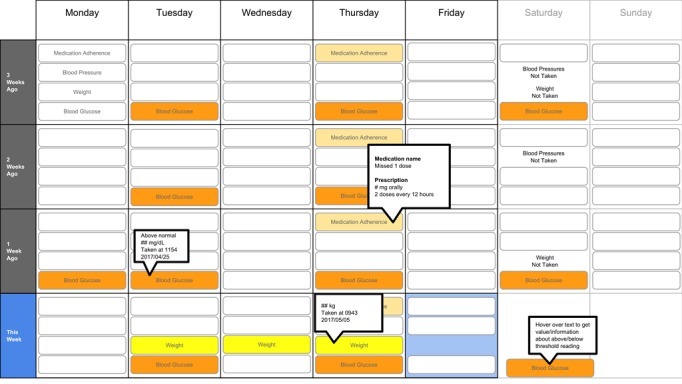
A 4-week overview all tab view.
Several participants noted issues with interpreting visualizations for patient-reported symptoms (Figure 10). This included lack of clarity about the meaning of the numeric scale, threshold values for the numeric scores that led to values being highlighted in orange, and whether the thresholds were the same across all symptoms (n=3). Participants also found it difficult to interpret the miniature line graphs (n=4) and to understand, compare, and interpret the 2 different ways of quantifying symptoms (n=3).
Interpretation
All participants (n=8) used visual elements to interpret data—finding patterns and viewing trends—to support understanding and decision making. They identified missed medications including the pattern of missed medications on Thursday using the calendar views (n=6). When seeing the pattern on Thursdays, participants were prompted to think about what could cause the patterns:
I wonder what’s going on Thursdays that she always forgets the medications.
MD3
Identifying this pattern supported RN4’s decision making to investigate the cause of the pattern:
I’m not sure why [she is missing her medications consecutively on Thursdays] so you would have to find out why is she missing her drugs on Thursday.
RN4
MD4 similarly described how using the visualizations supported understanding of the patient, reasoning about what might be causing abnormal readings, and ruling out potential causes:
...she just is not taking her medications for some reason...I can use the visualization and the colors to figure out some of her difficulties...[about] why she may not be adherent with her health [behaviors]and medications.
MD4
RN4 echoed how the visualizations could facilitate clinician reasoning, stating that a clinician could postulate about what might be causing the issues on Thursdays by bringing in symptoms and other data:
...you could really get I think a good picture.
RN4
Trends in line graphs helped participants interpret temporal glucose, blood pressure, and weight data (n=5). Participants reflected on several weeks’ worth of data, comparing normal and abnormal points over time as well as visual elements indicating missed medication, to formulate whether they believe the patient had well-controlled blood glucose (n=2). For example, MD4 stated:
[if the medication being missed is] related to her insulin...and her blood sugars aren’t controlled, [then] the general impression probably is that her blood sugars aren’t controlled and her diabetes isn’t controlled.
MD4
Participants viewed trends across different measures to infer relationships between measures. When viewing Figures 5 and 6, MD1, MD2, RN1, and RN4 viewed the line graph trend for blood pressure, guided by the gray bands indicating normal readings and color coding of the data points, to inform their reasoning about what might have caused blood pressure to stay within normal range but weight to increase (as indicated by the line graph trend and color-coded data points). Participants used the calendar structure to see if weekly patterns were consistent:
I also see that the same kind of pattern I’ve seen on this very day and the week before.
MD3
Use of Visualizations
Participants stated that visualizations could help gain an understanding of the patient outside the clinic and prepare specific questions to facilitate discussions with the patient about their self-management outside the clinic. This included discussing circumstances on Thursdays that made health management challenging (n=5), asking questions to help investigate the cause of rapid weight gain (n=1); and understanding symptom experiences or management (n=2). MD2 stated that the visualizations provide insights that “might open up a door to other questions that you normally wouldn’t ask if you didn’t [see trends].”
In addition, participants noted that visualizations could be helpful for patients. Having the visualizations during clinic visits could help patients remember symptoms; MD2 stated that the visualizations provide “another way to understand if the patient had any symptoms but forget to mention [them] to us or we forgot to ask [about them] during the clinic visit.” Visualizations could also support patients feeling empowered; MD4 stated that a visualization tool could empower patients to engage in health behaviors such as taking medications and “be more aware of their symptoms” regularly.
All participants (n=8) mentioned the use of visualization to personalize visits with patients. Visualizations helped them identify issues specific to the patient that needed to be addressed, making interactions more focused on the patient and their specific needs (n=3). Visualizations could also give a clearer and focused picture of the patient, their health status, and needs that can better guide conversations and interactions with patients (n=4):
I think it would cause us to get a good picture, get a fast picture, evaluate that with the patient so we don’t walk into an assumption, but dive a little bit quicker if we needed to.
RN4
MD3 stated that the visualization could personalize visits by bringing “attention to the important things” and focus “conversations with the patient directly to what’s the issues or the problems that now I see [using the visualizations]...” RN4 stated that a benefit of the visualizations through personalizing visits with patients could be earlier identification of issues “rather than waiting until things [snowball].”
Ranking of Overview Visualizations
Participants varied in their preferences for the 4-week overviews. On average, participants ranked Figure 2 as most helpful (mean 1.8 [SD 1.2]) and Figure 7 least helpful (mean 3.9 [SD 0.4]; see Table 2).
Table 2.
Participant rankings of the four 4-week overview versions.
| Figure version | MDa1 | MD2 | MD3 | MD4 | RNb1 | RN2 | RN3 | RN4 | Rankingc, mean (SD) |
| Figure 2 | 1 | 2 | 1 | 1 | 4 | 1 | 3 | 1 | 1.8 (1.2) |
| Figure 9 | 2 | 1 | 2 | 3 | 2 | 2 | 2 | 2 | 2.0 (0.5) |
| Figure 8 | 3 | 3 | 3 | 2 | 1 | 3 | 1 | 3 | 2.4 (0.9) |
| Figure 7 | 4 | 4 | 4 | 4 | 3 | 4 | 4 | 4 | 3.9 (0.4) |
aMD: medical doctor.
bRN: registered nurse.
cMean rankings (and SD) across all participants for each version and ordered from most helpful (closest to 1) to least helpful (closest to 4).
Discussion
Principal Findings and Comparison With Prior Work
In our user-centered design study, we found that MD and RN participants’ understanding of physiological and symptom data for individuals with MCC engaged in cancer care was supported by visualizations we developed by applying a visualization framework and relevant literature. Both MD and RN participants found that various visual encodings such as color, and familiar presentation such as calendar formats and line graphs supported their interpretation of the presented data. This research used foundational knowledge in data visualization in a novel way to develop visualizations that both MD and RN participants found helpful and effective in integrating various health-related data. Our MD and RN participants also noted the potential usefulness of the visualization in supporting personalized care. This user-centered design study offers findings from potential clinician users of the output of patient-generated health data from the OnPoint app. These results will be used specifically to inform the integration of visualizations into OnPoint system in the next phase of the project.
We demonstrated that using paper prototypes early in the design process allowed us to engage potential end users, gather useful insights, and explore suggested changes efficiently before investing in technical resources to build the system. We found that there were similar reactions by MDs and RNs to the visualizations. For example, all MD and RN participants found bands representing normal ranges and details on demand to be helpful, and they perceived the visualizations as helpful in providing personalized care. Both MDs and RNs reported that color helped them pick out important data points and that the blood glucose graph dips and peaks helped them think about what might have caused abnormal readings. This suggests that careful design of visualizations that incorporate fundamental guidance of data visualization can support a wide range of users. Although personalization and customization of a visualization interface based on different users’ needs could increase usefulness and usability [59-61], it is possible to minimize the extent to which visualization versions differ when they are designed thoughtfully and purposefully.
Although we cannot assume that an interactive tool incorporating visualizations for use by individuals with MCC engaged in cancer care would necessitate the same design as a tool for clinicians, we do believe that this study offers a starting point for features to consider for users who are patients.
This study has the potential to inform the growing domain of research in integrating visualizations into informatics solutions that support personalized patient care [45,62-71]. This includes work on integrating home monitoring data for individuals engaging in cancer care [27] as well as health-related quality of life data for prostate cancer care [72].
Our study findings are congruent with guidance and best practices described in the visualization literature. Both MD and RN participants noted that color helped them see patterns in the data or pick out data that require attention, congruent with work described by Ware [44]. They also were able to use the line graphs to identify meaningful patterns in the data; this aligns with recommendations based on work by Cleveland and McGill [37-39] and Mackinlay [41]. In particular, position rather than other data encodings (eg, area) supports more accurate interpretation of the data being represented by the encoding. Although we did not compare our line graphs with other graph types in this study, participants responded positively to our design choice that was guided by the data visualization literature.
Implications for Developing Health-Related Visualizations
On the basis of the findings from our study and the current literature of integrating visualizations into clinical care, we propose the following design recommendations: (1) applying knowledge from both health informatics and visualization domains to guide the creation of visualizations and (2) applying previous research can facilitate the development and testing of systems that integrate health data visualization. First, using Munzner Nested Model for Visualization Design [17] supported the design process by making it efficient, and it can facilitate integration of our findings with other research using the same model [73].
Second, providing users with options on how to visualize the same data may support use of the visualization. In our study, we found that among the 4-week calendar view options, there was not 1 that was consistently favored. Following 1 of Nielsen usability heuristics—flexibility and efficiency of use—visualization tool developers could allow users to customize how data and information are displayed [59-61].
Finally, engaging potential end users early in the design ideation process was feasible and insightful. To minimize time and burden on HCP participants, researchers can carefully develop study protocols so they can maximize opportunities for participants to provide insights such as using mock patient personas and scenarios to guide eliciting feedback about mock-ups. Using personas and scenarios is advocated within the human-computer interaction domain [48,49], and it has been used to support the development of health informatics tools [74,75].
Limitations
There were limitations to our study. Our sample was limited to MDs and RNs; these visualizations could be useful to other HCPs supporting individuals with MCC engaging in cancer care, such as care coordinators, dieticians, pharmacists, and social workers. In addition, inputs from patients themselves and their family members must be collected to understand their informational needs. This study was conducted at a single cancer center; therefore, it has limited generalizability to other cancer centers. Mock-ups were on paper rather than on a device that a clinician would use to view visualizations in practice (eg, computer tablet and desktop computer). The data visualization literature used to guide the development of our mock-ups has not been tested extensively and empirically within health-related apps for cancer care; our work can support the building of evidence regarding the application of the visualization literature within this health domain. Although the visualizations are intended to be delivered via the electronic health record, we did not explicitly address how this might be accomplished. This work will be pursued in a future phase.
Conclusions
This study suggests that visualizations guided by a framework and literature can support HCPs’ understanding of data to support personalized cancer care for individuals with MCC. By integrating health informatics and visualization literature and applying user-centered design methods, we were able to develop and elicit feedback on visualizations for health-related data including person-reported data. Future research could apply these methods toward the development of visualizations to support the care of other populations and the development of functional systems integrated into clinical and personal health care.
Acknowledgments
Funding for this study was provided in part by the Boston University-Center for the Future of Technology in Cancer Care (National Institute of Biomedical Imaging and Bioengineering award U54 CFTCC U54-EB015403-05) for authors UB, SCH, and KKK; and Gordon and Betty Moore Foundation grant to the Betty Irene Moore School of Nursing for SCH. The authors would like to thank Petra Backonja for her editorial support.
Abbreviations
- COSTaRS
Canadian Oncology Symptom Triage and Remote Support
- HCPs
health care practitioners
- MCC
multiple chronic conditions
- MD
medical doctor
- PGHD
person-generated health data
- RN
registered nurse
Footnotes
Conflicts of Interest: None declared.
References
- 1.Ward BW, Black LI. State and regional prevalence of diagnosed multiple chronic conditions among adults aged ≥18 years - United States, 2014. MMWR Morb Mortal Wkly Rep. 2016 Jul 29;65(29):735–8. doi: 10.15585/mmwr.mm6529a3. [DOI] [PubMed] [Google Scholar]
- 2.Edwards BK, Noone AM, Mariotto AB, Simard EP, Boscoe FP, Henley SJ, Jemal A, Cho H, Anderson RN, Kohler BA, Eheman CR, Ward EM. Annual report to the nation on the status of cancer, 1975-2010, featuring prevalence of comorbidity and impact on survival among persons with lung, colorectal, breast, or prostate cancer. Cancer. 2014 May 1;120(9):1290–314. doi: 10.1002/cncr.28509. doi: 10.1002/cncr.28509. [DOI] [PMC free article] [PubMed] [Google Scholar]
- 3.Coulter A, Entwistle VA, Eccles A, Ryan S, Shepperd S, Perera R. Personalised care planning for adults with chronic or long-term health conditions. Cochrane Database Syst Rev. 2015 Mar 3;(3):CD010523. doi: 10.1002/14651858.CD010523.pub2. doi: 10.1002/14651858.CD010523.pub2. [DOI] [PMC free article] [PubMed] [Google Scholar]
- 4.Parekh AK, Goodman RA, Gordon C, Koh HK, HHS Interagency Workgroup on Multiple Chronic Conditions Managing multiple chronic conditions: a strategic framework for improving health outcomes and quality of life. Public Health Rep. 2011;126(4):460–71. doi: 10.1177/003335491112600403. http://europepmc.org/abstract/MED/21800741 . [DOI] [PMC free article] [PubMed] [Google Scholar]
- 5.United States Department of Health and Human Services . Hhs.gov. Washington, DC: United States Department of Health and Human Services; 2010. Dec, [2018-10-01]. Multiple Chronic Conditions: A Strategic Framework - Optimum Health and Quality of Life for Individuals with Multiple Chronic Conditions https://www.hhs.gov/sites/default/files/ash/initiatives/mcc/mcc_framework.pdf . [Google Scholar]
- 6.Healthcare Information and Management Systems Society. 2017. Personalized Care, Healthy Populations: Ways Health IT Is Making Patients Healthier and Happier https://www.himss.org/sites/himssorg/files/u393098/personalized-care-healthy-populations.pdf .
- 7.Cortez A, Hsii P, Mitchell E, Riehl V, Smith P. Office of the National Coordinator for Health Information Technology. 2018. Jan, Conceptualizing a Data Infrastructure for the Capture, Use, and Sharing of Patient-Generated Health Data in Care Delivery and Research through 2024 https://www.healthit.gov/sites/default/files/onc_pghd_final_white_paper.pdf .
- 8.Ericsson. 2017. Jun, [2018-10-02]. From Healthcare to Homecare: The critical role of 5G in healthcare transformation https://www.ericsson.com/assets/local/networked-society/consumerlab/reports/2017/healthcare-to-homecare_screen_aw2.pdf .
- 9.Greenwood DA, Gee PM, Fatkin KJ, Peeples M. A systematic review of reviews evaluating technology-enabled diabetes self-management education and support. J Diabetes Sci Technol. 2017 Sep;11(5):1015–27. doi: 10.1177/1932296817713506. [DOI] [PMC free article] [PubMed] [Google Scholar]
- 10.Kim BY, Lee J. Smart devices for older adults managing chronic disease: a scoping review. JMIR Mhealth Uhealth. 2017 May 23;5(5):e69. doi: 10.2196/mhealth.7141. http://mhealth.jmir.org/2017/5/e69/ v5i5e69 [DOI] [PMC free article] [PubMed] [Google Scholar]
- 11.West P, Van Kleek M, Giordano R, Weal M, Shadbolt N. Information quality challenges of patient-generated data in clinical practice. Front Public Health. 2017;5:284. doi: 10.3389/fpubh.2017.00284. doi: 10.3389/fpubh.2017.00284. [DOI] [PMC free article] [PubMed] [Google Scholar]
- 12.Ryu B, Kim N, Heo E, Yoo S, Lee K, Hwang H, Kim JW, Kim Y, Lee J, Jung SY. Impact of an electronic health record-integrated personal health record on patient participation in health care: development and randomized controlled trial of MyHealthKeeper. J Med Internet Res. 2017 Dec 7;19(12):e401. doi: 10.2196/jmir.8867. http://www.jmir.org/2017/12/e401/ v19i12e401 [DOI] [PMC free article] [PubMed] [Google Scholar]
- 13.Hsueh PY, Cheung YK, Dey S, Kim KK, Martin-Sanchez FJ, Petersen SK, Wetter T. Added value from secondary use of person generated health data in consumer health informatics. Yearb Med Inform. 2017 Aug;26(1):160–71. doi: 10.15265/IY-2017-009. http://www.thieme-connect.com/DOI/DOI?10.15265/IY-2017-009 . [DOI] [PMC free article] [PubMed] [Google Scholar]
- 14.Bertin J. Semiology of Graphics: Diagrams, Networks, Maps. Madison, Wisconsin: University of Wisconsin Press; 1983. [Google Scholar]
- 15.Few S. Now You See It: Simple Visualization Techniques for Quantitative Analysis. Oakland, CA: Analytics Press; 2009. [Google Scholar]
- 16.Heer J, Bostock M, Ogievetsky V. A tour through the visualization zoo: a survey of powerful visualization techniques, from the obvious to the obscure. Graphics. 2010 Jun;8(5):59–67. doi: 10.1145/1743546.1743567. http://delivery.acm.org/10.1145/1810000/1805128/p20-heer.pdf?ip=38.99.145.18&id=1805128&acc=OPEN&key=4D4702B0C3E38B35%2E4D4702B0C3E38B35%2E4D4702B0C3E38B35%2E6D218144511F3437&__acm__=1539612616_4d4d9c6b2c49c657b2d817382ac49701 . [DOI] [Google Scholar]
- 17.Munzner T. Visualization Analysis and Design. Boca Raton, FL: CRC Press; 2015. Sep 5, [Google Scholar]
- 18.International Organization for Standardization. Ergonomics of human-system interaction - Part 210: Human-centered design for interactive systems https://www.iso.org/obp/ui/#iso:std:iso:9241:-210:ed-1:v1:en .
- 19.United States Department of Health and Human Services User-Centered Design Basics. [2018-10-03]. Usability.gov https://www.usability.gov/what-and-why/user-centered-design.html .
- 20.Goodwin S, Dykes J, Jones S, Dillingham I, Dove G, Duffy A, Kachkaev A, Slingsby A, Wood J. Creative user-centered visualization design for energy analysts and modelers. IEEE Trans Vis Comput Graph. 2013 Dec;19(12):2516–25. doi: 10.1109/TVCG.2013.145. [DOI] [PubMed] [Google Scholar]
- 21.Koh LC, Slingsby A, Dykes J, Kam TS. Developing and Applying a User-Centered Model for the Design and Implementation of Information Visualization Tools. IV '11 Proceedings of the 2011 15th International Conference on Information Visualisation; 15th International Conference on Information Visualisation; July 13-15, 2011; London, UK. Institute of Electrical and Electronics Engineers; 2011. pp. 90–5. [Google Scholar]
- 22.Hartzler AL, Chaudhuri S, Fey BC, Flum DR, Lavallee D. Integrating patient-reported outcomes into spine surgical care through visual dashboards: lessons learned from human-centered design. EGEMS (Wash DC) 2015 Mar;3(2):1133. doi: 10.13063/2327-9214.1133. http://europepmc.org/abstract/MED/25988187 .egems1133 [DOI] [PMC free article] [PubMed] [Google Scholar]
- 23.Hartzler AL, Weis B, Cahill C, Pratt W, Park A, Backonja U, McDonald DW. Design and usability of interactive user profiles for online health communities. ACM Trans Comput Hum Interact (TOCHI) 2016 Jul;23(3) doi: 10.1145/2903718. doi: 10.1145/2903718. [DOI] [Google Scholar]
- 24.Khairat SS, Dukkipati A, Lauria HA, Bice T, Travers D, Carson SS. The impact of visualization dashboards on quality of care and clinician satisfaction: integrative literature review. JMIR Hum Factors. 2018 May 31;5(2):e22. doi: 10.2196/humanfactors.9328. http://humanfactors.jmir.org/2018/2/e22/ v5i2e22 [DOI] [PMC free article] [PubMed] [Google Scholar]
- 25.Kim KK, Bell JF, Reed SC, Whitney RL. Coordination at the point of need. In: Hesse B, Ahern D, Beckjord E, editors. Oncology Informatics: Using Health Information Technology to Improve Processes Outcomes in Cancer Care. London, UK: Academic Press; 2016. pp. 81–103. [Google Scholar]
- 26.Basch E, Deal AM, Kris MG, Scher HI, Hudis CA, Sabbatini P, Rogak L, Bennett AV, Dueck AC, Atkinson TM, Chou JF, Dulko D, Sit L, Barz A, Novotny P, Fruscione M, Sloan JA, Schrag D. Symptom monitoring with patient-reported outcomes during routine cancer treatment: a randomized controlled trial. J Clin Oncol. 2016 Feb 20;34(6):557–65. doi: 10.1200/JCO.2015.63.0830.JCO.2015.63.0830 [DOI] [PMC free article] [PubMed] [Google Scholar]
- 27.Galligioni E, Piras EM, Galvagni M, Eccher C, Caramatti S, Zanolli D, Santi J, Berloffa F, Dianti M, Maines F, Sannicolò M, Sandri M, Bragantini L, Ferro A, Forti S. Integrating mHealth in oncology: experience in the province of Trento. J Med Internet Res. 2015;17(5):e114. doi: 10.2196/jmir.3743. http://www.jmir.org/2015/5/e114/ v17i5e114 [DOI] [PMC free article] [PubMed] [Google Scholar]
- 28.Haynes S, Kim KK. A mobile care coordination system for the management of complex chronic disease. Stud Health Technol Inform. 2016;225:505–9. [PubMed] [Google Scholar]
- 29.Haynes SC, Kim KK. A mobile system for the improvement of heart failure management: evaluation of a prototype. AMIA Annu Symp Proc. 2017;2017:839–48. http://europepmc.org/abstract/MED/29854150 . [PMC free article] [PubMed] [Google Scholar]
- 30.Faulkner L. Beyond the five-user assumption: benefits of increased sample sizes in usability testing. Behav Res Methods Instrum Comput. 2003 Aug;35(3):379–83. doi: 10.3758/bf03195514. [DOI] [PubMed] [Google Scholar]
- 31.Guest G, Bunce A, Johnson L. How many interviews are enough?: an experiment with data saturation and variability. Field Methods. 2006 Feb 1;18(1):59–82. doi: 10.1177/1525822X05279903. [DOI] [Google Scholar]
- 32.Macefield R. How to specify the participant group size for usability studies: a practitioner's guide. J Usability Stud. 2009 Nov;5(1):34–5. [Google Scholar]
- 33.Knowledge Translation Canada Ottawa Hospital Research Institute. 2018. [2018-10-03]. Canadian Oncology Symptom Triage and Remote Support (COSTaRS) https://ktcanada.ohri.ca/costars/
- 34.Stacey D, Macartney G, Carley M, Harrison MB, The Pan-Canadian Oncology Symptom TriageRemote Support Group (COSTaRS) Development and evaluation of evidence-informed clinical nursing protocols for remote assessment, triage and support of cancer treatment-induced symptoms. Nurs Res Pract. 2013;2013:171872. doi: 10.1155/2013/171872. doi: 10.1155/2013/171872. [DOI] [PMC free article] [PubMed] [Google Scholar]
- 35.Card SK, Mackinlay J. The Structure of the Information Visualization Design Space. INFOVIS '97 Proceedings of the 1997 IEEE Symposium on Information Visualization (InfoVis '97); VIZ '97: Visualization Conference, Information Visualization Symposium and Parallel Rendering Symposium; October 21, 1997; Phoenix, AZ. Los Angeles, CA: IEEE Computer Society Press; 1997. pp. 92–9. [Google Scholar]
- 36.Card SK, Mackinlay J, Shneiderman B. Readings in Information Visualization: Using Vision to Think. San Francisco, CA: Morgan Kaufmann Publishers; 1999. [Google Scholar]
- 37.Cleveland WS, McGill R. Graphical perception: theory, experimentation, and application to the development of graphical methods. J Am Stat Assoc. 1984 Sep;79(387):531–54. doi: 10.2307/2288400. [DOI] [Google Scholar]
- 38.Cleveland WS, McGill R. An experiment in graphical perception. Int J Man Mach Stud. 1986 Nov;25(5):491–500. doi: 10.1016/S0020-7373(86)80019-0. [DOI] [Google Scholar]
- 39.Cleveland WS, McGill R. Graphical perception and graphical methods for analyzing scientific data. Science. 1985 Aug 30;229(4716):828–33. doi: 10.1126/science.229.4716.828.229/4716/828 [DOI] [PubMed] [Google Scholar]
- 40.Heer J, Bostock M. Crowdsourcing graphical perception: using mechanical turk to assess visualization design. CHI '10 Proceedings of the SIGCHI Conference on Human Factors in Computing Systems; SIGCHI Conference on human factors in computing systems; 2010 April 10-15; Atlanta, GA, USA. Crowdsourcing graphical perception: Association for Computing Machinery (ACM); 2010. pp. 203–12. [Google Scholar]
- 41.Mackinlay J. Automating the design of graphical presentations of relational information. ACM Trans Graph. 1986 Apr;5(2):110–41. doi: 10.1145/22949.22950. [DOI] [Google Scholar]
- 42.Shneiderman B. The eyes have it: a task by data type taxonomy for information visualizations. VL '96 Proceedings of the 1996 IEEE Symposium on Visual Languages; IEEE Symposium on Visual Languages; 1996 Sept 3-6; Boulder, CO, USA. IEEE Computer Society Press; 1996. p. 336. [Google Scholar]
- 43.Shneiderman B, Plaisant C, Hesse BW. Improving healthcare with interactive visualization. Computer. 2013 Jan 21;46(5):58–66. doi: 10.1109/MC.2013.38. doi: 10.1109/MC.2013.38. [DOI] [Google Scholar]
- 44.Ware C. Information Visualization: Perception for Design (Interactive Technologies) (3rd edition) Waltham, MA, USA: Elsevier; 2013. [Google Scholar]
- 45.Kopanitsa G, Veseli H, Yampolsky V. Development, implementation and evaluation of an information model for archetype based user responsive medical data visualization. J Biomed Inform. 2015 Jun;55:196–205. doi: 10.1016/j.jbi.2015.04.009. https://linkinghub.elsevier.com/retrieve/pii/S1532-0464(15)00076-3 .S1532-0464(15)00076-3 [DOI] [PubMed] [Google Scholar]
- 46.Le T, Reeder B, Chung J, Thompson H, Demiris G. Design of smart home sensor visualizations for older adults. Technol Health Care. 2014;22(4):657–66. doi: 10.3233/THC-140839.5476R407M27676L8 [DOI] [PubMed] [Google Scholar]
- 47.Le T, Reeder B, Yoo D, Aziz R, Thompson HJ, Demiris G. An evaluation of wellness assessment visualizations for older adults. Telemed J E Health. 2015 Jan;21(1):9–15. doi: 10.1089/tmj.2014.0012. http://europepmc.org/abstract/MED/25401414 . [DOI] [PMC free article] [PubMed] [Google Scholar]
- 48.Carroll JM. Five reasons for scenario-based design. HICSS '99 Proceedings of the Thirty-Second Annual Hawaii International Conference on System Sciences-Volume 3 - Volume 3; Thirty-Second Annual Hawaii International Conference on System Sciences; January 5-8, 1999; Maui, HI, USA. 1999. p. 3051. [Google Scholar]
- 49.Pruitt J, Grudin J. Personas: practice and theory. DUX '03 Proceedings of the 2003 Conference on Designing for User Experiences; 2003 Conference on Designing for User Experiences; June 6-7, 2003; San Francisco, CA, USA. New York, NY, USA: Association for Computing Machinery (ACM); 2003. pp. 1–15. [Google Scholar]
- 50.National Institute of Diabetes and Digestive and Kidney Diseases. National Institutes of Health; 2016. [2018-10-03]. Know Your Blood Sugar Numbers: Use Them to Manage Your Diabetes https://www.niddk.nih.gov/-/media/Files/Diabetes/NDEP-10-Know-Your-Blood-Sugar-Numbers_508.pdf?la=en . [Google Scholar]
- 51.United States Department of Health and Human Services. 2013. [2018-10-03]. Management of Blood Pressure in Adults: Systematic Evidence Review from the Blood Pressure Expert Panel https://www.nhlbi.nih.gov/sites/default/files/media/docs/blood-pressure-in-adults.pdf .
- 52.Liu J. Usability.gov. 2010. Feb 1, [2018-10-03]. Color Blindness and Web Design https://www.usability.gov/get-involved/blog/2010/02/color-blindness.html .
- 53.National Eye Institute. 2015. [2018-10-03]. Facts About Color Blindness https://nei.nih.gov/health/color_blindness/facts_about .
- 54.Shaffer J. Tableau. 2016. Apr 20, [2018-10-03]. 5 tips on designing colorblind-friendly visualizations https://www.tableau.com/about/blog/2016/4/examining-data-viz-rules-dont-use-red-green-together-53463 .
- 55.Jaspers MW, Steen T, van den Bos C, Geenen M. The think aloud method: a guide to user interface design. Int J Med Inform. 2004 Nov;73(11-12):781–95. doi: 10.1016/j.ijmedinf.2004.08.003.S1386-5056(04)00182-0 [DOI] [PubMed] [Google Scholar]
- 56.Sanger PC, Hartzler A, Lordon RJ, Armstrong CA, Lober WB, Evans HL, Pratt W. A patient-centered system in a provider-centered world: challenges of incorporating post-discharge wound data into practice. J Am Med Inform Assoc. 2016 May;23(3):514–25. doi: 10.1093/jamia/ocv183.ocv183 [DOI] [PMC free article] [PubMed] [Google Scholar]
- 57.Hsieh HF, Shannon SE. Three approaches to qualitative content analysis. Qual Health Res. 2005 Nov;15(9):1277–88. doi: 10.1177/1049732305276687.15/9/1277 [DOI] [PubMed] [Google Scholar]
- 58.Topf M. Three estimates of interrater reliability for nominal data. Nurs Res. 1986;35(4):253–5. doi: 10.1097/00006199-198607000-00020. [DOI] [PubMed] [Google Scholar]
- 59.Nielsen J, Molich R. Heuristic evaluation of user interfaces. CHI '90 Proceedings of the SIGCHI Conference on Human Factors in Computing Systems; SIGCHI Conference on Human Factors in Computing Systems (CHI '90); April 1-5, 1990; Seattle, WA. New York, NY, USA: Association for Computing Machinery (ACM); 1990. pp. 249–56. [Google Scholar]
- 60.Nielsen J. Enhancing the explanatory power of usability heuristics. CHI '94 Proceedings of the SIGCHI Conference on Human Factors in Computing Systems; SIGCHI Conference on Human Factors in Computing Systems (CHI '94); April 24-28, 1994; Boston, MA, USA. New York, NY, USA: Association for Computing Machinery; 1994. pp. 152–8. [Google Scholar]
- 61.Nielsen J, Mack RL, editors. Usability Inspection Methods. New York, NY, USA: John Wiley & Sons; 1994. Heuristic evaluation. [Google Scholar]
- 62.Bauer DT, Guerlain S, Brown PJ. The design and evaluation of a graphical display for laboratory data. J Am Med Inform Assoc. 2010;17(4):416–24. doi: 10.1136/jamia.2009.000505. http://europepmc.org/abstract/MED/20595309 .17/4/416 [DOI] [PMC free article] [PubMed] [Google Scholar]
- 63.Farri O, Rahman A, Monsen KA, Zhang R, Pakhomov SV, Pieczkiewicz DS, Speedie SM, Melton GB. Impact of a prototype visualization tool for new information in EHR clinical documents. Appl Clin Inform. 2012;3(4):404–18. doi: 10.4338/ACI-2012-05-RA-0017. http://europepmc.org/abstract/MED/23646087 . [DOI] [PMC free article] [PubMed] [Google Scholar]
- 64.Forsman J, Anani N, Eghdam A, Falkenhav M, Koch S. Integrated information visualization to support decision making for use of antibiotics in intensive care: design and usability evaluation. Inform Health Soc Care. 2013 Dec;38(4):330–53. doi: 10.3109/17538157.2013.812649. [DOI] [PubMed] [Google Scholar]
- 65.Hirsch JS, Tanenbaum JS, Lipsky Gorman S, Liu C, Schmitz E, Hashorva D, Ervits A, Vawdrey D, Sturm M, Elhadad N. HARVEST, a longitudinal patient record summarizer. J Am Med Inform Assoc. 2015 Mar;22(2):263–74. doi: 10.1136/amiajnl-2014-002945. http://europepmc.org/abstract/MED/25352564 .amiajnl-2014-002945 [DOI] [PMC free article] [PubMed] [Google Scholar]
- 66.Klimov D, Shahar Y, Taieb-Maimon M. Intelligent visualization and exploration of time-oriented data of multiple patients. Artif Intell Med. 2010 May;49(1):11–31. doi: 10.1016/j.artmed.2010.02.001.S0933-3657(10)00022-9 [DOI] [PubMed] [Google Scholar]
- 67.Koopman RJ, Kochendorfer KM, Moore JL, Mehr DR, Wakefield DS, Yadamsuren B, Coberly JS, Kruse RL, Wakefield BJ, Belden JL. A diabetes dashboard and physician efficiency and accuracy in accessing data needed for high-quality diabetes care. Ann Fam Med. 2011;9(5):398–405. doi: 10.1370/afm.1286. http://www.annfammed.org/cgi/pmidlookup?view=long&pmid=21911758 .9/5/398 [DOI] [PMC free article] [PubMed] [Google Scholar]
- 68.Pickering BW, Dong Y, Ahmed A, Giri J, Kilickaya O, Gupta A, Gajic O, Herasevich V. The implementation of clinician designed, human-centered electronic medical record viewer in the intensive care unit: a pilot step-wedge cluster randomized trial. Int J Med Inform. 2015 May;84(5):299–307. doi: 10.1016/j.ijmedinf.2015.01.017.S1386-5056(15)00033-7 [DOI] [PubMed] [Google Scholar]
- 69.Segagni D, Sacchi L, Dagliati A, Tibollo V, Leporati P, De Cata P, Chiovato L, Bellazzi R. Improving clinical decisions on T2DM patients integrating clinical, administrative and environmental data. Stud Health Technol Inform. 2015;216:682–6. [PubMed] [Google Scholar]
- 70.Stubbs B, Kale DC, Das A. Sim·TwentyFive: an interactive visualization system for data-driven decision support. AMIA Annu Symp Proc. 2012;2012:891–900. http://europepmc.org/abstract/MED/23304364 . [PMC free article] [PubMed] [Google Scholar]
- 71.Dolan JG, Veazie PJ. Balance sheets versus decision dashboards to support patient treatment choices: a comparative analysis. Patient. 2015 Dec;8(6):499–505. doi: 10.1007/s40271-015-0111-6. http://europepmc.org/abstract/MED/25618789 .10.1007/s40271-015-0111-6 [DOI] [PMC free article] [PubMed] [Google Scholar]
- 72.Izard J, Hartzler A, Avery DI, Shih C, Dalkin BL, Gore JL. User-centered design of quality of life reports for clinical care of patients with prostate cancer. Surgery. 2014 May;155(5):789–96. doi: 10.1016/j.surg.2013.12.007. http://europepmc.org/abstract/MED/24787105 .S0039-6060(13)00626-0 [DOI] [PMC free article] [PubMed] [Google Scholar]
- 73.Lor M, Backonja U, Lauver DR. How could nurse researchers apply theory to generate knowledge more efficiently? J Nurs Scholarsh. 2017 Sep;49(5):580–9. doi: 10.1111/jnu.12316. [DOI] [PMC free article] [PubMed] [Google Scholar]
- 74.Reeder B, Zaslavksy O, Wilamowska KM, Demiris G, Thompson HJ. Modeling the oldest old: personas to design technology-based solutions for older adults. AMIA Annu Symp Proc. 2011;2011:1166–75. http://europepmc.org/abstract/MED/22195177 . [PMC free article] [PubMed] [Google Scholar]
- 75.LeRouge C, Ma J, Sneha S, Tolle K. User profiles and personas in the design and development of consumer health technologies. Int J Med Inform. 2013 Nov;82(11):e251–68. doi: 10.1016/j.ijmedinf.2011.03.006.S1386-5056(11)00072-4 [DOI] [PubMed] [Google Scholar]


