Abstract
Metagenomics provides quantitative measurements for microbial species over time. To obtain a global overview of an experiment and to explore the full potential of a given dataset, intuitive and interactive visualization tools are needed. Therefore, we established BioSankey to visualize microbial species in microbiome studies over time as a Sankey diagram. These diagrams are embedded into a project-specific webpage which depends only on JavaScript and Google API to allow searches of interesting species without requiring a web server or connection to a database. BioSankey is a valuable tool to visualize different data elements from single or dual RNA-seq datasets and additionally enables a straightforward exchange of results among collaboration partners.
Keywords: microbiome, gene expression, visualization, sankey, html
1. Introduction
Dramatic reductions in sequencing costs and improvements of sequencing technologies have led to a higher throughput of sequencing data and to a burst of dual transcriptomic and metagenomic studies in much shorter time over the last years. To understand and to detect key species in these datasets, detailed insights into the data are necessary. Therefore, researchers need access to intuitive visualization tools to obtain a global overview of the data. Commonly used tools include Krona [1], MEta Genome ANalyzer (MEGAN) [2], iTOL [3] and VAMPS [4]. These tools can visualize the taxonomic composition of the datasets by exploring the abundances on a species-level or on a broader taxonomic category, whereas in iTOL a phylogenetic clustering approach is used. For single organisms, the Integrative Genome Viewer (IGV) [5], Circos [6] and Tablet [7] are commonly used tools to visualize integrated genomic datasets.
In contrast to pie chart visualizations as offered in Krona, and to bar chart plots as integrated in MEGAN, Sankey diagrams are a good alternative to visualize gene expression data or microbial community compositions over time. Sankey diagrams are flow diagrams, in which the arrow width is proportional to the quantity (e.g. gene expression) to depict changes over time or hierarchy between nodes. These diagrams can indicate the increase or the decrease of data elements in two or more time points. Sankey diagrams are also commonly used in other research areas to highlight changes over time, e.g. in eye dynamics [8], medical records [9], energy flows in cities [10], energy efficiency [11] and voter transition [12].
As the costs for sequencing data decreases, more time series data are produced requiring intuitive methods for the visualization of the respective data and to support researchers that have no direct knowledge of programming languages. For the analysis of genes, Sankey plots are an ideal visualization method to detect candidate genes with a similar expression profile. Especially, when interlinked with functional descriptions, such as Interpro [13], gene ontology categories (GO, [14]), conserved orthologous groups (COG, [15]), protein families (PFAM, [16]) or KEGG [17] to explore the biological context of the genes, these types of visualization provide the basis to obtain a global overview.
Sankey plots are typically not included in programming and data analysis environments (e.g. in Excel, Matlab, Mathematica) or in easy-to-use tools like Circos. Nevertheless, several implementations are available such as software packages like Bioconductor Director [18], networkD3 [19], alluvial [20] and riverplot [21] in R libraries, Matplotlib [22] and Plotly [23] and APIs such as e.g. Google Charts. All of them require at least basic programming abilities. Furthermore, stand-alone implementations exist like RawGraphs [24] and SankeyMATIC [25] and several commercial tools. The term “interactive” is used differently among these tools; in Matplotlib it refers to a graphical editor, whereas Google charts provide an API to produce interactive charts as a webpage, where ’interactive’ refers to any kind of JavaScript webpage interaction. We use the Google Charts API to generate interactive web pages and static PDFs. Our tool converts biological data in given formats into Sankey plots.
BioSankey uses Sankey plots to analyze microbial communities, both on species and taxonomic level to inspect gene expression along different time points. The user can analyze lists of differentially expressed genes (DEGs) by inspecting the expression transitions over time and functionally by offering customized queries on the data. Additionally, the tool can be easily embedded into an existing analysis workflow. With BioSankey, we provide a tool for functional queries to search for and visualize key genes, with an additional export function to allow the integration of these plots into publications.
2. Materials and Methods
2.1. Import of Data into BioSankey and Generation of the Project-Specific Website
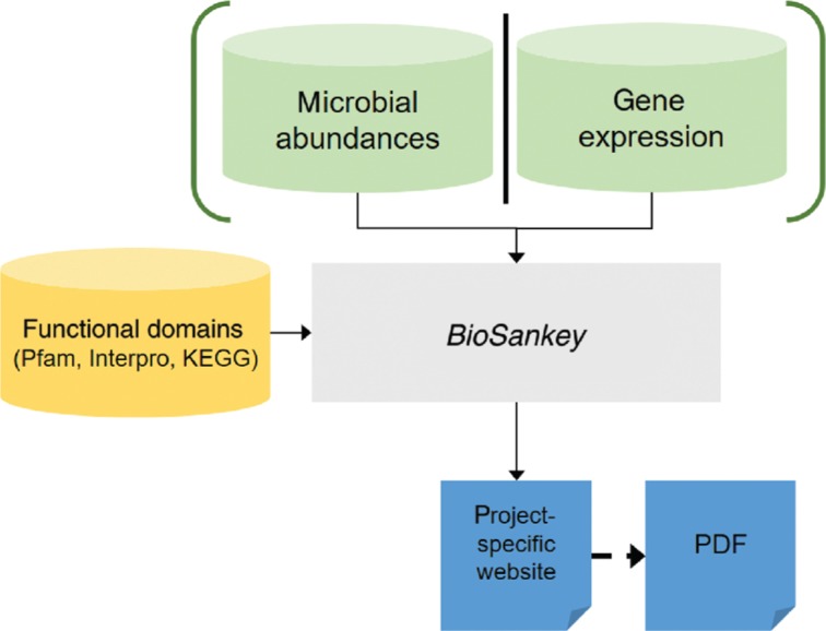
The absolute or relative abundance of an element type (e.g. normalized microbial species abundance or gene expression) is provided by the user as a comma separated file, where a row depicts the microbial species or gene and the second column contains the description of the gene or operational taxonomic unit (OTUs) followed by the normalized read counts per condition or optionally, the expression when genes should be analyzed. These identifiers can be used to query the dataset in the website. Optionally, time series data of the fluctuation of up- and down-regulated DEGs can be provided by the user (e.g. first versus second time point), which we will describe in use case 4. The whole functionality of BioSankey is summarized in Figure 1, starting from the specification of the possible input files, the integration of the information into a web page and finally the generation of the web page. We have created a graphical user interface (GUI) to guide the user throughout the configuration process and to automatically execute the python script for generating the project-specific web page. The python scripts are implemented under version 3.6 and require no additional packages and should work both on Linux and Windows.
Figure 1:
The workflow of the tool BioSankey: the green items on top, “microbial abundances” and “gene expression”, are alternative inputs, the yellow item on the left is optional information and the blue sheets at the bottom are the output, where the dashed arrow to “PDF” is an optional step.
2.2. Visualization of Elements in the HTML Site
The user can select different numbers of genes to be shown by the filter criteria. All genes are highlighted as Sankey diagrams, whereas if more than the defined amount of genes are searched, genes must be selected from a selection box. The search panel contains three visualization modes: In the “METAGENOME” mode, microbial communities are visualized from the highest taxonomic unit to the lowest taxonomic unit, a feature which is inspired by tools such as Krona and MEGAN to allow to analyze the abundances of each bacterium and to visualize the abundance over time. In addition, if the data is provided, a user can select “DEG categories”, where an overview of transitions of up- and down-regulated genes between consecutive time points is given, whereas in the mode “GENES” all genes are visualized and can be selected.
3. Results and Discussion
3.1. General use of BioSankey
BioSankey can visualize input data from two different data sources: (i) microbial data and (ii) gene expression data. In general, the tool can be used for any other dataset that contains quantitative data from different time points. When integrated into BioSankey, it is possible to infer the fluctuations in abundances in microbial species originating from metagenome projects. These different input data can be then used for generating a project-specific website by making use of JavaScript and the Google API to enable an intuitive and interactive selection and visualizations of all data elements. Furthermore, filter criteria are enabled by functional descriptions when genes instead of microbial species were integrated. The whole webpage can be exchanged with collaboration partners because no web server or database is required. Figure 1 provides the workflow of the tool where either the gene expression or microbial abundance can be integrated. When the webpage is generated, we offer an export function for the tool to generate Sankey diagrams in the PDF format.
3.2. Comparability to Other Tools
We have compared BioSankey to other tools, which allow to visualize the abundances of species or taxa, such as Krona [1] and iTOL [3]. An overview of the functionality that BioSankey provides in comparison to the two other tools is given in Table 1. While BioSankey allows to visualize taxonomical and time-series data, Krona and iTOL do not allow to visualize time-series data but offer a broad range of export functionalities. The advantage of BioSankey is to visualize the expression of single genes or selected species, which is so far not supported in the other tools.
Table 1:
Comparison of the three tools BioSankey, Krona and iTOL.
| Feature | BioSankey | Krona charts | iTOL |
|---|---|---|---|
| Taxonomical visualization | Yes | Yes | Yes |
| Time series data visualization | Yes | No | No |
| Various export possibilities | No | Yes | Yes |
| Highlighting of selected genes (e.g. DEGs) | No | Yes | Yes |
| Search function to find genes/taxa of interest | Yes | No | Yes |
3.3. Microbial Community Analysis
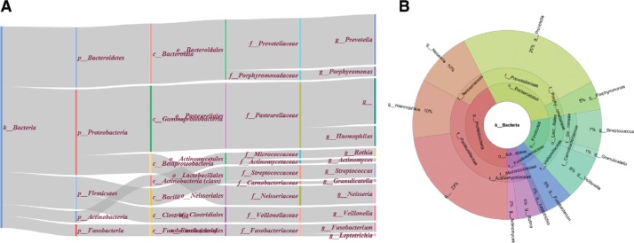
When metagenomic studies are considered, reads are often assembled with tools such as SSpace [26] and then enter a binning approach with help of tools such as Maxbin [27] or Concoct [28], which group contigs into Bins based on their tetranucleotide frequencies and additional intrinsic features. As an alternative, more often, the sequencing of the 16S rRNA gene is used to assess the abundance of the species in a metagenomics dataset. Thereby, sequences are clustered based on 97% sequence identity to form OTUs, which can be analyzed with resources such as the SILVA server [29] after being processed with Mothur [30] and QIIME [31]. To demonstrate BioSankey for analyzing microbial communities, we have used data generated with QIIME from [32], comprising time-series of microbial communities from different human tissues. The goal of this study was to get insights about variability in these tissues and to define potential core microbiomes. The authors of this paper use line- and pie-charts, scatter-plots, principal component analysis (PCA) and area charts, the latter two especially for showing time variation. PCAs over time were visualized in a video. In addition to this extensive collection of visualization, we added two alternative visualization options. First, we selected the tongue tissue and extracted all information on genus level and used BioSankey to generate a project-specific HTML site. Out of 373 genera, 250 of them had support by at least one read and were used for BioSankey. This is shown in Figure 2A. In comparison, we made also a Krona plot for the same data (Figure 2B). With the Sankey diagrams however, we can also visualize the changes of the microbiome over time in one diagram, while Krona plots have the advantage, that broader or very detailed taxonomic hierarchies can be depicted.
Figure 2:
Illustration of the taxonomic distribution of the most abundant genera from the tongue tissue as described in Caporaso et al. [32]. On the left side (subfigure A) is the diagram generated by BioSankey, on the right side (subfigure B) is the diagram generated by the tool Krona (Ondov et al. [1]. The information in both diagrams is the same, the difference – except style, is that the Sankey diagram is read left to right from general to more specific (= to lower taxonomic ranks) and the Krona diagram from inside to outside.
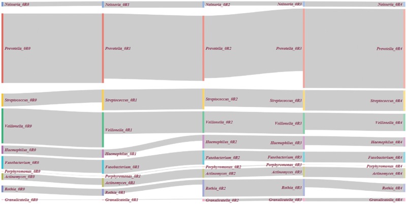
Further, we used the first six time points on genus level of the tongue microbial inhabitants for BioSankey (Figure 3). This is a partly replacement of the figure on genus level in Additional File 10 in the paper of Caporaso et al. [32]. The Sankey plot visualization contains more information (the labeling) and is more appealing to the reader, with the drawback of being infeasible to show all 396 time points at once. In this case, the BioSankey plots might be the right choice to zoom in or show a selection of up to 20 time-points or higher, depending on the used computer screen or resolution.
Figure 3:
Illustration of four timepoints from the microbial community of the tongue as described in Caporaso et al. [32]. The taxonomy level is genus. The largest absolute genera and the biggest absolute and relative changes over time are visible: Prevotella as largest genus and Rothia, and Granulicatella with large changes (large bars, with small lines from left to right, e.g. “Rothia_2” and “Rothia_3”).
3.4. Differential Gene Expression Visualizations Embedded into BioSankey
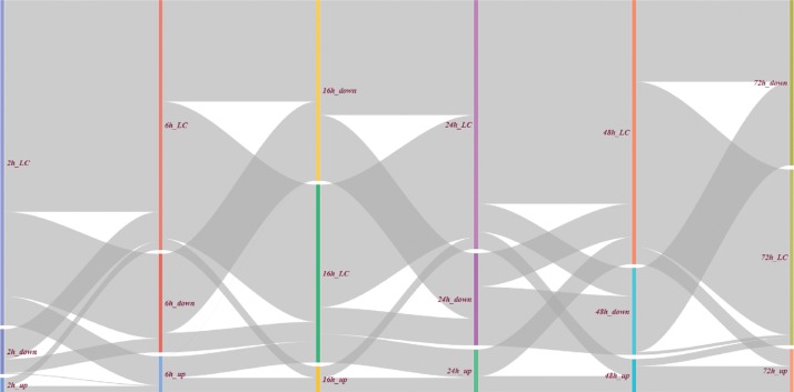
To demonstrate BioSankey, we used published gene expression time-series data to describe the effects of Camptothecin in U87-MG cell lines by integrating up- and down-regulated genes over time [33]. Camptothecin is a drug, that specifically targets topoisomerase I. In this study, the authors showed the effects of Camptothecin to two glioblastoma cell lines (U87-MG and DBTRG-05). This is important to assess the use of this drug for malignant gliomas. With the gene expression in hand the authors could infer the affected pathways and assess the changes over time by considering expression data of six time points (2, 6, 16, 24, 48 and 72 h). By using BioSankey, we show, that Sankey plots can be used to visualize the reported ∼80% of down-regulated genes in U87-MG even in a time-resolved manner (Figure 4).
Figure 4:
Groups of differentially expressed genes between pairs of consecutive timepoints. The number of genes is the same for each timepoint. Genes, which are differentially expressed in only one time point are prefixed with “_LC” in all others (LC; low-change). This example is the response of U87-MG cell lines to Camptothecin which shows, that the effect is highest after 16 h and 72 h (the smallest amount of LC), the biggest change in the series is also from/to 16 h and 72 h and there are virtually no genes changing between up- and down-regulated (only the little line from “2 h_up” and “6 h_down”).
As a general overview of (mode: “DEG”) we provide a feature in BioSankey to highlight the amount of differential expressed genes as shown in Figure 4. The genes at each time point are filtered for up- and down-regulated expression (in the example a minimal fold-change of 2). In Figure 4, all transitions of genes between these states (up-, down- or low-regulated) are shown in each time point.
For a detailed analysis, the genes of a transition (e.g. all genes up-regulated at 2 h and at 6 h) can be selected and visualized separately. To obtain an overview visualization, a user must provide lists of DEG for each time point in a directory. From the visualization we can observe, that only a certain fraction of the genes (64 of 408) is up-regulated already at the first hours and only 41 of them are differentially expressed at the later time points. Furthermore, a user can select a time-point of genes that are up-, down- or not differentially expressed and can then extract the respective genes and visualize their expression to find a candidate gene or to obtain a general overview of the functionality of these genes.
4. Conclusion
We have established BioSankey as a tool, which offers an alternative way to analyze gene expression and the abundances of metagenomics datasets over time by using interactive Sankey diagrams, functional enrichment analysis and overview panels without the requirement of web servers and databases. We demonstrate the possibilities to interactively view the data for an efficient analysis. Biosankey is a valuable tool to get insights and understand the complexity of different datasets, from a high-level view of gene numbers to the genes, and in case of metagenomics, from a high taxonomic level down to strain level. This tool is important for researchers, who want to analyze the taxonomic composition of bacterial species in metagenomes by e.g. also selecting broader taxonomic categories. As an additional feature of the tool data exchange with collaborations is easily accomplished. For the dual RNA-seq experiment, BioSankey might be especially powerful when hosts and microbes are compared to each other or to efficiently detect interesting candidate genes. Therefore, we have integrated various criteria, which are based on domain functionalities or gene description information.
5. Material Availability
The software is available at the Github repository https://github.com/nthomasCUBE/BioSankey.
Contributor Information
Alexander Platzer, Email: alexander.platzer@univie.ac.at.
Thomas Nussbaumer, Email: thomas.nussbaumer@univie.ac.at.
Conflict of interest statement
Authors state no conflict of interest. All authors have read the journal’s publication ethics and publication malpractice statement available at the journal’s website and hereby confirm that they comply with all its parts applicable to the present scientific work.
References
- [1].Ondov BD, Bergman NH, Phillippy AM. Interactive metagenomic visualization in a Web browser. BMC Bioinformatics. 2011;12:385. doi: 10.1186/1471-2105-12-385. [DOI] [PMC free article] [PubMed] [Google Scholar]
- [2].Huson DH, Auch AF, Qi J, Schuster SC. MEGAN analysis of metagenomic data. Genome Res. 2007;17:377–86. doi: 10.1101/gr.5969107. [DOI] [PMC free article] [PubMed] [Google Scholar]
- [3].Letunic I, Bork P. Interactive tree of life (iTOL) v3: an online tool for the display and annotation of phylogenetic and other trees. Nucleic Acids Res. 2016;44:W242–5. doi: 10.1093/nar/gkw290. [DOI] [PMC free article] [PubMed] [Google Scholar]
- [4].Huse SM, Mark Welch DB, Voorhis A, Shipunova A, Morrison HG, Eren AM. et al. VAMPS: a website for visualization and analysis of microbial population structures. BMC Bioinformatics. 2014;15:41. doi: 10.1186/1471-2105-15-41. [DOI] [PMC free article] [PubMed] [Google Scholar]
- [5].Robinson JT, Thorvaldsdóttir H, Winckler W, Guttman M, Lander ES, Getz G. et al. Integrative genomics viewer. Nat Biotechnol. 2011;29:24–6. doi: 10.1038/nbt.1754. [DOI] [PMC free article] [PubMed] [Google Scholar]
- [6].Krzywinski M, Schein J, Birol I, Connors J, Gascoyne R, Horsman D. et al. Circos: an information aesthetic for comparative genomics. Genome Res. 2009;19:1639–45. doi: 10.1101/gr.092759.109. [DOI] [PMC free article] [PubMed] [Google Scholar]
- [7].Milne I, Bayer M, Stephen G, Cardle L, Marshall D. Tablet: visualizing next-generation sequence assemblies and mappings. Methods Mol Biol. 2016;1374:253–68. doi: 10.1007/978-1-4939-3167-5_14. [DOI] [PubMed] [Google Scholar]
- [8].Burch M, Kull A, Weiskopf D. AOI rivers for visualizing dynamic eye gaze frequencies. Computer Graphics Forum. 2013;32:281–90. [Google Scholar]
- [9].Huang C-W, Lu R, Iqbal U, Lin SH, Nguyen PA, Yang HC. et al. A richly interactive exploratory data analysis and visualization tool using electronic medical records. BMC Med Inform Decis Mak. 2015;15:92. doi: 10.1186/s12911-015-0218-7. [DOI] [PMC free article] [PubMed] [Google Scholar]
- [10].Chen S, Chen B. Coupling of carbon and energy flows in cities: a meta-analysis and nexus modelling. Appl Energy. 2017;194:774–83. [Google Scholar]
- [11].Dietmair A, Verl A. A generic energy consumption model for decision making and energy efficiency optimisation in manufacturing. Int J Sustain Eng. 2009;2:123–33. [Google Scholar]
- [12].Fieldhouse EA, Prosser C. When attitudes and behaviour collide: how the Scottish independence referendum cost labour. SSRN Electronic J. 2016 https://papers.ssrn.com/sol3/papers.cfm?abstract_id=2770996. [Google Scholar]
- [13].Mulder NJ, Apweiler R, Attwood TK, Bairoch A, Bateman A, Binns D. et al. InterPro: an integrated documentation resource for protein families, domains and functional sites. Brief Bioinform. 2002;3:225–35. doi: 10.1093/bib/3.3.225. [DOI] [PubMed] [Google Scholar]
- [14].Ashburner M, Ball CA, Blake JA, Botstein D, Butler H, Cherry JM. et al. Gene ontology: tool for the unification of biology. The Gene Ontology Consortium. Nat Genet. 2000;25:25–9. doi: 10.1038/75556. [DOI] [PMC free article] [PubMed] [Google Scholar]
- [15].Tatusov RL, Galperin MY, Natale DA, Koonin EV. The COG database: a tool for genome-scale analysis of protein functions and evolution. Nucleic Acids Res. 2000;28:33–6. doi: 10.1093/nar/28.1.33. [DOI] [PMC free article] [PubMed] [Google Scholar]
- [16].Finn RD, Bateman A, Clements J, Coggill P, Eberhardt RY, Eddy SR. et al. Pfam: the protein families database. Nucleic Acids Res. 2014;42:D222–30. doi: 10.1093/nar/gkt1223. [DOI] [PMC free article] [PubMed] [Google Scholar]
- [17].Kanehisa M, Goto S. KEGG: kyoto encyclopedia of genes and genomes. Nucleic Acids Res. 2000;28:27–30. doi: 10.1093/nar/28.1.27. [DOI] [PMC free article] [PubMed] [Google Scholar]
- [18].Icay K. Director: A dynamic visualization tool of multi-level data. R package version 1.4.0. 2017. [Google Scholar]
- [19].Christopher Gandrud JA, Russell K, Yetman CJ. networkD3: D3 JavaScript Network Graphs from R. 2018.
- [20].Bojanowski M. Creating Alluvial Diagrams.
- [21].Weiner J. riverplot: Sankey or Ribbon Plots. 2017 [Google Scholar]
- [22].Hunter JD. Matplotlib: a 2D graphics environment. Comput Sci Eng. 2007;9:90–5. [Google Scholar]
- [23].Sievert C, Parmer C, Hocking T, Chamberlain S, Ram K, Corvellec M, plotly: create interactive web graphics via ‘plotly. js’. R package version. 2016. 3. [Google Scholar]
- [24].Mauri M, Elli T, Mauri M, Uboldi G, Azzi M. RAWGraphs: a visualisation platform to create open outputs; Proceedings of the 12th Biannual Conference on Italian SIGCHI Chapter; ACM; 2017. [Google Scholar]
- [25].Bogart S. SankeyMATIC. 2018 [Google Scholar]
- [26].Boetzer M, Henkel CV, Jansen HJ, Butler D, Pirovano W. Scaffolding pre-assembled contigs using SSPACE. Bioinformatics. 2011;27:578–9. doi: 10.1093/bioinformatics/btq683. [DOI] [PubMed] [Google Scholar]
- [27].Wu YW, Simmons BA, Singer SW. MaxBin 2.0: an automated binning algorithm to recover genomes from multiple metagenomic datasets. Bioinformatics. 2016;32:605–7. doi: 10.1093/bioinformatics/btv638. [DOI] [PubMed] [Google Scholar]
- [28].Alneberg J, Bjarnason BS, de Bruijn I, Schirmer M, Quick J, Ijaz UZ. et al. Binning metagenomic contigs by coverage and composition. Nat Methods. 2014;11:1144–6. doi: 10.1038/nmeth.3103. [DOI] [PubMed] [Google Scholar]
- [29].Quast C, Pruesse E, Yilmaz P, Gerken J, Schweer T, Yarza P. et al. The SILVA ribosomal RNA gene database project: improved data processing and web-based tools. Nucleic Acids Res. 2013;41:D590–6. doi: 10.1093/nar/gks1219. [DOI] [PMC free article] [PubMed] [Google Scholar]
- [30].Schloss PD, Westcott SL, Ryabin T, Hall JR, Hartmann M, Hollister EB. et al. Introducing mothur: open-source, platform-independent, community-supported software for describing and comparing microbial communities. Appl Environ Microbiol. 2009;75:7537–41. doi: 10.1128/AEM.01541-09. [DOI] [PMC free article] [PubMed] [Google Scholar]
- [31].Caporaso JG, Kuczynski J, Stombaugh J, Bittinger K, Bushman FD, Costello EK. et al. QIIME allows analysis of high-throughput community sequencing data. Nat Methods. 2010;7:335–6. doi: 10.1038/nmeth.f.303. [DOI] [PMC free article] [PubMed] [Google Scholar]
- [32].Caporaso JG, Lauber CL, Costello EK, Berg-Lyons D, Gonzalez A, Stombaugh J. et al. Moving pictures of the human microbiome. Genome Biol. 2011;12:R50. doi: 10.1186/gb-2011-12-5-r50. [DOI] [PMC free article] [PubMed] [Google Scholar]
- [33].Morandi E, Severini C, Quercioli D, D’Ario G, Perdichizzi S, Capri M. et al. Gene expression time-series analysis of camptothecin effects in U87-MG and DBTRG-05 glioblastoma cell lines. Mol Cancer. 2008;7:66. doi: 10.1186/1476-4598-7-66. [DOI] [PMC free article] [PubMed] [Google Scholar]


