

Abstract
The U.S. labor force participation rate has declined since 2007, primarily because of population aging and ongoing trends that preceded the Great Recession. The labor force participation rate has evolved differently, and for different reasons, across demographic groups. A rise in school enrollment has largely offset declining labor force participation for young workers since the 1990s. Labor force participation has been declining for prime age men for decades, and about half of prime age men who are not in the labor force may have a serious health condition that is a barrier to working. Nearly half of prime age men who are not in the labor force take pain medication on any given day; and in nearly two-thirds of these cases, they take prescription pain medication. Labor force participation has fallen more in U.S. counties where relatively more opioid pain medication is prescribed, causing the problem of depressed labor force participation and the opioid crisis to become intertwined. The labor force participation rate has stopped rising for cohorts of women born after 1960. Prime age men who are out of the labor force report that they experience notably low levels of emotional well-being throughout their days, and that they derive relatively little meaning from their daily activities. Employed women and women not in the labor force, by contrast, report similar levels of subjective well-being; but women not in the labor force who cite a reason other than “home responsibilities” as their main reason report notably low levels of emotional well-being. During the past decade, retirements have increased by about the same amount as aggregate labor force participation has
The labor force participation rate in the United States peaked at 67.3 percent in early 2000, and has declined at a more or less continuous pace since then, reaching a near 40-year low of 62.4 percent in September 2015 (figure 1). Italy was the only other country in the Organization for Economic Cooperation and Development that had a lower labor force participation rate for prime age men than the United States in 2016. Although the labor force participation rate has stabilized since the end of 2015, evidence on labor market flows—in particular, the continued decline in the rate of transition for those who are out of the labor force back into the labor force—suggests that this is likely to be a short-lived phenomenon. This paper examines secular trends in labor force participation, with a particular focus on the role of pain and pain medication in the lives of prime age men who are not in the labor force (NLF) and prime age women who are NLF and who do not cite “home responsibilities” as the main reason for not working, because these groups express the greatest degree of distress and dissatisfaction with their lives.
Figure 1.

The U.S. Labor Force Participation Rate, 1948–2017a
Sources: U.S. Bureau of Labor Statistics; National Bureau of Economic Research; author’s calculations.
a. Shading denotes recessions. The data are seasonally adjusted.
b. Data for 1990 to 2016 have been adjusted to account for the effects of the annual population control adjustments to the Current Population Survey.
The paper is organized as follows. The next section summarizes evidence on trends in labor force participation overall and for various demographic groups. The main finding of this analysis is that shifting demographic shares, mainly an increase in older workers, and trends that preceded the Great Recession (for example, a secular decline in the labor force participation of prime age men) can account for the lion’s share of the decline in the labor force participation rate since the last business cycle peak.
Because most of the movement in the labor force participation rate in the last decade reflects secular trends and shifting population shares, section II examines trends in the participation rate separately for young workers, prime age men, and women, as well as the retirement rate. The role of physical and mental health limitations, which could pose a barrier to employment for about half of prime age, NLF men, is highlighted and explored. Survey evidence indicates that almost half of prime age, NLF men take pain medication on any given day, and that as a group prime age men who are out of the labor force spend over half their time feeling some pain. A follow-up survey finds that 40 percent of prime age, NLF men report that pain prevents them from working at a full-time job for which they are qualified, and that nearly two-thirds of the men who take pain medication report taking prescription medication. It is also shown that generational increases in labor force participation that have historically raised women’s labor force participation over time have come to an end, so the United States can no longer count on succeeding cohorts of women to participate in the labor market at higher levels than the cohorts they are succeeding. This section also documents that an increase in the retirement rate since 2007 accounts for virtually all the decline in labor force participation since then, suggesting the persistence of labor force exits.
Section III presents evidence on the subjective well-being of employed workers, unemployed workers, and those who are out of the labor force, by demographic group. Two measures of subjective well-being are used: an evaluative measure of life in general, and a measure of reported emotional experience throughout the day. Young labor force nonparticipants seem remarkably content with their lives, and report relatively high levels of affect during their daily routines. Prime age, NLF men, however, report less happiness and more sadness during their days than do unemployed men, although they evaluate their lives in general more highly than unemployed men. Prime age and older NLF women report emotional well-being and life evaluations in general that are about on par with employed women of the same age, suggesting a degree of contentment that may make it unlikely that many in this group rejoin the labor force.
Given the high use of pain medication by prime age, NLF men and women, and the mushrooming opioid crisis in the United States since the early 2000s, section IV provides an analysis of the connection between the use of pain medication, opioid prescription rates, and labor force participation. Evidence is first presented indicating that pain medication is more widely used in areas where health care professionals prescribe more opioid medication, holding constant individuals’ disability status, self-reported health, and demographic characteristics. Next, regression analysis finds that labor force participation fell more in counties where more opioids were prescribed, controlling for the area’s share of manufacturing employment and individual characteristics. Although it is unclear whether these correlations represent causal effects, these findings reinforce concerns from anecdotal evidence. For example, in his memoir Hillbilly Elegy, J. D. Vance (2016, p. 18) writes about a recent visit with his second cousin, Rick, in Jackson, Kentucky: “We talked about how things had changed. ‘Drugs have come in,’ Rick told me. ‘And nobody’s interested in holding down a job.’” And the findings complement Anne Case and Angus Deaton’s (2017, p. 438) conclusion that “deaths of despair” for non-Hispanic whites “move in tandem with other social dysfunctions, including the decline of marriage, social isolation, and detachment from the labor force.”
The conclusion highlights the role of physical, mental, and emotional health challenges as a barrier to working for many prime age men and women who are out of the labor force. Because—apart from the unemployed—this group exhibits the lowest level of emotional well-being and life evaluation, there are potentially large gains to be had by identifying and implementing successful interventions to help prime age, NLF men and women lead more productive and fulfilling lives.
I. Trends in Participation
Figure 1 shows the seasonally adjusted labor force participation rate as published by the U.S. Bureau of Labor Statistics (BLS). In addition, the figure shows alternative estimates of the participation rate using labor force and population data that were smoothed to adjust for the introduction of the 2000 and 2010 decennial U.S. Census population controls in the Current Population Survey (CPS) in 2003 and 2012, respectively, and intercensal population adjustments introduced in January of each year.1 These population adjustments undoubtedly occurred more gradually over preceding months and years. Compared with the published series, the adjusted series indicates that the labor force participation rate rose a bit less during the 1990s recovery, declined a bit more during the 2001–07 recovery, and has fallen a bit less during the current recovery; but overall the trends are similar. Henceforth, I focus on the adjusted labor force data.
The aggregate labor force participation rate series masks several disparate trends for subgroups. Figure 2 shows the participation rate separately for men age 25 and older, women age 25 and older, and young people age 16–24. The online appendix figures show participation rate trends further disaggregated by age and sex.2 As is well known, the participation rate for adult men has been on a downward trajectory since the BLS began collecting labor force data in 1948. This trend has been a bit steeper since the late 1990s, but the decline in participation of prime age men in the labor force is not a new development and was not sharper after the Great Recession than it was before it (see figures A4–A6 in the online appendix).3 Workers age 55 and older are the only age group that has shown a notable rise in participation over the last two decades, albeit from a low base for the 65 and older age group, and the long-running rise in participation for women age 55–64 seems to have come to an end since the Great Recession.
Figure 2.

Labor Force Participation Rates by Age and Gender, 1948–2017a
Sources: U.S. Bureau of Labor Statistics; National Bureau of Economic Research.
a. Shading denotes recessions. The data are seasonally adjusted.
The aggregate labor force participation rate rose in the half century following World War II because women increasingly joined the labor force.4 Beginning in the late 1990s, however, the labor force participation rate of women age 25 and over unexpectedly reached a decade-long plateau, and since 2007 women’s labor force participation has edged down, almost in parallel with men’s. The plateau and then decline in women’s labor force participation are responsible for the downward trajectory of the aggregate U.S. labor force participation rate. Although age, cohort, and time effects cannot be separately identified, I show below that this appears more consistent with cohort developments than time effects.
Finally, younger workers have exhibited episodic declines in labor force participation since the end of the 1970s. After falling sharply toward the end of the Great Recession, the labor force participation rate for younger individuals has stabilized since then. The labor force participation rate of young workers probably responds more to the state of the business cycle than that of older workers because school is an alternative to work for many young workers in the short run.
I.A. Decomposing the Decline in the Labor Force Participation Rate
At an annual frequency, the labor force participation rate reached a peak in 1997 (figure 3). From 1997 to the first half of 2017, the aggregate participation rate fell by 4.2 percentage points, with most of the decline (2.8 points) occurring after 2007.5 Several studies have found that shifting demographics, mainly toward an older population, are responsible for about half the decline in labor force participation.6
Figure 3.

Labor Force Participation Rate, 1948–2017a
Sources: U.S. Bureau of Labor Statistics; National Bureau of Economic Research; author’s calculations.
a. Shading denotes recessions. The data are not seasonally adjusted, annual averages. The 2017 data point is the average of data from January through June. Data for 1990 to 2016 have been adjusted to account for the effects of the annual population control adjustments to the Current Population Survey.
To see the effects of shifting demographics, we can write the aggregate labor force participation rate in year t, denoted ℓt, as
| (1) |
where ℓit is the labor force participation rate for group i in year t, pit is the size of the population of group i in year t, and wit is the population share of group i in year t.
The change between year t − k and year t can be written as
| (2) |
or, a component due to the change in rates within groups (weighted by starting or ending period population shares), and a component due to changes in population shares (weighted by ending or starting period participation rates).
Table 1 reports the labor force participation rate and population shares for 16 age-by-sex groups.7 There are notable declines in the labor force participation rate for young workers, both male and female. The population shares have also shifted over time; the share of the population age 55 and over rose from 26.3 to 35.6 percent from 1997 to 2017, while the share for age 25–54 fell from 57.5 to 49.3 percent. The table’s bottom two rows report Σℓitwit, where the population weights are for either 1997 or 2017. In general, the population has shifted toward groups with lower labor force participation rates, and this accounts for well over half the decline in the labor force participation rate. Using the decompositions in equation 2, the shift in the population shares can account for 65 percent [= (65.6 − 62.8)/(67.1 − 62.8)] or 88 percent [= (67.1 − 63.3)/(67.1 − 62.8)] of the decline in labor force participation from 1997 to 2017, depending on whether 1997 or 2017 population shares are used to weight changes in each group’s participation rate. Clearly, the changing age distribution of the population has had a major influence on the labor force participation rate. However, the decline in the labor force participation rate of young workers, especially young men, is also quantitatively important. Regardless of which year’s population shares are used as weights, the decline in labor force participation of young men (age 16–24) from 1997 to 2017 accounts for almost one quarter of the decline in the overall labor force participation rate, or about triple their current share of the population.
Table 1.
Labor Force Participation Rates and Population Shares for Selected Demographic Groups, 1997–2017a
| Labor force participation rate (percent) | Population share (percent) | |||||
|---|---|---|---|---|---|---|
|
|
|
|||||
| Demographic group | 1997 | 2007 | 2017, first half | 1997 | 2007 | 2017, first half |
| Total | 67.1 | 65.6 | 62.8 | 100.0 | 100.0 | 100.0 |
| Men | ||||||
| Age 16–17 | 41.3 | 28.7 | 22.9 | 2.0 | 2.1 | 1.8 |
| Age 18–19 | 63.9 | 55.2 | 47.5 | 1.9 | 1.8 | 1.6 |
| Age 20–24 | 82.5 | 78.5 | 73.6 | 4.3 | 4.5 | 4.2 |
| Age 25–34 | 92.9 | 92.2 | 88.9 | 9.6 | 8.2 | 8.5 |
| Age 35–44 | 92.5 | 92.2 | 90.8 | 10.7 | 8.8 | 7.7 |
| Age 45–54 | 89.4 | 88.2 | 86.2 | 8.0 | 9.1 | 8.1 |
| Age 55–64 | 67.6 | 69.6 | 70.4 | 5.1 | 6.8 | 7.9 |
| Age 65 and over | 17.1 | 20.5 | 23.9 | 6.6 | 6.9 | 8.6 |
| Women | ||||||
| Age 16–17 | 41.0 | 30.7 | 24.8 | 1.9 | 2.0 | 1.8 |
| Age 18–19 | 61.2 | 53.7 | 47.5 | 1.8 | 1.7 | 1.5 |
| Age 20–24 | 72.6 | 70.0 | 68.2 | 4.3 | 4.4 | 4.2 |
| Age 25–34 | 76.0 | 74.4 | 75.3 | 9.9 | 8.5 | 8.7 |
| Age 35–44 | 77.7 | 75.5 | 74.8 | 10.9 | 9.2 | 8.0 |
| Age 45–54 | 76.0 | 76.0 | 74.4 | 8.4 | 9.6 | 8.4 |
| Age 55–64 | 50.9 | 58.3 | 58.9 | 5.5 | 7.4 | 8.5 |
| Age 65 and over | 8.6 | 12.6 | 15.8 | 9.1 | 9.1 | 10.7 |
| Aggregate of demographic groups | ||||||
| Σiℓi,t×wi,1997 | 67.1 | 66.5 | 65.6 | |||
| Σiℓi,t×wi,2017 | 63.3 | 63.4 | 62.8 | |||
Sources: U.S. Bureau of Labor Statistics; author’s calculations.
Data are not seasonally adjusted, annual averages. The 2017 data are averages of data from January through June. Data for 1990 to 2016 have been adjusted to account for the effects of the annual population control adjustments to the Current Population Survey.
A limitation of these decompositions is that there is no counterfactual comparison and no other factors are considered, apart from demographics. Furthermore, changing population shares could affect the labor force participation of different groups. These calculations are just accounting identities that highlight the potential magnitudes of various shifts in population groups.
I.B. Continuation of Past Trends?
As mentioned above, the decline in the labor force participation rate was faster in the last decade than in the preceding one. I next examine the extent to which the decline of 2.8 percentage points in the labor force participation rate since the start of the Great Recession represents a continuation of past trends that were already in motion, combined with shifts in population shares, or is a new development. Specifically, for each of the 16 groups listed in table 1, I estimated a linear trend from 1997 to 2006 by ordinary least squares.8 This 10-year period was chosen because it encompasses the pre–Great Recession downward trend in labor force participation.9 I then extrapolate from the past decade’s trend over the next decade. To the extent that secular trends were affecting participation trends for various groups before the Great Recession (for example, education rising for some groups, and in turn affecting the trend in the labor force participation rate), this approach would reflect those developments. The online appendix figures show the trends for each subgroup, where the intercept has been adjusted so the fitted line matches the actual labor force participation rate in 1997.
The group with the biggest negative forecast residual compared with the previous decade’s trend is women age 55–64, who were predicted to experience a rise of 9 percentage points in their participation rate but actually experienced little change from 2007 to 2017 (see table 1 and online appendix figure A15). In general, there was a form of mean reversion, with the groups with the sharpest downward (or upward) trends from 1997 to 2006 experiencing more moderate downward (or upward) trends in the ensuing decade.
The dashed line in figure 3 aggregates across the group-specific trends using fixed 1997 population shares for each year. The dotted line uses the actual population shares for each year to weight the group’s predicted labor force participation rate to derive an aggregate rate.10 The difference between the dashed and the dotted lines highlights the importance of shifting population shares. The labor force participation rate was almost 1 percentage point below its predicted level in 2015, which is probably a cyclical effect of the Great Recession; but this gap closed by 2017.
Figure 3 makes clear that the lion’s share of the decline in labor force participation since the start of the Great Recession is consistent with a continuation of past trends and shifting population shares. Extrapolating from the 1997–2006 trends for each group, and weighting by 1997 population shares, leads to a forecast that the labor force participation rate would have fallen by about 1 percentage point from 2007 to 2017 as a result of pre-existing trends, or about 40 percent of the actual decline. Shifting population demographics can account for almost all the remaining gap.
I.C. How Much of a Cyclical Recovery Should Be Expected?
A key question for economic policymakers is the extent to which labor force participation can recover from its two-decades-long decline. As emphasized so far, most of the decline in the participation rate since 2007 is the (anticipated) result of an aging population and group-specific participation trends that were in motion before the Great Recession.11 These trends could strengthen or reverse, but an aging workforce is likely to put downward pressure on labor force participation for the next two decades. To the extent that there was a cyclical negative shock to participation, however, one might expect some recovery in the near term.
The rise of 0.6 percentage point in the (seasonally adjusted) labor force participation rate from September 2015 to March 2016 gave some hope that a cyclical recovery might be taking place. However, three considerations suggest that there will be only a limited and short-lived cyclical recovery in labor force participation. First, John Fernald and others (2017) find that by 2016, the cyclical component of the fall in labor force participation had essentially dissipated, regardless of the lag structure. Second, the seasonally adjusted labor force participation rate has displayed no trend since March 2016, suggesting that the cyclical recovery may already be over, consistent with Fernald and others’ (2017) conclusion.
Third, the likelihood of transitioning into the labor force from out of the labor force edged down throughout the recovery, including in late 2015 and early 2016, when the labor force participation rate retracted 0.6 percentage point. Moreover, historically, there has been no tendency for the rate of transitions from out of the labor force into the labor force to behave cyclically (Krueger, Cramer, and Cho 2014).
Given the preexisting downward trend in labor force participation for most demographic groups and the aging of the U.S. population, stabilization in the labor force participation rate for a time may represent the best one could expect for a cyclical recovery. If a cyclical recovery in labor force participation is unlikely, then a reversal of secular trends toward a declining labor force is the only way to achieve an increase in labor force participation. The next section focuses on secular trends toward non-participation for key demographic groups.
II. Secular Trends for Specific Groups
Given that most of the changes in the the labor force participation rate in the last decade reflect secular trends and shifting population shares, in this section I examine trends in participation for various demographic groups.
II.A. Young Workers
Young people have exhibited the largest decline in labor force participation in the past two decades. To a considerable extent, however, this has been offset by their increased school enrollment. Figure 4 displays trends in the nonparticipation rate separately for young men and women age 16–24 from 1985 to 2016. The share of young workers who were neither employed nor looking for a job increased significantly from 1994 to 2016. In 1994, 29.7 percent of young men were not participating in the labor force, and in 2016 this share was 43.0 percent.
Figure 4.

Labor Force Nonparticipation and Idle Rates by Gender for Age 16–24, 1985–2016a
Sources: U.S. Bureau of Labor Statistics; National Bureau of Economic Research. a. Shading denotes recessions. The data are not seasonally adjusted, annual averages. “Idle” refers to persons who are neither enrolled in school nor participating in the labor force.
Nonparticipation in the labor force also rose for young women. However, if we remove individuals who were enrolled in school in the survey reference week, the story is quite different. The bottom two lines of figure 4 show the percentage of men and women in this age group who were idle, defined as neither enrolled in school nor participating in the labor force. Young men still display an upward trend, but the share who were idle only rose from 7.4 to 9.9 percent from 1994 to 2016, while the trend for women is downward (from 15.9 to 12.7 percent over the same period).
A rise in school enrollment has therefore helped to offset much of the decline in participation. Given the significant increase in the monetary return to education that began in the early 1980s, this development could be viewed as a delayed and overdue reaction to economic incentives.
WORKING AGE YOUNG MEN
Mark Aguiar and others (2017) highlight the rise in nonwork and nonschool time by young men age 21–30, especially those with less than a college education. The share of non–college educated young men who did not work at all over the entire year rose from 10 percent in 1994 to more than 20 percent in 2015. Aguiar and others (2017) propose the intriguing hypothesis that the improvement in video game technology raised the utility from leisure for young men, contributing to a downward shift in labor supply and a more elastic response to wages.12 Although Aguiar and others (2017) are clear to point out that demand-side factors may also have contributed to the decline in the work hours of young men, and that their estimates of the shift in the labor supply curve due to changes in leisure technology for video and computer games only account for 20 to 45 percent of the observed decline in market work hours of less educated young men, their hypothesis has generated keen interest. Here I briefly examine their video game hypothesis by comparing the self-reported emotional experience during video game playing, television watching, and all activities, as well as more standard labor force, school enrollment, and time use data.
Preliminarily, the CPS data indicate that from October 1994 to October 2014, the labor force participation rate of men age 21–30 fell by 7.6 percentage points, from 89.9 to 82.3 percent, and this decline was partially offset by an increase in school enrollment. Idleness—defined as not being enrolled in school, employed, or looking for work—rose by 3.5 percentage points over this period.
Table 2 reports the amount of time that men age 21–30 spent engaged in various activities per week in 2004–07, 2008–11, and 2012–15.13 Market work hours declined by 3.3 hours per week (9 percent) from 2004–07 to 2012–15. Increases in time devoted to education (1.4 hours), playing games (1.7 hours), and computers (0.6 hour) over this period more than offset the decline in the time spent working. If we limit the sample to young, NLF men (not shown), the time spent on education increased by an impressive 5.9 hours, or 40 percent. The time devoted to education activities edged up 0.2 hour per week for young, NLF men with a high school education or less; but conditioning on low education would downwardly bias any increase in school enrollment in this age group over time. The time spent playing video games by young, NLF men rose from 3.6 hours per week in 2004–07 to 6.7 hours per week in 2012–15, while the time spent watching television fell from 23.7 to 21.8 hours over this period. As Aguiar and others (2017) conclude, video game playing is clearly drawing more attention from this group over time.
Table 2.
The Average Number of Hours Spent per Week on Activities by Men Age 21–30, 2004–15a
| Activity | 2004–07 | 2008–11 | 2012–15 | Change from 2004–07 to 2012–15 |
|---|---|---|---|---|
| Sleeping | 60.84 | 60.76 | 61.64 | 0.80 |
| Work (including commuting) | 37.10 | 36.05 | 33.77 | −3.33 |
| Watching TV | 17.20 | 16.71 | 17.00 | −0.20 |
| Eating and drinking | 7.42 | 7.48 | 7.39 | −0.03 |
| Grooming | 3.91 | 4.07 | 4.06 | 0.14 |
| Socializing | 4.66 | 4.71 | 5.16 | 0.50 |
| Food and drink preparation | 1.33 | 1.69 | 1.94 | 0.61 |
| Cleaning | 1.22 | 1.32 | 1.08 | −0.13 |
| Reading | 0.85 | 0.74 | 0.95 | 0.10 |
| Shopping | 2.04 | 1.85 | 1.80 | −0.24 |
| Laundry | 0.40 | 0.45 | 0.56 | 0.16 |
| Relaxing or thinking | 1.44 | 1.38 | 1.51 | 0.07 |
| Gardening | 0.67 | 0.73 | 0.75 | 0.08 |
| Child care | 1.92 | 2.13 | 1.83 | −0.09 |
| Education | 3.35 | 3.80 | 4.74 | 1.39 |
| Adult care | 0.12 | 0.12 | 0.13 | 0.01 |
| Computer use | 1.25 | 1.56 | 1.86 | 0.60 |
| Playing games | 2.05 | 3.28 | 3.72 | 1.67 |
| No. of observations | 2,705 | 2,638 | 2,308 |
Source: U.S. Bureau of Labor Statistics, American Time Use Survey.
The data are weighted using final weights, and include respondents who reported no time spent on an activity.
The American Time Use Survey (ATUS) for 2010, 2012, and 2013 included a supplement on subjective well-being modeled on the Princeton Affect and Time Survey (Krueger and others 2009). Specifically, for three randomly selected episodes each day, respondents were asked to report—on a scale from 0 to 6, where a 0 means they did not experience the feeling at all and a 6 means the feeling was very strong—how happy, sad, tired, and stressed they felt at that time. In addition, they were asked how much pain, if any, they felt at that time, and how “meaningful” they considered what they were doing. Because television is a leisure activity that is probably a close substitute for video games, I explore the self-reported emotional experience during the time spent playing video games and watching TV, and during all activities for young men.
If video game technology did indeed improve sufficiently to make engaging in the activity more enjoyable, one would expect to see better emotional states (for example, a higher rating of happiness) during the time spent playing video games than during the time spent watching TV. Moreover, with three observations per person, it is possible to control for individual fixed effects and compare young men’s reported experiences as they engage in different activities throughout the day. Table 3 shows estimates of fixed effects regressions of the various affect measures on a dummy indicating the time spent playing games, watching television, and using a computer. The omitted group is all other activities. To increase the sample size, the sample consists of men age 16–35. The results show some evidence that episodes that involve game playing are associated with greater happiness, less sadness, and less fatigue than episodes of TV watching, although stress is higher during game playing. Game playing also appears to be a more pleasant experience than using the computer for this group. Game playing, however, is not reported as a particularly meaningful activity by participants; indeed, it is reported as less meaningful than other activities.
Table 3.
Regressions of Various Affect Measures on Activity Indicators for Men Age 16–35a
| Affect measure | ||||||
|---|---|---|---|---|---|---|
|
|
||||||
| Happiness (1) | Sadness (2) | Stress (3) | Tiredness (4) | Pain (5) | Meaning (6) | |
| Constant | 4.177*** | 0.512*** | 1.526*** | 2.277*** | 0.601*** | 4.226*** |
| (0.021) | (0.021) | (0.022) | (0.025) | (0.016) | (0.029) | |
| Gaming indicator | 0.549*** | −0.198** | −0.240** | −0.180 | −0.022 | −0.695*** |
| (0.109) | (0.086) | (0.119) | (0.209) | (0.047) | (0.256) | |
| TV indicator | 0.082 | −0.151* | −0.676*** | 0.507*** | −0.079 | −0.938*** |
| (0.072) | (0.092) | (0.090) | (0.088) | (0.056) | (0.095) | |
| Computer indicator | −0.323 | −0.004 | −0.342* | 0.090 | −0.352 | −0.947*** |
| (0.203) | (0.077) | (0.187) | (0.192) | (0.214) | (0.266) | |
| Person fixed effects | Yes | Yes | Yes | Yes | Yes | Yes |
| No. of observations | 12,603 | 12,618 | 12,621 | 12,618 | 12,621 | 12,594 |
| Test of equality of indicator variables | ||||||
| p value for gaming = TV | 0.000 | 0.662 | 0.002 | 0.002 | 0.340 | 0.343 |
| p value for gaming = computer | 0.000 | 0.081 | 0.633 | 0.323 | 0.113 | 0.468 |
Sources: U.S. Bureau of Labor Statistics, American Time Use Survey, Well-Being Module; author’s calculations.
The sample is pooled over 2010, 2012, and 2013 for men age 16–35. The regressions are weighted using the Well-Being Module’s adjusted pooled activity weights. Standard errors are in parentheses. Statistical significance is indicated at the ***1 percent, **5 percent, and *10 percent levels.
The ATUS also reveals that game playing is a social activity. For a little over half the time that young men play video games, they report that they were with someone while engaging in the activity, most commonly a friend. Furthermore, during 70 percent of the time that they were playing games, they report they were interacting with someone (presumably online when they were not present). As a whole, these findings suggest that it is possible that, as Aguiar and others (2017) argue, improvements in video games have increased the enjoyment young men derive from leisure in a consequential way.
II.B. Prime Age Men
Although the labor force participation rate of prime age men has trended down in the United States and other economically advanced countries for many decades, by international standards the labor force participation rate of prime age men in the United States is notably low. Because prime age men have the highest labor force participation rate of any demographic group, and have traditionally been the main breadwinners for their families, much attention has been devoted to the decline in participation of prime age men in the United States.14 Evidence given by Chinhui Juhn, Kevin Murphy, and Robert Topel (1991, 2002) and by Katharine Abraham and Melissa Kearney (2018) suggests that the secular decline in real wages of less skilled workers is a major contributor to the secular decline in their labor force participation rates. The Council of Economic Advisers (CEA 2016) reaches a similar conclusion, because the decline in labor force participation has been steeper for less educated prime age men. Figure 5 shows that the labor force participation rate of prime age men fell at all education levels, but by substantially more for those with a high school degree or less.
Figure 5.

The Labor Force Participation Rate for Men Age 25–54 by Educational Attainment, 1948–2017a
Sources: U.S. Bureau of Labor Statistics; National Bureau of Economic Research. a. Shading denotes recessions. The data are not seasonally adjusted, annual averages. The 2017 data point is the average of data from January through May.
Here I highlight a significant supply-side barrier to the employment prospects of prime age men, namely, health-related problems.15 Table 4 reports the distribution of men and women reporting their health as excellent, very good, good, fair, or poor, based on the 2010, 2012, and 2013 ATUS Well-Being Module (ATUS-WB).16 Forty-three percent of prime age, NLF men reported their health as fair or poor, compared with just 12 percent of employed men and 16 percent of unemployed men. NLF women are also more likely to report being in only fair or poor health compared with employed women, but the gap is smaller—31 versus 11 percent. Thus, health appears to be a more significant issue for prime age men’s participation in the labor force than for prime age women’s, so in this section I focus on documenting the nature, and probing the veracity, of their health-related problems. Although it is certainly possible that extended joblessness and despair induced by weak labor demand could have caused or exacerbated many of the physical, emotional, and mental health–related problems that currently afflict many prime age, NLF men, the evidence in this section nonetheless suggests that these problems are a substantial barrier to working that would need to be addressed to significantly reverse the downward trend in participation.
Table 4.
Self-Reported Health Status for Workers Age 25–54 by Labor Force Statusa
| Labor force status (percent) | |||
|---|---|---|---|
|
|
|||
| Health status | Employed | Unemployed | Not in the labor force |
| Men | |||
| Excellent | 20.0 | 19.5 | 12.3 |
| Very good | 36.3 | 29.2 | 20.6 |
| Good | 31.9 | 35.1 | 24.4 |
| Fair | 10.7 | 13.9 | 25.4 |
| Poor | 1.2 | 2.3 | 17.3 |
| No. of observations | 7,277 | 468 | 683 |
| Women | |||
| Excellent | 20.9 | 16.3 | 16.6 |
| Very good | 37.0 | 25.6 | 24.0 |
| Good | 30.9 | 36.3 | 28.0 |
| Fair | 10.0 | 18.1 | 19.3 |
| Poor | 1.1 | 3.7 | 12.1 |
| No. of observations | 7,453 | 637 | 2,265 |
Sources: U.S. Bureau of Labor Statistics, American Time Use Survey, Well-Being Module; author’s calculations.
The sample is pooled over 2010, 2012, and 2013 for individuals age 25–54. The data are weighted using the Well-Being Module’s final weights.
Beginning in 2008, the BLS has regularly included a series of six functional disability questions in the monthly CPS. For example, the survey asks, “Is anyone [in the household] blind or does anyone have serious difficulty seeing even when wearing glasses?”17 Pooling all the data from 2008 to 2016, the answers to these questions are reported in table 5, by labor force status for prime age men. At least one disability was reported for 34 percent of prime age, NLF men, and this figure rises to 42 percent for the subset of men age 40–54.18 Perhaps surprisingly, prime age, white men were more likely to report having at least one of the six conditions (35.8 percent) than were prime age, African American men (32.3 percent) or Hispanic men (29.3 percent). At least one disability condition was reported for 40 percent of nonparticipating prime age men with a high school education or less. The most commonly reported disabilities were “difficulty walking or climbing stairs” and “difficulty concentrating, remembering, or making decisions”; about half reported multiple disabilities. Only 2.6 percent of employed men and 6.0 percent of unemployed men in this age group reported a disability.
Table 5.
Disability Rates Conditional on Labor Force Status for Men Age 25–54, 2009–17a
| Labor force status (percent) | |||
|---|---|---|---|
|
|
|||
| Disability | Employed | Unemployed | Not in the labor force |
| Difficulty dressing or bathing | 0.2 | 0.4 | 7.4 |
| Deaf or difficulty hearing | 0.9 | 1.5 | 4.0 |
| Blind or difficulty seeing | 0.4 | 1.0 | 4.0 |
| Difficulty doing errands such as shopping | 0.3 | 0.9 | 14.9 |
| Difficulty walking or climbing stairs | 0.8 | 2.1 | 19.6 |
| Difficulty concentrating, remembering, or making decisions | 0.8 | 2.6 | 16.5 |
| Any disability | 2.6 | 6.0 | 33.7 |
| Multiple disabilities | 0.5 | 1.6 | 18.6 |
| No. of observations | 2,130,004 | 143,446 | 280,772 |
Source: U.S. Bureau of Labor Statistics, Current Population Survey.
The sample is pooled over January 2009 to May 2017 for men age 25–54. Specific disabilities are not mutually exclusive.
The top panel of figure 6 shows the probability of being out of the labor force conditional on having a disability each year from 2008 to 2017. The probability of being out of the labor force conditional on having a disability has trended up, which suggests that the improvement in the job market over this period is not drawing disabled individuals back to work. Pooling all the data together, the bottom panel of figure 6 shows the probability of being out of the labor force for each of the six conditions, for those who indicate having any of the six conditions, and for the subset with multiple conditions. Those who have difficulty dressing, running errands, walking, or concentrating have a much lower labor force participation rate than those who are blind or have difficulty seeing or hearing.
Figure 6.

Probability of Men Age 25–54 Not Being in the Labor Force, 2009–17
Sources: Current Population Survey; author’s calculations.
a. The 2017 data point is the average of data from January through May.
b. The bar heights are averages of data from January 2009 through May 2017.
PREVALENCE OF PAIN AND PAIN MEDICATION: ATUS AND CDC
For randomly selected episodes of the day, the ATUS-WB asked respondents, “From 0 to 6, where a 0 means you did not feel any pain at all and a 6 means you were in severe pain, how much pain did you feel during this time if any?” The first row of table 6 reports the average pain rating by labor force status (weighted by episode duration), and the second row reports the fraction of time respondents reported a pain rating above 0, indicating the presence of some pain. The results indicate that individuals who are out of the labor force report experiencing a greater prevalence and intensity of pain in their daily lives. As a group, workers who are out of the labor force report feeling pain during about half their time. And for those who report a disability, the prevalence and intensity of pain are higher—disabled prime age men who are out of the labor force report spending 70 percent of their time in some pain, and an average pain rating of 3.0 throughout the survey day.
Table 6.
Prevalence of Pain and Pain Medication Use for Men Age 25–54 by Labor Force Statusa
| Labor force status | |||
|---|---|---|---|
|
|
|||
| Measure of pain | Employed | Unemployed | Not in the labor force |
| All men age 25–54 | |||
| Average pain rating from 0 to 6 | 0.75 | 0.87 | 1.96 |
| Percentage of time spent with pain | 29.8 | 29.0 | 53.2 |
| Percentage who took pain medication yesterday | 20.2 | 18.9 | 43.5 |
| No. of activities | 21,650 | 1,391 | 2,021 |
| No. of observations | 7,277 | 468 | 683 |
| Disabled men age 25–54 | |||
| Average pain rating from 0 to 6 | 1.56 | 1.25 | 3.00 |
| Percentage of time spent with pain | 54.6 | 29.7 | 70.0 |
| Percentage who took pain medication yesterday | 32.4 | 12.4 | 57.7 |
| No. of activities | 564 | 74 | 811 |
| No. of observations | 191 | 25 | 276 |
Source: U.S. Bureau of Labor Statistics, American Time Use Survey, Well-Being Module.
The sample is pooled over 2010, 2012, and 2013 for men age 25–54. Average pain ratings are weighted using the Well-Being Module’s adjusted pooled activity weights. Time spent with pain and pain medication use are weighted using the Well-Being Module’s final weights.
Comparing the daily pain ratings of employed and NLF men who report a disability indicates that the average pain rating is 89 percent higher for those who are out of the labor force. Moreover, for five of the six disability categories, reported pain is more prevalent and more intense for those who are out of the labor force than for those who are employed. These results suggest that the disabilities reported for prime age men who are out of the labor force are more severe than those reported for employed men, on average.
The ATUS-WB also asked respondents, “Did you take any pain medication yesterday, such as Aspirin, Ibuprofen or prescription pain medication?” Fully 44 percent of prime age, NLF men acknowledged taking pain medication the previous day, although this encompasses a wide range of medications. This rate was more than double that of employed and unemployed men. (The gap was not as great for prime age women; 25.7 percent of employed women reported taking pain medication on the reference day, compared with 34.7 percent of NLF women.) And if we limit the comparison to men who report a disability, those who were out of the labor force were more likely to report having taken pain medication (58 percent) than were those who were employed (32 percent), again suggesting the disabilities are more severe, on average, for those who are out of the labor force. The high rate of pain medication utilization for NLF men is possibly related to Case and Deaton’s (2015, 2017) finding of a rise in mortality for middle age whites due to accidental drug poisonings, especially from opioid overdoses, from 1999 to 2013. I return to this issue below.
Since 1997, the Centers for Disease Control and Prevention’s (CDC’s) National Health Interview Survey has annually asked cross sections of more than 300,000 individuals whether they experienced pain in the last three months. Specifically, respondents are instructed, “Please refer to pain that LASTED A WHOLE DAY OR MORE. Do not report aches and pains that are fleeting or minor.” The top panel of figure 7 displays trends in the percentage of prime age men reporting pain in the last three months by labor force status.19 (Beginning in 2005, the unemployed can be distinguished from other nonemployed workers.) Although the data are volatile from year to year, there is a slight upward trend in the share of NLF and unemployed prime age men who report experiencing pain in the last three months. The trend is essentially flat for employed men, and for men as a whole. Despite the extraordinary rise in the use of opioid pain medication over this period, there is no indication of a decline in the proportion of men who report feeling pain.
Figure 7.

Percentage of Men Age 25–54 Reporting Pain, by Labor Force Status, and Probability of Men Age 25–54 Being Employed, by Pain Status, 1997–2015a
Sources: Centers for Disease Control and Prevention, National Health Interview Survey; National Bureau of Economic Research; author’s calculations.
a. Shading denotes recessions. Pain must last a whole day or more, and includes back pain, neck pain, leg pain, jaw pain, severe headaches, and migraines. The intervals shown for each year represent one standard error.
b. Not employed includes both unemployed and not in the labor force.
The National Health Interview Survey data displayed in the bottom panel of figure 7 also suggest that the employment consequences of feeling pain have increased. In 1997, prime age men who reported experiencing pain in the past three months were 6 percentage points less likely to work than were those who reported that they did not experience pain; by 2015, this difference had increased to 10 percentage points.
PRESCRIPTION PAIN MEDICATION, DISABILITY, AND LABOR FORCE DROPOUTS: THE PRINCETON PAIN SURVEY
To better understand the role of pain and pain medication in the life of prime age men who are neither working nor looking for work, I conducted a short online panel survey of 571 NLF men age 25–54 using an Internet panel provided by Survey Sampling International (henceforth, the Princeton Pain Survey, PPS).20 The first wave of the survey was conducted over the period September 30, 2016, to October 2, 2016. The results of this survey underscore the role of pain in the lives of nonworking men, and the widespread use of prescription pain medication. Fully 47 percent of prime age, NLF men responded that they took pain medication the previous day, slightly higher than but not significantly different from the corresponding share for the ATUS sample. Nearly two-thirds of those who took pain medication indicated that they took prescription pain medication (in 36 percent of these cases, the men reported that they also took over-the-counter pain medication); see figure 8. Thus, on any given day, 30 percent of prime age, NLF men took pain medication, most likely an opioid-based medication. And these figures likely understate the actual proportion of men taking prescription pain medication, given the stigma and legal risk associated with reporting the taking of narcotics.
Figure 8.
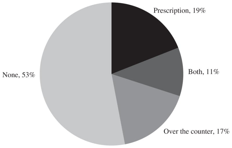
Consumption of Pain Medication by Men Age 25–54 Who Are Out of the Labor Forcea
Source: Princeton Pain Survey.
a. The data are based on 571 responses to the question, “Did you take any pain medication yesterday?” The survey was administered between September 30, 2016, and October 2, 2016.
Forty percent of this sample of prime age men responded “yes” when asked directly, “Does pain prevent you from working on a full-time job for which you are qualified?” Two-thirds of the men in the PPS reported that they had a disability, which is about double the rate in the CPS for prime age, NLF men. The higher disability rate partly resulted because respondents could write “other” in addition to the BLS’s six conditions, and 16 percent filled out other.21 It is also possible that men who are drawn to participate in Internet surveys are more likely to suffer from a disability, or that the CPS understates the number of prime age men with a disability.
A follow-up online survey conducted July 7–14, 2017, attempted to interview the 376 respondents who continued in the PPS panel, a little over 9 months after the initial survey. A total of 156 prime age men responded to the follow-up survey, or 41 percent of those who were eligible. Six of the respondents said that they had a steady, full-time job and were dropped from the sample, so the resulting analysis sample has 150 observations. Table 7 reports a cross-tabulation indicating the proportion who took prescription pain medication in the preceding day in waves 1 and 2 of the survey. The cross-tabulation indicates the persistence of taking pain medication, which is consistent with studies that find high rates of addiction to opioid medication (Frieden and Houry 2016). Nearly 80 percent of those who took prescription pain medication in the initial survey reported taking it in the follow-up survey.
Table 7.
Percentage of Men Age 25–54 Taking Prescription Pain Medicationa
| Wave 2
|
||
|---|---|---|
| Wave 1 | No | Yes |
| No | 64.9 | 8.1 |
| Yes | 6.1 | 20.9 |
Source: Princeton Pain Survey.
The sample consists of 150 respondents who did not have a steady, full-time job during wave 2 of the survey. The data are weighted using survey weights that have been adjusted to match age, race, and ethnicity figures from the Current Population Survey’s Annual Social and Economic Supplement for 2016.
Individuals in the follow-up survey were asked, “About how often would you say that you take prescription pain medication?” Almost a quarter (24 percent) responded that they took it every day, another 18 percent said more than once a week, and 3 percent said once a week. A minority (41 percent) responded “never.” All respondents except those who said they never take prescription pain medication were asked, “How do you usually pay for prescription pain medication? (Mark all that apply.)” The results are shown in table 8. It is clear that government health insurance programs (Medicaid, Medicare, Veterans Affairs) play a major role in providing pain medication to this group. Two-thirds of respondents used at least one of these government programs to purchase prescription pain medication, with the largest group relying on Medicaid.
Table 8.
Percentage of Men Age 25–54 Taking Prescription Pain Medication Using Various Methods of Paymenta
| Payment method | Percent |
|---|---|
| Out of pocket | 24.7 |
| Private health insurance | 13.0 |
| Medicaid | 37.7 |
| Medicare | 29.2 |
| Veterans Affairs or Tricareb | 9.6 |
| Other | 10.3 |
Source: Princeton Pain Survey.
The sample consists of 94 respondents who did not have a steady, full-time job during wave 2 of the survey. The data are weighted using survey weights that have been adjusted to match age, race, and ethnicity figures from the Current Population Survey’s Annual Social and Economic Supplement for 2016.
Veterans Affairs and Tricare are not explicit categories, but were often listed if the respondent selected “other.” Respondents citing these methods are not included in the total for the “other” category.
Respondents were asked, “What is the source of pain that typically causes you to take pain medication?” Overwhelmingly, they selected a non-work-related injury over a work-related one—88 percent to 12 percent.
In the first wave of the PPS, respondents were asked about their participation in various income support programs. Table 9 provides the responses. Half the prime age, NLF men report participating in at least one program. Thirty-five percent of the prime age, NLF men indicated that they were on Social Security Disability Insurance (SSDI), compared with 25 percent in the May 2012 CPS disability supplement (BLS 2013). The difference is likely a result of the PPS sample being nonrepresentative, underreporting in CPS, and an increase in SSDI participation from May 2012 to July 2017. Workers’ compensation insurance is a much less frequent source of income support than SSDI, consistent with work-related injuries being reported as a source of pain in only a small percentage of cases.
Table 9.
Percentage of Men Age 25–54 in Income Support Programsa
| Income support program | Percent |
|---|---|
| Workers’ compensation | 1.8 |
| Social Security Disability Insurance | 35.0 |
| Supplemental Security Income | 10.1 |
| Veterans disability compensation | 6.0 |
| Disability insurance | 5.2 |
| Other | 2.4 |
| None | 49.6 |
Source: Princeton Pain Survey.
The sample consists of 571 respondents. The order of response categories was randomized across respondents (except for “other” and “none”). The data are weighted using survey weights that have been adjusted to match age, race, and ethnicity figures from the Current Population Survey’s Annual Social and Economic Supplement for 2016.
In the PPS follow-up survey, respondents who were not currently on SSDI were asked if they had ever applied for SSDI. Fully 30 percent of those asked indicated that they had previously applied for SSDI.22 Many of these individuals could be in the process of applying for SSDI or appealing a decision, which could influence their current labor supply incentives.23 If the fraction of prime age, NLF men on SSDI is between 25 and 35 percent, then about half of all prime age, NLF men could have applied for SSDI at some point. This suggests that the program’s reach is substantially larger than previously appreciated.
The role of SSDI in reducing male labor force participation has long been debated by economists (Parsons 1980; Bound 1989). The CEA (2014) reports that the fraction of prime age men on disability insurance rose from 1 to 3 percent between 1967 and 2014, while the labor force participation rate of this group fell by 7.5 percentage points, which suggests that disability insurance could at most account for a quarter of the decline in participation over this period. Also, estimates of the causal effect of disability insurance suggest that the availability of benefits is responsible for even less of the decline in participation. The evidence reported here on the high incidence of pain experienced by the disabled, especially those who are out of the labor force, suggests that physical and mental health ailments are a barrier to participating in many activities.24
II.C. Women
As mentioned above, the aggregate labor force participation rate in the United States stopped rising after 2000 because the participation rate of women stopped rising. Starting in 2007, the participation rate began to fall for women overall, although the rate had already been declining for younger women over the previous decade. America’s relative standing among economically advanced countries in terms of the labor force participation rate of women also slipped. A particularly interesting comparison is with Canada.25 The participation rate of women in Canada was roughly equal to that in the United States in the late 1990s, but it continued to grow for another decade in Canada, while it plateaued and then declined in the United States. For prime age women, from 1997 to 2015 the participation rate rose from 76 to 81 percent in Canada, while it fell from 77 to 74 percent in the United States. Marie Drolet, Sharanjit Uppal, and Sébastien LaRochelle-Côté (2016) find that the participation rate of women in the United States has declined at all education levels since the 1990s, but it has declined more for women with a high school education or less, especially those age 25–44. In Canada, by contrast, the participation rate has risen for all education groups.
Francine Blau and Lawrence Kahn (2013) conclude that the expansion of “family-friendly” policies, including parental leave and part-time work entitlements, explains 29 percent of the decrease in women’s labor force participation in the United States relative to other countries in the Organization for Economic Cooperation and Development.26 Given that the biggest gap between women’s labor force participation in Canada and the United States opened up among less educated women of child-bearing age, who are unlikely to receive paid maternity leave and other family benefits, it is plausible that family leave policies, along with the rise in the education–income gradient in the United States, also account for a significant share of the rising gap in participation between women in the United States and Canada.27
There is also evidence that generational shifts, which drew increasing numbers of women into the workforce, have come to an end in the United States.28 This implies that the historic gains in women’s labor force participation that resulted from the entry of new birth cohorts and the exit of older ones will no longer lead to rising participation. Figure 9 displays the labor force participation rates of five cohorts of women based on 10 year- of-birth intervals over the life cycle from age 16 to 75, using data from the 1962–2016 CPS Annual Social and Economic Supplement (ASEC). The age displayed along the horizontal axis refers to the age of the middle birth year cohort. (That is, for the 1937–46 birth cohort, the horizontal axis marks the age of those born in 1941, and so on.) The cross-cohort pattern makes clear that at all ages, women in the 1947–56 cohort were more likely to participate in the labor force than were women of the same age born a decade earlier. The increase in labor force participation across succeeding cohorts was particularly evident for women age 21–45. But the cohort life cycle profiles essentially stopped rising after the 1957–66 cohort, and women in the 1977–86 cohort were actually less likely to work at a given age than were women born a decade earlier. And though it is impossible to separate out calendar time, age, and birth year effects, these generational developments are unlikely to represent time effects because they have been occurring over several years, and because participation is not very sensitive to the business cycle.
Figure 9.

Female Labor Force Participation Rates by Birth Cohort and Agea
Sources: Current Population Survey, Annual Social and Economic Supplement; National Bureau of Economic Research; author’s calculations.
a. The data are from 1962 to 2016. The line captions mark the birth year cohorts.
b. The horizontal axis marks the age of the middle birth year cohort.
The cohort pattern in figure 9 also helps explain another anomaly: Why did women age 55–64 exhibit the biggest break from the trend over the last decade, as shown in online appendix figure A15? The answer appears to be that as women born in the late 1940s and early 1950s aged out of the 55–64 age bracket, they were replaced by a succeeding generation of women who had about the same level of participation as the 1947–56 birth cohort when they were both in their late 40s and early 50s. An implication of this pattern is that a continuation of the sharp rise in participation over recent decades for women age 65 and over, which is evident in online appendix figure A16, is likely in jeopardy, as the 1950s birth cohort gives way to the 1960s birth cohort, which had roughly the same labor force participation rate in midlife.
The finding that the cohort labor force participation profiles stopped rising for younger women age 21–40, who are much more likely to be engaged in raising a family, highlights the potential for workplace flexibility and family-friendly policies to raise labor force participation. Clearly, the United States can no longer rely on the past tendency of succeeding generations of women to enter the labor force at earlier ages to lift the aggregate labor force participation rate.
LABOR FORCE NONPARTICIPATION FOR REASONS OTHER THAN HOME RESPONSIBILITIES
An important distinction for NLF women involves those who say they are not working mainly because of “home responsibilities” and those who are not working for other reasons. In 1991, 77 percent of prime age, NLF women were not working because of home responsibilities; and in 2015, that figure had declined to 60 percent, according to CPS and ASEC data. (Note that these questions on labor force participation relate to the calendar year, as opposed to the survey reference week.) Among those who cited something other than home responsibilities as the main reason for not working, the rise in nonparticipation for women parallels that of men (figure 10).29 Excluding those who cite home responsibilities, the distribution of reasons for not working for women also roughly equals that of men, with disability or illness representing the largest category. As we shall see below, the distinction between home responsibilities and other reasons also has a meaningful effect on subjective well-being for NLF women.
Figure 10.

Persons Age 25–54 Who Were Not in the Labor Force during the Past Year for Reasons Other Than “Home Responsibilities,” 1991–2015a
Sources: Current Population Survey, Annual Social and Economic Supplement (data provided by Steven Hipple); U.S. Bureau of Labor Statistics (data provided by Steven Hipple); National Bureau of Economic Research.
a. Shading denotes recessions.
II.D. Retirees
As emphasized in section I, a major reason for the decline in labor force participation after 2007 is that the large baby boom cohort started to reach retirement age, as had long been expected. Those born in 1946, at the beginning of the baby boom, would have qualified for Social Security retirement benefits starting in 2008.
Further evidence of the profound effect of retirement on the U.S. work-force is shown in figure 11, which shows the percentage of individuals age 16 and older who are classified as retired in the CPS.30 The share of the population age 16 and older that was retired hovered around 15 percent from 1994 to 2007, and then rose from 15.4 to 17.6 percent from 2007 to 2017. This 2.2 percentage point rise in the retirement rate over this period almost matches the 2.8 percentage point drop in the labor force participation rate over the same period. By gender, the retirement rate has increased by 2.2 percentage points for men and 2.1 percentage points for women since 2007. Because retirements tend to be permanent exits from the labor force, and the main reason for the decline in labor force participation over the past decade is the increasing number of retirements due to the aging of the baby boom generation, this is another reason to expect relatively little cyclical recovery in labor force participation in the near term.
Figure 11.

Retirement Rates by Gender, 1994–2017a
Sources: Current Population Survey; National Bureau of Economic Research; author’s calculations.
a. Shading denotes recessions. The retirement rate is the share of the population age 16 and older that reports being retired. The data are not seasonally adjusted, annual averages. The 2017 data point is the average of data from January through May.
III. Subjective Well-Being
This section evaluates the self-reported subjective well-being (SWB) of various demographic groups by labor force status. A comparison of SWB across labor force groups is of interest for two reasons. First, low levels of SWB can point to social problems for particular groups and potentially large welfare gains from successful interventions. Second, if the members of a group that is out of the labor force exhibit a high degree of SWB, it is probably unlikely that they are severely discontented with their situation and are eager to change their labor force status. Of course, SWB is difficult to measure and compare across individuals, so the usual caveats apply when using SWB measures.
Two types of measures of SWB are available from the ATUS-WB. The first is the Cantril ladder, a self-anchoring scale that asks respondents to evaluate their life in general, which was included in the 2012 and 2013 waves of the survey.31 The exact question wording is:
Please imagine a ladder with steps numbered from 0 at the bottom to 10 at the top. The top of the ladder represents the best possible life for you and the bottom of the ladder represents the worst possible life for you. If the top step is 10 and the bottom step is 0, on which step of the ladder do you feel you personally stand at the present time?
The second measure is the affect rating of randomly selected episodes of the day. This includes ratings of happiness, sadness, stress, pain, meaningfulness, and tiredness on a 0–6 scale. I compute the duration-weighted average of these affect measures as well as the U index. The U index is defined here as the proportion of time in which the rating of sadness or stress exceeds the rating of happiness. Daniel Kahneman and Krueger (2006) emphasize that the U index is robust if respondents interpret the scales differently, as long as they apply the same monotonic transformation to both positive and negative emotions.
The measures are summarized for men and women in tables 10 and 11, respectively. The tables report the mean Cantril ladder rating for each group. Figure 12 further shows the cumulative distributions of the Cantril ladder for each group, where the horizontal axis is arrayed in reverse numerical order (from 10 to 0) so that distributions that lie above lower ones totally dominate in terms of the ladder of life.
Table 10.
Subjective Well-Being for Mena
| Men, age 16–70 | Men, age 16–24 | |||||||||
|---|---|---|---|---|---|---|---|---|---|---|
|
|
|
|||||||||
| Affect measure | All | Employed | Unemployed | Not in the labor force | p valueb | All | Employed | Unemployed | Not in the labor force | p valueb |
| Happiness | 4.23 | 4.25 | 4.23 | 4.18 | 0.436 | 4.25 | 4.26 | 4.32 | 4.20 | 0.685 |
| Tiredness | 2.24 | 2.28 | 1.95 | 2.21 | 0.000 | 2.31 | 2.37 | 2.25 | 2.25 | 0.614 |
| Stress | 1.41 | 1.45 | 1.40 | 1.27 | 0.001 | 1.20 | 1.27 | 1.13 | 1.13 | 0.399 |
| Sadness | 0.59 | 0.53 | 0.70 | 0.77 | 0.000 | 0.42 | 0.40 | 0.53 | 0.39 | 0.312 |
| Pain | 0.88 | 0.73 | 0.89 | 1.39 | 0.000 | 0.47 | 0.47 | 0.56 | 0.44 | 0.497 |
| Meaning | 4.21 | 4.27 | 4.19 | 4.03 | 0.000 | 3.84 | 3.91 | 3.92 | 3.67 | 0.121 |
| U indexc | 0.13 | 0.13 | 0.14 | 0.13 | 0.647 | 0.11 | 0.12 | 0.09 | 0.10 | 0.455 |
| Cantril ladderd | 6.97 | 7.08 | 6.27 | 6.83 | 0.000 | 7.06 | 6.94 | 6.81 | 7.36 | 0.028 |
| No. of observations | 13,643 | 9,999 | 932 | 2,712 | 1,585 | 769 | 283 | 533 | ||
| No. of activities | 40,556 | 29,747 | 2,767 | 8,042 | 4,719 | 2,292 | 840 | 1,587 | ||
|
| ||||||||||
| Men, age 25–54 | Men, age 55–70 | |||||||||
|
|
|
|||||||||
| Affect measure | All | Employed | Unemployed | Not in the labor force | p valueb | All | Employed | Unemployed | Not in the labor force | p valueb |
|
| ||||||||||
| Happiness | 4.18 | 4.21 | 4.15 | 3.97 | 0.034 | 4.34 | 4.39 | 4.21 | 4.29 | 0.323 |
| Tiredness | 2.30 | 2.31 | 1.69 | 2.59 | 0.000 | 2.05 | 2.12 | 1.89 | 1.97 | 0.259 |
| Stress | 1.55 | 1.53 | 1.64 | 1.76 | 0.043 | 1.22 | 1.31 | 1.45 | 1.07 | 0.005 |
| Sadness | 0.60 | 0.53 | 0.79 | 1.16 | 0.000 | 0.67 | 0.59 | 0.91 | 0.77 | 0.004 |
| Pain | 0.87 | 0.75 | 0.87 | 1.96 | 0.000 | 1.18 | 0.84 | 1.77 | 1.59 | 0.000 |
| Meaning | 4.24 | 4.27 | 4.28 | 4.01 | 0.070 | 4.41 | 4.52 | 4.62 | 4.24 | 0.001 |
| U indexc | 0.14 | 0.13 | 0.18 | 0.21 | 0.000 | 0.11 | 0.11 | 0.14 | 0.10 | 0.264 |
| Cantril ladderd | 6.87 | 7.03 | 5.69 | 6.08 | 0.000 | 7.14 | 7.34 | 6.27 | 6.92 | 0.000 |
| No. of observations | 8,428 | 7,277 | 468 | 683 | 3,630 | 1,953 | 181 | 1,496 | ||
| No. of activities | 25,062 | 21,650 | 1,391 | 2,021 | 10,775 | 5,805 | 536 | 4,434 | ||
Source: U.S. Bureau of Labor Statistics, American Time Use Survey, Well-Being Module.
Each respondent was asked about three activities. Affects are measured on a 0–6 scale, from least to most affected. The sample is pooled over 2010, 2012, and 2013. Affect measures and the U index are weighted using the Well-Being Module’s adjusted pooled activity weights.
The p value is from an F test of equality of the means for the three labor force statuses.
The U index measures the proportion of time in which the rating of stress or sadness exceeds the rating of happiness.
The Cantril ladder question was asked in 2012 and 2013 only, and is weighted using the Well-Being Module’s final weights. It is measured on a 0–10 scale, from “worst possible life” to “best possible life.”
Table 11.
Subjective Well-Being for Womena
| Women, age 16–70 | Women, age 16–24 | |||||||||
|---|---|---|---|---|---|---|---|---|---|---|
|
|
|
|||||||||
| Affect measure | All | Employed | Unemployed | Not in the labor force | p valueb | All | Employed | Unemployed | Not in the labor force | p valueb |
| Happiness | 4.36 | 4.33 | 4.39 | 4.40 | 0.216 | 4.39 | 4.35 | 4.55 | 4.38 | 0.228 |
| Tiredness | 2.52 | 2.55 | 2.36 | 2.48 | 0.060 | 2.69 | 2.81 | 2.51 | 2.60 | 0.134 |
| Stress | 1.61 | 1.69 | 1.64 | 1.44 | 0.000 | 1.51 | 1.49 | 1.53 | 1.52 | 0.964 |
| Sadness | 0.65 | 0.58 | 0.77 | 0.77 | 0.000 | 0.46 | 0.37 | 0.68 | 0.48 | 0.031 |
| Pain | 0.98 | 0.81 | 0.92 | 1.34 | 0.000 | 0.58 | 0.52 | 0.79 | 0.57 | 0.279 |
| Meaning | 4.41 | 4.40 | 4.33 | 4.43 | 0.560 | 3.96 | 3.93 | 4.03 | 3.99 | 0.832 |
| U indexc | 0.15 | 0.16 | 0.16 | 0.14 | 0.013 | 0.14 | 0.14 | 0.13 | 0.13 | 0.937 |
| Cantril ladderd | 7.17 | 7.22 | 6.53 | 7.20 | 0.000 | 7.06 | 6.97 | 6.92 | 7.29 | 0.116 |
| No. of observations | 16,430 | 10,404 | 1,042 | 4,984 | 1,574 | 770 | 263 | 541 | ||
| No. of activities | 48,815 | 30,937 | 3,095 | 14,783 | 4,666 | 2,280 | 778 | 1,608 | ||
|
| ||||||||||
| Women, age 25–54 | Women, age 55–70 | |||||||||
|
|
|
|||||||||
| Affect measure | All | Employed | Unemployed | Not in the labor force | p valueb | All | Employed | Unemployed | Not in the labor force | p valueb |
|
| ||||||||||
| Happiness | 4.31 | 4.29 | 4.32 | 4.37 | 0.375 | 4.44 | 4.46 | 4.06 | 4.44 | 0.390 |
| Tiredness | 2.61 | 2.62 | 2.38 | 2.65 | 0.098 | 2.18 | 2.14 | 1.59 | 2.26 | 0.025 |
| Stress | 1.73 | 1.78 | 1.72 | 1.58 | 0.007 | 1.39 | 1.49 | 1.68 | 1.27 | 0.004 |
| Sadness | 0.65 | 0.60 | 0.78 | 0.77 | 0.001 | 0.79 | 0.67 | 1.12 | 0.89 | 0.000 |
| Pain | 0.95 | 0.83 | 0.97 | 1.34 | 0.000 | 1.31 | 0.94 | 1.20 | 1.69 | 0.000 |
| Meaning | 4.45 | 4.42 | 4.68 | 4.49 | 0.015 | 4.62 | 4.71 | 3.82 | 4.58 | 0.030 |
| U indexc | 0.16 | 0.17 | 0.16 | 0.14 | 0.029 | 0.14 | 0.14 | 0.23 | 0.13 | 0.137 |
| Cantril ladderd | 7.13 | 7.24 | 6.23 | 7.03 | 0.000 | 7.31 | 7.33 | 6.49 | 7.34 | 0.017 |
| No. of observations | 10,355 | 7,453 | 637 | 2,265 | 4,501 | 2,181 | 142 | 2,178 | ||
| No. of activities | 30,803 | 22,176 | 1,895 | 6,732 | 13,346 | 6,481 | 422 | 6,443 | ||
Source: U.S. Bureau of Labor Statistics, American Time Use Survey, Well-Being Module.
Each respondent was asked about three activities. Affects are measured on a 0–6 scale, from least to most affected. The sample is pooled over 2010, 2012, and 2013. Affect measures and the U index are weighted using the Well-Being Module’s adjusted pooled activity weights.
The p value is from an F test of equality of the means for the three labor force statuses.
The U index measures the proportion of time in which the rating of stress or sadness exceeds the rating of happiness.
The Cantril ladder question was asked in 2012 and 2013 only, and is weighted using the Well-Being Module’s final weights. It is measured on a 0–10 scale, from “worst possible life” to “best possible life.”
Figure 12.


Cumulative Distributions of Cantril Ladder by Age and Gendera
Source: U.S. Bureau of Labor Statistics, American Time Use Survey, Well-Being Module.
a. The sample is pooled over 2012 and 2013. The Cantril ladder question is weighted using the Well-Being Module’s final weights, and is measured on a 0–10 scale from “worst possible life” to “best possible life.” See the text for the exact wording of the survey question.
A few findings are noteworthy. First, young NLF men and women seem remarkably content with their lives. As a group, young people who are not in the labor force report that their lives are on a higher step of the Cantril ladder of the best possible life than do employed individuals of a similar age. On a moment-to-moment basis, there are only small and typically statistically insignificant differences in the duration-weighted average reported emotions across youth who are employed, unemployed, and out of the labor force.
Second, unlike youth, prime age men who are employed are considerably more satisfied with their lives in general than are men who are out of the labor force or unemployed. Prime age, NLF men are between employed and unemployed men on the Cantril ladder of life, but closer to unemployed men. The emotional experiences over the course of the day, however, indicate that NLF men are less happy, more sad, and more stressed than unemployed men, reversing the ranking from the Cantril ladder. Moreover, the U index (which measures unpleasant time but omits pain) is higher for NLF men than for unemployed men. This reversal suggests that there may be more adaptation in overall quality of life expectations for NLF men than there is in terms of their moment-to-moment experience. In other words, prime age, NLF men, who often have a significant disability, may have lowered their views of the best possible life they could expect, and reported their step on the Cantril ladder in relation to this compressed ladder, while their reporting of emotional experience was not recalibrated with respect to expectations. If this is the case, then the low SWB of prime age, NLF men should be an even bigger social concern based on the emotional data than on the ladder-of-life data.32
One factor that likely contributes to the low level of emotional well-being of prime age, NLF men is the relatively high amount of time they spend alone. Prime age, NLF men spend nearly 30 percent of their time alone, compared with 18 percent for prime age, employed men and 17 percent for prime age, employed women. Kahneman and Deaton (2010) find that time spent alone correlates more strongly with daily emotional well-being, while income and education correlate more strongly with evaluative well-being.
Third, unlike men, the SWB of prime age, NLF women is closer to that of employed women than it is to that of unemployed women. In fact, the U index is lower for prime age, NLF women than for prime age, employed women. NLF women report higher levels of happiness and sadness but less stress than employed women. Unlike men, women who are out of the labor force report deriving considerable meaning from their activities. These results do not paint a picture of NLF women as a group being discontented with their lives or daily routines and therefore being eager to return to work.
Fourth, prime age, NLF women who are not working for reasons other than home responsibilities report notably lower levels of SWB than other NLF women and employed women. The U index for NLF women who are not employed for a reason other than “taking care of house or family” is .20, as compared with .10 for NLF women who are not employed because of home responsibilities, and .17 for employed and unemployed women.33 Additionally, prime age, NLF women who are not employed for a reason other than home responsibilities report a much lower average step on the Cantril ladder (6.4) and a much greater incidence of pain and the use of pain medication (53 percent took pain medication the preceding day, compared with 27 percent of other NLF women). Thus, NLF women are a bifurcated group, with those who cite home responsibilities as the reason for not working reporting higher levels of SWB and meaning in their lives, and those who are NLF for other reasons expressing higher levels of distress and discomfort.
Finally, women age 55–70 appear to be similar to prime age women in that those in the NLF group report about equal contentment with their lives as a whole and with daily emotional experiences as employed women. Unemployed women age 55–70, however, appear quite unhappy and dissatisfied with their lives. Men in the age 55–70 group who are unemployed also appear to be quite dissatisfied and unhappy with their lives compared with employed men of the same age, while NLF men appear midway between employed and unemployed men on the Cantril ladder. NLF men express relatively low levels of meaning in their daily activities, but their U index indicates that less time was spent in an unpleasant state than employed or unemployed men.
IV. Pain Medication, Opioid Proliferation, and Labor Force Participation
Vance (2016, p. 19) warns that “an epidemic of prescription drug addiction has taken root.” Many alarming statistics bear out his fear. According to the CDC, sales of prescription opioid medication per capita were 3.5 times higher in 2015 than in 1999.34 More than one in five individuals insured by Blue Cross Blue Shield received an opioid prescription in 2015 (Fox 2017). Enough opioid medication is dispensed annually in the United States to keep every man, woman, and child on painkillers for a month (Doctor and Menchine 2017). The number of deaths from opioid overdoses quadrupled from 1999 to 2015. In 2015, more than 33,000 Americans died from an opioid overdose, more than double the number murdered. An estimated 1 in every 550 patients who started on opioid therapy died from an opioid-related cause, with the median fatality occurring within 2.6 years of the initial prescription (Frieden and Houry 2016). Fully 44 percent of Medicare recipients under age 65 were prescribed opioid medication in 2011 (Morden and others 2014). And despite the rapid diffusion of opioid medication in the United States, there is little evidence showing that opioid treatment is efficacious in reducing pain or improving functionality. In fact, Thomas Frieden and Debra Houry (2016, pp. 1501–02) note that “several studies have showed that use of opioids for chronic pain may actually worsen pain and functioning, possibly by potentiating pain perception.”
The opioid crisis preceded the Great Recession—indeed, opioid prescriptions fell from 2010 to 2015—and varying prescription rates are probably rooted in changing medical practices and norms, and more aggressive marketing strategies by pharmaceutical companies (Doctor and Menchine 2017; Satel 2017). Doctor training also seems to affect opioid prescription rates. Molly Schnell and Janet Currie (2017), for example, find that doctors from the lowest-ranked medical schools write 33 times more opioid prescriptions per year than do doctors from the highest-ranked schools, controlling for county and type of medical practice. Eleanor Krause and Isabel Sawhill (2017, p. 21) find that “the ten counties with the highest prime-age male mortality rates due to these ‘deaths of despair’ [alcohol, suicide, and accidental poisonings] in the CDC database had an average prime-age male participation rate of 73 percent in 2014, compared to 88 percent for the prime-age male population across the country.” Although the direction of causality is unclear, Goldman Sachs economist David Mericle notes that “the opioid epidemic is intertwined with the story of declining prime-age participation, especially for men, and this reinforces our doubts about a rebound in the participation rate” (Cheng 2017).
There is a clear regional pattern to opioid prescription rates and drug overdoses. The average quantity of opioids prescribed per capita varies by a factor of 31 to 1 in the top 10 percent of counties relative to the bottom 10 percent of counties, according to CDC data. The CDC argues that “health issues that cause people pain do not vary much from place to place, and do not explain this [state-to-state] variability in prescribing.”35
In this section, I probe the connection between the use of pain medication and local opioid prescription rates, controlling for individual health conditions and other characteristics. Consistent with the CDC’s assertion, the evidence suggests that local opioid prescription practices influence the use of pain medication, conditional on individuals’ disability status, self-reported health, and demographic characteristics. Leveraging local differences in prescription rates, regressions indicate that the labor force participation rate is lower and fell more in counties where more opioids were prescribed, controlling for the area’s share of manufacturing employment and individual characteristics.
IV.A. The Use of Pain Medication and Opioid Prescription Practices
To explore the relationship between local medical practices and the use of pain medication, I merge county-level data on the volume of opioid prescriptions per capita in 2015 from the CDC with data from the ATUS-WB, which includes data on whether individuals took any pain medication on the preceding day.36 Opioid prescriptions are measured by morphine milligram equivalent (MME) units prescribed per capita, which is a standard way of aggregating different opioid medications. To ease the interpretation, I take the log of MME units per capita in the county.37
Table 12 summarizes the results of linear probability models predicting whether an individual took pain medication on the preceding day as a function of opioid prescription rates in the area, functional disability status, self-reported overall health, and personal characteristics. Not surprisingly, in areas where more opioids are prescribed, individuals are more likely to report that they took pain medication on the preceding day. Column 1 shows that a 10 percent increase in the amount of opioids prescribed per capita is associated with a 0.6 percentage point, or 2 percent, increase in the share of individuals who report taking pain medication on any given day.38 This effect is cut roughly in half but remains highly statistically significant when controls are added for functional disabilities, self-reported health, and demographic characteristics (column 5). Even within detailed regions, the area-wide prescription rate is a significant predictor of whether individuals took pain medication the preceding day (column 6). These findings support the CDC’s view that differences in health conditions do not vary enough across areas to explain the large cross-county differences in the use of pain medication.
Table 12.
Linear Probability Models for the Likelihood of Taking Pain Medicationa
| Mean [SD] | Took pain medication yesterday
|
||||||
|---|---|---|---|---|---|---|---|
| (1) | (2) | (3) | (4) | (5) | (6) | ||
| Log opioids prescribed per capita | 6.389 | 0.060*** | 0.047*** | 0.050*** | 0.036*** | 0.028*** | 0.026*** |
| [0.396] | (0.010) | (0.010) | (0.011) | (0.010) | (0.010) | (0.009) | |
| Difficulty dressing or bathing | 0.011 | 0.086** | 0.067* | 0.069* | |||
| [0.104] | (0.041) | (0.038) | (0.037) | ||||
| Vision impairment | 0.011 | 0.057* | −0.000 | 0.001 | |||
| [0.105] | (0.033) | (0.030) | (0.029) | ||||
| Difficulty hearing | 0.014 | 0.093*** | 0.043* | 0.041 | |||
| [0.119] | (0.028) | (0.026) | (0.026) | ||||
| Difficulty doing errands | 0.021 | 0.104*** | 0.066** | 0.065** | |||
| [0.145] | (0.036) | (0.032) | (0.031) | ||||
| Difficulty walking | 0.045 | 0.333*** | 0.160*** | 0.160*** | |||
| [0.207] | (0.019) | (0.020) | (0.020) | ||||
| Difficulty remembering | 0.024 | 0.067*** | 0.032 | 0.031 | |||
| [0.154] | (0.023) | (0.021) | (0.021) | ||||
| Health statusb | |||||||
| Very good | 0.342 | 0.064*** | 0.053*** | 0.052*** | |||
| [0.474] | (0.008) | (0.008) | (0.008) | ||||
| Good | 0.302 | 0.142*** | 0.123*** | 0.122*** | |||
| [0.459] | (0.009) | (0.009) | (0.008) | ||||
| Fair | 0.127 | 0.294*** | 0.240*** | 0.241*** | |||
| [0.334] | (0.012) | (0.012) | (0.012) | ||||
| Poor | 0.036 | 0.525*** | 0.387*** | 0.385*** | |||
| [0.187] | (0.021) | (0.023) | (0.023) | ||||
| Racec | |||||||
| African American | 0.124 | −0.028*** | −0.039*** | −0.042*** | |||
| [0.330] | (0.009) | (0.009) | (0.009) | ||||
| Other | 0.067 | −0.067*** | −0.080*** | −0.073*** | |||
| [0.249] | (0.010) | (0.010) | (0.010) | ||||
| Genderd | |||||||
| Female | 0.508 | 0.054*** | 0.047*** | 0.046*** | |||
| [0.500] | (0.007) | (0.006) | (0.006) | ||||
| Age | 41.578 | 0.007*** | 0.002 | 0.002 | |||
| [15.353] | (0.001) | (0.001) | (0.001) | ||||
| Age2/1,000 | 1.964 | −0.003 | 0.032** | 0.032** | |||
| [1.302] | (0.016) | (0.016) | (0.016) | ||||
| Years of education | 13.582 | −0.008*** | 0.001 | 0.002 | |||
| [3.078] | (0.001) | (0.001) | (0.001) | ||||
| Marital statuse | |||||||
| Married | 0.528 | −0.026*** | 0.003 | 0.002 | |||
| [0.499] | (0.006) | (0.007) | (0.007) | ||||
| Regionf | |||||||
| Mid-Atlantic | 0.128 | −0.034 | |||||
| [0.334] | (0.034) | ||||||
| East North Central | 0.161 | −0.004 | |||||
| [0.368] | (0.034) | ||||||
| West North Central | 0.074 | 0.000 | |||||
| [0.262] | (0.034) | ||||||
| South Atlantic | 0.187 | −0.015 | |||||
| [0.390] | (0.034) | ||||||
| East South Central | 0.059 | 0.000 | |||||
| [0.236] | (0.036) | ||||||
| West South Central | 0.116 | 0.002 | |||||
| [0.321] | (0.034) | ||||||
| Mountain | 0.071 | −0.029 | |||||
| [0.256] | (0.034) | ||||||
| Pacific | 0.155 | −0.039 | |||||
| [0.362] | (0.034) | ||||||
| Adjusted R2 | 0.003 | 0.043 | 0.072 | 0.060 | 0.119 | 0.120 | |
| No. of observations | 30,073 | 30,073 | 30,073 | 30,073 | 30,073 | 30,073 | |
Sources: U.S. Bureau of Labor Statistics, American Time Use Survey, Well-Being Module; Centers for Disease Control and Prevention, QuintilesIMS (IQVIA); author’s calculations.
The sample is pooled over 2010, 2012, and 2013 for individuals age 16–70. The mean of the dependent variable is 0.270. The regressions are weighted using the Well-Being Module’s final weights. Robust standard errors clustered by county are in parentheses. Statistical significance is indicated at the ***1 percent, **5 percent, and *10 percent levels.
The omitted category is “Excellent.”
The omitted category is “White.”
The omitted category is “Male.”
The omitted category is “Single.”
The omitted category is “New England.”
IV.B. Opioid Prescription Rates and Labor Force Participation
Next, I link 2015 county-level opioid prescription rates (MME per capita) to individual-level labor force data from the CPS for the periods 1999–2001 and 2014–16.39 Table 13 reports estimates of linear probability models for prime age men, where the dependent variable is 1 if an individual participates in the labor force and 0 if he does not. Table 14 has comparable estimates for prime age women. A dummy variable indicates the 2014–16 period.
Table 13.
Linear Probability Models for Labor Force Participation of Men Age 25–54a
| Mean [SD] | Participated in the labor force
|
|||||||
|---|---|---|---|---|---|---|---|---|
| (1) | (2) | (3) | (4) | (5) | (6) | (7) | ||
| Period 2 dummy (2014–16) | 0.511 | −0.032*** | 0.067*** | 0.038* | 0.037* | 0.039* | 0.049* | |
| [0.500] | (0.002) | (0.026) | (0.022) | (0.022) | (0.022) | (0.026) | ||
| Log opioids per capita by county | 6.342 | −0.023*** | −0.015*** | −0.010*** | −0.009** | −0.009*** | ||
| [0.430] | (0.005) | (0.005) | (0.003) | (0.004) | (0.003) | |||
| Log opioids × period 2 | 3.245 | −0.016*** | −0.010*** | −0.010*** | −0.011*** | −0.013*** | ||
| [3.186] | (0.004) | (0.003) | (0.003) | (0.003) | (0.004) | |||
| Raceb | ||||||||
| African American | 0.119 | −0.061*** | −0.059*** | −0.058*** | −0.057*** | |||
| [0.324] | (0.004) | (0.004) | (0.004) | (0.004) | ||||
| Other | 0.078 | −0.037*** | −0.034*** | −0.033*** | −0.034*** | |||
| [0.268] | (0.003) | (0.003) | (0.003) | (0.003) | ||||
| Hispanic | 0.160 | 0.035*** | 0.038*** | 0.038*** | 0.042*** | |||
| [0.367] | (0.003) | (0.003) | (0.003) | (0.003) | ||||
| Marital statusc | ||||||||
| Married | 0.597 | 0.086*** | 0.086*** | 0.086*** | 0.085*** | |||
| [0.491] | (0.002) | (0.002) | (0.002) | (0.002) | ||||
| Age | 39.391 | 0.012*** | 0.012*** | 0.012*** | 0.012*** | |||
| [8.558] | (0.001) | (0.001) | (0.001) | (0.001) | ||||
| Age2/1,000 | 1.625 | −0.186*** | −0.186*** | −0.187*** | −0.184*** | |||
| [0.678] | (0.009) | (0.009) | (0.009) | (0.009) | ||||
| Years of education | 13.570 | 0.013*** | 0.013*** | 0.013*** | 0.012*** | |||
| [3.083] | (0.001) | (0.001) | (0.001) | (0.001) | ||||
| Share manufacturing (1999–2001) | 0.140 | 0.090*** | ||||||
| [0.048] | (0.033) | |||||||
| Share manufacturing × period 2 | 0.071 | −0.008 | 0.010 | |||||
| [0.077] | (0.031) | (0.037) | ||||||
| Regiond | ||||||||
| Mid-Atlantic | 0.135 | −0.009 | −0.006 | |||||
| [0.341] | (0.006) | (0.005) | ||||||
| East North Central | 0.153 | 0.007 | 0.003 | |||||
| [0.360] | (0.004) | (0.004) | ||||||
| West North Central | 0.068 | 0.018*** | 0.018*** | |||||
| [0.251] | (0.004) | (0.004) | ||||||
| South Atlantic | 0.189 | 0.000 | 0.003 | |||||
| [0.391] | (0.005) | (0.004) | ||||||
| East South Central | 0.057 | −0.019* | −0.021** | |||||
| [0.232] | (0.010) | (0.010) | ||||||
| West South Central | 0.115 | −0.001 | 0.002 | |||||
| [0.319] | (0.006) | (0.006) | ||||||
| Mountain | 0.067 | 0.003 | 0.009 | |||||
| [0.250] | (0.006) | (0.005) | ||||||
| Pacific | 0.168 | −0.008* | −0.007 | |||||
| [0.374] | (0.004) | (0.004) | ||||||
| County fixed effectse | No | No | No | No | No | No | Yes | |
| Adjusted R2 | 0.003 | 0.001 | 0.004 | 0.055 | 0.056 | 0.056 | 0.063 | |
| No. of observations | 1,824,890 | 1,824,890 | 1,824,890 | 1,810,246 | 1,810,246 | 1,788,508 | 1,788,508 | |
Sources: U.S. Bureau of Labor Statistics, Current Population Survey; Centers for Disease Control and Prevention, QuintilesIMS (IQVIA); author’s calculations.
The sample is pooled over 1999–2001 and 2014–16 for men age 25–54. The mean of the dependent variable is 0.900. The regressions are weighted using the Current Population Survey’s final weights. Robust standard errors clustered by county or state are in parentheses. Statistical significance is indicated at the ***1 percent, **5 percent, and *10 percent levels.
The omitted category is “White.”
The omitted category is “Single.”
The omitted category is “New England.”
County refers to county, metropolitan area, or state, whichever is the smallest available aggregation. See note 39 in the text.
Table 14.
Linear Probability Models for Labor Force Participation of Women Age 25–54a
| Mean [SD] | Participated in the labor force
|
|||||||
|---|---|---|---|---|---|---|---|---|
| (1) | (2) | (3) | (4) | (5) | (6) | (7) | ||
| Period 2 dummy (2014–16) | 0.510 | −0.025*** | 0.087** | 0.055* | 0.047 | 0.048 | 0.058* | |
| [0.500] | (0.003) | (0.037) | (0.030) | (0.031) | (0.031) | (0.035) | ||
| Log opioids per capita by county | 6.345 | 0.002 | 0.011 | 0.006 | 0.011** | 0.010* | ||
| [0.431] | (0.010) | (0.011) | (0.007) | (0.006) | (0.005) | |||
| Log opioids × period 2 | 3.241 | −0.018*** | −0.016*** | −0.014*** | −0.014*** | −0.015*** | ||
| [3.187] | (0.006) | (0.005) | (0.005) | (0.005) | (0.005) | |||
| Raceb | ||||||||
| African American | 0.139 | 0.003 | 0.009 | 0.009 | 0.016*** | |||
| [0.345] | (0.005) | (0.005) | (0.005) | (0.005) | ||||
| Other | 0.082 | −0.067*** | −0.061*** | −0.061*** | −0.061*** | |||
| [0.275] | (0.007) | (0.007) | (0.007) | (0.006) | ||||
| Hispanic | 0.149 | −0.033*** | −0.024*** | −0.024*** | −0.015*** | |||
| [0.356] | (0.005) | (0.004) | (0.004) | (0.004) | ||||
| Marital statusc | ||||||||
| Married | 0.601 | −0.086*** | −0.086*** | −0.086*** | −0.087*** | |||
| [0.490] | (0.005) | (0.005) | (0.005) | (0.005) | ||||
| Age | 39.480 | 0.012*** | 0.012*** | 0.012*** | 0.012*** | |||
| [8.552] | (0.001) | (0.001) | (0.001) | (0.001) | ||||
| Age2/1,000 | 1.632 | −0.149*** | −0.149*** | −0.148*** | −0.148*** | |||
| [0.679] | (0.014) | (0.014) | (0.014) | (0.015) | ||||
| Years of education | 13.746 | 0.028*** | 0.028*** | 0.028*** | 0.028*** | |||
| [2.987] | (0.001) | (0.001) | (0.001) | (0.001) | ||||
| Share manufacturing (1999–2001) | 0.139 | 0.059 | ||||||
| [0.048] | (0.053) | |||||||
| Share manufacturing × period 2 | 0.071 | −0.043 | −0.044 | |||||
| [0.077] | (0.054) | (0.051) | ||||||
| Regiond | ||||||||
| Mid-Atlantic | 0.137 | −0.039*** | −0.038*** | |||||
| [0.344] | (0.007) | (0.007) | ||||||
| East North Central | 0.152 | −0.007 | −0.009 | |||||
| [0.359] | (0.008) | (0.008) | ||||||
| West North Central | 0.065 | 0.043*** | 0.043*** | |||||
| [0.247] | (0.008) | (0.008) | ||||||
| South Atlantic | 0.193 | −0.021*** | −0.020*** | |||||
| [0.395] | (0.005) | (0.006) | ||||||
| East South Central | 0.059 | −0.055*** | −0.055*** | |||||
| [0.236] | (0.006) | (0.006) | ||||||
| West South Central | 0.114 | −0.035*** | −0.033*** | |||||
| [0.318] | (0.007) | (0.007) | ||||||
| Mountain | 0.065 | −0.026*** | −0.023*** | |||||
| [0.247] | (0.008) | (0.008) | ||||||
| Pacific | 0.166 | −0.032*** | −0.032*** | |||||
| [0.372] | (0.006) | (0.006) | ||||||
| County fixed effectse | No | No | No | No | No | No | Yes | |
| Adjusted R2 | 0.001 | 0.000 | 0.001 | 0.049 | 0.052 | 0.052 | 0.057 | |
| No. of observations | 1,962,822 | 1,962,822 | 1,962,822 | 1,947,471 | 1,947,471 | 1,924,732 | 1,924,732 | |
Sources: U.S. Bureau of Labor Statistics, Current Population Survey; Centers for Disease Control and Prevention, QuintilesIMS (IQVIA); author’s calculations.
The sample is pooled over 1999–2001 and 2014–16 for women age 25–54. The mean of the dependent variable is 0.755. The regressions are weighted using the Current Population Survey’s final weights. Robust standard errors clustered by county or state are in parentheses. Statistical significance is indicated at the ***1 percent, **5 percent, and *10 percent levels.
The omitted category is “White.”
The omitted category is “Single.”
The omitted category is “New England.”
County refers to county, metropolitan area, or state, whichever is the smallest-available aggregation. See note 39 in the text.
Consider first the results for men. Column 1 of table 13 indicates that the labor force participation rate fell by 3.2 percentage points for men from 1999–2001 to 2014–16. Column 2 adds the opioid prescription rate for 2015, and column 3 adds an interaction between the opioid prescription rate and the 2014–16 period dummy. Both these additional variables are negative and significant, indicating that labor force participation is lower in areas of the United States with a high rate of opioid prescriptions, and labor force participation fell more over this 15-year period in areas with a high rate of opioid prescriptions. These conclusions continue to hold when additional variables are included in the model, including demographics, eight region indicators, the share of manufacturing employment in the county during the period 1999–2001, and the manufacturing share interacted with the 2014–16 period dummy.40 I continue to find a negative and statistically significant interaction between the 2014–16 period and opioid prescriptions when unrestricted county dummies are included in column 7 to absorb persistent area effects. The fact that the coefficients on the opioid prescription variables are unchanged when the manufacturing variables are included in the regression in column 6 suggests that the opioid crisis is occurring in areas outside traditional manufacturing strongholds. And I find similar results (in a regression not shown here) using the China import exposure variables developed by David Autor, David Dorn, and Gordon Hanson (2013) in place of the share in manufacturing.
These regressions are difficult to interpret for a number of reasons. But if cross-county differences in opioid prescription rates can be taken as an exogenous result of differences in medical practices and norms, conditional on personal characteristics and broad region dummies, the effect of the growth in opioid prescriptions on the labor force can be estimated. In particular, I assume that the base opioid prescription rate coefficient reflects inherent differences across regions, and the interaction between prescriptions and time captures the effect of changes in prescriptions on labor force participation over time. This is a big leap, and ideally I would have preferred to have a baseline measure of prescriptions (county-level MME data are unavailable before 2010), so this calculation is best considered illustrative. These caveats aside, opioid prescriptions per capita increased by a factor of 3.5 nationwide between 1999 and 2015, which is the equivalent of 0.55 log points. Multiplying 0.55 by the coefficient on the interaction between opioids and the second period (−0.011) suggests that the increase in opioid prescriptions could perhaps account for a 0.6 percentage point decline in male labor force participation, which is 20 percent of the observed decline during this period.
The results for women indicate a similar coefficient for the interaction term between time and county-level opioid prescription rates, but the base opioid prescription rate is positive. If the preceding calculation is conducted for women, about one quarter of the decline in labor force participation can be accounted for by the growth in opioid prescriptions.
An obvious concern about the labor force regressions is that omitted variables, such as workers’ health conditions that cause pain and demand for pain medication, are correlated with county-level opioid prescription rates. For example, the incidence of obesity has increased in the United States, and it is plausible that the rise in obesity has led to increased back pain and other health ailments, which in turn have caused both labor force participation to decline and demand for pain medication to rise. Although the basic monthly CPS does not include information on health, the ASEC does include information on self-reported health. If one estimates the labor force regressions, pooling together men and women using this smaller sample and controlling for self-reported health, the county-level opioid prescription rate has a similar effect as in the the regression using the larger basic monthly CPS data. It is also worth noting that Jessica Laird and Torben Nielsen (2016), using arguably exogenous variation in physicians’ practices stemming from geographic mobility across municipalities, find a significant and sizable negative effect of the opioid prescription rate—but not other medications—on labor force participation in Denmark.41 In the United States, however, it is possible that other confounding factors are influencing both opioid usage and low labor force participation.
These findings are preliminary and highly speculative. A useful extension of this analysis would be to determine whether higher prescription rates are associated with depressed flows of workers from outside the labor force back into the labor force, or with greater labor force exit rates. In addition, future research could seek to identify the sources of exogenous variability in prescription rates, or in treatment for opioid addiction, to estimate the causal effect of opioid medication on labor force participation.
V. Conclusion
The decline in labor force participation in the United States over the past two decades is a macroeconomic problem and a social concern. Along with several other studies, this paper finds that declining labor force participation since 2007 is largely the result of an aging population and ongoing trends that preceded the Great Recession, such as increased school enrollment.
Given ongoing downward pressure on labor force participation from an expected wave of retirements among members of the baby boom generation in coming decades, a reversal in the aggregate slide in labor force participation will require a change in secular trends affecting various demographic groups, and perhaps a major reform in immigration policy. There are a few demographic groups that may be more susceptible to a rise in labor force participation than others. First, older workers may increasingly delay retirement, bolstering their rise in labor force participation that has occurred over the past two decades. This trend may not continue for older women, however, as a cross-cohort analysis shows that labor force participation stopped rising for cohorts that are about to enter their late 50s and 60s.
Second, the labor force participation rate of women age 25–44 has been edging down for two decades, unlike their counterparts in Canada. Although NLF women who report “home responsibilities” as their main reason for not working appear satisfied with their lives, the group of women who are out of the labor force mainly for other reasons report low levels of life satisfaction and high levels of emotional distress. More generous vacation time and workplace flexibility provided by private company policies and supported by government policies could possibly help reverse the decline in labor force participation by prime age women. Corporate and government policies that promote equal pay and the advancement of working women to supervisory and managerial positions, as well as a more robust economic recovery, may also facilitate such a reversal.
Third, addressing the decades-long slide in labor force participation by prime age men should be a national priority. Prime age men express low levels of SWB and report finding relatively little meaning in their daily activities. Because nearly half this group reported being in poor health, it may be possible for expanded health insurance coverage and preventive care under the Affordable Care Act to positively affect the health of prime age men. The finding that nearly half of prime age, NLF men take pain medication on any given day and that 40 percent report that pain prevents them from accepting a job suggests that pain management interventions could potentially be helpful.
The evidence presented here suggests that much of the regional variation in opioid prescription rates across the United States is due to differences in medical practices, rather than varying health conditions that generate pain. Furthermore, labor force participation is lower and fell more in the 2000s in areas of the United States that have a higher volume of opioid medication prescribed per capita than in other areas. Although some obvious suspects can be ruled out—for example, areas with high opioid prescription rates do not appear to be only masking historical manufacturing strongholds that subsequently fell on hard times—it is unclear whether other factors underlying low labor force participation could have caused the high prescription rates of opioids in certain counties. Regardless of the direction of causality, the opioid crisis and depressed labor force participation are now intertwined in many parts of the United States. And despite the massive rise in opioid prescriptions in the 2000s, there is no evidence that the incidence of pain has declined; in fact, the results presented here suggest a small upward trend in the incidence of pain for prime age, NLF and unemployed men. Addressing the opioid crisis could help support efforts to raise labor force participation and prevent it from falling further.
Finally, several studies have found that the rise in inequality and shift in demand against less skilled workers in the United States are linked to the decline in labor force participation. Although labor market shifts that have lowered demand and wages for less skilled workers have not been a focus of this paper, policies that raise after-tax wages for low-wage workers, such as an increase in the minimum wage or expansion of the Earned Income Tax Credit, would also likely help raise labor force participation. The enormous rise in incarceration from the 1980s to the mid-2000s and the consequent rise in the number of men with criminal records are also likely factors that have exacerbated the decline in male labor force participation and that could be addressed to reverse the trend.
Supplementary Material
Acknowledgments
I thank David Cho, Kevin DeLuca, and Amy Wickett for outstanding research assistance, and Edward Freeland for indispensable assistance administering the survey used in subsection II.B. An earlier version of this paper was presented at the Federal Reserve Bank of Boston’s 60th Economic Conference on October 14, 2016. Lawrence Katz, Matthew Notowidigdo, and James Stock provided helpful comments on an earlier draft of the paper. The author is responsible for all views expressed and for any mistakes.
Footnotes
The population controls introduced in 2012, for example, caused an abrupt drop of 0.3 percentage point in the labor force participation rate from December 2011 to January 2012, largely because the population of older individuals exceeded the figure that had been assumed in intercensal years. I closely follow the procedures outlined at http://www.bls.gov/cps/documentation.htm#pop to smooth out changes in population controls.
The online appendixes for this and all other papers in this volume may be found at the Brookings Papers web page, www.brookings.edu/bpea, under “Past BPEA Editions.”
Charles, Hurst, and Notowidigdo (2016, forthcoming) provide evidence that the housing boom in the prerecession period masked an even greater fall in the labor force participation of less-educated, prime age men from 2000 to 2006 due to the collapse of manufacturing.
See Goldin (1991) for an analysis of women’s post–World War II labor supply.
Data for 2017 are only available for the first six months of the year, as of this writing. Because the aggregate labor force participation rate historically is not very different over the first six months and full year, I do not make an adjustment for seasonality here.
See CEA (2014) for an excellent survey of the literature. Fernald and others (2017) further expand the shift-share analysis by disaggregating cells by education, race, and marital status. They find that from 2010 to 2016, two-thirds of the decline in labor force participation occurred within groups, and one-third was due to the shift across groups. However, it is possible that membership in some of the categories, such as marital status, is endogenously determined.
I use annual data because seasonally adjusted, smoothed population controls are not available for each group. Data for 2016 are the average of the first eight months of the year. In earlier years, the average of the first eight months of the year was close to the annual average, so no adjustment is made for seasonality.
Although tables 2 and 3 suggest a quadratic trend fits the aggregate data better than a linear one, in 7 of the 16 subgroups, the quadratic term is insignificant in the period 1997–2016, and a linear trend does not do much injustice for describing the data for the other groups. Over such a short period, the linear extrapolation could be thought of as a first-order approximation to a more complicated trend.
If a 7-year sample period is used, the results are similar; and if a 15-year period is used, the trends are mostly flat.
Formally, the predicted participation rate is the weighted sum of each group’s predicted labor force participation rate based on the linear trend for that group, where the weights are the group’s actual share of the population in the year: ℓ̂t = Σ ℓ̂itwit, where ℓ̂it is based on an extrapolation from the ordinary least squares estimated linear trend.
The CEA (2007; table 1–2 and box 1–2), for example, predicted an annual decline of 0.2 to 0.3 percentage point in the labor force participation rate from 2007 to 2012 because of the aging of the baby boom cohort. See also Aaronson and others (2006, 2014).
Technically, their time use measure pertains to all game playing. I follow their precedent of referring to the game playing activity in the American Time Use Survey as video game playing, as the increase in time devoted to this activity is most likely overwhelmingly the result of video game playing.
The total amount of time per week spent in the listed activities does not add up to 168 hours because some categories, such as travel, are omitted.
Eberstadt (2016), for example, calls the increase in jobless men who are not looking for work “America’s invisible crisis.”
Coglianese (2016) finds that about half the decline in labor force participation for prime age men is due to permanent exits, and that only 20 to 30 percent of the decline is due to reduced labor demand, suggesting a major role for supply-side factors.
The exact question is: “Would you say your health in general is excellent, very good, good, fair, or poor?” Self-reported subjective health questions have been found to correlate reasonably well with objective health outcomes in the past.
One could question whether this measure results in an underestimate or overestimate of the “true” disability rate. On one hand, the list is restricted to just six conditions (for example, speech and language disorders are omitted). In addition, there could be a stigma attached to reporting physical, emotional, and mental health conditions for household members. On the other hand, a disability could be self-reported because it is a more socially acceptable reason for joblessness than the alternative.
A natural question is whether an increase in the number of disabled military veterans returning to civilian life has contributed to the decline in the labor force participation rate. The short answer is that this does not appear to be the case. The share of prime age, NLF men who are veterans has declined, from 11.4 percent in 2008 to 9.7 percent in 2016. Moreover, the proportion of prime age men who are veterans has trended down over the last two decades as the large cohort of Vietnam-era veterans has aged out of the prime age category. Nevertheless, about 40 percent of veterans who are out of the labor force report a significant disability, so any strategy to assist veterans to return to the labor force would need to address disability issues.
Any individual who reported lower back pain, neck pain, leg pain, or jaw pain is coded as having experienced pain. For the details of the survey, see https://www.cdc.gov/nchs/nhis/.
We screened for men age 25–54 who did not work in the previous week, were not absent from a job, and did not search for a job in the previous week. Because the BLS definition of “out of the labor force” requires that individuals did not search for a job in the past four weeks, our definition is a bit less restrictive. Weights were developed to match the 2016 CPS Annual Social and Economic Supplement by age group (25–40 and 41–54), race, and Hispanic ethnicity. Weighted percentages are reported in the text. The survey was conducted using Qualtrics software.
Common write-in responses for those who marked “other” included anxiety disorder, back pain, cancer, chronic pain, epilepsy, heart condition, and sleep disorder.
Among the subset of individuals who were not on any income support program, 20 percent reported that they had previously applied for SSDI.
The Social Security Administration (2017, p. 7) advises applicants for SSDI: “If you’re working and your earnings average more than a certain amount each month, we generally won’t consider you to be disabled.” Von Wachter, Song, and Manchester (2011) find that a substantial number of male applicants age 30–44 who are rejected from SSDI tend to work postapplication, while relatively few rejected applicants age 45–64 are employed postapplication.
See Krueger and Stone (2008) on the relationship between pain and time use.
Matthew Notowidigdo expands on this relationship between the United States and Canada in his comment.
Dahl and others (2016), however, find that the extension of maternity benefits from 18 to 35 weeks in Norway had little effect on labor force participation.
Moffitt (2012) highlights the puzzling fact that the employment rate declined for unmarried women without children, and also for higher-educated women.
See Juhn and Potter (2006) for an early discussion of this issue. Goldin and Mitchell (2017) highlight that the life cycle labor force participation profile of women evolved from an inverted U shape for cohorts born before the 1950s to a fairly flat shape with a sagging middle for those born after the mid-1950s.
Steven Hipple of the BLS generously shared these tabulations with me. Also see Lysy (2016) for an analysis of these data.
This is based on the EMPSTAT variable in the IPUMS-CPS data.
See Kahneman and Deaton (2010) for a comparison of the correlates of the Cantril ladder and daily emotional well-being. They find that the Cantril ladder is more strongly correlated with education and income, while daily emotional well-being is more closely correlated with loneliness and health.
For the sample of men age 21–30 who were out of the labor force, I find that the Cantril ladder is closer to employed men than to unemployed men, but the U index indicates that they have much lower emotional experience than employed and unemployed men.
To be precise, NLF status is determined from the ATUS, and the subset of NLF women who are not employed because they are “taking care of house or family” is identified from the final CPS interview.
Specifically, the CDC data on MME per capita were merged to the ATUS based on county FIPS codes. If the FIPS code was missing for a metropolitan area in the ATUS, the average MME for the counties that made up that metropolitan area was matched to the ATUS; and if an individual was not residing in a metropolitan area and lacked a FIPS code in the ATUS, he or she was linked to the average MME per capita in nonmetropolitan areas in the balance of the state.
Although one might expect a one-to-one correspondence between opioid prescription rates and the use of pain medication absent other controls, there are two important reasons why such a direct relationship does not hold in these data. First, the dependent variable includes many forms of pain medication in addition to opioids; and second, the independent variable reflects dosage as well as usage, whereas the dependent variable only reflects usage.
If separate regressions are estimated for men and women, the coefficient on log opioids per capita is larger for men than for women, but the difference is not statistically significant.
To be more precise, in 41 percent of observations, opioid prescriptions prescribed per capita could be matched directly at the county level; in 34 percent of the observations, I had to aggregate over counties to match at the metropolitan or central city level; and in the remaining cases, I used the average of counties in the balance of the state. For simplicity, I refer to all these areas as “counties.”
The manufacturing share of employment for 1999–2001 was calculated from the CPS, and merged based on county (where available), metropolitan area (where county was not available), or state (where county and metropolitan area were not available).
Although it is difficult to compare the magnitudes of the estimates that Laird and Nielsen find with those reported here, because Laird and Nielsen focus on opioid prescription rates (rather than the amount of opioids prescribed per capita), their estimates imply large labor force effects that appear substantially larger than those reported here. They find that an increase of 10 percentage points in a doctor’s prescription rate, which is roughly a 50 percent increase from the current U.S. average, is associated with a decline of 1.5 percentage points in the labor force participation rate.
Conflict of Interest Disclosure: The author received financial support for this work from the Federal Reserve Bank of Boston and the National Institute on Aging. With the exception of the aforementioned, the author did not receive financial support from any firm or person for this paper or from any firm or person with a financial or political interest in this paper. He is currently not an officer, director, or board member of any organization with an interest in this paper. No outside party had the right to review this paper before publication. declined, and the retirement rate is expected to continue to rise. A meaningful rise in labor force participation will require a reversal in the secular trends affecting various demographic groups, and perhaps immigration reform.
References
- Aaronson Stephanie, Cajner Tomaz, Fallick Bruce, Galbis-Reig Felix, Smith Christopher, Wascher William. Labor Force Participation: Recent Developments and Future Prospects. Brookings Papers on Economic Activity, Fall. 2014:197–255. [Google Scholar]
- Aaronson Stephanie, Fallick Bruce, Figura Andrew, Pingle Jonathan, Wascher William. The Recent Decline in the Labor Force Participation Rate and Its Implications for Potential Labor Supply. Brookings Papers on Economic Activity. 2006 Spring;:69–134. [Google Scholar]
- Abraham Katharine G, Kearney Melissa S. Working Paper no. 24333. Cambridge, Mass: National Bureau of Economic Research; 2018. Explaining the Decline in the U.S. Employment-to-Population Ratio: A Review of the Evidence. [Google Scholar]
- Aguiar Mark, Bils Mark, Charles Kerwin Kofi, Hurst Erik. Working Paper no. 23552. Cambridge, Mass: National Bureau of Economic Research; 2017. Leisure Luxuries and the Labor Supply of Young Men. [Google Scholar]
- Autor David H, Dorn David, Hanson Gordon H. The China Syndrome: Local Labor Market Effects of Import Competition in the United States. American Economic Review. 2013;103(6):2121–68. [Google Scholar]
- Blau Francine D, Kahn Lawrence M. Female Labor Supply: Why Is the United States Falling Behind? American Economic Review. 2013;103(3):251–56. [Google Scholar]
- BLS (Bureau of Labor Statistics) Technical Note. Washington: U.S. Department of Labor; 2013. Persons with a Disability: Barriers to Employment, Types of Assistance, and Other Labor-Related Issues—May 2012. https://www.bls.gov/news.release/dissup.tn.htm. [Google Scholar]
- Bound John. The Health and Earnings of Rejected Disability Insurance Applicants. American Economic Review. 1989;79(3):482–503. [PubMed] [Google Scholar]
- Case Anne, Deaton Angus. Rising Morbidity and Mortality in Midlife among White Non-Hispanic Americans in the 21st Century. Proceedings of the National Academy of Sciences. 2015;112(49):15078–83. doi: 10.1073/pnas.1518393112. [DOI] [PMC free article] [PubMed] [Google Scholar]
- Case Anne, Deaton Angus. Mortality and Morbidity in the 21st Century. Brookings Papers on Economic Activity. 2017 Spring;:397–443. doi: 10.1353/eca.2017.0005. [DOI] [PMC free article] [PubMed] [Google Scholar]
- CEA (Council of Economic Advisers) Economic Report of the President. Washington: U.S. Government Printing Office; 2007. [Google Scholar]
- CEA (Council of Economic Advisers) Report. Washington: White House; 2014. The Labor Force Participation Rate since 2007: Causes and Policy Implications. https://obamawhitehouse.archives.gov/sites/default/files/docs/labor_force_participation_report.pdf. [Google Scholar]
- CEA (Council of Economic Advisers) Report. Washington: White House; 2016. The Long-Term Decline in Prime-Age Male Labor Force Participation. https://obamawhitehouse.archives.gov/sites/default/files/page/files/20160620_primeage_male_lfp_cea.pdf. [Google Scholar]
- Charles Kerwin Kofi, Hurst Erik, Notowidigdo Matthew J. The Masking of the Decline in Manufacturing Employment by the Housing Bubble. Journal of Economic Perspectives. 2016;30(2):179–200. [Google Scholar]
- Charles Kerwin Kofi, Hurst Erik, Notowidigdo Matthew J. Housing Booms, Manufacturing Decline, and Labor Market Outcomes. Economic Journal Forthcoming. [Google Scholar]
- Cheng Evelyn. Goldman Sachs Thinks the Opioid Crisis Is So Bad It’s Affecting the Economy. CNBC. 2017 Jul 6; [Google Scholar]
- Coglianese John. Shrinkouts versus Dropouts: Explaining Declines in Labor Force Participation. Working paper. 2016 https://scholar.harvard.edu/files/coglianese/files/Coglianese_2016.pdf.
- Dahl Gordon B, Løken Katrine V, Mogstad Magne, Salvanes Kari Vea. What Is the Case for Paid Maternity Leave? Review of Economics and Statistics. 2016;98(4):655–70. [Google Scholar]
- Doctor Jason, Menchine Michael. Blog post. Schaeffer Initiative for Innovation in Health Policy; Washington: 2017. Mar 20, Tackling the Opioid Crisis with Compassion: New Ways to Reduce Use and Treatment. [Google Scholar]
- Drolet Marie, Uppal Sharanjit, LaRochelle-Côté Sébastien. Insights on Canadian Society. Ottawa: Statistics Canada; 2016. The Canada–U.S. Gap in Women’s Labour Market Participation. [Google Scholar]
- Eberstadt Nicholas. The Idle Army: America’s Unworking Men. Wall Street Journal. 2016 Sep 1; [Google Scholar]
- Fernald John G, Hall Robert E, Stock James H, Watson Mark W. The Disappointing Recovery of Output after 2009. Brookings Papers on Economic Activity. 2017 Spring;:1–58. [Google Scholar]
- Fox Maggie. NBC News. 2017. Jun 29, Lots of Americans Prescribed Opioids, Insurance Survey Shows. [Google Scholar]
- Frieden Thomas R, Houry Debra. Reducing the Risks of Relief—The CDC Opioid-Prescribing Guideline. New England Journal of Medicine. 2016;374(16):1501–04. doi: 10.1056/NEJMp1515917. [DOI] [PMC free article] [PubMed] [Google Scholar]
- Goldin Claudia D. The Role of World War II in the Rise of Women’s Employment. American Economic Review. 1991;81(4):741–56. [Google Scholar]
- Goldin Claudia, Mitchell Joshua. The New Life Cycle of Women’s Employment: Disappearing Humps, Sagging Middles, Expanding Tops. Journal of Economic Perspectives. 2017;31(1):161–82. [Google Scholar]
- Juhn Chinhui, Murphy Kevin M, Topel Robert H. Why Has the Natural Rate of Unemployment Increased over Time? Brookings Papers on Economic Activity. 1991;(1):75–126. [Google Scholar]
- Juhn Chinhui, Murphy Kevin M, Topel Robert H. Current Unemployment, Historically Contemplated. Brookings Papers on Economic Activity. 2002;(1):79–116. [Google Scholar]
- Juhn Chinhui, Potter Simon. Changes in Labor Force Participation in the United States. Journal of Economic Perspectives. 2006;20(3):27–46. [Google Scholar]
- Kahneman Daniel, Deaton Angus. High Income Improves Evaluation of Life but Not Emotional Well-Being. Proceedings of the National Academy of Sciences. 2010;107(38):16489–93. doi: 10.1073/pnas.1011492107. [DOI] [PMC free article] [PubMed] [Google Scholar]
- Kahneman Daniel, Krueger Alan B. Developments in the Measurement of Subjective Well-Being. Journal of Economic Perspectives. 2006;20(1):3–24. [Google Scholar]
- Krause Eleanor, Sawhill Isabel. Report. Brookings, Center on Children and Families; 2017. What We Know and Don’t Know about Declining Labor Force Participation: A Review. [Google Scholar]
- Krueger Alan B, Cramer Judd, Cho David. Are the Long-Term Unemployed on the Margins of the Labor Market? Brookings Papers on Economic Activity. 2014 Spring;:229–80. [Google Scholar]
- Krueger Alan B, Kahneman Daniel, Schkade David, Schwarz Norbert, Stone Arthur A. National Time Accounting: The Currency of Life. In: Krueger Alan B., editor. Measuring the Subjective Well-Being of Nations: National Accounts of Time Use and Well-Being. University of Chicago Press; 2009. [Google Scholar]
- Krueger Alan B, Stone Arthur A. Assessment of Pain: A Community-Based Diary Survey in the USA. The Lancet. 2008;371(9623):1519–25. doi: 10.1016/S0140-6736(08)60656-X. [DOI] [PubMed] [Google Scholar]
- Laird Jessica, Nielsen Torben. The Effects of Physician Prescribing Behaviors on Prescription Drug Use and Labor Supply: Evidence from Movers in Denmark. Job market paper. 2016 http://scholar.harvard.edu/files/lairdja/files/Laird_JMP.pdf.
- Lysy Frank J. The Structural Factors behind the Steady Fall in Labor Force Participation Rates of Prime Age Workers. Blog post. 2016 Oct 14; https://aneconomicsense.org/2016/10/14/the-structural-factors-behind-the-steady-fall-in-labor-force-participation-rates-of-prime-age-workers/
- Moffitt Robert A. The Reversal of the Employment–Population Ratio in the 2000s: Facts and Explanations. Brookings Papers on Economic Activity. 2012 Fall;:201–50. [Google Scholar]
- Morden Nancy E, Munson Jeffrey C, Colla Carrie H, Skinner Jonathan S, Bynum Julie PW, Zhou Weiping, Meara Ellen. Prescription Opioid Use among Disabled Medicare Beneficiaries: Intensity, Trends, and Regional Variation. Medical Care. 2014;52(9):852–59. doi: 10.1097/MLR.0000000000000183. [DOI] [PMC free article] [PubMed] [Google Scholar]
- Parsons Donald O. The Decline in Male Labor Force Participation. Journal of Political Economy. 1980;88(1):117–34. doi: 10.1086/261241. [DOI] [PubMed] [Google Scholar]
- Satel Sally. Taking On the Scourge of Opioids. National Affairs. 2017;32:3–21. [Google Scholar]
- Schnell Molly, Currie Janet. Working Paper no. 23645. Cambridge, Mass: National Bureau of Economic Research; 2017. Addressing the Opioid Epidemic: Is There a Role for Physician Education? [DOI] [PMC free article] [PubMed] [Google Scholar]
- Social Security Administration. Woodlawn, Md: 2017. Disability Benefits. Publication no. 05-10029. https://www.ssa.gov/pubs/EN-05-10029.pdf. [Google Scholar]
- Vance JD. Hillbilly Elegy: A Memoir of a Family and Culture in Crisis. New York: HarperCollins; 2016. [Google Scholar]
- von Wachter Till, Song Jae, Manchester Joyce. Trends in Employment and Earnings of Allowed and Rejected Applicants to the Social Security Disability Insurance Program. American Economic Review. 2011;101(7):3308–29. doi: 10.1257/aer.101.7.3308. [DOI] [PMC free article] [PubMed] [Google Scholar]
Associated Data
This section collects any data citations, data availability statements, or supplementary materials included in this article.