

Abstract
There is a growing interest in using so-called dynamic functional connectivity, as the conventional static brain connectivity models are being questioned. Brain network analyses yield complex network data that are difficult to analyze and interpret. To deal with the complex structures, decomposition/factorization techniques that simplify the data are often used. For dynamic network analyses, data simplification is of even greater importance, as dynamic connectivity analyses result in a time series of complex networks. A new challenge that must be faced when using these decomposition/factorization techniques is how to interpret the resulting connectivity patterns. Connectivity patterns resulting from decomposition analyses are often visualized as networks in brain space, in the same way that pairwise correlation networks are visualized. This elevates the risk of conflating connections between nodes that represent correlations between nodes' time series with connections between nodes that result from decomposition analyses. Moreover, dynamic connectivity data may be represented with three-dimensional or four-dimensional (4D) tensors and decomposition results require unique interpretations. Thus, the primary goal of this article is to (1) address the issues that must be considered when interpreting the connectivity patterns from decomposition techniques and (2) show how the data structure and decomposition method interact to affect this interpretation. The outcome of our analyses is summarized as follows. (1) The edge strength in decomposition connectivity patterns represents complex relationships not pairwise interactions between the nodes. (2) The structure of the data significantly alters the connectivity patterns, for example, 4D data result in connectivity patterns with higher regional connections. (3) Orthogonal decomposition methods outperform in feature reduction applications, whereas nonorthogonal decomposition methods are better for mechanistic interpretation.
Keywords: dynamic brain connectivity, interpretation, tensor decomposition/factorization
Introduction
The brain inherently possesses a complex network organization and brain network analyses have become a major methodology in neuroimaging (Bullmore and Sporns, 2009). Brain network analyses model brain regions as network nodes and relationships between regions as network edges. Traditionally, the relationship between the time series for each and every node pair is identified using some form of correlation analysis. This results in a single, static network for each person where the connections (edges) between nodes indicate the strength of the correlation between the nodes' time series. More recently, the idea of static network representation of the brain is being questioned and researchers are studying dynamic changes in functional brain networks (Chang and Glover, 2010; Chen et al., 2016; Handwerker et al., 2012). Although this is an issue of intensive research, it is beyond the scope of this article to resolve the debate over static versus dynamic brain networks. Instead, we recognize the growing literature using dynamic connectivity methods and our main focus is to address the challenges for analysis and interpretation of dynamic complex brain networks (Hutchison et al., 2013). Readers interested in static versus dynamic connectivity issues are referred to Handwerker and colleagues (2012), Hindriks and colleagues (2016), Hutchison and colleagues (2013), and Preti and colleagues (2016).
Various methodologies have been exploited to estimate dynamic connectivity such as sliding window correlations (Allen et al., 2014; Handwerker et al., 2012), time/frequency coherence analysis (Chang and Glover, 2010), and parametric volatility models (Lindquist et al., 2014). Regardless of the technique, dynamic connectivity estimation extends brain network representation along time. Thus, rather than having one static functional brain network for the entire scan period, each participant will have many functional brain networks that capture the dynamic evolution of connectivity across time. As static brain networks are traditionally represented by a single matrix structure, dynamic connectivity can be represented with a series of matrices that form a three-dimensional (3D) array, also known as 3D tensor. Collecting dynamic brain networks for many individual participants in a study adds a fourth dimension and yields a four-dimensional (4D) tensor. Moreover, each connectivity matrix at each time and for each participant is symmetric, and the unique entries of each matrix can also be “unfolded” into a vector, shaping the data back into three dimensions.
The 3D or 4D tensors resulting from a dynamic connectivity analysis can become quite large depending on the number of dynamic networks created. The dynamic data are often 100 times larger than the static data. Multivariate data decomposition approaches have recently gained popularity (Leonardi et al., 2013; Tobia et al., 2017) to reduce and simplify dynamic brain network data. The primary objective of the decomposition techniques applied to dynamic functional brain networks is to identify the main components underlying the data, such that all the components together can optimally reconstruct the original dynamic network time series. This is ideally achieved in a manner such that the data size is reduced substantially compared with the original 3D or 4D data.
When applying decomposition methods to dynamic functional brain networks, the result is a set of components, each including a spatial factor, a time factor, and a participant factor. The spatial factor is a vector of weights that indicate the strength of the relationship between pairs of nodes. It is often reformatted into an  matrix, with
  number of network nodes. This spatial factor can also be mapped back into brain space to visualize the anatomical location of nodes. The time factor is a time series presenting the temporal fluctuations of the corresponding spatial factor. The participant factor is an array of scores, with scores representing the strength of each participant's contribution to the corresponding spatial and time factors. The participant scores from any given component can be used in statistical analysis for between-group comparisons (Leonardi et al., 2013; Mokhtari et al., 2018b; Tobia et al., 2017). In the remainder of this article, we refer to the spatial factor reformatted into a matrix as the spatial matrix, and the spatial factor projected into brain space as the spatial map. This is in contrast to the terms “connectivity matrix” and “connectivity map” that we reserve for describing the original functional brain networks.
In this study, among the existing approaches for multidimensional data decomposition, we mainly focus on Tucker decomposition (also known as higher order singular value decomposition [SVD] or multilinear SVD) (De Lathauwer et al., 2000) and canonical polyadic (CP) decomposition (also known as parallel factorization) (Bro, 1997; Harshman and Lundy, 1994).
There are two key benefits of data decomposition techniques such as those investigated here. First, they reduce the large variable set (a series of whole-brain networks) to a much smaller set of components. This simplifies any further analyses as much less data are needed to represent the functional networks from a given participant or even a population of participants. Second, the resulting components capture complex relationships between the network nodes that may not be readily observable in the original network time series (Leonardi et al., 2013; Richiardi et al., 2013). However, interpreting the components resulting from these multivariate data-driven approaches remains an ongoing challenge.
The main goal of this article is to provide guidance on how to interpret the spatial matrices and spatial maps that result from these data decomposition approaches. As part of this goal, we examine how the decomposition method and data structure interact to affect the ultimate interpretation of results. It is our hope that a detailed discussion of these issues will help prevent oversimplification or inaccurate interpretations and will provide an interpretational framework for future studies. Our main conclusions from this article are as follows. (1) The spatial matrix and spatial map from an individual component should not be confused with a connectivity matrix or connectivity map from the original data, even though they are often visualized in a similar way. (2) Each spatial matrix or map represents a multivariate pattern of relationships between network nodes, and individual nodes or edges should not be interpreted in isolation. (3) Decomposing connectivity data formatted into a 4D tensor imposes more structure on the spatial factor of each component, compared with the decomposition of data formatted into a 3D tensor. (4) Interpreting the components of CP decomposition is more straightforward than interpreting those of Tucker decomposition. However, the Tucker model is often more effective when classification analyses are to be performed (such as group differentiation).
Materials and Methods
Data sets
In this study, we used both simulated networks and real functional brain networks to examine the implications of data structure and decomposition approaches. Each data set is briefly described in the following.
Simulated data
Images changing intensity over time
To achieve a straightforward yet informative insight into the results from the decomposition methods, the initial simulation was a series of images that contained intensity changes over time. For these data, we had two images with a same size of 64 × 64 (pixels), as shown in Figure 1. For both images, the intensity of the entire image changed over time periodically with a cosine function with the length  time points. The intensity of the first image changed two times faster than the second image. We reshaped each image to a single-intensity vector and then multiplied the resulting vector by the corresponding fluctuation time series to make a matrix (equivalently two-way tensor) of size
  , where I represents total number of the image pixels, that is, 4096. Finally, we summed up the two matrices to create a combined image. These relatively simple example data were used to visually depict the components extracted from a time series of matrices using data decomposition methods.
FIG. 1.

The two images (a); and their corresponding intensity fluctuation time series (b). Color images are available online.
Simulated networks
The simulated data were built using the idea of spatiotemporal separability model (Erhardt et al., 2012). A process is known to be spatiotemporal separable if it can be factorized into the product of spatial factors and temporal factors. The model of spatiotemporal separability has been widely used in functional magnetic resonance imaging (fMRI) connectivity studies, and comparable spatiotemporal networks have been observed using different methods, for example, independent component analysis (Calhoun et al., 2009) and general linear models (Whitfield-Gabrieli et al., 2009).
In brain studies, the connectivity between two separate regions is commonly quantified as the temporal correlation between those regions' activity time series (Bullmore and Sporns, 2009). Thus, a simple way to incorporate connectivity between two nodes is to assume those nodes fluctuate very similarly over time, equivalently, their fluctuation frequency should be very similar. Using this idea in association with the spatiotemporal separability model, we simulated a network, including eight nodes with the nodes {1, 2, 3}, {4, 5}, and {6, 7, 8}, showing similar temporal fluctuations (the nodal time series depicted in Table 1). This resulted in a simulated network with three connected sets of nodes. The length of time series was 1000 time points. The time series of nodes {1, 2, 3} and {4, 5} fluctuated with a cosine function in the first half of the time period, and then shifted to random noise in the second half of the period. In contrast, the time series of nodes {6, 7, 8} was random noise and then a cosine harmonic in the first and second halves of the time period, respectively. The oscillations in these simulated data were in the low-frequency range, that is, ∼[0.01, 0.1] Hz, to be consistent with the signals found in real resting-state fMRI data (rs-fMRI) (Cordes et al., 2001).
Table 1.
Simulated Network Specifications
| Sets of connected nodes | Time series | Sample mode variations |
|---|---|---|
 |
|
 
|
 |
|
 |
 |
|
 |
The sets of connected nodes are given in the first column, nodal time series are specified in the second column, and variation patterns across participants for connectivities within the corresponding set of nodes (n is the index of participants) are in the third column. Each node fluctuates with a cosine harmonic in a half of the time series and a random normal noise (noted by  where
where  ) in the other half of the time series, tis the index of time. Note that connected nodes fluctuate with a similar frequency.
A “population” of networks were simulated with  , to generate a data set that resembles a population of participants in a typical fMRI study. To be consistent with the terms used for the real fMRI data, we refer to simulated data samples as participants in the remainder of the article. The connectivity of nodes {1, 2, 3} and {4, 5} varied linearly across the participants, and the connectivity between nodes {6, 7, 8} varied with a rectangular function across participants. For the remaining connections, the correlation varied according to a random normal noise (
 ) across participants. The variation pattern across the participants is represented in Table 1.
Real fMRI data
We analyzed rs-fMRI data collected as part of a randomized lifestyle weight loss intervention study (Marsh et al., 2013). The participants were randomly assigned to a lifestyle weight loss intervention, including (1) diet only, (2) diet+aerobic exercise, and (3) diet+resistance exercise. The length of interventions was 18 months. The data set included 52 obese/overweight older adults (mean age: 67.62, body mass index ≥28 kg/m2 but <42 kg/m2, female: 39, male: 13), all signed an informed consent/HIPAA authorization form. The institutional review board approved the study. rs-fMRI data were collected from all participants while they viewed a fixation cross. For greater details regarding these data, please refer to Marsh and colleagues (2013) and Rejeski and colleagues (2017).
We performed standard fMRI preprocessing to transform a functional atlas of 268 brain regions (Shen et al., 2013) to each participant's native space. We then used the resulting images to extract the average fMRI time series for each brain region in each participant. This resulted in a time series set with 268 regions and 147 time points for each participant. For greater details regarding preprocessing methodologies, refer to Mokhtari and colleagues (2018b).
It should be noted that as our analyses in this study are for demonstration purpose, not hypothesis testing, we randomly chose 20 of those participants for analyses in this article. However, to support our discussions, we also performed a few supplementary hypothesis testing analyses using these data, which are explained in detail in the Supplementary Data.
Dynamic connectivity quantification
There are various approaches to estimate dynamic brain connectivity, mostly resulting in a 3D array/tensor for each individual participant. Traditionally, brain connectivity network is represented as an affinity matrix (or equivalently a 2D tensor). For example, for a brain network between N regions, the connectivity matrix C is of size  , in which the entry
  represents the strength of connections between regions i and j. For the vast majority of functional networks, this matrix is symmetric as
  . For a dynamic analysis, there are multiple connectivity matrices generated across time. Such matrices could be stacked over time, resulting in a 3D tensor.
In this work, we used sliding window correlation analysis (Handwerker et al., 2012; Kiviniemi et al., 2011) to quantify dynamic connectivity (Fig. 2). For this technique, the fMRI time series was divided to T overlapping splits, for each of which a pairwise correlation matrix was created. The resulting matrices were stacked to create a 3D connectivity tensor of size  . The sign of edges was preserved as recommended by previous studies (Rubinov and Sporns, 2010, 2011). For performing groupwise data decomposition, the participants' 3D connectivity tensors were again stacked to create a 4D tensor of size
  , where M is the number of individual participants.
FIG. 2.

Dynamic connectivity tensor creation procedure using sliding window technique, for which a window of fixed length is used to divide the fMRI time series to T overlapped splits. For each split, a connectivity matrix is then constructed using pairwise Pearson correlation analysis, by concatenating the resulting matrices along the time, a 3D connectivity tensor of size  is created for each participant. fMRI, functional magnetic resonance imaging. Color images are available online.
According to the article published by Leonardi and Van De Ville (2015), to exclude spurious fluctuations caused by intrinsic statistical properties of individual node time series from sliding window correlation measures, the length of window should be higher than  , where
  is the lowest fluctuation frequency present in the time series. Thus, for simulated time series, we set the window length to
  sec (here
  Hz as noted in Table 1). This length also allowed excluding spurious fluctuations in the correlation values yielded by the random noise, as checked following the computations. The resulting connectivity tensor was of size
  (nodes × nodes × time windows × samples). For real fMRI data using a sliding window of length
  sec (here
  Hz and
  sec), a connectivity tensor was created for each participant Simulated Network Specifications. As mentioned above, for performing groupwise data decomposition, the participants' connectivity tensors were stacked to create a 4D tensor of size
  (regions × regions × time windows × participants).
Tensor decomposition methods
The primary goal of the data decomposition methods is to identify a simpler representation of complex data in the form of main components that explain a major portion of data variance (equivalently data content). In tensor decomposition methods, each component involves a separate factor for each dimension of the tensor data. The schematic of tensor decomposition for a generic 3D tensor is represented in Figure 3. Tensor decomposition models preserve the information embedded in the structured tensors by computing the factors of each dimension separately, and a core tensor that represents the strength of interactions/associations between the factors of different dimensions. For the toy example shown in Figure 3,  ,
,  , and
, and  are factor matrices, such that each column on these matrices represents a factor of the corresponding dimension. The entry
  of the core tensor, on the intersection of the i-th horizontal plane, j-th vertical plane, and k-th frontal plane represents the strength of the component comprising the i-th factor of the first dimension, j-th factor of the second dimension, and k-th factor of the third dimension. For interested readers, a basic scheme of mathematical formulations is explained in the Supplementary Data and Supplementary Fig. S1. However, to follow the remaining sections of this article, knowledge of the model's mathematical theory is not necessary.
FIG. 3.

Tensor decomposition for a generic 3D tensor  of size
  that decomposes the tensor to a core tensor
  of size
  and a factor matrix in each dimension, that is,
  of size
  , where
  is the dimension index (a). Each column of a matrix represents a factor in the corresponding dimension. Thus, the values of
  determine how well the decomposition components may approximate the original tensor
  , and may be increased to achieve the predefined approximation threshold level. The decomposition method can be reformatted in the form of row (b), which shows that each component of the decomposition emerges as the interaction (outer product) between the factors of different dimensions. The same notions provided here can be generalized to n-dimensional tensors where
  . 3D, three dimensional. Color images are available online.
Tucker decomposition
Tucker decomposition is a generalization of the regular matrix-based SVD where the factor matrices are orthogonal (De Lathauwer et al., 2000). In other words, each factor matrix represents a set of orthogonal, therefore linearly independent, factors. Unlike the regular matrix-based SVD, which constrains the core matrix to be diagonal and positive, all the entries of the core tensor diagonal and off-diagonal can be nonzero and either positive or negative. Note that for a diagonal matrix, only diagonal entries can be nonzero. In fact, for most tensor decomposition methods, both orthogonality and diagonality constraints may not be satisfied simultaneously (De Silva and Lim, 2008).
As mentioned above, the core tensor entries determine the strength of interactions between factors of different dimensions. Thus, for Tucker decomposition, any combination of factors of different dimensions could potentially represent an interaction, with the possible number of combinations being  for the example shown in Figure 3. Although applying no constraint to the core tensor is associated with an easier decomposition solution, it yields significant challenges, due to a high number of factor interactions that must be analyzed and interpreted. See the Results section (Fig. 7) for clarification.
FIG. 7.

Components resulting from CP decomposition of the 3D data (a); comparable outcomes resulting from 3D data using Tucker decomposition (b). Each panel represents a component. For each component, the spatial factor converted to the spatial matrix is shown on the left, the top-right graph (red line) shows the time factor, and the bottom-right graph (green line) shows the participant factor. The y-axis for the line plots represents the magnitude of each factor. The x-axis represents time and participant indices for the top and bottom graphs, respectively. The components are ordered according to the value of the corresponding core tensor entry. Components are labeled with the core tensor entries (g), such that the indices of g represent the corresponding factor index in the spatial, time, and participant dimensions, respectively. Color images are available online.
CP decomposition
CP constrains the entries of core tensor to be zero, except the superdiagonal entries, where  , but does not include the orthogonality constraint. Thus, for CP decomposition, there is the same number of factors in each dimension (e.g.,
  in the example shown in Fig. 3). In the case of a connectivity tensor, superdiagonality implies that each factor in the spatial dimension is associated with only one factor in time dimension and one factor in participant dimension. Thus, only R interactions between the factors of different dimensions exist. The components generated by the CP model are not orthogonal and could be linearly dependent.
Analysis of dynamic functional connectivity tensors
The connectivity tensors may be analyzed in two different ways: (1) they can be reshaped or (2) the whole 4D tensor structure may be directly used in the decomposition models. For instance, prior studies (Leonardi et al., 2013; Mokhtari et al., 2018a) have reshaped the group dynamic connectivity tensor to matrix form, and performed principal component analysis (PCA) on the resulting matrix. In this study, as our primary focus is on tensor-based methods, we investigated different ways of using dynamic connectivity data in tensor decomposition models. For example, due to symmetry, one may only use either upper or lower triangular part of the matrices from each time window. These data can be reshaped into an individual vector, and the resulting vectors across time and participants can then be stacked together to create a 3D tensor of size  (connections × time windows × participants). In this study, the first dimension represents connectivity between node pairs, the second dimension represents time, and the third dimension represents participants. When directly using the entire 4D structure of group connectivity tensor in the decomposition algorithm, the first and second dimensions both represent brain regions, the third dimension represents time, and the fourth dimension represents individual participants.
We performed decomposition on 3D and 4D tensors to examine the effects on interpretation of results. Figure 4a and c shows a schematic representation of 3D and 4D tensor decompositions for dynamic functional connectivity data. The main difference between analyses on 3D and 4D data is that for the 3D data, each connection between a pair of regions (network edge) represents a variable/feature in the first dimension, while for the 4D data each region represents a variable/feature in the first and second dimensions. We used the ground truth supplied by the simulated network to investigate how these two approaches may result in different components and interpretations.
FIG. 4.

The connectivity tensors of a group of individual participants are converted to a 3D tensor. Tensor decomposition is used to the resulting 3D tensor. As shown in the figure, the variables are connectivity, time points, and individual participants in the first to third dimensions, respectively (a). The spatial matrix associated with the first factor in the connectivity dimension is created. The same process can be used in the remaining factors to build all spatial matrices (b). The 4D tensor structure of the group dynamic functional connectivity data is maintained and 4D decomposition is used. The variables are region, region, time points, and individual participants in the first to fourth dimensions, respectively (c). The spatial matrix associated with the first factor in the region dimensions is created. The same process can be used to create all spatial matrices (d). Recall that as correlation matrices are symmetric, practically,  . 4D, four dimensional. Color images are available online.
It is worth mentioning that standardizing (e.g., converting correlation values to z-scores) is often used as a preprocessing step in data decomposition, as some variables may present significantly different scales (Abdi and Williams, 2010; Harshman and Lundy, 1984; Wold et al., 1987). However, in this study, we did not convert the correlation values to z-scores because of the following: (1) mean-centering removes the offset/baseline component of the data, which is revealed as the first component of decomposition (Leonardi et al., 2013). However, in this study, we were interested in identifying the baseline network state. (2) The correlation values are bounded by −1 and +1 with approximately normal distributions. (3) Standardizing intensifies the challenge of spatial map interpretation, as every interpretation of the nodes and edges appearing in a spatial map should be stated in terms of data mean and standard deviation (Leonardi et al., 2013).
Generating spatial maps in brain space
For the 3D analysis, to visualize the results in matrix or brain space, each resulting factor of the first dimension was symmetrically embedded in both upper and lower triangular entries of a zero matrix of size  . Each node was then mapped back to its respective location in brain space. Figure 4b shows a schematic representation of building spatial matrices for 3D analysis that were then transformed to brain space to generate the spatial maps.
Comparable visualizations were also generated for the 4D analyses. As mentioned earlier, the factors of the first and second dimensions both represent the connectivity variation patterns across regions due to symmetry. We exploited these factors to transform the data into matrix form as  , where
  represents the matrix made by factors
  and
and  from the dimensions 1 and 2, respectively, and “
 ” is the symbol of “outer product” operation, again for CP decomposition
  . The resulting spatial matrix was of size
  , and the entry
  is computed as
 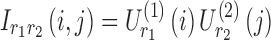 . Figure 4d represents a schematic representation of building spatial matrices for the 4D analysis. These spatial matrices can be transformed into brain space to generate the spatial maps.
Implementation
Both Tucker and CP decomposition approaches were used to identify the components underlying different modes of data. Furthermore, these approaches were run on both 3D and 4D tensors. Thus, overall, we performed four different analyses on the simulated and real fMRI data. The N-way Toolbox for MATLAB was used to perform these analyses (Andersson and Bro, 2000).
Different strategies have been proposed in the literature to determine the number of components that best represent the data, such as checking model fitness (or residual) and core consistency diagnostic measures (Bro and Kiers, 2003), or using cross-validation to assure that comparable components are identified across different permutations of available sample (Bro, 1997). In this study, for simulated data, we chose the number of components based on our knowledge of the data ground truth. For the real fMRI data, where there is lack of prior knowledge about the dynamic connectivity components, we tested model fitness to estimate the number of components. Model fitness score was quantified as the ratio of variance explained by the data reconstructed using the components to the total variance of the original data (Andersson and Bro, 2000). In this work, we used a threshold of 80% for model fitness to determine the number of components. As mentioned earlier, CP structure requires the same number of factors in all dimensions. In this study, for Tucker decomposition, we also chose the same number of factors, as it could potentially result in smaller off-diagonal core tensor entries (Chen and Saad, 2009); thus, potentially lower numbers of significant interactions between the factors of different dimensions would exist, leading to decreased efforts required for computations and interpretations.
Results
Image intensity fluctuations
Figure 5 shows the decomposition results for the intensity-modulated images using CP in two separate runs. The number of components was set to two for both runs, as two different images fluctuating with two different temporal patterns were fused to make these data. In the first run, the general CP model was used and yielded 100% fitness but failed to identify the original images with their temporal fluctuations. Rather, we identified a combination of intensity images as the spatial factors and a combination of the original time series as the temporal factors. This was due to a nonuniqueness of solution (Bro, 1997; Harshman and Lundy, 1994). For the second run, based on our domain knowledge of intensity images (that are non-negative), we constrained the factor matrices to be non-negative. Interestingly, non-negative tensor decomposition identified the original images, while showing 100% fitness. This implies that prior knowledge is critical when checking the validity of resulting components. However, as a proper knowledge base of brain dynamic connectivity has not been formed (Hutchison et al., 2013), this could be a significant challenge for dynamic brain network studies.
FIG. 5.

(a) The original images (size:  pixels) together with their intensity fluctuation time series (length:
  ). The intensities of these images were summed over time yielding a tensor of size
  , (b) the components resulted from CP decomposition, (c) and the components resulted from CP decomposition constrained to have non-negative factor matrices. CP, canonical polyadic. Color images are available online.
Simulated dynamic networks
Figure 6 represents dynamic connectivity (correlation value) time series estimated using a window of length 100 time points. These data represent a 3D tensor of size 8 × 8 × 901. As evident in the figures, there were three sets of connected nodes that exhibit varying connectivity over time, that is, the pairwise connections between nodes in three different sets {1, 2, 3}, {4, 5}, and {6, 7, 8}. Nodes 1 and 2 were initially highly positively correlated with each other and were both negatively correlated with node 3. The dynamic change in the latter half of the time series (shift from cosine signals to random noise) resulted in a loss of these relationships. Nodes 4 and 5 were negatively correlated in the first half of the time series and uncorrelated in the second half of the time series. Nodes 6, 7, and 8 were initially not correlated and then all became positively correlated in the latter part of the time series. There were only weak (random) associations between the nodes that belong to different clusters.
FIG. 6.

Dynamic functional connectivity time series estimated using sliding window correlation method for a single simulated participant. Each cell in the figure shows the time course of the correlation (r-value) between the time series for the given node pair whose labels are noted on the top and left rows. For each cell, time is on the x-axis and Pearson's correlation is on the y-axis. Note that, for example, node 1 and node 2 (cell [1, 2] and cell [2, 1]) were strongly positively correlated for the first portion of the time series. This correlation dropped toward zero (0) in the latter half of the time series. The cells with beige shading had time series changes that were due to random noise rather than meaningful node correlations. The correlation of each node with itself was set to zero for the whole time series and is not depicted in this figure. Color images are available online.
For the 3D analysis, only the upper triangular part of correlation data was used. Figure 6 indicates that there were two sets of nodes, {1, 2,…, 5} and {6, 7, 8}, in the upper triangular part that showed similar fluctuations over time and participants. This is evident by the similar correlation time courses in Figure 6. It should be noted that the similarity in the correlation dynamics does not indicate that the nodes' time courses were all correlated. For example, edges between nodes {2, 3} and nodes {4, 5} show similar dynamics over time. However, node 3 was correlated with node 2, but not nodes 4 or 5. Based on this a priori knowledge, the number of components, R, for the CP decomposition was set to 2. We observed that two components explained over 99% of data variance. Similarly, for Tucker decomposition, using  , a similar level of data variance was captured. The spatial matrices and their corresponding time and participant factors are shown in Figure 7. To facilitate comparison between different components' strength, the core tensor entry corresponding to each component is noted on the top, while the factors' norm in all dimensions was set to 1. Note that for the CP method, there were only two interactions between the factors of different dimensions, due to the superdiagonality constraint. The first component contained the first factors in each of the connectivity, time series, and participant weight dimensions, and the second component contained the second factors.
Due to applying no constraint to the core tensor in Tucker decomposition, setting  yielded eight potential interactions between the different dimensions. Note that core tensor entries (g) represent various combinations of factors such that, for example, the components labeled with
  and
and  (in Fig. 7b) share spatial and time factors, but not participant factors, while the components labeled with
  and
and  share a same participant factor but not spatial and time factors. For these simulated data, the entries
 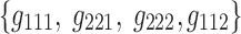 of the core tensor captured the majority of the variance (∼95%), suggesting that the current data could be efficiently reduced to their corresponding components.
Recall that for the 4D analysis, all the connections to an individual region are represented by a single variable. In Figure 6, we see that each region has a unique sequence (the order is important) of correlation time series. The independent fluctuation patterns across regions imply that the rank of data in the region dimension should be  . When the number of components, R, was set to eight in the CP model, over 99% of data variance was captured, while it was ∼90% with seven components, implying that eight was the proper choice for these data. For the Tucker decomposition, as we had eight different fluctuation patterns across regions, two across time, and two across participants,
  was used. This setting explained a similar level of data variance as
  in the CP model. The resulting components from the 4D tensors are presented in Figure 8. For the Tucker decomposition, there were numerous nonzero interactions between the factors of different dimensions (i.e., 256). We sorted the core tensor entries to identify the strongest components. The nine highest ranked components of Tucker decomposition are shown in Figure 8.
FIG. 8.

Components resulting from CP decomposition of the 4D data, including spatial matrices, and time and participant factors (a); comparable components resulting from Tucker decomposition of the 4D data (b). The nine highest ordered components are shown for the Tucker model. See Figure 7 legend for a description of each panel. Each component is labeled with the core tensor entries (g) such that the first two indices of g represent the corresponding factor number in the spatial dimensions, and the third and fourth indices represent the factor number in the time and participant dimensions, respectively. Color images are available online.
rs-fMRI data
The components resulting from CP and Tucker decomposition analyses on the rs-fMRI data were generated for both 3D and 4D data structures. For the 3D data, using CP decomposition, the number of components was set to  to capture 80% of data variance. The same number of components (e.g., 10) for fMRI dynamic connectivity tensor decomposition has been used previously (Ponce-Alvarez et al., 2015; Tobia et al., 2017). The six highest ranking components (including spatial maps, time, and participant factors) were selected for use in Figure 9a. For Tucker decomposition, we set
  . Similar to the simulated data, there were numerous potential interactions (i.e., 1000) between the different modes. The six highest ranked components of Tucker decomposition were also selected for visualization in Figure 9b.
FIG. 9.

3D components showing spatial maps with the corresponding time series (magenta plot) and participant (cyan plot) factors for CP (a) and Tucker (b) models. For each component, the “glass-brain” images show all nodes from an axial (top) and coronal (bottom) perspective. The total edge strength for each node was summed to generate node size that indicates the node strength. The thickness of each edge shows the corresponding edge strength, and the positive/negative edges are shown in red/blue. Color images are available online.
For 3D analysis, 80% of variance was explained with 10 components for both CP and Tucker models, while the same number of components only captured ∼50% of 4D data variance, implying that a higher number of components were required to represent 4D data. In this study, we used  and
and  to capture 80% of data variance. The spatial maps and their corresponding time and participant factors for the six highest ranked components of the 4D analysis were selected for Figure 10a and b. Note that for each of the top six components shown for the Tucker method, the time series and participant factors were identical. The only variables that changed were the spatial maps as evident by the core tensor entries g. For CP, the spatial maps all had unique temporal factors but tended to be dominated by individual participants. This indicates that for the 4D analysis of this particular data set, the Tucker method provides more generalizable solutions.
FIG. 10.

4D analysis components showing spatial maps with the corresponding time (magenta plot) and participant (cyan plot) factors for (a) CP and (b) Tucker models. Color images are available online.
Comparing Figures 9 and 10 shows that for 3D analysis (Fig. 9), the resulting spatial maps had nodes that were widely distributed throughout the brain space. There were some nodes in each map that had higher strength (total of weighted edges) as indicated by node size, but overall node strength was relatively homogeneous. Some spatial clustering of the high-strength nodes was evident in the spatial maps of the 3D analysis (e.g., left lateral and frontal regions in the component labeled with  in Fig. 9a), but not to the extent seen in the 4D analysis. We also statistically compared the 3D and 4D spatial maps, and showed that the node strength of 3D and 4D spatial maps was generated from two distributions with different medians (p-value <
 ). For greater details, refer to Supplementary Data.
Discussion
Functional brain networks can become very complex as the data size increases, and data decomposition methods can be used to simplify the data. In several recent studies (Leonardi et al., 2013; Mokhtari et al., 2018b; Tobia et al., 2017), these methods have been used to reduce dynamic networks to a manageable number of components that explain a major portion of data content/variance. Given that these components are identified as a (linear) combination of the original variables, one may argue that there is no guarantee that the components are interpretable in terms of original variables (Abdi and Williams, 2010; Bahrami et al., 2017; Broumand et al., 2015; Hand et al., 2001; Novembre and Stephens, 2008; Wold et al., 1987; Zou et al., 2006). Nevertheless, there is a pressing need to understand such components if we are to better understand brain function. Numerous recent neuroimaging studies have used different approaches to interpret the components resulting from these methodologies (Leonardi et al., 2013; Mahyari et al., 2017; Mokhtari et al., 2018b; Quevenco et al., 2017; Rao, 1964; Tobia et al., 2017). The main objective of the current study is to clarify the implications of these methods and to directly address the issues that may arise when trying to understand the brain based on the results of decomposition methods. Although we focused on dynamic connectivity tensor decomposition, equivalent issues are relevant to the traditional static connectivity analysis using either tensor or conventional matrix-based decompositions (e.g., SVD and PCA) (Calhoun et al., 2014; Leonardi et al., 2013; Yu et al., 2015). In the following, we discuss the results from each aspect of this study in greater detail.
Image intensity fluctuations
Using the intensity image modulation data (Fig. 5), we aimed to demonstrate that a decomposition analysis may result in an output that cannot be interpreted as simply as the data used as the input. Specific to this work, this simple example indicates that performing decomposition on the connectivity data may result in the output components that cannot be interpreted in the same way as one would interpret the input correlation matrices.
Note that in the matrix (2D tensor) case, CP and Tucker methods do not provide unique solutions (Bro, 1997; De Lathauwer et al., 2000), and thus, one might argue that different decomposition runs should be performed until consistent solutions are achieved. Another option is to constrain the analysis using prior knowledge about the components if such information is available. For example, based on our prior knowledge about the intensity images, we used non-negativity constraint in the factor matrices and observed that a non-negative CP decomposition can retrieve the original images. However, in the case of connectivity networks, where our understanding of dynamic brain components is still very limited, no appropriate a priori knowledge is available to constrain the analyses. In this case, it could be possible to perform analyses, such as examining model fitness or cross-validation, to examine the results' convergence toward a consistent and reasonable set of components.
3D and 4D analyses
We ran decomposition algorithms on both 3D and 4D connectivity tensors to demonstrate how these data structures could alter interpretations of the resulting components.
Simulated data
As explained earlier, in 3D data, each connectivity is a variable in the first dimension. As evident in Figure 7, for the 3D analysis, both CP and Tucker decompositions placed nodes {1, 2,…, 5} in a same spatial matrix, despite the fact that the two clusters of nodes, {1, 2, 3} and {4, 5}, were not correlated in the original correlation data. This suggests that dynamic connectivity of these nodes varied with a similar pattern over time and participants.
In 3D spatial matrices, the groups of edges with the same sign (either positive or negative) have a positive relationship with each other (in the correlation data) across time and participants. In contrast, the edges with different signs represent opposite relationships across time or participants. For example, as shown in Figure 7a component  , and Figure 7b components
  ,
,  ,
,  , and
, and  , edges {1, 3}, {2, 3}, and {4, 5} that have the opposite sign of edge {1, 2}, as their corresponding dynamic correlation, exhibit opposite fluctuations over time (Fig. 6). Comparable interpretations have been provided by Abdi and Williams (2010), Leonardi and colleagues (2013), and Wold and colleagues (1987). Thus, it is important not to confuse the sign of the edges in the spatial matrices/maps and the negative and positive correlations in the original connectivity matrices/maps. Rather, the sign of edges in the spatial matrices/maps should be interpreted within the context of the remaining edges in the same matrix/map. The sign is relative to the other edges and should be interpreted in conjunction with the time and participant factors. No edge sign should be interpreted in isolation. Moreover, following decomposition, the strength of each edge in the spatial factor represents the strength of the relationship between edges across time and participants. We performed a supplement analysis to better clarify the implications of edges' strength, see Supplementary Data, Supplementary Table S1, and Supplementary Figure S2 for greater details.
Overall, it is essential to reiterate that edge weights in a spatial matrix or map should not be confused with the correlation values in the original functional connectivity matrix or map. The appearance of a strong positive edge between two nodes in a spatial matrix does not indicate that there was a strong positive correlation between the time series for those nodes in the connectivity matrix.
As explained in the Simulated Dynamic Networks section, for the 4D analysis, each node is a variable in the first and second dimensions. For example, node 1 is a variable that is represented by the sequence of its correlation time series (order is important), as shown in the first row of Figure 6. Thus, 4D analysis reveals the regions with related connectivity sequences in a same network. In spatial maps, each edge's strength is then an indication of the strength of that relationship between the corresponding nodes. The relationship occurs over time or participants, for which fluctuations are represented by the factors of time and participant dimensions. Thus, unlike the 3D data, for the 4D data, the nodes {1, 2, 3} and {4, 5} appeared in different connectivity network maps. Note that due to the methodological details of 4D analysis (Fig. 4d), the diagonal entries of the corresponding spatial matrices are nonzero, unlike the 3D analysis. These values capture how the connectivity sequence of each individual region alone contributed to the 4D data variance. Thus, the diagonal weights do not indicate that there were self-connections in the original networks.
It is evident that the same interpretations suggested for the results from a 3D analysis may not be appropriate for results from a 4D analysis. For example, nodes {6, 7, 8} were all positively correlated in the original correlation data (Fig. 6), and all the corresponding edges were always associated with a same sign in the spatial matrices in the 3D data analyses (e.g., see Fig. 7a component  , or Fig. 7b components
  ,
,  ,
,  , and
, and  ). This was not the case for the 4D analysis (e.g., see Fig. 8a component
  where edges between nodes 6 and 8 and nodes 7 and 8 appeared with opposite signs). This suggests that there is not always a guarantee that the spatial matrices/maps will be readily interpretable and directly relatable to the original variables (Novembre and Stephens, 2008), especially for complex nonlinear data sets such as brain connectivity. Overall, these findings suggest that spatial matrices/maps should be interpreted as a whole structure and fine-grained interpretations of individual nodes or edges should be avoided.
In contrast to the 3D analysis for which the power of each spatial factor was fairly uniformly distributed among the involved regions, for the 4D analysis, it was observed that the major focus was on the diagonal entries that represent how a specific region contributed to a component. As explained in the Simulated Dynamic Networks section, this outcome could be due to the fact that each region in 4D analysis actually represents an independent rank of the data. In other words, the probability of having multiple nodes with individual edges that have related correlation time series is much higher than those nodes sharing related correlation time series across all edges. This yields a few high-strength nodes in the 4D spatial matrix, while the other nodes are significantly weaker. On the contrary, 3D analysis results in more uniformly weighted nodes distributed within the spatial matrices.
rs-fMRI data
For the real-brain network analyses, considerable differences between the results of the 3D and 4D data were evident. For the 3D analysis, the resulting spatial maps had nodes and edges uniformly distributed throughout the brain. For the 4D analyses, a small number of nodes had very high strength. This was statistically confirmed using the comparison of node strength between the spatial maps. This observation was consistent with the earlier discussion of simulated data where it was found that the spatial matrices from the 3D analysis included more uniformly weighted nodes.
It is currently not possible to conclude which method results in the components that are more closely aligned with real patterns underlying real fMRI data, given a lack of a gold standard. However, the outcomes of simulated data indicate that the 3D analysis produced outcomes with greater simplicity in interpretation, whereas the 4D analysis resulted in spatial matrices that were complex and intermixed. This is also related to the method used to create spatial matrices/maps for the 3D and 4D analyses (shown in Fig. 4b, d). The individual factor of the first dimension of the data was used for the 3D data, but the outer product of the two factors in the first and second dimensions was used for the 4D data. This results in more convoluted relationships in the 4D spatial matrices/maps compared with those of 3D analysis. Refer to Supplementary Figures S3 and S4 for greater clarification.
Some technical notes
We observed that the number of connectivity components for 3D analyses was higher than the 4D analyses while capturing a comparable amount of the variance. When dynamic connectivity data are represented using a 3D tensor, the first factor of each component represents a full-rank symmetric spatial matrix with as many free parameters as there are brain region pairs. When a 4D tensor is used, spatial matrices/maps are generated by the outer product of the factors in the first and second dimensions of the data. The resultant matrices are rank one with only as many free parameters as there are brain regions. This implies that components of a 4D decomposition do not contain as much information as those of a 3D decomposition, and so, more components are required to achieve a similar fitness level. Refer to Supplementary Figures S3 and S4 for greater clarification.
In addition, the 3D spatial matrices are not guaranteed to be positive semidefinite (PSD), but they are generally full rank. On the contrary, the 4D analysis guarantees that the spatial matrices are PSD, but they are rank one rather than full rank. Connectivity matrices from the original data are PSD and generally full rank because they are symmetric matrices for which entries are correlation values that are computed as the inner product of a pair of vectors (which means their eigenvalues are non-negative). This supports the argument that spatial matrices from 3D or 4D decompositions should not be interpreted as, or confused with, connectivity matrices because they are not guaranteed to be both full rank and PSD.
We believe that the rank-one characteristic of spatial matrices from the 4D data imposes specific structure to the spatial maps shown in Figure 10. The size of each node (referred as “node strength” in this study) in the visualization corresponds to the sum of absolute values of the row (or column) of the spatial matrix corresponding to that brain region. When the spatial matrix is the outer product of two identical vectors, the relative size of the region/node is exactly the relative size of the absolute value of the entry in the vector. Thus, when the vector has a few large entries, the corresponding brain regions appear as very-high-strength nodes in the spatial map. This pattern emerges more frequently in Figure 10 (for 4D) than in Figure 9 (for 3D), suggesting that it is inherited from the mathematical structure of data.
CP and Tucker decompositions
For both 3D and 4D analyses of the simulated network, CP decomposition identified the exact time and participant factors used in data simulation. To see this, compare the time factors in Figures 7a and 8a with the connectivity/correlation time series in Figure 6, as well as participant factors with simulated data variations across participants (as noted in Table 1). However, due to orthogonality constraint of the Tucker decomposition, the factors of the participant dimension represent a mixed pattern of the original data variations across participants (Figs. 7b and 8b). Note that as the two temporal fluctuations are orthogonal in the original connectivity data (their dot product is approximately zero), the time factors of Tucker decomposition are identified similar to the temporal fluctuations of the original data. Thus, we suggest that when the goal of the study is to yield a mechanistic interpretation of brain connectivity networks, the CP decomposition method will likely result in more accurate interpretations than Tucker.
Our suggestion is consistent with a general rule of thumb in data decomposition (Kolda and Bader, 2009; Papalexakis et al., 2017) that recommends Tucker decomposition (as a generalization of matrix SVD) for use in machine learning analyses (for feature reduction purpose), as it provides orthogonal/linearly independent components that could construct a new efficient variable space. CP (as a generalization of matrix factorization), on the contrary, has been recommended for mechanistic studies where interpretations are essential (Kolda and Bader, 2009; Papalexakis et al., 2017). To support this discussion, we performed a supplement analysis and demonstrated that when using dynamic brain networks to predict success in a behavioral weight loss intervention, Tucker decomposition significantly outperformed CP (see Supplementary Data for more information).
Limitations
A limitation of this work is that the simulated data used in this study were quite simple and do not capture the complexity of real-brain networks. First, we used single-frequency time series for each node, while fMRI time series show signals within a frequency range (e.g., [0.01, 0.1]). This may cause a region/connection or a combination of them to be observed in multiple components. Second, weak ties are a crucial aspect of real-world networks (Gallos et al., 2012; Granovetter, 1977) and we did not investigate how they may affect the resulting components. Third, the regions showing dynamic connectivity can be modeled as coupled oscillators that could add to the complexity of components, while our simulated data do not present such behavior. Nevertheless, even using small and simplistic simulated networks, we showed that there are cases for which the resulting spatial matrices/maps cannot be interpreted in the same manner as the original connectivity matrices/maps (e.g., correlation values). Future work focusing on expanding the findings of this study, using more realistic simulated data, is needed. In addition, future studies should investigate if rotation algorithms, for example, varimax or quartimax, would be able to enhance the interpretability of brain connectivity components.
Conclusion
Data reduction techniques, such as tensor decomposition, are becoming popular tools to simplify the data generated by dynamic connectivity analyses. Once the data are reduced to a smaller, more manageable number of components, a new challenge of interpreting the components arises. This article specifically discusses the results that come from popular tensor decomposition methods. It was argued that the spatial factors and associated spatial matrices/maps from individual components cannot be simply interpreted in the same way as the original data, despite the fact that the original correlation analyses and the decomposed results are conventionally visualized in the same way (in matrix form on in maps transformed back into brain space). In general, we observed that analyses using 3D and 4D tensor data resulted in findings that must be interpreted differently. We found that the 3D results were simpler to interpret. Both methods have been commonly used in the literature and one should be aware of the method used before interpreting the outcomes. In addition, we showed that while CP is capable of identifying components similar to those in the original data, Tucker decomposition may reveal a mixed pattern of original components to satisfy orthogonality constraint. Overall, CP may facilitate interpretations, but Tucker may capture more complex interactions that are useful for feature reduction purpose in machine-learning analyses.
Supplementary Material
Acknowledgments
This work was supported by the National Heart, Lung, and Blood Institute (R18 HL076441), the Translational Science Center of Wake Forest University, the National Institutes on Aging (P30 AG021332), the National Science Foundation (ACI-1642385), and the Wake Forest Clinical and Translational Science Institute (UL1TR001420).
Author Disclosure Statement
No competing financial interests exist.
Supplementary Material
References
- Abdi H, Williams LJ. 2010. Principal component analysis. Wiley Interdiscip Rev Comput Stat 2:433–459 [Google Scholar]
- Allen EA, Damaraju E, Plis SM, Erhardt EB, Eichele T, Calhoun VD. 2014. Tracking whole-brain connectivity dynamics in the resting state. Cereb Cortex 24:663–676 [DOI] [PMC free article] [PubMed] [Google Scholar]
- Andersson CA, Bro R. 2000. The N-way toolbox for MATLAB. Chemometr Intell Lab Syst 52:1–4 [Google Scholar]
- Bahrami M, Laurienti PJ, Quandt SA, Talton J, Pope CN, Summers P, et al. 2017. The impacts of pesticide and nicotine exposures on functional brain networks in Latino immigrant workers. Neurotoxicology 62:138–150 [DOI] [PMC free article] [PubMed] [Google Scholar]
- Bro R. 1997. PARAFAC. Tutorial and applications. Chemometr Intell Lab Syst 38:149–171 [Google Scholar]
- Bro R, Kiers HA. 2003. A new efficient method for determining the number of components in PARAFAC models. J Chemometr 17:274–286 [Google Scholar]
- Broumand A, Esfahani MS, Yoon B-J, Dougherty ER. 2015. Discrete optimal Bayesian classification with error-conditioned sequential sampling. Pattern Recognit 48:3766–3782 [Google Scholar]
- Bullmore E, Sporns O. 2009. Complex brain networks: graph theoretical analysis of structural and functional systems. Nat Rev Neurosci 10:186–198 [DOI] [PubMed] [Google Scholar]
- Calhoun VD, Liu J, Adalı T. 2009. A review of group ICA for fMRI data and ICA for joint inference of imaging, genetic, and ERP data. Neuroimage 45:S163–S172 [DOI] [PMC free article] [PubMed] [Google Scholar]
- Calhoun VD, Miller R, Pearlson G, Adalı T. 2014. The chronnectome: time-varying connectivity networks as the next frontier in fMRI data discovery. Neuron 84:262–274 [DOI] [PMC free article] [PubMed] [Google Scholar]
- Chang C, Glover GH. 2010. Time-frequency dynamics of resting-state brain connectivity measured with fMRI. Neuroimage 50:81–98 [DOI] [PMC free article] [PubMed] [Google Scholar]
- Chen J, Saad Y. 2009. On the tensor SVD and the optimal low rank orthogonal approximation of tensors. SIAM J Matrix Anal Appl 30:1709–1734 [Google Scholar]
- Chen S, Ji B, Li Z, Langley J, Hu X. Dynamic analysis of resting state fMRI data and its applications. In IEEE, 2016, pp. 6295–6299 [Google Scholar]
- Cordes D, Haughton VM, Arfanakis K, Carew JD, Turski PA, Moritz CH, et al. 2001. Frequencies contributing to functional connectivity in the cerebral cortex in “resting-state” data. Am J Neuroradiol 22:1326–1333 [PMC free article] [PubMed] [Google Scholar]
- De Lathauwer L, De Moor B, Vandewalle J. 2000. A multilinear singular value decomposition. SIAM J Matrix Anal Appl 21:1253–1278 [Google Scholar]
- De Silva V, Lim L.-H. 2008. Tensor rank and the ill-posedness of the best low-rank approximation problem. SIAM J Matrix Anal Appl 30:1084–1127 [Google Scholar]
- Erhardt EB, Allen EA, Wei Y, Eichele T, Calhoun VD. 2012. SimTB, a simulation toolbox for fMRI data under a model of spatiotemporal separability. Neuroimage 59:4160–4167 [DOI] [PMC free article] [PubMed] [Google Scholar]
- Gallos LK, Makse HA, Sigman M. 2012. A small world of weak ties provides optimal global integration of self-similar modules in functional brain networks. Proc Natl Acad Sci 109:2825–2830 [DOI] [PMC free article] [PubMed] [Google Scholar]
- Granovetter M. 1973. The strength of weak ties. Am J Sociology 78:1360–1380 [Google Scholar]
- Hand DJ, Mannila H, Smyth P. 2001. Principles of Data Mining (Adaptive Computation and Machine Learning). Cambridge, MA: MIT Press [Google Scholar]
- Handwerker DA, Roopchansingh V, Gonzalez-Castillo J, Bandettini PA. 2012. Periodic changes in fMRI connectivity. Neuroimage 63:1712–1719 [DOI] [PMC free article] [PubMed] [Google Scholar]
- Harshman RA, Lundy ME. 1984. Data preprocessing and the extended PARAFAC model. In Research Methods for Multimode Data Analysis. New York: Praeger; pp. 216–284 [Google Scholar]
- Harshman RA, Lundy ME. 1994. PARAFAC: parallel factor analysis. Comput Stat Data Anal 18:39–72 [Google Scholar]
- Hindriks R, Adhikari MH, Murayama Y, Ganzetti M, Mantini D, Logothetis NK, Deco G. 2016. Can sliding-window correlations reveal dynamic functional connectivity in resting-state fMRI? Neuroimage 127:242–256 [DOI] [PMC free article] [PubMed] [Google Scholar]
- Hutchison RM, Womelsdorf T, Allen EA, Bandettini PA, Calhoun VD, Corbetta M, et al. 2013. Dynamic functional connectivity: promise, issues, and interpretations. Neuroimage 80:360–378 [DOI] [PMC free article] [PubMed] [Google Scholar]
- Kiviniemi V, Vire T, Remes J, Elseoud AA, Starck T, Tervonen O, Nikkinen J. 2011. A sliding time-window ICA reveals spatial variability of the default mode network in time. Brain Connect 1:339–347 [DOI] [PubMed] [Google Scholar]
- Kolda TG, Bader BW. 2009. Tensor decompositions and applications. SIAM Rev 51:455–500 [Google Scholar]
- Leonardi N, Richiardi J, Gschwind M, Simioni S, Annoni J-M, Schluep M, et al. 2013. Principal components of functional connectivity: a new approach to study dynamic brain connectivity during rest. NeuroImage 83:937–950 [DOI] [PubMed] [Google Scholar]
- Leonardi N, Van De Ville D. 2015. On spurious and real fluctuations of dynamic functional connectivity during rest. Neuroimage 104:430–436 [DOI] [PubMed] [Google Scholar]
- Lindquist MA, Xu Y, Nebel MB, Caffo BS. 2014. Evaluating dynamic bivariate correlations in resting-state fMRI: a comparison study and a new approach. Neuroimage 101:531–546 [DOI] [PMC free article] [PubMed] [Google Scholar]
- Mahyari AG, Zoltowski DM, Bernat EM, Aviyente S. 2017. A tensor decomposition-based approach for detecting dynamic network states from EEG. IEEE Trans Biomed Eng 64:225–237 [DOI] [PubMed] [Google Scholar]
- Marsh AP, Janssen JA, Ambrosius WT, Burdette JH, Gaukstern JE, Morgan AR, et al. 2013. The cooperative lifestyle intervention program-II (CLIP-II): design and methods. Contemp Clin Trials 36:382–393 [DOI] [PMC free article] [PubMed] [Google Scholar]
- Mokhtari F, Mayhugh RE, Hugenschmidt CE, Rejeski WJ, Laurienti PJ. 2018a. Tensor-Based vs. Matrix-Based Rank Reduction in Dynamic Brain Connectivity. In: Angelini ED, Landman BA, (eds.) Medical Imaging 2018: Image Processing. Houston, TX: SPIE [Google Scholar]
- Mokhtari F, Rejeski WJ, Zhu Y, Wu G, Simpson SL, Burdette JH, Laurienti PJ. 2018b. Dynamic fMRI networks predict success in a behavioral weight loss program among older adults. Neuroimage 173:421–433 [DOI] [PMC free article] [PubMed] [Google Scholar]
- Novembre J, Stephens M. 2008. Interpreting principal component analyses of spatial population genetic variation. Nat Genet 40:646. [DOI] [PMC free article] [PubMed] [Google Scholar]
- Papalexakis EE, Faloutsos C, Sidiropoulos ND. 2017. Tensors for data mining and data fusion: models, applications, and scalable algorithms. ACM Trans Intell Syst Technol 8:16 [Google Scholar]
- Ponce-Alvarez A, Deco G, Hagmann P, Romani GL, Mantini D, Corbetta M. 2015. Resting-state temporal synchronization networks emerge from connectivity topology and heterogeneity. PLoS Comput Biol 11:e1004100. [DOI] [PMC free article] [PubMed] [Google Scholar]
- Preti MG, Bolton TA, Van De Ville D. 2016. The dynamic functional connectome: State-of-the-art and perspectives. NeuroImage 160:41–54 [DOI] [PubMed] [Google Scholar]
- Quevenco FC, Preti MG, Van Bergen JM, Hua J, Wyss M, Li X, Schreiner SJ, et al. 2017. Memory performance-related dynamic brain connectivity indicates pathological burden and genetic risk for Alzheimer's disease. Alzheimers Res Ther 9:24. [DOI] [PMC free article] [PubMed] [Google Scholar]
- Rao CR. 1964. The use and interpretation of principal component analysis in applied research. Sankhyā Indian J Stat A 329–358 [Google Scholar]
- Rejeski WJ, Ambrosius WT, Burdette JH, Walkup MP, Marsh AP. 2017. Community weight loss to combat obesity and disability in at-risk older adults. J Gerontol A Bio Sci Med Sci 72:1547–1553 [DOI] [PMC free article] [PubMed] [Google Scholar]
- Richiardi J, Achard S, Bunke H, Van De Ville D. 2013. Machine learning with brain graphs: predictive modeling approaches for functional imaging in systems neuroscience. IEEE Signal Process Mag 30:58–70 [Google Scholar]
- Rubinov M, Sporns O. 2010. Complex network measures of brain connectivity: uses and interpretations. Neuroimage 52:1059–1069 [DOI] [PubMed] [Google Scholar]
- Rubinov M, Sporns O. 2011. Weight-conserving characterization of complex functional brain networks. Neuroimage 56:2068–2079 [DOI] [PubMed] [Google Scholar]
- Shen X, Tokoglu F, Papademetris X, Constable RT. 2013. Groupwise whole-brain parcellation from resting-state fMRI data for network node identification. Neuroimage 82:403–415 [DOI] [PMC free article] [PubMed] [Google Scholar]
- Tobia MJ, Hayashi K, Ballard G, Gotlib IH, Waugh CE. 2017. Dynamic functional connectivity and individual differences in emotions during social stress. Hum Brain Mapp 38:6185–6205 [DOI] [PMC free article] [PubMed] [Google Scholar]
- Whitfield-Gabrieli S, Thermenos HW, Milanovic S, Tsuang MT, Faraone SV, McCarley RW, et al. 2009. Hyperactivity and hyperconnectivity of the default network in schizophrenia and in first-degree relatives of persons with schizophrenia. Proc Natl Acad Sci 106:1279–1284 [DOI] [PMC free article] [PubMed] [Google Scholar]
- Wold S, Esbensen K, Geladi P. 1987. Principal component analysis. Chemometr Intell Lab Syst 2:37–52 [Google Scholar]
- Yu Q, Erhardt EB, Sui J, Du Y, He H, Hjelm D, et al. 2015. Assessing dynamic brain graphs of time-varying connectivity in fMRI data: application to healthy controls and patients with schizophrenia. Neuroimage 107:345–355 [DOI] [PMC free article] [PubMed] [Google Scholar]
- Zou H, Hastie T, Tibshirani R. 2006. Sparse principal component analysis. J Comput Graph Stat 15:265–286 [Google Scholar]
Associated Data
This section collects any data citations, data availability statements, or supplementary materials included in this article.