. 2019 Feb 26;8:e40162. doi: 10.7554/eLife.40162

Figure 4. EGF titration at physiological levels disrupts boundary formation.

(A) Destabilisation of the junction with EGF addition. All in 5% serum with snapshots of endpoint (144 h). Shown also is the green channel CP-A MOSES mesh. The closeness of the lines indicates impeded motion leading to a local aggregation of superpixels in the vicinity and is suggestive of a boundary. The less lattice-like the mesh, the less ordered the motion. Blue triangles mark the boundary position in the image and its corresponding inferred position in the CP-A mesh. All scale bars: 500 μm. (B) Top: maximum projected video kymograph. Bottom: x-direction velocity kymograph computed from optical flow for the representative videos in (A). (C) Grouped boxplot of the average speed for the different cell lines in the combination in 5% serum with increasing EGF concentration. (D) Mean displaced distance of the boundary normalised by image width following gap closure with increasing EGF concentration in 5% serum. Mean displaced distance of EPC2:CP-A and EPC2:OE33 cultured in 5% serum from Figure 1G are also plotted for comparison. T-test was used with * indicating p = < 0.05, ** p = < 0.01, *** p = < 0.001. Error bars are plotted for ± one standard deviation of the mean. (E) Mean normalised strain curves for EPC2:CP-A in 5% serum for each concentration of EGF. The mean curve for EPC2:OE33 videos in 5% serum without EGF in Figure 3 is shown for comparison (black curve). (F–H) Violin plots of boundary formation index (F), mesh stability index (G) and maximum velocity cross-correlation (H) for each concentration of EGF and cells in 5% serum. Red solid line = mean, Black solid line = median. Dots are individual videos, total n = 40. Shaded region is the probability density of the data whose width is proportional to the number of videos at this value. Violins of respective measures for EPC2:OE33 in 5% serum without EGF with thresholds (horizontal black line) from Figure 3 is shown for comparison. (I,J) Boxplots of velocity order (I) and mesh order (J) for individual cell lines (left) and pooled across the two cell lines in the combination (right). Values for EPC2:OE33 in 5% serum without EGF and threshold from Figure 3 are shown for comparison.

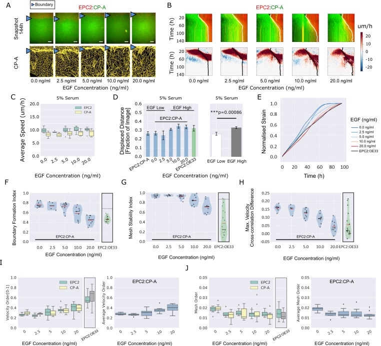
Figure 4.

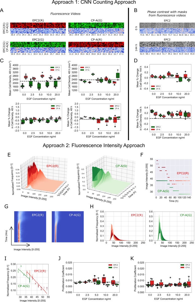
Figure 4—figure supplement 1. Migration-independent cell counting to assess cell proliferation upon EGF addition to EPC2:CP-A in 5% serum.

Figure 4—figure supplement 1.

(A) Example results of CNN counting on fluorescence videos as described in Materials and methods with switching of dyes. For each panel, the top row shows video snapshots, the bottom row shows the CNN heatmap output and the numbers below it are the CNN predicted number of cells within the image patch. Exemplar patches shown are all sampled from the initial video frame. Consistent cell numbers across all sampled cell patches enables the use of the averaged cell density as an estimate of the cell density in the entire migrating epithelial sheet. Similar cell counts using either red or green dye shows cell counting is unaffected by the dye. (B) Similar examples presented as in (A) but using the matched phase contrast videos to illustrate the changing appearance of cells over time. Top panel: cell patches sampled from the initial frame (0 h). Bottom panel: cell patches sampled from the final frame (144 h). Individual cell types in co-cultures are distinguished using the matched fluorescence videos for image masking. (C) Boxplots of mean cell density (top) and corresponding mean % change in cell density (bottom) of each cell population, labelled with red and green dyes, where the average change in cell density is normalised by the average cell density across all frames up to 48 h. (D) Similar boxplots of mean % change as in (C) but with cell density computed from phase contrast videos. (E) Surface plot of the temporal evolution of the red and green channel normalised image intensity histograms for a representative video over 144 h. Given an image intensity value, the darker the colour the higher the proportion of image pixels share this image intensity (normalised frequency). (F) Plot of the change in the modal image intensity value of (E) over time with lighter colours representing later times. (G) Spatiotemporal evolution of the image intensity histogram of (E) as a heatmap with time on the y-axis, image intensity on the x-axis and the colour representing the normalised frequency. (H) Spatiotemporal evolution of the image intensity histogram of (E) shown as an overlay of histograms using the progression of dark to light colours to show time. (I) Plot of the (image intensity, normalised frequency) pair for the histogram peak estimated at each time point. Passage of time is indicated by the progression of dark to light colours. Points fit a linear regression. The proliferation gradient is the negative of the gradient of the best fit line. (J,K) Boxplots of the extracted proliferation coefficient for increasing EGF concentrations for individual cell populations where EPC2 is dyed ‘red’ (J) and ‘green’ (K). Compared to fitting the image intensity vs time in (F) which shows too discrete a transition between intensity values, fitting the normalised frequency vs image intensity was found to be more robust whilst yielding the same conclusions when all videos are of the same temporal length (144 h) as was the case here for EGF addition to EPC2:CP-A. All boxplots depict median and interquartile range (IQR) of values with whiskers defined 1.5 x IQR above and below the quartiles.
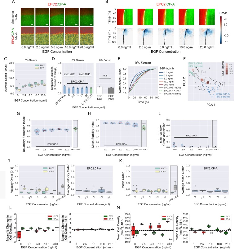
Figure 4—figure supplement 2. EGF addition to EPC2:CP-A in 0% serum does not induce boundary formation.

Figure 4—figure supplement 2.

(A) Snapshots of the video (top) and fused red EPC2 and green CP-A MOSES mesh (bottom) at 144 h with increasing EGF concentration. (B) Top: maximum projected video kymograph. Bottom: x-direction velocity kymograph computed from optical flow for the representative videos in (A). The speed and direction of movement are indicated by the intensity and colour, respectively (blue, moving left; red, moving right). (C) Average speed of each cell line in each cell line combination for increasing concentrations of EGF. (D) Mean displaced distance of the boundary following gap closure with increasing EGF concentration. Mean displaced distance of EPC2:CP-A and EPC2:OE33 in 0% serum from Figure 1G are also plotted for comparison. T-test was used with * indicating p = < 0.05, ** p = < 0.01, *** p = < 0.001. Error bars are plotted for ± one standard deviation of the mean. (E) Mean normalised strain curves for EPC2:CP-A in 0% serum with each tested EGF concentration. The mean curves for EPC2:OE33, 0% serum and EPC2:CP-A, 5% serum, EPC2:EPC2, 5% serum without EGF are also shown for comparison. (F) Evolution of the mean curves in (E) plotted onto the motion map of Figure 5. (G–I) Violin plots of (G) boundary formation index, (H) mesh stability index and (I) maximum (max.) velocity cross-correlation before and after gap closure, left and right violins respectively of each paired violin in (I). Shaded region represents the probability density of the data. Width of shaded region is proportional to the number of videos with that value. Each point is a video, black line is the median, red line is the mean. EPC2:OE33, 0% serum without EGF and thresholds in Figure 3 are shown for comparison. (J,K) Box plots of the velocity order (J) and mesh order (K) for individual cell lines (left) and pooled over the combination (right). EPC2:OE33 in 0% serum without EGF from Figure 3 is shown for comparison. (L,M) Boxplots of mean % change in cell density normalised by the average cell density (L) and mean cell density (M) of each cell for all frames up to 48 h. Each point is a video. All boxplots depict median and interquartile range (IQR) of values with whiskers defined 1.5 x IQR above and below the quartiles.