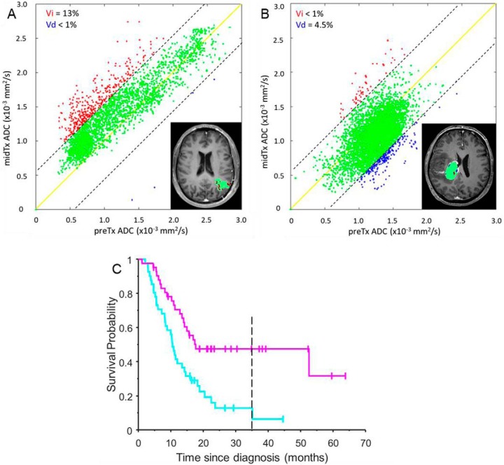
Figure 2.
fDM metrics determined from midTx versus preTx ADC PRM scatter plots is overlaid on the T1Gd image inserts for the same two patients [responder (A) and nonresponder (B)] as in Figure 1 histograms. The dashed diagonal lines indicate 95% CI for the change encompassing green voxels corresponding to tumor regions not altered by therapy. The solid yellow line corresponds to the perfect fDM correlation. Red and blue areas mark tumor voxels with respective significant increase and decrease in ADC midTX verus preTx (summarized in the legends). (C) shows stair-step graph for reference fDM KM survival analysis of responders (magenta) and nonresponders (cyan) based on a median response threshold of 4% fDM-increase (magenta KM stair-step trend) for the whole glioma study population. Magenta and cyan KM trends correspond to the tumor fDM, respectively, above and below median response threshold. Vertical tick-marks along KM trends indicate individual patients whose survival times have been censored. Dashed vertical line corresponds to the minimal survival time included into the corresponding KM cumulative distribution function (CDF) probability analysis (excluding survival for the late censored patients).

