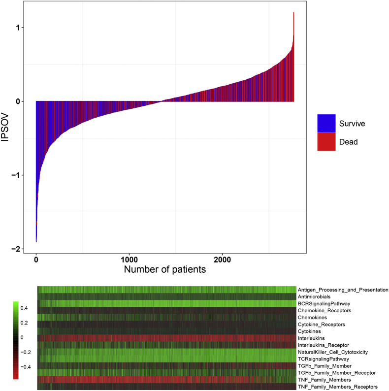
Fig. 3.
IPSOV distribution with survival status in the combined dataset. Upper half panel: IPSOV distribution with patient survival status. The X axis is sorted by IPSOV values. Red color indicates the patients are dead while blue color indicates survive. Lower half panel: Heatmap showing the corresponding 15 immune categories enrichment scores. The score of each immune category is normalized to mean = 0 and standard deviation = 1. (For interpretation of the references to color in this figure legend, the reader is referred to the web version of this article.)

