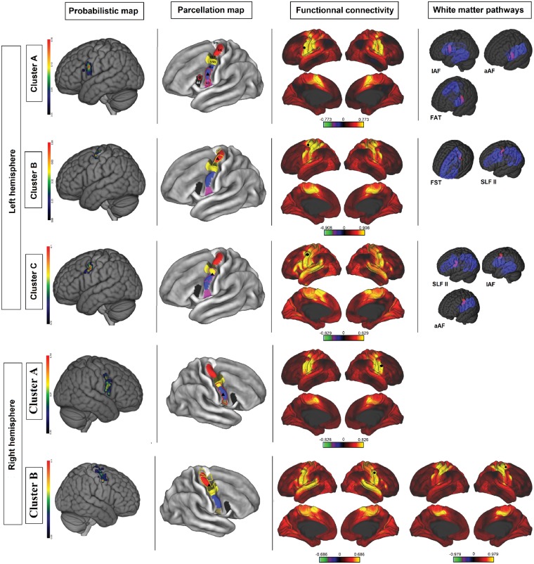
Figure 5.
Cluster analysis of upper limb NMAs. Each row corresponds to a cluster. First column: probabilistic map of the cluster (colour bar scales were adjusted to highlight differences inside the precentral gyrus). Second column: overlap between cluster boundaries (cluster A = red dots; cluster B = yellow dots; cluster C = purple) and the Glasser parcellation map (area 6 m = white; area 6d = red; FEF = brown; area 55b = yellow; area 6v = blue; area 43 = purple; area 44 = black; black triangle = centroid). Third column: areas functionally connected to the corresponding cluster, according to the Wu-Min HCP Data dataset (high connectivity = yellow; low connectivity = red; the colour bar represents Pearson’s r; seed = black circle; Glasser parcellation map = black line). Fourth column: overlap (purple) between clusters (red) and white matter pathways (opaque blue = cortical projection; transparent blue = subcortical fibres).

