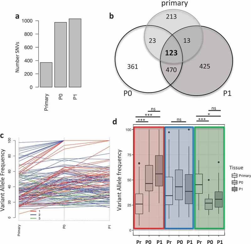
Figure 1.

Mutational landscape in primary tumor and PDXs. a) Barplot indicating the number of mutations in the different samples. b) Venn diagram showing the unique and common mutations in primary and PDX samples. c) Line plot showing the changes in the variant allele frequency (VAF) of mutations common between the primary, P0 and P1 tumors. Colors indicate the mutational cluster calculated via Pearson correlation. Red (cluster 1), blue (cluster 2) and green (cluster 3). d) Boxplot showing the changes in variant allele frequency (VAF) within each sample across the clusters. Highlighted in colors are the clusters and from left to right each cluster shows VAF for primary (Pr), P0 and P1. (*, p < 0.05, ***, p < 0.001, ns = non significant).
