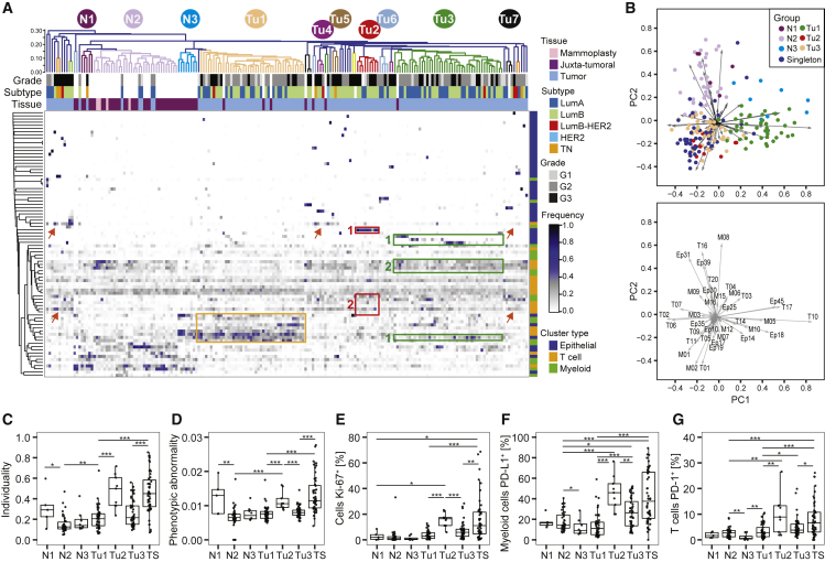
Figure 5.
Relationships in the Tumor Ecosystem Correlate with Features of Disease Progression
(A) Heatmap of frequencies of epithelial, T cell, and myeloid PhenoGraph clusters in mammoplasty, juxta-tumoral, and tumor tissues. For tumors, the subtype and grade are indicated by color. Cosine distance and average linkage were used.
(B) Biplots of first two principal components (PCs) of cluster frequencies. Dots represent samples colored by group (top). The arrow length and direction indicate the importance of the cluster to the PC (bottom).
(C–G) Boxplots of (C) individuality and (D) phenotypic abnormality scores and frequencies of (E) Ki-67+ cells, (F) PD-L1+ macrophages, and (G) PD-1+ T cells by group.
Wilcoxon rank-sum test was used for statistical analysis. ∗p < 0.05, ∗∗p < 0.01, ∗∗∗p < 0.001. See also Figure S5.

