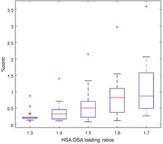
Figure 4.

Free component contributions at different loading ratios are depicted in a boxplot. Although a linear increasing trend is observed by moving toward higher loading ratios, the medians (red lines) of contributions stay below one percent for healthy individuals. The red crosses are outliers in each series.
