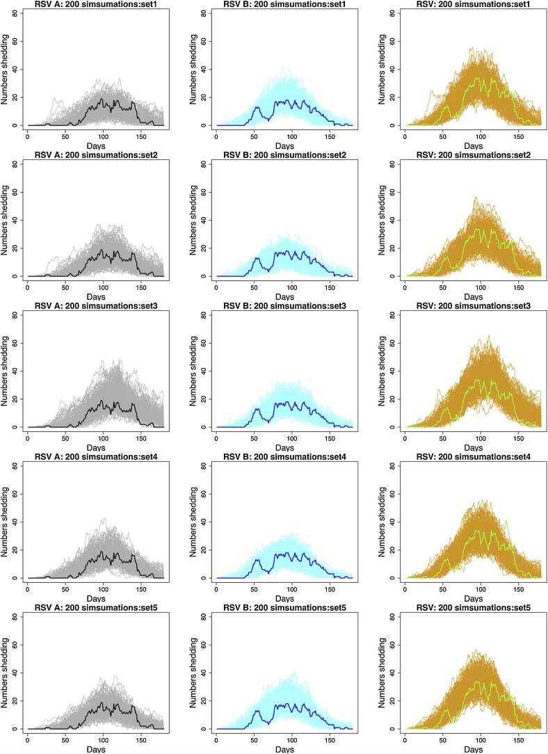
Fig. 4.
A comparison between the simulated data and real epidemics using simulations from 5 different parameter sets estimated from the full model (row 1 to 5). First column: RSV A simulated epidemics (grey lines) compared to real data (thick black line). Second column: RSV B simulated epidemics (light blue lines) compared to real data (thick blue line). Third column: RSV simulated epidemics (orange lines) compared to real data (thick green lines) (For interpretation of the references to colour in this figure legend, the reader is referred to the web version of this article).

